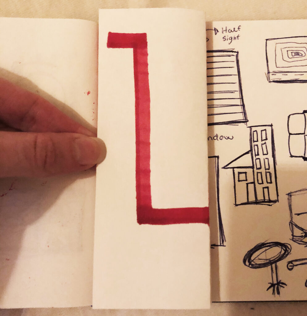
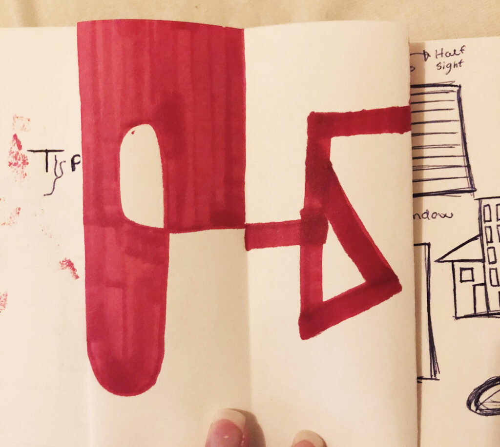
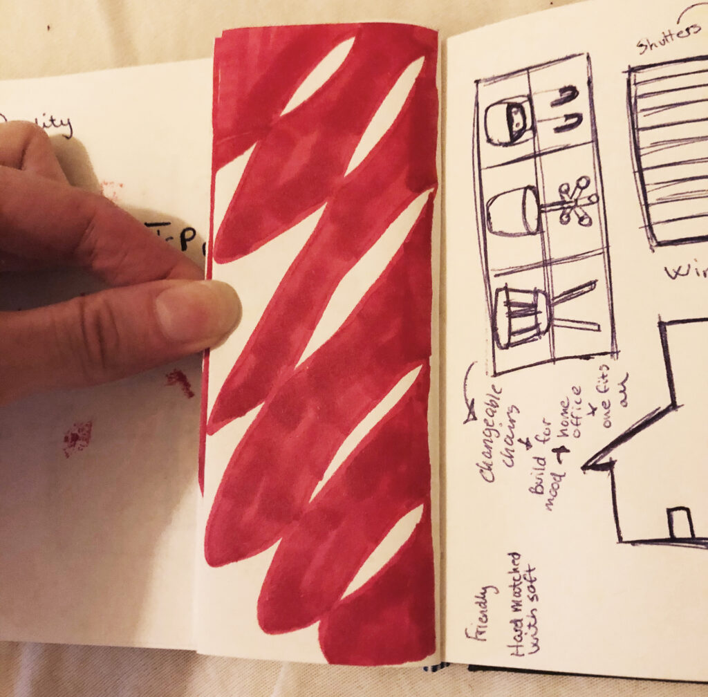
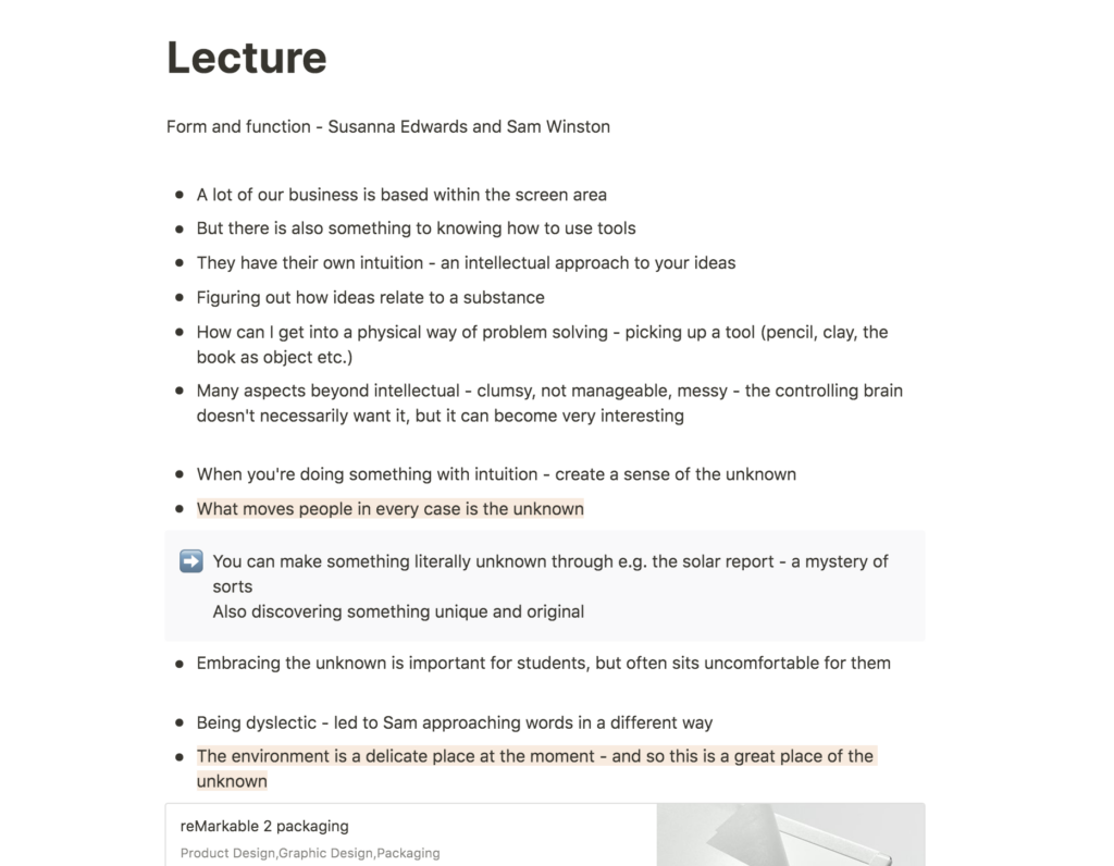
Lecture notes
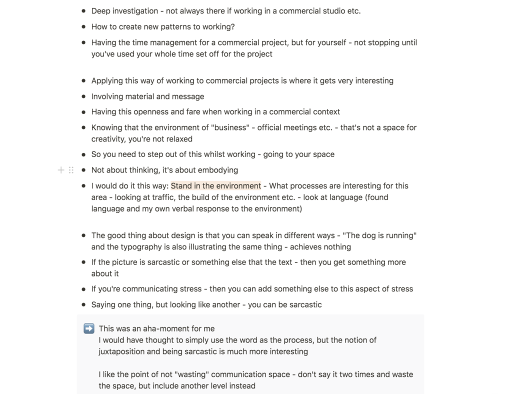
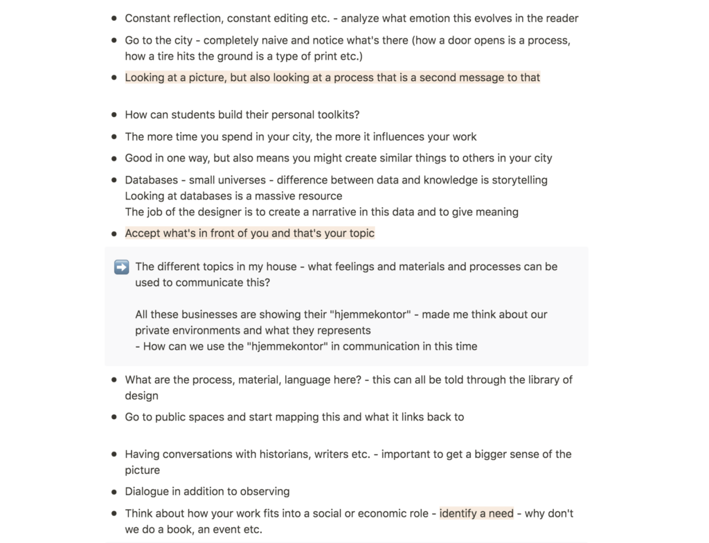
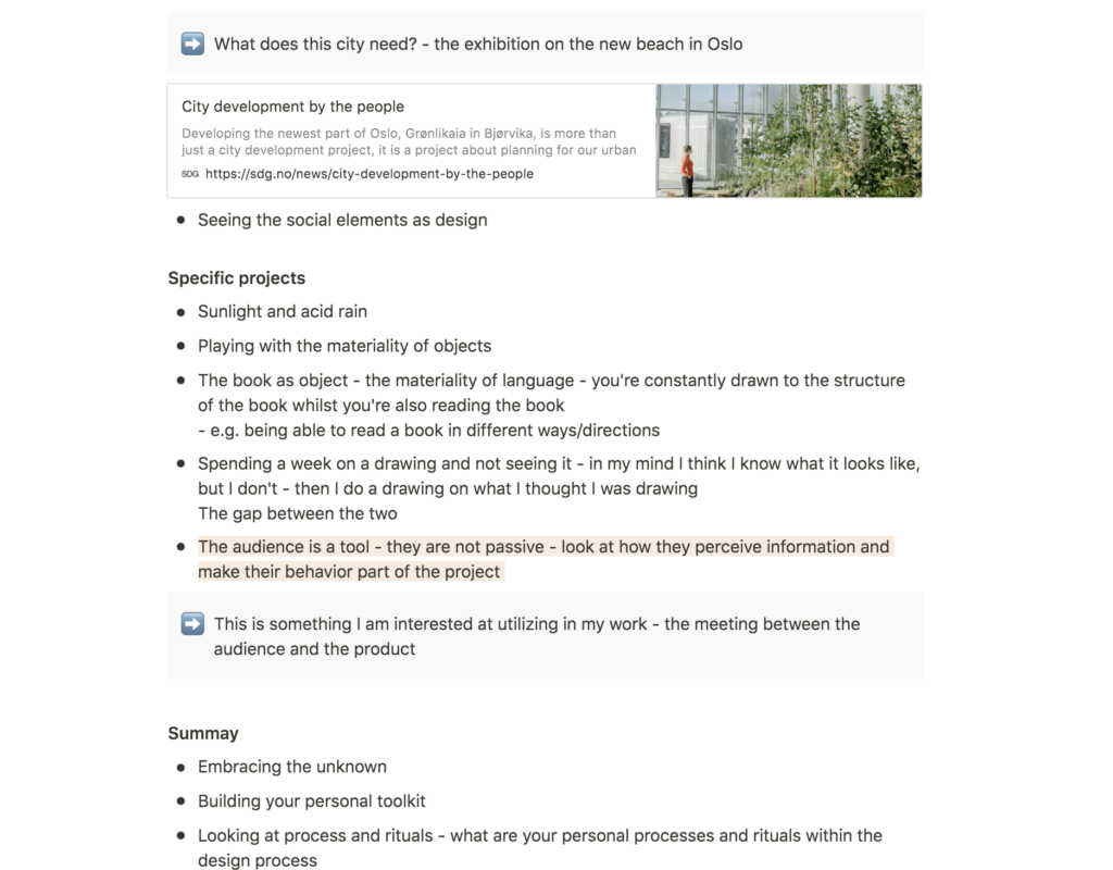
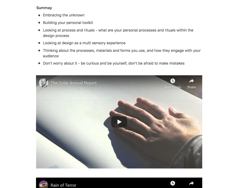
Lecture reflection
Finding the unknown
To me, The Solar Annual Report is a great example of how the unknown moves people, as Winston and Edwards discussed in this week’s lecture (Winston and Edwards, 2020). It is literally unknown because the pages are hidden until they are exposed to sunlight, but the report is also unknown in the sense of being an original and innovative project. This piece has inspired me to try and embrace the unknown this week.

Trusting the process
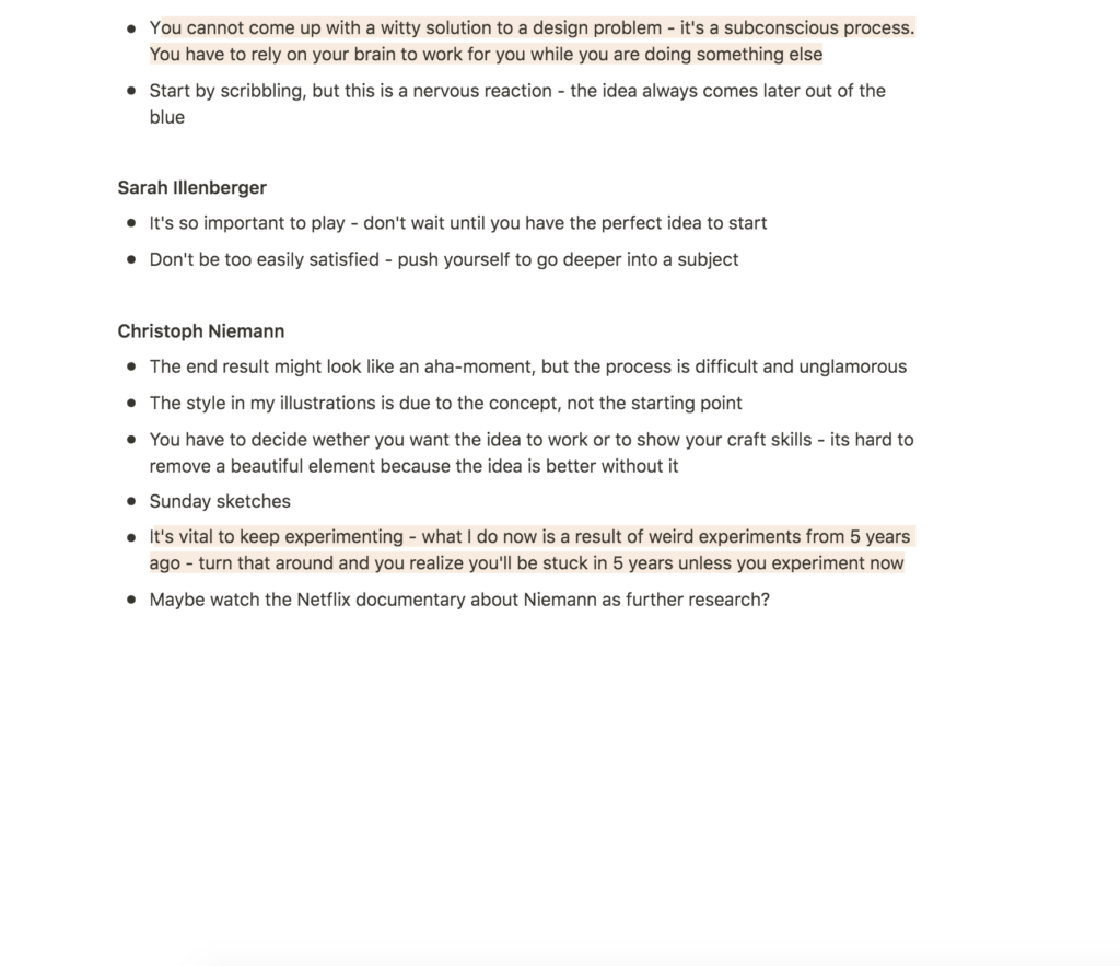
I was particularly intrigued by Winston’s point of trusting one’s ability to come up with interesting ideas (Winston and Edwards, 2020). Going into a new project I often get anxious and worried that I won’t get a good idea. This anxiety is very unproductive as it often gets in the way of creativity. Therefor Winston’s point was a good reminder of trusting the process, which I will try to keep in mind from now on.
Focusing on what’s available
I am quite interested in using Winston’s tip on literally standing in the city in order to observe (Winston and Edwards, 2020). However, the covid situation might make it difficult to implement this method, as we are currently encouraged to stay at home in Oslo. I was therefor inspired by Winston’s point of accepting what’s in front of you (Winston and Edwards, 2020). Even if I can’t go to the main areas of Oslo, I could still observe my local area, or perhaps the insides of my apartment. In Norway, people spend a lot of their time at home, so this could potentially be a way of accepting what is currently in front of me.
City development by people
Further, the lecture opened my eyes to the idea of looking for social and economic needs (Winston and Edwards, 2020). Perhaps an interesting starting point for this week’s challenge would be to investigate what might make Oslo a better place to live? In a recent exhibition, design studio SDG invited the public of Oslo to submit their suggestions of what they would like a new part of the city to contain (Scandinavian Design Group, 2020). This seems like an interesting research method, but also a great way of creating awareness of what the people want, as well as implementing their needs (sustainability, urban surroundings etc.).
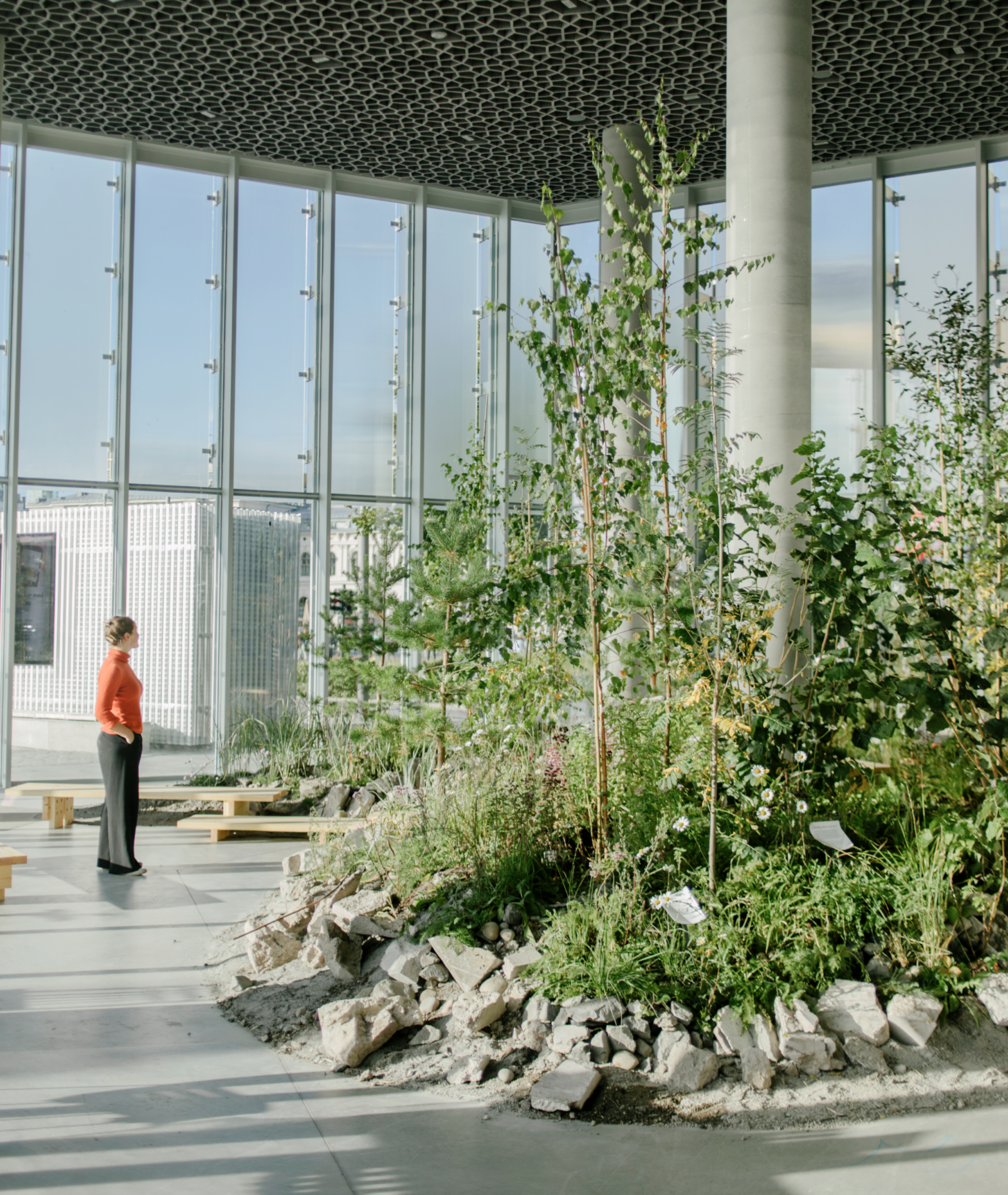
How can we use the medium as part of our message?
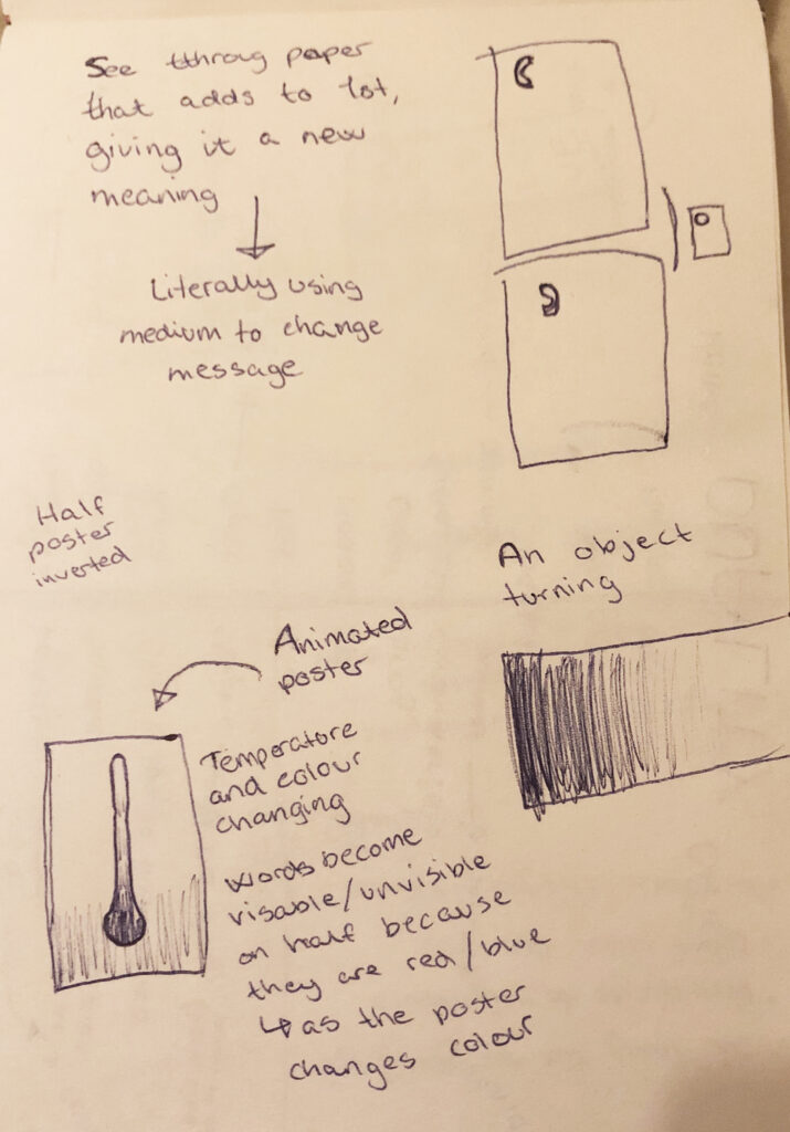
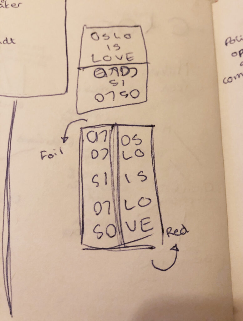
In light of this week’s workshop challenge, the examples of work provided in the lecture were very inspiring. The acid rain poster is so simple, yet it speaks in a loud and bold manner because of it’s material. The examples seem to utilise the science aspect of materials to a large degree, but I am also interested in investigating how simpler usages of mediums could potentially work in a similar manner. How could we for example use paper, glass or aluminium foil to express a set of different messages?

Resource notes
Resource reflection
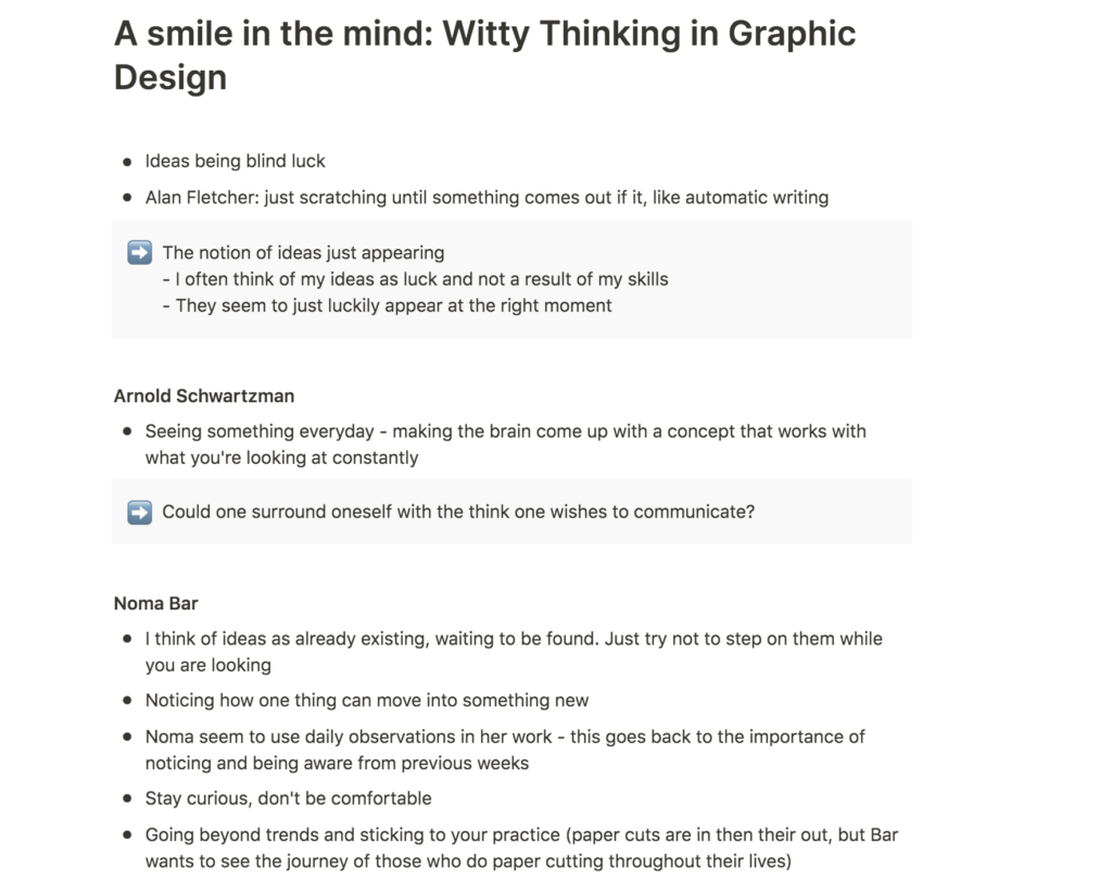
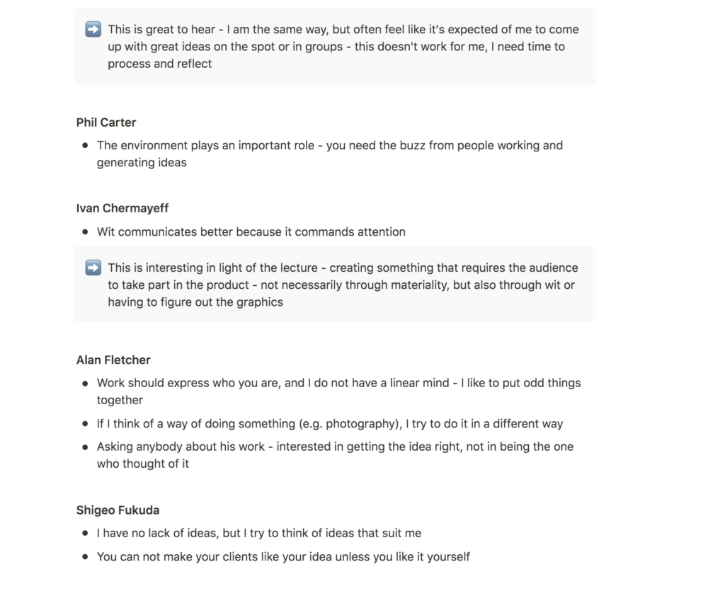
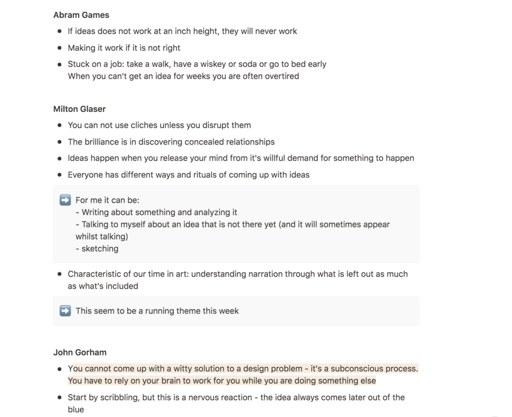
I loved this week’s reading from the book A Smile in the Mind; Witty Thinking in Graphic Design. Hearing about how grand designers get their ideas was both reassuring and inspiring, as some points felt familiar, whilst others led to new insights.
The discovery
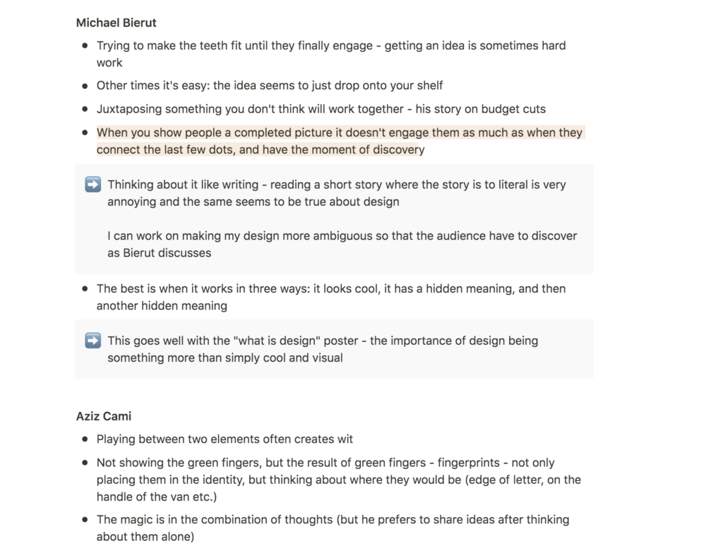
An example of a new insight, which seemed to be a running opinion amongst several of the designers, was that the designer should avoid to portray the entire picture, as an audience enjoys the moment of discovery (McAlhone et al., 2016). I’m aware of this importance in the context of writing or cinema, but I have never been conscious about it’s importance in design.
The three points of good design
In light of this, a point mentioned by Michael Bierut, about how a design should work in three ways becomes particularly interesting. According to Bierut good design looks cool, but it also has a “hidden” meaning which the audience has to discover. Further, a good design should also have a second “hidden” meaning (McAlhone et al., 2016). This way of looking at design made me realise that an audience can interact with a design, not only through physical action, but also by figuring out the meaning behind the design.
Further research
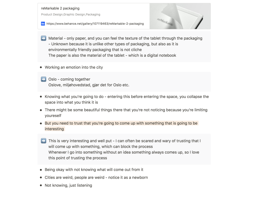
reMarkable 2: packaging by Goods
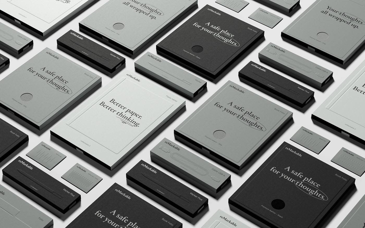
Sustainability-concerned design studio Goods, recently dropped the new packaging design for reMarkable, a paper tablet which aims to replace note books and printed documents. The design becomes very interesting as we are discussing how we might use the medium as part of our message this week.
Using paper in the packaging design works well with the essence of the product, which aims to feel like a paper note book. Using paper, not only for the box, but also as a replacement to the plastic film one usually sees in tech packaging, builds up nicely with the paper aspect of reMarkable’s branding.
The usage of paper is also interesting in an environmental aspect. The paper is recycled and Goods has also decreased the usage of material used compared to reMarkable’s previous products. I think it could be interesting to look at sustainable materials, and how we might communicate sustainable messages through the choice of environmentally friendly mediums.
Workshop challenge
Ideation and process
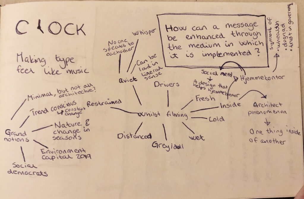
Inspired by Sam Winston’s tip on how to approach this week’s challenge from the lecture, I started this assignment by trying to “feel” and listen to the city. As mentioned previously, I was also inspired by the comment on accepting what’s available to you. Since Oslo is in lockdown, I didn’t want to go to the city centre (which probably would have given me a set of different impressions than I ended up with). Most of Oslo’s citizens are currently staying at home. This made me think that our present connection to the city is hugely rooted in our connections to our homes. In order to “feel” the city, I therefor decided to stay inside my apartment, and to “feel” the city through my window.
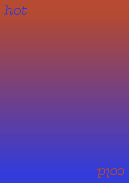
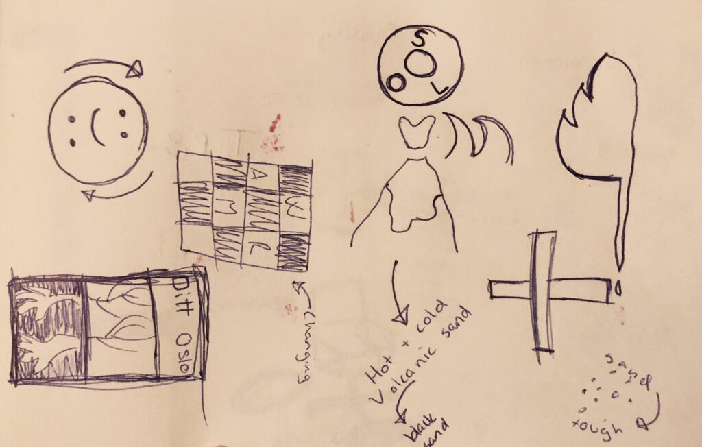
I did a few video recordings to capture the sounds and visuals, but the most apparent notion to me was the fresh air, and how it felt on my warm and dry skin. This made me think about the duality between summer and winter in Oslo. Our summers are quite warm and the sun is only gone for a couple of hours. The winters on the other hand, are cold and snowy and we only see the sun in the middle of the day. I realised that this duality was relevant for many elements in my city, like the way people act (they are cold to strangers, but warm to loved ones). I was interested in this sense of duality and started experimenting with visualising it through different concepts.
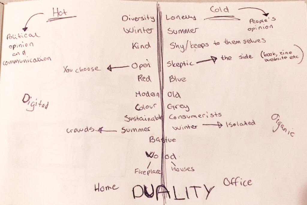
Initially I had an idea about a poster (either physical or animated) which would communicate this duality through being two things. I could for example make two sides with different messages, or perhaps create an animated poster with a changing background colour, which would hide and show the different messages.
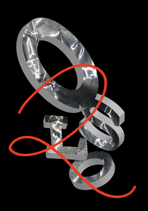
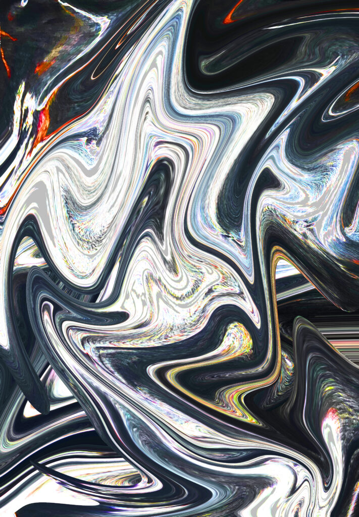
I also experimented with communicating duality through sharp and fluid forms. Whilst experimenting I also started thinking about materials I have at home, which could portray the sense of chill and freshness I experienced when opening the window. Hence, I had a quick experiment with aluminium foil, which I played with in photoshop in order to also portray fluidity (bottom right in the grid below).
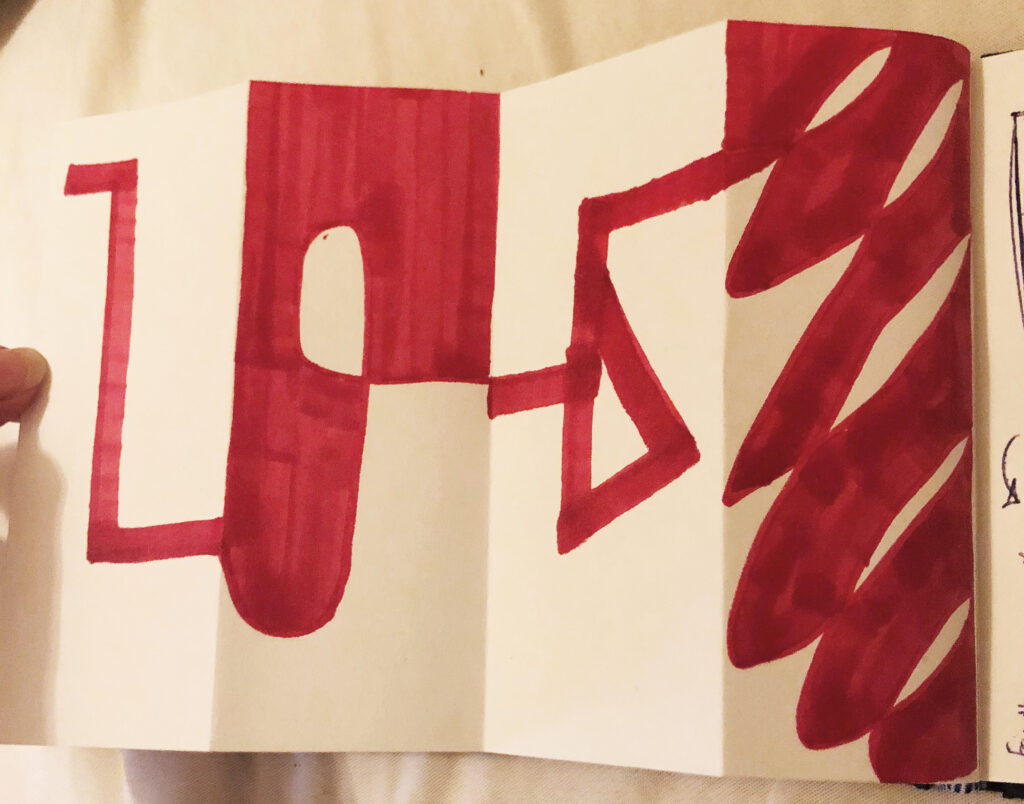
As this workshop challenge asked us to look at materials, I also had a quick look at portraying the contrast between sharp and fluid on a four way folded page. I think this idea of using a page as a way of showing and hiding contrasting elements would have been interesting to investigate further, within a larger time frame.
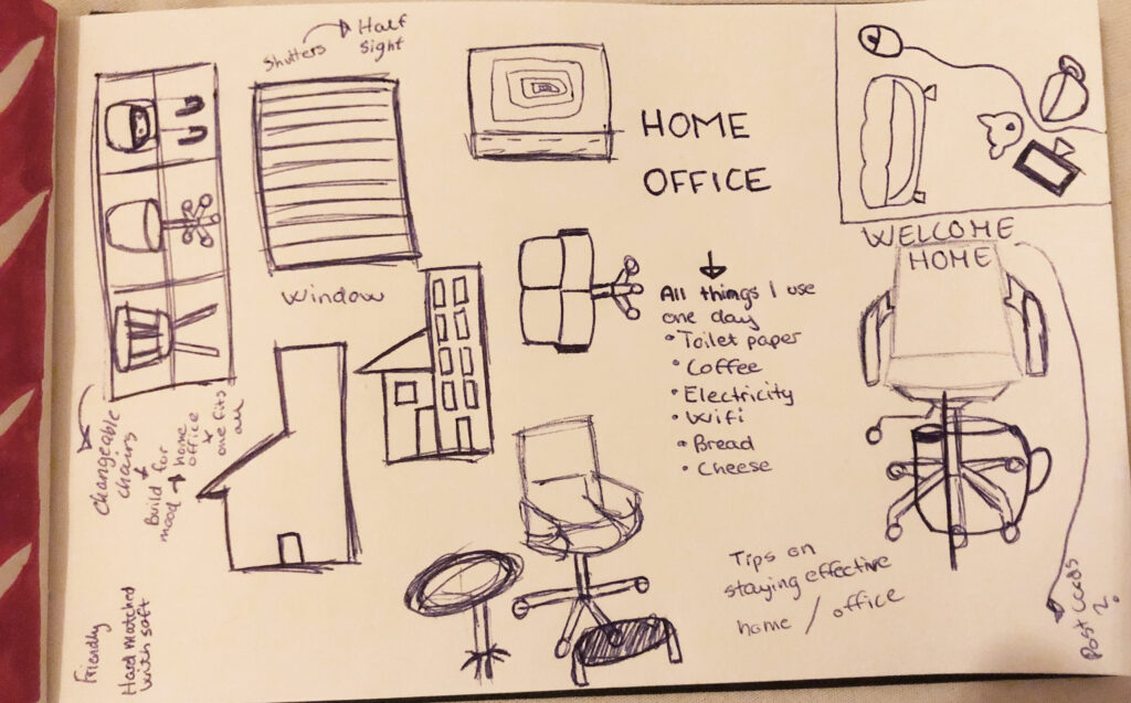
After various ideas and experiments I still didn’t feel like I had found the right concept. However, in my tutorial this week Paul made an insightful comment. I was explaining how the word “Hjemmekontor” (which translates to Home Office) has become a popular word in Norway (it basically means working from home). Paul then said that the duality between home and office is quite interesting in it self, which I agreed with.
I started thinking about Home Office further and realised that it is actually a very representative term for Oslo during lockdown. Staying at home has forced us to turn our homes into what the whole of Oslo used to be. Instead of going to the pub we consume our beers on the couch, and instead of going to our local cafes we drink coffee in our kitchen. And most importantly, instead of working from our offices, we work from our living rooms, bedrooms or kitchens. We suddenly have to be professional within a personal context. Hence, I got interested in how I might convey these conflicting elements through juxtaposing notions of home and office, as a representation of present Oslo.
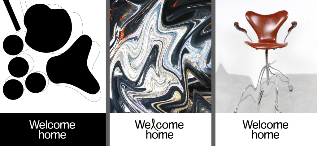
(Photo of chair is borrowed from google as this was only used for testing)
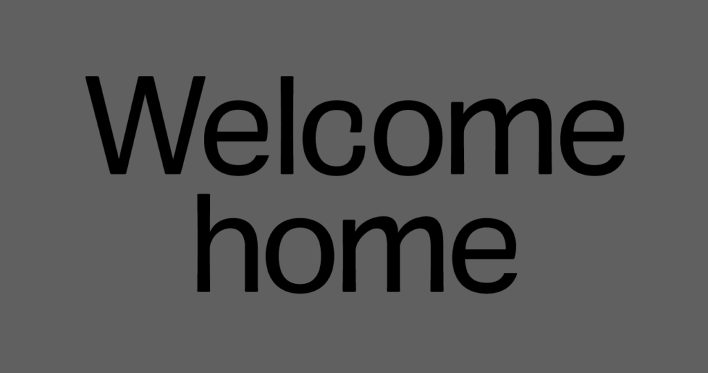
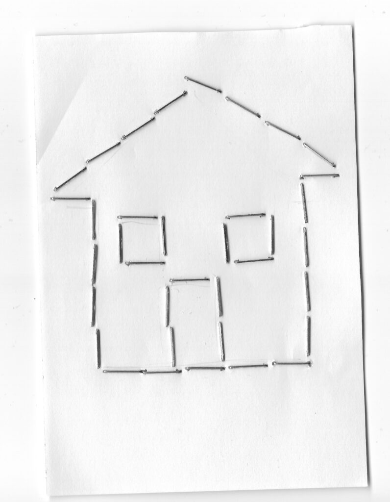
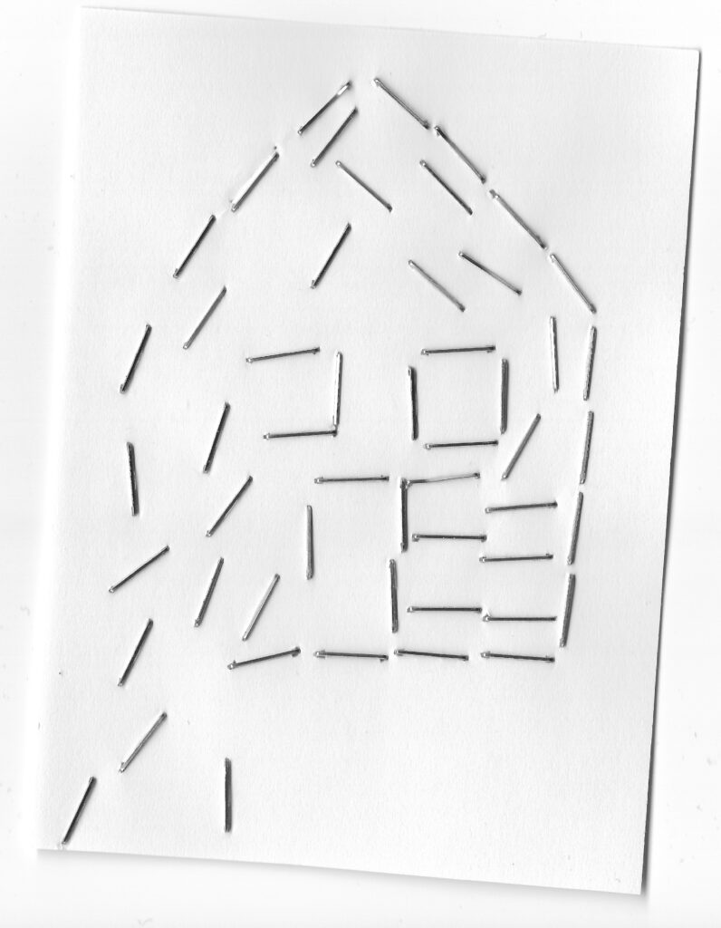
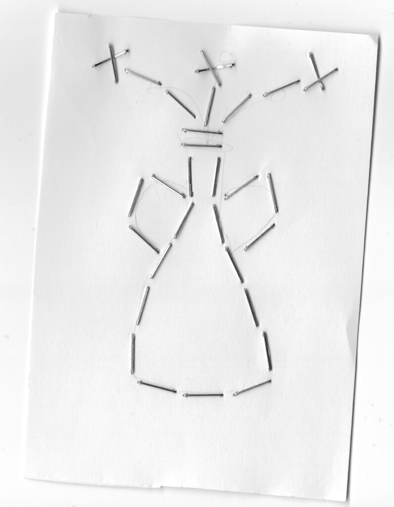
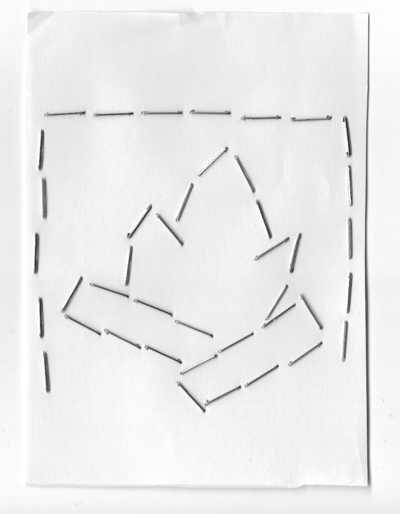
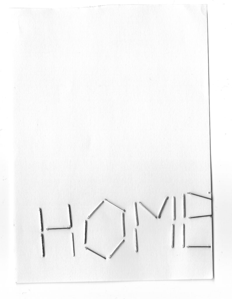
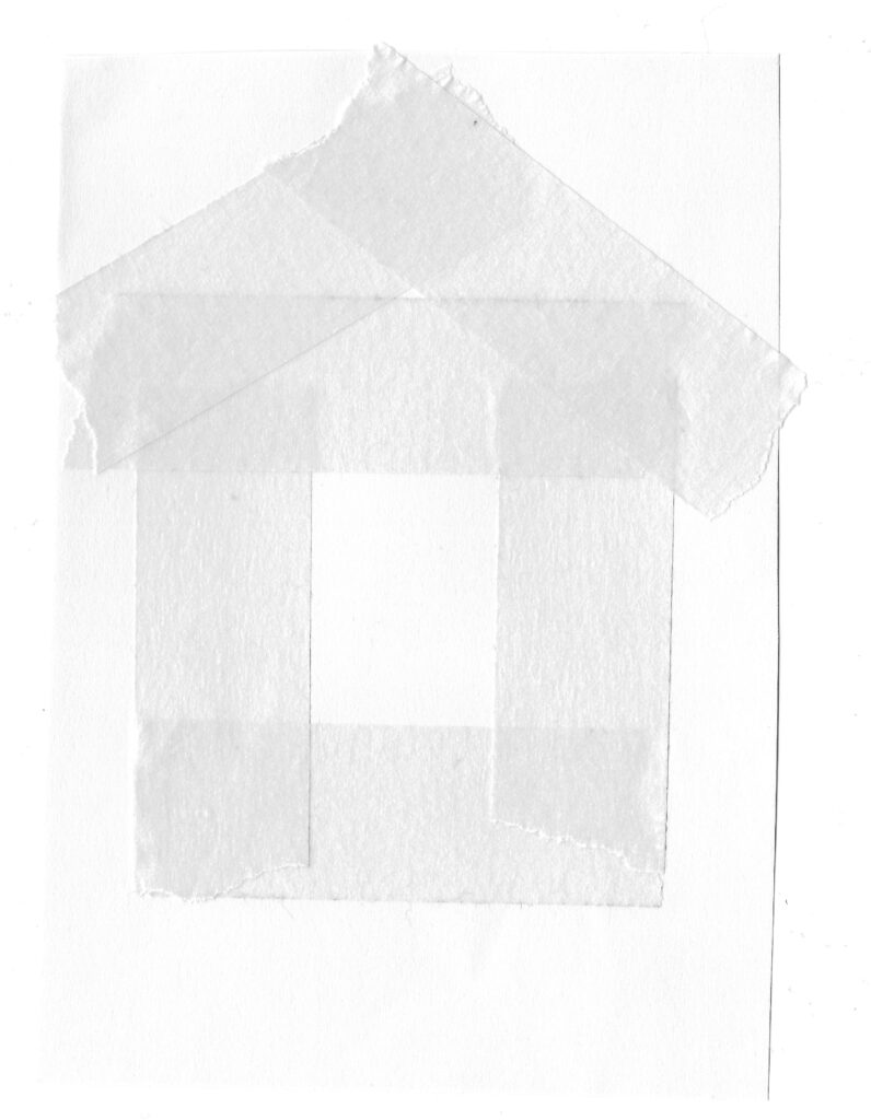
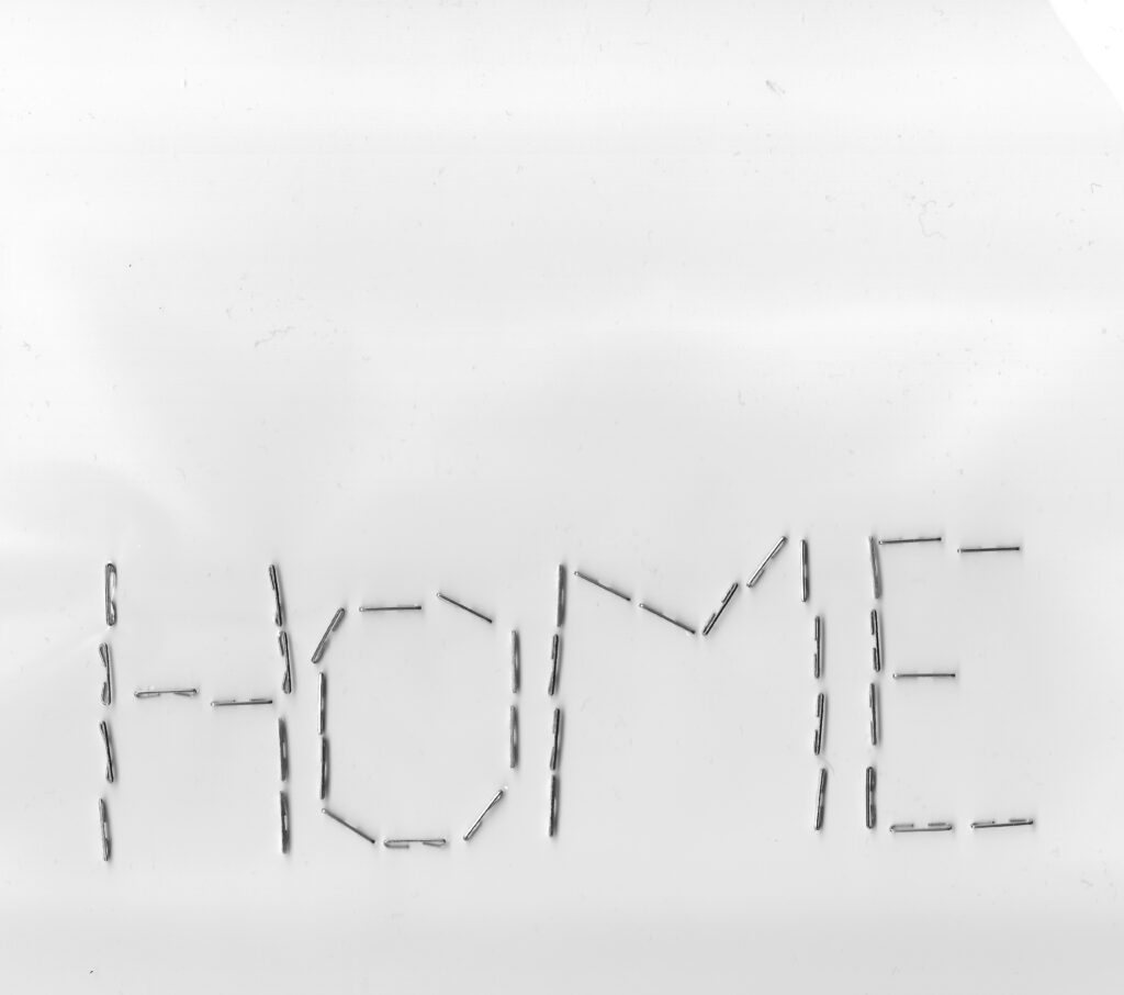
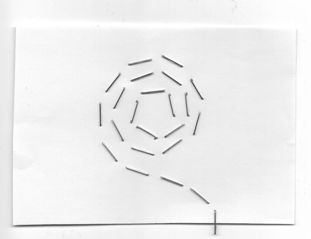
I initially had an idea of combining the frase “Welcome home” with office imagery, like an office chair or a desk. However, I didn’t feel like this explored any mediums, and so I decided to experiment with a physical approach, attempting to create imagery by using stationary items to create homely associated symbols, like a house or a fire place.
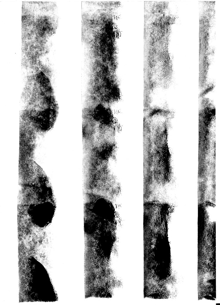
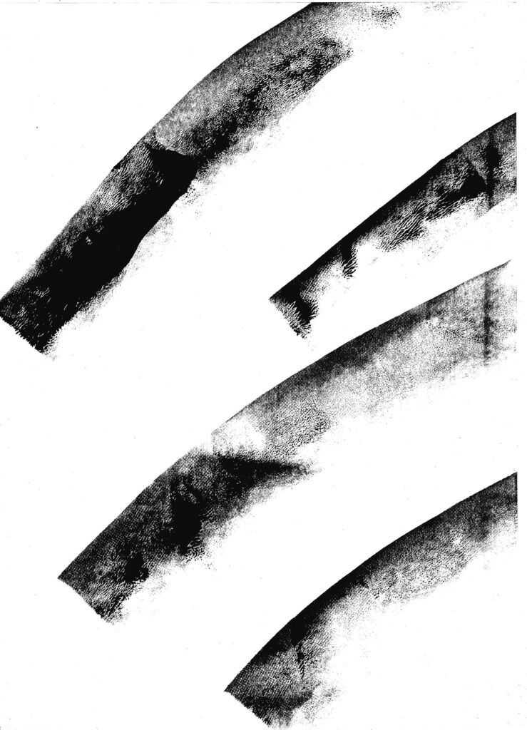
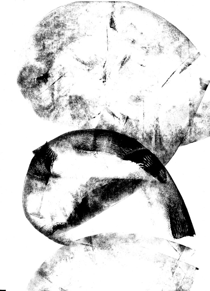
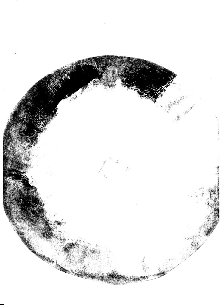
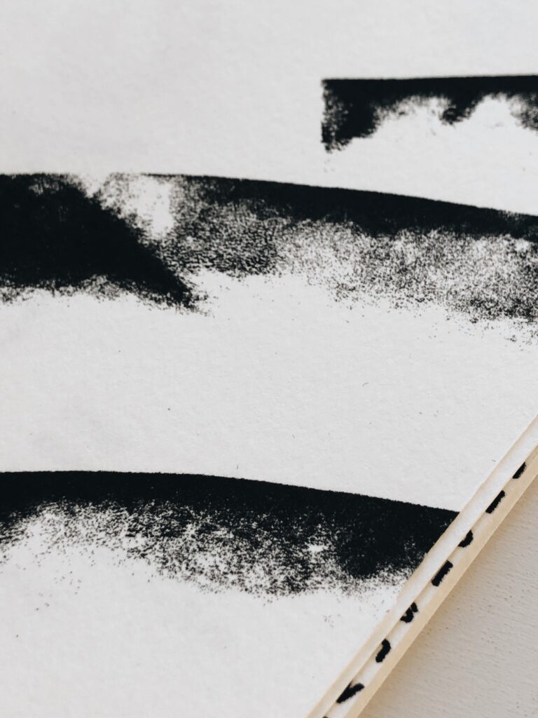
I was quite happy with my concept and I also enjoyed working with a physical approach. However, I was still interested in using the office chair as a symbol. This led to the idea of trying to visualise the way an office chair would press against the floor as one roles around in it. I initially wanted to use wheels from an office chair to create patterns, but as I didn’t have any spare wheels at hand (who would?), I decided to use a roller which I have previously used for litho printing.
Although these prints don’t have any specific elements associated with home in them, I still think they represent the impact an office chair has on a home. It’s big and bulky, and it definitely changes the vibe of one’s personal space. I therefor decided that I wanted to use the prints in my final work.
As mentioned previously, I was inspired by Winston’s comment on filling a social need through design (Winston and Edwards, 2020). Whilst working I’d gotten the idea of creating postcards for the public of Oslo. This week has been quite hard on me due to lockdown, and I therefor wanted to create something motivational. Hence, I decided to make postcards that would work as a thanks from Oslo to the public, for working at home.
I experimented with colours, but unfortunately I wasn’t able to find something that worked within the time I had left. However, I think using colours would have been beneficial for the postcards as this probably would have communicated happiness and motivation to a larger degree than my final design does.
Result
As mentioned in my process description, I decided to focus on the duality of the term “Hjemmekontor” (Home Office) for this week’s challenge. Due to covid, the citizens of Oslo are currently mainly exposed to their own homes as we are strongly encouraged to stay at home. Hence, our home becomes our individual Oslos.
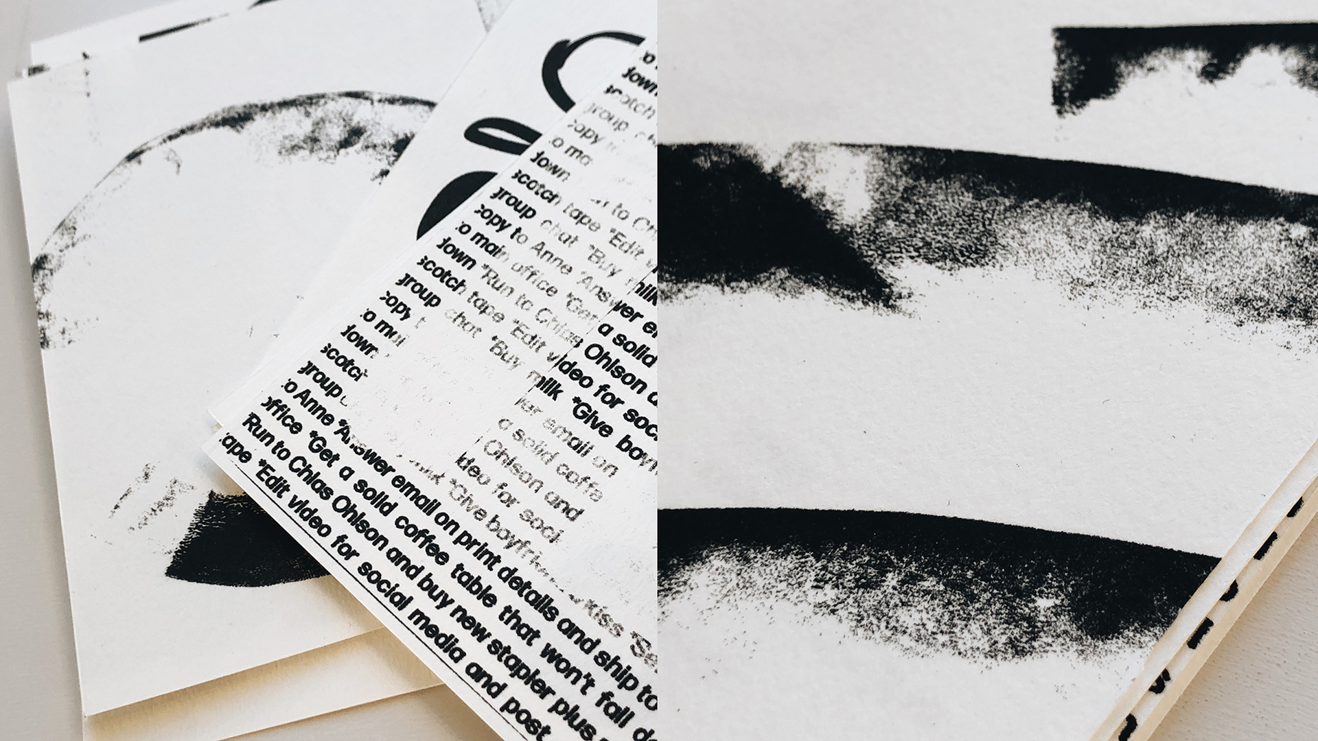
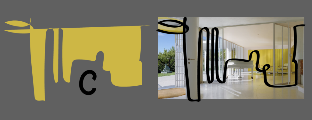
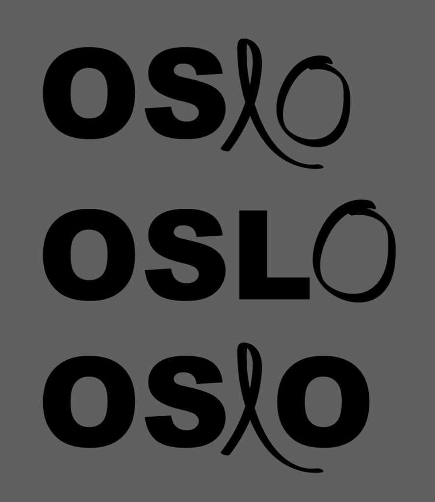
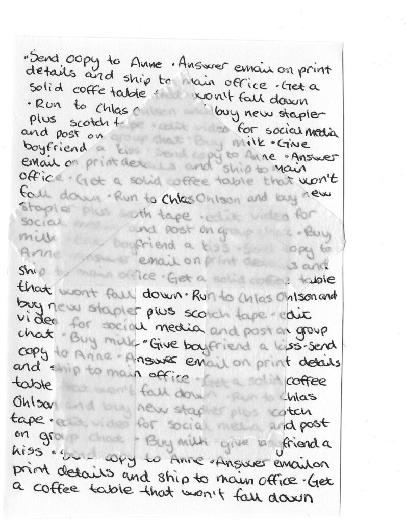
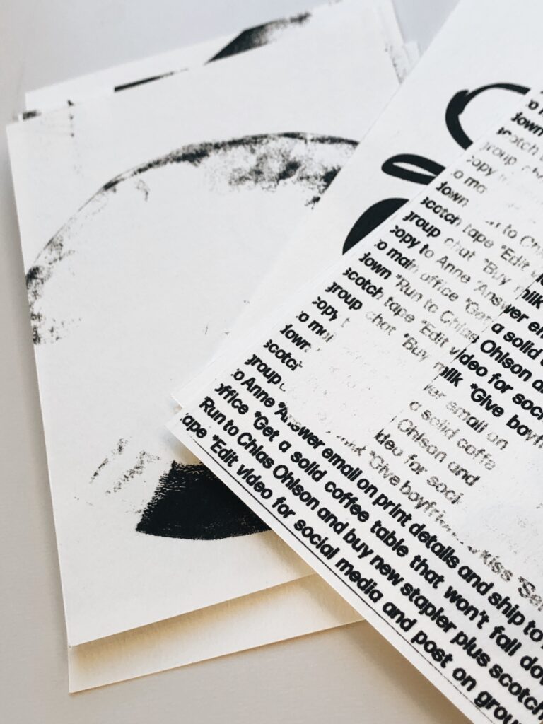
By juxtaposing elements usually associated with the office and those associated with the home, I have tried to present the sacrifice we make when following regulations. This duality is also visualised through the typography on the back of the post cards, through the combination of a bold sans serif and self drawn letters. I have also added texts to the back of the cards as clues to the meaning behind the imagery:
- Thank you for stapling at home (imagery created with staples)
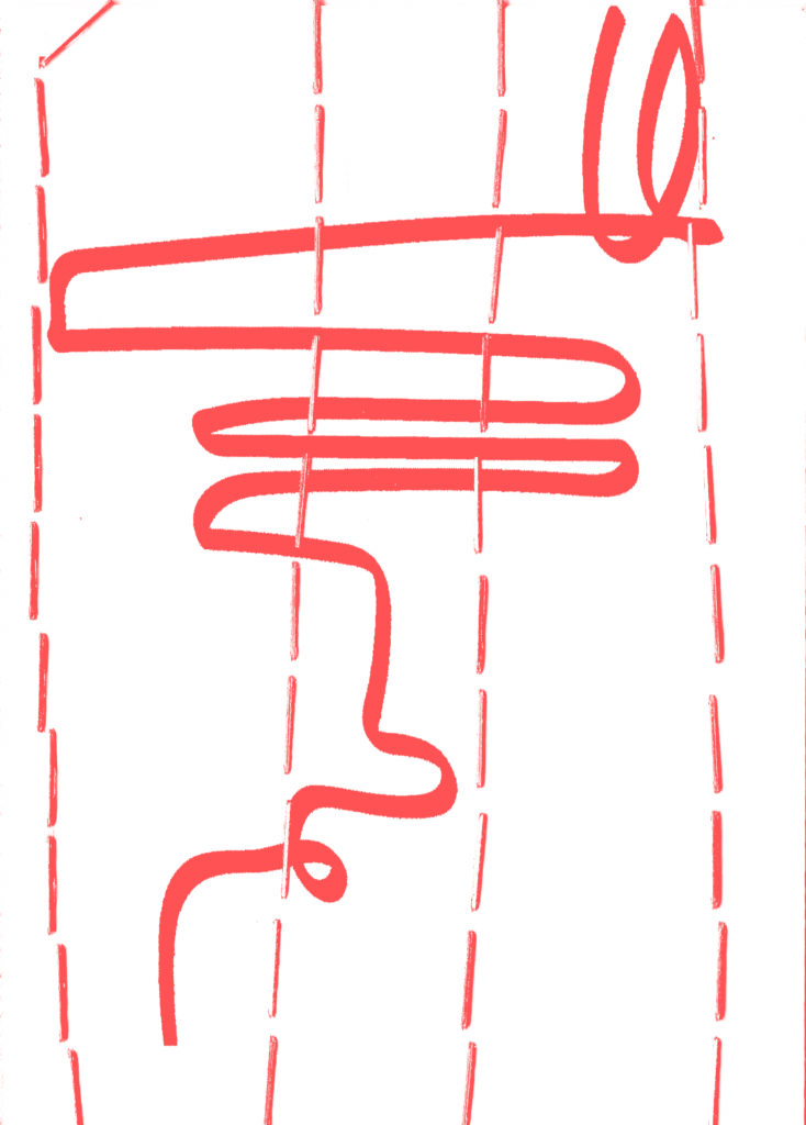
- Thank you for citying at home (imagery portraying an urban city landscape)
- Thank you for wheeling at home (imagery portraying the print of office chair wheels)
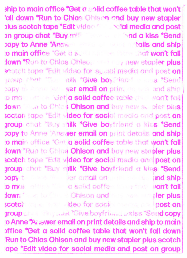
- Thank you for doing at home (imagery revolved around to do lists which consists points of both the work and personal kind)
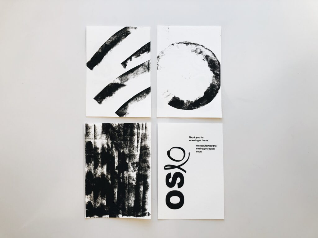
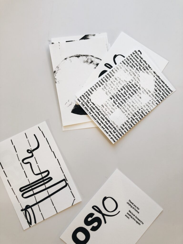
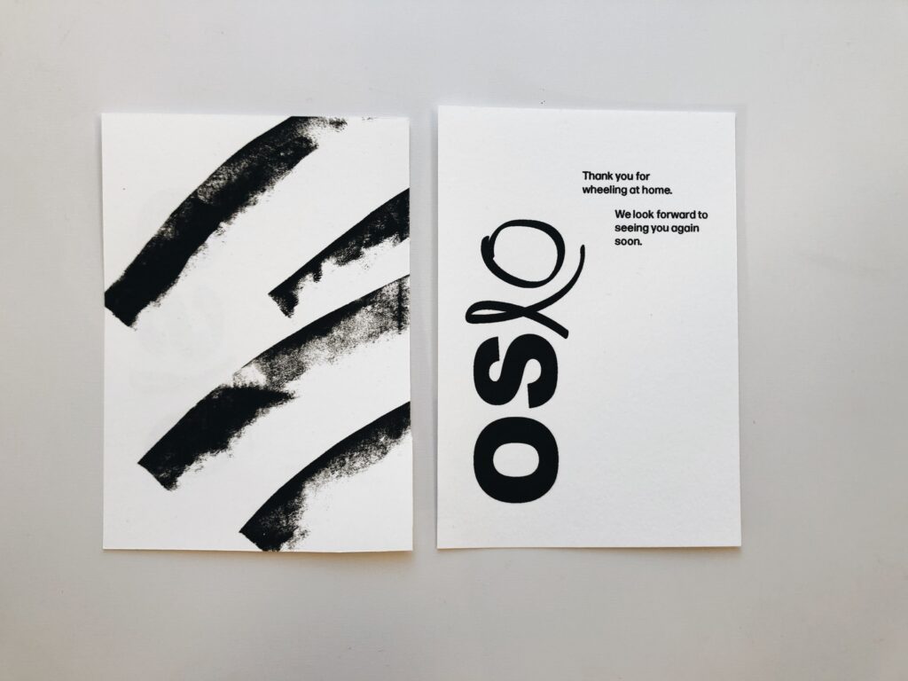
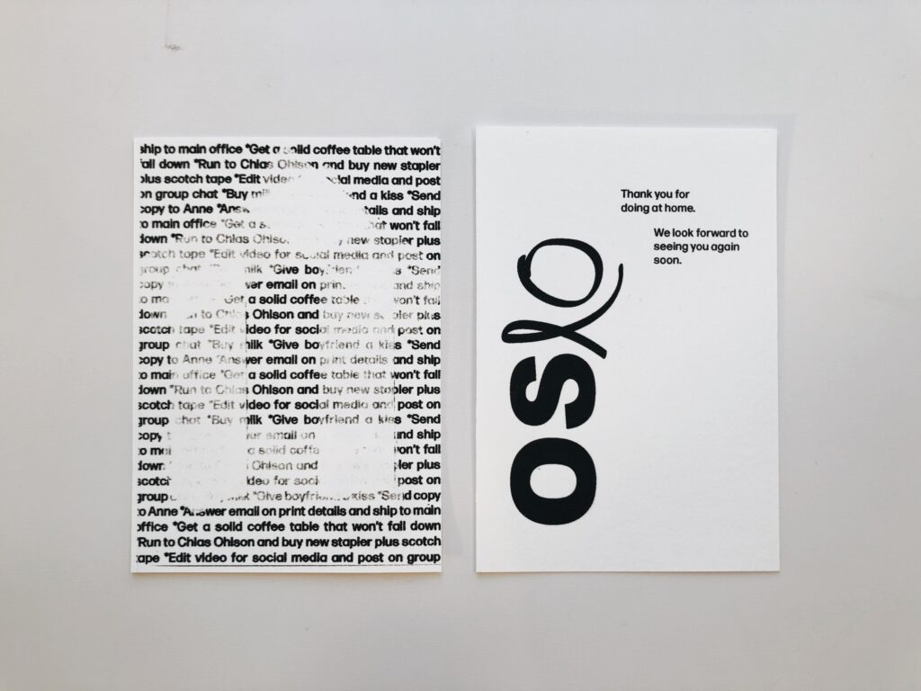
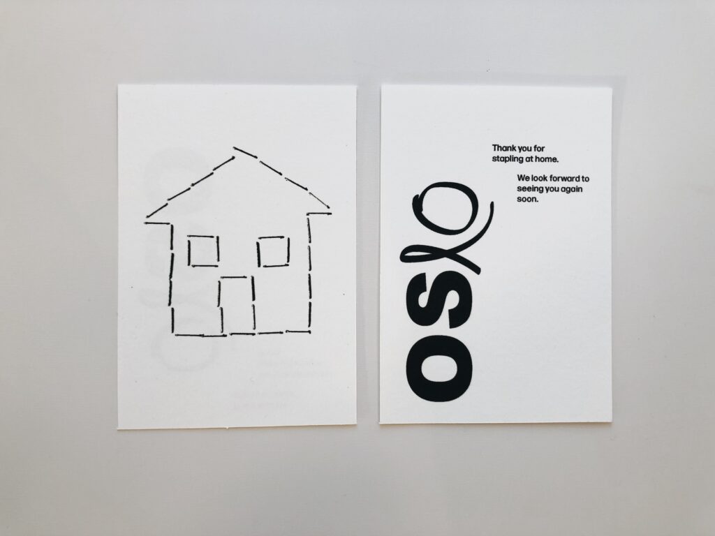
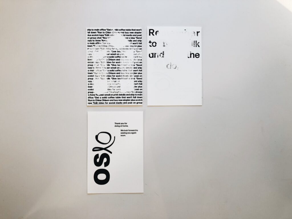
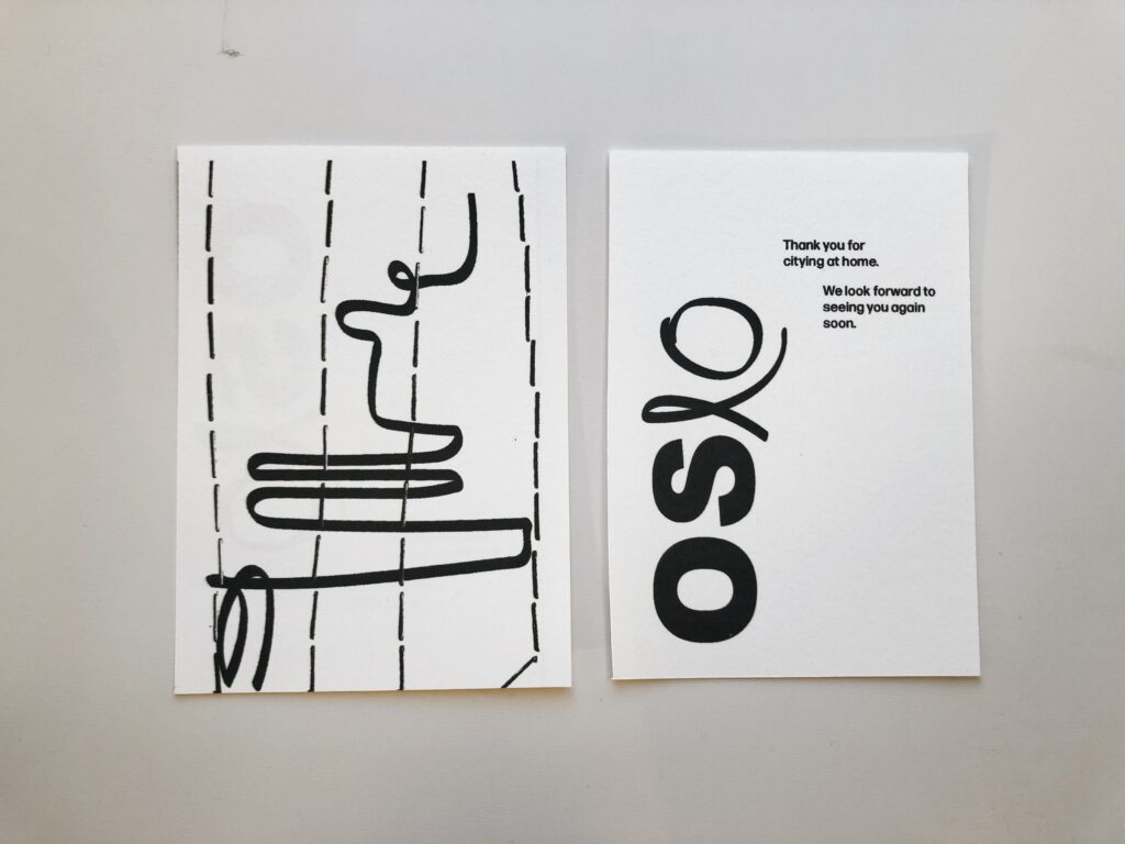
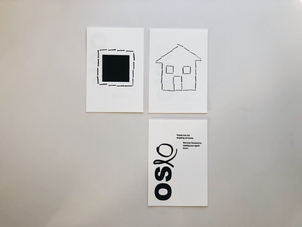
If I had more time, I would have tried to develop my concept further, as it currently feels a bit incoherent. Whilst the stapled house works well as a juxtaposition between home and office, the wheel and city prints don’t really have a specific home element. The texts on the back still relate to working from home, but I would have liked to have come up with more juxtapositions in order for the project to become more cohesive.
In conclusion
Have I managed to create good design?
I was eager to try and create a design for this week’s workshop challenge with a concept in line with Bierut’s take on what good design is. In terms of visuals, I am quite happy with my prints (although I would have enhanced them further if I had time). Therefor I think my design works on Bierut’s first level (looking good). Hopefully the audience will also get an aha-moment when they read the texts on the back of the cards and understand the imagery. I am also hoping that the audience will reflect upon the duality between home and office, and that they will then start to think about the sacrifice they are making, thus becoming proud of their effort. However, I think this is asking a lot from the audience, and so I’m not quite sure if I’ve managed to make good design according to Bierut or not.
Either way, this week has been very insightful. I’ve had a big realisation when it comes to wit in design, and I take with me the fact that one should leave some things unsaid for the audience to figure out for themselves. It’s also been fun to work with forms and mediums as ways of communicating, and I am eager to continue using these aspects in my practice.
Room for improvement
If I had more time this week I would have experimented more with the layout of my post cards. I also would have experimented with colour, perhaps by combining and overlaying the different prints. This would have worked better with the concept of giving thanks to the citizens for the sacrifice they make, as it probably would have lead to a more friendly design. I also would have loved to work further with materials, perhaps by experimenting with sustainable print and packaging methods.
REFERENCES:
McAlhone, B. et al. (2016) A Smile in the Mind; Witty Thinking in Graphic Design. Revised and expanded edition. London: Phaidon.
Scandinavian Design Group (2020) ‘City development by the people’, SDG.no, 7 October. Available at: https://sdg.no/news/city-development-by-the-people (Accessed: 15 November 2020).
Winston, S. and Edwards, S. (2020) ‘Form and Function’. Canvas Falmouth Flexible [online], 13 November.
LIST OF FIGURES:
Figure 1. SERVICEPLAN MÜNCHEN. 2011. The Solar Annual Report 2011. Behance [online]. Available at: https://www.behance.net/gallery/2986075/The-Solar-Annual-Report-powered-by-the-sun
Figure 2. Sigrid BJORBEKKMO. 2020. City development by the people. Scandinavian Design Group [online]. Available at: https://sdg.no/news/city-development-by-the-people
Figure 3. FRIENDS OF THE EARTH. 1991. Litmus Paper. D&AD [online]. Available at: https://www.dandad.org/awards/professional/1991/posters/28292/litmus-paper/
Figure 4. GOODS. 1904. reMarkable 2 packaging. Behance [online]. Available at: https://www.behance.net/gallery/107119463/reMarkable-2-packaging
Figure 5: Ingrid REIGSTAD. 2020. Experiments workshop challenge week 9. Private collection: Ingrid Reigstad.
Figure 6: Ingrid REIGSTAD. 2020. Welcome Home. Private collection: Ingrid Reigstad.
Figure 7: Ingrid REIGSTAD. 2020. Staple scans. Private collection: Ingrid Reigstad.
Figure 8: Ingrid REIGSTAD. 2020. Office chair wheel marks. Private collection: Ingrid Reigstad.
Figure 9: Ingrid REIGSTAD. 2020. Colour testing. Private collection: Ingrid Reigstad.
Figure 10: Ingrid REIGSTAD. 2020. Home Office Postcards 1. Private collection: Ingrid Reigstad.
Figure 11: Ingrid REIGSTAD. 2020. Home Office Postcards 2. Private collection: Ingrid Reigstad.
Figure 12: Ingrid REIGSTAD. 2020. Home Office Postcards 3. Private collection: Ingrid Reigstad.
Figure 13-18: Ingrid REIGSTAD. 2020. Home Office Postcards 4. Private collection: Ingrid Reigstad.
