Lecture notes
Lecture reflections
Cultivating low culture
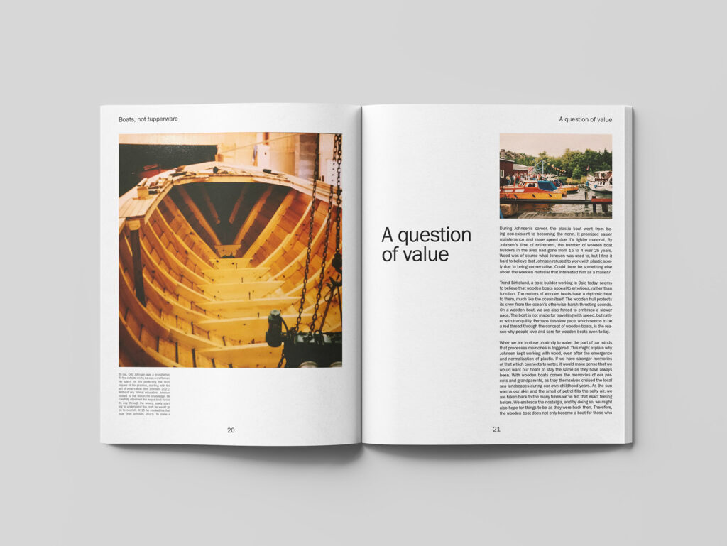
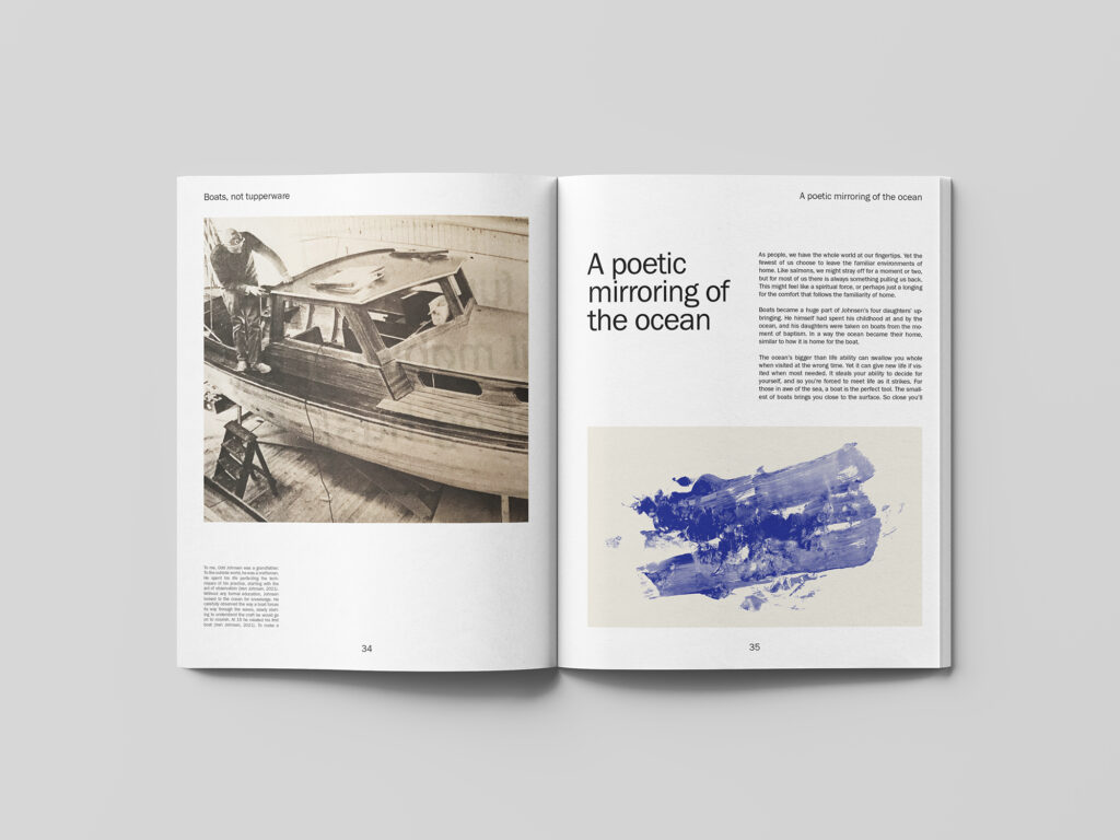
In the lecture this week, Darren Wall discussed how his books mixes high and low culture, by portraying video game topics in beautifully produced books (Darren Wall and Stuart Tolley, 2021). This was very interesting, as it made me realise that this is also what I’m trying to do with my essay. When my grandfather was building boats, his craft was not seen as culture, like it is today. Thus, producing a beautiful book could be a nice contrast to the working class space which his craft sprung out from. I also think, as Wall mentioned in his lecture, that by portraying video games / boat building in a beautiful context, one is cultivating the subject and adding to the cultural value of the craft (Darren Wall and Stuart Tolley, 2021).
Staying in control with crowdfunding
Further, I was fascinated by the described opportunities of funding a project through Kickstarter. Wall made it seem like a great way of producing something that is solely your own, where you can control all details, including a high end production (Darren Wall and Stuart Tolley, 2021). If I ever was to launch my book about my grandfather, this would probably be the way to go. The project is so personal, and therefor I believe it demands 100% control for it to stay personal and meaningful.
An object to keep forever
Wall’s approach to books as objects was also very inspiring (Darren Wall and Stuart Tolley, 2021). As I move on with my final book design this week, I as well will try to create an object and book experience, which the potential audience would want to keep in their bookshelf for ever (Darren Wall and Stuart Tolley, 2021). Hopefully my idea about a wooden memory box with a poster, notes and a book will contribute value which makes people want to collect and keep it.
Resource notes
Resource reflections
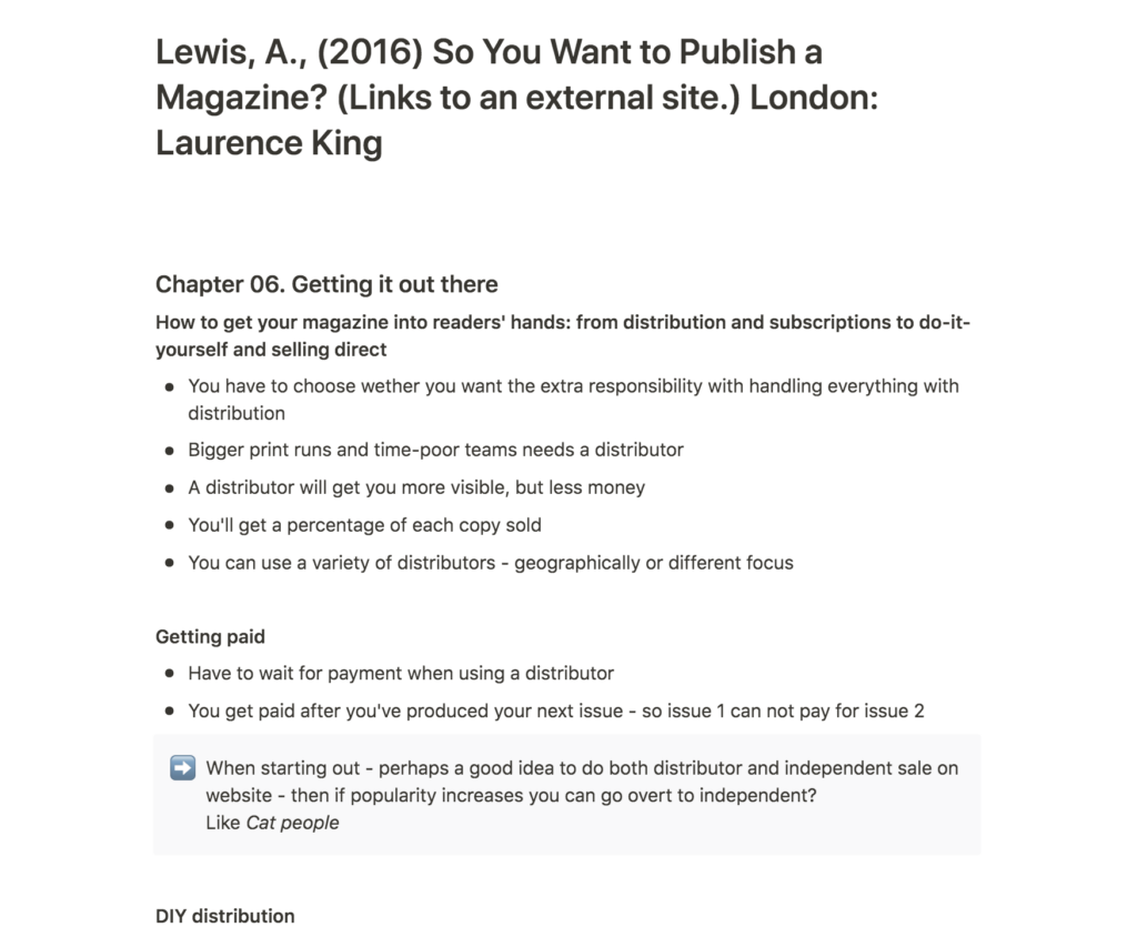
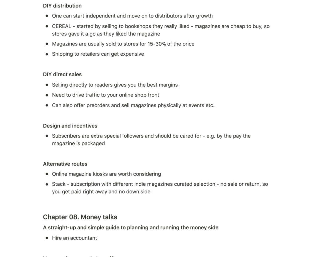
Although I’m not producing a magazine for my essay, Lewis’ book was an interesting insight into the indie magazine publishing scene. Some of her insights might also be relevant for book publishing, and I think it could be useful to use her book as a reference when building my distribution plan for this week’s challenge.
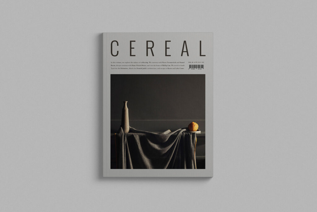
An interesting point from Lewis’ conversation with Rosa Parks from Cereal, was how bookshops seemed quite open to giving new magazines a chance (Angharad Lewis, 2016). Thus, approaching bookshops yourself seems to be a good way of distributing when starting out. This would also give you a higher percentage for each sold copy (Angharad Lewis, 2016). However, being someone who loves to create, I would also be tempted to go down the distribution route in order to focus on the magazine 100% (Angharad Lewis, 2016).
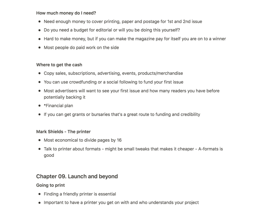
Lewis’ interview with magazine printer Mark Shields was great as it made me realise that one can actually have conversations with printers in order to find the best solutions (Angharad Lewis, 2016). Dependant on costs, I would be interested in having my book about my grandfather produced, rather than using a digital mockup. If I am to do so, I will keep Lewis’ interview in mind and make sure to have a proper discussion on production, page stocks and other printing opportunities (Angharad Lewis, 2016).
Further research
I didn’t feel completely happy with my design choices from my moodboard last week. Therefor, I decided to look into examples of editorial design that looks functional, fluid and classic, which is what I would like my visual identity to communicate, in lines with my essay.
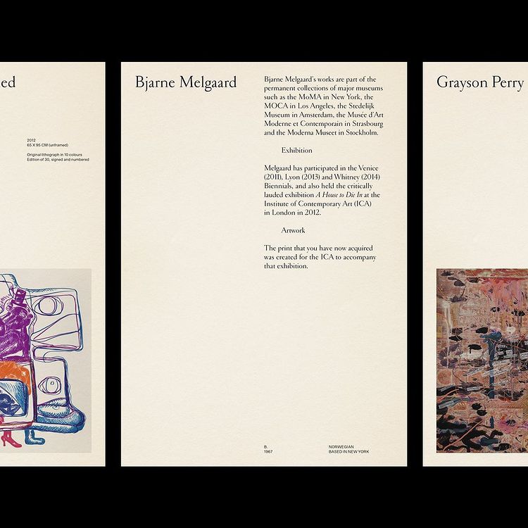
Studio Tillack Knoell: Exploriso: Low-tech Fine Art
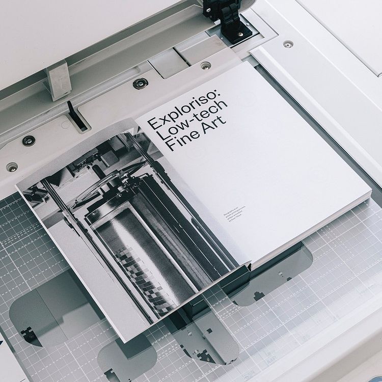
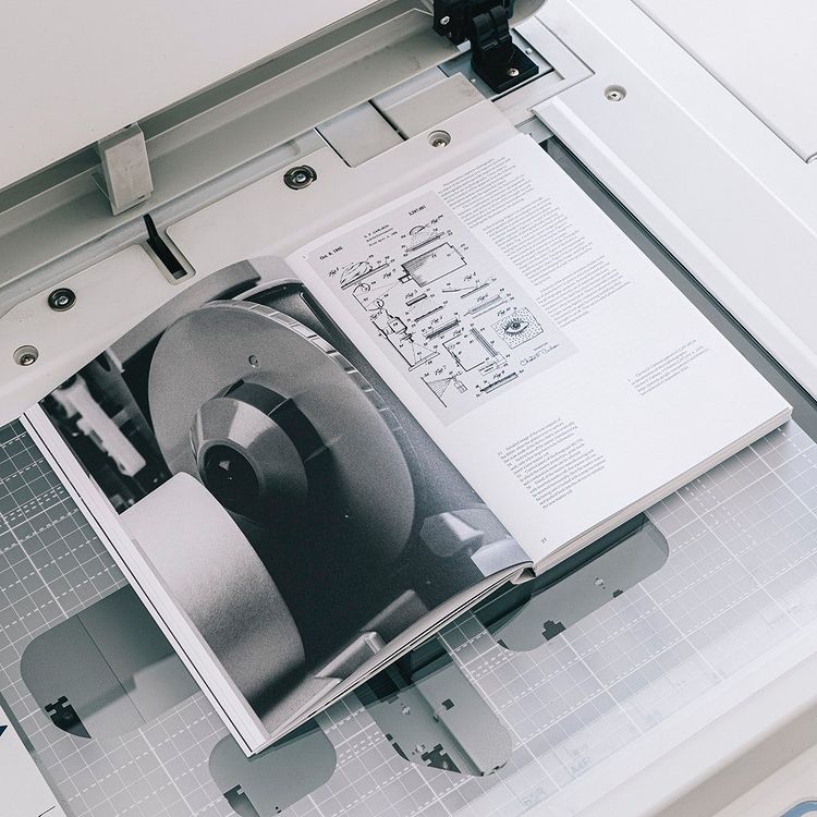
Exploriso: Low-tech Fine Art is a beautiful publication. I think the headline typeface is very nice and the functionality it portrays would suit my visual identity. The photography and sketches communicates functionality as well, providing a great example of how photographs and product sketches can work together through a strict grid system. If I have enough time, I would love to create more simplistic, but also organic line sketches for my book.
Bleed: Cornelia Svedman
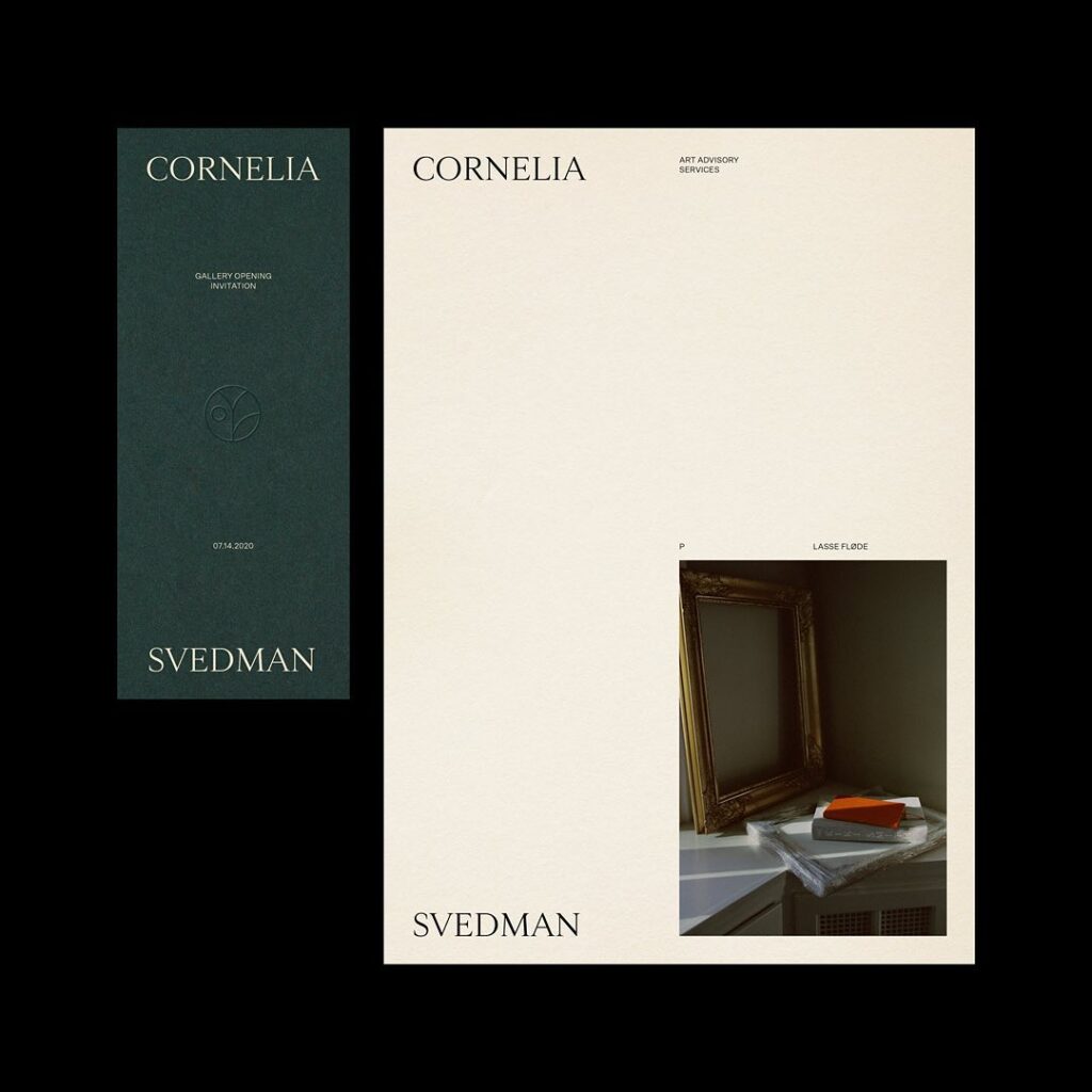
This visual identity system by Bleed is very different from the previous layout design, yet it does play on similar methods like a strict grid system and the mix of photographs and illustrations (art pieces). The typography feels elegant and classic, something I want my book to communicate as well. Further, I hope to experiment with combining classic and functional elements in order to communicate a variety of values.
Workshop challenge
Essay
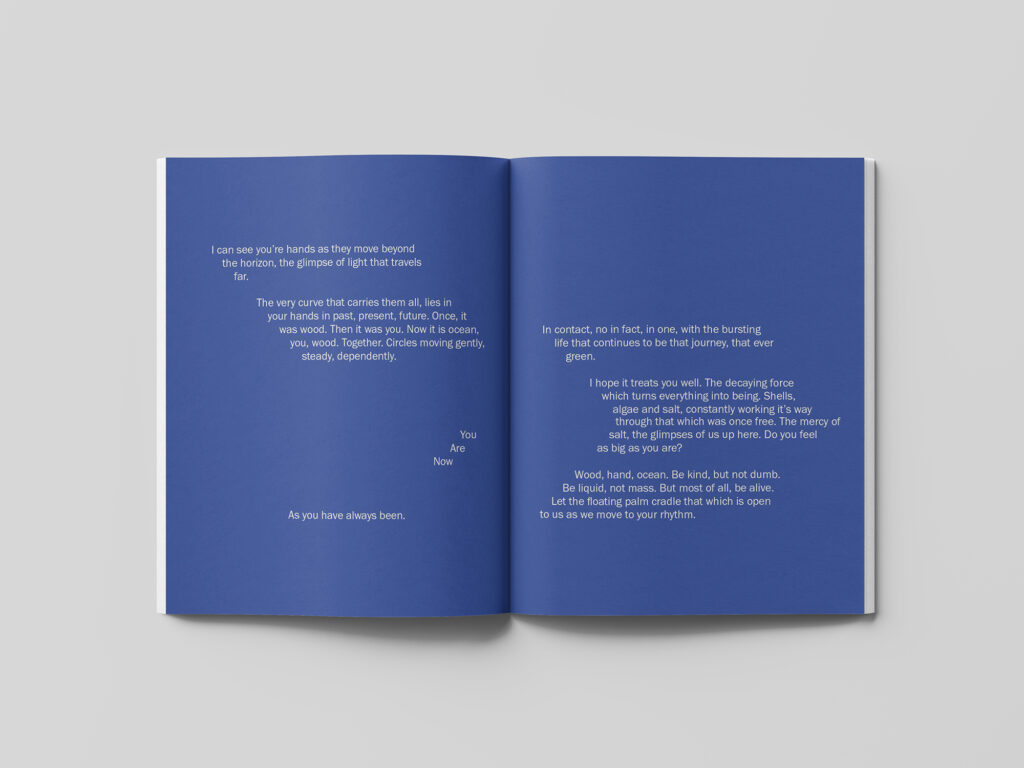
I was quite happy with my essay draft from last week, and so instead of changing the main text, I focused on writing the poem that I didn’t get a chance to write last week. I wanted the poem to feel spiritual and fluid, almost as an underwater conversation with my grandfather. The poem was also supposed to communicate the relationship between my grandfather and nature. I’m not sure if it will make sense to the reader or not, but first and foremost I want it to be a piece of aesthetic writing, and not necessarily something a reader would understand 100% percent. This mysterious vibe could represent the mystery that comes with the ocean.
After finishing my poem, I fixed some further details and then I decided to move on to the visual part of the brief. Below is my last draft.
Book design
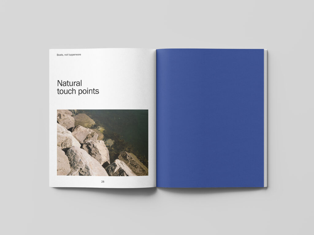
Based on my moodboard and ideas from last week, I started my book design by making a selection of illustrative elements. I want my book to be reference the functionality of boat building, as well as the human aspect of hand made craft.
Photography session
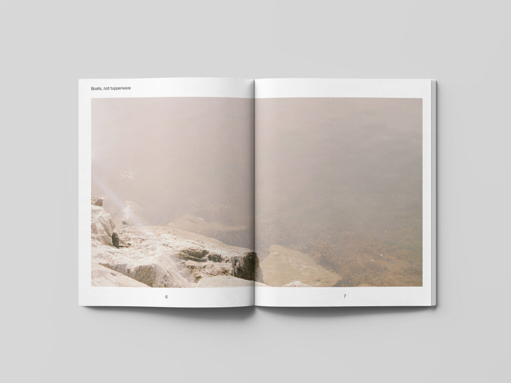
As discussed in last week’s blog post, I thought it could be a good idea to supplement the old photographs of my grandfather with new photographs of boats and nature. I visited one of Oslo’s harbours, but unfortunately I wasn’t able to find many wooden boats, as most of them were locked in and hidden away from the snow. I did however, manage to capture some images of the ocean, which I think communicates the fluid tone of voice from my essay.
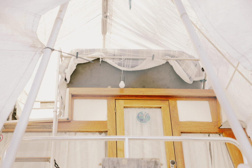
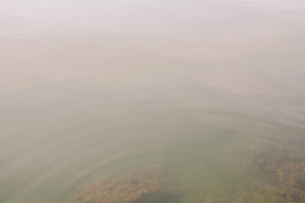
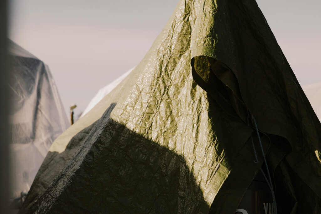
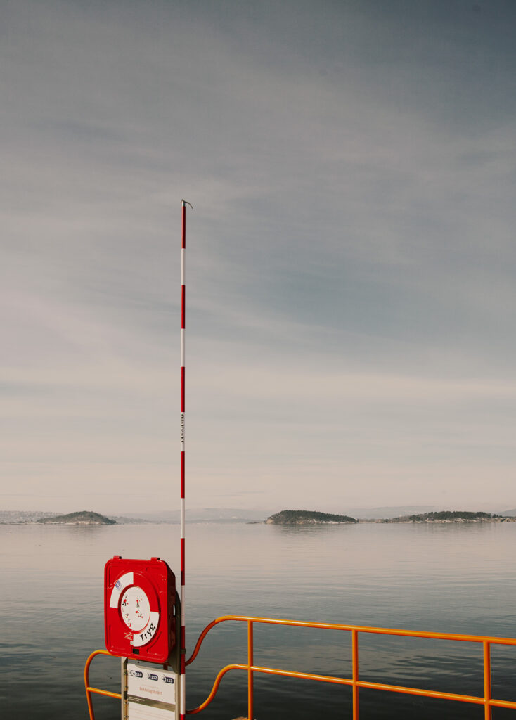
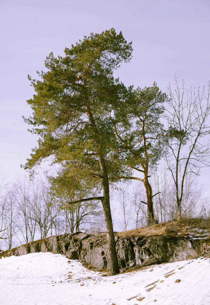
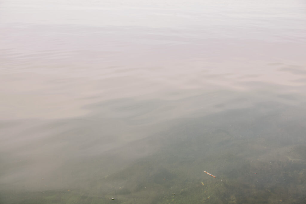
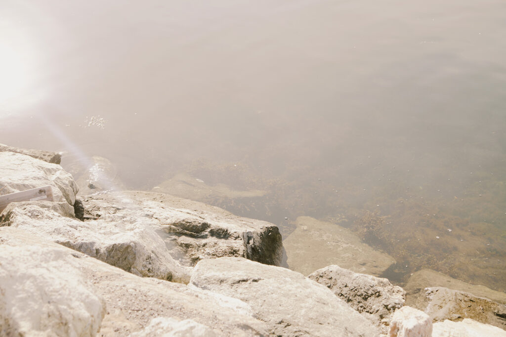
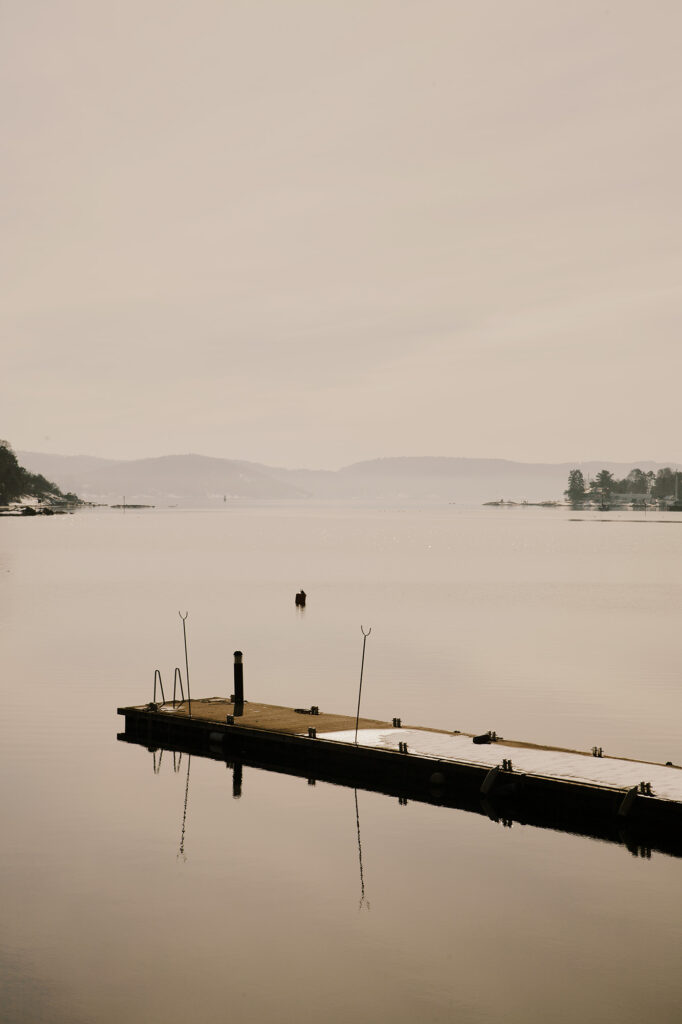
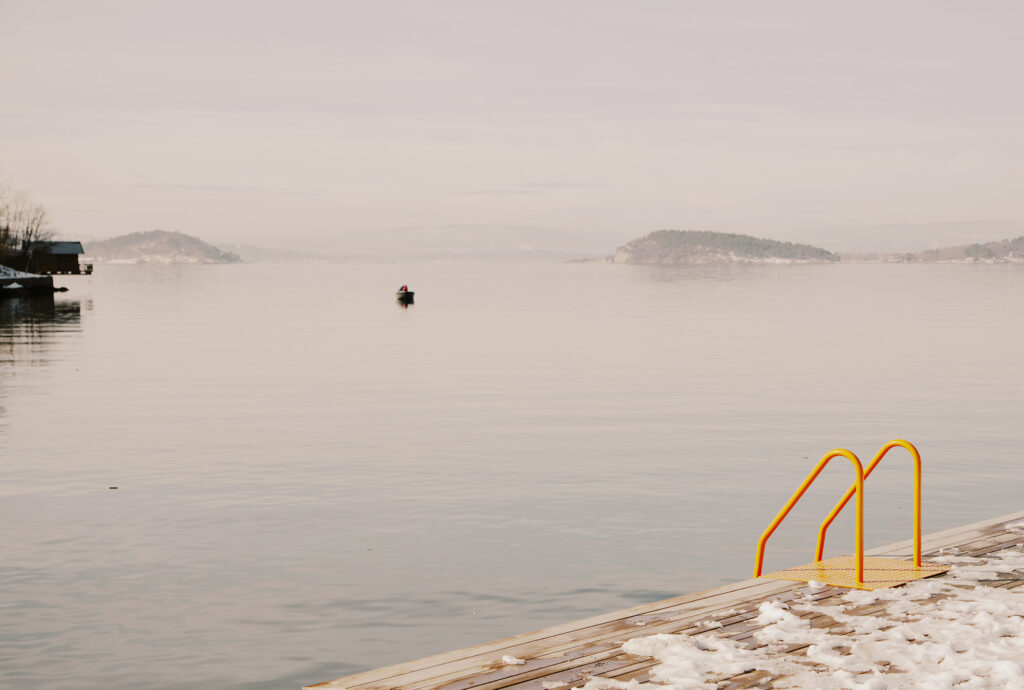
Illustration process
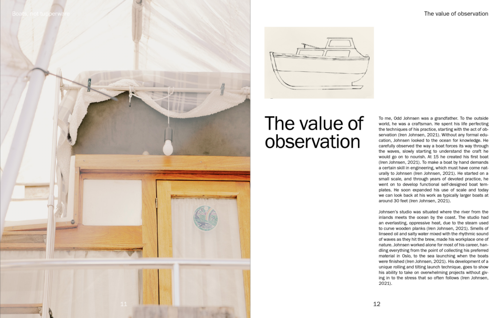
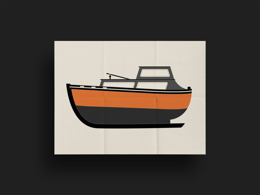
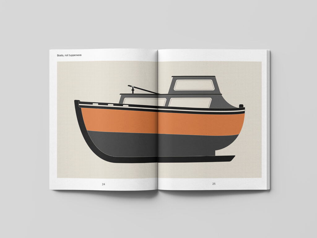
Based on my reflections and final conclusion last week, I knew that I wanted to experiment with illustrative elements in order to make my layout design more fluid and organic. I had a variety of ideas in mind, but decided to start with an illustration of one of my grandfather’s boats, based on one of the old photographs. I knew that I potentially would like to use this as a poster which would be included in the box memories, and so this felt like a good place to start.
I quite like where the boat illustration ended up as it feels like a nice representation of the fluid lines and functionality of the boats. If I had more time I would have loved to create several illustrations in the same style, perhaps of tools, more boats and my grandfather’s studio.
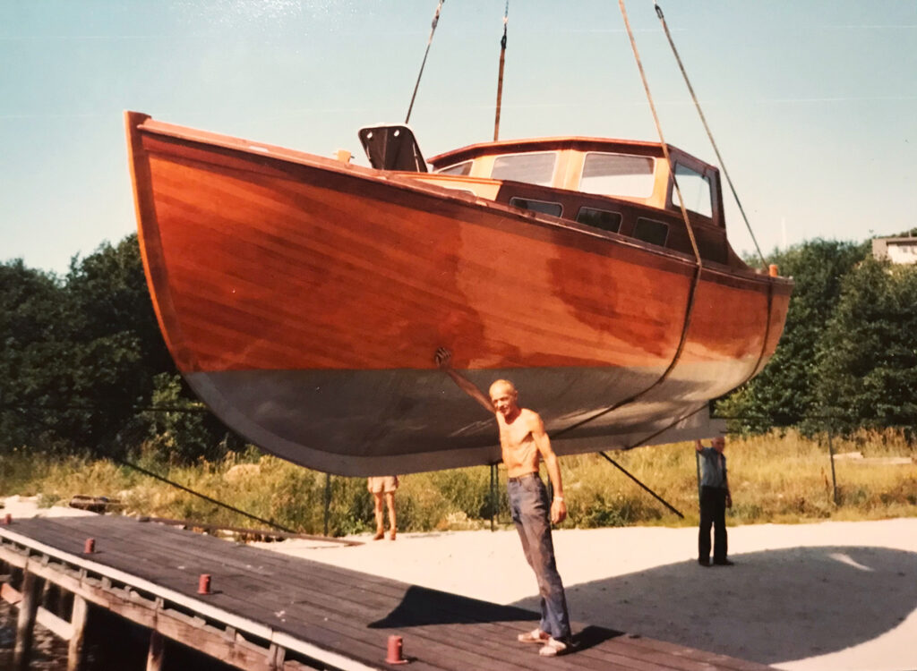
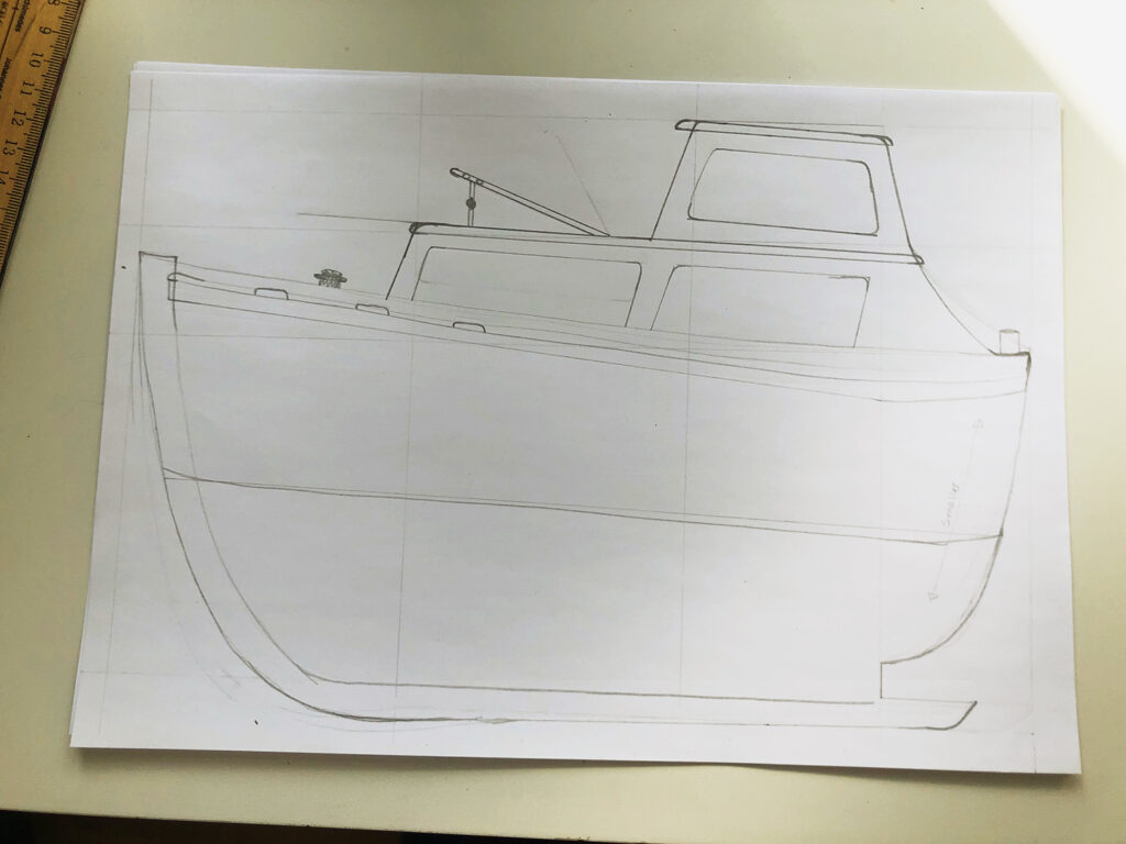
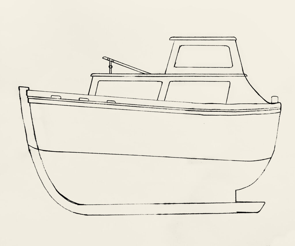
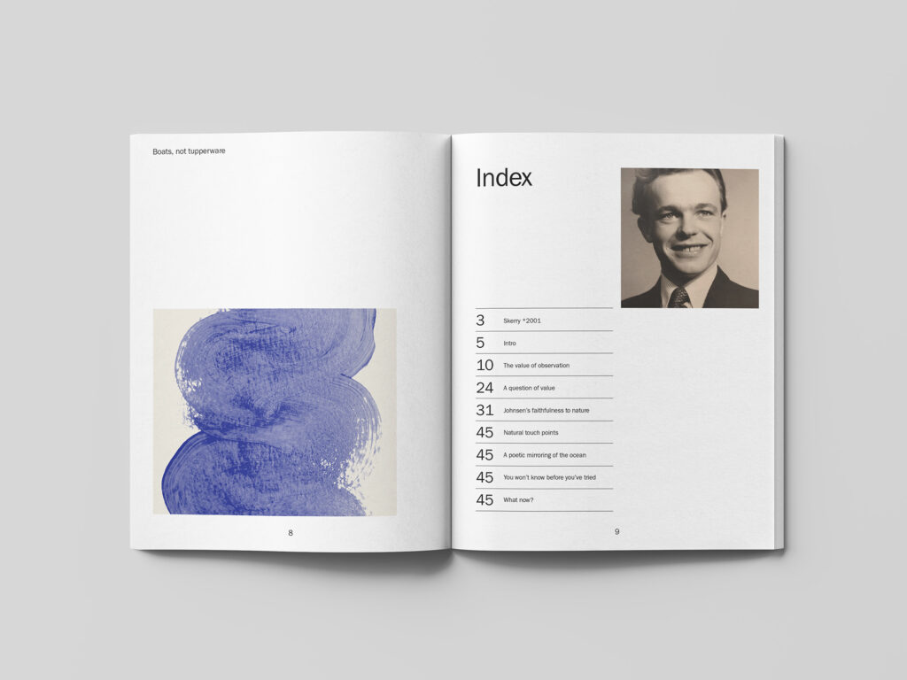
Fig. 17-20: Reigstad 2021. Johnsen crosser sketches
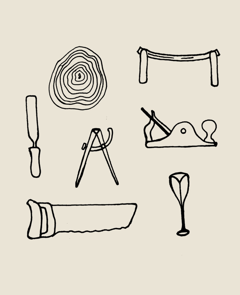
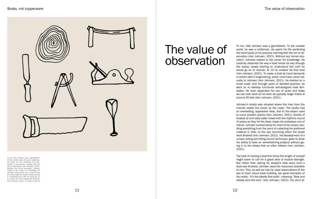
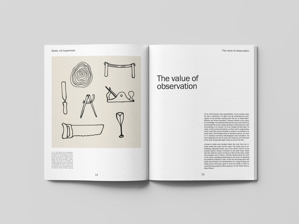
Inspired by the mix of different illustration styles in Bleed’s work from my further research, I decided to experiment with different illustration approaches. In the image below I’ve drawn boat building tools in a rougher style, to communicate the organic aspect of hand made craft. I think mixing functional illustrations with more organic ones could potentially become a nice representation of my grandfather’s work as it seems to be a combination of the two.
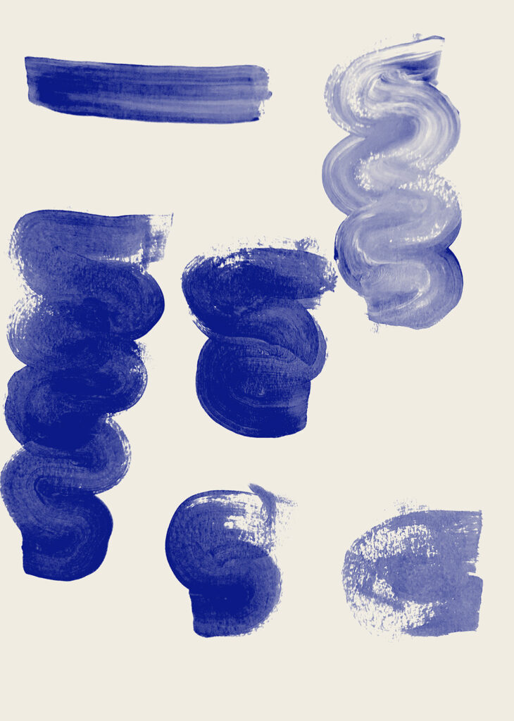
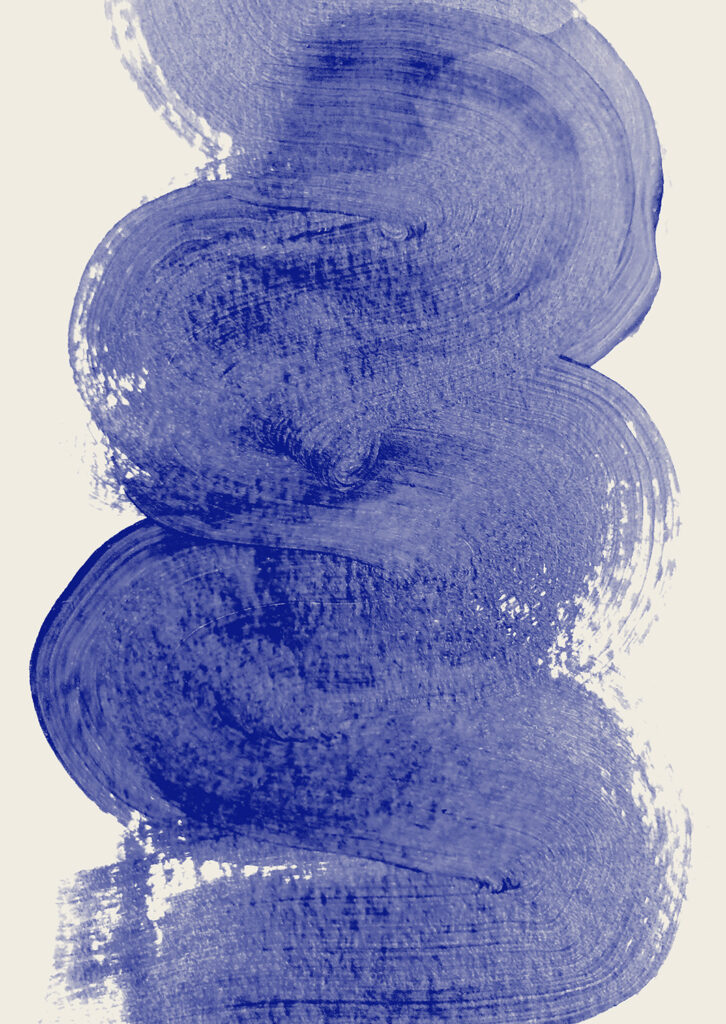
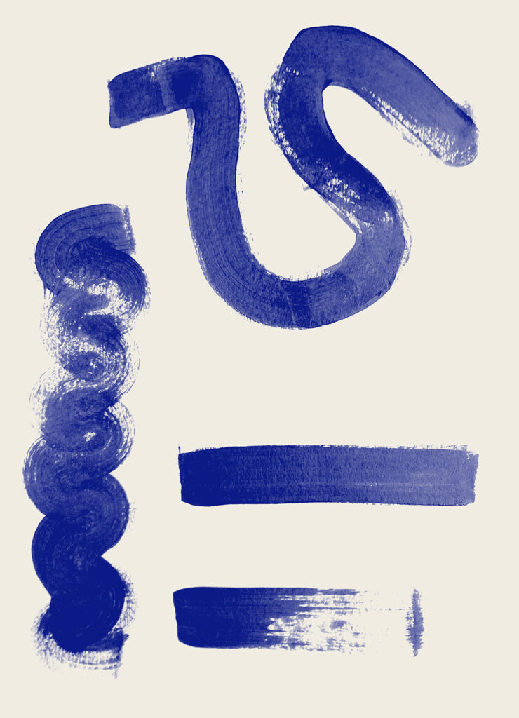
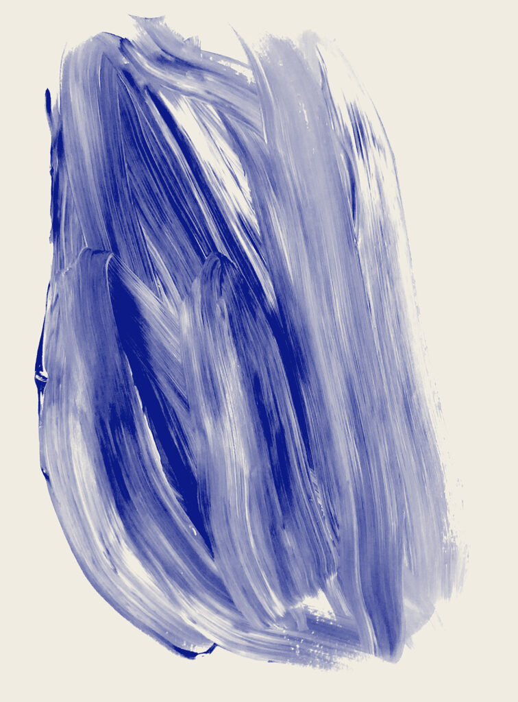
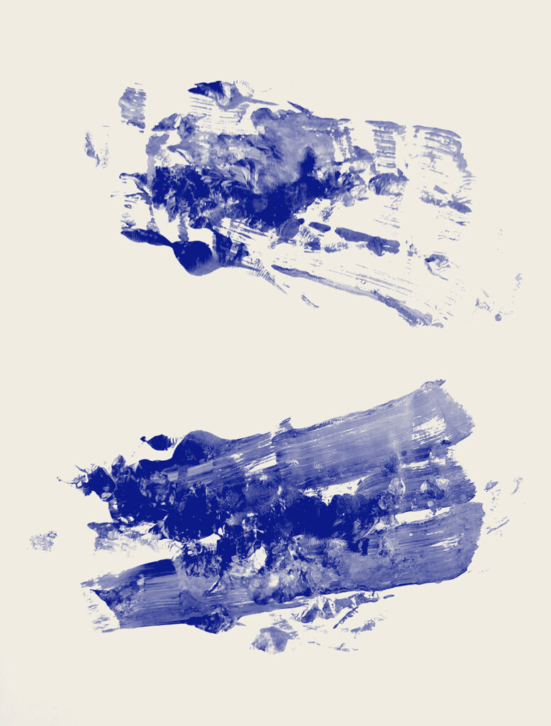
In order to play further on fluidity, I also experimented with painting in a wave like movement. Some of the textures remind me of water, but also the strokes of wood stain being applied to a boat. If I’m able to make these work with the functional elements of my design, they might provide the fluidity I’m looking for in my design.
Layout design
After finishing my illustrations, I went on to work on the layout sketches from last week. I decided to stick to a functional design with a strict grid structure, in line with the functionality of the boat. By including large amounts of white space, I tried to also make the layout feel light and airy. I also used the illustrations to introduce the fluidity from my tone of voice.
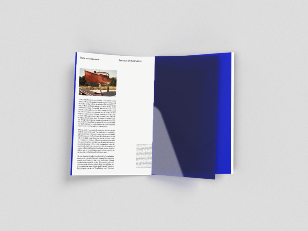
James suggested on the ideas wall that I could explore ways of using human endeavour and natural elements into my design. In order to communicate craft and human endeavour, I’m planning on making a tactile experience through production methods. There will be a variety of textures and the open spine, as well as the wooden box directly links to craftsmanship. Also, since the box will contain not only the book, but also a personal note, poster and an envelope of photographs, the reader will have to physically interact with the piece, and thus he or she will also add a human endeavour to it. In terms of natural elements, I’m planning on having a section in the book where the reader is taken under water to a poem. The pages will turn blue and uncoated and a blue plastic spread will separate this part from the uncoated paper sections. James’ question was very interesting, and I wish I had more time to explore this to a larger extent.
After establishing a layout, I did a quick print of a spread to check my type specifications in real life. After altering my typography, I went on to work on my layout and cover in order to finalise my book.
3D mockup experiments
As my plan for the publication might be too expensive to get printed, I wanted to look into possible ways of mocking it up digitally. For the main spreads where I’m looking to use uncoated pages, I could use a book mockup. However, I’m also planning on using blue plastic spreads, uncoated blue paper and a wooden box. I therefor experimented briefly in Adobe Dimension. The result was not great, but I will keep this as a backup solution in case I’m not able to source the right materials or have my publication printed.
Distribution research
Nuda Paper
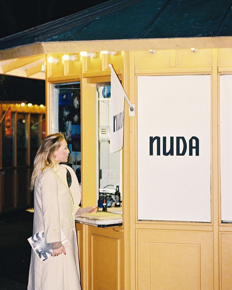
Nuda Paper is a Stockholm based magazine and exhibition space whom’s events seem great. Above is an image from their magazine launch which took place in an ice cream kiosk. I think it could be cool to be conceptual with my book launch in the way that Nuda was here. Perhaps I could have a launch in a wood boat studio (maybe in the building of my grandfather’s studio if it still stands). I like the way Nuda uses performances like poetry readings and live music to create a vibe for their exhibitions. To honour my grandfather’s humorous side, I would definitely like the exhibition to be quite lively and an event that one experiences. In my final physical publication, the element of opening and interacting with the piece is of essence. I therefor think it could be nice to create an exhibition which uses this idea of discovering something personal through interacting with installations and the book itself.
The image above is from one of Nuda’s exhibitions, Shaping Restistance. I think the use of wood with neutral colours would translate into my book launch as it matches the book design. The use of wood would be vital in the launch (due to the discussions on wood in the text) and I think the smell of freshly cut wood could be something to include somehow, perhaps through an installation “machine” which constantly cuts wood?
Exhibition design: Being Human
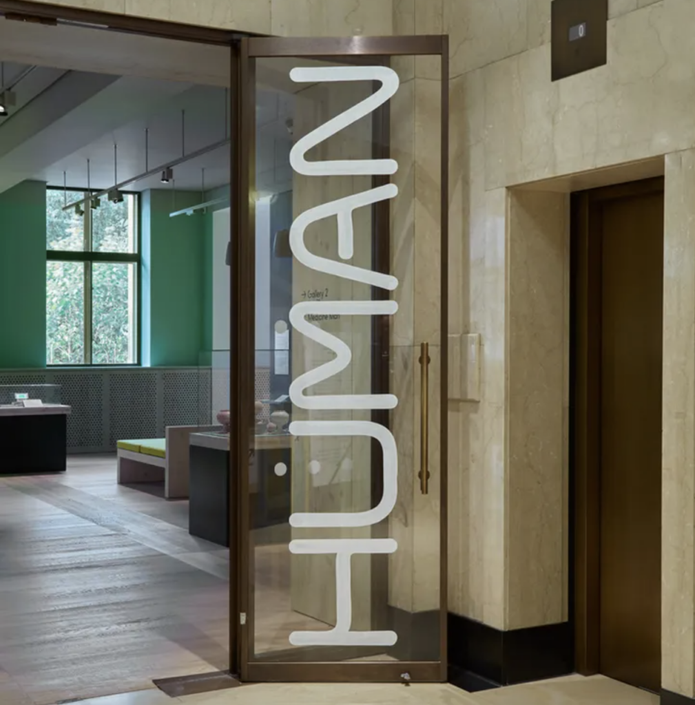
Fig. 36: Kellenberger-White 2019. Being Human exhibition at Wellcome Collection. [typeface]
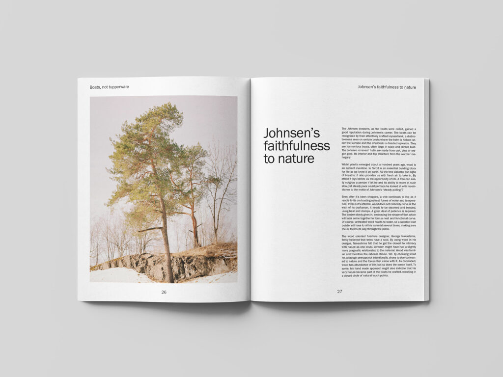
I’ve briefly looked at The Wellcome Collection’s exhibition, Being Human, previously in this course, and I thought it would be nice to revisit it here as the tactile and safe exhibition design relates nicely to my book. The exhibition consists of a lot of handmade elements from typography to furniture (Alif Ibrahim, 2019). By adopting my grandfather’s hand made approach to boat building, I could potentially convey his way of working in a contemporary manner by opting for a more modern design which draws on his way of working with natural materials.
Being Human uses a humanist geometric typeface which mixes geometry with the handmade (Alif Ibrahim, 2019). The letters have also been used to create a handmade glass lettering installation (Alif Ibrahim, 2019). If I had more time I would have loved to create my own letter design for the title of the book, but even if using the logo as it is now, I would love to create a physical sign for the book launch, using a handmade method as done in Being Human.
Distribution plan
Funding
Since my final publication might struggle to communicate it’s tactile value online (which makes crowd funding difficult), government and organisation funding could be a great solution. I would particularly be interested in applying for Grafill’s yearly grant (Norwegian organisation for designers and illustrators) and to Kulturrådet (Norway’s governmental grant organisation for artists). Of course, the book might not receive funding from these grants and if not I would look into crowdfunding.
Launch
Since my final product is very tactile, I think the launch should be physical. I would like to put on an exhibition with a design which focuses on tactility and the use of natural materials. The launch could take place in a boat builder’s studio and there would be lively performances with live music and readings from the book on the opening. The overall mood of the exhibition should honour my grandfather’s humorous side and it should therefore feel lively and welcoming. In my final physical publication, the element of opening and interacting with the piece is of essence. I therefor think it could be nice to create an exhibition which uses this idea of discovering something personal through interacting with installations, but also the book itself.
Promote
In addition to an exhibition I would promote my book by trying to get book shops to sell it, particularly those in the arts and culture sector. Since my book is very tactile, I think it could be beneficial for people to discover it in real life. However, I would also look into online promotion, perhaps by attempting to get the book featured on popular art and design blogs.
Final result
My final result for the module essay is a written text about my grandfather’s boat building. The text discusses his life and work by demonstrating inspiring life lessons. I have approached the text in a personal way, where I’ve tried to reflect upon his work both in a logical and an abstract manner. The ocean and his use of natural building materials are the main key points of the text, and I’ve tried to use these points to inform my tone of voice. I wanted my text to feel light and airy as if the reader is floating along.
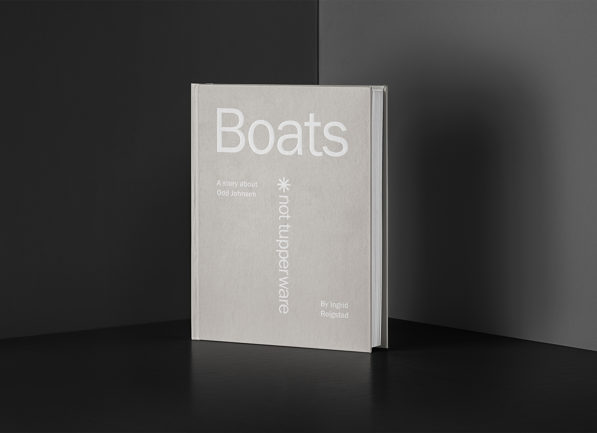
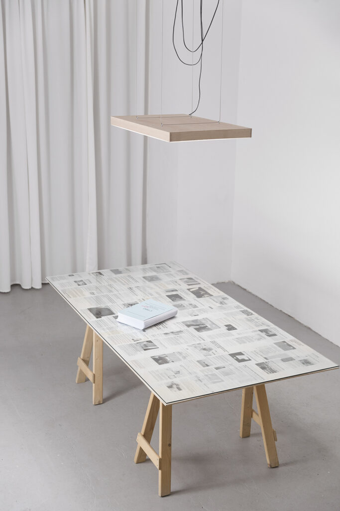
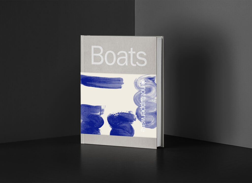
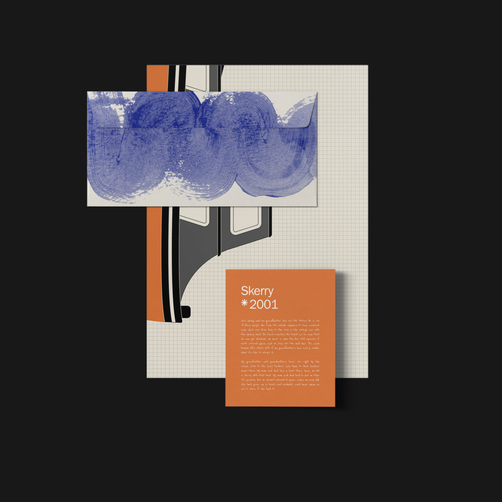
My final essay is showcased in a physical publication in the shape of a memory box. The box is made out of wood with a carving of the book’s title, to reference the wooden materials and the wood carvings seen in my grandfather’s work. Inside the box there is a book, a hand written note/memory, a poster with a boat illustration and an envelope of old photographs. The memory box is inspired by boxes with personal belongings that families go through after the passing of a family member. Since my grandfather passed away when I was young, this project has become a way of getting to know my grandfather as an adult. Thus, interacting with the box represents getting to know the life and work of someone after their passing.
The work of my grandfather was very tactile as he made his boats by hand. Thus, the book experience is also one of tactility. The reader has to interact with the box and everything is texturised (please see the image below for further material/texture details). The layering effect that arise from the box, book and book jacket reminds me of how one can be above and below water, but also the process of removing layers from a tree stub and finally using that wood to build a boat.
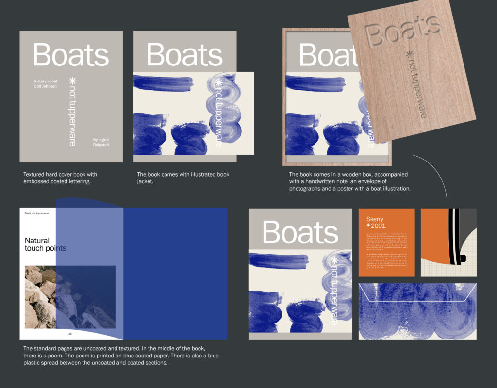
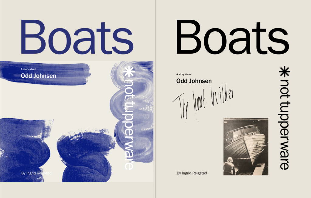
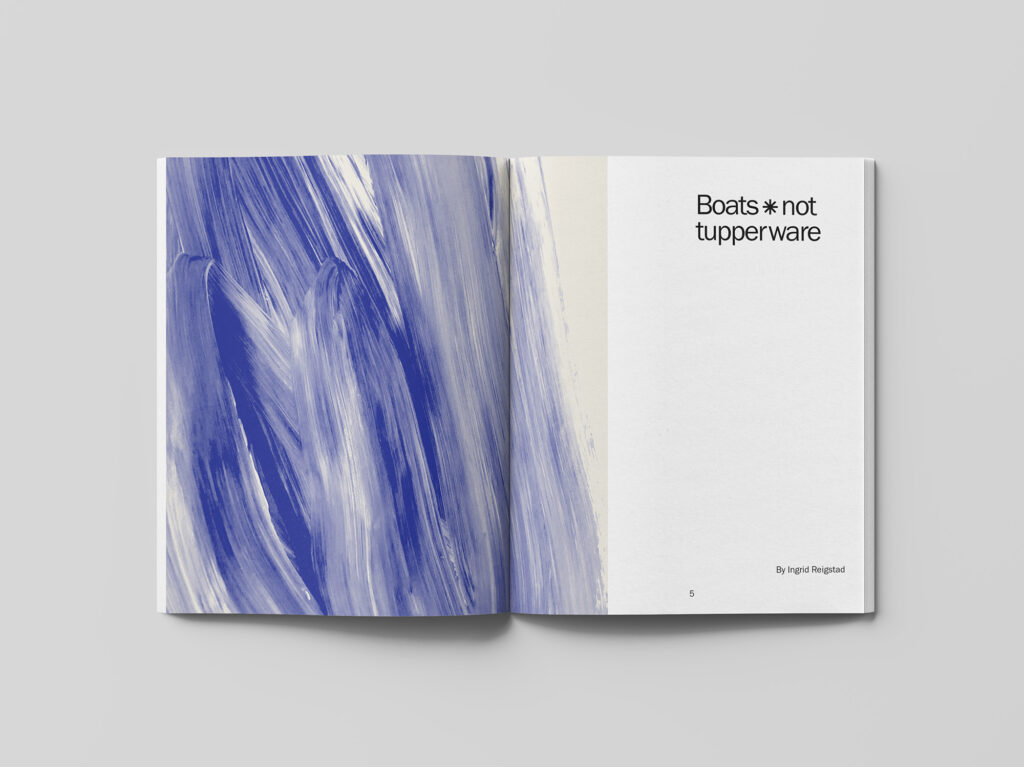
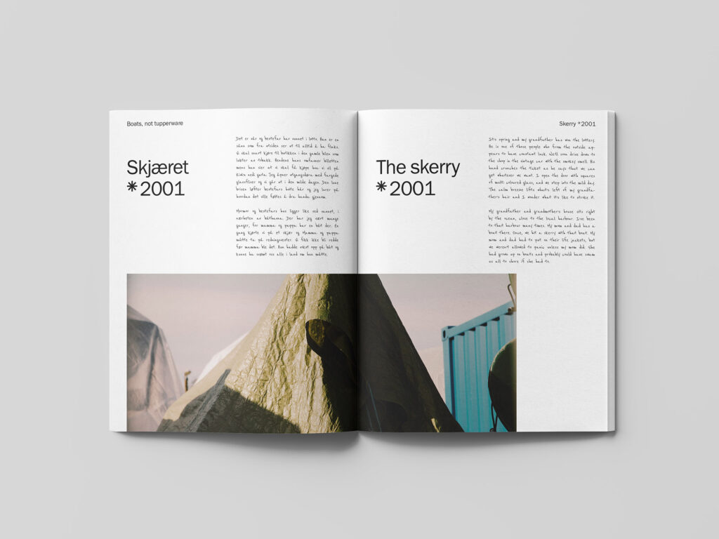
The logo of the book (which is also used in a smaller format on a few spreads inside the book) is set in a functional typeface that runs through the book. The title Boats, not tupperware is inspired by one of my grandfather’s sayings mentioned in the book: “Wood is boats, plastic is tupperware”. The ‘*’ therefore acts as a reminder to the reader that this book is not about plastic boats. It also refers to the name of my grandfather’s boats, Johnsen-crossers, as the star consists of two overlapper crosses. I think the ‘*’ works well on the cover as it can also be interpreted as the light of a light house or a sun, both symbols that connects to boats.

The mockup used in this work was collected from a website with a creative commons license, and was not created by me.
The mockup used in this work was collected from a website with a creative commons license, and was not created by me.
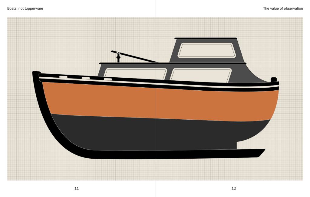
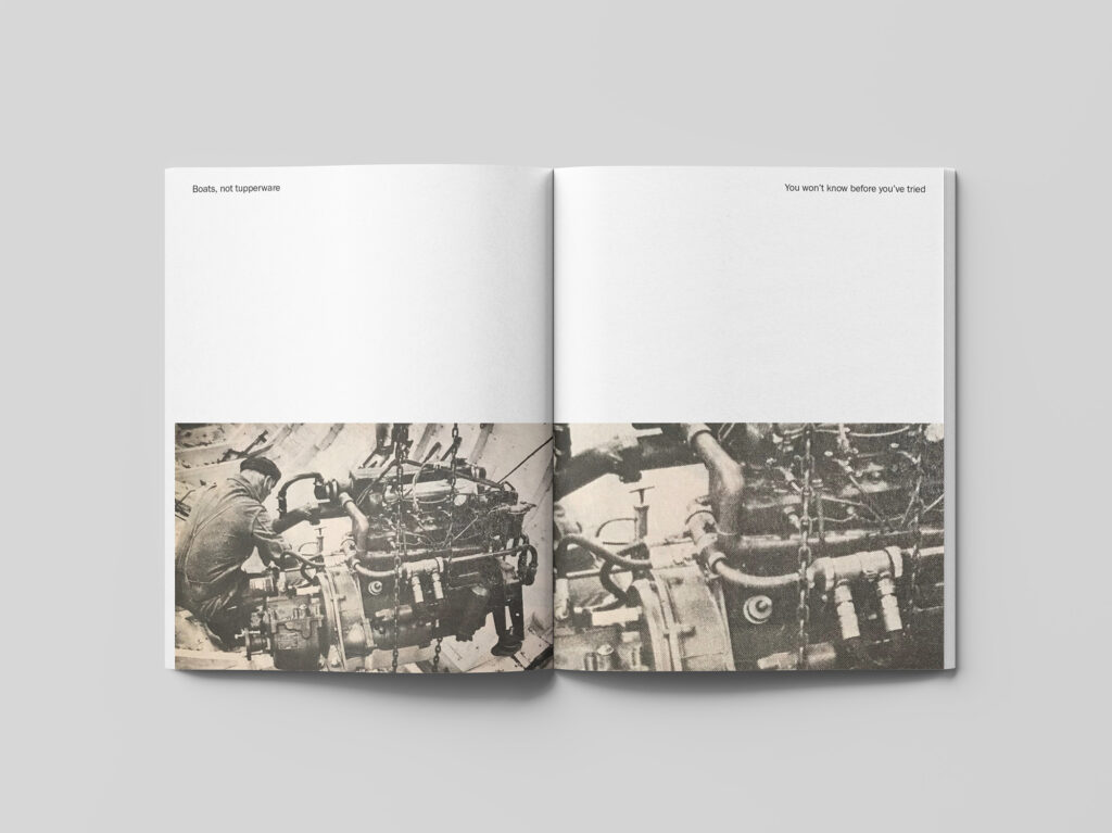
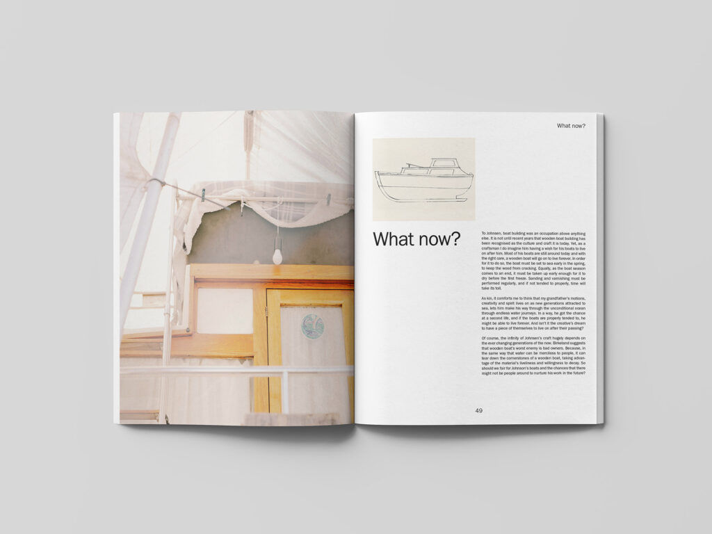
As mentioned previously in the blog post, I’ve gone for a grid structured layout with functional typography. This decision was based on the clean lines of my grandfather’s boats. I have used a lot of negative space in my design, in order to make the content seem light, in line with the tone of voice in my text. As a way of incorporating craft and fluidity I have used brush strokes and some handwriting elements. I’ve used a combination of old and new photographs, as well as illustrations, in order to be relevant today whilst also showing the history of my topic. Each chapter’s illustrations and photographs are meant to compliment the text and the point made in that section. The main colours, blue and orange, represent wood and water.
The mockup used in this work was collected from a website with a creative commons license, and was not created by me.
The mockup used in this work was collected from a website with a creative commons license, and was not created by me.
Below is a PDF with all book spreads and my final written text.
In conclusion
It’s been great to finally be able to visualise my publication this week. As a designer, I think it’s easier to make sense of a visual piece than a written one, and so I’ve enjoyed to finally be able to communicate the whole story of my grandfather with the help of graphics and curated photographs. As always though, I wish I had had more time to explore in order to create a layout more in line with my written concept.
In the crit this week, Paul and James mentioned that they would have liked to see the concept of the book cover run throughout my book. This would have been great to experiment with further, as I don’t think the book feels totally cohesive at the moment. This could have been done by using the star symbol throughout the book, or perhaps by adopting the separating middle line from the cover into my layout. Although I have used illustrations to add fluidity, I would have liked to worked further fluidity, perhaps by introducing it to my typography and layout design.
If it doesn’t cost too much, I think it would be nice to get this book made. It would be good to see my final result in real life rather than through flat mockups, but I also think this could be a personal object to own. It could be a constant reminder of my grandfather’s way of living and his approach to work, which I would want to adopt in my practice. I would also love to give the publication as a gift to my mom and her sisters.
Although I would have liked to work further on my layout design, I am quite happy with the production concept of my publication. The memory box feels personal and in line with my grandfather’s work, but I also think it could help to communicate my relationship to him to readers. As we move forward I will particularly take with me the approach to production which I’ve explored over these essay weeks. I have realised that a concept does not always have to be rooted in typography and images alone – it can also be communicated through tactility and physical experiences.
REFERENCES:
Alif Ibrahim (2019) ‘Warm, tactile and accessible: Kellenberger-White on its exhibition design for Being Human’, It’s Nice That, 8 November. Available at: https://www.itsnicethat.com/articles/kellenberger-white-being-human-graphic-design-081119 (Accessed: 8 April 2021).
Angharad Lewis (2016) So You Want to Publish a Magazine? London: Laurence King.
Darren Wall and Stuart Tolley (2021) ‘Stuart Tolley in conversation with Darren Wall’. Canvas Falmouth Flexible [online], 12 March.
LIST OF FIGURES:
Figure 1. Daren WALL. 2014. Saga mega drive collected works. Darren Wall [online]. Available at: https://darrenwall.co/sega-mega-drive-collected-works
Figure 2. CEREAL. 2018. Cereal Volume 16. Cereal [online]. Available at: https://readcereal.com/product/cereal-volume-16/
Figure 3-4. STUDIO TILLACK KNOLL. 2021. Low-tech Fine Art. Instagram [online]. Available at: https://www.instagram.com/p/CLpZ7zohc74/
Figure 5-6. BLEED. 2021. Visual identity: Cornelia Svedman. Instagram [online]. Available at: https://www.instagram.com/p/CKjOkzwhKRd/
Figure 7-15: Ingrid REIGSTAD. 2021. Ocean photographs. Private collection: Ingrid Reigstad.
Figure 16. Unknown maker. ca. 1952-1991. No title. [analogue photograph]. Private collection: Iren Johnsen.
Figure 17-20: Ingrid REIGSTAD. 2021. Johnsen crosser sketches. Private collection: Ingrid Reigstad.
Figure 21: Ingrid REIGSTAD. 2021. Boat building tools. Private collection: Ingrid Reigstad.
Figure 22-26: Ingrid REIGSTAD. 2021. Ocean brush strokes. Private collection: Ingrid Reigstad.
Figure 27-31: Ingrid REIGSTAD. 2021. Boats *not tupperware layout experiments. Private collection: Ingrid Reigstad.
Figure 32: Ingrid REIGSTAD. 2021. 3D experiment. Private collection: Ingrid Reigstad.
Figure 33. NUDA PAPER. 2021. Nuda:Terra release kiosk. Instagram [online]. Available at: https://www.instagram.com/p/CLCGh-9pfcE/
Figure 34. Unknown maker. 2017. Shaping Resistance exhibition. [exhibition space]. Nuda Paper [online]. Available at: http://nudapaper.com/space/ [accessed 8 April 2021].
Figure 35. KELLENBERGER-WHITE. 2019. Being Human exhibition at Wellcome Collection. It’s Nice That [online]. Available at: https://www.itsnicethat.com/articles/kellenberger-white-being-human-graphic-design-081119
Figure 36. KELLENBERGER-WHITE. 2019. Being Human exhibition at Wellcome Collection. It’s Nice That [online]. Available at: https://www.itsnicethat.com/articles/kellenberger-white-being-human-graphic-design-081119
Figure 37: Ingrid REIGSTAD. 2021. Boats *not tupperware: production map. Private collection: Ingrid Reigstad.
Figure 38-39: Ingrid REIGSTAD. 2021. Boats *not tupperware cover. Private collection: Ingrid Reigstad.
Figure 40: Ingrid REIGSTAD. 2021. Boats *not tupperware poster. Private collection: Ingrid Reigstad.
Figure 41-53: Ingrid REIGSTAD. 2021. Boats *not tupperware spreads. Private collection: Ingrid Reigstad.
Figure 54: Ingrid REIGSTAD. 2021. Boats *not tupperware components. Private collection: Ingrid Reigstad.