Resource reflection
Following one of the suggested action points from the tutorial with Celine, I wanted to spend some time researching this week.
Social Life of Small Urban Spaces
In this short film, Whilliam H. Whyte wittingly presents findings from his research project on how people use different kinds of spaces in the city. Whyte takes a systematic spatial design approach, and concludes with six key elements needed for a successful city plaza: sitable space, food, sun (light), water, trees and a physical element that brings strangers together (Whilliam H. Whyte, 1979).
In terms of place making, this is very interesting as the principles can be easily adapted into most city spaces. The film also shows how human behaviour changes based on simple, even banal, factors in a space, to the extent where I struggle to see how visual language can play a contributing role.
There is however one factor that could be looked at in detail to inform visual language: the physical element bringing strangers together. An example of such an element, discussed by Whyte, is the sculpture (Whilliam H. Whyte, 1979). In a public space, people will talk about it (even if they don’t like it), touch it, and sit on it (Whilliam H. Whyte, 1979). This way, the sculpture creates a flow of people, attracting them to interact with the sculpture (and thus the space) (Whilliam H. Whyte, 1979).
My reading of Whyte’s sculpture discussions, is that interaction is key for it to function. If people are not allowed to touch or sit on it, it will loose it’s function, and no longer attract people (Whilliam H. Whyte, 1979). In relation to my project, I think it’s interesting to consider the physicality language could potentially take, and how people could begin to interact with it, in order to connect with a place.
Notes can be found here.
Theory of the Dérive
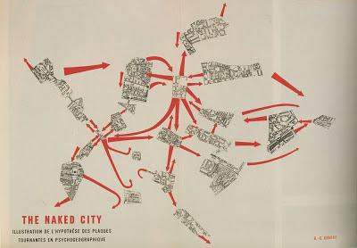
The theory of dérive seems to describe a method for developing psychogeographical data, where one moves between various ambiances (places) in a rapid manner(Guy Debord, 1958). Further, if I’m reading the material correctly, the method’s aim is to reveal social borders in places (which can be different from the physical ones), as well as how the environments affect emotion and behaviour, (Guy Debord, 1958).
Although I might not have managed to grasp the theory of dérive in it’s entirety, I wonder if the method of walking whilst documenting psychogeography could be used in my project – particularly when beginning to research a specific place. This could be a way of attempting to understand the cultures that are not represented in that particular place, but that could be introduced through a common language.
I’m particularly interested in the concept of invisible borders, and wether there are any visual forms of language to be found that might prevent others from entering particular spaces.
‘We Can’t Feel Our Language”: Making Places in the City
In her article “We Can’t Feel Our Language”: Making Places in the City, Natalie Baloy looks at native language revitalization and how aboriginal language education can become part of the urban domain.
Land and language
A fascinating aspect of Baloy’s article was her research into how aboriginal land seems to be so connected to their languages. Xálek’, a Squamish hereditary chief, tells Baloy:
“I realized that it’s the shape of our land. When the winds hit our mountains and they come over, they drop into the valleys, they kind of move around through the forest. That’s kind of the structure of the language – it has a lot of sharp inflections like that. . . . We adapt to our environment. Our language mimics that.”
(Natalie J. K. Baloy, 2011)
Jerilynn Webster, executive director of the Knowledgeable Aboriginal Youth Association, states a similar quote:
If you look at different languages, languages are what the land looks like. So it’s according to what your environment is. If you’re not in that environment, you’re displaced. Cut. That’s why the language isn’t happening, because we’re not feeling that. . . . We can’t feel our Mother, we can’t feel our language.
(Natalie J. K. Baloy, 2011)
Xálek’’s and Webster’s points are further backed up by social analyst, Mary Jane Norris, who explains how mountains “impose physical barriers to communication” (Natalie J. K. Baloy, 2011). If barriers and borders play key roles in the variation of language, surely language must be a potential tool for bringing those (at least non-physical) barriers and borders down.
The idea of connection between land and language itself is also interesting on a conceptual level. If my aim was to develop a communal language for a place – one that could be understood across verbally spoken languages – the land of that place could be an interesting starting point for inspiration.
Potential questions for investigation could be:
- Can we visually translate Norwegian nature into language, in order to reconnect with our heritage and land?
- Is there a room for nature in urban spaces? And if so, how can language be used to help us reconnect with nature in those urban spaces?
Making places for language
Although my original aim was not to use existing languages, this might be a point to consider if choosing to look at inclusion. Baloy talks about “making places for language”, where one can learn, speak hear, or use aboriginal language (Natalie J. K. Baloy, 2011). This made me wonder if we could perhaps develop a sort of multi-language for Oslo, Norway, or another place, using aspects of all represented languages in that place – almost as a visual or conceptual version of Esperanto.
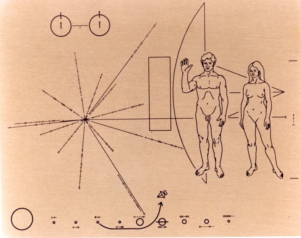
The Pioneer plaque demonstrates how difficult it is to communicate without shared language. Even for us humans, the map is hard to grasp without any given context. Therefore, a visual language’s aim should not be to communicate a specific message, but perhaps rather a sense of spirit.
Purpose of language education
In the article, the question of why people should learn native languages is raised. In contrast to learning other languages, like French or Spanish, the Dauenhauers argue that the function of learning a native language is simply spiritual (Natalie J. K. Baloy, 2011). Baloy further argues that learning one’s native language lets people connect with their sense of self, leading to a sense of pride (Natalie J. K. Baloy, 2011).
I wonder if language can also be used in an opposite manner – to help immigrants connect with their “new” sense of self, and to feel proud of their new home. Further, I’m also interested in how the learning of a language can be spiritual – and also, if a language can be spiritual in itself, and not necessarily made to be understood verbally.
Language development
Another interesting point from the article, was Xálek’s explanation of how parts of his language has become obsolete in urban societies (Natalie J. K. Baloy, 2011). As our way of life adapts, language follows (Natalie J. K. Baloy, 2011).
This made me wonder wether a language for a particular place needs to be broad in it’s form. Perhaps a language rather needs ways of expressing that which belongs within it’s place. A grocery store for example, might not need words for mountain or car, but it could benefit from having lots of words for cheese, helping it differentiate the various kinds.
Notes can be found here.
Webinar: Thinking through making
Ben’s webinar from last week was a great counter part to the more theoretical research above. In the webinar, Ben argued that when all designers use the same tools and sources of inspiration, we end up making very similar outputs (Ben Evans James, 2022). Therefore, we as designers need to be mindful of our chosen tools and processes (Ben Evans James, 2022).
Analogue photography as observational method
Initially coming from a photography background, I enjoyed Ben’s discussion on why he shoots film, suggesting that the process forces him to slow down and carefully consider his shots (Ben Evans James, 2022). During my BA I also used film when photographing, and I can very much resonate with Ben’s interest in the physicality of it.
Although I’m not considering doing photography for my project, I think it could be interesting to use analogue photography as a method for observing places. Waiting for the film to develop might then help me make new observations of the place due to separating with it, as mentioned by Ben (Ben Evans James, 2022).
Other material driven observation methods could be:
- Lino cutting
- Drawing
- Writing
- Asking citizens about their surroundings for then to take a picture of what they see
Slowing down digital processes
In the webinar, Ben asked how we can begin to slow down processes in digital software (Ben Evans James, 2022). This made me wonder if I could test a process which almost switches the process of analogue photography: the process would consist of sketching for as long as I need, and for then to only allow an allocated amount of time in the actual software. This way I would have to figure out what I’m doing using physical techniques, whilst also leaving room for mistakes due to the time limitation.
Notes can be found here.
Peer-to-peer
The peer to peer session was really beneficial this week as it helped me put words to the various reflections and material above. Talking to Alice, I ended up summarising my current ideas as:
- Develop a visual language for Oslo, which can help non-Norwegian speakers connect with the city. The aim could be to help immigrants connect with their new home, or to give tourists a sense of the city.
- Develop a visual language that helps Norwegians re-connect with their land. The language would be inspired by Norwegian nature, and perhaps also Norwegian heritage.
What fascinated me with these ideas was the concept of developing a visual language that can be interpreted by a group of people, despite them not sharing similar verbal languages. The idea of a language that can be felt and that is spiritual rather than practical (inspired by how the aboriginals spoke about their language) is interesting, and something I’d like to explore through making.
Me and EU
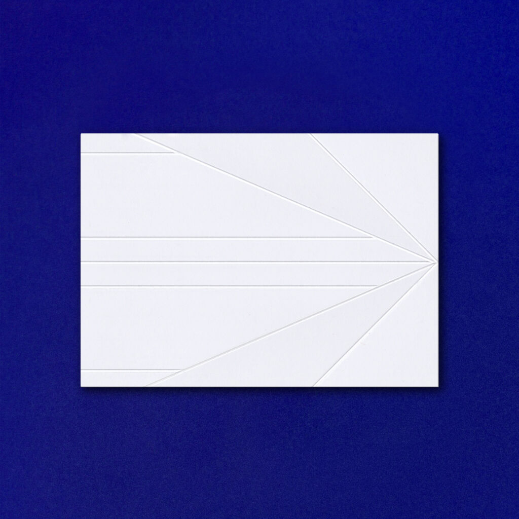
In the session, Alice recommended to watch the Nicer Tuesdays episode on Me and EU, a self initiated post card project by Sam T Smith and Nathan Smith as a response to Brexit.
Smith discusses the format of the postcard, and how it can be seen as a reference to crossing borders (Sam T. Smith, 2017). As my project is becoming more and more about breaking down invisible borders, I think it would be helpful to reflect on other objects and applications with the same function. More obvious ones are of course planes and boats, but I’d like to brainstorm symbols that are less cliche.
The concept of collecting post cards in itself could be an interesting research method if the goal was to gather insight on people’s perception of Norway. Maybe I could ask research participants to send letters, post cards or photographs from their everyday lives in Norway?
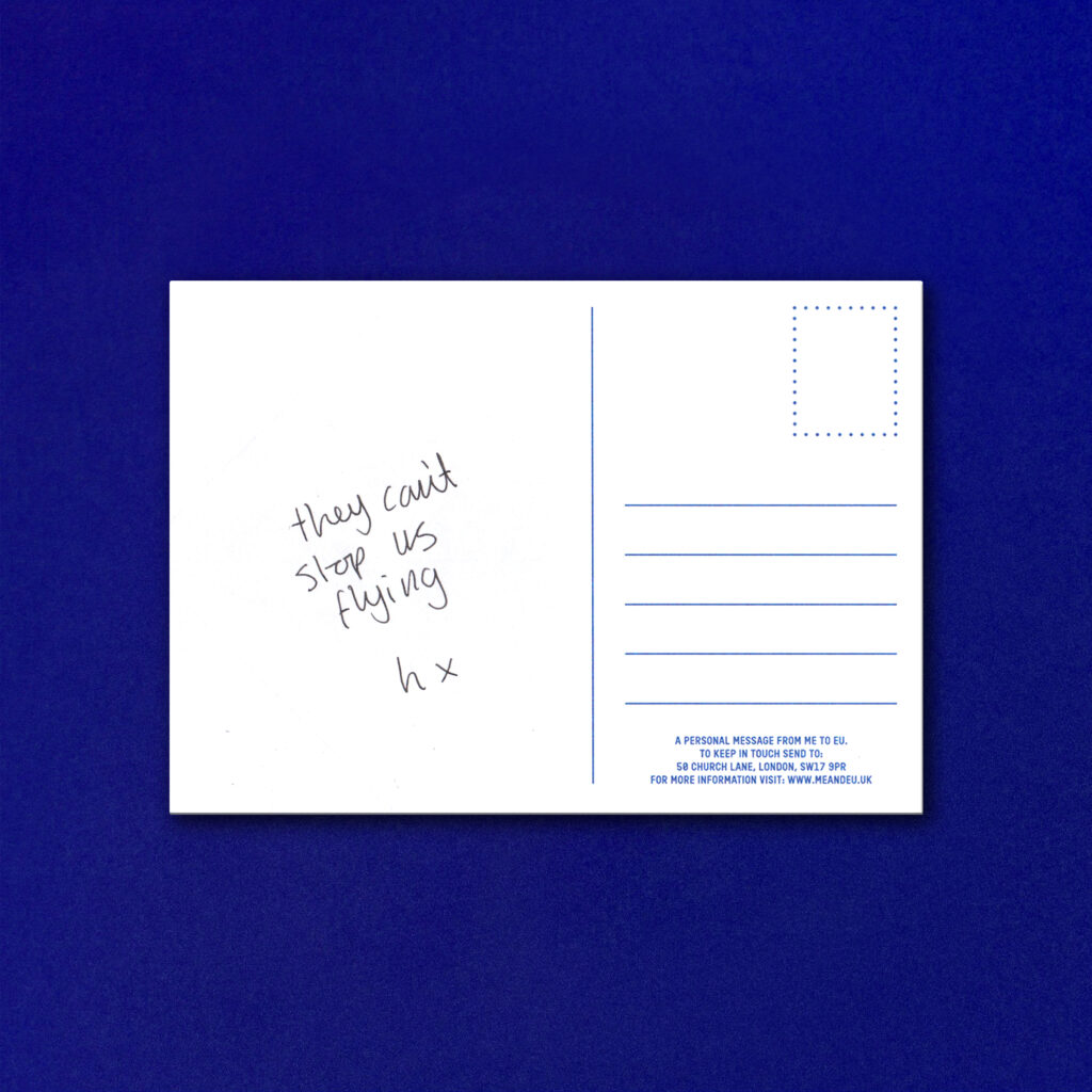
I found the quote in the postcard above quite moving – an emotional verbalisation of the limitations of borders, but also how borders are quite banal and meaningless. I’d love for my project to adopt a similar sense of communal spirit and emotion.
North: Type that mirrors the Munch’s “unconventional spirit”
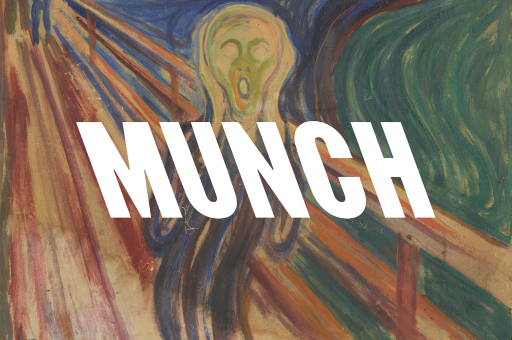
Inspired by the peer-to-peer discussions, I decided to re-visit the new Munch Museum identity by North Design (briefly looked at in the beginning of the module).
In an interview with It’s Nice That, the design studio explains how they wanted to develop concepts that “felt like contemporary expressions of his attitude” (Jenny Brewer, 2020). If choosing to look at heritage and nature as inspiration for language, I think it will be important to follow a similar strategy. There’s not really any use in developing a language that feels “old”, as the language’s aim would really be to connect with people of today.
In my opinion I think it’s very much okay for heritage inspired projects to feel modern and contemporary, as long as they capture the ethos of the heritage. Perhaps it’s even vital for them to be contemporary, for people to truly connect with the heritage in question?
Non-legible visual languages
I further wanted to begin collecting some visual references, and decided to look for typographic visuals which were hard or impossible to read. Since the main function of type is to be read, I think it’s quite funny that some type can’t be. In a sense they become visuals to be read, rather than words – which is very much the current direction of my project.
Type that can’t be read can also be seen as a reference to verbal languages that can’t be understood by a foreigner.
Regular Practice: Everpress
In the video above, Regular Practice discusses their process on designing a t-shirt for Everpress. As the typographic design is almost impossible to read, the design becomes a very visual piece of communication.
Discussing a book on Korean lettering, Soelling explains that “when you don’t have any understanding of what something says or communicates, you can sort of look at it in a very different way, and appreciate it for different reasons” (Tom Finn and Kristoffer Soelling, 2020). This very much ties in with my project, where the aim will most probably be to communicate in a non-verbal language.
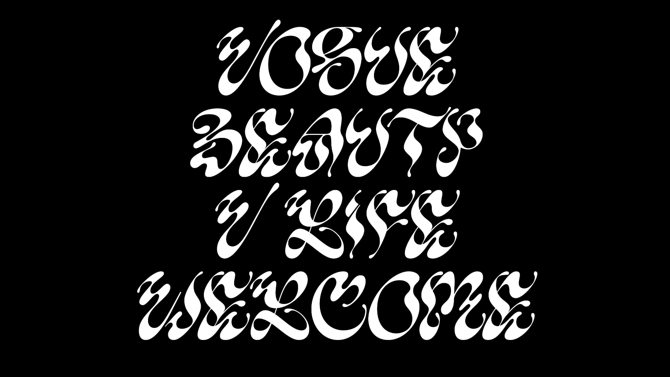
Studio Nari: Vogue Singapore

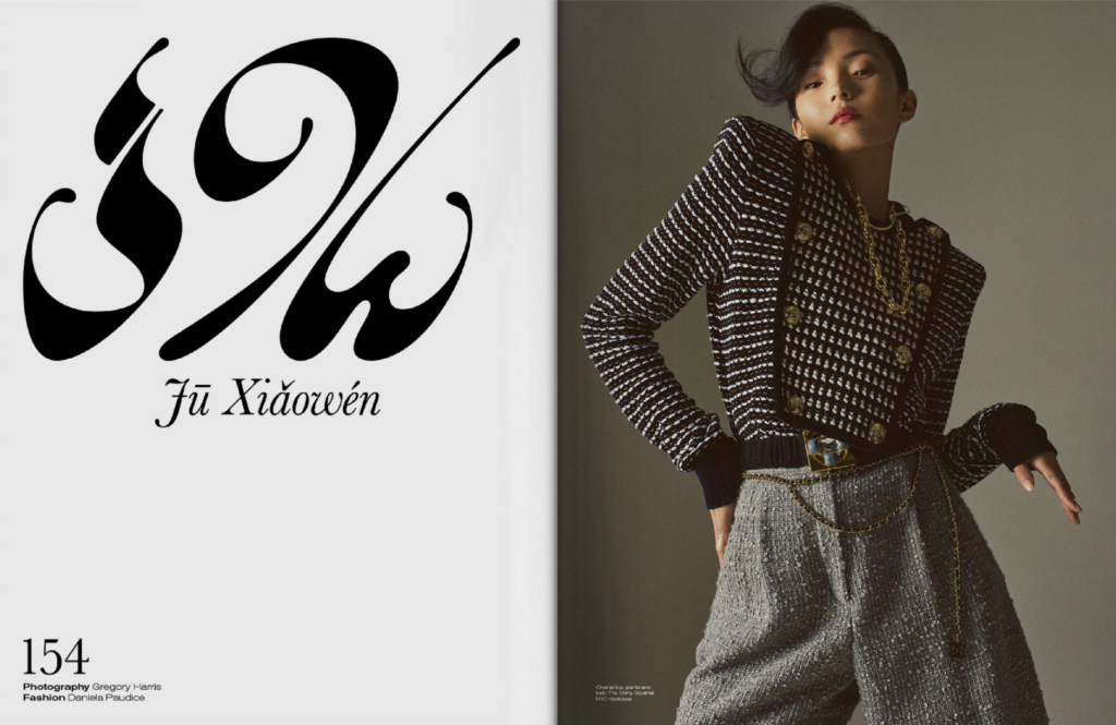
This beautiful, and not so legible, typeface was created for Vogue Singapore by Studio Nari. The typeface was inspired by Singapore’s national flower, as well as the Singapore stone, which is one of the oldest typographic artefacts in Singapore, written in Sanskrit (Studio Nari, 2020). A similar process of research could perhaps be adopted if I choose to develop a language for Norwegian nature/heritage.
In an interview about the project, Vogue Singapore’s art director Henry Lloyd explains how they “wanted something that ignored legibility and focused on form, shape and beauty” (Chandreyee Ray, 2020). Again, this relates to the current direction of my project, and I’m curious as to why they wanted something nonlegible. Perhaps they wanted to address the range of cultures living in Singapore? Or maybe they wanted to refer to the form of fashion? Either way, I think it’s fascinating to see how typography adopt the function of illustration, and almost ignore it’s basic function of communicating words.
Weekly tasks
Last week I decided that I would complete a set of tasks at the end of each week, in order to help develop my project. However, this week I didn’t quite feel like the visual piece was helpful, nor was the weekly assessment of design objectives. I therefore concluded that I would focus on key word definitions for my weekly tasks moving forward, and that the other two would be done if relevant.
Below are the current reflections/definitions of my key words:
Place
With the direction my project is currently going, place refers to a country or city – an area with physical or invisible borders.
Language
I’m currently looking at developing non-verbal languages, and I’m interested in a more spiritual approach where language is non-practical, as apposed to verbal languages like Norwegian and English.
Rather than aiming for words to be understood, the language should aim to be felt, and read in a visual manner. The reason for doing would be to develop a language that can be understood by a group of people, despite them not sharing the same verbal language.
Connect
By developing a language that can be understood by all, I hope to democratise places such as Oslo or Norway, giving everyone a chance to understand and resonate with them.
With connection, I also refer to an increased connection of spirituality, as I want the language to be felt, and thus for readers to feel the land of which that language speaks about.
Weekly wrap up
Although I’ve solely focused on research this week, I finally feel like I’ve made some real progress with the project. The article ‘We Can’t Feel Our Language”: Making Places in the City was an important contributor to this, as it opened my eyes to what a language can be, particularly in terms of it’s function. I love the idea of a language that can be felt, and I’m excited to see how this can be used in visual explorations.
The peer-to-peer session was very useful in helping me put words to my reflections, which made me realise that I’ve began to form a couple of specific ideas. From here it was easy to delve into more specific research, like on typography that isn’t legible. Moving forward I hope to explore a range of concepts and case studies related to non-verbal communication, where the aim is to communicate spirit and emotion, rather than words.
Looking back, I could have spent more time ideating this week, using ideation-methods rather than solely writing down ideas as I went along. Next week I think it will be important to mind map thoroughly, so that I can make sure that all possible directions have been explored before choosing one. As we enter phase 2 of the project, I also want to start testing and making, in order to collect research that isn’t solely theory based.
REFERENCES:
Ben Evans James (2022) ‘Thinking Through Making’. Canvas Falmouth Flexible [online], 14 February.
Chandreyee Ray (2020) Behind the scenes: How Vogue Singapore’s custom-made typeface came to life | Vogue Singapore | Interiors, Lifestyle, Vogue Singapore. Available at: https://vogue.sg/vogue-singapore-font-studio-nari-sanskrit-orchid-design/ (Accessed: 18 February 2022).
Guy Debord (1958) Theory of the Dérive. Available at: http://www.bopsecrets.org/SI/2.derive.htm (Accessed: 16 February 2022).
Jenny Brewer (2020) North’s severe backslanted type for the Munch Museum mirrors the artist’s “unconventional spirit”. Available at: https://www.itsnicethat.com/news/north-munch-museum-identity-graphic-design-210520 (Accessed: 18 February 2022).
Khachaturyan, E. and Camilotti, S. (2017) ‘The Place of Language in (Re)constructing Identity: The Case of “Fortunate Immigrants” to/from Italy’, Romance Studies, 35(1), pp. 31–47. doi:10.1080/02639904.2017.1299911.
Natalie J. K. Baloy, N.J.K. (2011) ‘’We Can’t Feel Our Language”: Making Places in the City for Aboriginal Language Revitalization’, American Indian Quarterly, 35(4), pp. 515-548,622.
Sam T. Smith (2017) Nicer Tuesdays: Me & EU. (Nicer Tuesdays). Available at: https://www.youtube.com/watch?v=vpjpOP8Zby0 (Accessed: 18 February 2022).
Studio Nari (2020) Vogue Singapore, Studio Nari. Available at: https://www.studionari.co.uk/projects/vogue-singapore-1/ (Accessed: 18 February 2022).
Tom Finn and Kristoffer Soelling (2020) Behind the Design | Everpress Episode 01: Regular Practice. Available at: https://www.youtube.com/watch?v=pOdjErrU76s (Accessed: 18 February 2022).
Whilliam H. Whyte (1979) Social Life of Small Urban Spaces – Whilliam H. Whyte – Full Movie. Available at: https://www.youtube.com/watch?v=hZ2o4RclJGM (Accessed: 16 February 2022).
LIST OF FIGURES:
Figure 1: Whilliam H. WHYTE. 1979. Social Life of Small Urban Spaces . Available at: https://www.youtube.com/watch?v=hZ2o4RclJGM&ab_channel=VaibhavSingh [accessed 21 December 2022].
Figure 2. Guy DEBORD. 1957. Naked City. Spontaneous Architecture [online]. Available at: http://www.spontaneous-architecture.org/2013/02/guy-debord-theory-of-derive.html
Figure 3. Carl SAGAN and Frank DRAKE. 1972. Pioneer plaque. Wikipedia [online]. Available at: https://no.wikipedia.org/wiki/Pioneerplatene#/media/Fil:Pioneer10-plaque.jpg
Figure 4. Bernard LEACH. 1965. A Potter’s Book. Camden Lock Books [online]. Available at: https://camden-lock-books.myshopify.com/products/a-potters-book-leach-bernard-introductions-by-soyetsu-yanagi-michael-cardew-published-by-faber-faber-london-1965-condition-very-good-hardcover
Figure 5: Sam T SMITH. 2017. Me and EU . Available at: https://www.youtube.com/watch?v=vpjpOP8Zby0&ab_channel=It%27sNiceThat [accessed 18 February 2022].
Figure 6-7. Harry GRUNDY. 2017. Me and EU. Me and EU [online]. Available at: http://www.meandeu.uk/harry-grundy
Figure 8. NORTH. 2020. Munch Museet. It’s Nice That [online]. Available at: https://www.itsnicethat.com/news/north-munch-museum-identity-graphic-design-210520Figure
9: Tom FINN and Kristoffer SOELLING. 2020. Behind the Design | Everpress
Episode 01: Regular Practice . Available at: https://www.youtube.com/watch?v=pOdjErrU76s&ab_channel=Everpress [accessed 18 February 2022].
Figure 10-11. STUDIO NARI. 2020. Vogue Singapore. Studio Nari [online]. Available at: https://www.studionari.co.uk/projects/vogue-singapore-1/