Lecture notes
Lecture reflections
Humanising big data
Drawing on my work from last week on humanising information design by using photography, I found Pochodzaj’s discussions on the migrant crisis very interesting. As Pochodzaj mentioned in this week’s lecture, there were a lot of numbers and statistics in the media, but the big data failed to show the human aspect and personal stories of the migrants (Pochodzaj, 2021). To me, information design start to become interesting when data is communicated through a variety of mediums, and thus humanised through story telling.
Visualising data through performance and installation
One interesting approach to choice of medium was The List, mentioned by Pochodzaj in the lecture (Pochodzaj, 2021). By turning the heartbreaking catalogue into an installation, one could start to grasp the scale of deaths, in a much better way than one could when facing a large number on a page or screen.
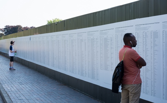
The List as well as We are here got me interested in ways of using installations and performance when communicating data. If people can actually experience the data, they might also begin to grasp it to a fuller extent. Could we perhaps create future realities as real life installations, or virtual realities, in order to shape the public’s perception on what certain actions could do to our future society?
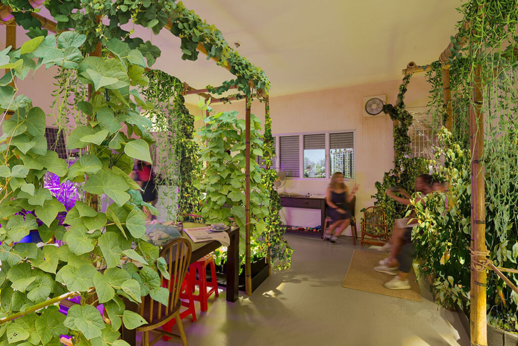
Fig. 2: Super Flux 2019. Mitigation of Shock II (Singapore). [interior design installation]
Can we enhance democracy through virtual realities?
Imagine if rather than creating a flat diagram of left and right politics (as done by McCandless, which I touched upon last week), we could create virtual realities of what society might look like in 10 years time, if we were to follow different political parties’ visions. This could perhaps truly help the public to make an informed decision in political elections, but it would also put a huge responsibility on the creators of those virtual realities. How could we be sure that each party’s reality was the true vision of that party, and not information design propaganda?
Resource notes
Resource reflections
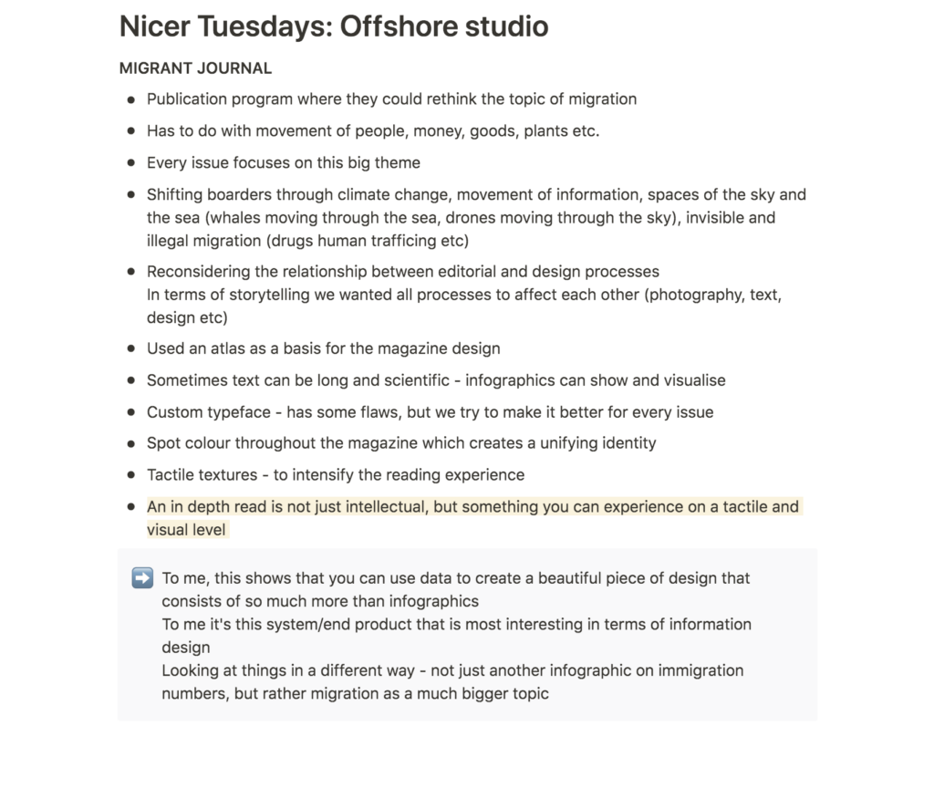
Nicer Tuesdays: Offshore studio
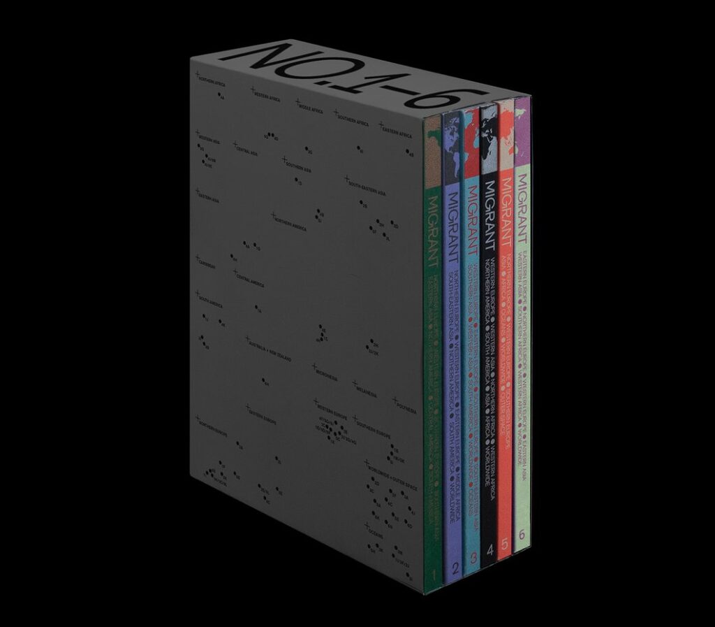
Moving on from the lecture, it was lovely to see Offshore’s Migrant Journal, as this was yet another example of how one can visualise and communicate data through not just infographics, but images, design and tactility (Miler, 2018). I particularly liked what Miler said about enhancing the intellectual experience through offering a tactile and visual product (Miler, 2018). Migrant Journal also shows that one can portray data, not just through the combination of photography, text, infographics and tactility, but by looking at a theme in a different and broader way, by questioning the essence of ones topic.
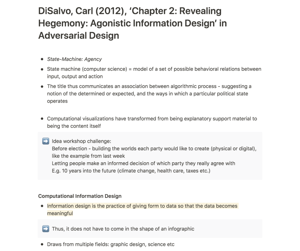
Carl DiSalvo: Revealing Hegemony: Agonistic Information Design’ in Adversarial Design
To me, the MAIC-gregator highlighted the opportunities, but also the dangers of information design. The MAIC-gregator is a web browser extension that informs the user of academic research papers that are funded by military(DiSalvo, 2012). In a time where fake news have become a true problem, one might think that this type of design could help us detect fake news across the internet. However, I am worried that this type of web browser extension could be used to the opposite and promote fake news as the truth.
Funding in it self is an interesting topic to look at in terms of information design. In Norway, I think most people are against investing in fossil fuel. However, the government pension fund of Norway only only recently stopped investing in this area. Several organisations and companies invest in industries and actions over seas that are not legal domestically. Could this perhaps be something to look into for my workshop challenge this week?
Further research
Judging by the cover
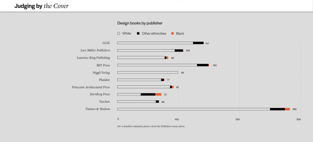
Judging by the cover is a information design project that highlights race bias in design book publishing (de Vasconcelos, 2021). Although this website doesn’t feature any particularly experimental or over the top infographics, it’s very powerful through it’s simplistic and clear design. I find this very inspiring in terms of creating an information design with a political message.
The two typefaces are by the two and only black type designers on AdobeFonts (de Vasconcelos, 2021).
W. E. B. Du Bois: Infographics that challenges white supremacy
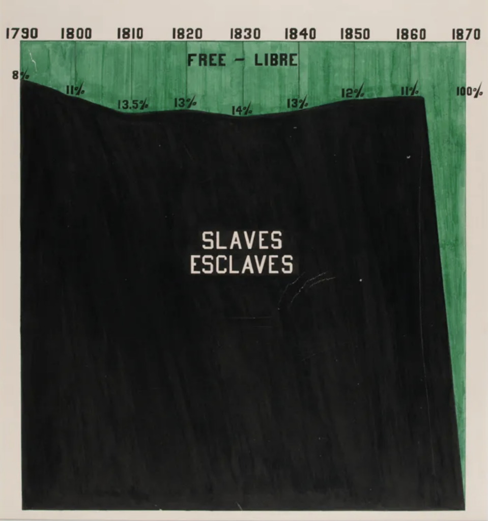
I found African American activist and academic W. E. B. Du Bois’s infographics, posted by Stuart on the ideas wall very beautiful. They are powerful in their message, and I was particularly inspired by the tactile look of them. The handmade marker/paint application somehow make them more activist-like and thus powerful in my opinion. Perhaps a textural approach to infographics could create the humanising aspect in my workshop challenge? This would be easier within the time frame as I wouldn’t have to source images or photograph myself.
Tactile shapes @ Tate
I sometimes like to visit Tate’s online collection for visual inspiration as this often leads to unexpected discoveries. Inspired by W. E. B. Du Bois’s handmade infographics, I decided to do a search for ‘circle’, in hope of finding something new and unexpected.
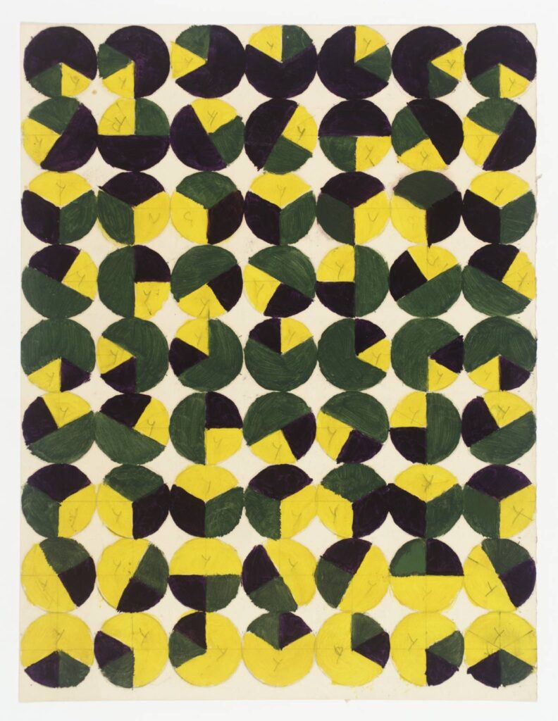
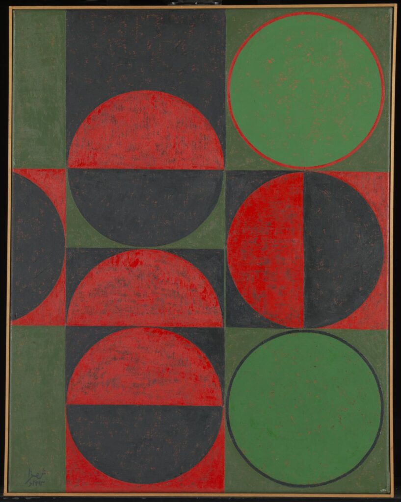
Fig. 7: Shemza 1963. Composition in Red and Green, Squares and Circles. [Oil paint on canvas]
The beautiful textures of Kidner’s and Shemza’s artworks above would be great in an organic context.
Fig. 9: Tambellini 1965-1968. Cell Series. [Cells]
I think that working with stamps or other physical approaches could be very interesting when making infographics for the screen. I have seen a lot of flat design infographics, but not many that uses tactility. If I have time I would like to experiment with something like this.
Workshop challenge
Choosing a set of data
After reflecting on this week’s material I knew that I wanted to focus on climate change, as this is a topic I care about. Inspired by DiSalvo, I also knew that I wanted to explore politics in some way.
WWF and ipcc
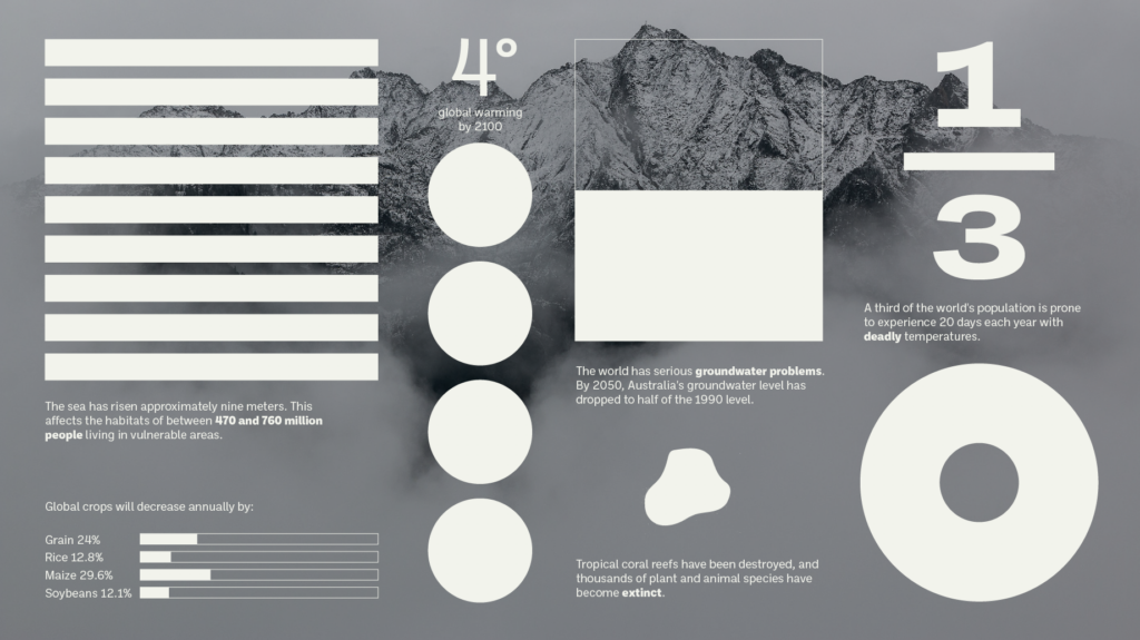
On WWF’s pages I found several topics of interest, like how our pension funds affect the climate as well as more generic information. I was particularly interested in their facts on predicted Climate Change effects based on a special report by IPCC, Global Warming of 1.5 ºC. Drawing upon my lecture reflections on creating virtual realities based on political parties’ visions, I got the idea of connecting climate change to political parties’ emission goals.
Voting sustainably
The next Norwegian election will be in September this year, and so I got the idea of creating a guide that helps the public vote sustainably. I personally think that many Norwegians, particularly young people, struggle to understand politics in a way that lets them vote accurately according to their values, due to the fact that we have a bunch of political parties, which usually comes together in a government. Thus, I believe a guide to voting sustainably could play an important role for those who perhaps haven’t thought about the value of their vote and how it can affect the environment.
MDG (The Norwegian green party)
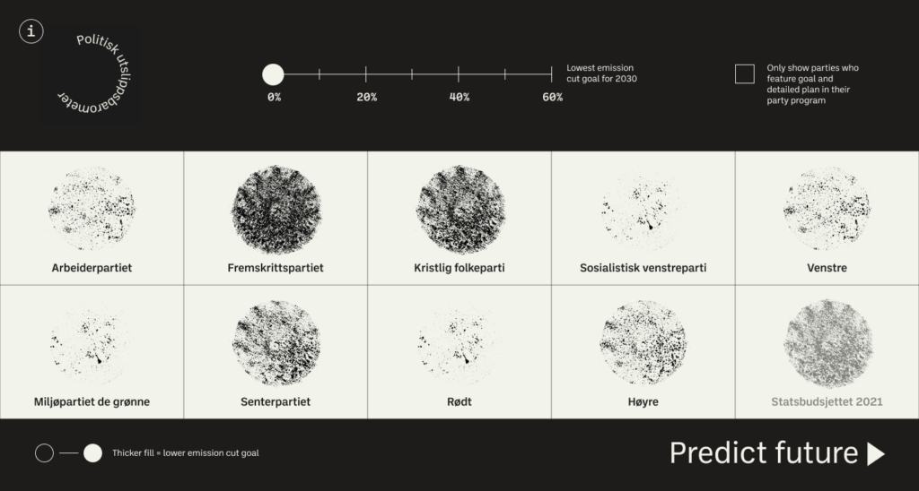
The most environmentally concerned political party in Norway is The Green Party. Online they have posted an alternative state budget for 2021, compared to the state budget that has been created by current government (who consists of right wing parties). This document is an economic and political plan where MDG shows how we could cut emission by 62% (compared to 1990) by 2030, as apposed to the current state budget, which only aims to cut about 20% (Miljøpartiet de grønne, 2021). Although the current state budget is not a political party, I thought it could be informative for the user to have this in order to compare parties’ emission goals.
Finding a common value
If I had more time to analyse data, I think it could have been interesting to create a set of qualifications in order to judge each party’s sustainability score. However, within the one week timeframe, I decided to focus on each party’s emission cut goal, considering almost all parties had featured this on their websites.
Comparing emission cuts to speculative design
Inspired by the use of data to create future scenarios, mentioned in the lecture, I decided to connect the parties’ emission goals to climate change predictions based on data found on WWF and in the IPCC report.
In search of a visual identity
After pinpointing my data focus, I went on to work on the visual part of my design. I decided to make an interactive website, as I wanted the product to be easy accessible for the public, particularly the younger generation who tends to be more environmentally focused. I also wanted to product to be interactive as this would suit the future scenario part aspect.
I am not used to working with neither information design, nor web design, so my process started off quite messy with a combination of sketches and digital experiments.
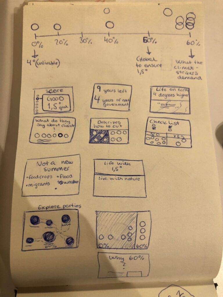
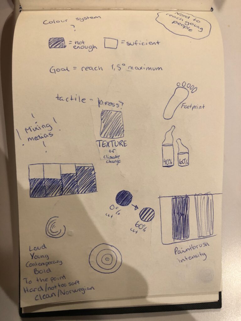
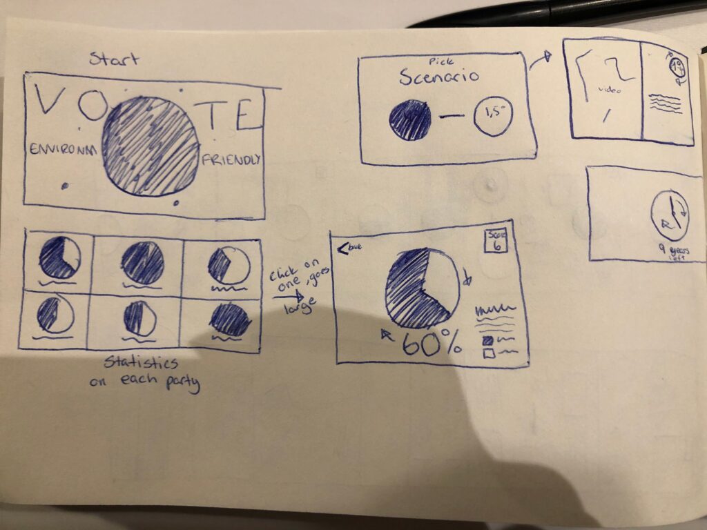
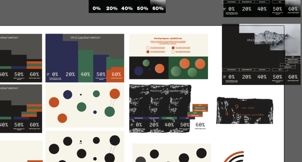
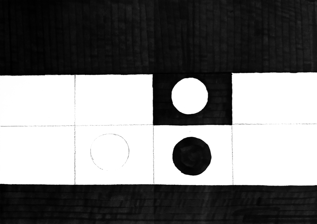
Through sketching I got the idea of a monochromatic design, where light would be associated with “environmentally good” and black with “environmentally bad”. However, through my digital experiments I also started experimenting with the colours of each political party as a way of clarifying which bar belonged to who. At this stage I was feeling quite overwhelmed by data and I wasn’t quite sure how to approach the data visualisation.
Student crit session
This week’s student crit session was very valuable, as it helped me concentrate and clarify my concept. Through the discussions I realised that my project was too big and complicated, which made everything hard to grasp for the user. Heidi suggested that I could create a quiz which would show the user who to vote for, rather than showing a bunch of data that was hard to read. Usha thought it could be interesting to look at magic eight balls and fortune cookies.
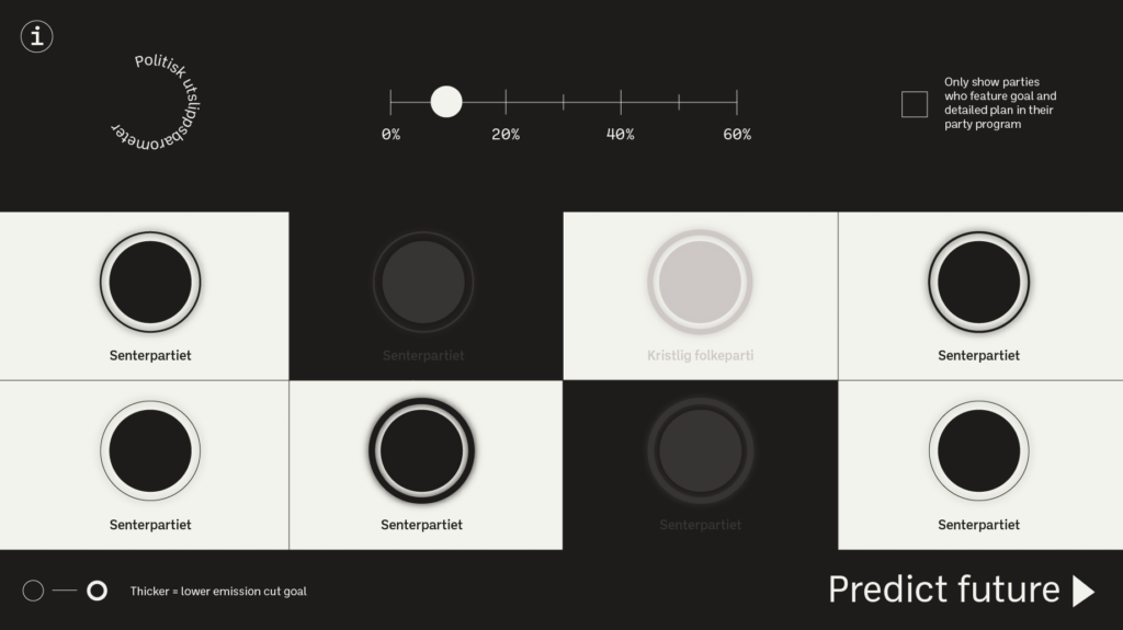
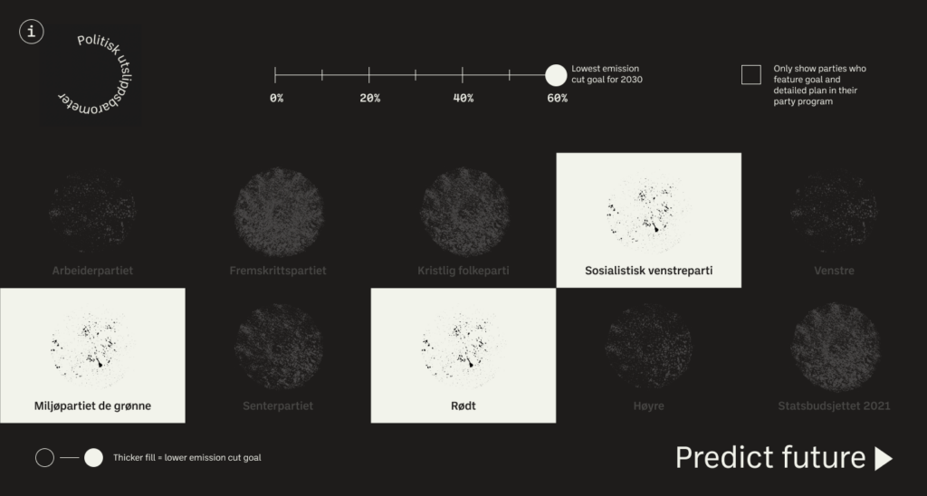
These insights led to me experimenting with a sliding poll which the user could move from percentage to percentage, removing political parties interactively. The user’s choice could at anytime be used to predict the future based on the emission cut percentage. As no one knows for sure what will happen due to climate change, I thought it was a great idea to use the word “predict” when showing data on potential future.
I decided to stick to a monochrome colour palette, so that the user wouldn’t need to consider if the parties are left or right oriented when using the website.
Exploring handmade approaches
As my visual pieces were slowly moving towards a graphic state with little room for images, I started thinking about ways of humanising my design in other ways that with photography (as reflected upon earlier this and last week). Going back to my further research, I decided to experiment with handmade elements which could be part of the digital product.
Painting
I experimented with black, thick paint in order to try and create an oil like texture. Oil is a big part of Norwegian industry and an important topic in terms of the future and climate politics.
Marker
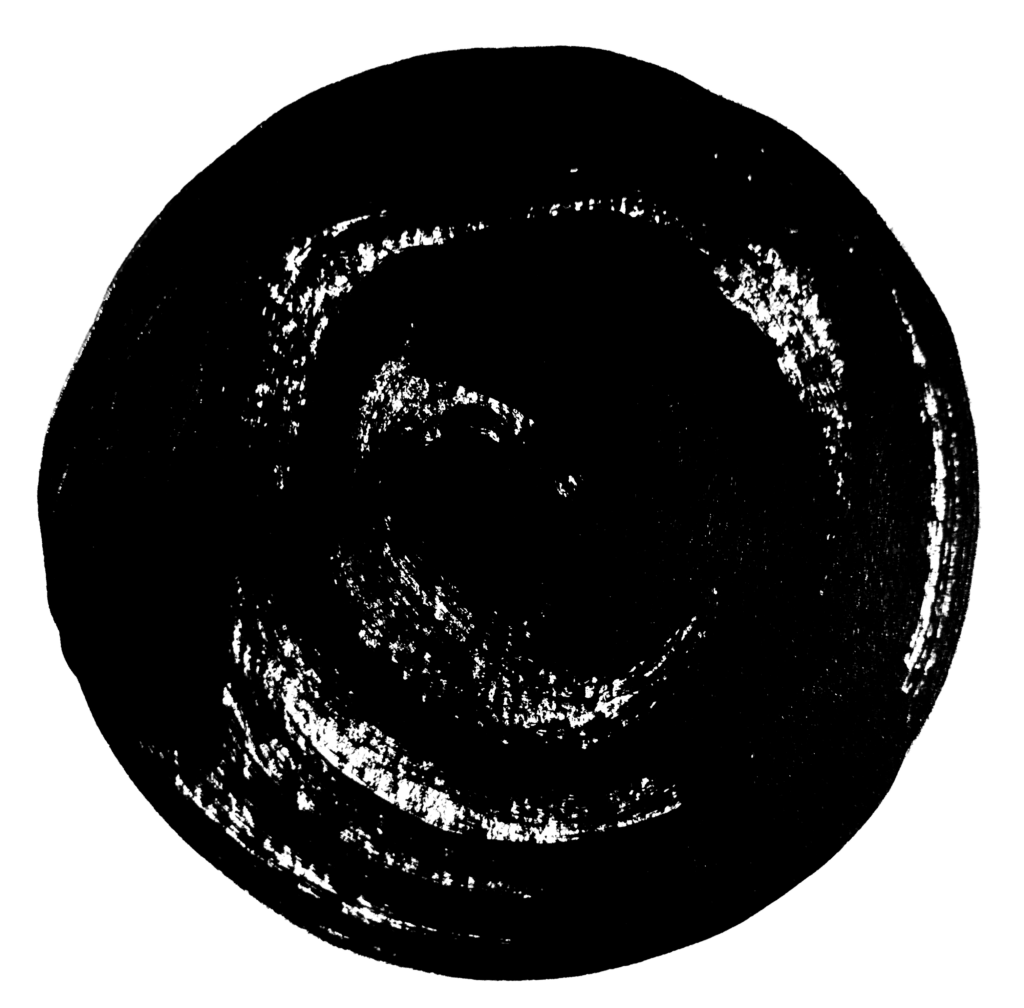
Inspired by W. E. B. Du Bois’s infographics I also wanted to experiment with markers. I thought this could go well with the climate strike aspect of politics.
Sand paper prints
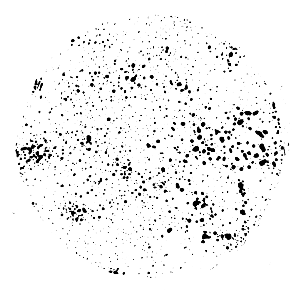
I was keen to find a texture that could represent emissions and carbon gas. Searching the apartment for printing material, I decided to give sandpaper a go. That resulted in a lot of small dots, which I thought could represent sources of emissions going into the atmosphere. Charles also suggested to revisit my coal painting from last week. I thought this was a great idea, but unfortunately I didn’t notice the comment quickly enough.
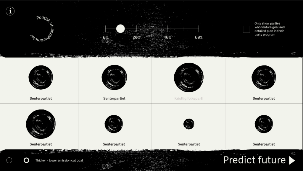
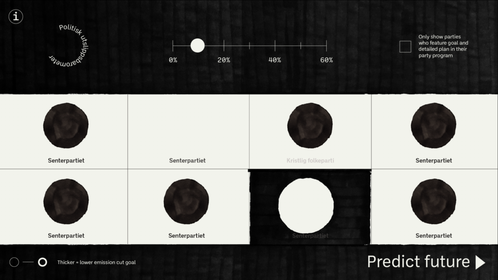
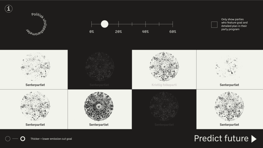
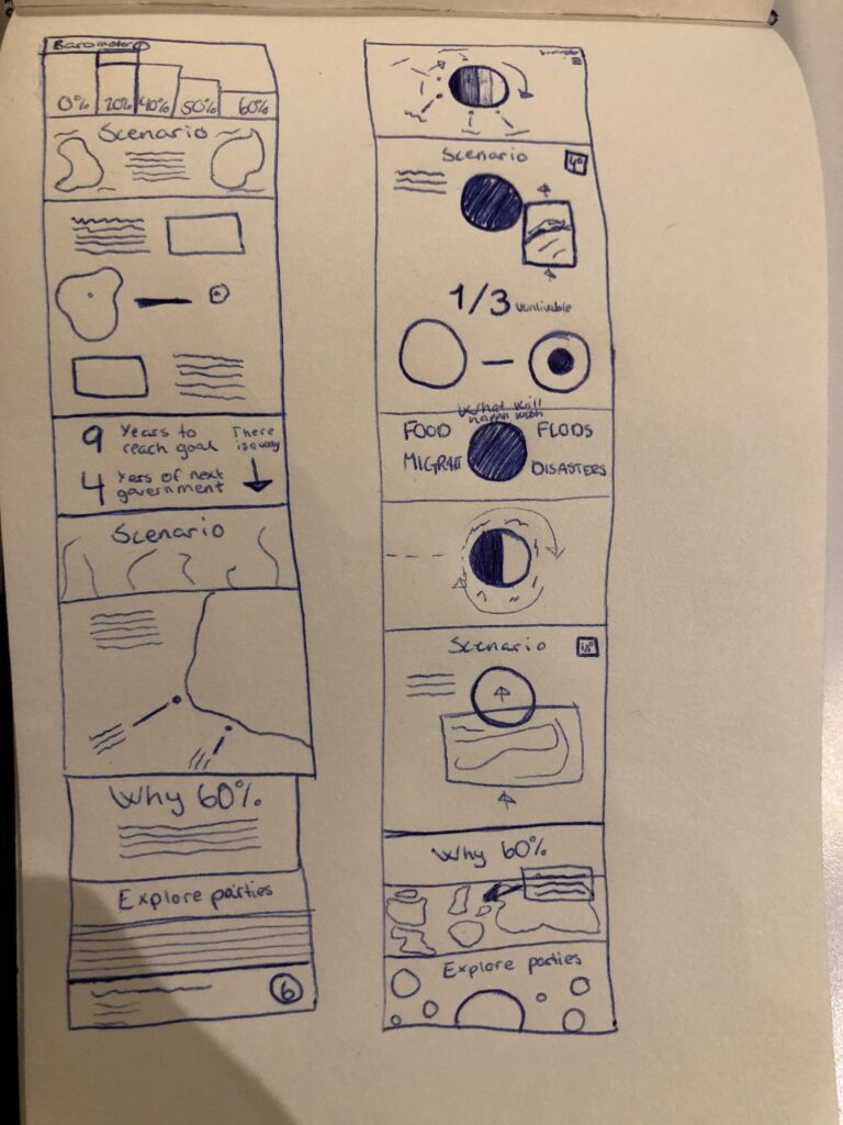
Having done the experiments above, I decided to test them out as part of my design. I landed on the sandpaper emission circles as I thought they would be best to visualise the difference in percentage. After finalising my design, I moved into Figma where I started working on a very simple prototype.
Result
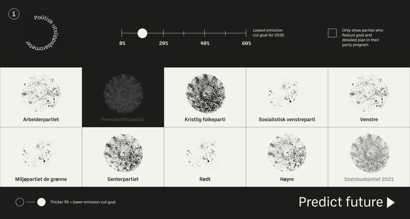
My result for week 4, Political emission barometer, is an interactive website prototype which highlights the Norwegian political parties’ goals for emission cuts by 2030. The service is meant to guide the Norwegian public on voting sustainably. This is the first time I’ve used Figma, but I’ve created a video that shows the idea of the website (please excuse my glitchy mac and the slider which doesn’t really work as I could only figure out how to activate clicks):
The photographs used in this work were collected from websites with a creative commons license, and were not created by me.
The monochrome colour palette is meant to highlight what’s good and bad for the environment (although this could have been explored further in order to come across). The beige colour represents a clean and bright future, the dark grey represents a dark future, but also carbon and oil, which is bad for the environment. In my infographic I’ve used small printed dots to indicate the cut in emissions proposed by political parties.
By attempting to predict the future for every percentage, the website is meant to educate the user on why it is important to vote sustainably. The videos (not featured in the video, so please scroll down to see these pages properly) are meant to provide an organic aspect to the project, adding to the future scenarios presented.
The video used in this work was collected from a website with a creative commons license, and was not created by me.
The video used in this work was collected from a website with a creative commons license, and was not created by me.
Looking back at the week, I wish I would have been able to have more time to explore data. Due to the fact that not all political parties has provided an emission cut goal on their website, I do question the accuracy of my final design. Thus, I would have liked to mark my data better, perhaps by adding small info buttons which could open a pop-up that explained what that specific data is based on.
I also would have liked to work further on the info page in order for the website to make sense to the user’s who might not understand. This also could have been a good place to showcase my references in a clearer way. Further, I would have liked to activate the ticking-box that removes parties that haven’t featured a detailed emission cut plan on their website. Finally, I would have liked to make the website responsive, and perhaps look at ways of making the front page clearer for users who don’t know what the website is.
In conclusion
This week has been a roller coaster. I have felt overwhelmed by data and infographics, and my workshop challenge process has been all over the place. Therefor I am so glad that I got to do this week’s student crit session, as it helped me focus and clarify my project. The result is a (hopefully) easier to grasp design, made to serve the Norwegian public.
An insight that seems to have followed me through these two weeks, is the matter of humanising information design. To me, storytelling is an important part of design, and I think the simplicity of traditional infographics can sometimes lack the human element that often gives a story it’s spark. Through using video and handmade illustrations, I have hopefully managed to give my work an organic side this week. However, I would have liked for it to bee even more human, perhaps by emphasising the environment’s impact on the future of humanity.
Although I think there is room for improvement in terms of user experience, I am quite happy with how my design turned out. To me, the service could potentially play a role to young people in a confusing political scene.
If I find time I would be interested in looking at how one might take the website further. If I was to do so, I would start by looking at how the design could work on mobile, and perhaps if I could make the future scenarios more impactful. I would also dig deeper into the data, perhaps by getting in touch with each political party in order to confirm their percentage, as some of the data is based on news paper stories and other articles.
On a more sentimental note, I this week has shown me the importance of dialogue and collaboration. Looking back, the student crit was a real turn point for my design, and the other students’ feedback was vital for it’s success. My messy process this week has reminded me that design can sometimes feel hopeless mid-assignment, but still turn out well if you push through. As we move forward I will try to remember these important reflections.
REFERENCES:
Arbeiderpartiet (2017) ‘Klima: En rettferdig klimapolitikk’, Arbeiderpartiet. Available at: https://www.arbeiderpartiet.no/politikken/klima/ (Accessed: 18 February 2021).
Christensen, L. (2019) ‘Kutte hjemme eller ute – hva sier partiene?’, Cicero, 21 May. Available at: https://www.cicero.oslo.no/no/posts/klima/hjemme-eller-ute-hva-sier-partiene (Accessed: 18 February 2021).
DiSalvo, C. (2012) Adversarial Design. Cambridge: Mass: MIT Press. Fremskrittspartiet (2017) ‘Klima’, Fremskrittspartiet. Available at: https://www.frp.no/tema/miljo/klima (Accessed: 18 February 2021).
Høyre (2017) ‘Klima og miljø: Høyre vil kutte utslippene, ikke utviklingen’, Høyre. Available at: https://hoyre.no/politikk/var-politikk/klima-og-miljo/ (Accessed: 18 February 2021).
IPCC (2018) Global Warming of 1.5 oC. Special report. IPCC. Available at: https://www.ipcc.ch/sr15/ (Accessed: 18 February 2021). Kristlig folkeparti (2017) ‘Klimautslipp’, Kristlig folkeparti. Available at: https://krf.no/politikk/klima-og-miljo/klimautslipp/ (Accessed: 18 February 2021).
Miler, C. (2018) ‘Nicer Tuesdays: Offshore Studio’, 12 June. Available at: https://www.youtube.com/watch?v=9uxcQmQlCS8&ab_channel=It%27sNiceThat (Accessed: 13 February 2021).
Miljøpartiet de grønne (2017) ‘Klima’, Miljøpartiet de grønne. Available at: https://www.mdg.no/klima (Accessed: 18 February 2021).
Miljøpartiet de grønne (2021) ‘Alternativt Statsbudsjett 2021’. Miljøpartiet de grønne. Available at: https://d3n8a8pro7vhmx.cloudfront.net/mdg/pages/1938/attachments/original/1605609260/Alternativt_statsbudsjett_2021.pdf?1605609260 (Accessed: 14 February 2021).
NTB (2021) ‘Rødt vil kutte utslippene med 60 prosent’, Dagbladet [online], 11 February. Available at: https://www.dagbladet.no/nyheter/rodt-vil-kutte-utslippene-med-60-prosent/73396222 (Accessed: 18 February 2021).
Pochodzaj, J. (2021) ‘Projecting a New Perspective’. Canvas Falmouth Flexible [online], 12 February.
Sosialistisk venstreparti (2017) ‘Klimakutt’, Sosialistisk venstreparti. Available at: https://www.sv.no/sv-fra-a-til-a/klimakutt/ (Accessed: 18 February 2021).
Sunniva Kvamsdal Sveen and Ida Jørgensesn Thinn (2019) ‘Partiene svarer: Hva skal være Norges klimamål?’, FN-sambandet: Nyheter, 24 September. Available at: https://www.fn.no/Nyheter/Partiene-svarer-Hva-skal-vaere-Norges-klimamaal (Accessed: 18 February 2021).
de Vasconcelos, L. (2021) Judging by the cover. Available at: http://judgingbythecover.com/ (Accessed: 17 February 2021).
WWF Norge (2019) ‘Klimaendringer’, WWF Norge. Available at: https://www.wwf.no/klima-og-energi/klimaendringer (Accessed: 18 February 2021).
LIST OF FIGURES:
Figure 1. Banu CENNETOGULI. 2018. The List. Liverpool Biennial [online]. Available at: https://www.biennial.com/2018/exhibition/artists/banu-cennetoglu
Figure 2. SUPER FLUX. 2019. Mitigation of Shock II (Singapore). Super Flux [online]. Available at: https://superflux.in/index.php/work/mitigation-of-shock-singapore/#
Figure 3. OFFSHORE STUDIO. 2019. MIGRANT JOURNAL 1—6 COMPLETE COLLECTION. Migrant Journal [online]. Available at: https://migrantjournal.com/products/subscriptions
Figure 4. Leonardo DE VASCENCELOS. 1904. Judging by the cover. Judging by the cover [online]. Available at: http://judgingbythecover.com/
Figure 5. W. E. B. Du BOIS. Ca. 1880-1900. Proportion of Freemen and Slaves Among American Negroes. It’s Nice That [online]. Available at: https://www.itsnicethat.com/articles/w-e-b-du-bois-charting-black-lives-house-of-illustration-131119
Figure 6. Michael KIDNER. 1960-1964. Le Repas Frugal. Tate [online]. Available at: http://www.tate.org.uk/art/work/T07785
Figure 7. Anwar Jalal SHEMZA. 1963. Composition in Red and Green, Squares and Circles. Tate [online]. Available at: http://www.tate.org.uk/art/work/T14768
Figure 8. Michael ROTTENSTEIN. 1963. In Between. Tate [online]. Available at: https://www.tate.org.uk/art/artworks/rothenstein-in-between-t00889
Figure 9. Aldo TAMBELLINI. 1965-1968. Cell Series. Tate [online]. Available at: https://www.tate.org.uk/visit/tate-modern/display/media-networks/aldo-tambellini
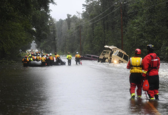
Figure 10. RJ SANGOSTI. Ca. 2010-2020. Flood. WWF Norge [online]. Available at: https://www.wwf.no/klima-og-energi/klimaendringer
Figure 11: Ingrid REIGSTAD. 2021. Infographic experiment. Private collection: Ingrid Reigstad.
Figure 12-13: Ingrid REIGSTAD. 2021. Interface experiment. Private collection: Ingrid Reigstad.
Figure 14-16: Ingrid REIGSTAD. 2021. Hand made circles. Private collection: Ingrid Reigstad.
Figure 17-18: Ingrid REIGSTAD. 2021. Hand made circle interfaces. Private collection: Ingrid Reigstad.
Figure 19: Ingrid REIGSTAD. 2021. Political emission barometer prototype. Private collection: Ingrid Reigstad.
Figure 20-21: Ingrid REIGSTAD. 2021. Political emission barometer prototype. Private collection: Ingrid Reigstad.
Figure 22: Ingrid REIGSTAD. 2021. Political emission barometer prototype. Private collection: Ingrid Reigstad.
Figure 23: Ingrid REIGSTAD. 2021. Political emission barometer prototype. Private collection: Ingrid Reigstad.