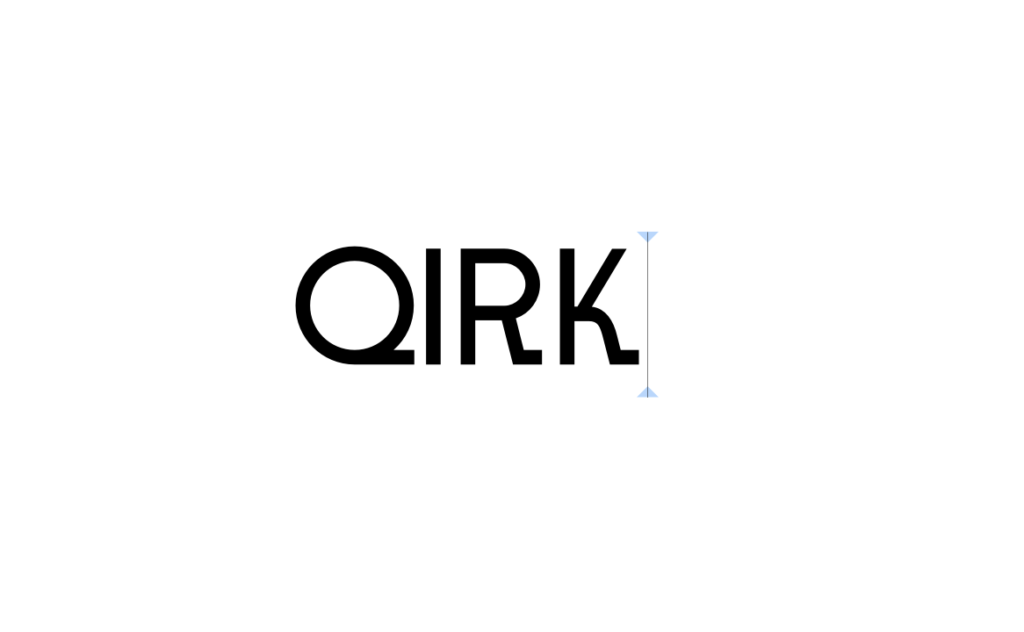
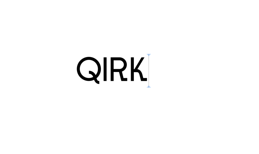
Lecture notes
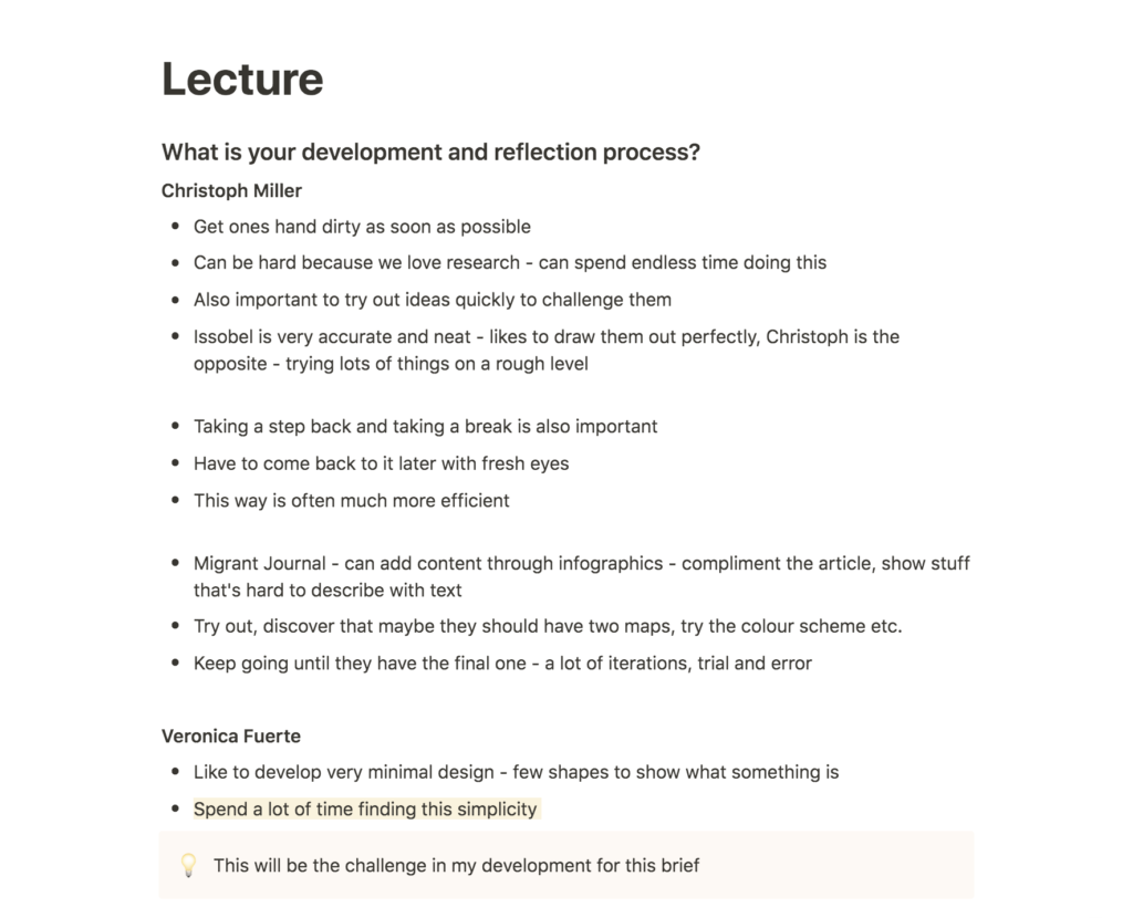
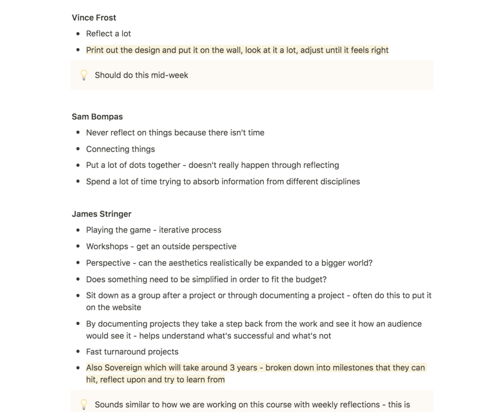
Lecture reflection
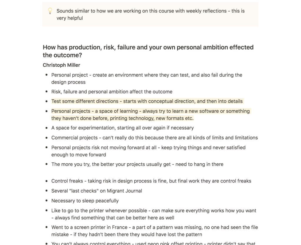
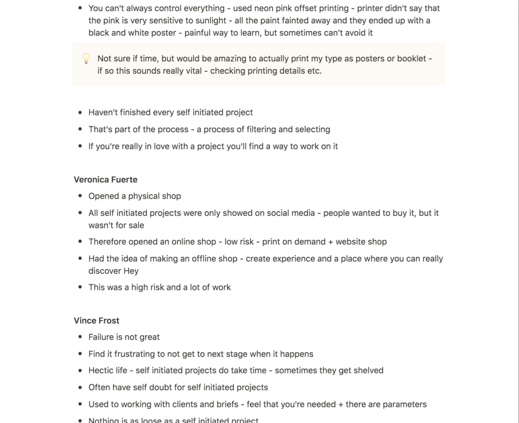
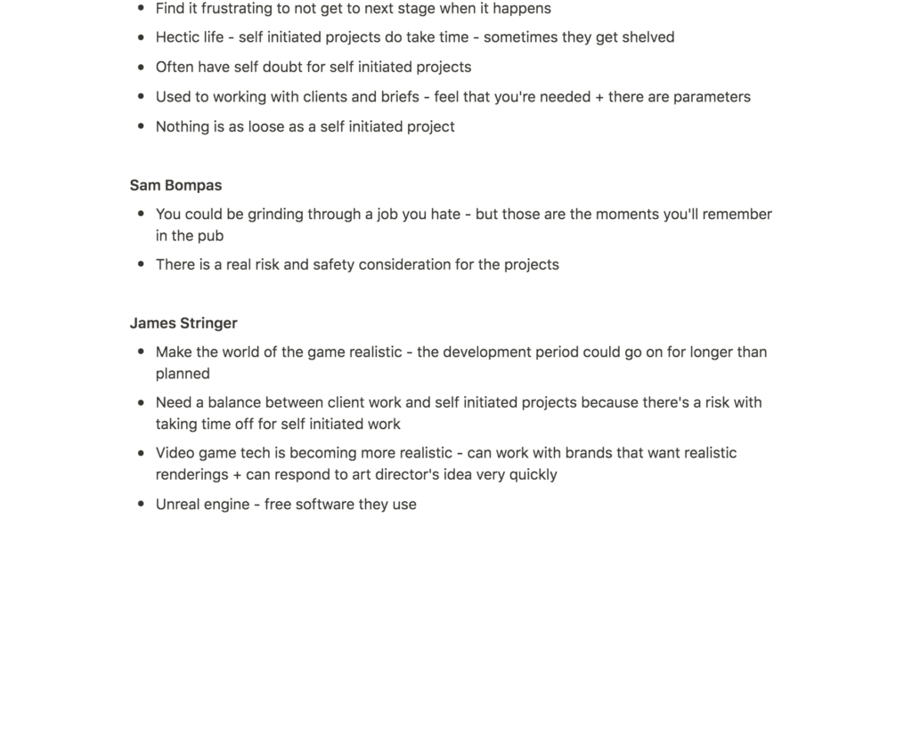
In relation to my self-initiated project, Fuerte’s process of spending time to find simplicity was interesting (Christoph Miller et al., 2021). The nature of my project makes the development process somewhat limiting, as I have already established that I will be making a modular typeface, made up of a specific amount of shapes. I will therefore have to spend time working on simplicity, by finding the right combination of shapes and compositions.
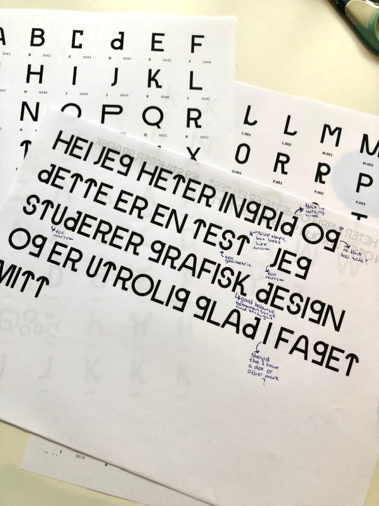
During the development process, I also think it would be helpful to use Frost’s method of printing the design, in order to look at it a lot and adjust it (Christoph Miller et al., 2021).
Miller discussed how Offshore tries to learn new techniques or software when working on self-initiated projects (Christoph Miller et al., 2021). With my project I’m already trying to learn about typography, however I was intrigued by Miller’s discussion on printing techniques. I have almost never worked with print, and I therefore think this project could be a good excuse to do so. If I have time I might consider making a set of posters, or perhaps a booklet, using my typeface.
Resource notes
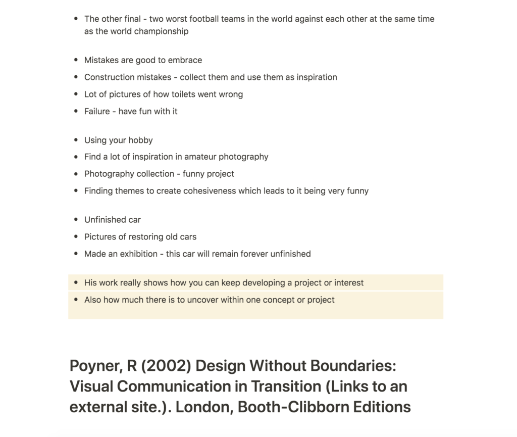
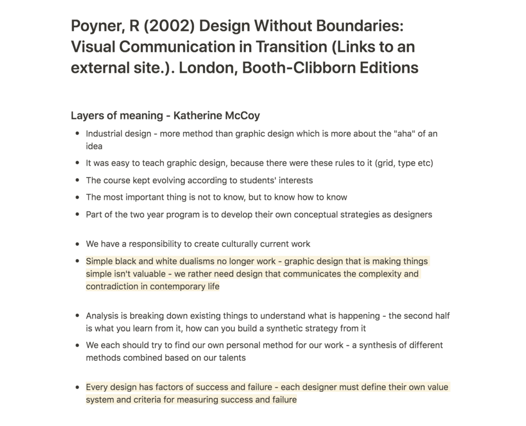
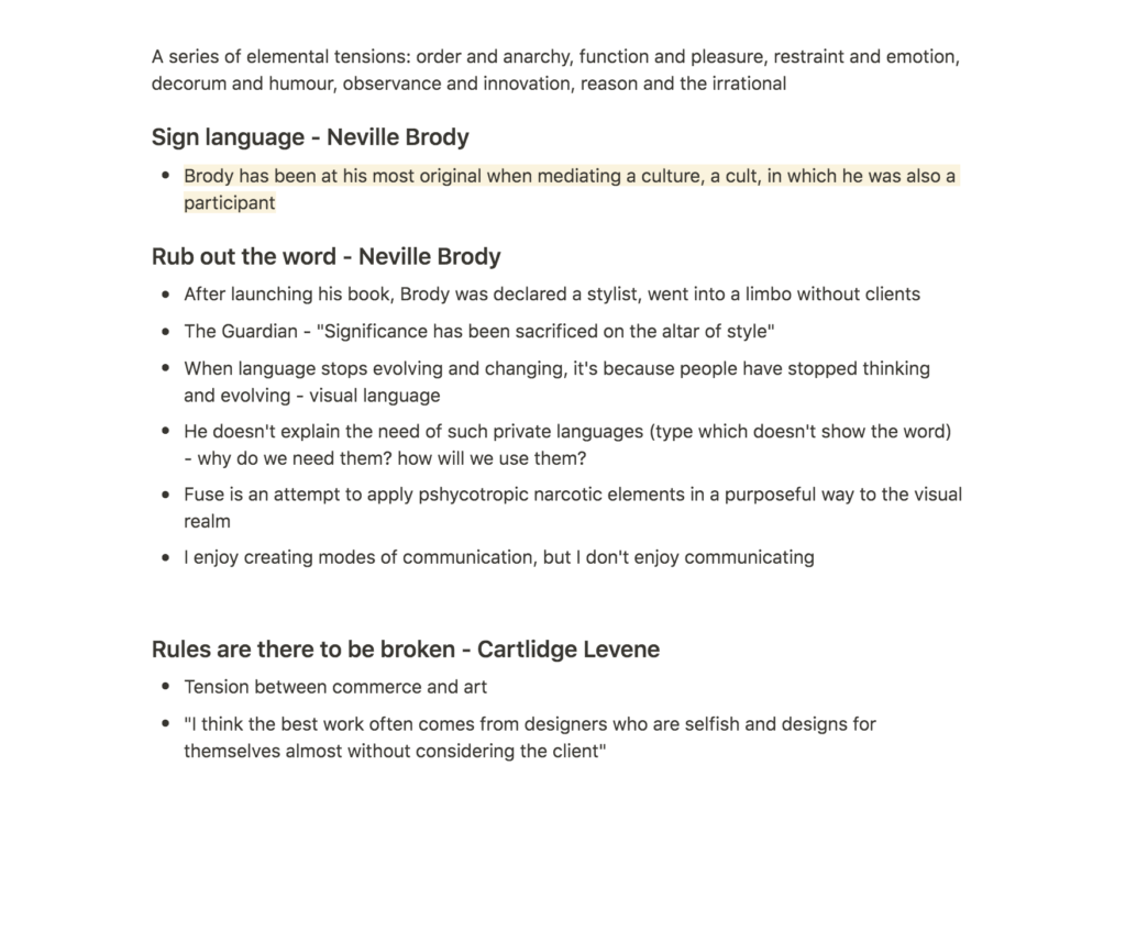
Resource reflection
Erik Kessels on the power of failure
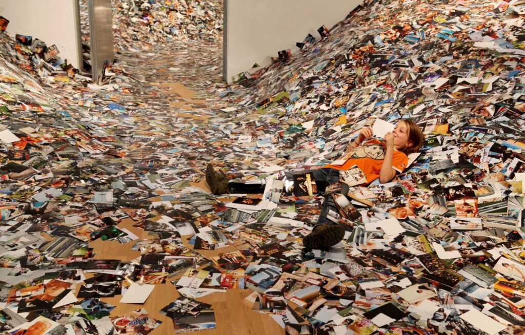
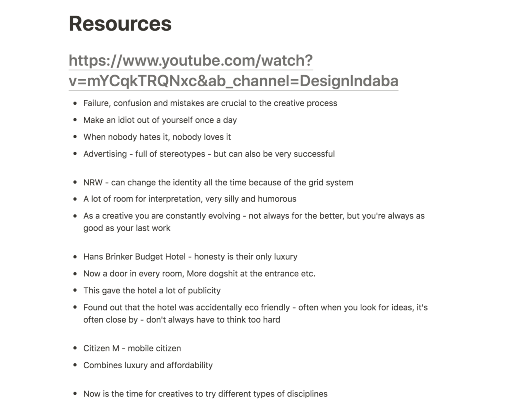
Kessels’ advertising work wasn’t exactly my humour, but I really did enjoy his photography projects. The cohesiveness of truly absurd themes was very funny, and I could easily see why he’s obsessed with collecting amateur photographs. I also think there were a sense of sadness to most of the photography collections, and the balance between this and humour was very unique and interesting.
Kessel’s projects truly showed how one can keep developing a project forever. He somehow manages to uncover so much from so little, which is great when looking at self-initiated projects, as they can potentially become life long projects.
Design Without Boundaries: Visual Communication in Transition
Although slightly confusing at times, the interview with Katherine McCoy was a fascinating read. I particularly liked her opinion on dualism and how graphic design should communicate complexity rather than portraying a theme as black and white (Rick Poyner, 2002). I’ve often been led to believe that graphic design should be clear, and I suppose it should be in some cases, for example when working with advertising. However, the projects I personally enjoy working on are those with more complex and undefined concepts, where you can’t necisarnaly understand the full concept as a spectator (that is without reading about the concept).
I personally enjoy the process of written reflection and how this can affect a design. However, the commerce nature of graphic design might make one question the value of meaning and reflection that isn’t communicated to the spectator. When looking at my final design for this brief, people are not likely to read the concept I have developed for the typeface. However, without the concept, the typeface wouldn’t have turned out the way it is about to do. I do wonder wether there is space for conceptual complexity in commerce design, and if so, is there a need to communicate it to users, or can conceptual complexity simply provide value in the shape of design development.
Further research
Will Mower: Alpha-set
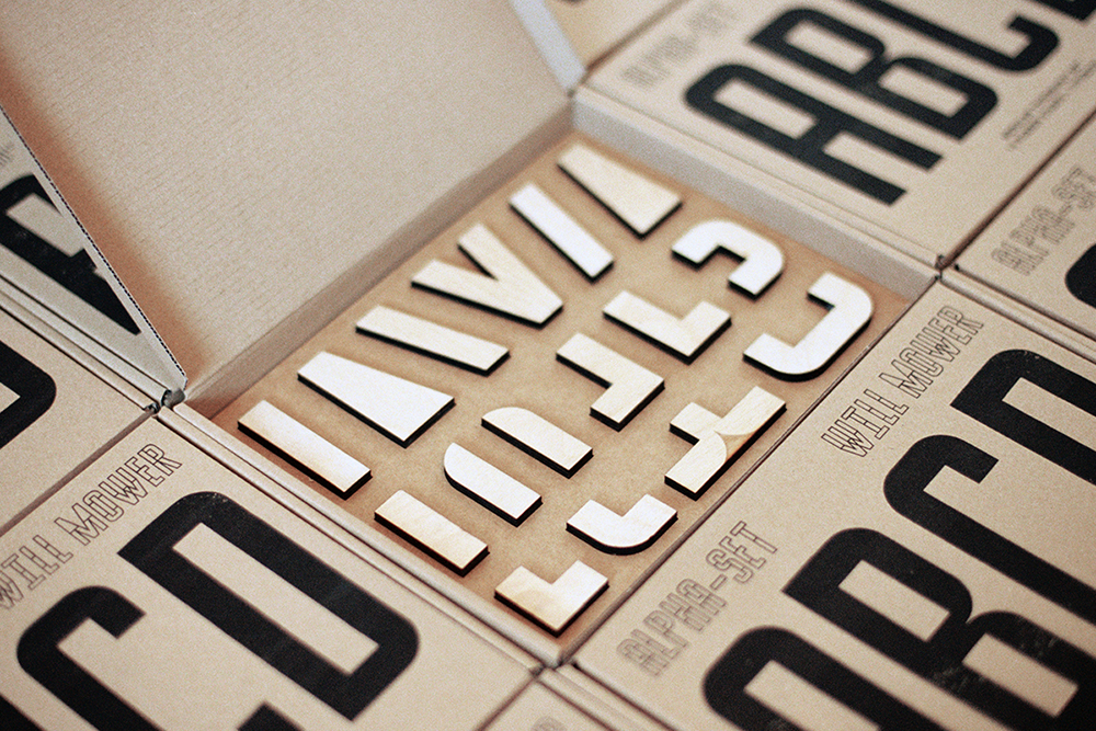
After posting on the ideas wall I was sent the project above as a reference as I’m working with a modular typeface. The Alpha-set by Will Mower is a tactile and play-encouraging typography kit which lets the user print modular letters using physical components as stamps.
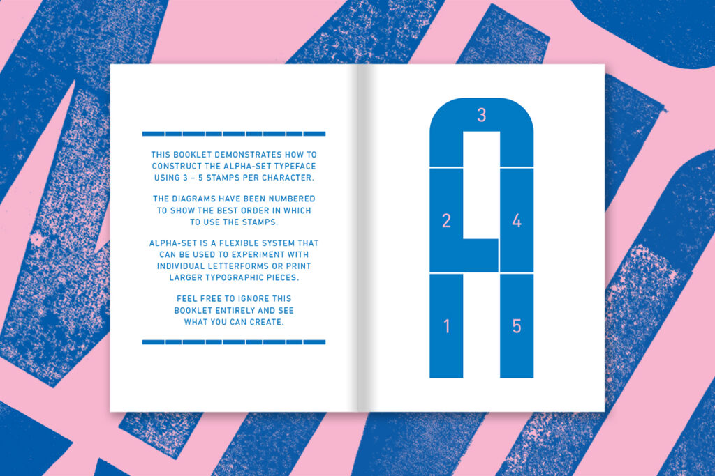
What I like most about this project is the booklet that comes with the type-kit. Since the users will be compiling the letters themselves, the book seems very handy as they might not know how to do that. In relation to my own typeface (which I’m planning on making available to the public as components), I will have to take user experience into account. Although mine will be compiled digitally, I assume users will need information similar to the booklet (although less rigid because the users will be encouraged to compile their own unique shapes).
The task of the translator
Ben advised me to have a look at Walter Benjamin’s Task of the Translator, in order to understand how one can translate something into graphic design. This was an enlightening read, which contextualised a lot of my process and reflections from week 1 and 2.
I particularly liked Benjamin’s discussion on finding the intention of the original, and how the original and the translation should have this in common (Walter Benjamin, 1923). I was also interested in the notion of emotional connotations in words, and how a word-for-word translation rejects reproduction of meaning (Walter Benjamin, 1923). In relation to my project, I interpret this as meaning that simply translating shapes from furniture to graphic design would not be optimal. Rather the intention of the furniture should be adopted (as I have attempted to do by adopting the democratic and multi-functional aspects of the Scandinavian design movement).
Workshop challenge
I started the workshop challenge off with a tutorial with Harriet as I felt unsure about the next stages of my project. After discussing with her, I realised that the next step was simply to keep developing my typeface in Glyphs by building more letterforms.
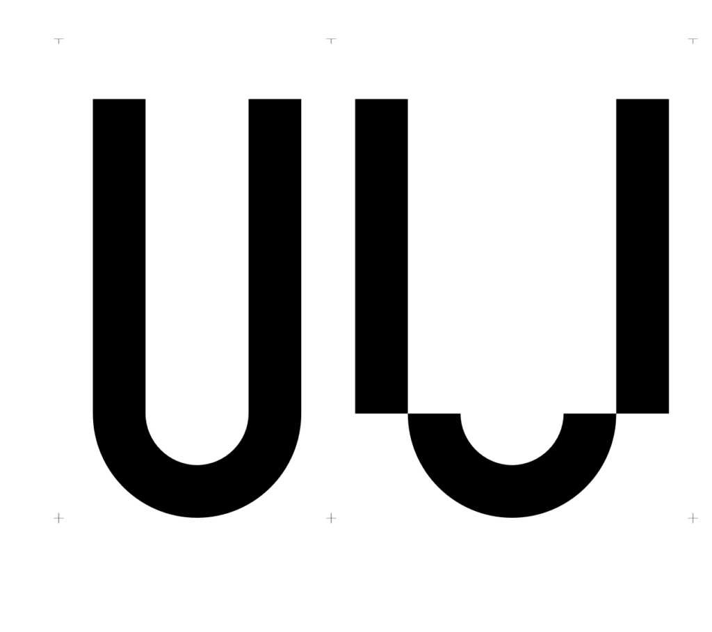
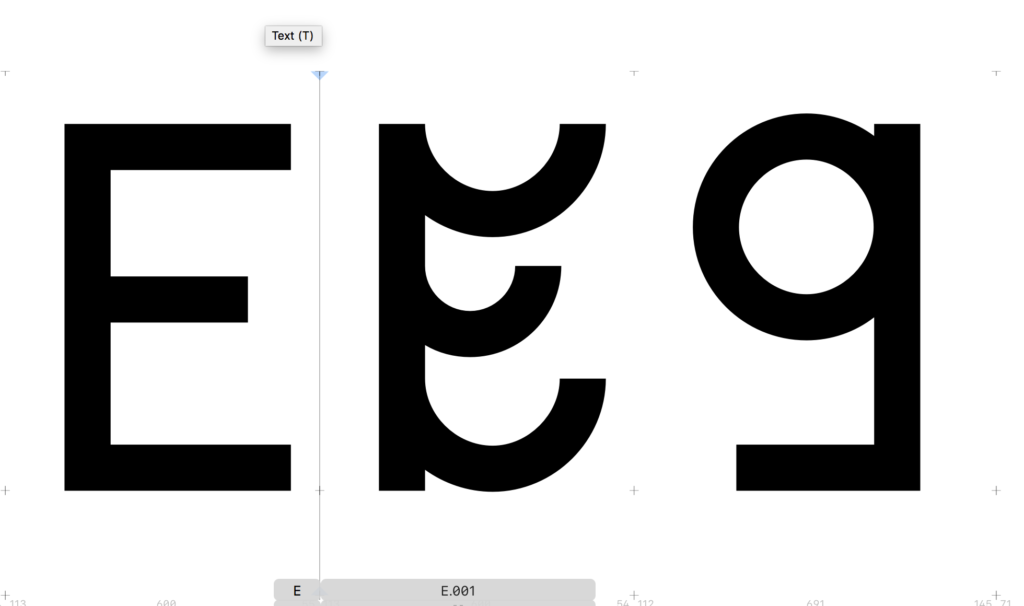
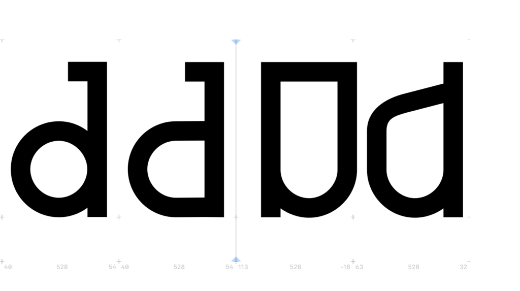
Last week I concluded that I was happy with the direction of my typeface, but that I needed to make a decision on what components to use and wether I needed to add or delete some of them. I therefore started this week’s challenge by establishing to myself which I was “allowed” to use. These letters should not be rotated or re-seized. Having these set rules was great as it made me experiment further with strange combinations, which helped me create unique letterforms.
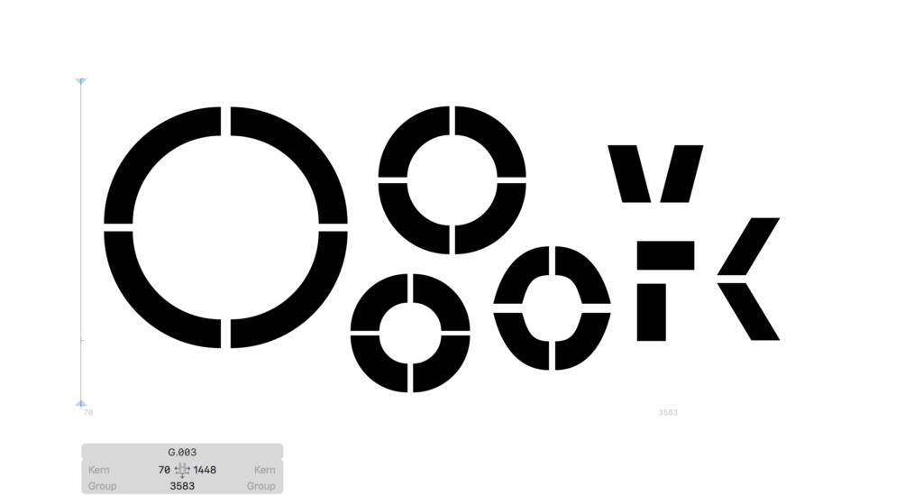
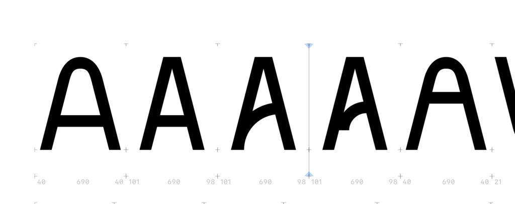
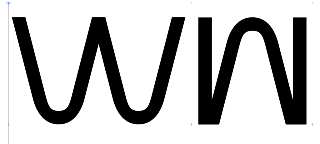
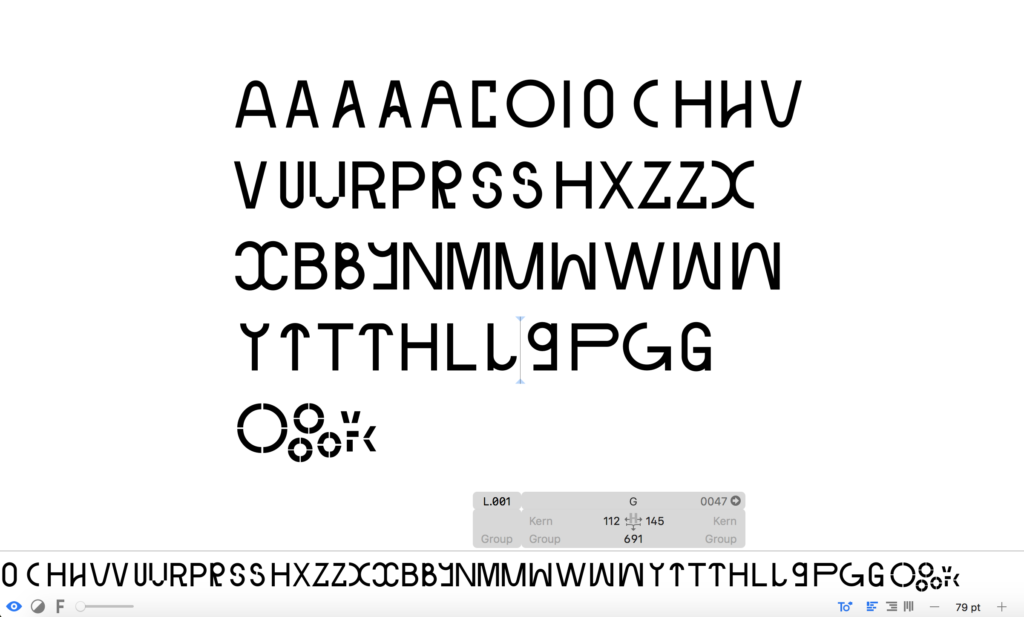
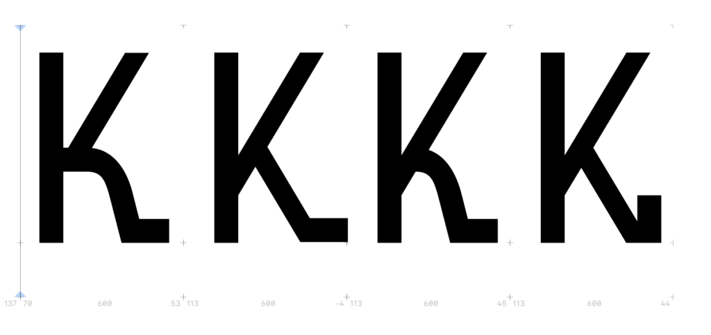
After establishing my component rules, I went on to develop the missing letters. I tried to come up with several options for each letter, in order to experiment and make sure that I found the best combinations.
At this stage I didn’t follow my sketches and images of vintage furniture. However, I did try to communicate the spirit and established characteristics that I decided on last week (modular, geometric, tilted strokes, asymmetry, interesting combinations of curves and lines).
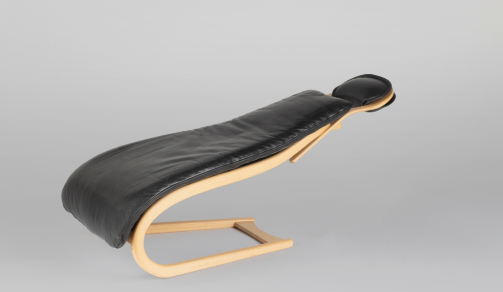
From the letters I created last week, I quite liked the more strange ones as these reminded me of the obscure furniture references from week 1. The chair below for example, is very strange, and I wanted to capture this uniqueness in my letters.
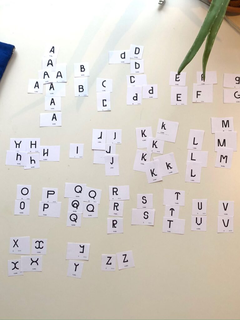
Having created at least two options for each letter, I went on to print a few sentences, as well as all individual letters. This let me analyse how the letters worked together, but more importantly it let me edit out options that didn’t work with the typeface’s overall characteristics.
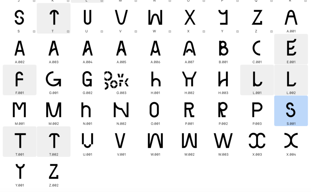
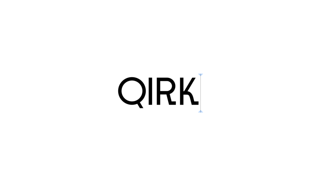
Whilst editing physically, I also tested options for each letter in Glyphs:
Some options were discarded, whilst others were either made main glyph or kept as an alternate glyph. At this point I had the following letters as my main characters:
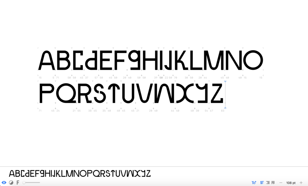
Rephrasing my research question
Since I don’t have much experience with research questions, I asked Ben for advice on wether my question from the initial week 1 brief could be adopted in any way. He advised that I should remove all vagueness, and be specific in my language. For example, he mentioned that vintage is a vague term, and that I could make the question more specific by sticking to a certain time period.
The research question I wrote in week 1 was How can Norwegian vintage furniture design influence the creation of a modern typeface? In my head I had already interpreted the vintage furniture term as furniture from the 1950s–1980s, and so I decided to stick to this as it worked with my research. However, I didn’t want to discard the second-hand aspect of vintage since my concept depends on the act of buying used furniture. I therefore rephrased the question to How can Norwegian second-hand furniture created between the 1950s to the 1980s influence the creation of a modern typeface?
Ben had also question the word modern as this is also a vague term. Having refined my concept since week 1 I was now mainly looking at the current/future socio-political landscape (circular economy and dealing with the climate crisis) as a contrast to the socio-political landscape during the emergence of the Scandinavian design movement (when functional furniture was made affordable to everyone as a result of the democratic socialism that emerged after WW2). I decided to rephrase my question to How can typography comment on Norwegian second-hand furniture from the 1950s–1980s seen in the context of today’s socio-political landscape?
OHNO Type School
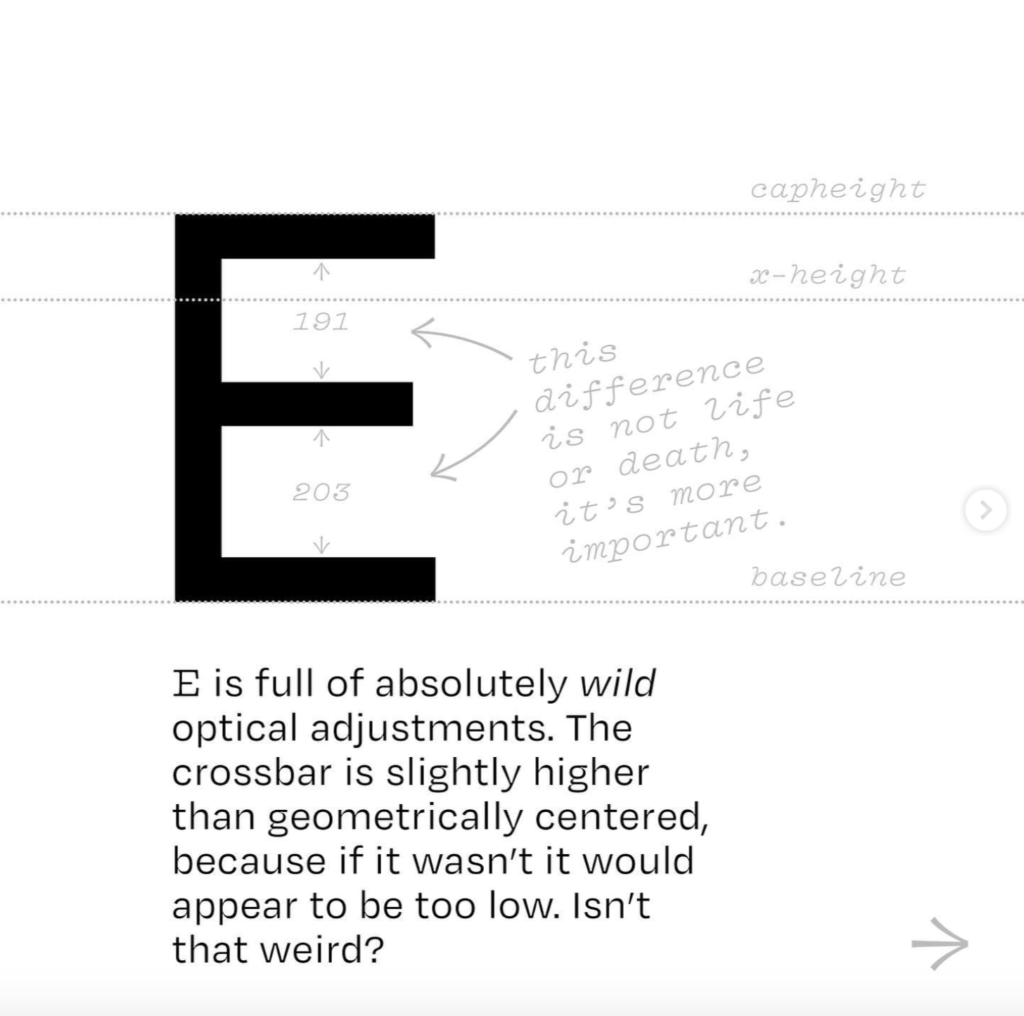
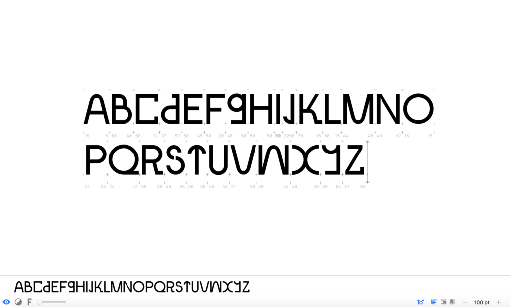
During our first module, I discovered OHNO Type Co’s #ohnotypeschool on instagram, a series of instagram posts explaining type principles for each letter of the latin alphabet. In order to refine my letters further, I decided to go through each letter from the series, and to alter the ones I could. Since my typeface is modular, there were many principles I couldn’t adopt as I had to stick to the components. After refining some letters, I was left with the following design:
Final result
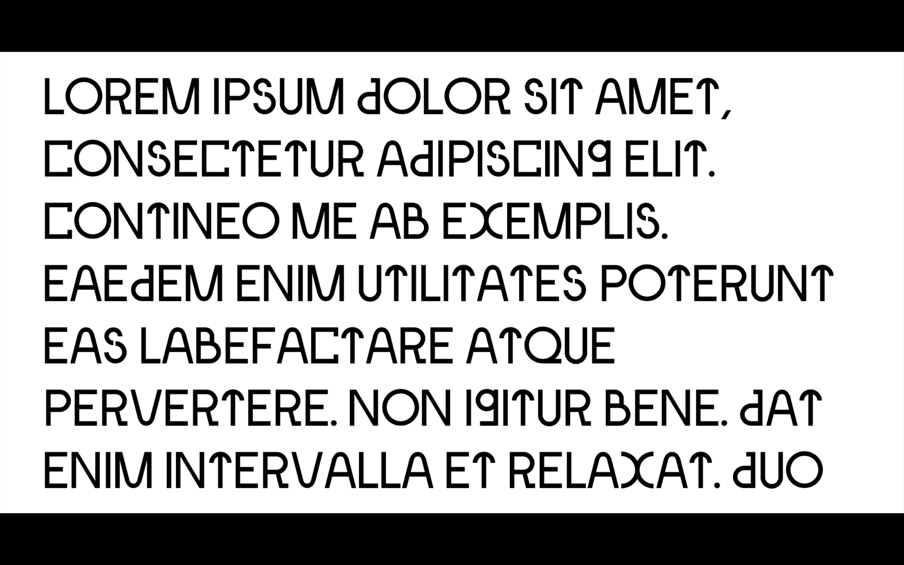
As mentioned in my brief from week 1, the intention of this project is not to create a finished typeface, but rather the beginning of a self-initiated project that I can keep refining in my spare time. This week I have developed this sort of project, by creating initial options for all capital letters of Modul.
In my week 1 brief I discus how the typeface should encourage and comment on today’s socio-political landscape, referring to the concept of circularity. I have attempted to do so by 1: using old objects (second-hand furniture) as a foundation for something new (typeface) and 2; using the sustainable design principle of multi-functionality (open-source modular typeface). The typeface itself also encourages circularity as users will be able to use the components to create new letterforms. This notion of user availability also refers to the democratic aspect of democratic socialism, of which arising the Scandinavian design movement emerged from.
In my brief I aslo mention that the typeface should be inspired by the Scandinavian furniture design from 1950s–1980s. Going back to Benjamin’s Task of the Translator, I have attempted to develop a typeface that communicates the same intention as the original (the furniture design). By analysing furniture references, I have attempted to adopt intentions such as modularity, functionality and asymmetric aesthetics, but also the political aspect of mass availability with the concept of user compiling.
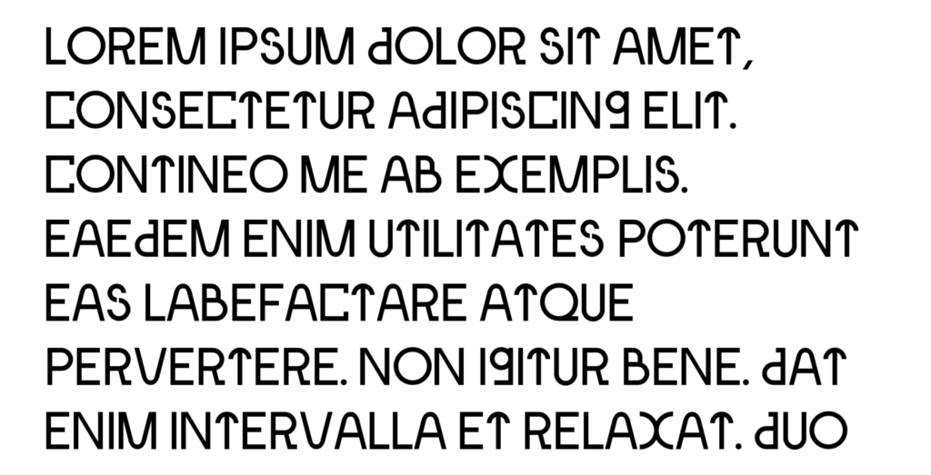
Going in to next week I hope to find the time for further development. I’d like to work further on the widths of the diagonals, as they should ideally be wider than the vertical strokes. However, if I was to do so, I’d need to also make sure that they can be intersected with all other components. Further, the large circle components should be adjusted, as Os are usually not made using perfect geometric circles – this would help the overall look of the typeface, as the Os are currently taking up too much negative space. If I was do make this adjustment, I’d have to consider cohesiveness, but also the intersection issue.
In order to create a working typeface, I’ll also have to do the spacing, which I haven’t started. I’d also like to develop visuals for the typeface (e.g. posters or a booklet), as well as a prototype for the website where users can compile their own letterforms.
In conclusion
This week has really been about development and refinement, and I have enjoyed taking the time to sit and design, almost meditatively. Although my typeface has a concept and follows a brief, the act of building letters seems to come from instinct and experimentation, and thus the beginning of my week was very enjoyable. This notion of instinct also came into play when I printed my letters and started to edit the selection of letterforms. At this point, there was a question of deciding what worked and what didn’t work visually, which I also did using my instinct.
The #ohnotypeschool was a great tool for working on refinement as it gave me a set of rules – a nice contrast to the previous instinctive development stage. By learning about each letter’s construction I began to understand the concept of negative space, and how this should be balanced in order to avoid large pockets of air in text. This observation made me realise that my Os are currently too wide, and hopefully I’ll get the time to alter this next week.
If I had more time I would have loved to do more prints of my letters, preferably in varied sizes, in order to refine further. I also would have liked to experiment further with letter constructions, and perhaps to test the typeface on my target audience. As we move on to next week I hope to find the time for further iteration, spacing, development of posters/booklets and a website prototype. It would also be helpful to test the latter with my audience, as the website will require good user experience.
REFERENCES:
Christoph Miller et al. (2021) ‘Lecture’. Canvas Falmouth Flexible [online], 1 October.
Erik Kessels (2016) Erik Kessels on the power of failure. Available at: https://www.youtube.com/watch?v=mYCqkTRQNxc&ab_channel=DesignIndaba (Accessed: 4 October 2021).
Rick Poyner (2002) Design Without Boundaries: Visual Communication in Transition. London: Booth-Clibborn Editions.
Walter Benjamin (1923) ‘The Translator’s Task’. Illuminations. Available at: https://core.ac.uk/download/pdf/59325864.pdf (Accessed: 6 October 2021).
LIST OF FIGURES:
Figure 1. Erik KESSELS. 2011. 24 hours in photos. Erik Kessels [online]. Available at: https://www.erikkessels.com/w40ip1hkb3e7a7huaj7mj7lbowscnc
Figure 2. Will MOWER. 2020. Alpha-set. Will Mower [online]. Available at: https://www.willmower.com/alphaset.html
Figure 3. Will MOWER. 2020. Alpha-set. Will Mower [online]. Available at: https://www.willmower.com/alphaset.html
Figure 4: Ingrid REIGSTAD. 2021. Modul components. Private collection: Ingrid Reigstad.
Figure 5-12: Ingrid REIGSTAD. 2021. Modul process. Private collection: Ingrid Reigstad.
Figure 13. Tone GRIMSRUD. 1983. Frontal 2. Digitalt Museum [online]. Available at: https://digitaltmuseum.no/021068556580/frontal-2-hvilestol
Figure 14-15: Ingrid REIGSTAD. 2021. Modul review. Private collection: Ingrid Reigstad.
Figure 16-18: Ingrid REIGSTAD. 2021. Modul process. Private collection: Ingrid Reigstad.
Figure 19: Ingrid REIGSTAD. 2021. Modul process. Private collection: Ingrid Reigstad.
Figure 20. OH NO TYPE CO. 2020. #ohnotypeschool E. Instagram [online]. Available at: https://www.instagram.com/p/CAVch0XBCDL/
Figure 21: Ingrid REIGSTAD. 2021. Modul process. Private collection: Ingrid Reigstad.
Figure 22: Ingrid REIGSTAD. 2021. Modul process. Private collection: Ingrid Reigstad.
