Lecture notes
Lecture reflections
This week’s lecture was very informative, as I haven’t really thought about the possibility of being accused of copying other people’s work, even though the copy would be coincidental. Thus, Poulter and Mayner’s discussions on documenting your process and email conversations were great advice (Alec Dudson, Kevin Poulter, and Jonathan Mayner, 2021).
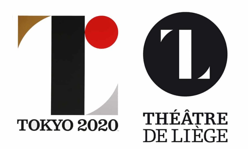
Fig. 2: Debie 2013. Théâtre de Liege design. [logo design]
How do we protect ourselves from public shaming?
Yet, even if you document your process, there doesn’t really seem to be a way of securing yourself from public shaming (Alec Dudson, Kevin Poulter, and Jonathan Mayner, 2021). Hearing about the Tokyo Olympics logo made me wonder what happened to the designer of it, and if the shaming ever caused him to loose work.
In the same way as fake news, you can’t trust social media to depict the full truth, particularly with something as complicated as copyright. However, social media still have the power to convince a large group of people. Thus, I wonder how we as designers can protect ourselves, beyond structured documentation.
Resource notes
Resource reflections
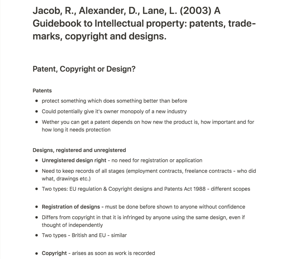
A guidebook to intellectual property
A guidebook to intellectual property was a great resource in terms of understanding the difference between copyright, registered rights and patents. I was particularly surprised to learn that copyright belongs to the commissioner when he pays to have work done (Robin Jabob, Daniel Alexander, and Matthew Fisher, 2003). Does this mean that, if I was paid to present three potential concepts for a logo to a client, the client would automatically get ownership to all three?
This seems unfair to me, and I would be interested to find out if other designers puts anything in their contracts which lets them retain the copyright or not.
Tokyo Olympics Logo embroiled in Plagiarism Row
I was intrigued by Graphic design writer, Armin Vit’s point of the fact that a simple logo with basic geometric shapes is bound to have similarities to other logos (Rob Alderson, 2015). This made me wonder if there is really such a thing as 100% originality?
Convention vs copy
As designers we draw inspiration from a variety of sources, and as we are all living in the same world, we are bound to come up with similar ideas and visuals. When developing branding work, designers will also have to adapt their work to current market tendencies, wether they choose to follow the current trends or not. In book design for example, you can expect to find a variety of examples where the title has been centre aligned and set in a serif typeface. Why is this seen as a genre convention, whilst the Tokyo Olympics logo was seen as a copy?
The Tokyo Olympics logo is of course a more unique piece of design than a generic serif typeface. However, I do think it’s interesting to ask yourself where you draw the line between convention and copy. Personally, I think an ideal solution (and perhaps the most interesting in terms of result) would be to step away from conventions whenever possible. However, in terms of the Tokyo Olympics logo, there wasn’t really an issue of convention, but rather a (most likely) coincidental similarity to a design from the other side of the globe. And so, I wonder wether it really matters if the Olympics logo and a theatre logo from Europe look the same? Could they not coexist as long as there isn’t in fact proof of copying or a real chance of confusion? This again comes back to social shaming, which I think seems like an interesting issue without any obvious solution, and I’d be interested to hear how designers have dealt with being shamed.
Further research
Norwegian law
After investigating this week’s material, I wanted to look into Norwegian IP law, in order to make sure that there weren’t any major differences. I discovered that there is a Norwegian law called Åndsverkloven (the intellectual property law), which seems similar to Copyright.
Similar to the IPO in the UK, Norway has Patentstyret (the patent board), where you can apply for patents and register trademarks. They also let you search for Norwegian registered trademarks, which I think would be a great resource when developing branding for a client.
IPO case studies
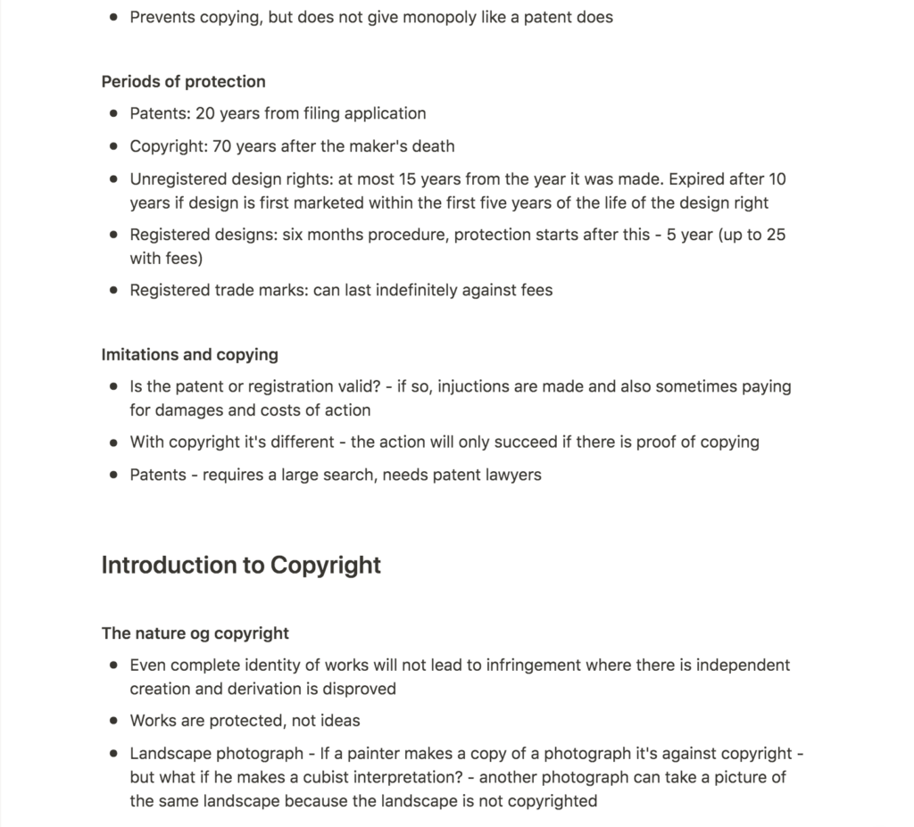
After reading about the difference between patents, copyright and design rights, I was still slightly confused about how to use patents or registrations in terms of graphic design. Getting a patent didn’t really seem applicable, and registering for a trademark for all my branding commissions seemed slightly strange, as I wouldn’t own the business. The case studies below was of great help with clarifying when to use registered design and trademark registrations.
Fig. 3: Intellectual Property Office 2015. How can I protect my designs? NICOLE PHILLIPS
Nicole Phillips’ case study made me realise that registered design is relevant for visual designs, whilst patents are aimed towards the way something works (Intellectual Property Office, 2015). I don’t generally think this would be relevant when working with branding work, as it doesn’t seem like you could register a combination of colours and typefaces, for example. However, I’d imagine it being handy if you were to develop a distinct pattern or other type of visual for a brand.
The Billy and Margot case study was useful as it explained how business owners could register a trademark, as well as how the process worked between the designer and client. Sawle was asked by her graphic designer if she had registered the name, but then it was Sawle’s job to actually do this (Intellectual Property Office, 2015). As a branding focused designer, I think asking wether the client has registered their name seems like good practice. So does suggesting to register the logo after the branding work is finished. Thus, as a designer, you won’t necessarily have to deal with the registration and admin work, but rather focus on educating and reminding the client.
Workshop challenge
For this week’s challenge, I wanted to choose a designed object which would inform my business plan, as suggested by Richard on the ideas wall. Since I am writing my business plan on a hypothetical design studio which focuses on visual identity development, I decided to use a branding and packaging case study.
After engaging with this week’s material, I think IP law for branding seems quite difficult, and thus interesting. As long as the documentation of the process exists, proving that something is a copy seems tricky. However, I have tried to outline the actions one is able to take in terms of protection. The copyright issue between a graphic designer and a client is also an interesting point here, and I have therefore tried to include the importance of contracts in my analysis.
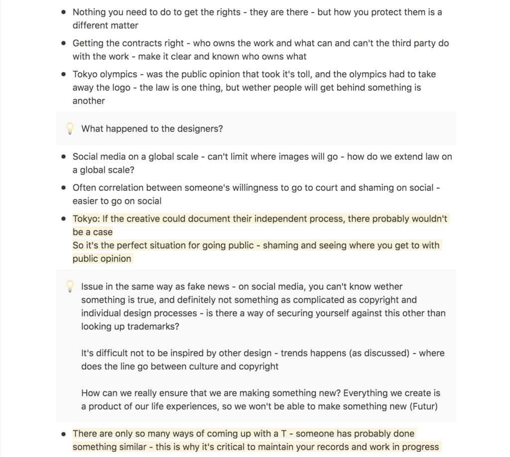
I decided to use SDG’s branding case study of Kolonihagen, as the branding consists of several graphical elements, including an illustrative pattern. I thought this would provide a variety of IP protection key points.
Case study: Kolonihagen by Scandinavian Design Group – IP protection and avoiding infringement
Who owns the copyright?
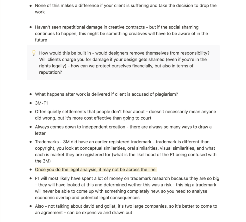
Before considering protection of the design from outsiders, SDG and Kolonihagen would have to determine who owns the copyright between themselves. This would be done through their contract (James Cartwright, 2016). Here, SDG og Kolonihagen would have to negotiate if there are restrictions in terms of copies, time period, geographic area, and wether Kolonihagen gets the copyright to some or all parts of the design (Grafill, Ca. 2015-2021). If Kolonihagen were to own the copyright, SDG would have to get permission to use the work. Likewise if SDG were to own it, Kolonihagen would have to follow the regulations made in the contract, in order to avoid infringement.
Documenting the process
As soon as the copyright owner is established, SDG would need to make sure that a documentation of the design process got stored (Alec Dudson, Kevin Poulter, and Jonathan Mayner, 2021). This includes emails, work in progress, sketches, etc. (Alec Dudson, Kevin Poulter, and Jonathan Mayner, 2021). The documentation would prove that SDG has come up with the design independently, and thus that it has not been copied (Alec Dudson, Kevin Poulter, and Jonathan Mayner, 2021).
Checking and registering for trademarks
During the design process, SDG could check existing trademarks, in order to make sure that they create a unique logo that won’t get infringed. Kolonihagen should also check for registered trademarks in terms of naming. When the branding work is completed, Kolonihagen should attempt to register their logo and name as a trademark, in order to protect their brand from being copied in the future (Intellectual Property Office, 2015).
Registered design
Since the branding system uses specific illustrations, it could also be a good idea for Kolonihagen to apply to register their pattern design (Intellectual Property Office, 2015). This would of course depend on the contract between Kolonihagen/SDG and the illustrator, and that Kolonihagen has bought the copyrights to the illustrations.
Social shaming and precautions
The registered pattern, registered trademark and copyright will protect Kolonihagen’s logo, name, pattern and exact design. However, the style of their design could still be copied by others (Robin Jabob, Daniel Alexander, and Matthew Fisher, 2003). A way of protecting their work might be for SDG and Kolonihagen to post evidence of it on social media, as the public would then be able to go back to your posts and check the publishing date. This would not protect their work from being copied (perhaps the contrary), but it might be a way of avoiding social shaming in the future if someone where to come up with a similar design at a later point.
In order to avoid social shaming for having copied someone’s work (if the Kolonihagen branding was to look like someone else’s work by coincidence), it might be a good idea for SDG to stay updated on current design trends and to perform a thorough competitor analysis whilst developing the design. This way, SDG could do their best to make sure that their work is truly unique, at least within the segment and geographic areas Kolonihagen operates in.
As mentioned in the lecture, there are only so many ways to draw a letter, and in addition to that, design trends emerge constantly (Alec Dudson, Kevin Poulter, and Jonathan Mayner, 2021). Thus, it seems to me that the best way of protecting yourself from infringement is to document your process, and to try and create unique work which breaks the conventions of the market of which you are designing for.
Visual process
My case study text ended up quite broad, and without any particular angle, other than a general look at IP law in branding. I therefore thought my visual could focus on the broad theme of copyright. I started my process with a quick doodle and brainstorm session, where I got the idea of focusing on the copy aspect of IP law.
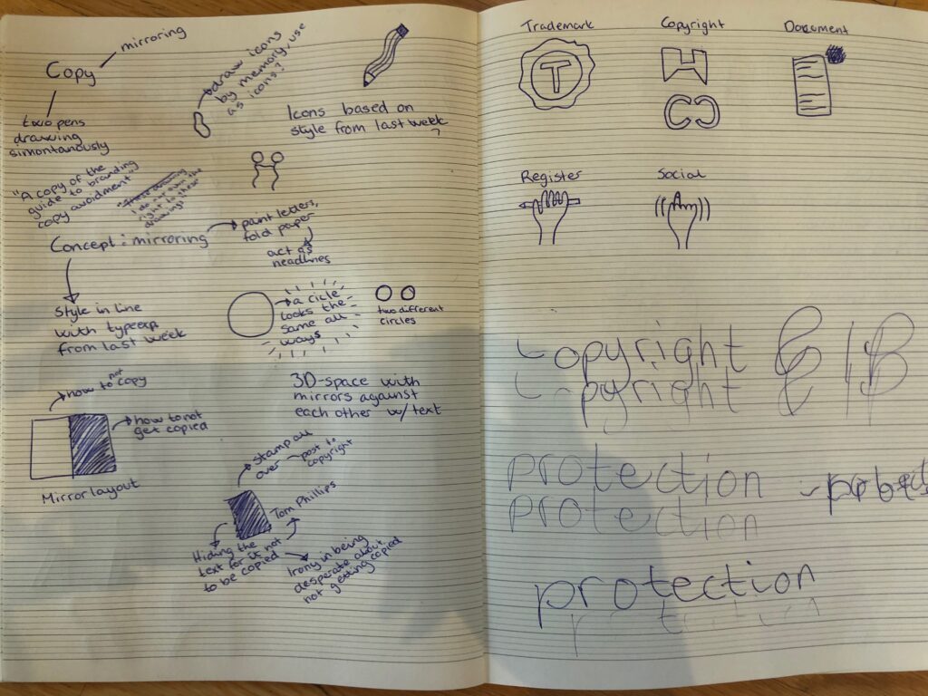
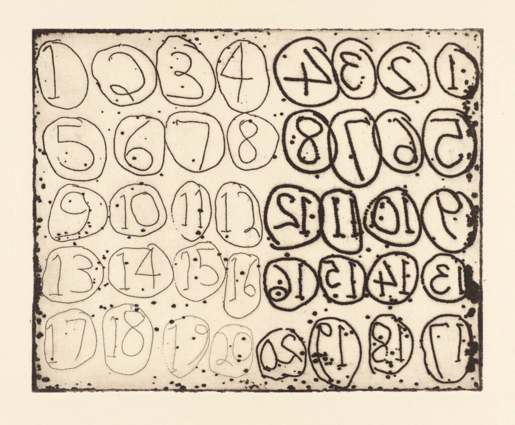
After establishing a focus, I went on to research art works with mirroring effects. I particularly liked the one below by Barry Flanagan. The child like style is an interesting aesthetic, and I also think it was cool that the right side isn’t an exact copy. This suits the theme of IP law quite well, as I get the feeling that most issues are in regards to wether or not a concept has been copied, rather than someone replicating an exact image. In order to create this almost copy, I thought it could be nice to create copies by hand.
After posting Flanagan’s art work on the ideas wall, Paul mentioned a website which asks the user to draw famous logos. This made me think about wether I could get someone else to create a copy of my visual from memory. Unfortunately, I didn’t have enough time to go ahead with this, but if I did have more time I think it could have been an interesting concept to explore. In the sketches above, I also performed some quick experiments where I wrote whilst holding two pens. This as well could have been interesting to explore further if I had more time.
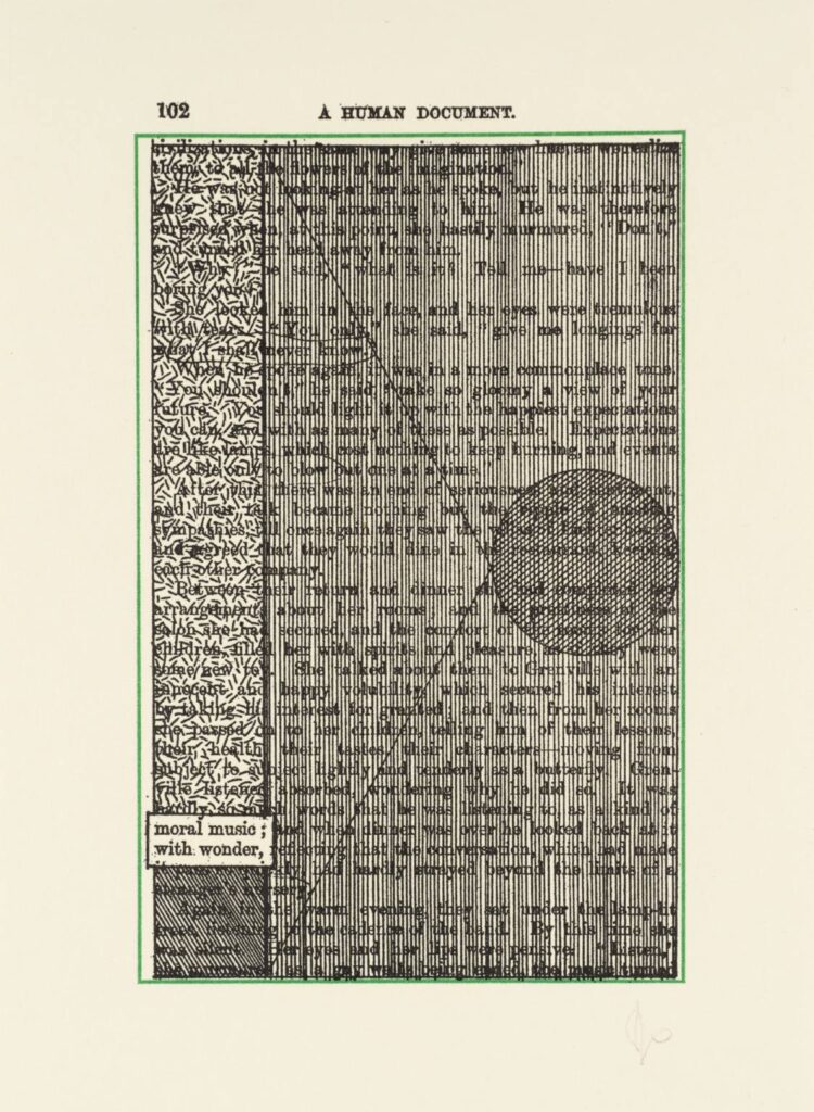
By browsing the online Tate collection, I also discovered the work below by Tom Phillips. This made me think about the idea of stamps and hiding work, inspired by the mentioning of people posting their work to themselves in order to get copyright. To me, this seemed like a silly thing to do, and I therefore thought it could be fun to print my text and cover it with decorations. This would remove the actual purpose of the text, and turn it into something else, similar to how keeping an art piece in an envelope makes it something else than an art piece if it’s just stored in a drawer somewhere.
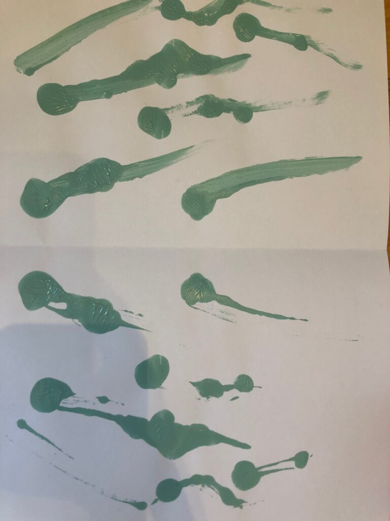
Moving on, I decided to focus on the concept of mirroring, as I hadn’t really focused on the posting of art works in my written text. I experimented with painting letters and patterns, and then copying it by folding the paper. However, I wasn’t really feeling this idea.
I felt a little frustrated at this point, as I had a bit of a creatives block. I therefore decided to try something completely different and started taking pictured of my screen of a photo of my text. This also wasn’t going anywhere, so I decided to go into illustrator to experiment with type.
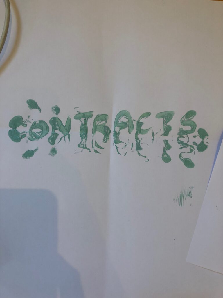
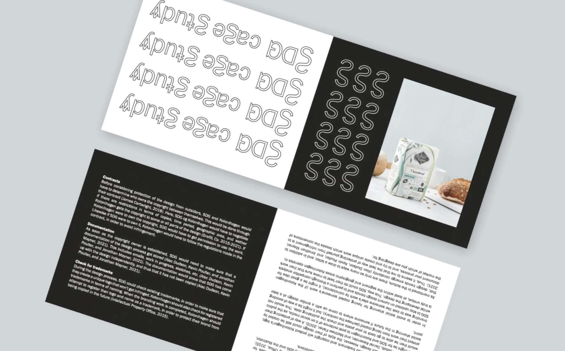
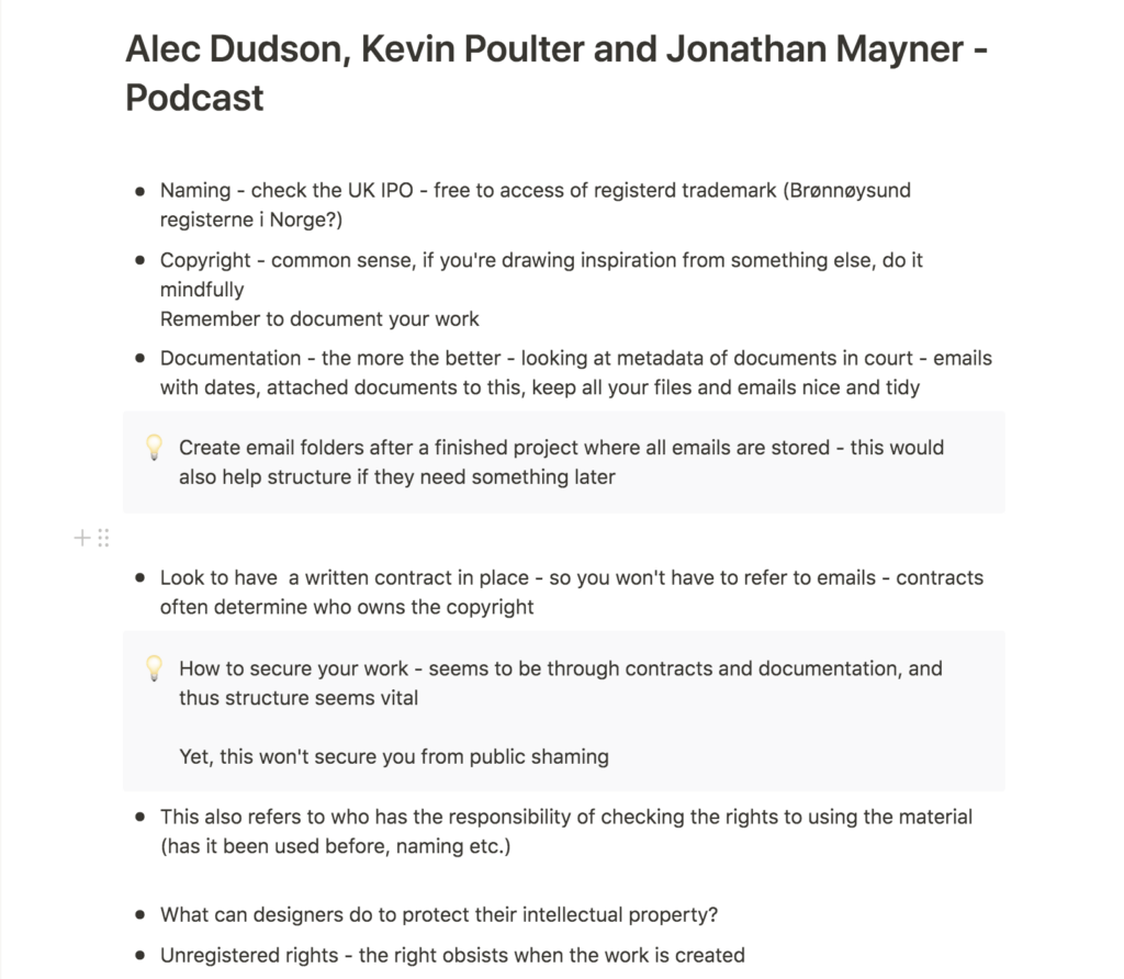
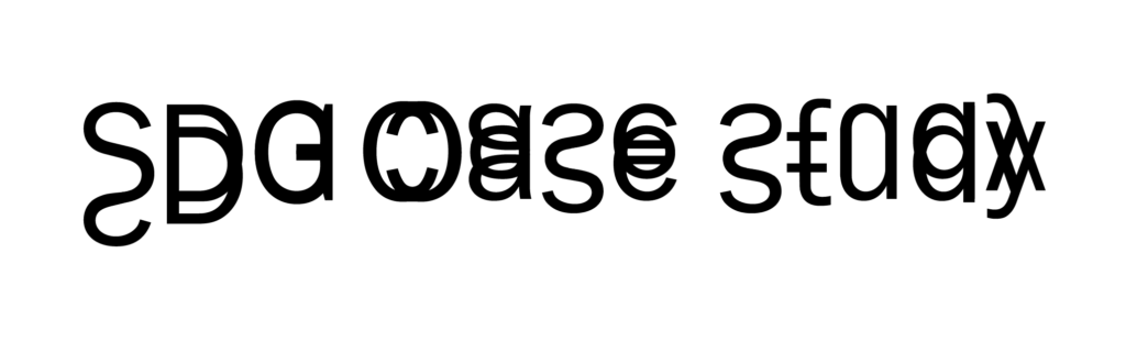
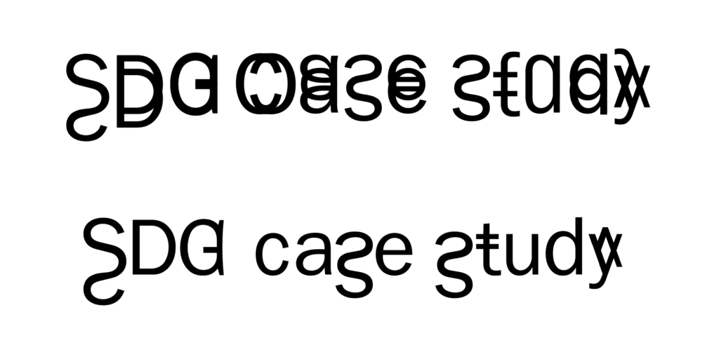
I started experimenting with overlapping copies of text in illustrator, which gave me the idea of copying certain features of letters onto themselves. I quite liked the look of it, and decided to attempt building a layout with the heading type. I decided to create a pamphlet, as I thought this could be a handy reminder for future projects, which you could keep at your desk.
Moving on from my reflections on Flanagan’s art piece, and how it’s not a direct copy, I thought it could be interesting to create a mirroring layout, where the content differs.
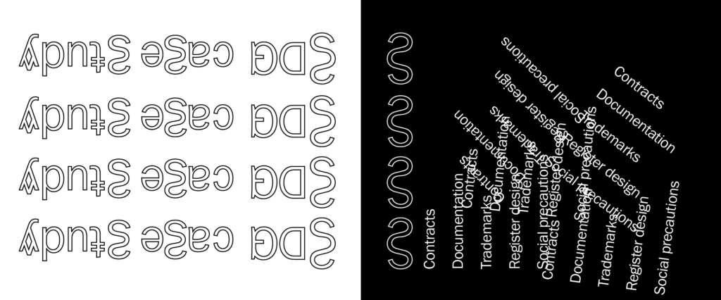
As I was working with the layout, I also got the idea of presenting the content in different directions. This raises a question of which section is the copy and which is the original – similar to cases in IP law. In order to illustrate this point, I ended up presenting my final pamphlet design as a spinning animation.
Final result
My final result this week is a case study on IP protection, seen in the light of a branding case study by Scandinavian Design Group. For my visual presentation I have looked at the essence of copying and mirroring. The headline type uses certain aspects of it’s own letters twice, in order to convey the essence of copying. As a mimic of IP cases, which seems to often consist of works that are almost similar, but not a direct copy, I have used symmetry in my layout design. By placing the content in various directions, I have attempted to ask the question of which side is the original, and which is the copy, similar to IP law cases. The pamphlet is designed to be kept at your desk, so that you can go back to it as you’re working on future projects.
In conclusion
This week’s topic has not been the most exiting for me personally, but it has still felt very important. I was not aware that creatives need to document their process for example, and so it’s definitely been useful to get to know more about precautions and potential dangers.
Looking back at my workshop challenge, I think I could have created a more insightful analysis, had I looked at a more unique case. My text currently feels quite broad, without any particular angle, and there might have been a more interesting way of going about the assignment. However, as my future goal is to work with branding, I am also a little happy that I chose a generic case study. This has left me more confident in going to work with clients in the future, and I could now potentially advice them on how to protect their brand. The fact that I now know that clients automatically get copyright when working on submissions as a designer, will also let me make an informed decision when it comes to contracts and fees.
Unfortunately, I wasn’t paying enough attention to the assignment text this week, and I thus didn’t pick up on our text having to be visually presented. This left me with a shorter amount of time for design and if I had more time, I would have loved to experiment further with my mirroring concept.
Although I think it could have been developed further, I am happy with the core concept of the visual piece. I think it feels like an obvious, yet interesting take on the topic of copyright, as it’s playing on the word copy, but also has certain aspects which are more ambiguous. I particularly enjoyed experimenting with the heading typography this week, and moving on with the course, I would like to continue with this type of experiments.
REFERENCES:
Alec Dudson, Kevin Poulter, and Jonathan Mayner (2021) ‘Podcast: Alec Dudson, Kevin Poulter and Jonathan Mayner’. Canvas Falmouth Flexible [online], 11 June.
Grafill (2015) ‘Veiledning til kontrakt’, Grafill. Available at: https://www.grafill.no/nyttig/lover-og-avtaler/kontrakter (Accessed: 14 June 2021).
Intellectual Property Office (2015a) How can I protect my designs? NICOLE PHILLIPS. YouTube. Available at: https://www.youtube.com/watch?v=NjzPiXGrAjs&ab_channel=IntellectualPropertyOffice (Accessed: 14 June 2021).
Intellectual Property Office (2015b) How do I protect my brand name? BILLY AND MARGOT. YouTube. Available at: https://www.youtube.com/watch?v=AXzAR_2TO9o&ab_channel=IntellectualPropertyOffice (Accessed: 14 June 2021).
James Cartwright (2016) ‘http://eyeondesign.aiga.org/what-young-designers-need-to-know-about-copyright-law/’, AIGA Eye on Design, 2 December. Available at: http://eyeondesign.aiga.org/what-young-designers-need-to-know-about-copyright-law/ (Accessed: 14 June 2021).
Rob Alderson (2015) ‘Tokyo Olympics Logo embroiled in Plagiarism Row’, The Guardian, 30 July. Available at: https://www.theguardian.com/artanddesign/2015/jul/30/tokyo-olympics-logo-plagiarism-row (Accessed: 12 June 2021).
Robin Jabob, Daniel Alexander, and Matthew Fisher (2003) A Guidebook to Intellectual property: patents, trade-marks, copyright and designs. London: Sweet and Maxwell.
LIST OF FIGURES:
Figure 1. Kenjiro SANO. 2015. Tokyo 2020 Olympics logo. The Guardian [online]. Available at: https://www.theguardian.com/artanddesign/2015/jul/30/tokyo-olympics-logo-plagiarism-row
Figure 2. Olivier DEBIE. 2013. Théâtre de Liege design. The Guardian [online]. Available at: https://www.theguardian.com/artanddesign/2015/jul/30/tokyo-olympics-logo-plagiarism-row
Figure 3: INTELLECTUAL PROPERTY OFFICE. 2015. How can I protect my designs? NICOLE PHILLIPS.
Figure 4: INTELLECTUAL PROPERTY OFFICE. 2015. How do I protect my brand name? BILLY AND MARGOT. . Available at : https://www.youtube.com/watch?v=AXzAR_2TO9o&ab_channel=IntellectualPropertyOffice [accessed 19 June 2021].
Figure 5. SCANDINAVIAN DESIGN GROUP. 2018. Kolonihagen. Scandinavian Design Group [online]. Available at: https://www.sdg.no/work/kolonihagen
Figure 6. Barry FLANAGAN. 1972, reprinted circa 1983. Numbers. Tate [online]. Available at: http://www.tate.org.uk/art/work/P02769
Figure 7. Tom PHILLIPS. 1970. no title: p. 102. Tate [online]. Available at:
Figure 8-11: Ingrid REIGSTAD. 2021. Experiments. Private collection: Ingrid Reigstad.
Figure 12-13: Ingrid REIGSTAD. 2021. Type experiments. Private collection: Ingrid Reigstad.
Figure 14: Ingrid REIGSTAD. 2021. Experiments. Private collection: Ingrid Reigstad.
Figure 15: Ingrid REIGSTAD. 2021. SDG Case study. Private collection: Ingrid Reigstad.