Lecture notes
Lecture reflections
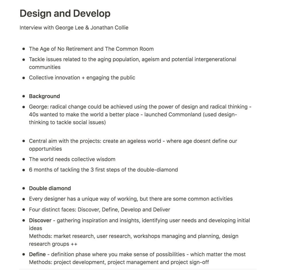
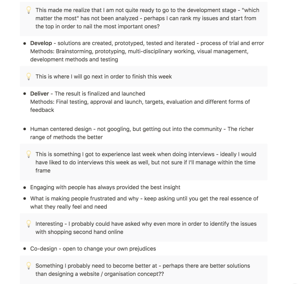
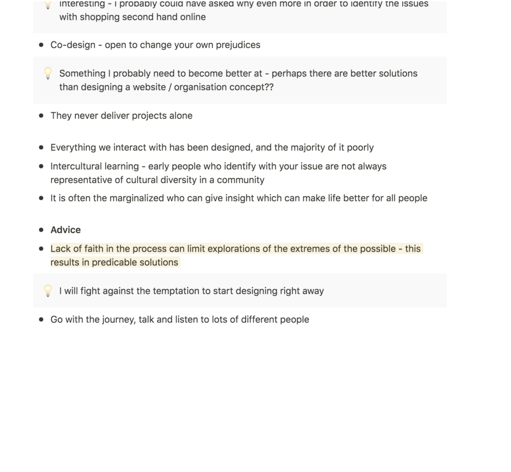
After last week’s discovery of user oriented research, it was great to read about Lee and Collie’s way of working with user centred processes. I found their explanations of the double diamond particularly interesting. Even though I have looked at this process a couple of times throughout the course, reading about each stage again made me realise that I still have a few steps left of the discovery and define faces before I can move on to the develop face.
Lee and Collie’s advice on interviewing was also insightful and I would have loved to have know them before doing my interviews last week. Their suggestion of digging into why someone feels a certain way was interesting and made me realise that I probably should have dug deeper into why the shoppers from last week found the shops dull for example (George Lee and Jonathan Collie, 2021). I will take with me this advice for interviews in the future.
Resource notes
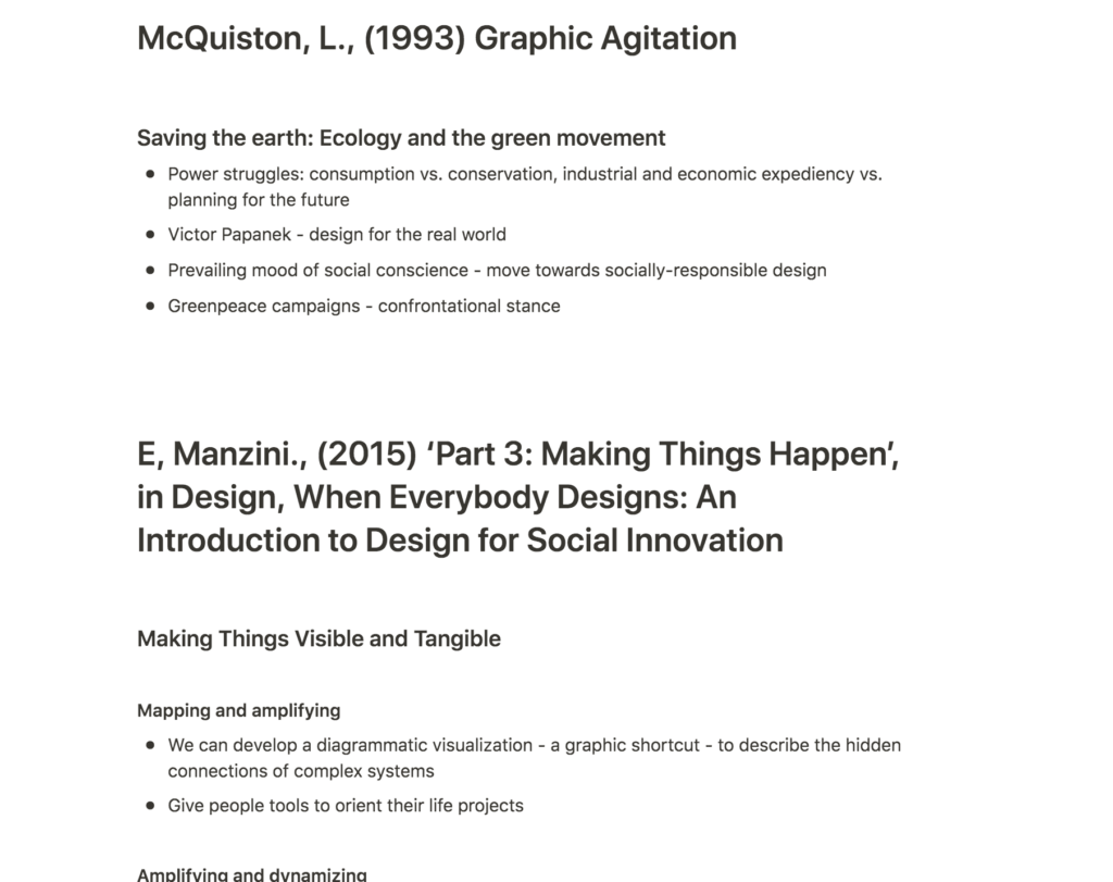
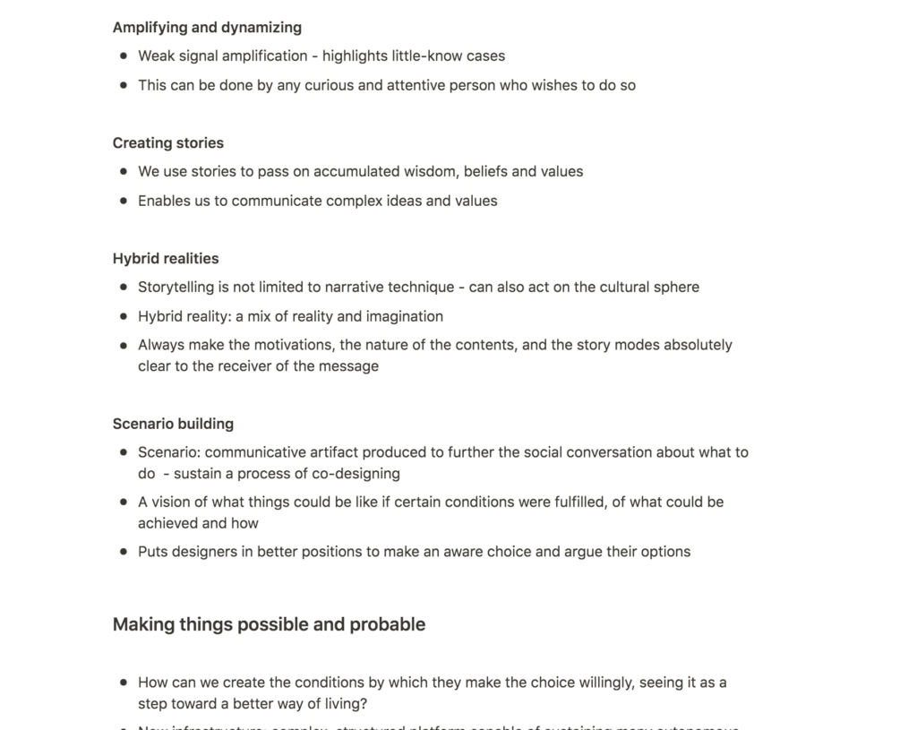
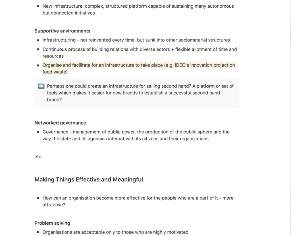
Resource reflections
Entrepreneurial support
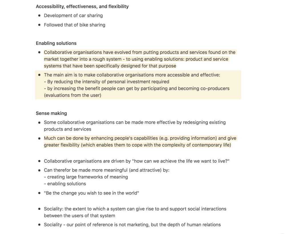
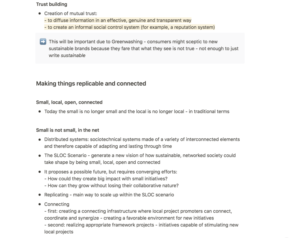
Design, When Everybody Designs was hugely interesting in terms of creating something connected that goes beyond one service and it’s sphere. In the book, Manzini discusses how an infrastructure in which design can happen organically (Ezio Manzini, 2016). Inspired by this (as well of a project by IDEO from week 9), I wonder if my service could create an infrastructure which somehow encourages entrepreneurs to develop sustainable fashion solutions.
Can users participate in other ways than the established system of individual sales?
Manzini goes on to discuss how designers can make a service accessible and effective by 1: reducing the user’s required amount of effort, and 2: making it more beneficial for users to participate and co-produce (Ezio Manzini, 2016). The first point is very much in line with my discoveries from last week of shoppers avoiding second hand clothing because the shopping act is too difficult. The second point makes me wonder wether I could create functions in my service which lets users participate and co-produce something, even if they aren’t selling their own clothes (as last week’s discoveries showed that shopping from individuals rather than businesses can make the act of second hand shopping one of high-risk and unprofessionalism).
Catering a service to the life of ones users
Further, I found Manzini’s point of catering a service to users’ lives inspiring (Ezio Manzini, 2016). Through simple design actions like providing sufficient information and greater flexibility, a designer will be able to make her service more effective (Ezio Manzini, 2016). I imagine the flexibility aspect to be very important as all of my interviews indicate that people dissociate from second hand due to the lack of return policies.
Could H&M be inspiring in terms of replication?
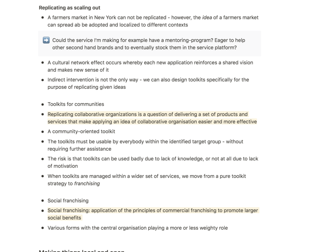
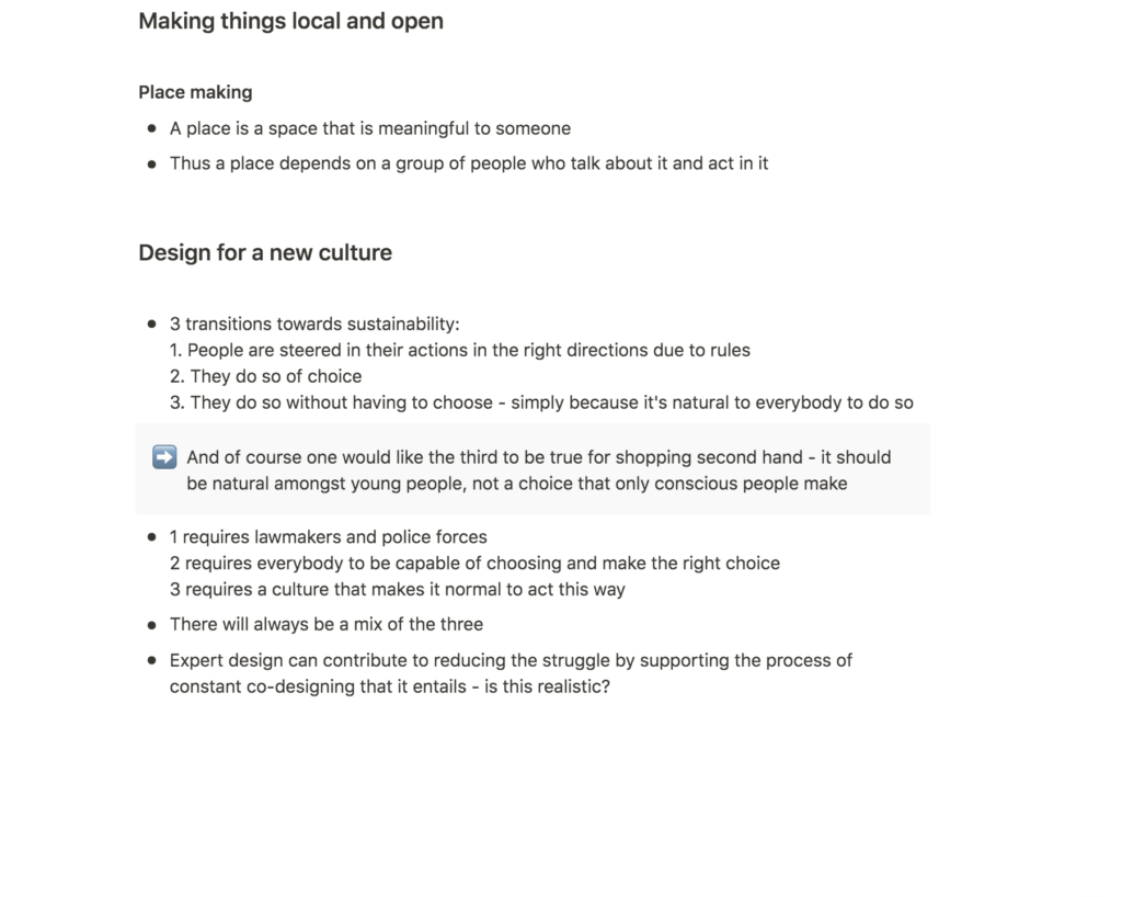
Lastly, I enjoyed Manzini’s discussions on replication and social franchising (Ezio Manzini, 2016). Although I have not decided on my choice of service, one service is unlikely to be enough to change the world on it’s own. Thus, if I for example were to build a second hand brand, replicating this service by using a toolkit or a franchise-model would in fact be a great way of enhancing the second hand market. The H&M group is a great example of how one organisation could provide products for a variety of audiences through it’s set of sister companies. Perhaps something similar could be done with second hand clothes?
Further research
Market research
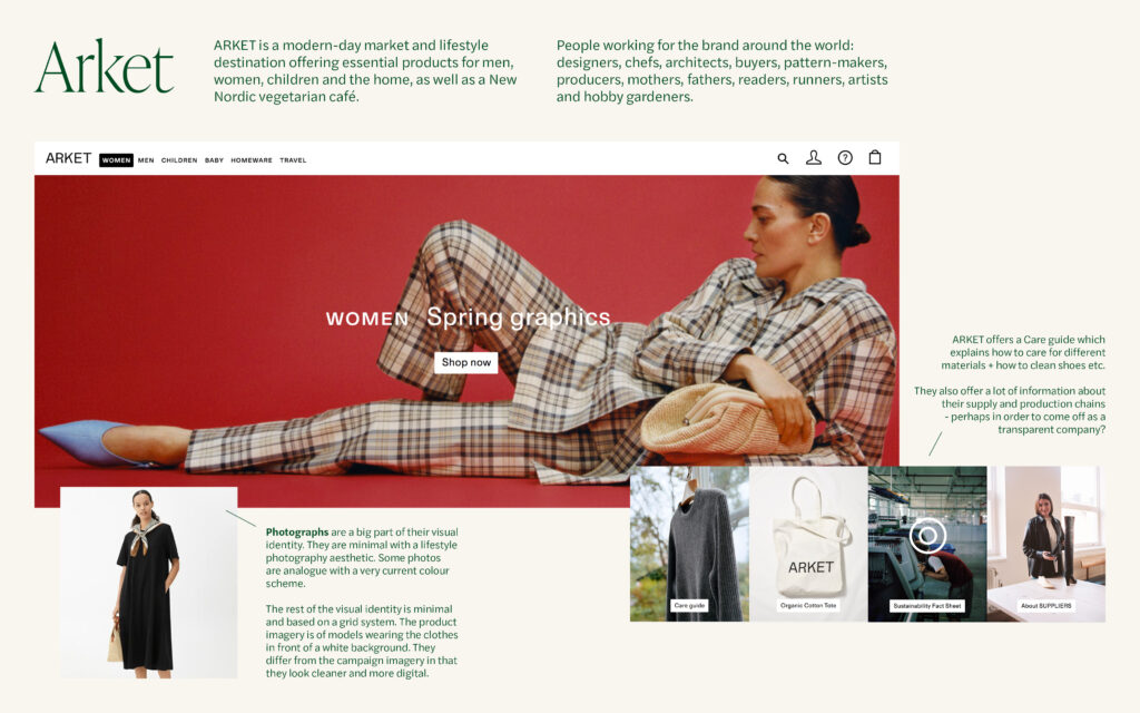
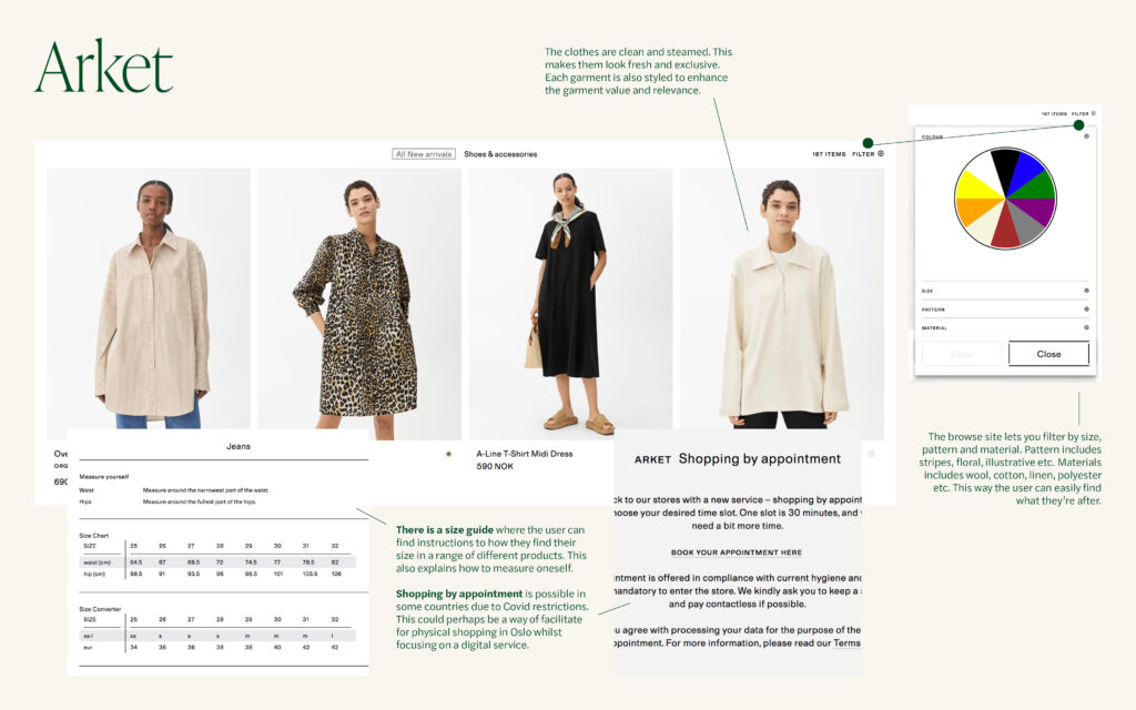
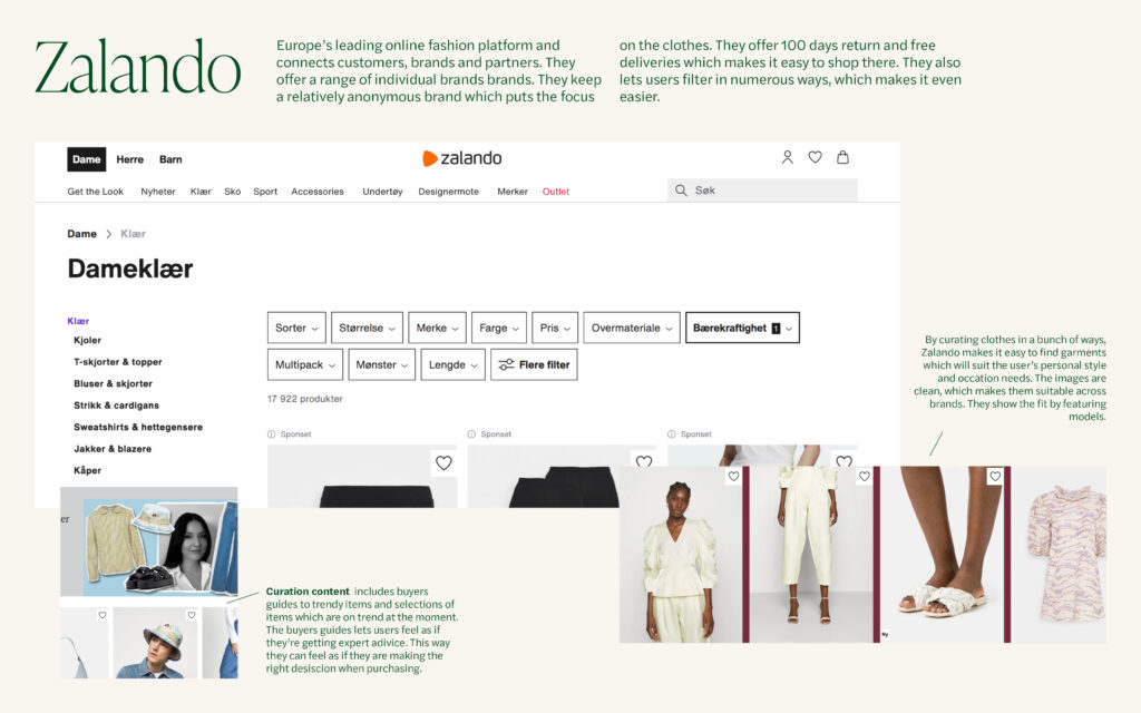
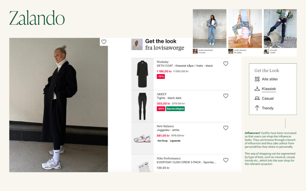
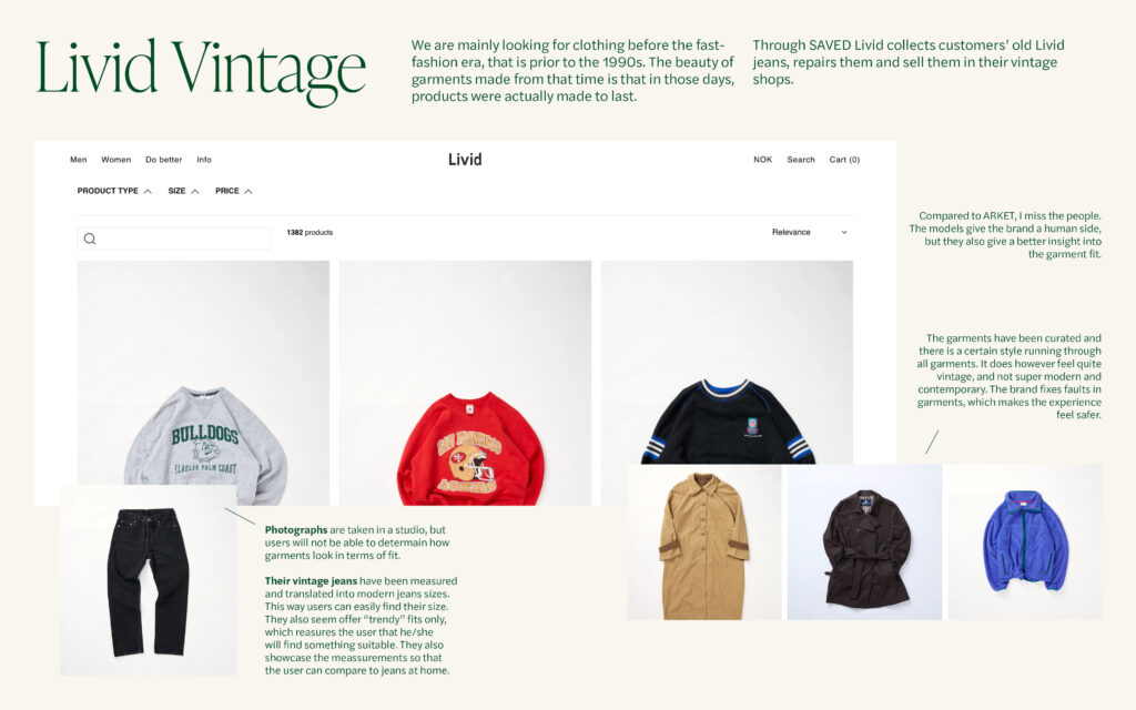
Inspired by the discussions on the double diamond from this week’s lecture, I decided to perform one more research method that could be added to last week as I’ve looked at that as the discover stage. I therefore created a quick (and I say quick because this could have been a lot more comprehensive) market research where I looked at how Arket, Zalando and the local vintage shops Livid Vintage tackles some of the issues discovered last week. This was very useful as I think I could adapt some of the solutions in my own service design (see the images for more details).
(All photographs and web designs belong to the individual brand of which the relevant slide is about)
Workshop challenge
Since I got so invested in my topic last week I decided to stick with my own issue rather than picking someone else’s.
Define: what matters the most?
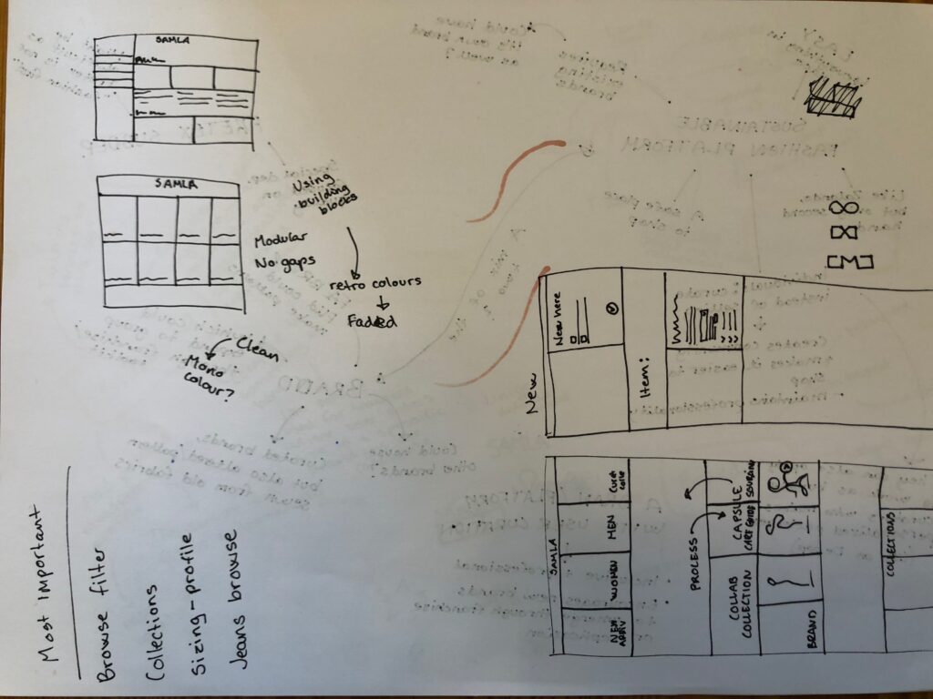
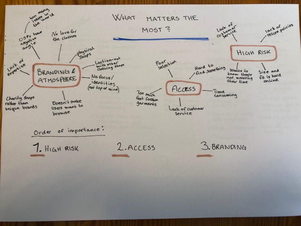
Inspired by the lecture, I started the workshop challenge by defining the most important issues from last week. By placing smaller issues into three categories, I was able to clarify before tackling the issues. I have ranged High Risk as the highest priority because this was actually stopping users from shopping second hand online. This is also the easiest problem to solve (by getting a return policy in place, increasing customer service and making the service easier to navigate). Access is ranged as number two since shoppers found second hand shopping difficult due to it being time consuming. Branding is ranged as number three as I don’t think it will fix the most pressing issues. I do however consider it important if the service is to be as good as fast-fashion services – which I believe it will have to be if it is to convert shoppers to buying mostly or only second hand.
What kind of service?
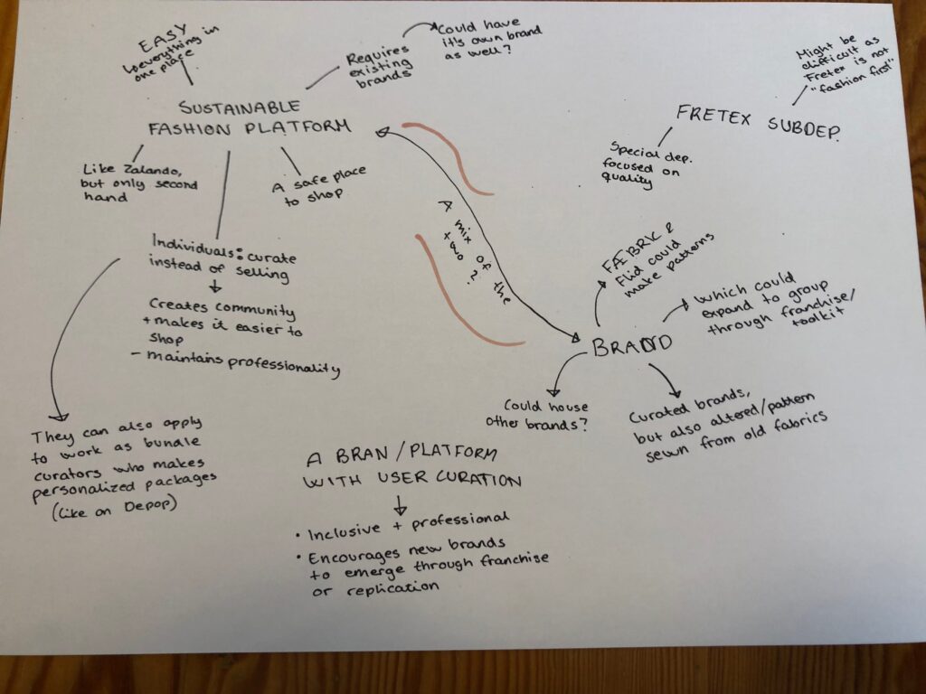
In order to decide on a service type I created a mind map with ideas. I knew that the service would be digital due to Norwegian geography (few habitants pr. square meter). I also knew that I did not want to create a service where individuals sell their clothes (like Depop) – both because this already exists in Norway (a service called Tise) and because my interviews showed that the individual sales model leads to a less professional customer journey.
A second hand fashion platform
The final idea is to create an online fashion platform which only sell products made out of second hand material (and of course second hand clothes in general). The platform will first and foremost be a fashion brand, but this is mostly due to the lack of second hand fashion brands in Norway at the moment. In order to encourage brand entrepreneurs, the platform will need to have a system in place for future expansion (franchise model / sister companies), toolkits, a mentorship program etc. This way, the brand/platform can grow into a Zalando-inspired platform that houses a variety of brands under it’s umbrella. The fashion platform works as a collection of brands, but each brand should also have it’s own page with their garments only.
User curation
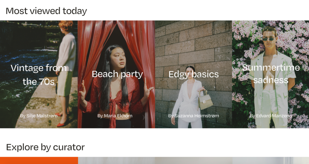
As suggested by Manzini, the platform should make it beneficial for users to participate and co-produce (Ezio Manzini, 2016). Inspired by Zalando’s curation services, I got the idea of building a customer curation service within the platform. This way, customers can participate, but also find suitable garments quickly by following curators they like the style of.
Idea sheet
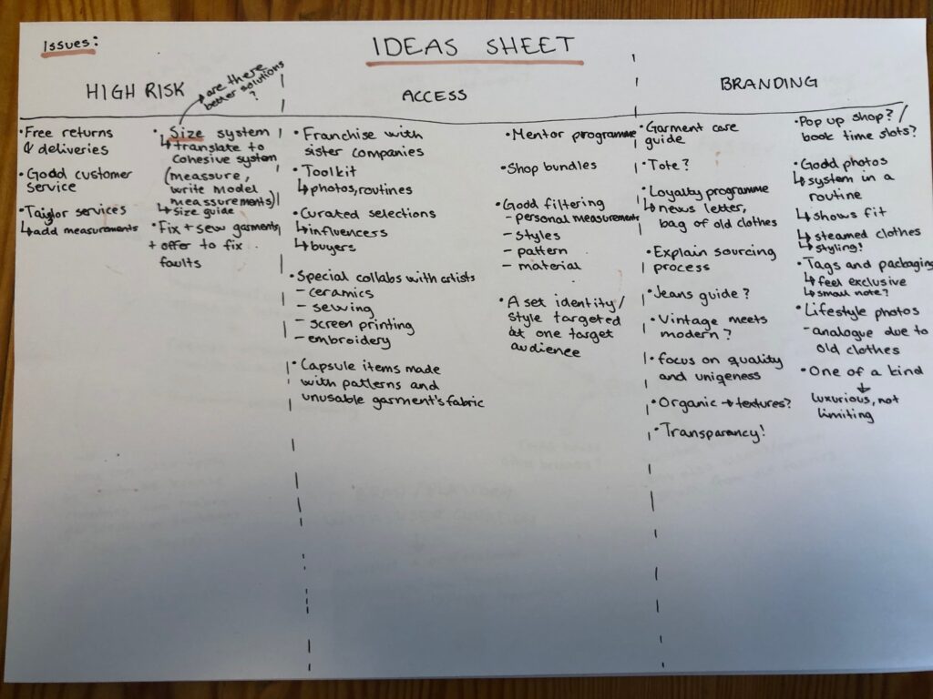
After deciding on a service I decided to create an ideas sheet to keep ideas in place.
Branding experiments
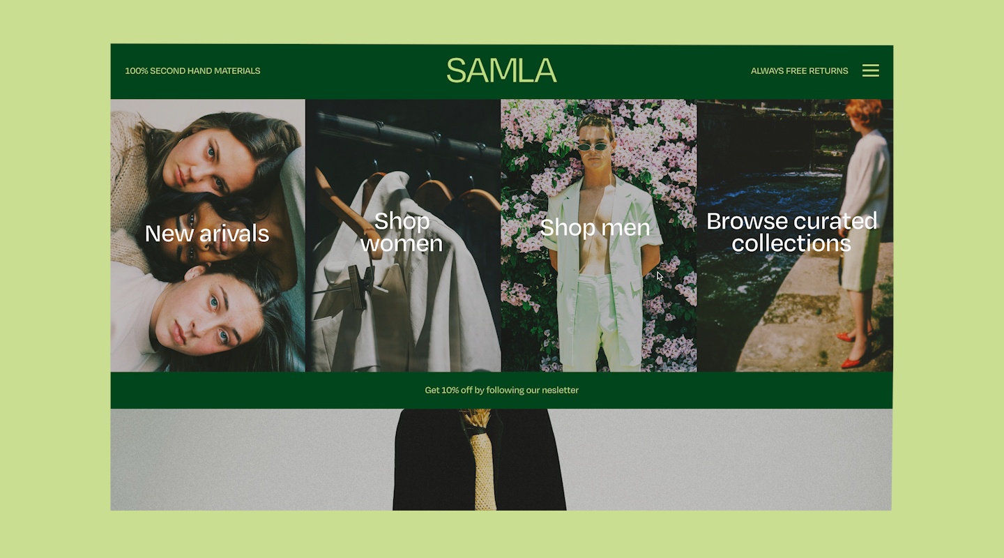
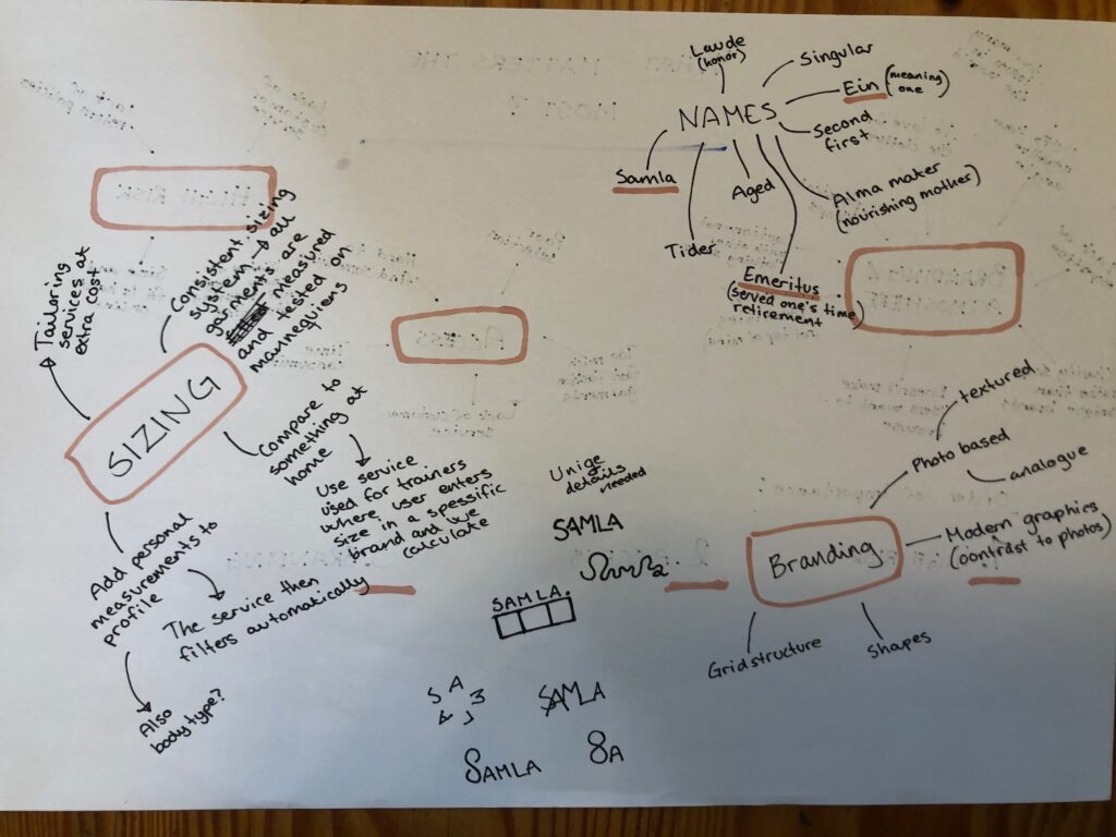
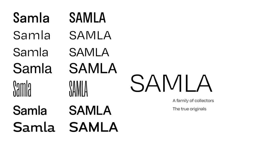
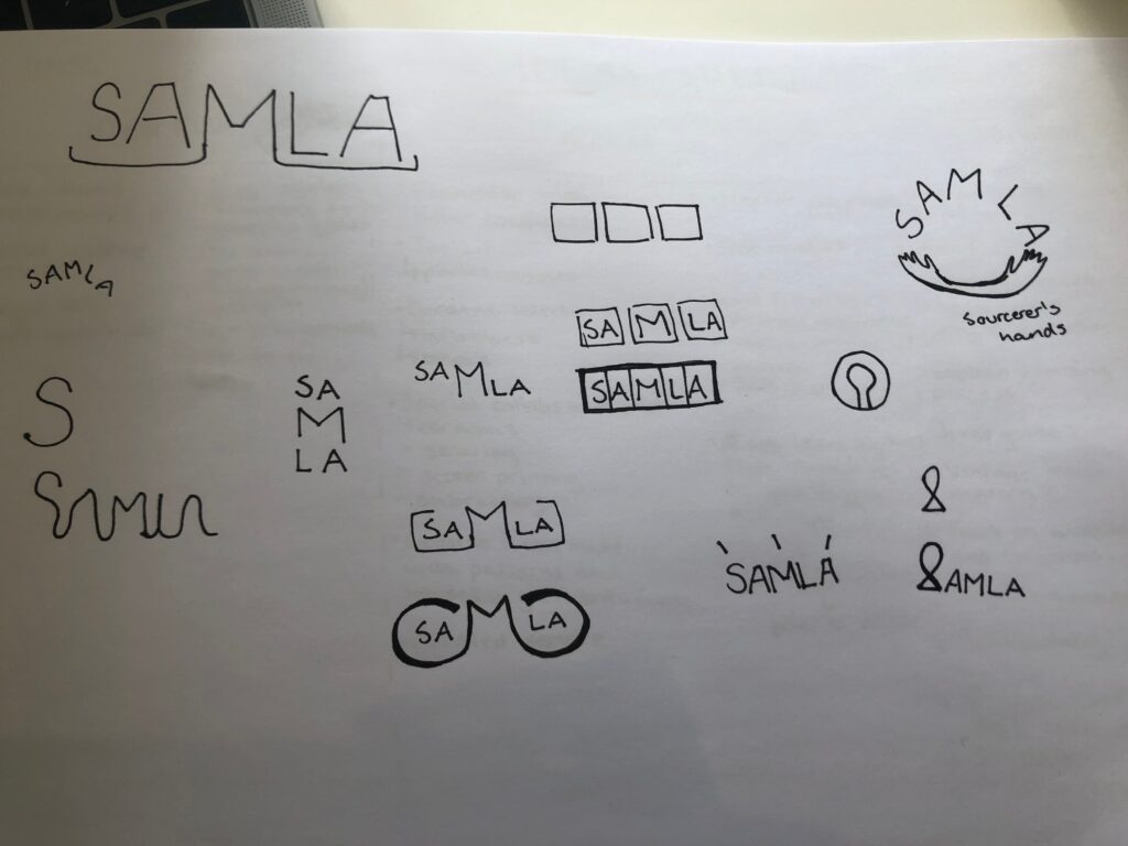
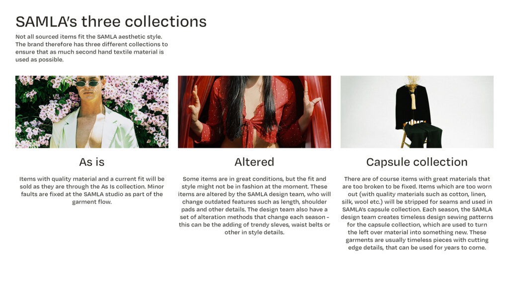
After my brainstorm on features, I went on to brainstorm platform names, branding features and possible ways of solving the second hand sizing issue (se notes below for details). I decided to name my platform Samla which means Collected or Gathered in Norwegian. I liked this name because it fit the Curated Collections feature from my ideas sheet.
Exclusive, Clean and Current
In my interviews, shoppers reported that second hand shopping could be difficult as there is only one piece of each garment. By focusing on exclusivity, I want the branding to turn the one-of-a-kind feature of second hand shopping into something positive and luxurious. I also wanted the platform to feel clean and minimal so that users wouldn’t feel like the clothes were dull and dirty (another issue discovered last week). Lastly, I wanted the brand to come off as trendy and current in order to appeal to fashion oriented people, and inspire them to make the transition from fast fashion to second hand.
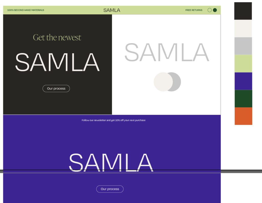
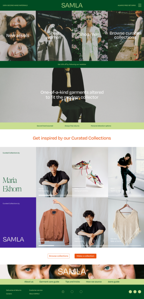
By using a set of bold green hues, I’ve tried to refer to nature, whilst maintaining a trendy vibe. I have also chosen a set of secondary bold colours to go with the primary greens. The website is built up from modular square components – the way these individual parts come together into one design represents the sourcing of clothes from different eras and how they as well come together to form one outfit and one brand. The typeface used in both logo and other text is a text version of Degular, which when you enlarge it shows signs of ink traps. I liked the idea of portraying these inktraps – almost as symbols of ware which can sometimes be found on second hand clothes.
Photography focused
An important element of the branding, which particularly will help the platform stand out amongst it’s competitors, is the photography focus. Similar to fast fashion brands, Samla will have campaign photo shoots, which will contribute to a set branding. Even if the garments on campaign images gets sold out, the images will be used to promote, inspired and navigate the website. As a reference to second hand clothes, campaign images will have a typically analogue look with warm tones and a lot of texture to symbolise the natural aspect of shopping sustainably. The motifs will be candid and inspired by lifestyle photography as the whole brand is supposed to sell the fact that a sustainable lifestyle can also be cool and trendy.
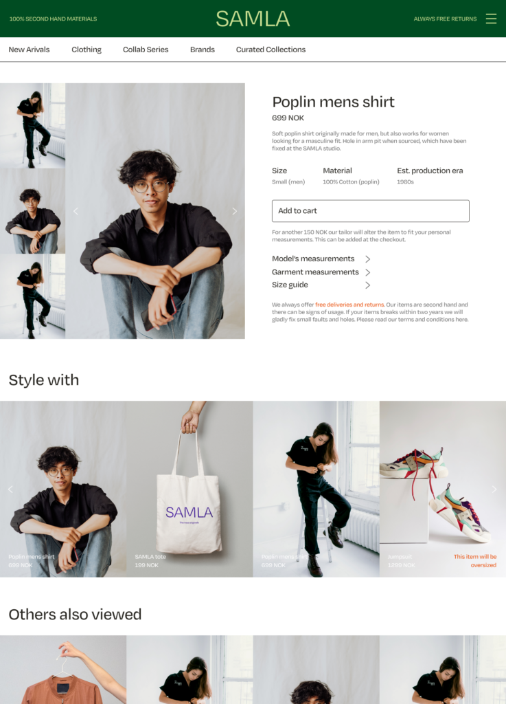
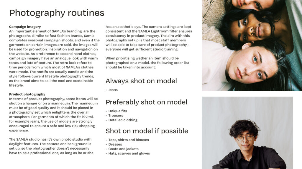
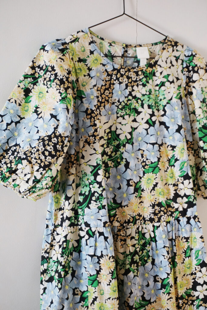
James noted that photographing all garments on models might be too expensive as one would have to pay for models quite frequently. Therefore, some pieces will be shot on a hanger or on a mannequin. The garment categories were fit is vital, like jeans, will however be shot on models in order to create a safe and low risk shopping experience. The image below was taken using daylight in my kitchen – this way of shooting can easily be replicated in order to create a cohesive product imagery style.
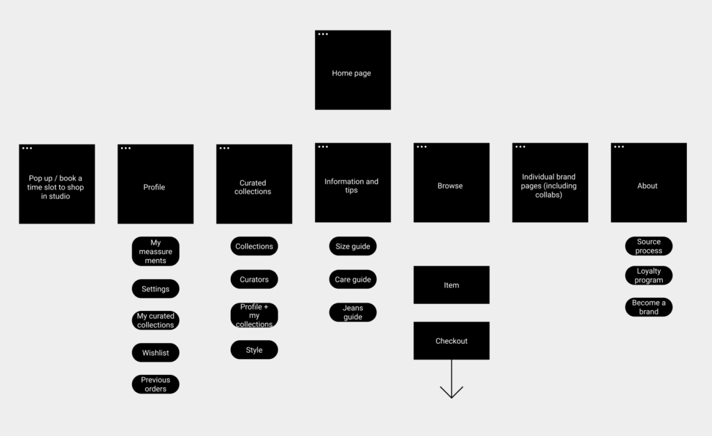
Before starting on the prototype I created a quick flow chart of what I wanted the website flow to be like.
The photographs used in this work were collected from websites with a creative commons license, and were not created by me.
User testing of branding
As advised på Paul on the ideas wall, I did a quick user test of the branding so far (due to time this was very quick and text based – if I had more time I would have spent more time in order to get better results). I asked the same shoppers from last week to have a look at the prototype screenshots above, and had them answer two questions:
- What are your first impressions of the brand?
- Who do you think would shop here?
I was happy to find that their answers were in line with my ideas of target audience. Below is a summary of each shopper’s answer.
Shopper 1
“The brand looks like it’s concerned with climate and the environment, particularly because of the greens which you quickly notice. It’s also very clear that the clothes are second hand. The shop feels clean and I get the impression that the clothes are of good quality – I think this website could challenge prejudices about second hand shopping.
I quickly noticed that there are free returns, which would definitely make it easier for me to shop there – particularly jeans and trousers. I also like that you can filter on materials, and that the size calculator seems easy to use.
I think the brand appeals to a variety of people – both those who shops in order to be sustainable, and to those who cares about clothes, style and quality.”
Shopper 2
“I think the brand is targeted towards people who lives / wishes to live a sustainable lifestyle, but also those who cares about the environment because it’s trendy to do so. Since the clothes are more expensive than H&M I think this will suit those who cares about fashion and who are willing to pay a little more for clothes.”
Shopper 3
“I love the colours – they go very well together and I get a relaxed feeling when I see the website. I think it would appeal to creatives between 22-40 year olds, but also to that age group in general. The brand feels quite Scandinavian and it makes me think of creatives from Copenhagen. I also think the site seems easy to navigate, but I would have liked to see a “Our story”.”
Main takeaways
The user feedback was pretty much in line with my plan, and it was useful to hear that I was on the right track. I was surprised to hear that all users found the brand so environmentally oriented, as I was worried that the environment aspect wasn’t coming across well enough. The branding also seems to have hit the age group I’m aiming for. My worry however, is that by being so environmentally focused, some people might not feel like the brand is for them.
Logo concepts and packaging design
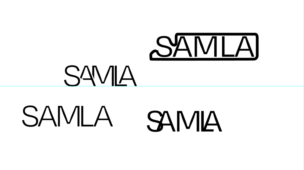
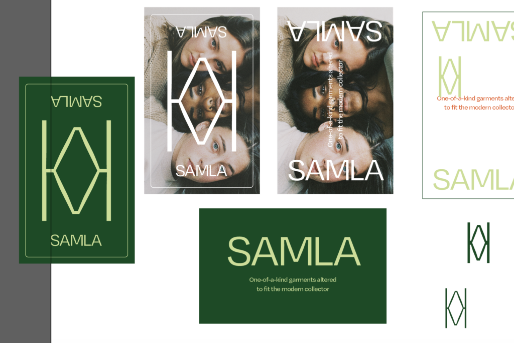
My impression from the user feedback was that my branding was heading in the right direction. James did however comment on the ideas wall that the logo needed kerning and that I could put some love into it’s concept. I completely agree as I didn’t do much else than type out the brand name in a nice typeface. I decided to experiment with a few solutions, but unfortunately I wasn’t to happy about my ideas or results.
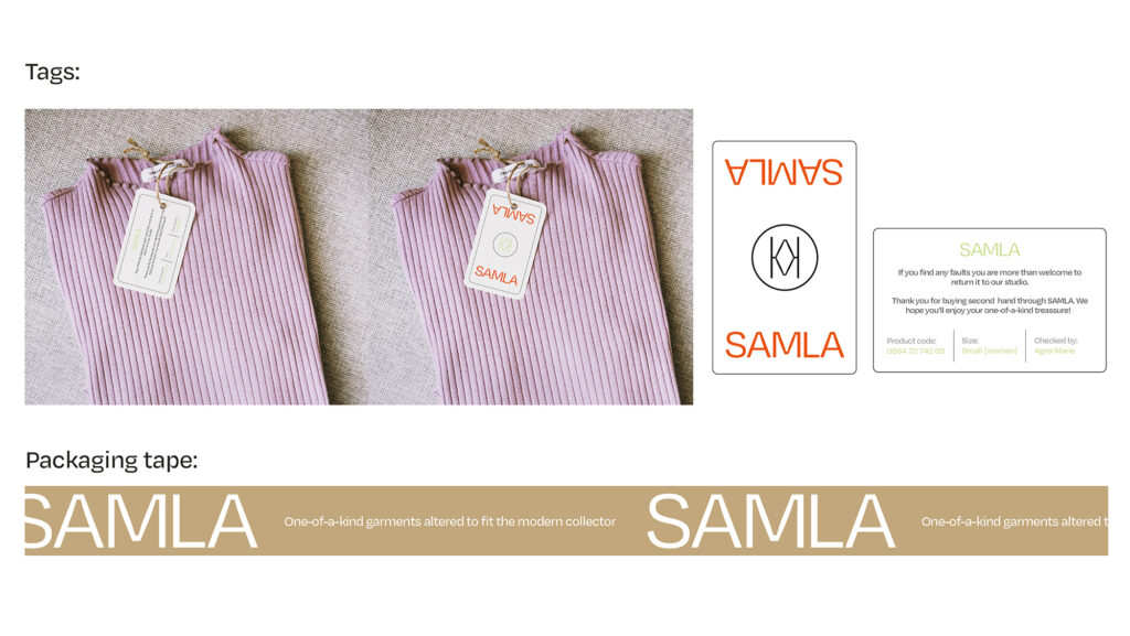
I did however create a symbol to go with the logo in certain placements. The symbol is the m from the word mark mirrored upside down. Since SAMLA offers second hand clothes I though a second M could be cool. The symbol also turned out to have diamond/gem resemblances which suits the brand well since it’s all about those vintage gems. I still feel as if the logo needs a proper concept, so if I have time I will continue to work on it next week.
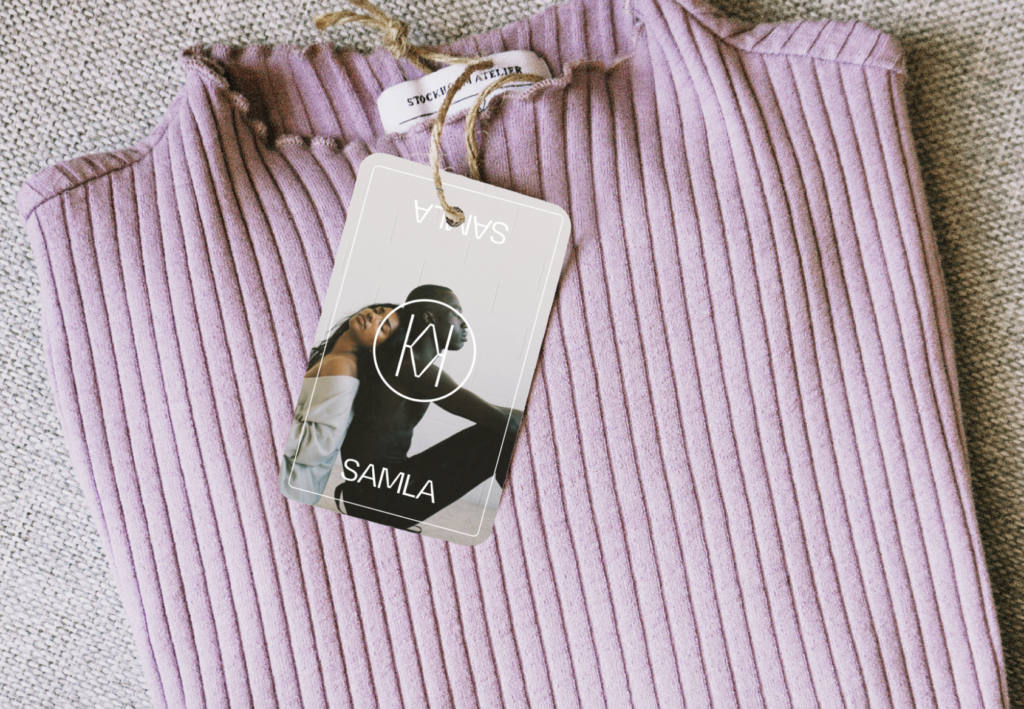
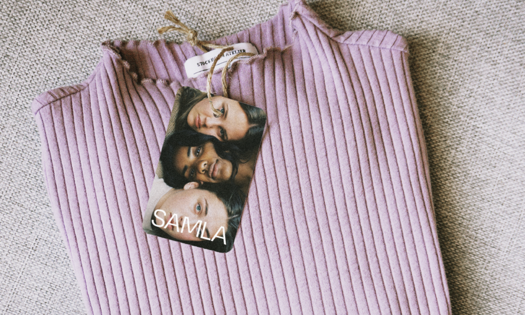
After creating my final (at least so far) logos I designed a tag to go on the garments. I also created a simple packaging tape design. I want SAMLA’s packaging to be circular and as minimal as possible in order to reduce waste. However, I still want the package to feel luxurious. I therefore imagine the clothing with the tag below, wrapped in recycled tissue paper, which is then placed in a recycled cardboard box which is shut with the tape. Rather than including a card (which means extra waste), which one often receives when ordering online, I have added a message directly on the tag. The tag is marked with the name of the person who checked and wrapped it, and it also encourages the user to return the garment if faulty and thanks the shopper for buying second hand.
The photographs used in this work were collected from websites with a creative commons license, and were not created by me (Except from purple jumper photograph).
Final result
My result this week is a second hand fashion platform concept inspired by the issues of shopping second hand, discovered last week. The platform’s vision is to be a retailer that converts shoppers from fast fashion to second hand. The brand, SAMLA (meaning gathered or collected in Norwegian), is target towards young fashion oriented Norwegians, particularly those who wishes to live a sustainable lifestyle. For now, SAMLA only houses their own clothing lines. They are however built to stock other emerging second hand brands who share their vision. Although I have not elaborated on it in my work this week, SAMLA would be keen to obtain sister companies through a mentor ship programme.
Low risk shopping
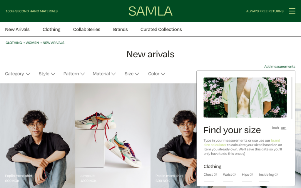
The first issue I have attempted to solve is that shoppers found it difficult to shop second hand online due to insecurity. By offering free returns SAMLA makes it able to try on clothes at home before deciding on a purchase. The platform also has a function which lets users register their measurements. Their size is saved and by ticking a box, they will only be faced with clothes in their size. By adding an extra fee, users can also get the item tailored specifically to their measurements at check out.
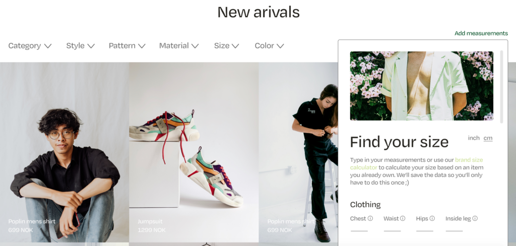
The photographs used in this work were collected from websites with a creative commons license, and were not created by me.
Finding your personal style quicker
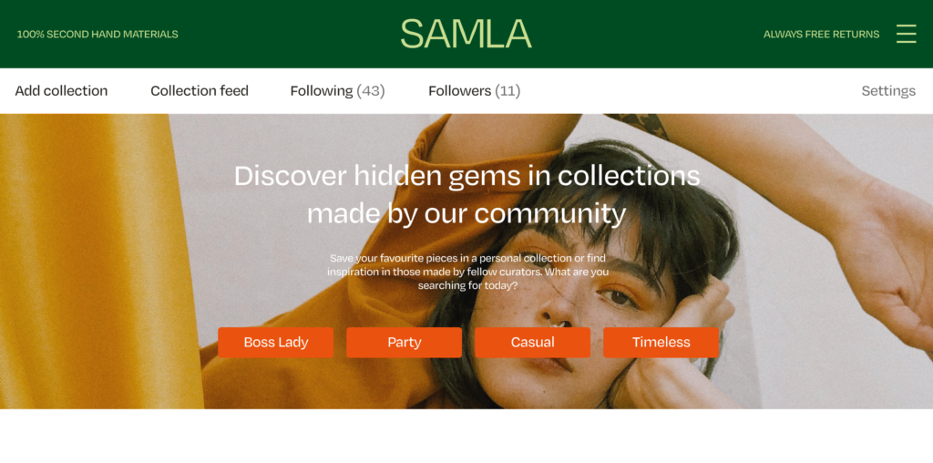
The second discovered issue was that shoppers found second hand shopping too time consuming. Thus, some of them would by fast fashion due to easy access. On SAMLA, users can filter by clothing category, style, pattern, material, size and colour. The platform also offers a Curated Collections function, which lets users (as well as the SAMLA team) to make lists of their favourite items. This works in a similar way to Pinterest – one can create personal collections, and follow other collectors. Through influencer collaborations, users can shop garments chosen by those they admire the style of.
The photographs used in this work were collected from websites with a creative commons license, and were not created by me.
An inviting brand
All shoppers mentioned that most second hand shops in Norway lack branding and inviting stores. By giving SAMLA a colourful branding, I have attempted to appeal to the target audience. The greens represent nature and the logo’s ink traps represents the marks of usage on second hand clothes. In order to avoid what shoppers referred to as dull and messy shops, I’ve kept the layout minimal and clean so that the clothes will come off as clean and of quality. Through the tone of voice I have also attempted to focus on the one-of-a-kind exclusivity of shopping second hand. The photographs also plays an important role when it comes to “selling” the garments (almost all photographs have been collected from a website with a creatives commons license due to time restrictions).
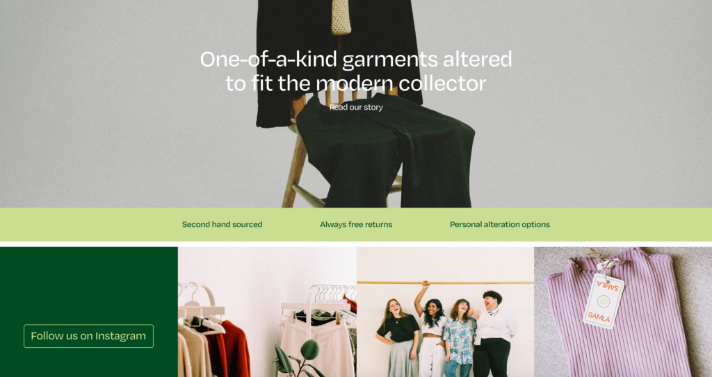
The photographs used in this work were collected from websites with a creative commons license, and were not created by me (Except from purple jumper photograph).
The prototype can be seen by opening in full screen below. Please bear in mind that several buttons won’t work as I have not had the time to create a full website.
Fig. 23: Reigstad 2021. SAMLA: Prototype
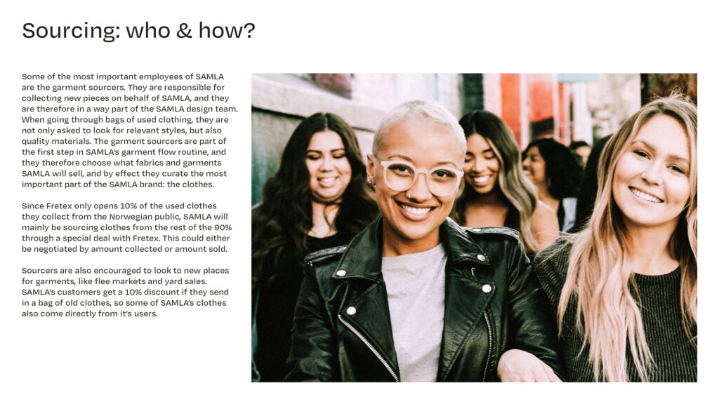
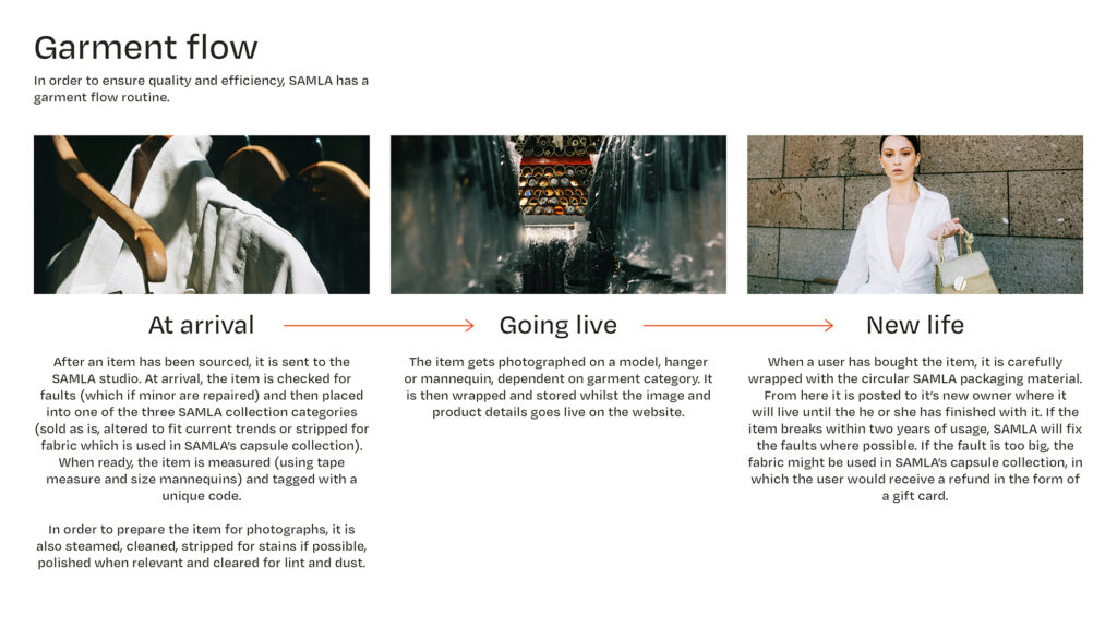
In addition to my prototype I have created a process guide for SAMLA, which explains how some of their routines might work. Some of this information would also be featured on the website and if I had more time I would have liked to add it to the prototype.
The photographs used in this work were collected from websites with a creative commons license, and were not created by me.
As mentioned I’ve also created a simple tag design in order to build a foundation for further branding material. Even though I would have liked to work further on my logo and branding system, I am happy with the cohesiveness of it. The tags are in line with the web design and I also think the minimal amount of packaging speaks for the brand’s vision.
In conclusion
It’s been a lot of fun to design SAMLA. By focusing on solving the issues discovered last week, the ideas for functionality almost appeared on their own through possible solutions. I particularly enjoyed working with the sizing calculator and the curated collections, as these functionalities were actual solutions to issues from the real world. In terms of the whole website however, I don’t think I’ve been able to make something super innovative. The platform does not have a unique set up that changes the retail experience, as it does have similar features to most fashion platforms on the market.
What I’ve found quite difficult this week was to come up with a thought out branding concept. Since most of my research from last week spoke about functionality, the branding sort of emerged as I was working on the website. Looking back, I wish I would have allowed more time for visual research and experimentation. Focusing on user experience and branding at the same time has been a real challenge that I hope to become better at in the future. At the moment, I unfortunately think that both the UX and branding feels half done, and if I had more time I would have worked on this further, in addition to finishing other functionalities like the Curated Collection user journey and the Our story page.
Even if the idea of a fashion retail service isn’t innovative in it self, I am pleased with the ways I’ve attempted to solve the users’ issues. I think the branding has made the online shop inviting with it’s colourful theme, and I’m also pleased with how SAMLA includes it’s community through Curated Collections. SAMLA is perhaps a consumerism oriented solution to a social problem, but with it’s vision of community engagement and sustainable consumer behaviour, SAMLA attempts to solve a social issue by looking at the environmental problem in a fun and encouraging way.
REFERENCES:
Ezio Manzini (2016) Design, When Everybody Designs: An Introduction to Design for Social Innovation. Cambridge: The MIT Press.
George Lee and Jonathan Collie (2021) ‘Design and Develop’. Canvas Falmouth Flexible [online], 16 April.
LIST OF FIGURES:
Figure 1. H&M GROUP. Ca. 2010-2021. H&M Group Brands. H&M Group [online]. Available at: https://hmgroup.com/
Figure 2-6: Ingrid REIGSTAD. 2021. Retail Market Research. Private collection: Ingrid Reigstad.
Figure 7: Ingrid REIGSTAD. 2021. Photography test. Private collection: Ingrid Reigstad.
Figure 8-10: Ingrid REIGSTAD. 2021. Branding experimentation and development. Private collection: Ingrid Reigstad.
Figure 11: Ingrid REIGSTAD. 2021. SAMLA Flow Chart. Private collection: Ingrid Reigstad.
Figure 12-14: Ingrid REIGSTAD. 2021. SAMLA development. Private collection: Ingrid Reigstad.
Figure 15-18: Ingrid REIGSTAD. 2021. SAMLA development – branding. Private collection: Ingrid Reigstad.
Figure 19: Ingrid REIGSTAD. 2021. SAMLA: Sizing Calculator. Private collection: Ingrid Reigstad.
Figure 20-21: Ingrid REIGSTAD. 2021. SAMLA: Curated Collections front page. Private collection: Ingrid Reigstad.
Figure 22: Ingrid REIGSTAD. 2021. SAMLA: Front page cut out. Private collection: Ingrid Reigstad.
Figure 23: Ingrid REIGSTAD. 2021. SAMLA: Prototype. Private collection: Ingrid Reigstad.
Figure 24-28: Ingrid REIGSTAD. 2021. SAMLA process guide. Private collection: Ingrid Reigstad.
Figure 29: Ingrid REIGSTAD. 2021. Packaging pieces. Private collection: Ingrid Reigstad.
