Lecture notes
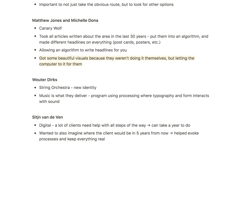
Lecture reflection
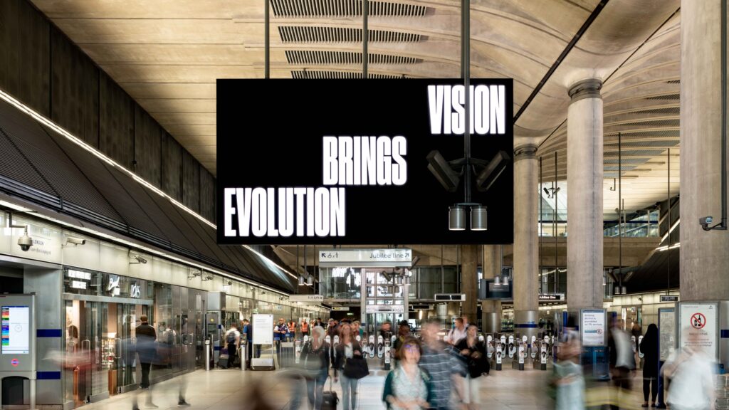
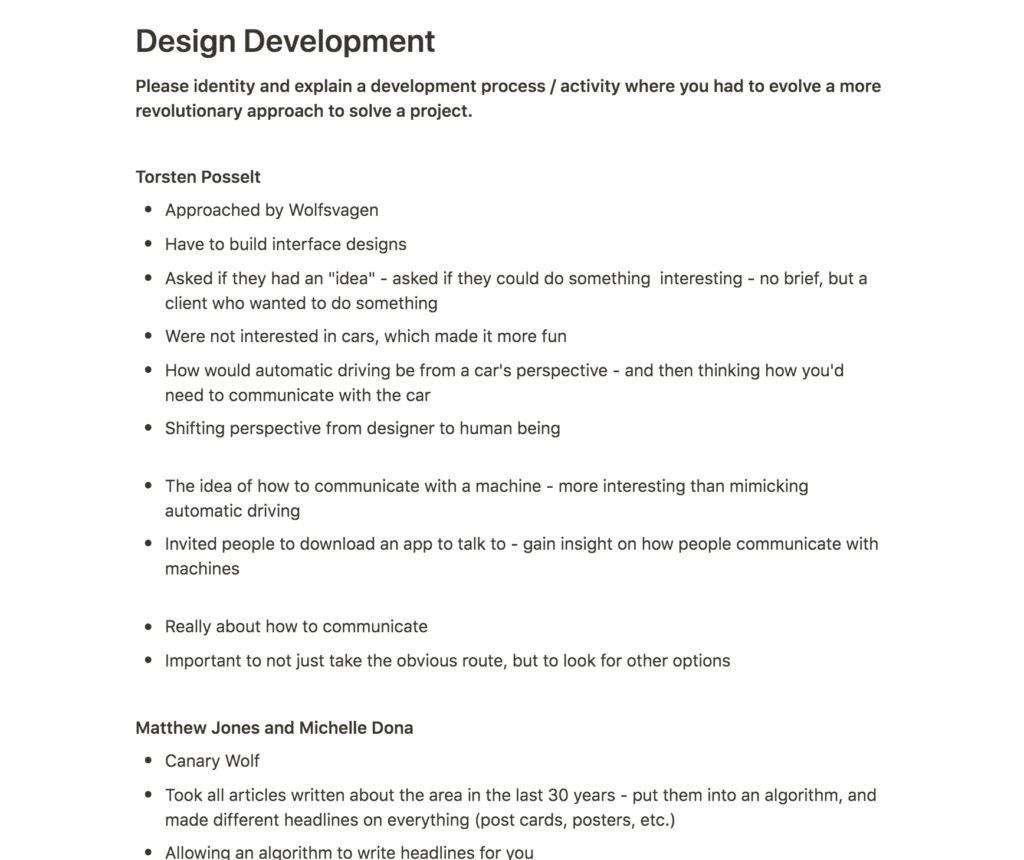
In relation to my project, I enjoyed hearing about Accept and Proceed’s project with Canary Wharf. In the lecture, Jones explained how they managed to develop a range of beautiful visuals that they wouldn’t have come up with themselves as they were made by an algorithm (Torsten Posselt et al., 2021). Although I’m not quite sure how to achieve it, this is the very thing I’m hoping to do with my grain patterns – to have an algorithm produce beautiful patterns.
What I find interesting about these visuals made by machines are mainly that they are bound to be unique and original in a different way than those that are human made. By using algorithms and machines, we can avoid personal human patterns, and take on the role as a curator.
Resource notes
Resource reflection
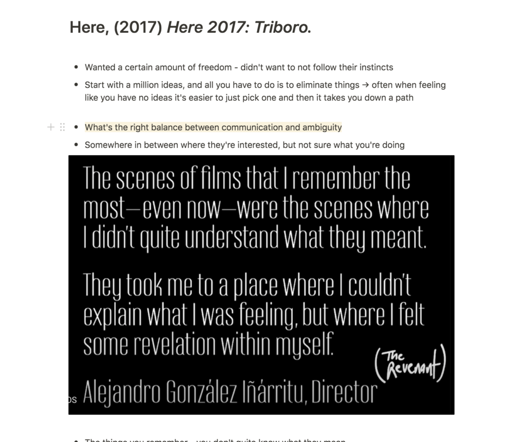
Here: Triboro
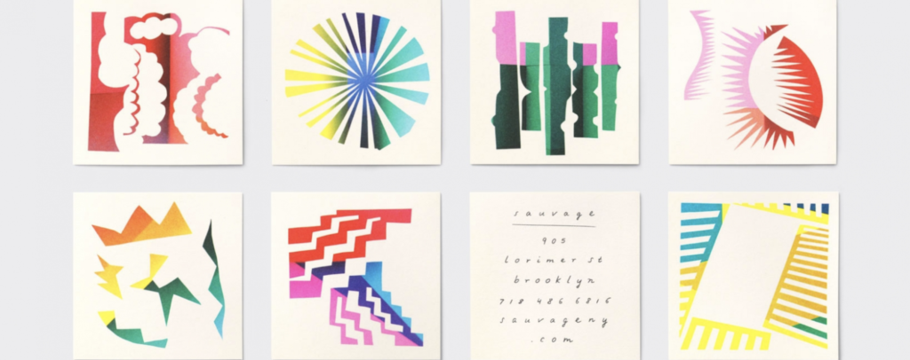
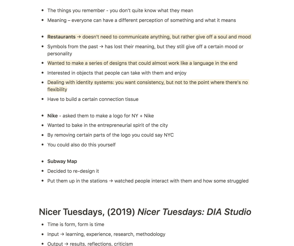
The talk by David Heastly from Triboro was very inspiring and I resonated with what he said about finding the right balance between communication and ambiguity (David Heasty, 2017). In my work I tend to have a reference or meaning behind most aesthetic choices. However, users wouldn’t really understand most of them unless they were told about this meaning or reference. I can see how this might come off as egocentric to non-designers, because what function are these references actually serving, if the function isn’t communicated?
I also enjoyed Heastly’s discussion on developing symbols that worked like a language. Although I’m not planning on doing this exactly for my project, I am hoping to develop an interface where certain patterns/illustrations will appear. These might not communicate any specific message, yet they might end up adding to a certain mood through certain movements, or how people react to the aesthetics.
Nicer Tuesdays: DIA Studio
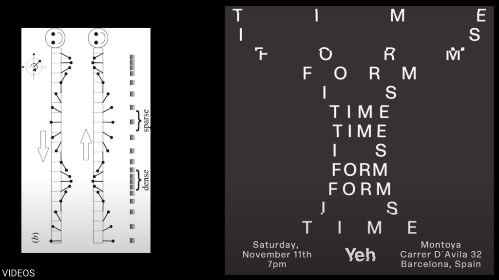
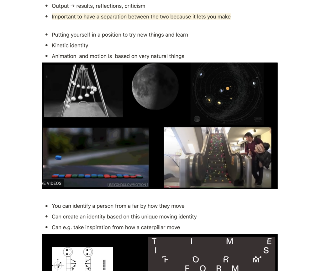
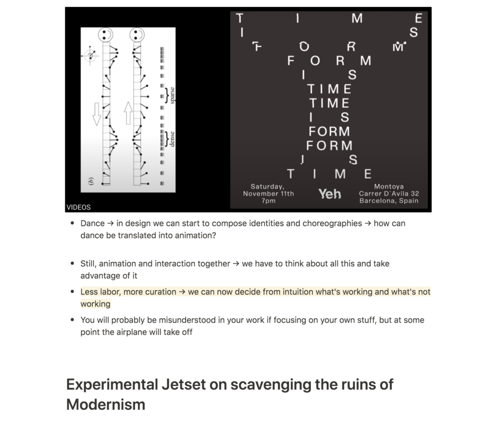
Since I’m planning on working with movement for my project, DIA Studio’s talk was very fascinating. The fact that different types of movement communicates different things (Mitch Paone, 2019) is something I haven’t thought much about before, yet I think it is something that will be so vital for my project to consider.
Since I want to communicate calmness, it might be a good idea to research calm movements in nature and dance, similar to how Paone works. The way he was inspired by the movements of caterpillars for example, was so fun, yet simple. Perhaps I could adopt this way of working by looking into how sand moves, and attempt to mimic the patterns in my interface. This will be challenging as I don’t have much animation skills, but I would love to at least try and consider it to a certain extent.
Workshop challenge
Animation experiments
Since a large part of my concept revolves around animation, I wanted to start off this week with animation experiments. I knew that I wanted to develop a floating unity of grains, which moved around, resulting in a range of abstract patterns and illustrations. At this stage I had no idea how to actually develop this however, and so I decided to spend a fair amount of time researching tutorials.
As advised by Ben last week I wanted to explore a range of potential tools (Processing, After Effects, and Blender) in order to find out which one I could potentially understand and use. Eventually, I found the below tutorials, which made me think that I might be able to use After Effects.
Repeater Grids
I needed my animations to contain a large amounts of circles, and I didn’t want to control each of those myself (due to time, but also wanting to use an AI to develop my patterns as a way of avoiding human patterns). The repeater function in After Effects let me repeat a circle horizontally and vertically, and by adjusting the position, size and rotation of these lines of circles, I was able to develop abstract and flexible patterns.
Using the functions from the Repeater tutorial, I created the below animation experiments:
Random expressions
Inspired by Accept and Proceed’s work (as well as prior reflections on my concept), I wanted After Effects to come up with the patterns for me, rather than making them myselves. I thought using AI technology would work nicely with the nature of science, and thus the Science Museum.
Using random expressions I was able to develop a range of pattern (see video below). However I couldn’t get them to move through flows, and the result therefore ended up being quite stressful:
Math.sin
Inspired by DIA Studio’s process, I wanted the movement of the grains to have a connection to the way sand grains move when becoming sand dunes.
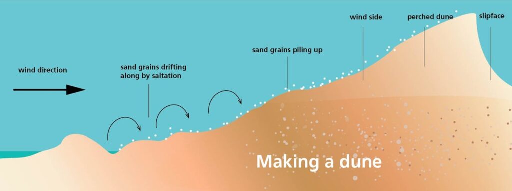
As a result of the image below, I concluded that the grains should move in a wave like manner, and I therefore experimented with the expression Math.sin which let me mimic wave movements in the way a value increased and decreased. Although I liked this idea in theory, it wasn’t working out visually. As the position and rotation decrease, grains are pulled inwards, making them impossible to hover over as elements for discovery.
Random flow
Since I wasn’t quite able to find the right expressions, I decided to cheat slightly in order to at least create a visual representation of what I wanted to do. By using the random expression, I was able to collect a range of keyframes, which I then used as points within a flow. This meant that I could use the AI within a controlled environment, which also resulted in a range of unexpected patterns which evolved in between keyframes.
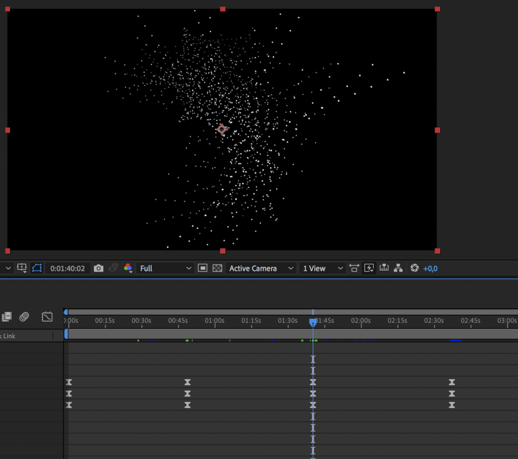
Below are my initial random flow experiments:
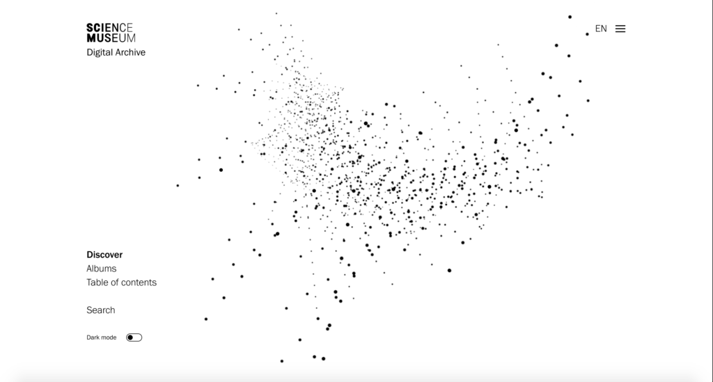
Last week I made the decision to go with a light background, in order to develop a unique aesthetic for my project. However, after testing an inverted version, I realised that the black background worked a lot better. The smaller grains were more visible, and the general feeling I was getting from this experience was calmer and more dreamy:
Since The Science Museum’s identity uses a range of gradients, I also wanted to test a gradient background. I personally found this a bit over the top, but if this was a real project with a longer time frame, I would have liked to test it on audiences and ask for client feedback.
Having developed the animation experiments above I decided to post them on the ideas wall for feedback. Weronika mentioned that the patterns were moving a bit too fast, which I agreed on, particularly if users were to use them as discovery objects. Otherwise, the feedback was positive. Some people mentioned that the animations were calming, which was great as this was my intention.
Building a prototype
Feeling happy about the direction of my animations were going, I moved on to work on my Figma prototype.
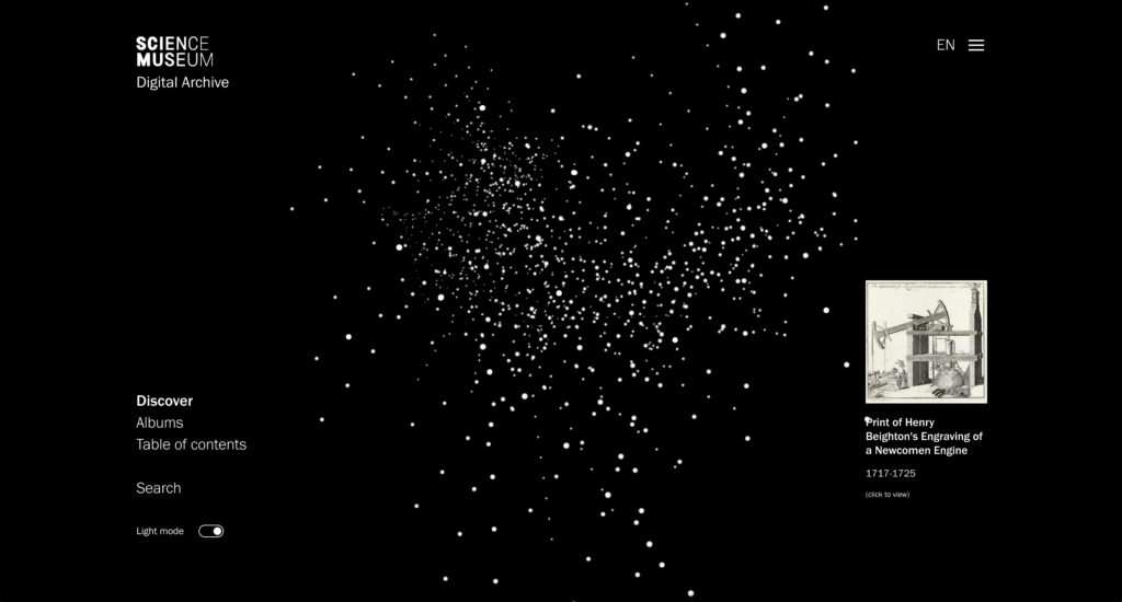
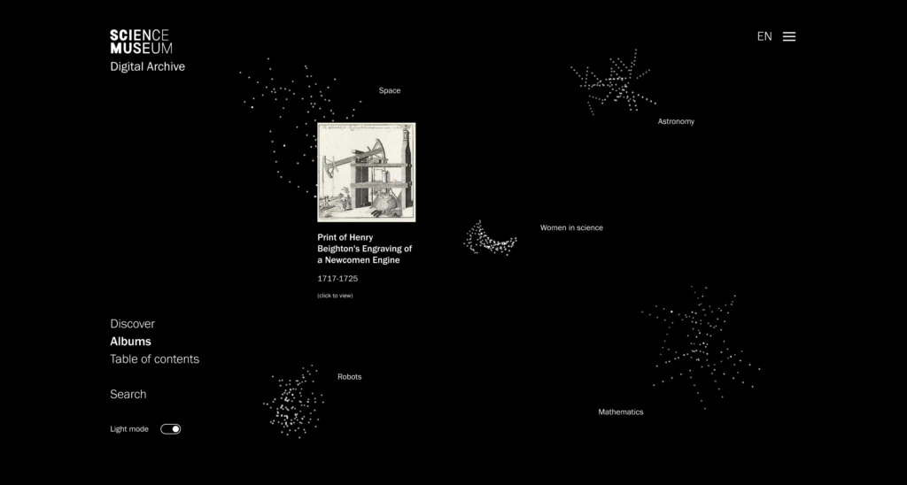
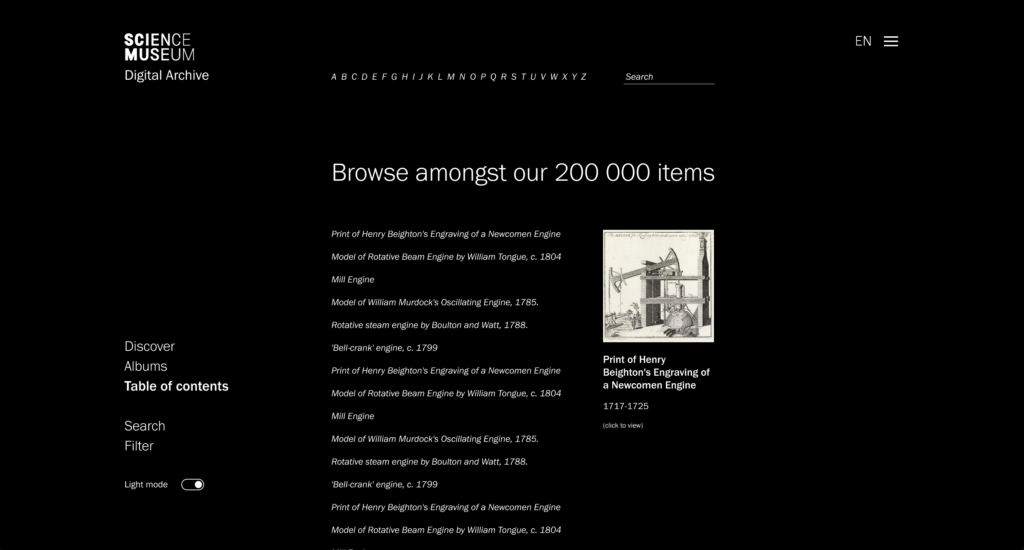
The intention of my project is to develop a calming digital space, in which users can discover a range of entries. The animated discovery sequence therefore needed to be the main element, and the rest needed to be quite minimal in order to retain calmness. A large part of my challenge was to give users a range of options for discovery, whilst not overwhelming them. I therefore decided to develop three main discovery modes: Discover, Albums and Table of Contents.
The discovery mode would be the front page, containing a grain clouds of entries in which people could hover and click on to read more. Here, micro vs. macro is presented by building one element out of several smaller ones.
The albums would contain a range of categories/folders/themes, selected my the museum, presented as smaller grain clouds. This way of presenting groups was heavily inspired by the Google Arts and Culture project Medusae, which I looked at last week. By clicking on an album, users could explore it as a larger one (presented in the same way as the discovery cloud). This way of presenting folders could also be used in users’ individual collections, where they could keep track of items they like.
The table of contents is a response to the teacher’s feedback from last week, who mentioned that he’d rather browse in a written and more analytical format. Since there are 200 000 entries in the collection, this becomes another reference to the micro vs. macro element, resulting in a typographic translation of the visual grain cloud, which still lets users discover in a randomised fashion.
After reflecting on how people would browse, I also added a search and filter option, which users could use to limit their discovery sections. I also included a dark/light mode, as I imagined the black background being slightly tiering on the eyes when used over a long period of time.
Object pages
As established last week, I wanted to include object pages where users could read about each item, and navigate forward and backwards between similar items (as a way of guiding users onwards after discovery). These object pages were not to contain large amounts of information however, as I wouldn’t want to overwhelm users. When wanting to read more, users could click to view entry on the Science Museum’s webpage.
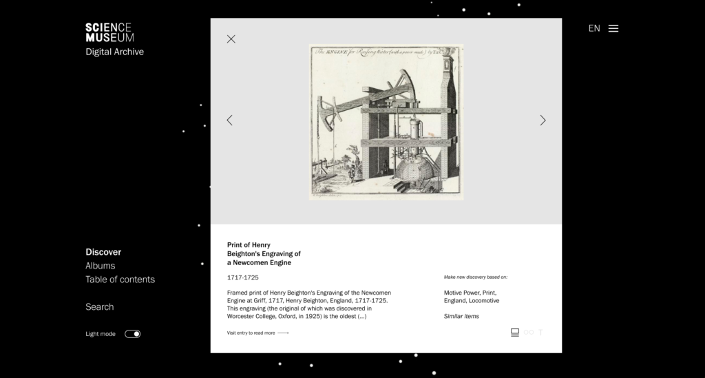
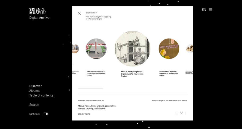
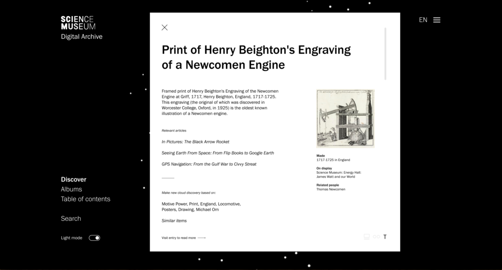
I wanted the object pages to target the different audience groups – vultures and snackers. Therefore, I developed three types of viewing modes.
The first presents one image at the time, with an introductory amount of information to go with it. Here, users can choose to make new discovery clouds based on relevant keywords or similar items.
The second is targeted towards visually led snackers, with a surface browsing need. Users can horizontally scroll through a range of similar items and click on them if wanting to visit the entry on the Science Museum’s website.
The third is aimed at more analytical people looking for information (vultures), inspired by the teacher’s feedback last week. This mode also presents a list of relevant articles, so that information seekers can discover more analytical information.
Final animations
Based on the feedback from Weronika I also exported slower animations.
Front page animation (dark mode):
Front page animation (light mode):
Albums animation:
Since Figma doesn’t support video, I had to export smaller outtakes as GIFs for my prototype. Also, since the prototype grains are separate GIF/video files, you wouldn’t actually be able to click on them. I therefore added still white dots to illustrate the hovering effect. Unfortunately Figma doesn’t let you add hover and click interactions to one object, and so I’ve included one red dot in the discovery mode which can be used to open the object pages.
The prototype can be viewed here.
Gathering feedback
At this stage my prototype didn’t convey anything hugely different from when I last gathered feedback, and at this stage the teacher’s feedback was still relevant. Rather than gathering feedback from the same group, I therefore decided to reach out to a new friend who’s a student that’s used to working with references. I was also very unsure about the user experience aspect of my prototype, and I therefore decided to speak to the UX-designer who I also spoke to in week 8.
Feedback from a UX-perspective:
- The first reaction was a lot of confusion – he didn’t understand what was going on or what he was expected to do.
- He mentioned that there were no title to explain what he had entered and that there might be too many choices and elements to click on, leading him to think that the animation was mainly decorative and not a browsing tool.
- He suggested a few solutions to make it less confusing, like changing the name of the page or building a brief intro guide
- In terms of the object pages he didn’t see why I needed three viewing modes, and suggested that the first and second could be combined.
- He also mentioned how the viewing modes has different functions, not just viewing, which is something to be aware of
- Further he mentioned that if the point with the visual mode is to have few images at the time, I should show even fewer that five
- He liked to weirdness of the table of content as a concept, almost like an irrational design that comments on our constant urge to rationalise interfaces – in relation to this he reflected on how one can almost “loose oneself” in the list, and how this could be part of the copy somehow
- He suggested to make the interface clearer by indicating that each sentence is a different item, and also to change the name to something clearer
- We also discussed how the table of content could be linked to the grain cloud, for example by animating a randomised order every time you enter the page
- In terms of the over all design he liked how the interface made him curious and wanting to reveal images
- In order to simplify the interface he suggested to get rid of the filtering option, and to make the search less visible, for example by moving it to the top right menu
This feedback was very helpful and I agreed with most of it. Moving forward to next week, these points will be important to consider as I go on to finalise my project.
(The student needed more time to give feedback, and so hers can be found in the week 11 blogpost).
In conclusion
This week has gone by so quickly, maybe because I had to spend quite a bit of my time learning and experimenting with animation. I don’t regret this decision though, as I’m quite happy with how I almost managed to visualise the idea I had in my mind. Although they’re not perfect, I think the animations are working well enough considering the time frame, and moving on I will be focusing on interface iteration, holistic and physical approaches, and attempting to develop lettering animations as a kind of logo for the digital archive.
Although they are looking clean, I’m not very happy about the object pages. They don’t feel as contemporary and dynamic as I would like, and I agree with the feedback I received about not needing three different viewing modes. Perhaps it could be helpful to make one very visual mode and one very verbal mode – emphasising how they are catered to different types of audiences. At the moment I also struggle to see how they connect with the interface visually – they might be missing some of the tranquility and motion from the discovery pages, and moving forward I might have to think about making the two more cohesive.
Looking back I realise that I haven’t spent much time experimenting with the typographic layout of the interface. This might be the cause for why the UX-designer felt confused, and why I’m finding the object pages a bit dull. If I have time next week I might attempt to experiment further with this, as a way of lifting the visual aesthetic.
REFERENCES:
BigBlueButton – Week 10: Crit Etiquette (no date). Available at: https://exab021305.reu1.blindsidenetworks.com/html5client/join?sessionToken=egptvq5v26jeoypf (Accessed: 25 November 2021).
David Heasty (2017) Here 2017: Triboro. (Here). Available at: https://www.youtube.com/watch?v=jHBMG0B2ZEk&ab_channel=It%27sNiceThat (Accessed: 23 November 2021).
Mitch Paone (2019) Nicer Tuesdays: DIA Studio. (Nicer Tuesdays). Available at: https://www.youtube.com/watch?v=qTynk4wmXD8&ab_channel=It%27sNiceThat (Accessed: 23 November 2021).
Torsten Posselt et al. (2021) ‘Design Development’. Canvas Falmouth Flexible [online], 19 November.
LIST OF FIGURES:
Figure 1. Accept and Proceed. 2019. Canary Wharf Residental. Accept and Proceed [online]. Available at: https://www.acceptandproceed.com/project/CanaryWharfResidential
Figure 2. TRIBORO. 2016. Sauvage: visual identity for a restaurant. Triboro [online]. Available at: https://triborodesign.com/
Figure 3: DIA STUDIO. 2019. Nicer Tuesdays: DIA Studio
Figure 4: ECABRAMS. 2020. Repeater Grids – Adobe After Effects tutorial . Available at : https://www.youtube.com/watch?v=0oJ1Ipa_cdM&ab_channel=ECAbrams [accessed 26 November 2021].
Figure 5: Ingrid REIGSTAD. 2021. Animation exploration. Private collection: Ingrid Reigstad.
Figure 6: Ingrid REIGSTAD. 2021. Animation exploration. Private collection: Ingrid Reigstad.
Figure 7: ECABRAMS. 2021. Random Expressions in Adobe After Effects . Available at : https://www.youtube.com/watch?v=xrKMeeFrMxg&ab_channel=ECAbrams [accessed 26 November 2021].
Figure 8: Ingrid REIGSTAD. 2021. Animation exploration. Private collection: Ingrid Reigstad.
Figure 9: ECABRAMS. 2018. Math.sin – Adobe After Effects Expression . Available at : https://www.youtube.com/watch?v=Oiiq4wmbuPo&ab_channel=ECAbrams [accessed 26 November 2021].
Figure 10. Unknown maker. ca. 2018-2020. Dunes. [digital illustration]. National Park Service [online]. Available at: https://www.nps.gov/slbe/learn/kidsyouth/dunes.htm [accessed 26 November 2021].
Figure 11: Ingrid REIGSTAD. 2021. Animation exploration. Private collection: Ingrid Reigstad.
Figure 12: Ingrid REIGSTAD. 2021. Animation exploration process. Private collection: Ingrid Reigstad.
Figure 13: Ingrid REIGSTAD. 2021. Animation exploration. Private collection: Ingrid Reigstad.
Figure 14: Ingrid REIGSTAD. 2021. Animation exploration. Private collection: Ingrid Reigstad.
Figure 15: Ingrid REIGSTAD. 2021. Animation exploration. Private collection: Ingrid Reigstad.
Figure 16: Ingrid REIGSTAD. 2021. Animation exploration. Private collection: Ingrid Reigstad.
Figure 17: Ingrid REIGSTAD. 2021. Animation exploration. Private collection: Ingrid Reigstad.
Figure 18-21: Ingrid REIGSTAD. 2021. The Science Museum prototype. Private collection: Ingrid Reigstad.
Figure 22-24: Ingrid REIGSTAD. 2021. The Science Museum prototype. Private collection: Ingrid Reigstad.
Figure 25: Ingrid REIGSTAD. 2021. Animation exploration. Private collection: Ingrid Reigstad.
Figure 26: Ingrid REIGSTAD. 2021. Animation exploration. Private collection: Ingrid Reigstad.
Figure 27: Ingrid REIGSTAD. 2021. Animation exploration. Private collection: Ingrid Reigstad.

