Defining my target audience
Having done some design experimentation last week I realised that although I’ve had a vague target audience in mind, it might help to develop a set of specific personas in order to really determine my final visual aesthetic direction.
I knew that I needed to target groups of people who would be intrigued by Esperanto’s inner idea –those with an interest for the common good and societal issues. Based on this I determined that I should have three main personas:
- The activist
- The high school pupil
- The humanities student
In order to figure out details about each persona I reflected on their potential interests, places they would hang out and what brands they would love (in addition to general information, wants and needs). From here I researched the places and brands, in order to develop a characterised presentation for each of the personas.
If I had more time this week I also think it would have been beneficial to conduct target audience interviews, in order to really make sure that my research was correct.
The activist
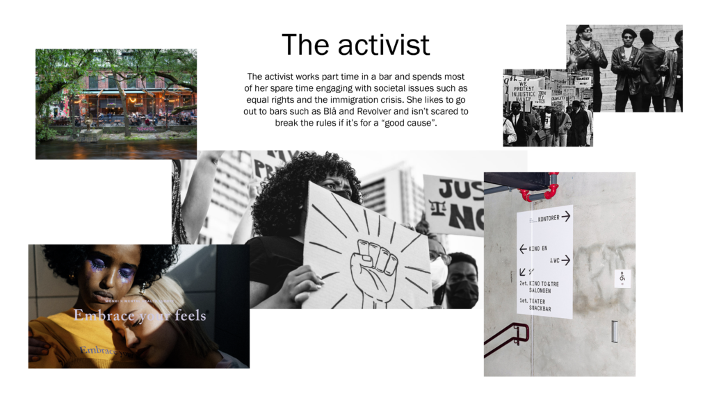
About
The activist works part time in a bar and spends most of her spare time engaging with societal issues such as equal rights and the immigration crisis. She likes to go out to bars such as Blå and Revolver and isn’t scared to break the rules if it’s for a “good cause”.
Wants & needs
- Make a difference in the world
- To be heard by politicians, friends and family
- Influence those with other opinions than herself
Communication platforms
- Physical demonstrations
- Speaking at conventions
- The press (personal opinion letters) → Papers: Natt&Dag, Subjekt, Aftenposten, Morgenbladet
Favourite brands
- Deichmanske bibliotek
- Monki
- Pust
The high school pupil
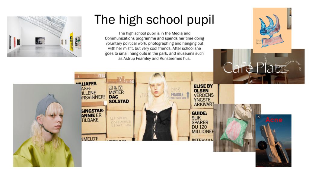
About
The high school pupil is in the Media and Communications programme and spends her time doing voluntary political work, photographing and hanging out with her misfit, but very cool friends. After school she goes to small hang outs in the park, and museums such as Astrup Fearnley and Kunstnernes hus.
Wants & needs
- To find herself (something to identify with)
- To be part of something bigger than herself
- To be cool (she follows trends, but not necessarily the most popular ones)
Communication platforms
- Tiktok
- Political gatherings
Favourite brands
- Weekday
- Fretex
- Bubble tea
- Holzweiler / Café Platz
The humanities student
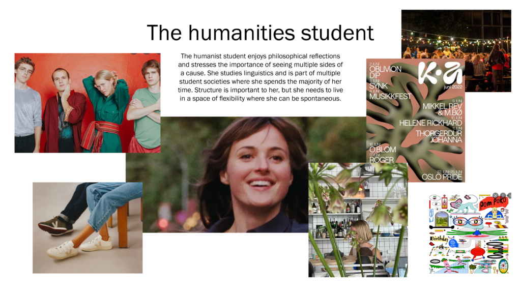
About
The humanist student enjoys philosophical reflections and stresses the importance of seeing multiple sides of a cause. She studies linguistics and is part of multiple student societies where she spends the majority of her time. Structure is important to her, but she needs to live in a space of flexibility where she can be spontaneous.
Wants & needs
- Being part of and contributing to a community
- Finding and discussing new perspectives with others
- Continuous development as a person → loves to jump onto new things and to find new interests
Communication platforms
- Tiktok
- Student society gatherings/speeches/entertainment (low key)
Favourite brands
- Tise
- Kaffebrenneriet
- Veja
- & other stories
Key take aways
Based on the personas I then went on to establish a set of key take aways with suggestions for improvement of last week’s design:
- Inspire community building + sharing one’s opinion
- Posting outcomes to social media
- Physical gatherings
- Contributing to an exhibition or book
- Writing: could it be more about perspective and opinion, rather than literature?
- Needs to be more political
- Something to identify with
- Activist tone of voice
- Needs to have a stronger brand → specific and slightly trend based → more drawings and organic/deformed
- Highlight how culture making can change the world → Why should they use the platform?
- “Esperanto culture making: empowering makers of inclusiveness and peace”
Further development
Based on the insight from last week’s conclusion and this week’s target audience definition, I went on to iterate on my design.
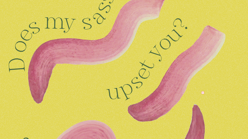
A more organic typeface
The first task was to find a more organic typeface, which could symbolise craft and making. I found MAD Serif by Colophon Foundry to be a good alternative, not only because of it’s imperfect nature, but also because it reminded me of the lined borders you find on maps. The curves also had the friendly feel I was after.
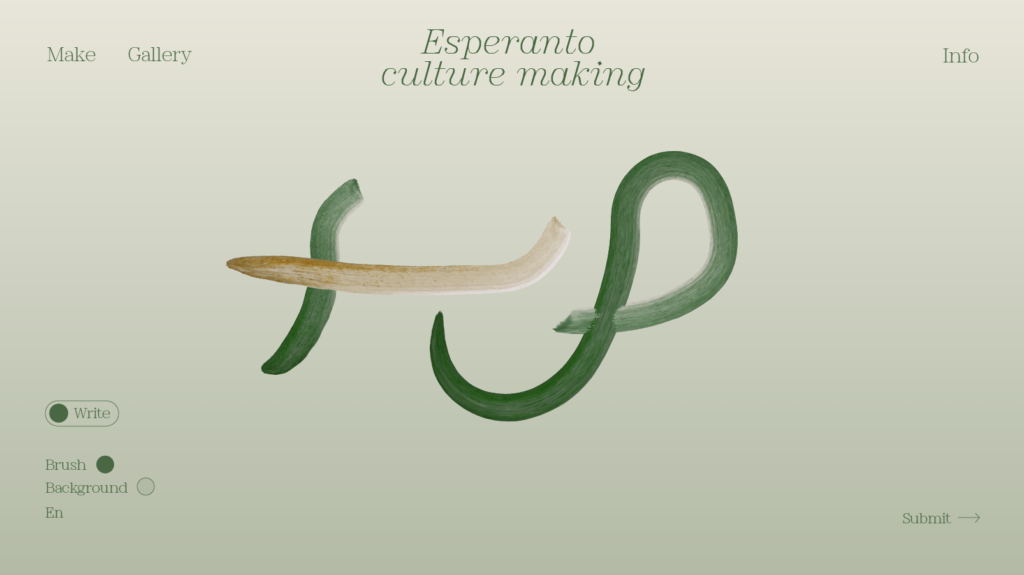
New layout system
I also wanted to experiment with layout and the various interface elements of the platform. The design needs to emphasise the making aspect and I therefore didn’t want the UI to be too detailed or text filled. However, it can’t have so few details that users don’t understand what the platform is. In fair of this being too much of a copy, I took inspiration from Café Platz’s website, who used a convenient way of distributing menu elements in the top of the website.
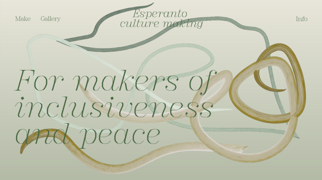
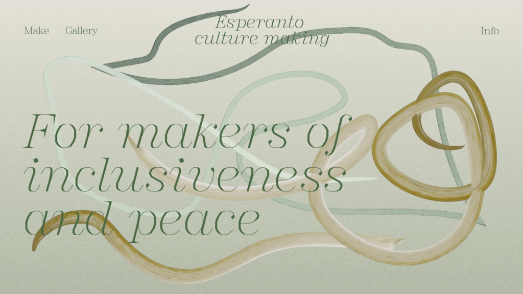
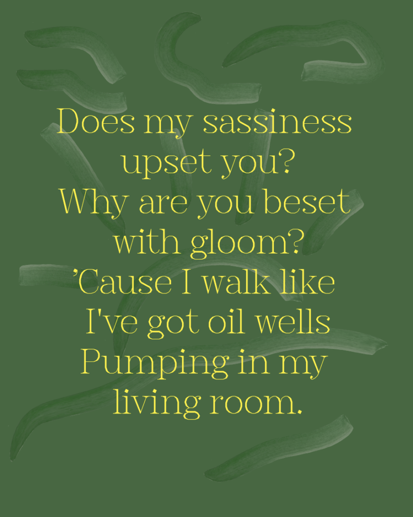
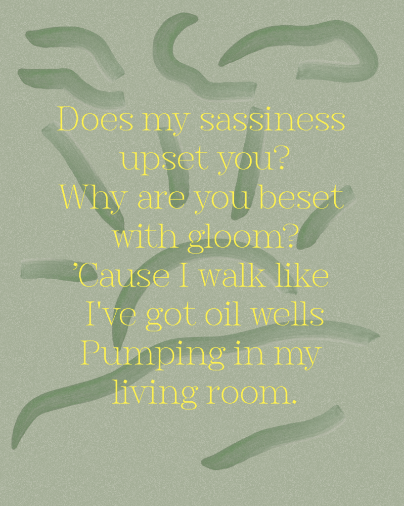
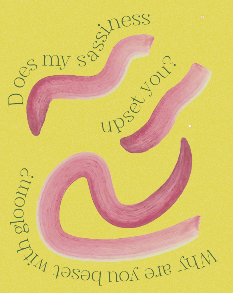
I also wasn’t happy with last week’s conventional website design, where users scroll down on a long website. Instead, I wanted the website to be more of an experience, where interaction with elements reveals content. Below I have sketched a suggestion for how user developed strokes could appear on the front page (this would be animated), symbolising the blending of cultures:
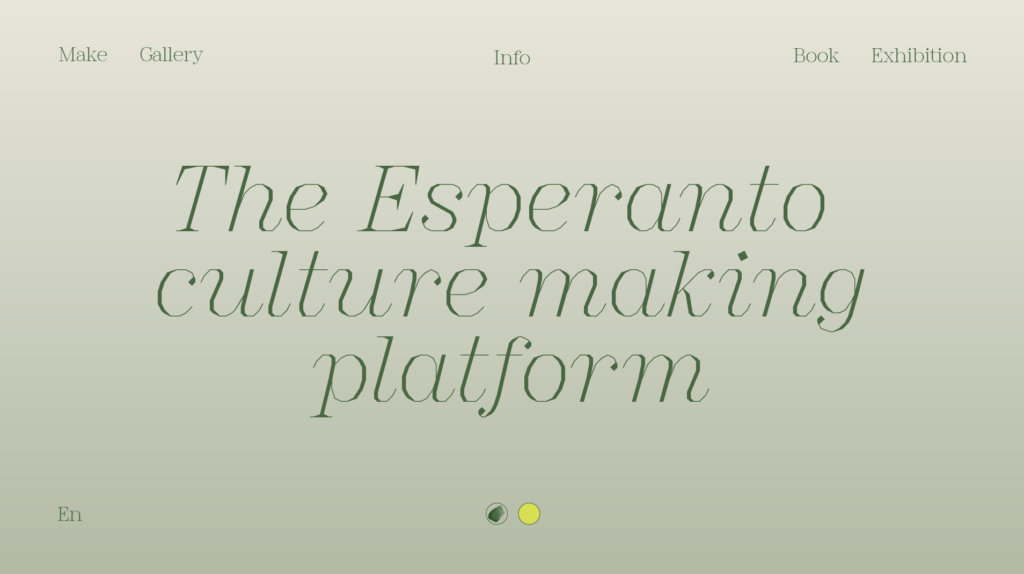
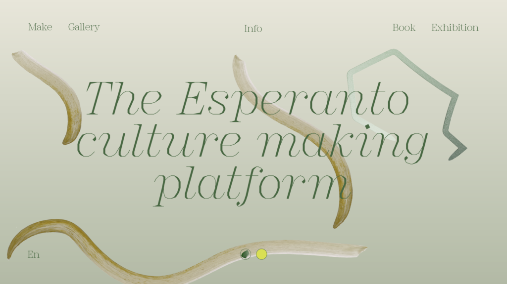
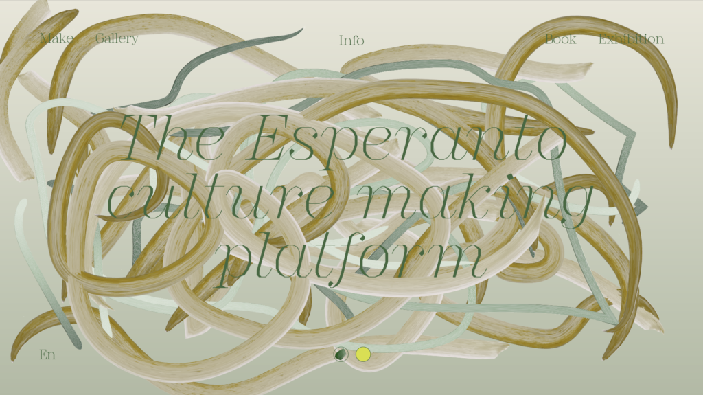
Fig. 4-6: Reigstad 2022. Interface development
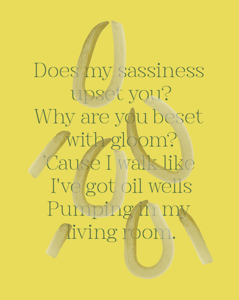
Feeling happy about the direction I was going in I did some further layout development:
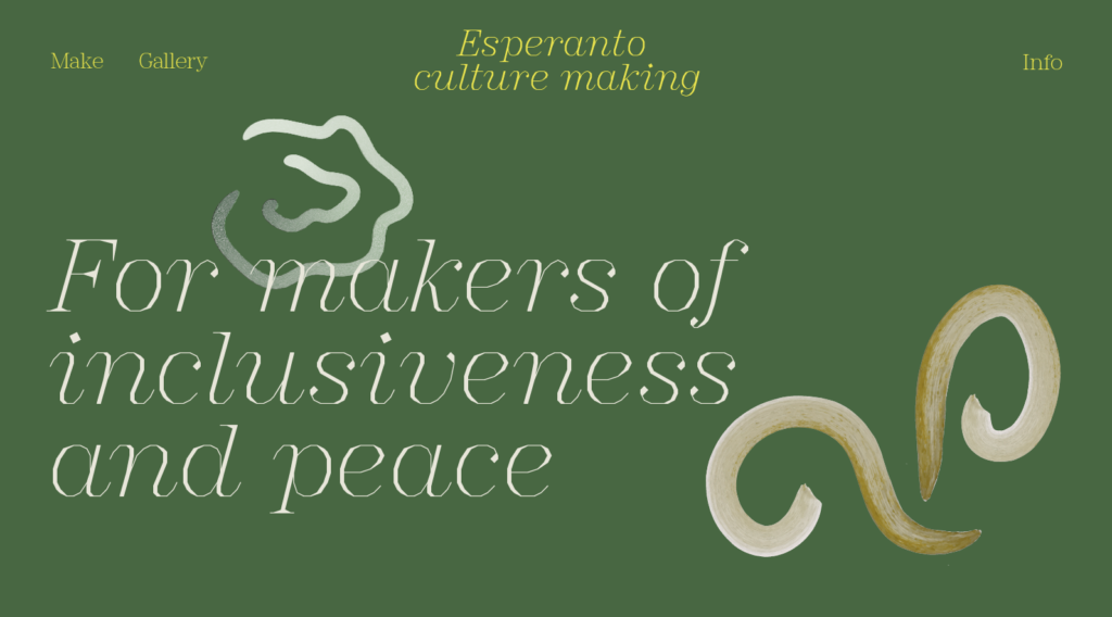
Although I thought the above designs looked “nice”, I still felt as it they could be more experimental and edgy, in order to target my personas. In attempt to fix this I experimented further with combinations of colour, text and brush strokes:
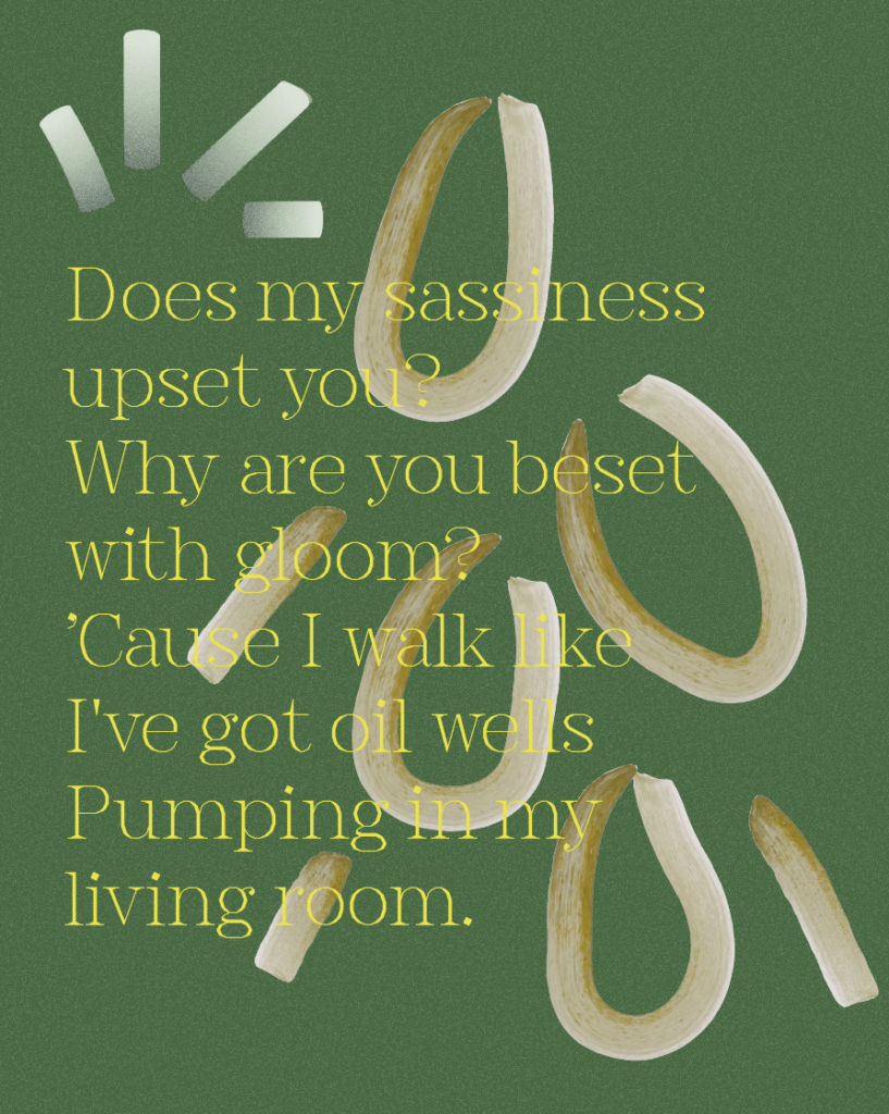
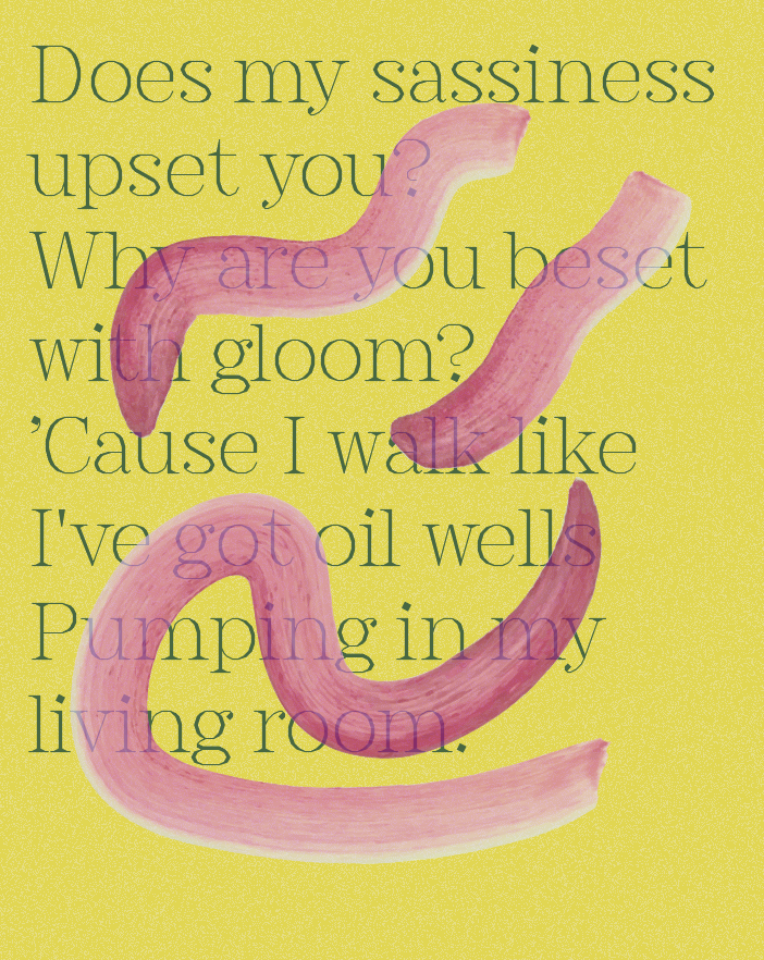
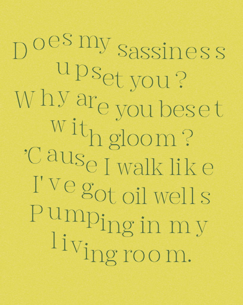
I wanted to experiment with visual movement, as well as how different users’ outcomes could be combined (as a reflection of hybridisation). Even though Esperanto deals with serious themes such as inclusion and peace, I think the design should reflect individualism (which shows different cultures and people, coming together in a shared space), optimism (hope is foundational for the inner idea) and attitude (this would most likely resonate with my personas’ interest for activism, and the culture making is also all about lifting people’s voices). However, I think I will have to find a balance between an energetic aesthetic and a happy go lucky aesthetic – the design shouldn’t feel naive.
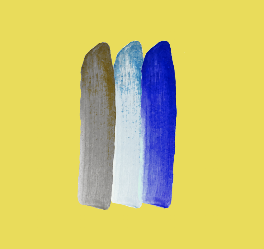
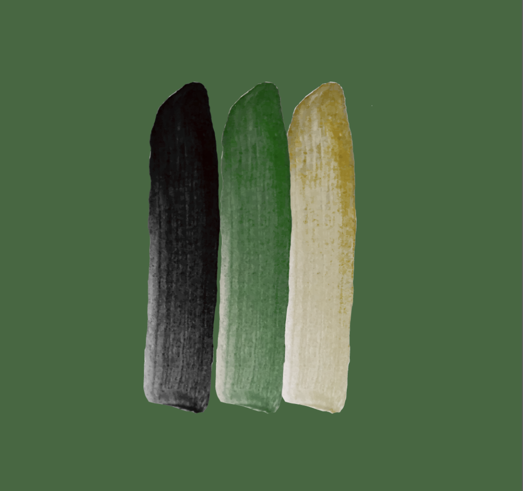
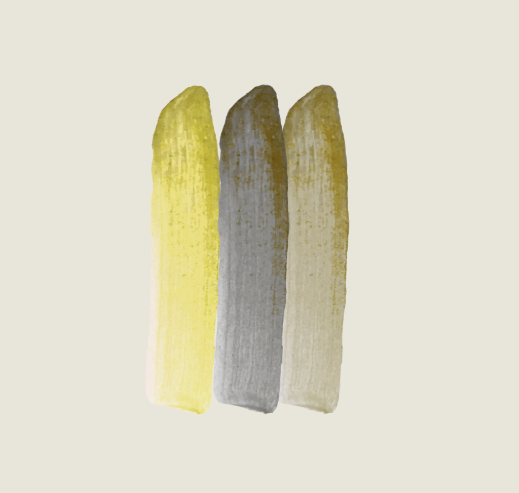
In attempt to finalise the general look of my project I also developed a (work in progress) colour palette for graphics and brushes:
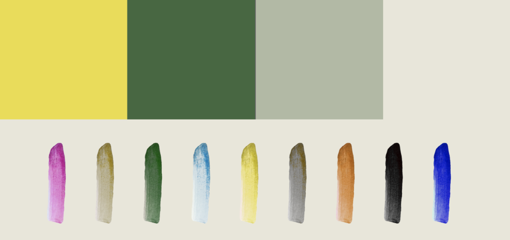
By testing the combination of various brush colours I was able to tweak the colours so that they could all be used to generate various colour combinations:
Applications
In addition to existing online I’d love for the Esperanto culture making to become part of the world outside of it’s own website.
Social media
I’ve previously discussed how I’d like users to be able to export their outcomes as social media posts – by letting them draw on top of selfies/photos, combine their drawings with other users’ texts (and vice versa), or simply exporting their outcomes as imagery. I think this could make for a great awareness campaign where activists could demonstrate their opinions and beliefs through digital dialogue.
AR
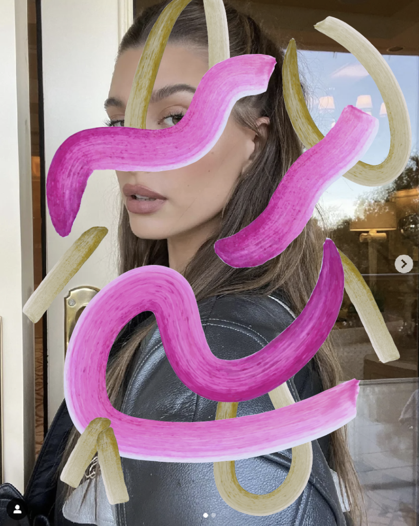
Inspired by Hato’s D&AD project (which originally inspired the approach I’m taking), I also wanted to experiment with exploration of the gallery through augmented reality. Emma advised me to check out the Adobe app Aero, which easily let me export brush strokes from Illustrator to AR:
Fig. 19: Reigstad 2022. AR experiment 1
The above experiment made me wonder wether the gallery could be viewed in augmented reality as a whole, in order to manifest the culture makings as “real” objects? This could be a great way of adopting other cultures and people’s makings into one’s own world, again symbolising the coming together as people.
Fig. 19: Reigstad 2022. AR experiment 2
When animated and viewed from various angles, the strokes get a wonderful essence of physicality, and almost becomes a sculpture.
Exhibition
Although I wouldn’t have time to actually set this up, it would be great to imagine the culture making outcomes in a real life exhibition. Here, drawings could be turned into actual sculptures by artists, and users could make more culture through physical workshop installations. Having experimented with AR however, I wonder wether the exhibition could take place in a digital space only, through a new reality that simulates Esperantujo by portraying digital culture outcomes in physical space. By showcasing the various culture makings, the exhibition itself would become a hybridisation of cultures, and so the outcomes might not need to be combined 2 by 2.
Although the AR is starting to feel far away from the organic and manmade themes that I was initially hoping to adopt, I think the solution is valuable in terms of being available to everyone across the globe. A physical exhibition would never be fair in light of Esperanto because it’s location would always be beneficial to some and not to others.
Physical posters
With a digital exhibition I think physical posters could be great. Using a QR-code, people could access the gallery in real time, using their phones. The posters could be ordered and hung by exhibition contributors, resulting in them being on show around the globe.
Book
Although this wouldn’t be needed for my project, I think it would be beneficial for my portfolio to make a printed outcome as well. A book called “Esperanto culture making” would be a fun thing to make if I can find the time.
Development outcome plan
Up until this point I had felt a little overwhelmed due to not having wrapped my head around what I was making. I therefore decided to set up an outcome plan with lists of what I will need to develop through the remaining weeks of my project:
Please click here to access the plan.
In conclusion
I’ve really enjoyed experimenting this week, and I love seeing the design moving forward. Developing personas was hugely beneficial as it helped me see several errors with my project, like how the aesthetic was a bit too pretty in the beginning of the week. As I go on with design development I will attempt to keep the personas in mind for every decision, so that I can remain on the right track visually.
An important turning point this week was the discovery of Aero and the AR solution for the platform’s gallery. I have been very unsure about how to present user outcomes in a meaningful way, and it would feel a bit dull to simply lay out doodles in a grid based design. By doing an AR exhibition I can make sure that the works are available to everyone around the globe, whilst also delivering tangible culture objects that people can actually “feel” through physical interaction.
I’m starting to realise that the deadline is approaching, which worries me slightly. With my new idea I will have to spend a fair amount of time on development, meaning I I might not have time to develop a project typeface. I wouldn’t necessarily need an original typeface, but in terms of personal interest I’d love to make one. Hopefully the outcome plan will keep me on track over the following weeks, and ideally I’ll be able to develop every outcome, including a typeface.
List of figures:
Figure 1: Ingrid REIGSTAD. 2022. Personas: The activist. Private collection: Ingrid Reigstad.
Figure 2: Ingrid REIGSTAD. 2022. Personas: The high school pupil. Private collection: Ingrid Reigstad.
Figure 3: Ingrid REIGSTAD. 2022. Personas: The humanist student. Private collection: Ingrid Reigstad.
Figure 4-6: Ingrid REIGSTAD. 2022. Interface development. Private collection: Ingrid Reigstad.
Figure 7-10: Ingrid REIGSTAD. 2022. Interface development. Private collection: Ingrid Reigstad.
Figure 11-18: Ingrid REIGSTAD. 2022. Visual development. Private collection: Ingrid Reigstad.
Figure 19: Ingrid REIGSTAD. 2022. AR experiment 1. Private collection: Ingrid Reigstad.
Figure 20: Ingrid REIGSTAD. 2022. AR experiment 2. Private collection: Ingrid Reigstad.