
Lecture notes
Lecture reflection
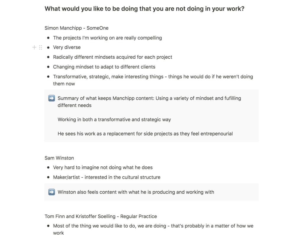
How can we make what we would like to be doing, part of our day jobs?
What I found very interesting about this week’s case studies was that all of the designers seemed to work in a way where they would naturally incorporate what they want to be doing into their work. This must be the ultimate goal for a designer – to get to work with what you want to be working with in your day job. Thus, I wonder how I can make that happen in my own work.
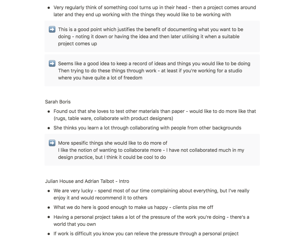
Finn and Soelling from Regular Practice seemed to have an effective way of ensuring this. They mentioned how they often discuss ideas they would like to be doing, and that they tend to note these ideas down and then use them when the right project comes along (Manchipp et al., 2020). I think what we are doing this week, noting down what we would like to get better at, is a good way of ensuring that we get to work with what we would like to be doing in the future.
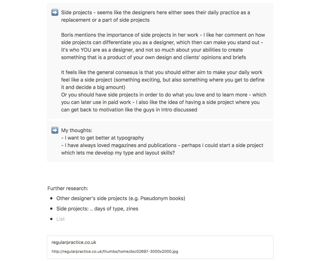
The advantage of side projects
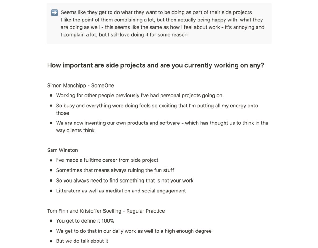
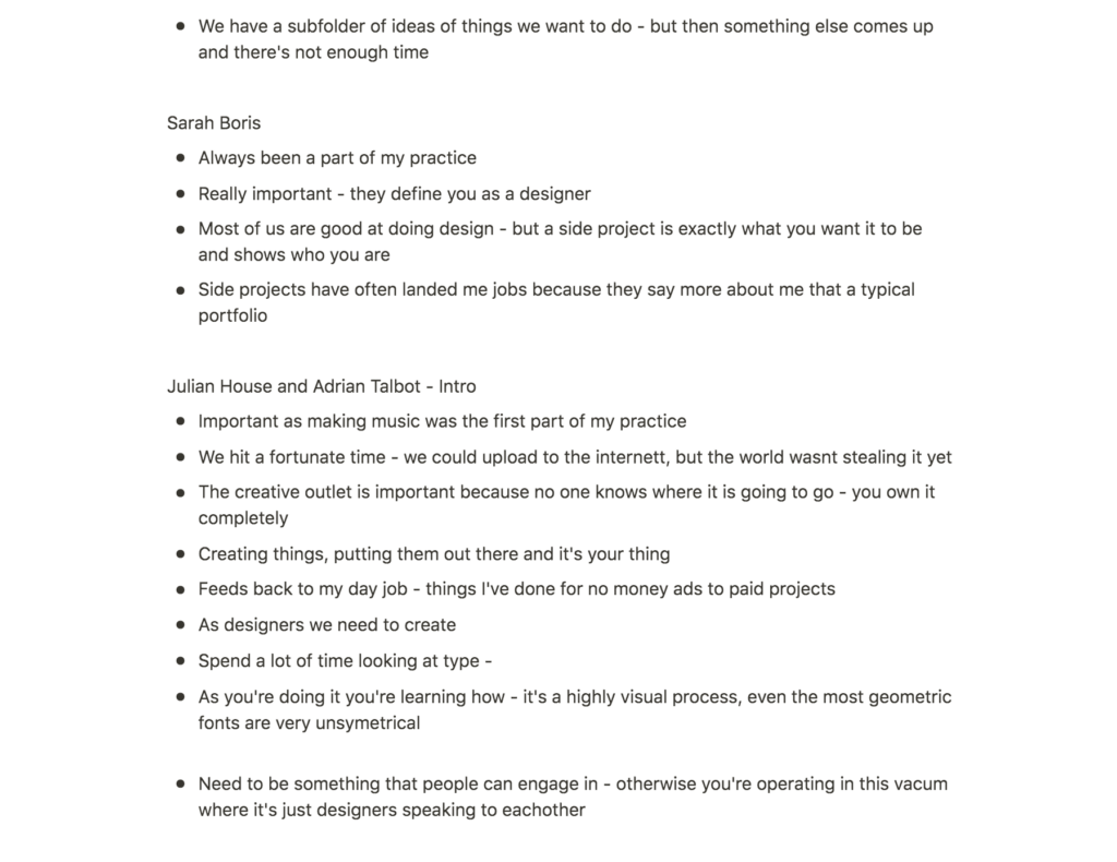
The discussions on side projects in this week’s lecture was very inspiring to me. The idea of working on a project which you get to define yourself is intriguing, and I would like to consider creating a side project of my own. I think Julian House from Intro made a good point in that a side project can work as a motivational booster when your day job become difficult (Manchipp et al., 2020). Therefor I would like to investigate how I might use side projects as a way of improving the skills I would like to obtain in my practice.
Resource notes
Resource reflection
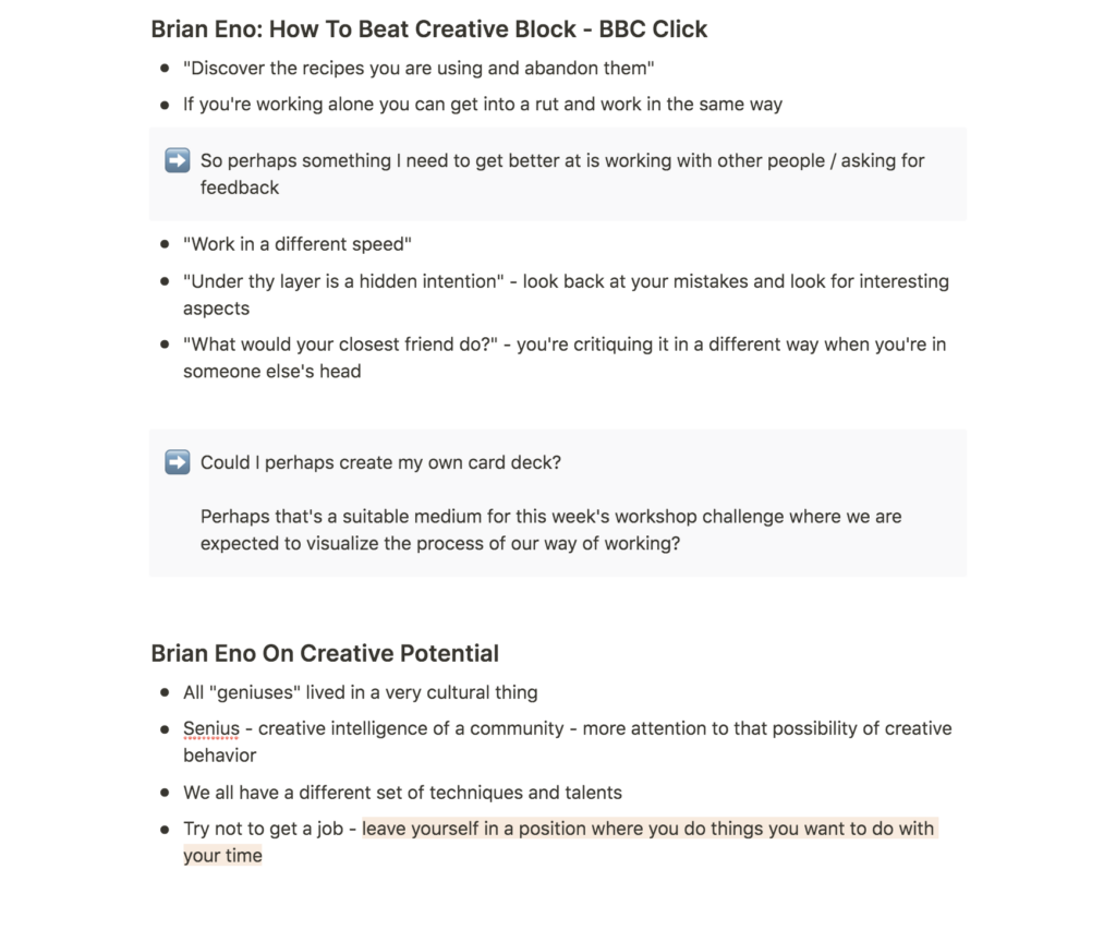
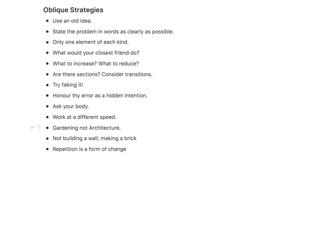
The Oblique Strategies seem very useful for situations when one doesn’t know what to do for a project, or simply how to start a task. I wonder if there are other techniques or products one could create in order to achieve the same thing. What I like about the Oblique Strategies is that the cards seem to be just specific enough to spark an idea of what to do next. You don’t have to think about what to do, the card will simply tell you, even though it is not saying anything about what to create.

A deck of oblique strategies cards made specifically for graphic designers
As these cards were initially created with the intention of making music (Wikipedia, 2020), I think it could be beneficial to create a deck for graphic design oblique strategy cards, or perhaps for an area within graphic design like typography. Most of Eno and Schmidt’s cards could be included, like “Use an old idea” or “Repetition is a form of change”. However, I think more visual aspects could be added, for example “Combine two elements you wouldn’t normally put together” or “Create a new shape”.
Further research
As mentioned in my lecture reflection, I am curious about how other designers use side projects as part of their practice. To me, there has always been something intriguing about magazines and publications – perhaps because I come from a fashion photography background, where magazines are usually the ultimate context.
I have often wanted to make my own magazine. Once I tried to set the idea to life by creating a distributable life style magazine, but unfortunately I didn’t get funding. For this point of time, I don’t think I would like to create a real magazine. However, it would be interesting to investigate the idea of creating a zine series or online magazine/blog as a personal project. Further, I will take a look at some publication side projects of other designers, in order to get some ideas of what I might do if deciding to make one of my own.
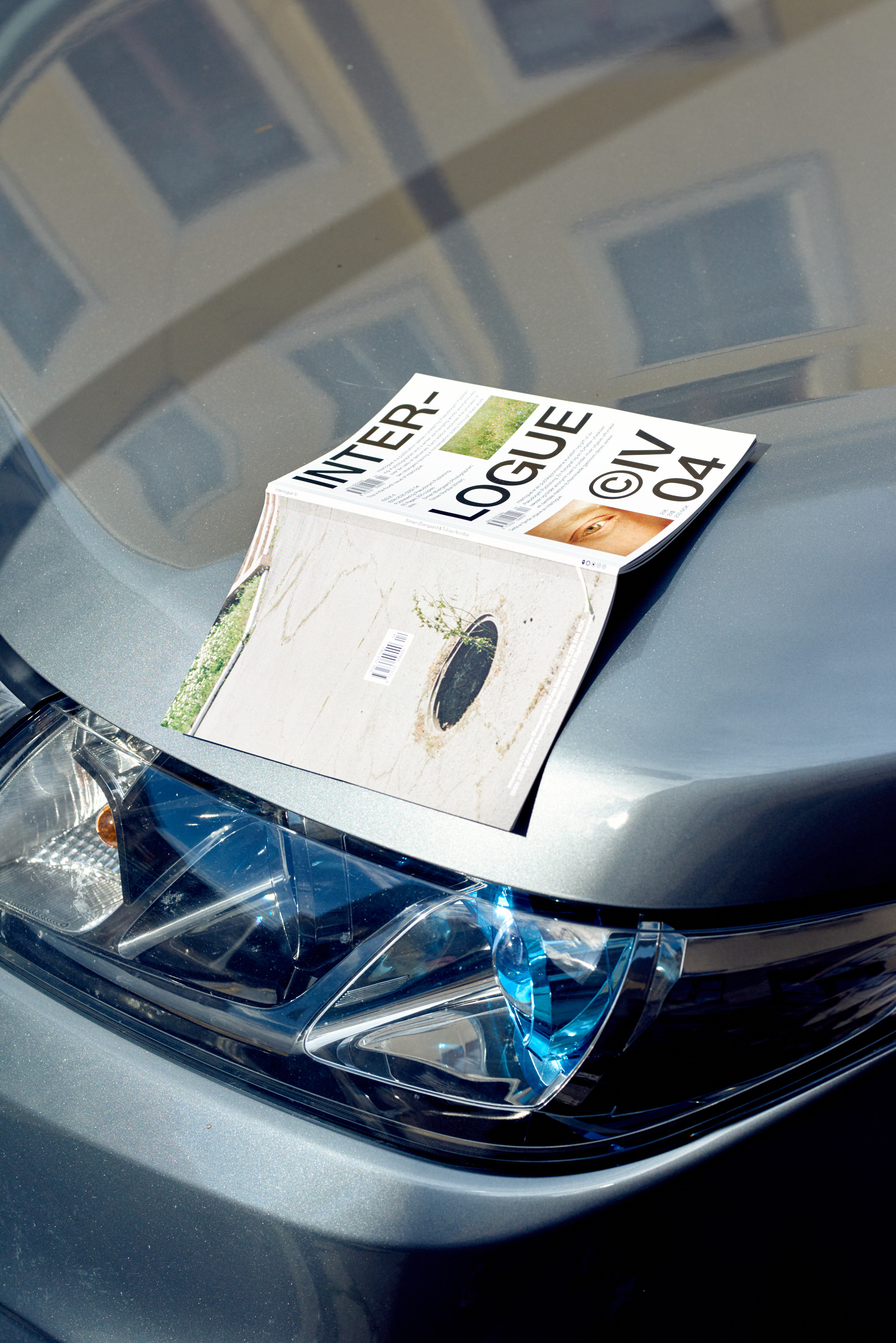
Pseudonym Publishing
Pseudonym Publishing is a publishing practice created by designers William Stormdal and Halvor Nordrum. They create publications about curation and design, as well as typefaces, t-shirts and other goods. What I find interesting about this practice is that it doesn’t seem to have any boundaries. Even though they have a distinct visual aesthetic, they could still potentially create whatever they’d like. If the designers wanted to make an album, an exhibition or a furniture line, these products would, in my opinion, only ad to the universe of Pseudonym.
The idea of creating a universe of my own, in which a number of side projects could live, is very interesting as this type of universe must ultimately become something bigger than yourself, yet it is still a representation of yourself as a designer. I am drawn to the freedom of this type of project. However, as I constantly find myself shifting between ideas and interests, I am also scared that sticking to one universe can become limiting at times.
RP in review
RP in review is Regular Practice’s physical newsletter, which, from their instagram page, seems to contain various published and unpublished work from the design duo. Perhaps not a side project per se, but rather an original take on classic news letters, this seems like great combination of making something for yourself, whilst still utilising your published work.

It’s Nice That
Even though I quite like the idea of print, creating a digital magazine could be interesting. What I like about It’s Nice That is the idea of commenting on design in general, and not just making design of your own. I imagine that a project like this must provide the creator with an abundance of knowledge as one would have to do a lot of research, and of course stay up to date on what is going on in the design scene.

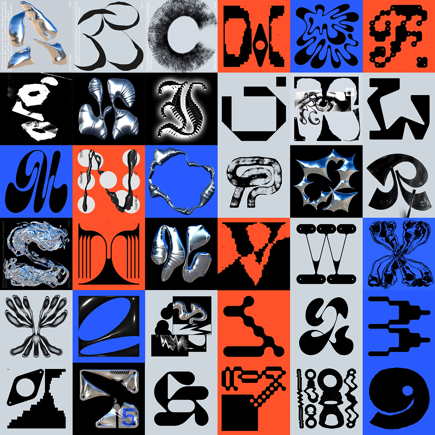
36 days of type
This is not publication, but an intriguing idea for a side project nonetheless. 36 days of type is a social media campaign where designers create one letter of the latin alphabet each day, resulting in the creation of all letters and numbers over 36 days. Even though the official campaign isn’t on at the moment, I think it could be fun to have this as a side project on my own. I could either make quite conceptual letters, like most designer seems to be doing for this campaign, or I could create classic letters, simply to learn more about basic type construction.
LogoArchive
Instead of simply providing a broad overview of interesting logos, LogoArchive showcases logos from a chosen topic for each issue, thus becoming a witty and more curated type of publication, than other logo books like, for example, the book Logo Modernism.
In order to learn about typography, I think it could be interesting to make a similar zine series, based on typography. For each issue I could create my own letters, look at iconic as well as contemporary typefaces and include historic information, with a chosen typeface category for each issue. The series doesn’t necessarily have to be based on type categories, it could also have more abstract topics, like movies (typography used on movie posters, movie scripts, credits etc.) or food (typography used in restaurant menus, food packaging, fruit delivery boxes etc.).
Workshop challenge
List of skills and gaps
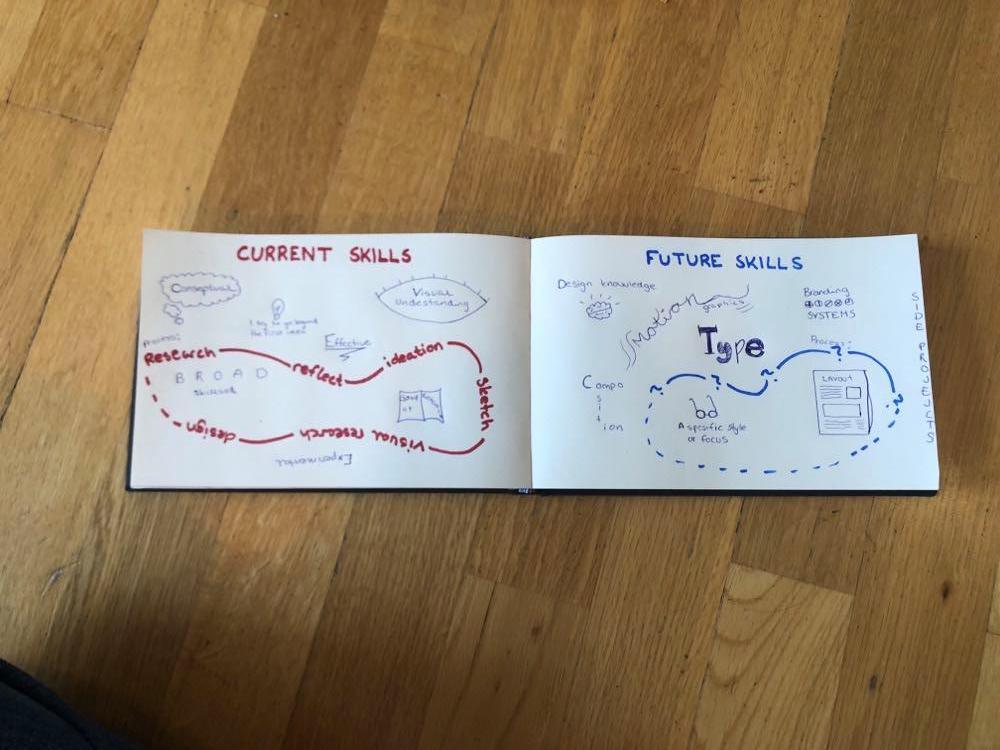
I started this week’s workshop challenge by creating an overview of what I consider to be my skills and gaps. In my overview below, I have named the gaps Future skills as these are techniques and design areas I would like to get obtain in the future.
As I come from a background in photography, I consider myself to have a good visual understanding, as well as an ability to come up with creative ideas and concepts. One of my positive traits as a designer is that I love to experiment and try new things. This is a good skill to have as it has led to a broad skillset. Yet, it has also made it difficult to find a unique style or area of focus in my work. Most of my future skills are based on gaining a deeper understanding of graphic design, like typography and layout.
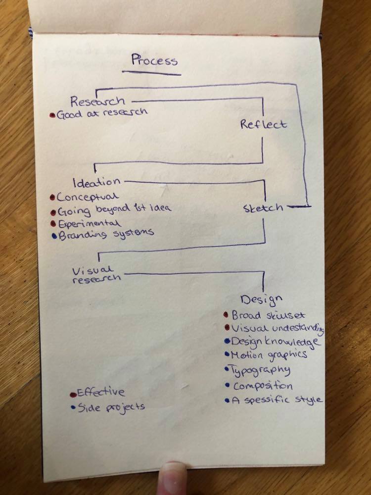
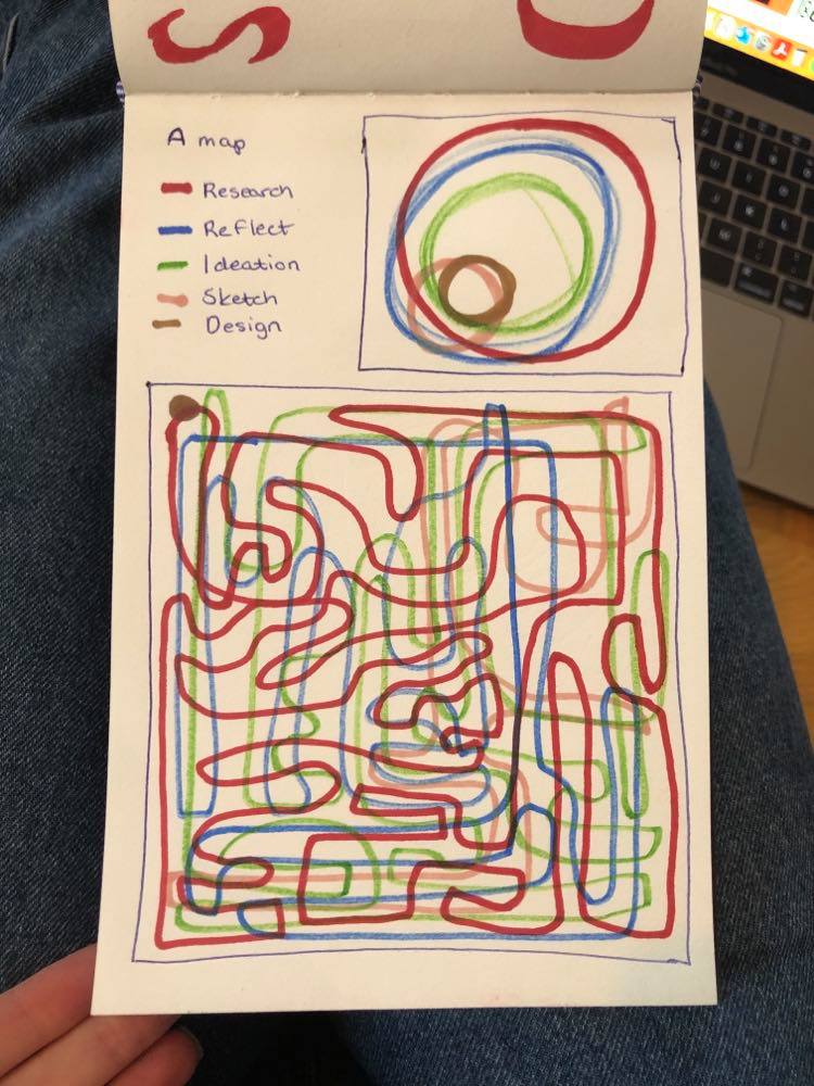
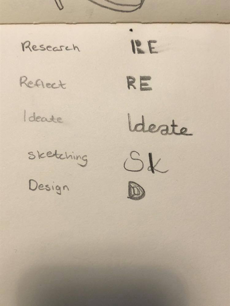
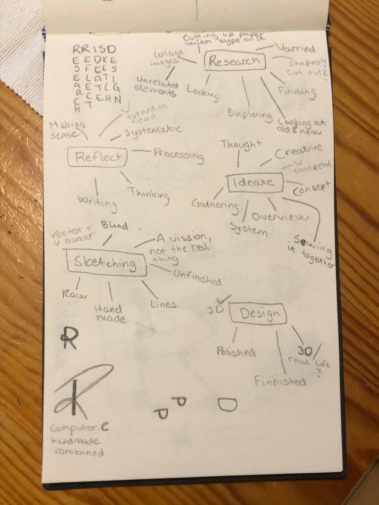
Since starting the course, I have developed a design process that I think is working well for me at the moment, especially within this module where we work on a new task each week. This is quite a linear process that usually goes like this: RESEARCH – REFLECT – IDEATION – SKETCH – DESIGN. Sometimes I also do visual research in between sketching and designing. I’m sure this process will be altered and improved as we proceed with the course, which is why I have included a “question mark process” in my future skills.
My final list is:
Current skills
- Conceptual
- I try to go beyond the first idea that comes to mind
- Experimental
- Visual understanding
- Broad skillset
- Research
- Effective
Future skills
- Design knowledge
- Motion graphics
- Branding systems
- Layout and composition
- Typography
- A unique style / focus area
- Developing and executing side projects
Process
After establishing my current and future skillset, I decided to have a quick search in Tate’s online collection for the word processes. I also made a few sketches of ideas for visualising my process as a result of the findings.


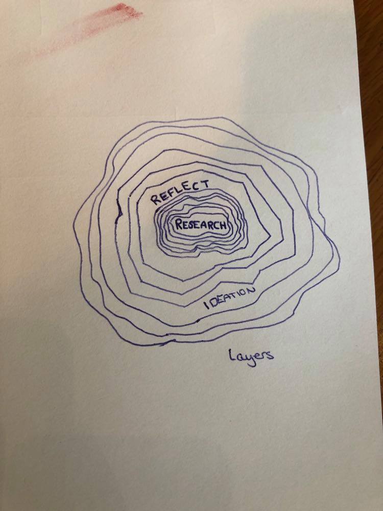
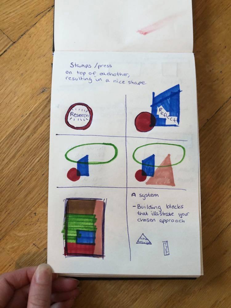
In terms of visualising a process, I was intrigued by the idea of making a system of shapes, symbolising the building blocks of the design process. However, I was also very keen to do something typographic as my work for the past weeks have been quite illustrative. Typography is an area that really interests me and since I consider trying new things one of my skills, I wanted to use one of the points from my future skills list in the workshop challenge. Thus, I decided to spend some time trying to figure out how to start creating letters.
Learning about typography
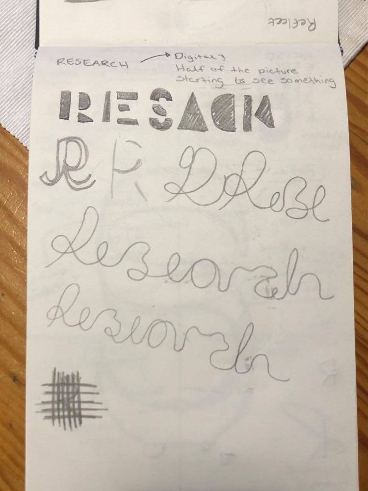
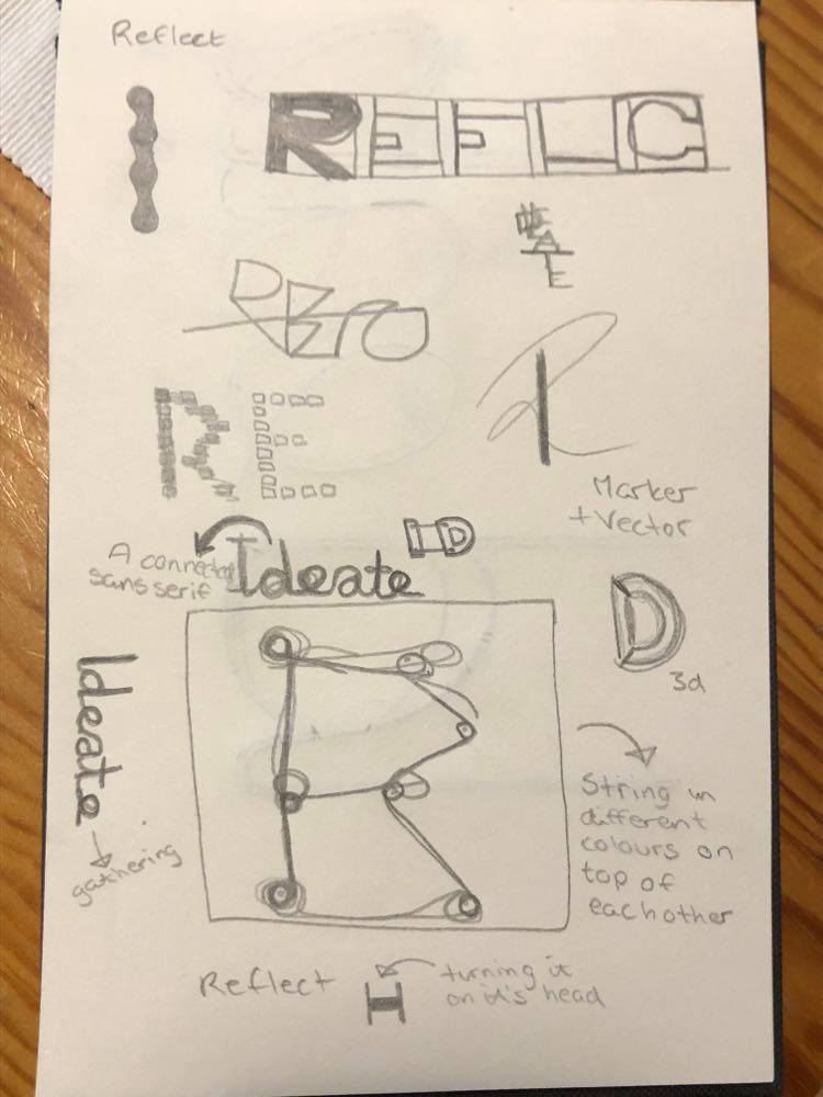
I was recently told my a designer that a good tip for creating letters, is to imagine which strokes would be thin and which would be thick when using a calligraphy pen. I didn’t want to make letters that were 100% traditional (as I consider “going beyond the first idea” as one of my strengths), and so I decided to make letters that could have been constructed through using an angled calligraphy pen, thus making the horizontal strokes thick and the vertical strokes thin. In order to test the idea, I had a quick sketch where I used a marker held at an angle. After this quick experiment I tried to construct the initial letters for my process words in illustrator.
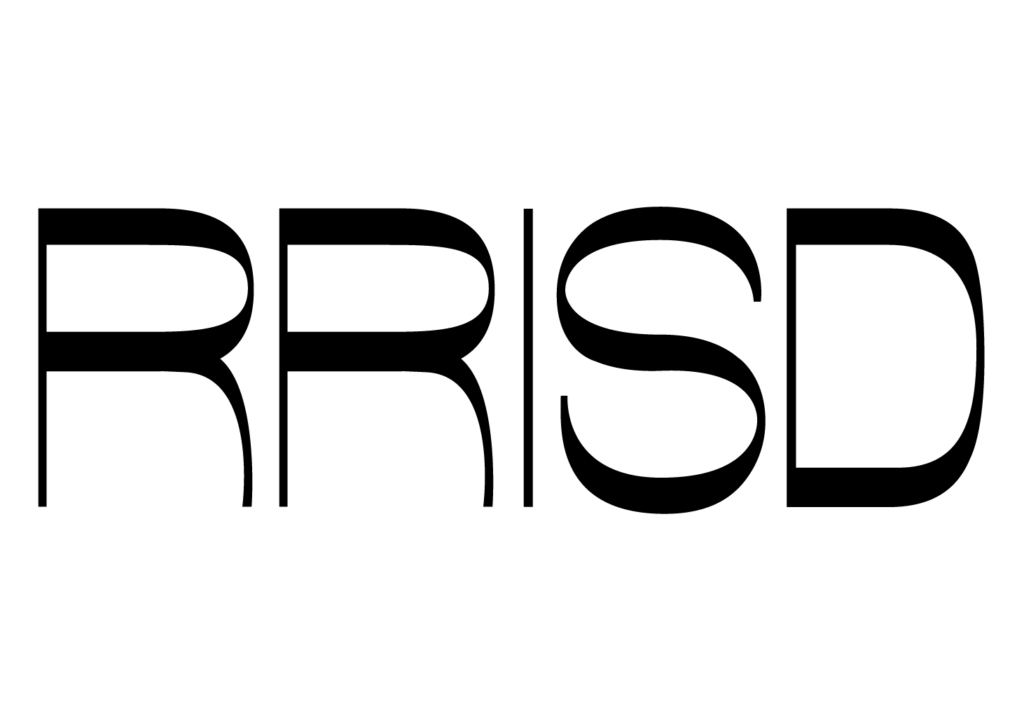
I thought my first attempt (image above) showed potential and I thought the contrast between the thicks and thins worked well. However, there was definitely a sense of clumsiness to the letters.
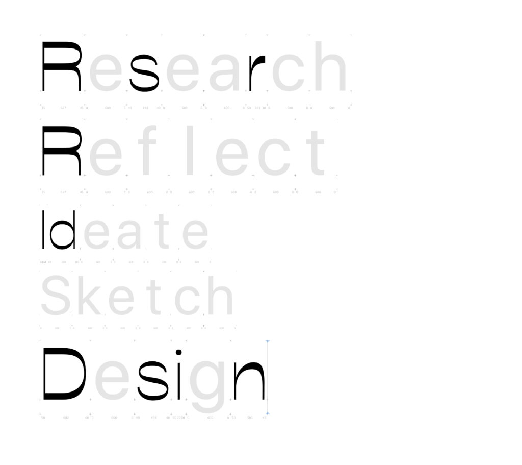
After watching a set of youtube videos, reading about letter construction as well as downloading Glyphs (a typeface software), I decided to have another go. As I was working in Glyphs I also took the time to study the letter constructions of Helvetica, which gave me a better understanding of widths and balance. As I wasn’t able to create a whole typeface within the set timeframe, I decided to focus on H,O,n and o, which are the recommended letters to begin with when making a typeface, as well as the initial letters of my process words, established in the beginning of the workshop challenge (research, reflect, ideate, sketch, design).
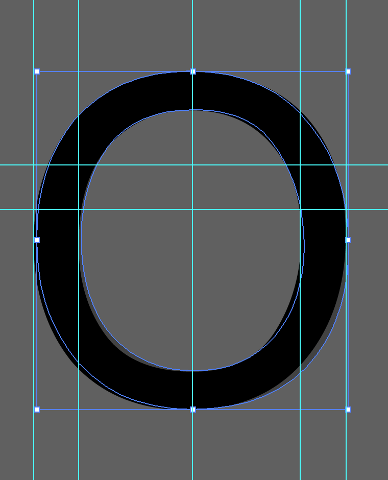
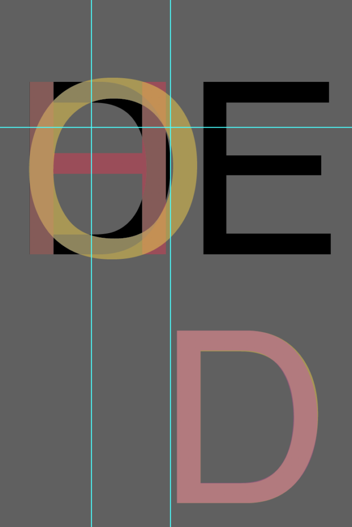
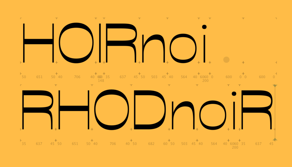
I think the letters n, o, d and H were quite successful. The lines look natural and I think they show enough resemblance to be part of the same typeface. Other letters, like s, and D were more difficult and I would have spent more time on them if I could.
Result
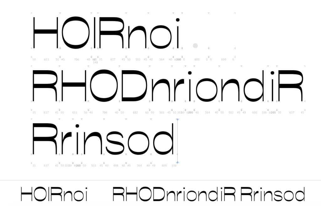
My initial idea for the workshop challenge was to make a different set of letters for each word and then to make a poster of the various typography pieces (an idea received from Weronika through the ideas wall). This idea turned out to be way too ambitious, as I didn’t even have enough letters for my words in one type style.
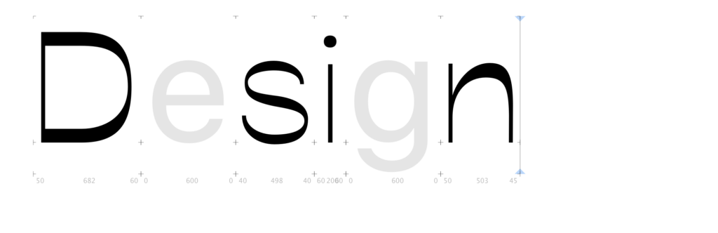
In Glyphs you can write out letters even though you haven’t created them yet (using Glyphs’ model letters). As I didn’t manage to create all letters for my words, I thought it could be interesting to use this feature in my design, symbolising the journey towards my future skillset. The unfinished typeface represents my ability to try new things, but it also represents my gaps in terms of typography.
Although I didn’t have much time to explore it, I thought it could be a good idea to incorporate my previous idea of building blocks as a representation of the process steps. Through combining these ideas, I created a poster which showcases both my letter experiments, my process words and a visual representation of how a piece of design is created through using a variety of steps.
If I had more time, I would have worked further on my typeface, as well as on the building blocks system. I also would have liked to experiment further with the poster design and layout, perhaps through bring a physical aspect into my process.
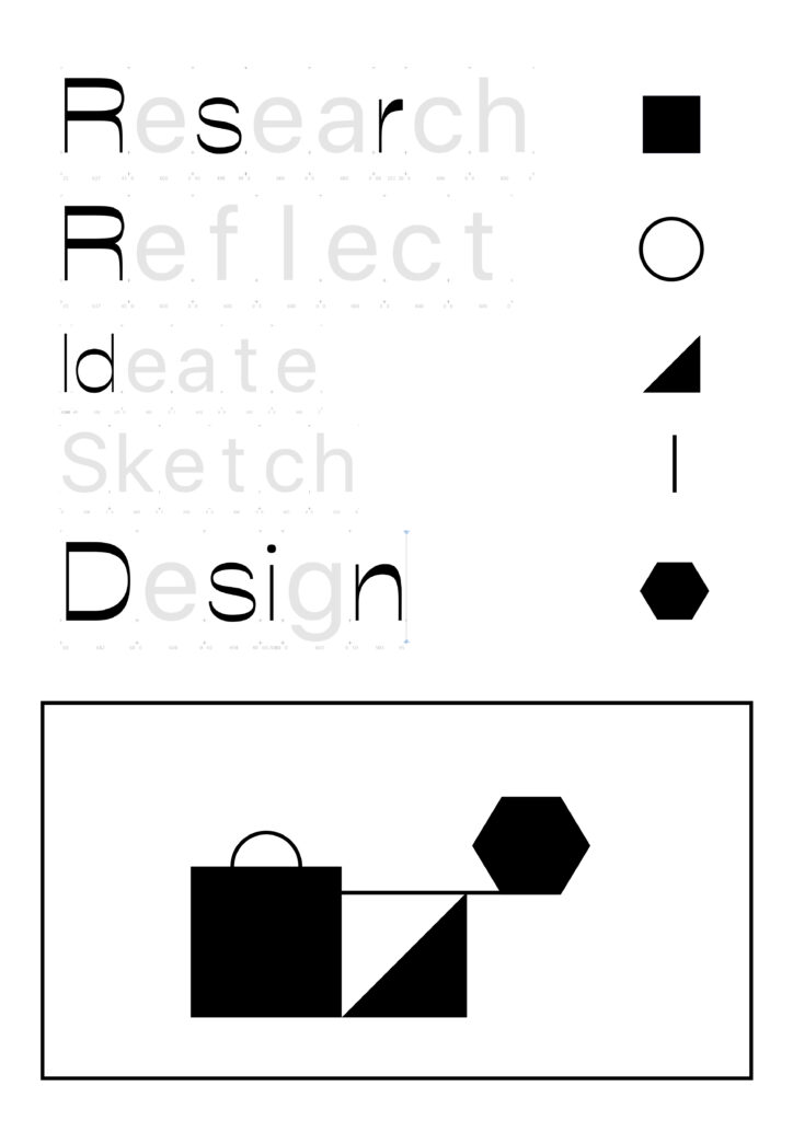
After receiving feedback in the crit session, I decided to skip the building block elements, as it’s not properly finished, which means the design works better with text only.
In conclusion
After working within a theoretical sphere for the last couple of weeks, it’s been great to explore and to make for this week’s workshop challenge. I was very inspired by the discussions on side projects in this week’s lecture, and although I didn’t get to start a side project this week, an idea has been sparked and I might have a go at establishing a long or short term typography project for myself some time soon. Perhaps my project could be the typeface from this week’s challenge, rather than a typography zine?
My impression is that this week was supposed to be about our skills and gaps in general. However, I ended up spending most of my time exploring typography. This was a great experience as typography is a gap I am looking to fill. Yet, there are also other gaps I would have liked to explore, like layout and motion graphics. Hopefully the time for these investigations will come soon enough.
If I had more time this week, I would have liked to further develop my idea of building blocks as a representation of my process. My result for this week’s workshop challenge feels quite unfinished as I spent a lot of time in Glyphs. However, this activity has definitely sparked my motivation and eagerness to keep learning about typography as we proceed with the course, and so I consider it a success in terms of learning.
REFERENCES:
Manchipp, S. et al. (2020) ‘Finding the Gaps (Case studies)’. Canvas Falmouth Flexible [online], 6 November.
Wikipedia (2020) ‘Oblique Strategies’, Wikipedia [online]. Available at: https://en.wikipedia.org/wiki/Oblique_Strategies (Accessed: 7 November 2020).
LIST OF FIGURES:
Figure 1. Brian ENO and Peter SCHMIDT. 1975. Oblique Strategy. The David Bowie Archive. Available at: https://i.pinimg.com/originals/7b/ae/50/7bae50e6fc8df9213a95693a7dd0fead.jpg
Figure 2. PSEUDONYM PUBLISHING. 2020. Interlogue #4. Pseudonym Publishing [online]. Available at: https://pseudonym.no/
Figure 3. REGULAR PRACTICE. 2020. RP in Review #2. Regular Practice [online]. Available at: http://regularpractice.co.uk/
Figure 4. Unknown maker. ca. 2007-2020. No title. [animation]. It’s Nice That [online]. Available at: https://www.itsnicethat.com/about [accessed 12 November 2020].
Figure 5. Kirill RATMAN. 2020. 36 Days of type / 20. Behance [online]. Available at: https://www.behance.net/gallery/94949723/36-Days-of-type-20?tracking_source=search_projects_recommended%7C36%20days%20of%20type
Figure 6. Richard Baird. 2020. LogoArchive Issue 7. BPandO [online]. Available at: https://bpando.org/2020/07/06/logoarchive-issue-7/
Figure 7. Dóra MAURER. 1974. Traces of a Circle. Tate [online]. Available at: https://www.tate.org.uk/art/artworks/maurer-traces-of-a-circle-p77125
Figure 8. Frieder NAKE. 1967. No title. Tate [online].
Figure 9. Bernard COHEN. 1967. In That Moment. Tate [online]. https://www.tate.org.uk/art/artworks/cohen-in-that-moment-t00800
Figure 10: Ingrid REIGSTAD. 2020. Type experiments 1st attempt. Private collection: Ingrid Reigstad.
Figure 11: Ingrid REIGSTAD. 2020. Helvetica studies. Private collection: Ingrid Reigstad.
Figure 12: Ingrid REIGSTAD. 2020. Type experiments 2nd attempt. Private collection: Ingrid Reigstad.
Figure 13: Ingrid REIGSTAD. 2020. Workshop Challenge week 8. Private collection: Ingrid Reigstad.
Figure 14: Ingrid REIGSTAD. 2020. Workshop Challenge week 8 new. Private collection: Ingrid Reigstad.