Lecture notes
Lecture reflections

Last week I got to do a test of my tool after the Thursday webinar, and this week’s lecture gave me a lot to think about in regards to the next steps forward.
Parry’s point of it needing to be being easy for your audience to adopt (Dan Parry and Nana Parry, 2021) was helpful as I realised during my test that the presentation (both verbally and visually) could have been clearer and perhaps divided into sections. I also think it would be relevant to ask how easy it would be for non-designers to adopt to a creative headspace, and how one might go about facilitating for that. I might also want to look at ways of making it easier for the audience to produce interesting visual results, for example by giving more directions on what/how to write/draw.
Parry’s mentioning of unique value propositions was also interesting, as I think this could help me convey the value of the workshops to the participants, and thus motivate them. My initial thought of value would be that the tool lets participants/client become an actual part of their new project.
Further, it was great to hear Parry say that the audience rarely behaves as you think they will (Dan Parry and Nana Parry, 2021). The workshop test went quite differently to what I had expected, so Parry’s point of testing early was definitely beneficial. The observations from the test will hopefully let me alter the structure and instructions for my next workshop. I’ll go into further details on analysing the workshop test later in this blog post.
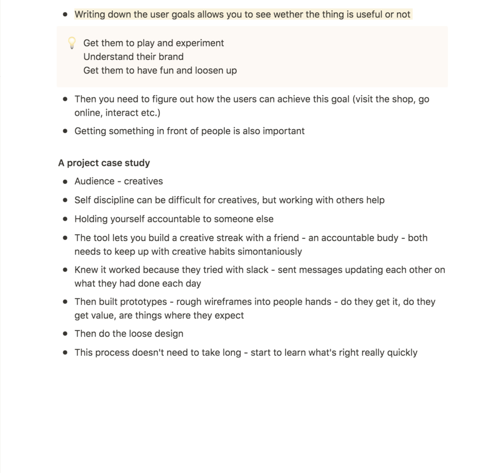
The notion of writing down user goals for a tool also seems relevant, as you will have something to measure the success by (Dan Parry and Nana Parry, 2021). Initially, I’m thinking that my user goals would be to “play and experiment”, “understand and explain the essence of a project” and “have fun and loosen up”.
Resource notes
Resource reflections
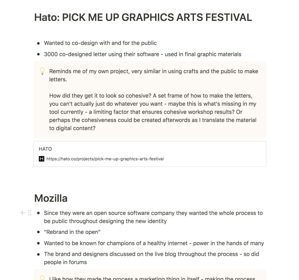
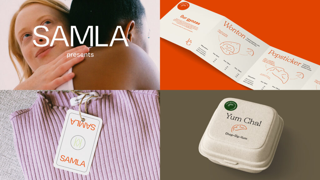
Hato: Pick Me Up Graphics Arts Festivals

The Pick Me Up identity by Hato was great to see as Hato is one of the studios that have really inspired my final idea for the collaboration tool/process. What’s interesting about Hato’s work is that they manage to make very cohesive designs, that have also been informed by a large amount of people. Just in my test with about 10 people, the results were hugely different, and this makes me wonder wether I should add limitations to my workshop structure. I’m also wondering wether this cohesiveness could be achieved during the act of interpreting the results for my visual piece.
Visually I think the enlargement of the initially small letterform really works as they almost look like sculptures (especially the P). Perhaps it could also be interesting to play with the scale and composition of the workshop results in order to achieve cohesiveness.
Mozilla: an open rebrand
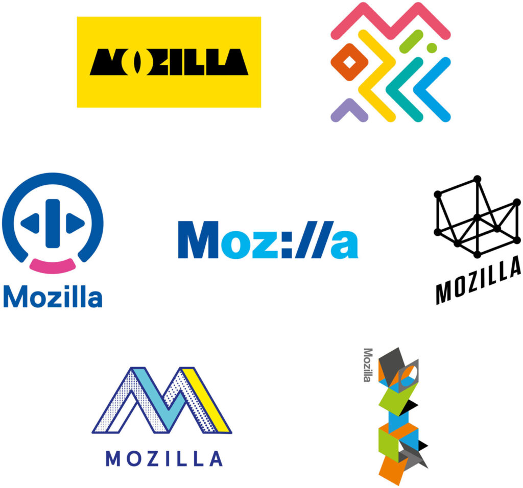
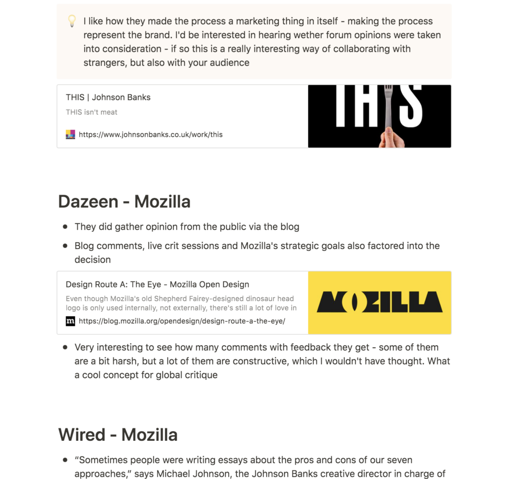
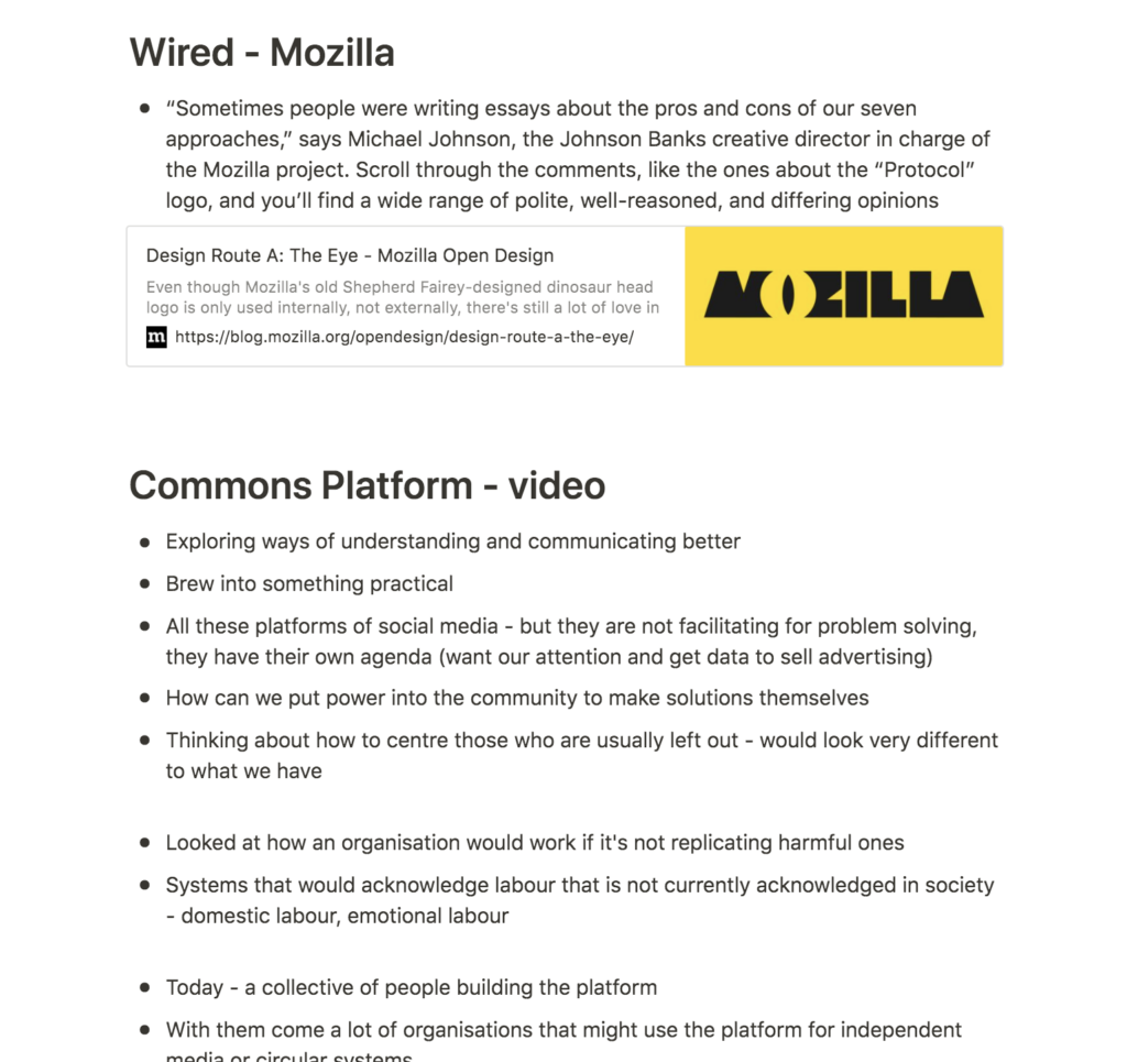
I really liked the open rebrand concept of Mozilla, and how they altered the design process to be representative of who they are as a brand (Johnson Banks, 2017). The open rebrand almost turned into an advertising campaign in itself, which must have helped greatly on getting the new logo known quickly.
By having a quick look at some of the rebrand blog posts, I noticed that lots of people had provided constructive feedback, which is not what I would have expected from online users. Some of the arguments are very well informed and Mozilla by effect got to test all initial concepts on users for free.
This way of collaborating with users can also be seen on smaller levels on Instagram, where profiles can ask their audience to vote on which alternative to choose when making something. If I wasn’t invested in my current idea I would have loved to do experiments on collaborating with anonymous users through social media, as I imagine this being a quick and perhaps very honest platform for feedback.
Further research
What does it take to run a successful workshop?
After seeing Hato’s way of turning co-creation into a cohesive visual identity for Pick Me Up, I decided to look into how to run a successful workshop, as I wanted to improve from my first test last week. I discovered an article by Cindy Chang, which had several interesting points.
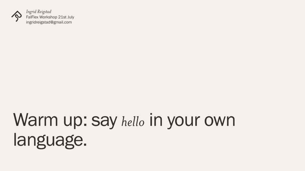
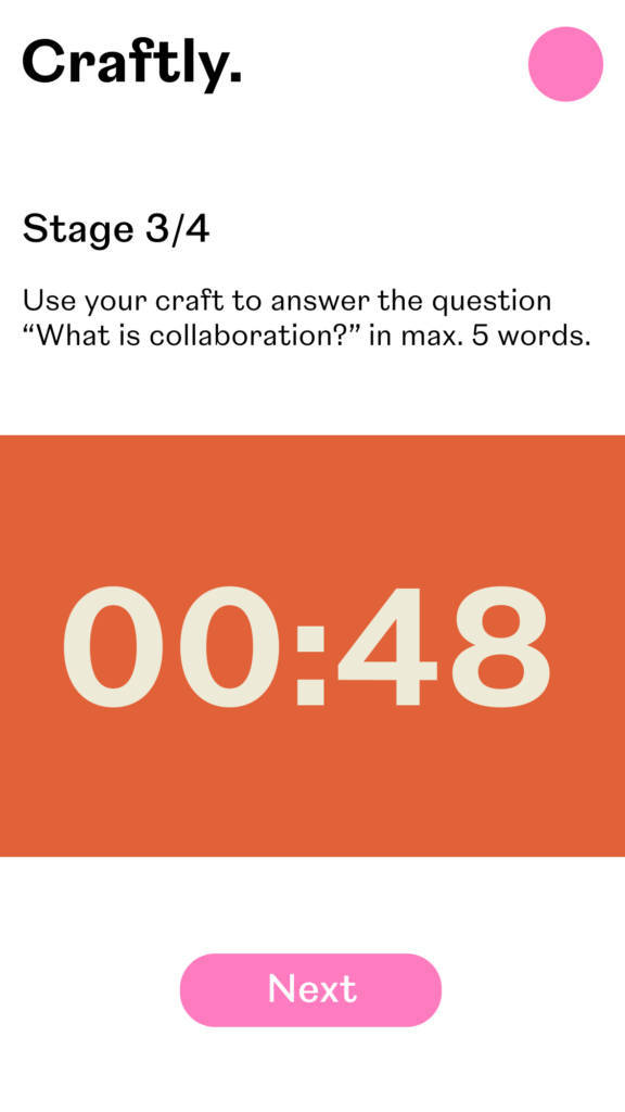
Chang states that a workshop presentation should have a new slide for every stage (Cindy Chang, 2017). In my workshop challenge I only had one slide, and I think that must have caused confusion as there really two stages (find a craft and create a visual piece). Another interesting point was Chang’s mentioning of warm up games, used to build energy and excitement before a workshop (Cindy Chang, 2017). My test proved that building an energy in a digital workshop can be difficult, and I would therefore like to look at warmup games for my next workshop. As participants can sometimes find it difficult to turn on their mics, I think it could be smart to do a warm up game that asks them to say something (for example hello in their own language). This way, they might be more likely to turn off their mics during the discussions, as they’ve already done it once.
Workshop challenge
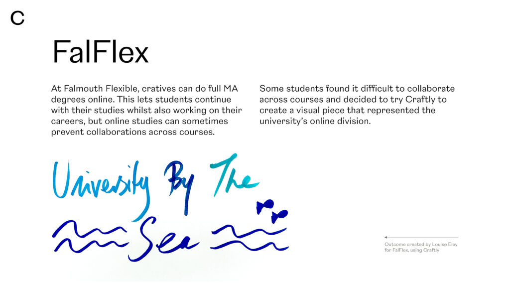
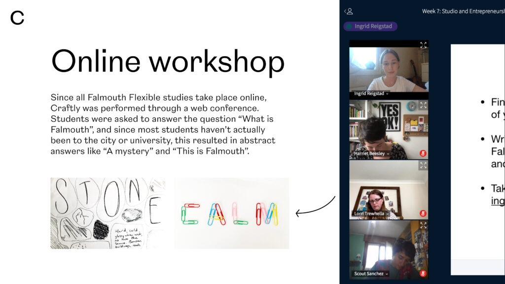
Following upon the ideas from last week’s pitch, I knew that I wanted to create a craft oriented workshop that asks non-designers to participate in the visual development and ideation of a design project. In order to test and demonstrate this collaborative tool, I chose to focus on Falmouth Flexible students, with the intention of creating a visual piece that represents us, as well as what it means to study online.
Analysis of the workshop test
As mentioned, I decided to test my initial ideas for the tool through a quick workshop after last Thursday’s webinar (with my peers as participants). Although the students produced a lot of interesting work, there were definitely room for improvements on my part in terms of verbal and visual presentation, but also in limitations of what the participants were asked to do.
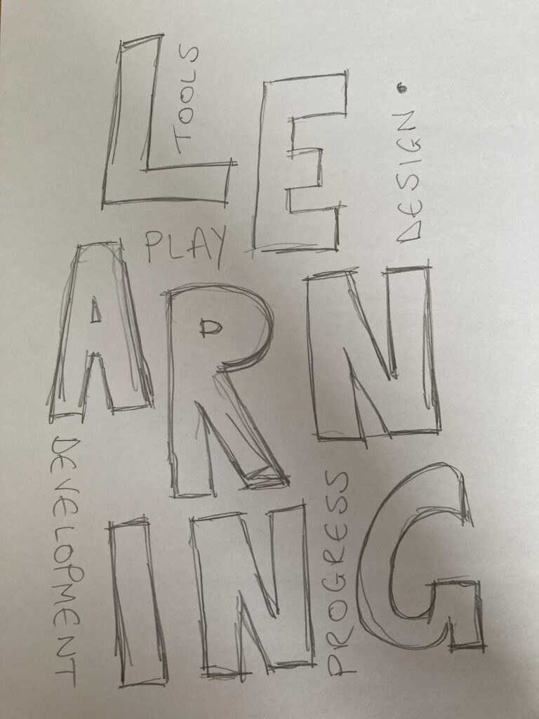
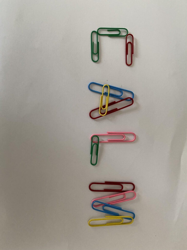
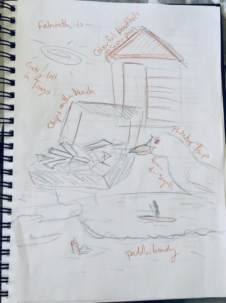
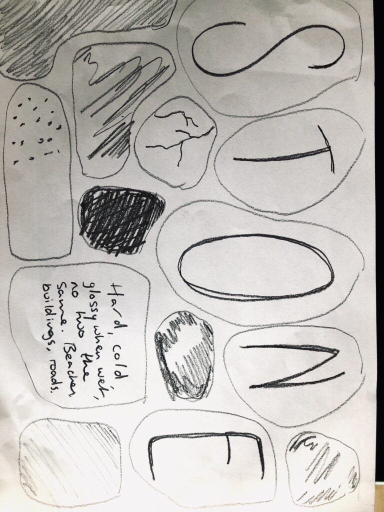
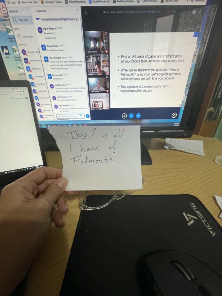
Above are the participants’ results from the workshop test and below are a collection of personal opinions on what went well and what could could be developed further.
This went well:
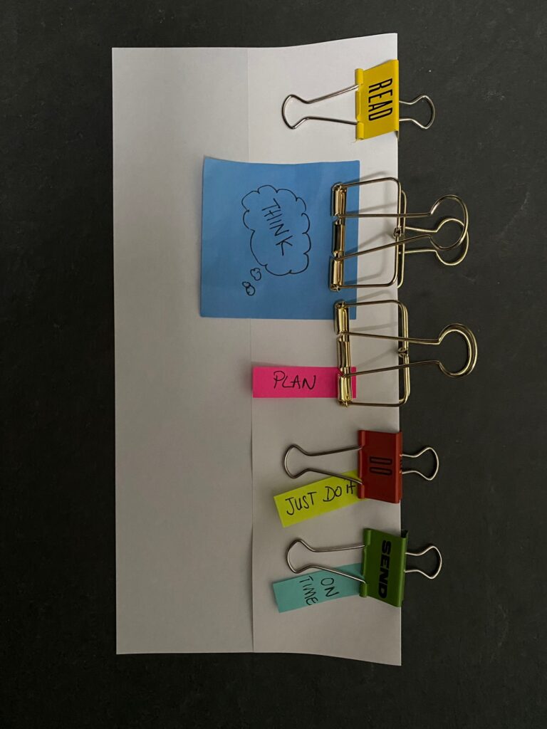
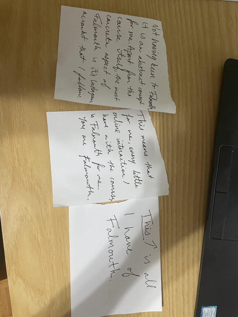
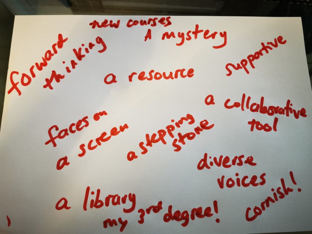
- Good variety in letterforms: I particularly love the script work, as well as the paper clips. This could have inspired some interesting digital work I think.
- Texture and materials: Although there could have been a more varied usage of crafts, I really like the way some of the results are going in terms of texture. In the STONE one, there are some lovely textured lines and the image of a note in front of a screen reminds me of an installation that is really starting to represents what it means to study online.
- Ideas: There were some great ideas and metaphors created – I’m particularly fond of Falmouth being “a mystery” to those who haven’t visited.
- Amount of material: I’m very pleased with how many people who chose to stay for my workshop, and the amount of material I received.
- Time allocation: In terms of coming up with a visual result, 10 minutes seemed to work well.
This could be improved:
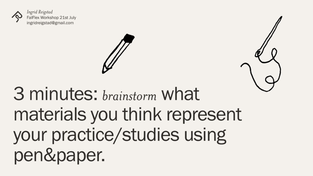
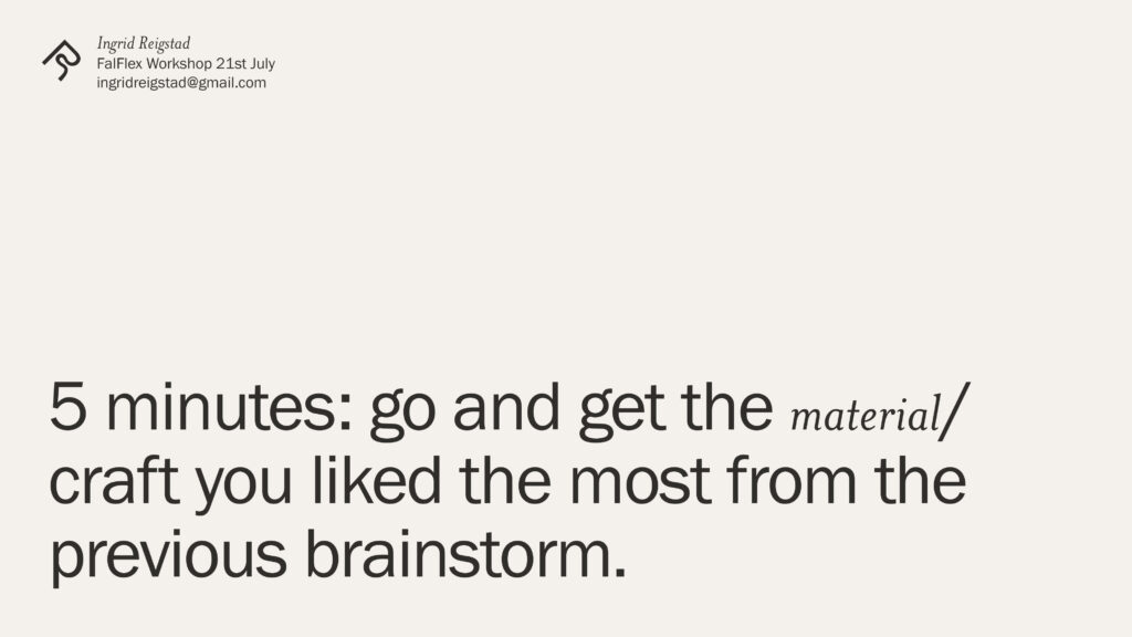
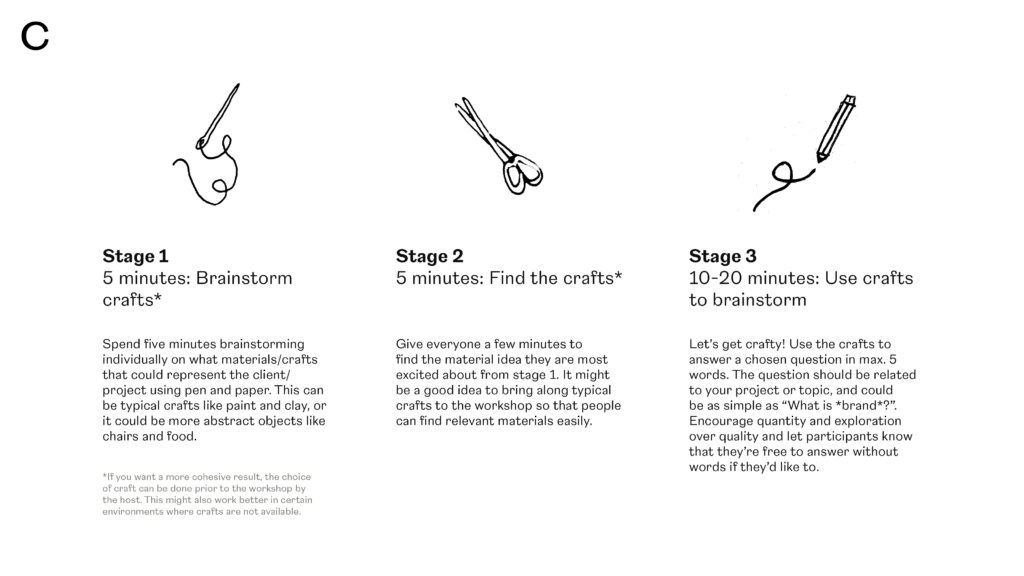
- Variety of crafts and materials: I think the results could have been interesting if there were an even bigger variety in materials used to create the letterforms. Since we are all designers, it’s natural that we use similar crafts, and by performing the workshop with other creatives I think this could fix itself automatically. However, I realised during my workshop that people couldn’t just come up with interesting materials at once. I therefore decided to make the material section of the workshop a individual brainstorm section, so the participants could have a think about what they wanted to use, rather than just going with the fastest option.
- Structure: I asked the participants to do a number of things at once (find crafts, do a drawing etc.). For my next workshop I will need to divide every action into separate slides so that everyone knows exactly what they are doing. This might also help me seem more confident as I felt very unsure when I was presenting.
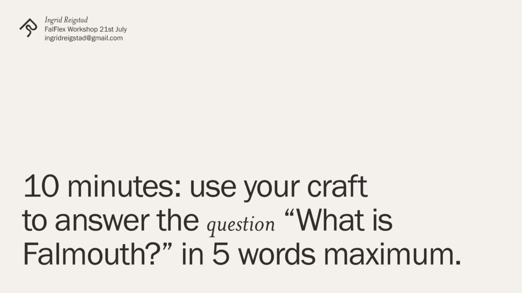
- Ideas vs. visuals: Several people ended up producing ideas rather than visuals, and I can understand that as I didn’t specify enough. I do want insight, but I would also like the participants to make something visually grounded. I think limiting the amounts of words the participants are allowed to use might help this, as this might help them make something that might look like a set of more cohesive poster like pages, which is what I had pictured in my mind.
- Discussing the project: I wasn’t going to say much about the project, but as I was presenting I realised that some context would have been good. This might have motivated the participants, as I could have helped them understand why they were doing it and what value it would give them.
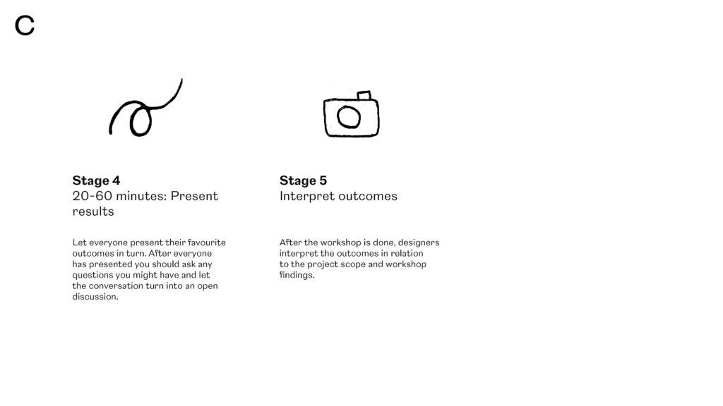
- Energy: The discussion part at the end could have been better, as it can be scary to speak up in a digital workshop. As mentioned, I think it might help to do a warm up game in the beginning. I also think it might help if I took part in the workshop and presented my work first. I could then ask by name if participants wanted to present. Another way would be to get participants’ results showed on screen. It could then be easer to ask about certain results, which might help participants speak up.
Unique value proposition
In order to covey my project in a swift manner for the third workshop, I decided to experiment with unique value propositions, inspired by the lecture.
- A workshop method that engages non-designers in visual development and idea generation through tactile experimentation.
- A collaborative tool which lets non-designers produce visual insights.
- A collaborative tool that lets non-designers produce unique and self representative visual insights.
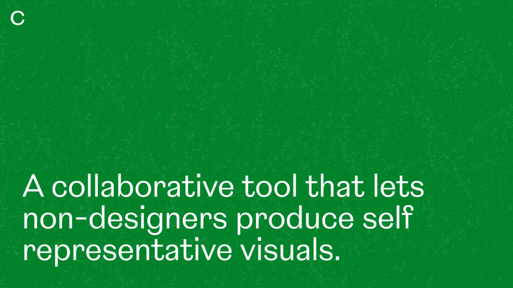
- A collaborative and tactility centred tool that lets non-designers produce unique and self representative visuals to be used as input for design projects.
I decided to stick to the last suggestion, as I think this presents all the workshop’s values: collaboration, making non-designers part of a design outcome, tactility, the notion of producing something that’s not come from design trends.
Workshop presentation development
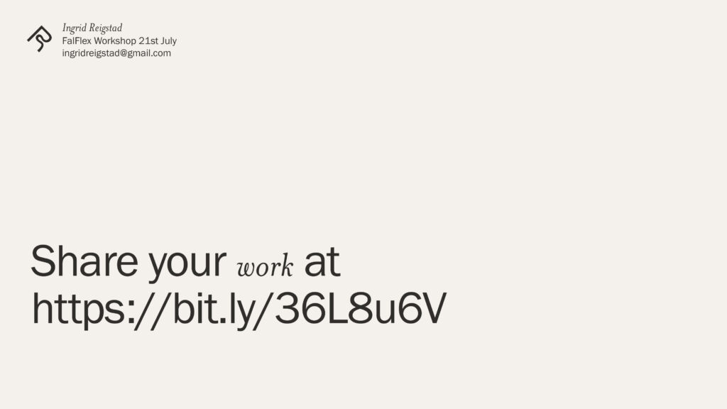
With help from Susanna and the student advisors I was able to schedule a workshop with FalFlex students from other courses on Wednesday. In order to improve from the first workshop test I therefore went on to develop a workshop presentation. I used my analysis to develop the slides and also set up a Milanote board (a tip from Piotr on the ideas wall) where participants can upload images for the final discussion. By using the Milanote board, I’d be able to do a screen shot of the results and show this in Canvas. I think this could get the discussion rolling as I could start the conversation off by asking about individual images, rather than asking volunteers to present.
I also took inspiration from Harriet’s presentation techniques from last week’s webinar when preparing what to say during the workshop. My plan was to start with the workshop agenda, and also to give some context by explaining briefly about my work and the project of which the workshop is for. In order to build some energy (and also to make people less scared about turning on their mics) I planned a warm up game where all participants would turn on their mics and say hello in their first language.
Workshop with FalFlex students
Unfortunately no one turned up to the workshop, and so I wasn’t able to test the iterated version, or to create a collaborative visual piece representative of the whole of Falmouth Flexible. At this point it was too late to set up a new workshop, or to plan a different format for receiving submissions.
If this was a longer project, I would have continued by trying to get in touch with individual tutors to ask if I could possible join in on a webinar like I got to do with my own course last week. I also think it could have helped to get in touch with students personally, as they might feel less scared about turning up, and perhaps also more obliged. I would also be very interested in testing the workshop on a hypothetical client, so that I could see how it works when performed physically. This could be interesting to look at in terms of investment (might be bigger as it would be their own project/brand) and work produced (as they are non-designers and perhaps non-creatives I’m curious about the visual creation would go).
Interpreting workshop result
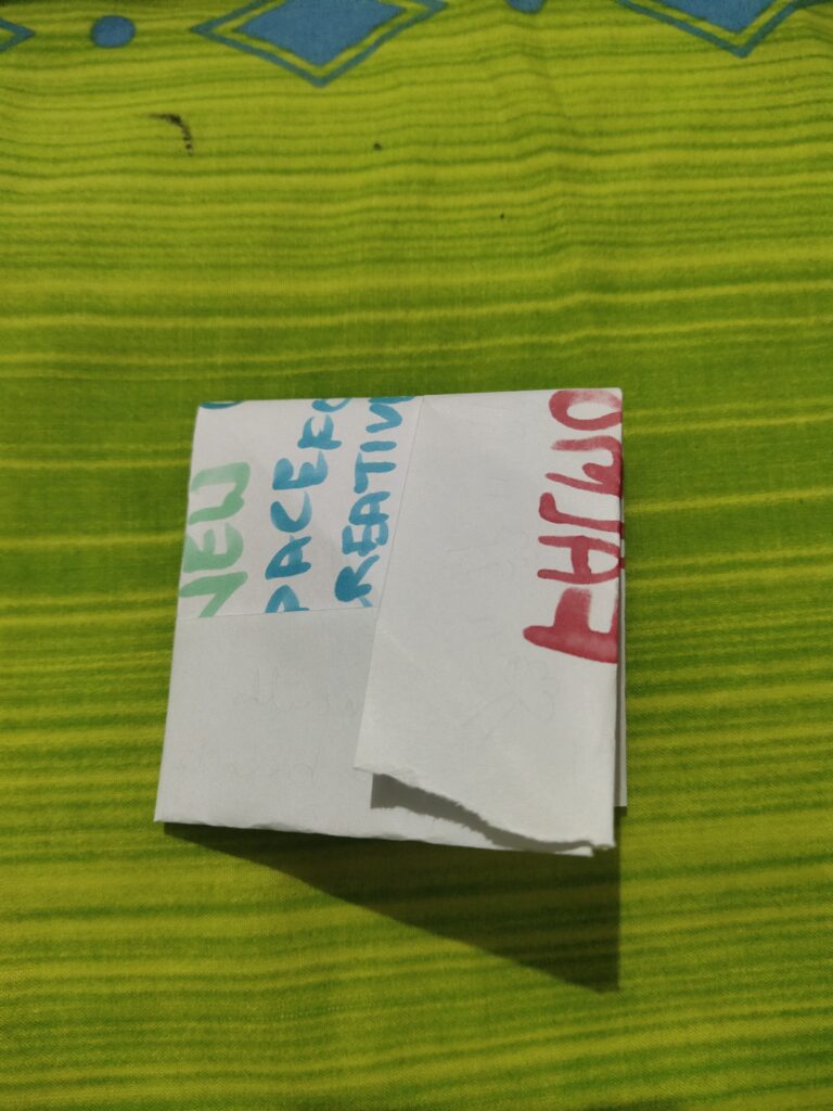
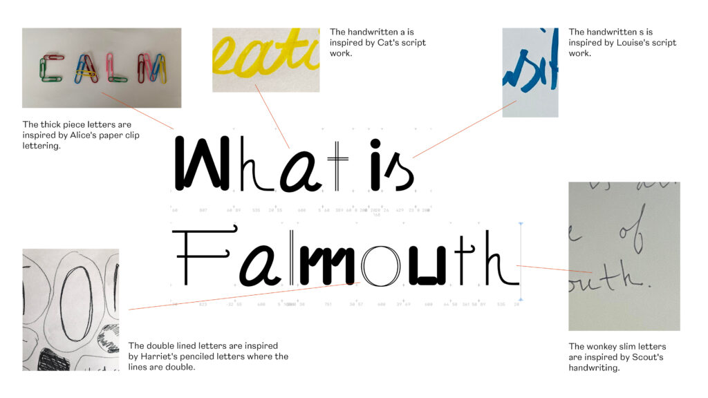
Since the workshop with other FalFlex student fell through, I decided to use the material from my test workshop from last week to create a visual piece to represent Falmouth Flexible. The thing I liked the most about the materials was all the different handwriting styles. I therefore decided to experiment in Glyphs to see if I could create a typographic piece.
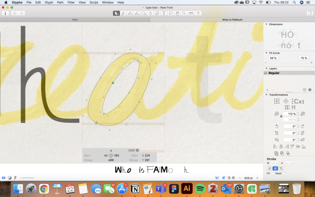
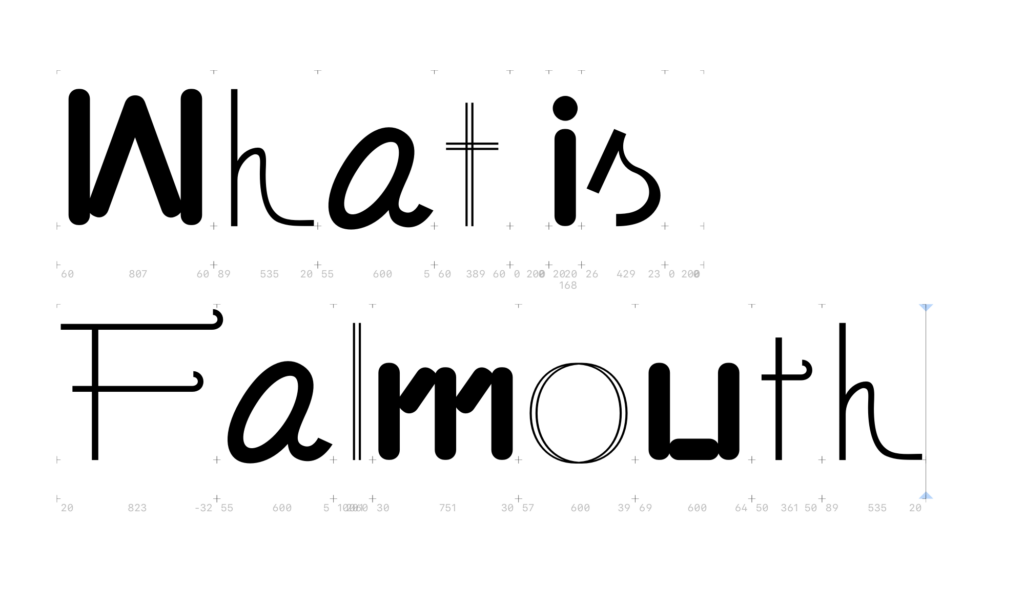
In the overview below I’ve highlighted the origin for each letter style.
I’m not very efficient in creating letterforms, so the above took some time even though I wasn’t able to create something I really loved (or a finished piece that was set in a context). Yet, as we had to make a visual proposal that explained the actual tool, I decided to leave the FalFlex piece so that I could get the presentation finished in time.
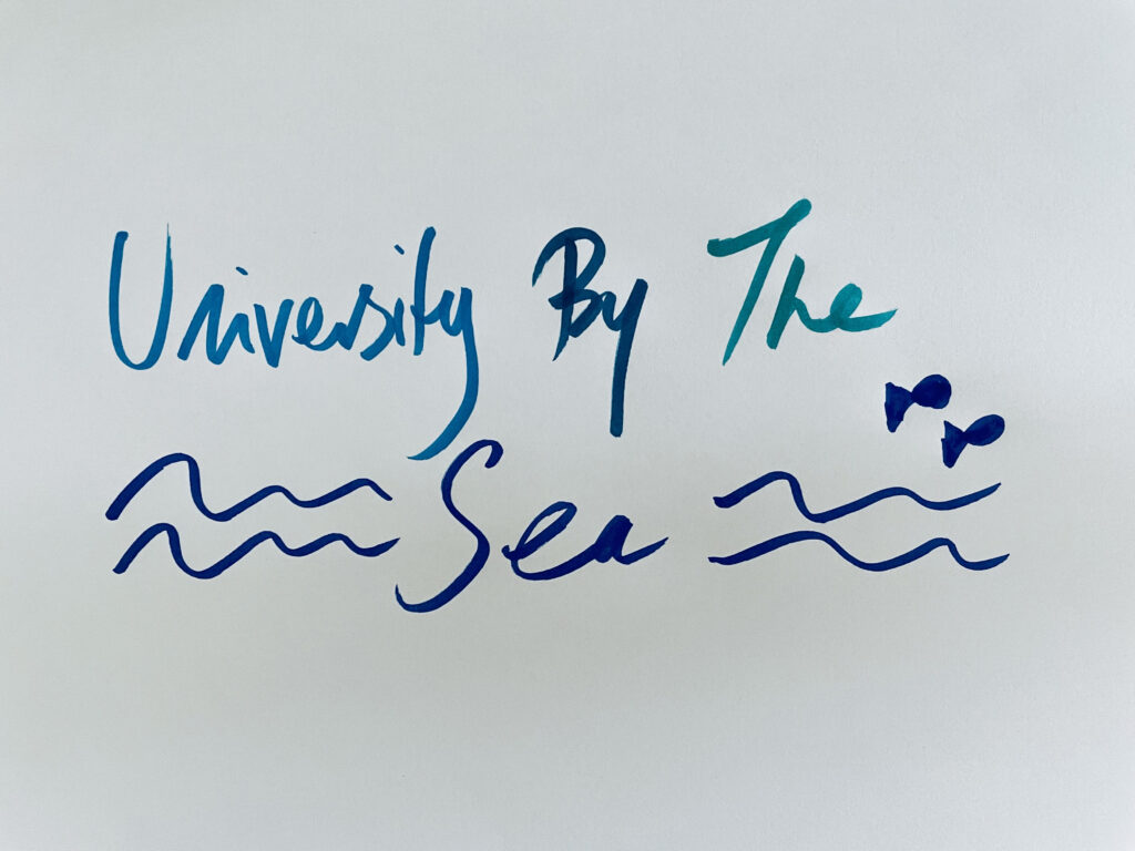
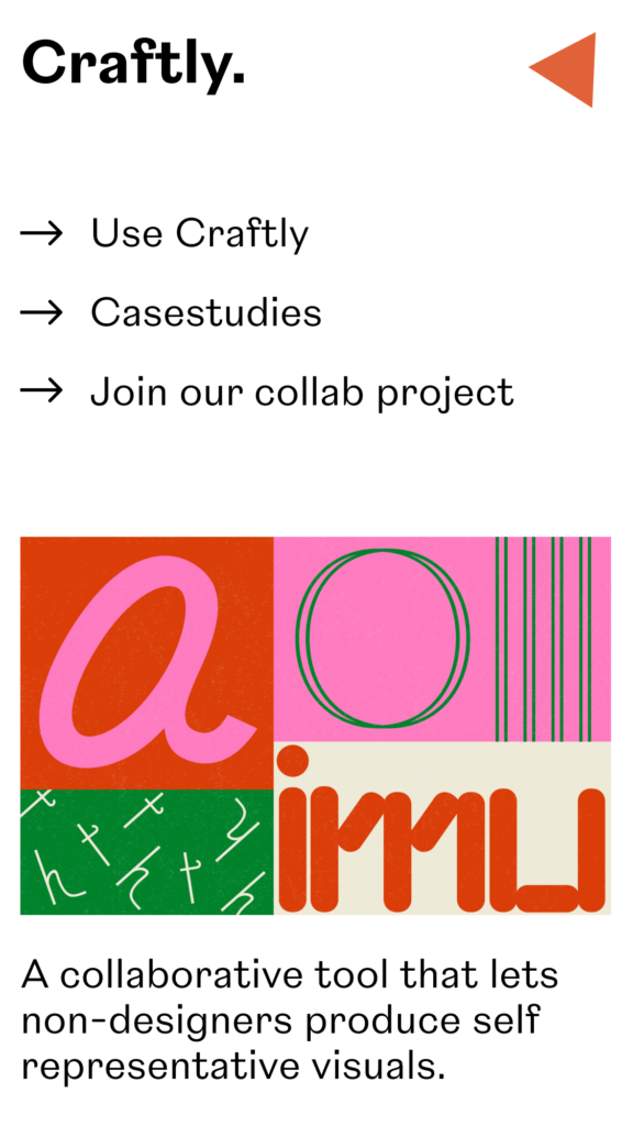
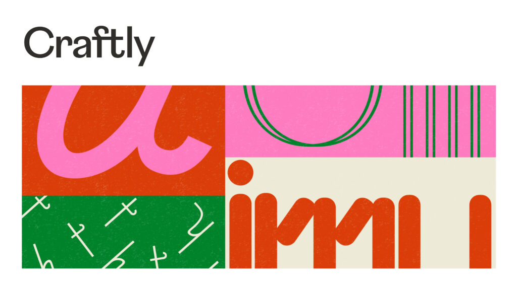
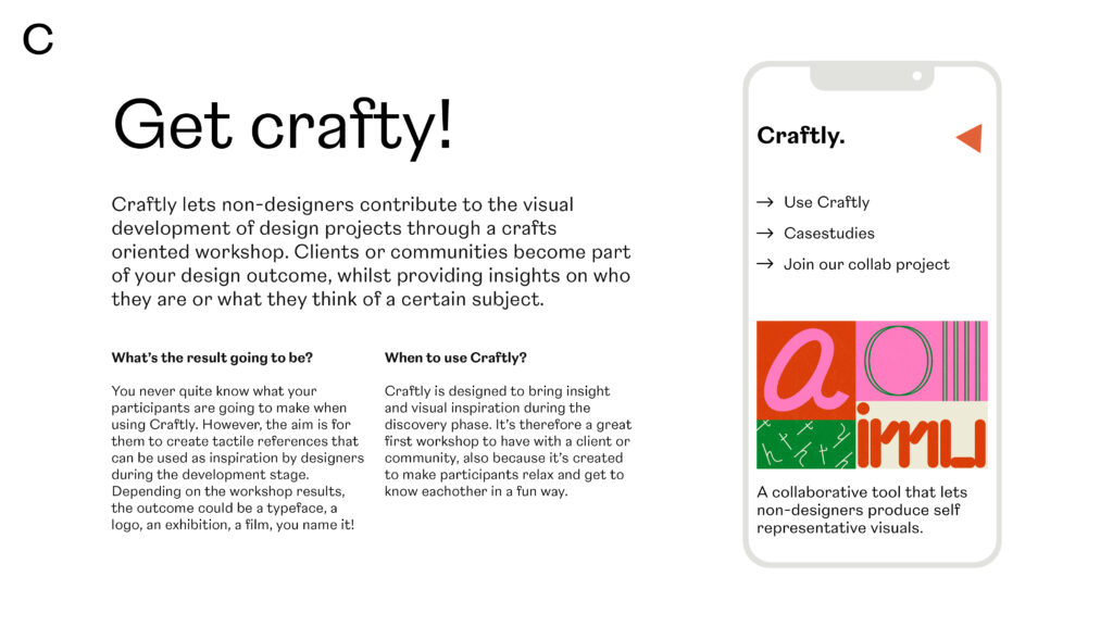
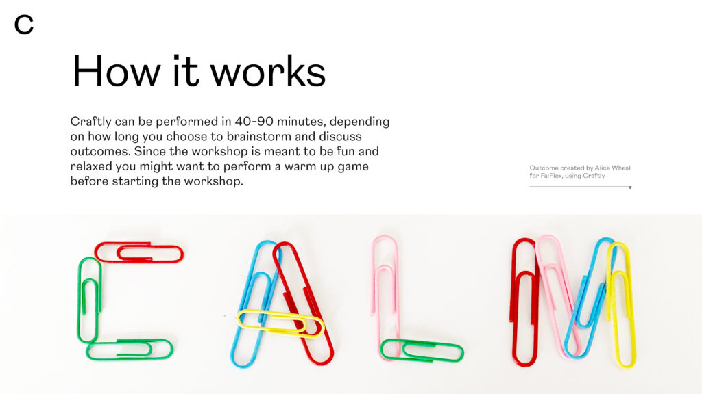
I decided to call my tool Craftly, because craft is the essence of the workshop. I quite liked some of the individual letterforms from the FalFlex piece, and I therefore thought it could be nice to use them to illustrate Craftly. I used colours inspired by Alice’s paper clips in order to convey the fun you can expect to have during the workship. I also created a texture in order to reference the tactile aspect of the tool. This led me to the image below.

After making the illustration above I got an idea for how I could have taken my FalFlex piece further if I had the time. It could have been great to use the colour grid structure to create a motion graphics piece. Letters could move around in moving squares and the whole thing could merge into “What is Falmouth” at the end, using a mixture of letterforms as seen in my initial piece. This could have been a trailer/starting piece for a final outcome, like an online exhibition where further interpretations of workshop results could have been displayed (or perhaps for an online graduate exhibition space). If I had more time I would have loved to explore this further.
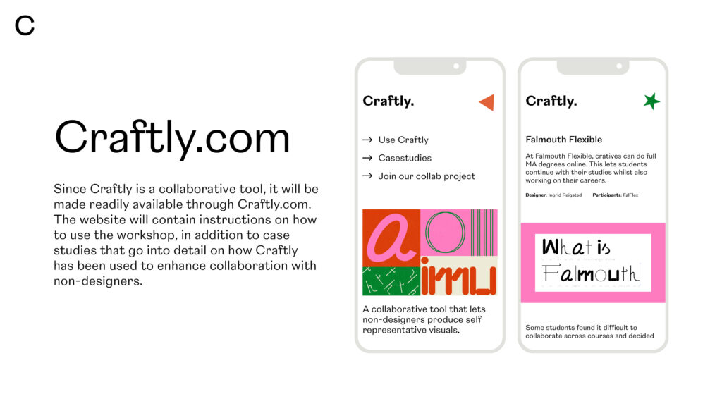
Craftly.com
Since Craftly is a collaborative tool, I thought it would be nice if it was made available to other designers through Craftly.com. The website could contain instructions on how to use the tool, in addition to case studies that could go into detail on how Craftly has been used to enhance collaboration with non-designers.
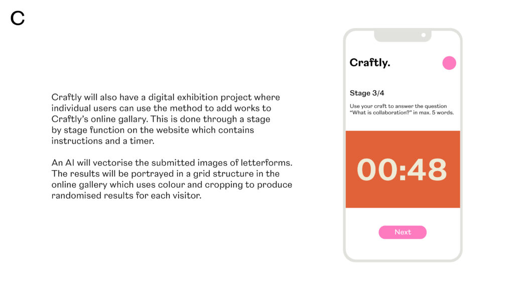
Craftly.com could also have a digital exhibition project where individual users could use the method to produce letterforms. This could be done through a stage by stage function on the website which contains instructions and a timer. An AI would vectorise the submitted images of letterforms. The results would be portrayed in a grid structure in the online gallery which would use colour and cropping to produce randomised results for each visitor. This could have a similar look to my letterform illustration.
Developing the visual proposal
After producing some simple wireframes, I went on to design my visual proposal. This was pretty straight forward in terms of process as most of the material had been created in my wireframes and writings above. I made sure to use the same typography as in my wireframes (a playful typeface from Adobe that I thought illustrated the fun aspect of Craftly). I also used hand drawn elements and the texture from my illustration to convey the tactile notion of the tool.
Virtual exhibition
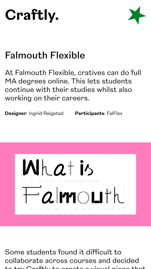
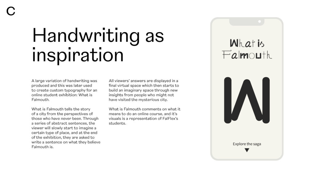
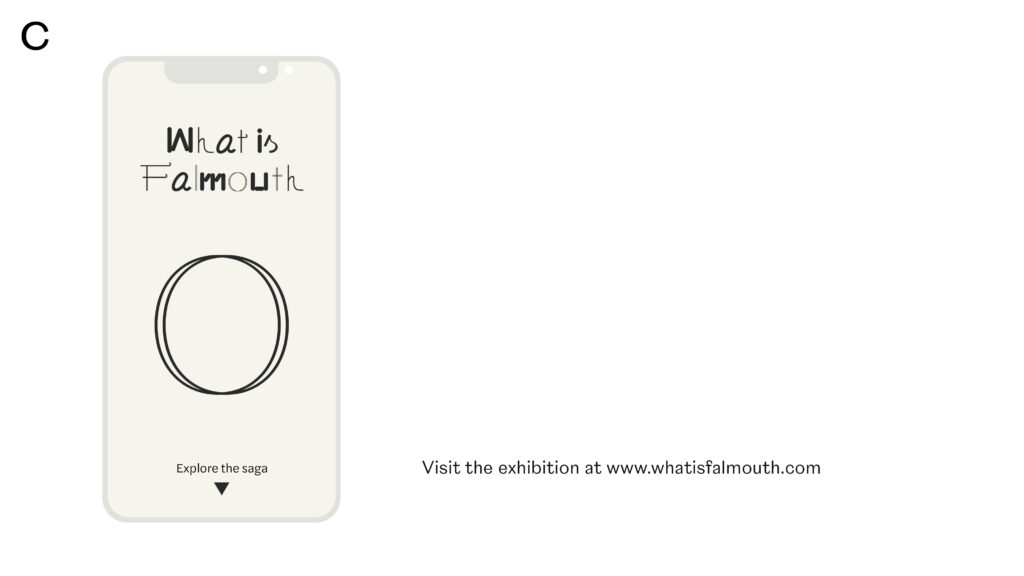
When doing my proposal I also demonstrated how my FalFlex piece could be used in a virtual exhibition. Since a large variation of handwriting was produced, this could be used to create custom typography for an online student exhibition: What is Falmouth.
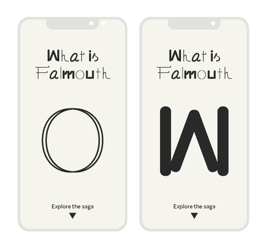
What is Falmouth would tell the story of a city from the perspectives of those who have never been. Through a series of abstract sentences, the viewer would slowly start to imagine a certain type of place, and at the end of the exhibition, they would be asked to write a sentence on what they believe Falmouth is. All viewers’ answers would be displayed in a final virtual space which would then start to build an imaginary space through new insights from people who might not have visited the mysterious city. What is Falmouth would comment on what it means to do an online course, and it’s visuals would be a representation of FalFlex’s students.
Final result
My final result this week is a collaborative tool, Craftly, which I’ve demonstrated through a hypothetical online exhibition, What is Falmouth. Craftly lets non-designers become part of the visual development process, whilst providing insight on a certain topic in a fun and relaxed setting.
In my visual proposal for Craftly I’ve attempted to convey aspects of fun and tactility through the use of bright colours, a funky typeface and texture. I’ve tried to highlight the value of using Craftly so that readers will take an interest. Thereafter I’ve explained how the workshop works stage by stage, so that it can be adopted by other creatives, which will add to the element of collaboration. Lastly, I’ve also illustrated my What is Falmouth idea in order to convey what the workshop can be used for.
In conclusion
Even though my scheduled workshop with the other FalFlex courses fell through and I’m not able to know how my iterated tool would work in practice, I’m quite excited about my concept. I like the fact that the tool uses crafts to create visual ideas, as this is something I love to do in my own work. I also like the aspect of involving a client or a client’s audience in a visual project as I’m hoping this would make them feel more part of a final outcome.
If I had more time this week, I would have loved to work further on my online exhibition idea – What is Falmouth. I think the notion of speaking about a city you haven’t visited works well as a metaphor for studying online, and I would have loved to work further on interpreting the handwriting. Garry mentioned in the crit that the outcome could have been physical as well, and I do like the idea of it becoming a physical exhibition or book project. If I had more time to explore, What is Falmouth might have had the potential to become my final outcome, instead of Craftly.
When it comes to Craftly, I would have loved to test the workshop on more people, in order to iterate further. This could have been students from other FalFlex courses (by getting the hold of some of them I might have been able to get them to join a video conference), hypothetical clients or colleagues from work. I also would have loved to work further on the visual identity and website for Craftly by giving it a more unique word mark (not just using an Adobe typeface). Further, I think it could have been great to explore the Craftly online gallery function, by building out more wireframes for the online workshop stages and gallery.
Even though I think Craftly and What is Falmouth are interesting by themselves, I’m not sure if I cracked the code by integrating them. One of them might have had the potential to be more comprehensive had I focused on only one, and if I’d had the idea of What is Falmouth earlier I might have tried to build this out and present it as my final outcome.
Although my tool has the potential to get non-designers involved in visual development, I do feel as if I should question the extent of collaboration. Participants contribute by brainstorming ideas and creating visuals, but the final visual outcome will in the end be produced by the designer. Yet, I do think the tool has potential to involve participants in visual development in another way than you would be able to do by solely interviewing or talking to them. Thus, I conclude with Craftly being a fun way of getting to know your client, which can also provide insight and potential visual inspiration.
REFERENCES:
Cindy Chang (2017) ‘Design workshops that work: how to get better at brainstorming’, Inside Intercom. Available at: https://www.intercom.com/blog/running-design-workshops/ (Accessed: 19 July 2021).
Dan Parry and Nana Parry (2021) ‘Dan and Nana Parry’. Canvas Falmouth Flexible [online], 16 July.
Johnson Banks (2017) ‘Re-branding the Internet champion’, Johnson Banks. Available at: https://www.johnsonbanks.co.uk/work/mozilla (Accessed: 17 July 2021).
LIST OF FIGURES:
Figure 1. TECTONIC. Ca. 2015-2021. Nana and Dan Parr. Tectonic [online]. Available at : https://www.tectoniclondon.com/team
Figure 2. HATO. 2016. Pick Me Up. Hato [online]. Available at : https://hato.co/projects/pick-me-up-graphics-arts-festival
Figure 3. MOZILLA. 2017. Mozilla Rebrand. Johnson Banks [online]. Available at : https://www.johnsonbanks.co.uk/work/mozilla
Figure 4-15. FALMOUTH FLEXIBLE MA GRAPHIC DESIGN. 2021. Craftly test. Canvas web conference.
Figure 16-23: Ingrid REIGSTAD. 2021. Workshop presentation. Private collection: Ingrid Reigstad.
Figure 24-25: Ingrid REIGSTAD. 2021. FalFlex process. Private collection: Ingrid Reigstad.
Figure 26: Ingrid REIGSTAD. 2021. FalFlex process. Private collection: Ingrid Reigstad.
Figure 27: Ingrid REIGSTAD. 2021. Craftly illustration. Private collection: Ingrid Reigstad.
Figure 28-30: Ingrid REIGSTAD. 2021. Craftly wireframes. Private collection: Ingrid Reigstad.
Figure 31: Ingrid REIGSTAD. 2021. What is Falmouth wireframes. Private collection: Ingrid Reigstad.
Figure 32-45: Ingrid REIGSTAD. 2021. Craftly proposal. Private collection: Ingrid Reigstad.