
Lecture notes
Lecture reflections
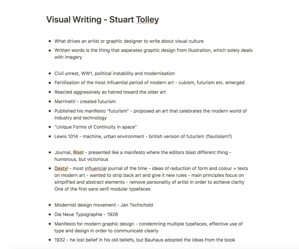
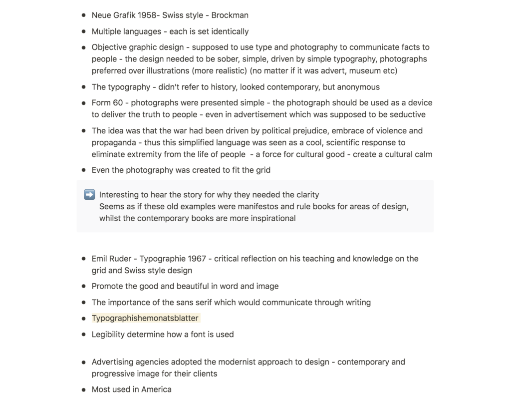
This week’s lecture was useful as it made me question the fundamentals of visual writing. I have never paid much attention to this area of writing and so I was intrigued by the fact that art movement manifestos for example, goes under this category (Stuart Tolley, 2021). It’s interesting to think about the fact that what is today seen as common design principles (the grid system, sans serif typefaces etc.), were in fact a response to propaganda and communication during the war (Stuart Tolley, 2021). The fact that these principles are still used today might be evidence of the importance of the visual writing of the time.
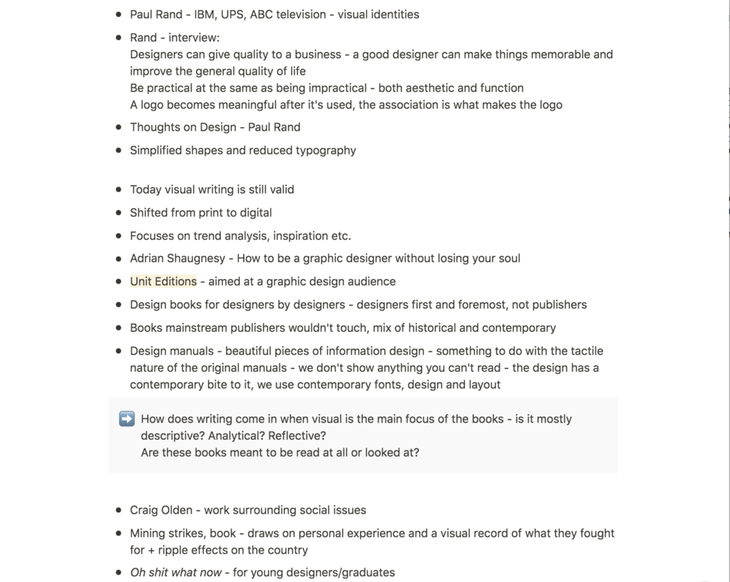
As mentioned in the lecture, today’s examples of visual writing seems to contain mostly inspirational content filled with visual references (Stuart Tolley, 2021). Seeing the beautiful publications from Unit Editions made me wonder what the writing of these books is like. Is it mostly descriptive? Analytical? Reflective? This makes me wonder about the importance of writing vs. Visuals in contemporary writing. Are these books meant to be read or mainly looked at?
Resource notes
Resource reflections
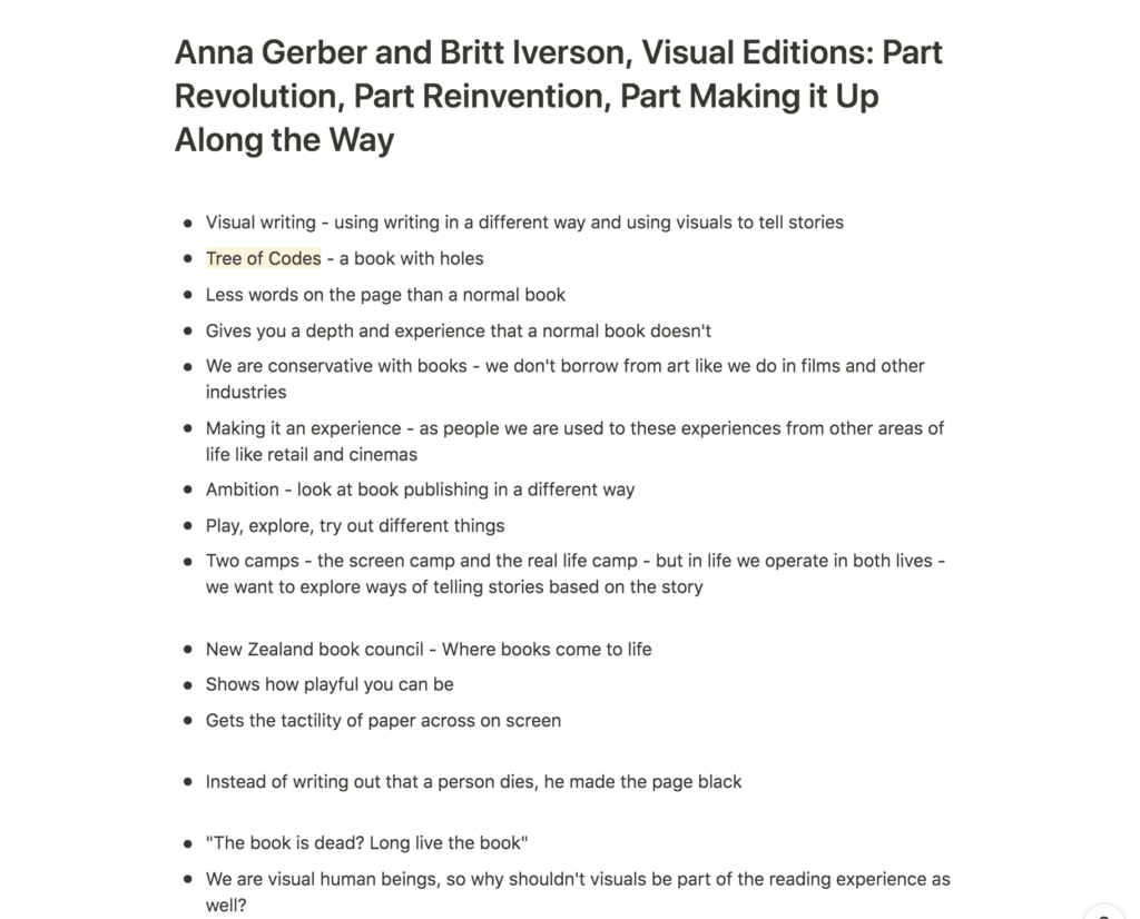
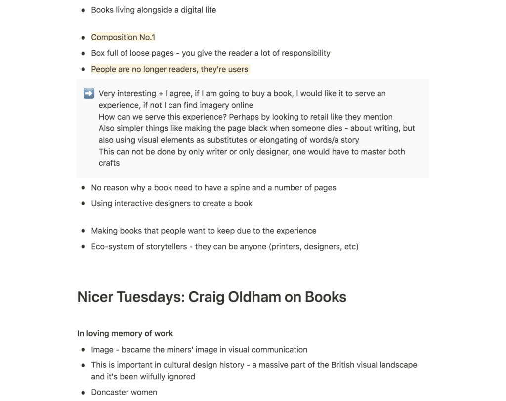
Visual Editions: Part Revolution, Part Reinvention, Part Making it Up Along the Way
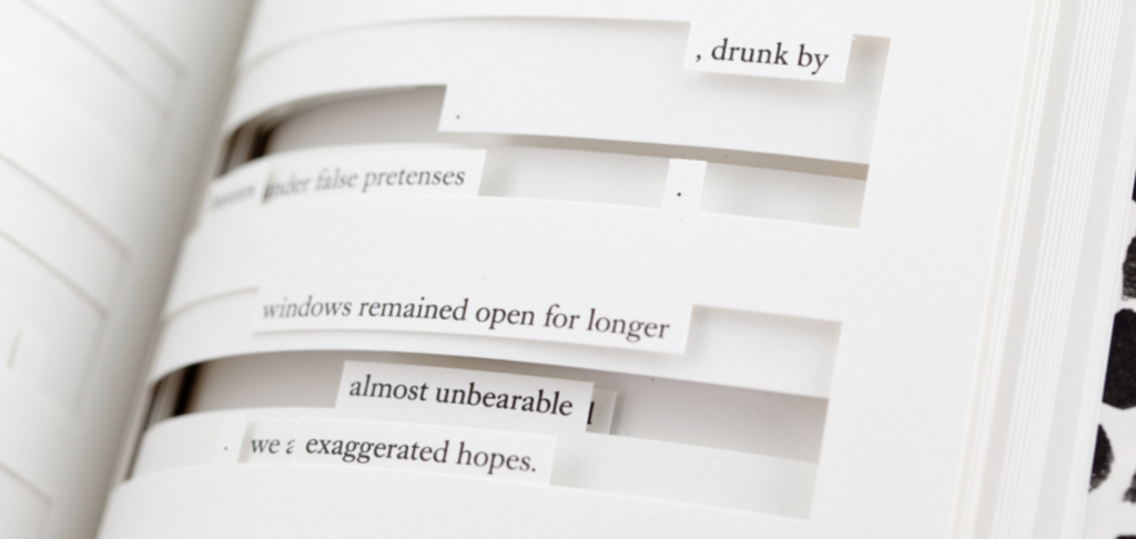
Gerber and Iverson provided some wonderful examples of how one can use production methods to rethink the standard book format (Anna Gerber and Britt Iverson, 2011). I also think they had a lovely approach to book design, which was to make the book an experience (Anna Gerber and Britt Iverson, 2011). In today’s technological age it seems this seems like a cleaver approach to printed matter.
Although I was intrigued by the discussions on investigating experiences from the movies or retail as mentioned in the talk (Anna Gerber and Britt Iverson, 2011), I also think an experience can be provoked from subtler elements, like paper stock and printing materials.
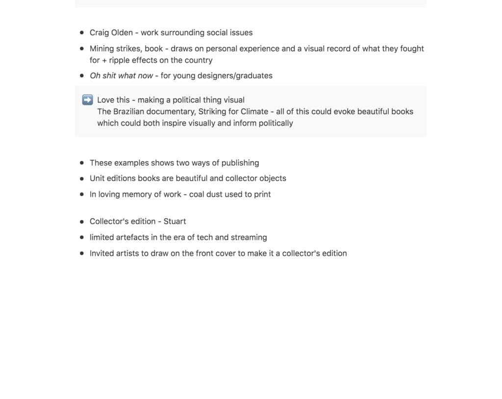
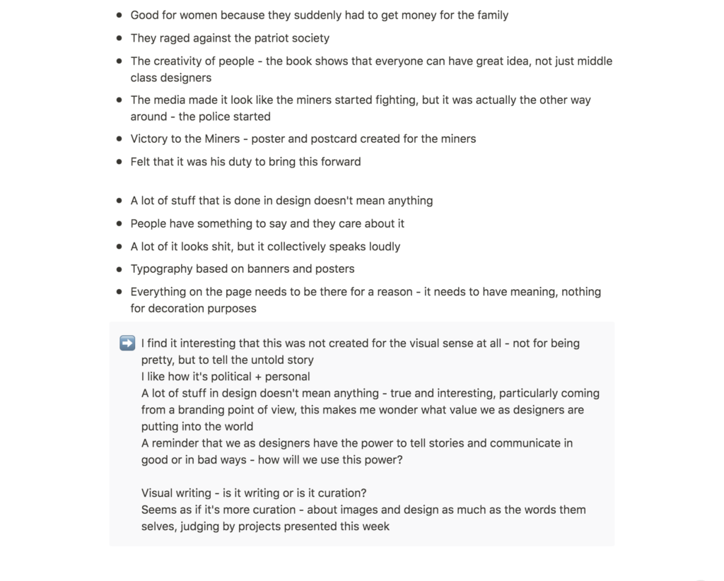
Craig Oldham on Books
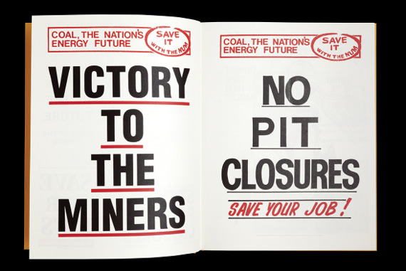
Oldham’s talk was an important reminder on the importance of purpose in graphic design (Craig Oldham, 2015). I think he is right in the fact that a lot of design doesn’t mean anything, and I can often fall into the trap myself, of thinking that good design is about it visually looking good. I was very inspired by his political and personal approach to visual writing, and the talk made me wonder if I could perhaps embark on such a topic for my 3000 word essay (Craig Oldham, 2015). His book first and foremost seem to have been created to tell an untold story, not to comment on visual styles or for being pretty. This, I imagine will appeal to many more people than only designers.
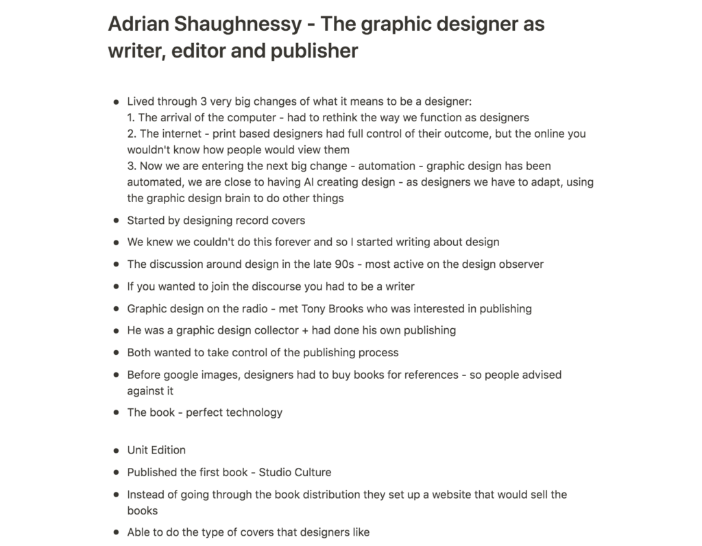
Adrian Shaughnessy: The graphic designer as writer, editor and publisher
The most inspiring part of Shaughnessy’s talk to me, was his description of the visual writing and book design process (Adrian Shaughnessy, 2017). I will take this with me as I embark on my essay for this brief. Further, I will take with me his notes on books having to be special and perfect artefacts in order to live in todays world (Adrian Shaughnessy, 2017). It has to be something that people want to flip through and keep in their homes/offices.
I also liked what Shaughnessy said about books vs. websites. To him, websites are limiting as one has to adapt to grids and templates (Adrian Shaughnessy, 2017), and I can agree that this adds a certain blandness to web design. However, his remark also made me wonder if we could potentially explore the freedom and dynamics of books online (Adrian Shaughnessy, 2017). If we are to explore the freedom of books on a screen, I believe we need to gain control, tactility as well as freedom. However, I do wonder if we could ever give an exposable website the same ownership feeling as holding a physical object in one’s hands.
Further research
Ciara Cordasco: Quarentimes
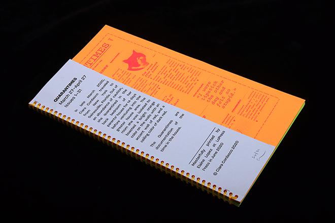
This zine by Ciara Cordasco shows how one can take a personal approach to visual writing. The zine seems to be a humorous diary from the beginning of Covid, which uses beautiful bright colours and quirky typography, that suits the lively writing style. The spiral binding also fits the theme of the zine, as it correlates with the type of notebook one would have in one’s room.
Werk #28
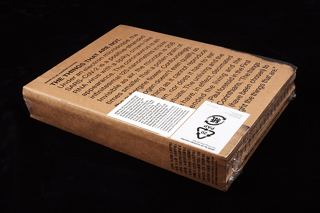
On the note of conceptual production methods, the 28th issue of Werk Magazine shows how one can take an original approach to the magazine format. The magazine’s pages are mede up of thick cardboard pieces, making it appear thick, but also very light in weight, which suits the name The things that are not (Jeremy Leslie, 2021). This leaves little room for longer in depth articles, resulting in a piece of visual writing that does not only communicate through the written word, but perhaps mainly through the magazine’s application.
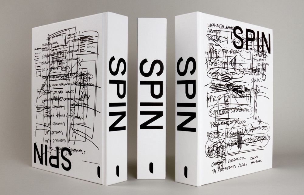
Spin/Adventures in Typography 2
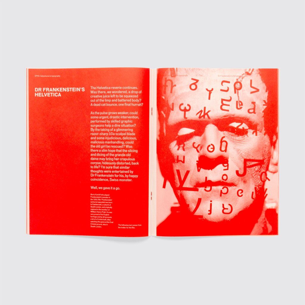
Spin/Adventures in Typography 2 explores what Helvetica might look like having been overused by designers everywhere (Unit Editions, 2018). To me, this is a great visual exploration, communicating that the authors are tired of seeing the typeface, through visual writing rather than simply uttering their comment through words. They have created a fun and expressive set of type experiments, which comments on the design scene through text and visuals, where the visuals are a nice elongate of the humorous tone of voice seen in the written words.
Workshop challenge
Picking a topic
I started the workshop challenge by brainstorming ideas for both a children story and a brand launch. Both led to interesting starting points, but seeing as this was a visual writing assignment, I chose to focus on the idea I though could work best in a visual context. I also wanted to explore one of my product launch ideas as I have a big interest for branding and thought this would be a useful learning experience.
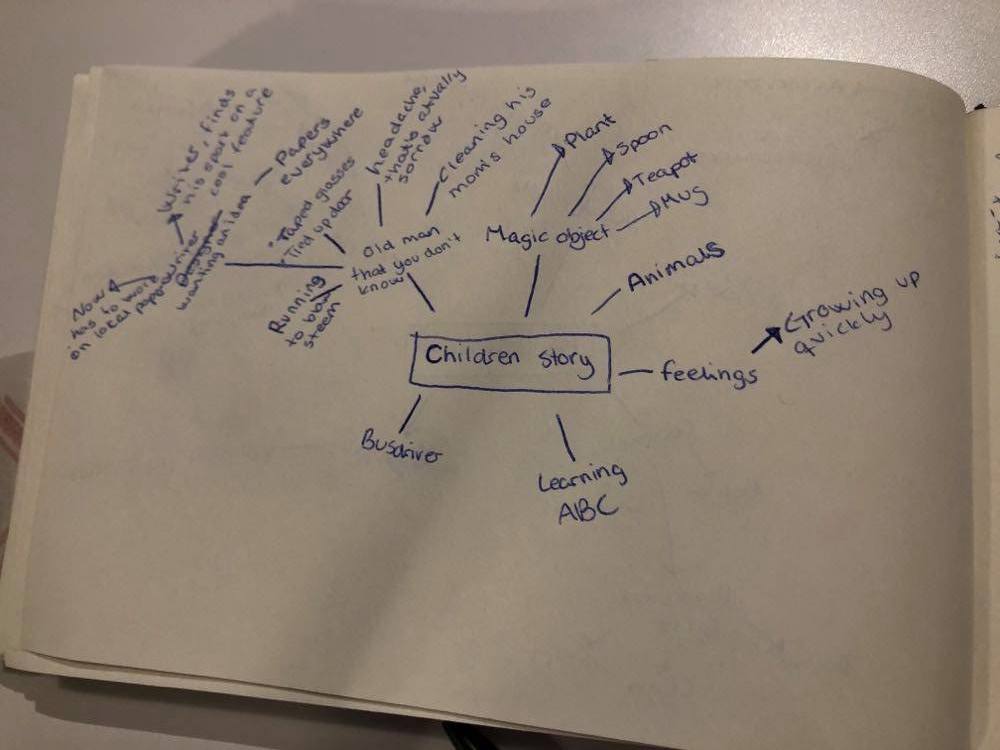
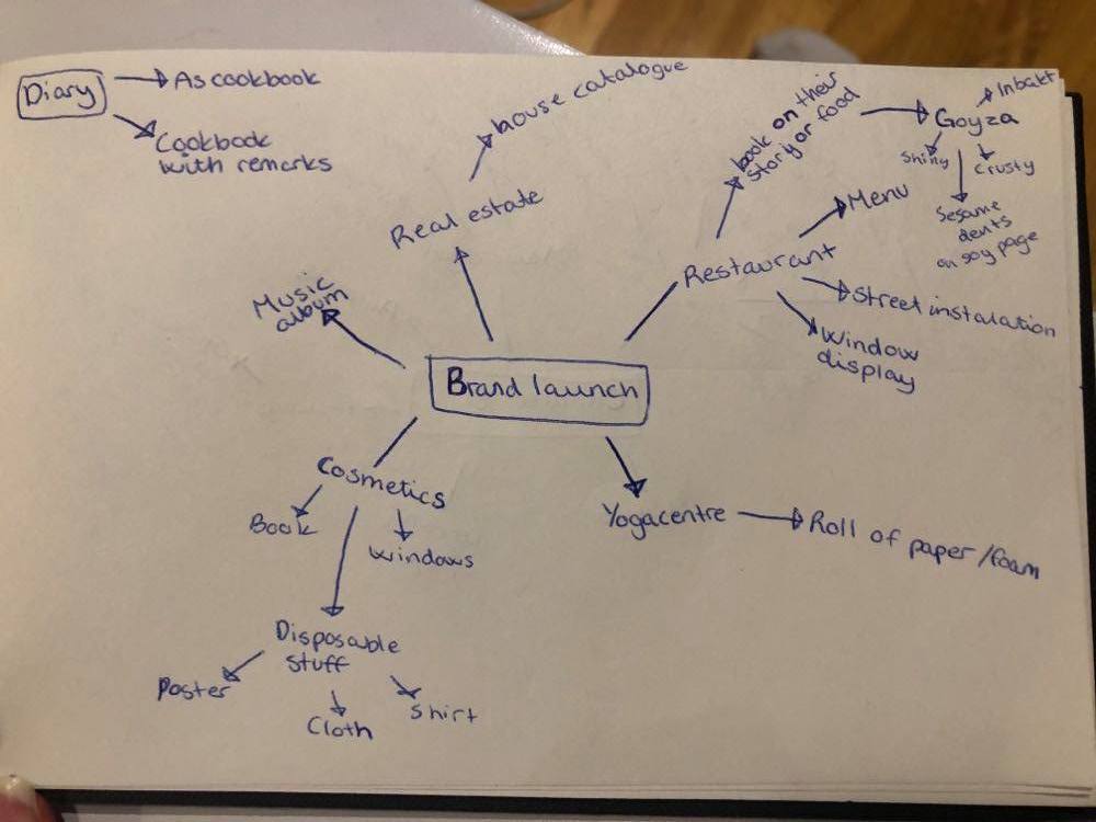
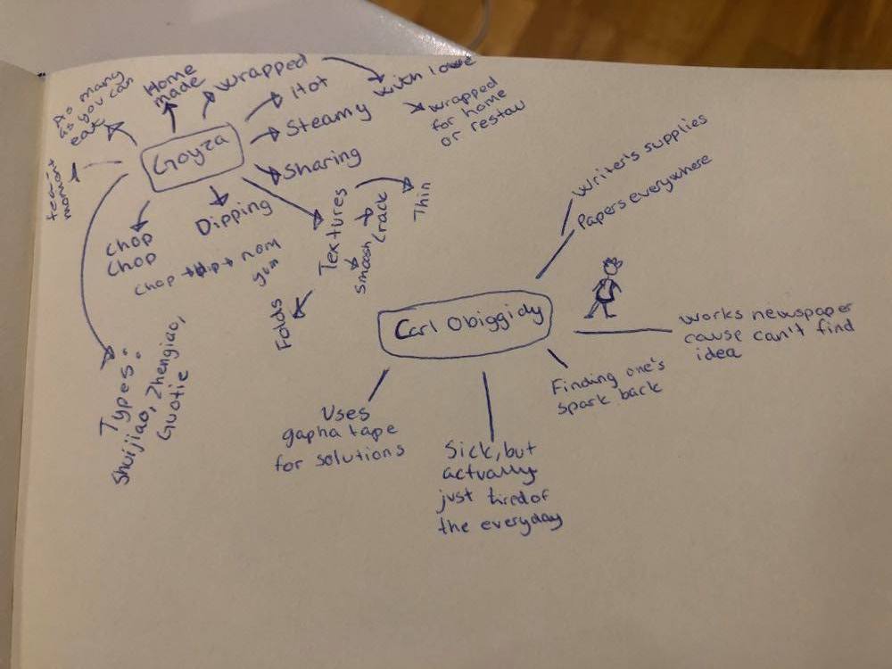
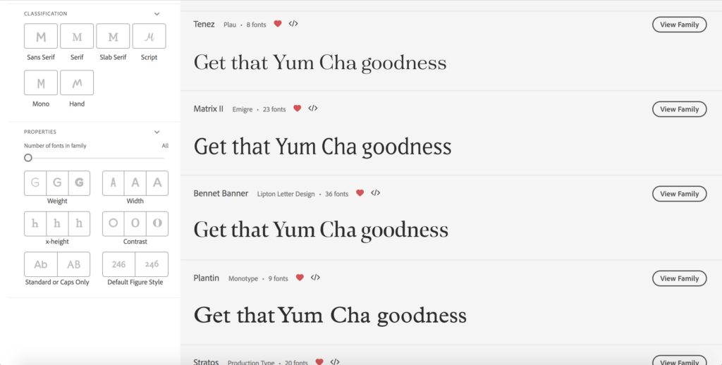
The idea I ended up with was a product launch idea for a dumpling restaurant, which I’ve named Yum Cha (a Chinese meal with tea which often contains dumplings/gyozas). I love gyoza and I thought the texture, colours, heritage and folding technique could provide a great foundation for visual explorations.
Planning my tone of voice
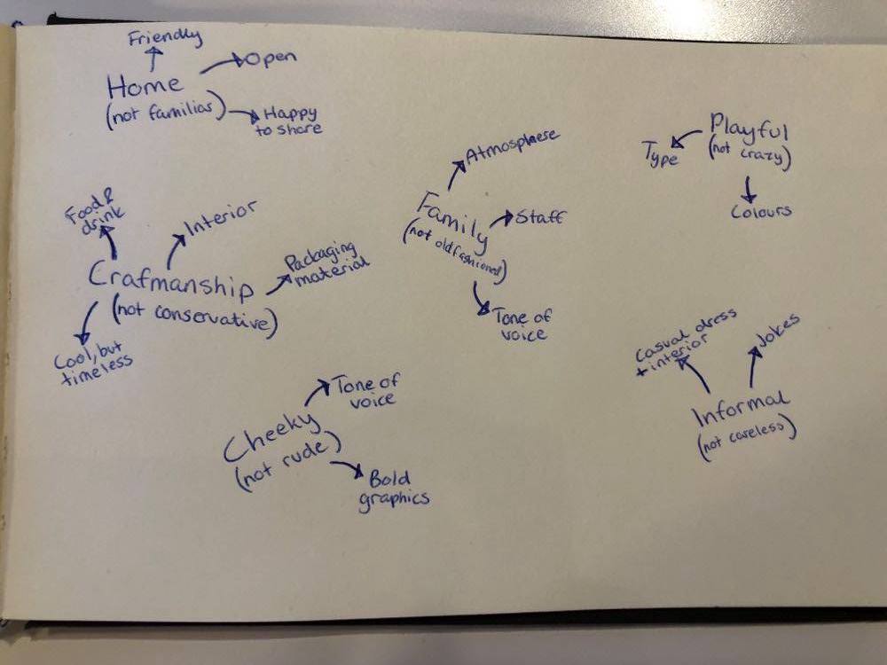
Before starting my text I considered areas to touch upon, as well as what my tone of voice should be like. In order to do so, I reflected upon the use of humor, formality and target audience. This led to some key points about my restaurant concept:
- Aimed at foodies who is eager to explore the newest and trendiest foods – 25-40 year olds
- The restaurant consists of a family staff (although they are not related), which welcomes guests to join their group
- The atmosphere is friendly and laid back
- Focus on craftsmanship and a varied menu where there is an option for everyone
I also considered the sounds of Chinese words related to Gyozas. Yum Cha has a resemblance to Wowza (which I later used in my design) and I liked how snappy some of the names of types of gyozas were.
Text
Building upon the reflections above I started experimenting with a text, which ended up like this:
Coming soon to Prinsens Gate: Yum Cha
Chop-dip-yum
We in the Yum Cha family can’t wait to meet the common foodies of Oslo as we open Norway’s first and only gyoza restaurant this spring. We promise dumplings of all shapes and sizes and a worry free atmosphere where guests are invited as parts of the Yum Cha gang. Get a table for all your friends or meet us at the bar for a cup of our special adult tee brew (our bartender Mark will happily tell you about the time he walked across Huangshan for the world’s best Longjing tee). Our gyozas are folded with love, making sure our steamy gyoza-mix is kept fresh and tasty from kitchen to plate. Eat here or bring a serving home to eat in front of the TV (we won’t judge).
The Yum Cha family is an adventurous bunch, keen to explore new challenges. We like to think that our menu features every dumpling style there is, but if you can’t find your favourite, our chef will happily make it for you. The same goes for dipping sauces, which is offered at any spice level. Never tried a gyoza? Ask your designated Yum Cha waiter for a gyoza tasting plate. This way you can establish a favourite before your next visit.
Why Gyozas?
The person asking this question has obviously never tried a gyoza. In all seriousness we believe gyozas are the source to everything good. Their hot and steamy essence makes for a delicious pillow, which wraps perfectly around hot asian flavours, adding saliva to any dum old dry-mouth. Gyozas are soft, crispy, hot, tangy, spicy, packed with flavour … where were we?
All tummies welcome
At Yum Cha, we don’t care if you’re vegan, gluten free or carnivore – our pots and pans will steam for everyone. We do however care about the environment, which is why we offer all our gyozas as a vegetarian option. Our ingredients are sourced locally and conditions are checked regularly by our production manager Josh.
Join the family
Tasty food is good and all, but our most important mission is to spread our family love. This means that you will leave our restaurant with a tummy filled to the rim. You might also have to deal with our cheesy humour (our kitchen staff loves a good pun), but don’t worry, we won’t be offended if you don’t laugh.
So what are you waiting for? Get ready for that gyoza goodness and order a table now!
Visual process
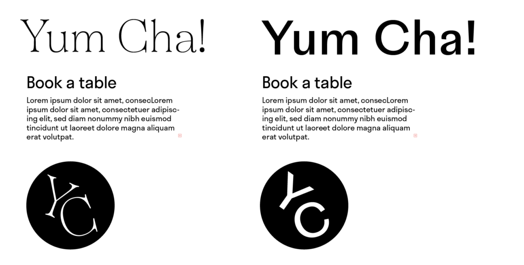
In my tutorial with Paul this week, we discussed how type and tone of voice can correlate. As I wrote my text piece, ideas and thoughts on design popped into my head and I almost felt as if the text worked as a foundation for my type choice. I therefor decided to start my visual process by exploring potential typefaces. In order to stay on track I wrote down some notes on what I wanted my design to communicate, using my text piece as a foundation.
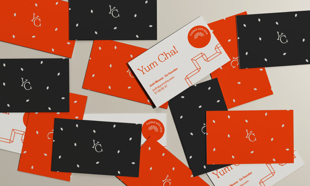
After deciding on typography, I started experimenting with colour and layout, slowly starting to build a design system. I wanted to use beige to symbolise the colour of a gyoza and dark grey to symbolise the dipping sauce. As my tone of voice is quite lively and expressive, I wanted to experiment with bright colours. I particularly liked the red featured below. Red is the colour of China, but it also represents the colour of chilli and other vegetables one might use in a gyoza filling. By using red, the design got a fresher look than when I only used the more dull colours based on the gyoza.
I didn’t sketch much this week. After writing the text I almost felt as if I knew the brand and it therefor felt natural to develop ideas whilst working in adobe. The discovery of how one can use writing as “visual research” was great and I really want to continue using this as a method for ideation in the future.
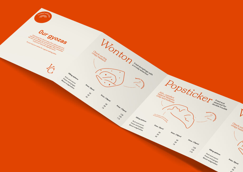
Folding techniques
Through earlier sketching I got the idea of using a folding element, as I wanted to reference the craftsmanship of making gyozas. I decided to look into Chinese binding techniques and discovered the beautiful documents below. This gave me the idea of making a folded menu, which could feature one gyoza on each “page”.
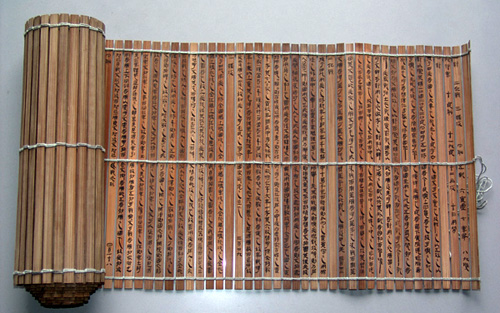
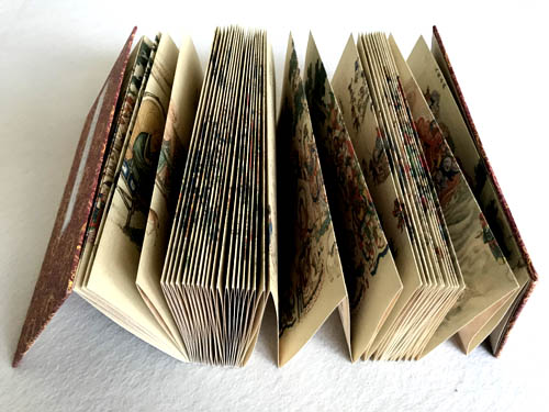
Fig. 13: Unknown maker. ca. 618 to 907. No title [Sutra-style Binding]
Unfortunately I didn’t have time to make a real product like this due to time limitations, but if I had, I would have loved to create a similar wooden front- and back page to hold the folded menu in place.
Result
My result this week is a dumpling restaurant concept, for which I’ve created written content and a visual identity sketch. I have created 6 key words to describe the restaurant, which I’ve tried to communicate through both text and visuals: Home, Craftsmanship, Family, Cheeky, Playful and Informal. The playful and lively text is visualised through a main bold colour, expressive typography, photographs and illustrations.
Production methods
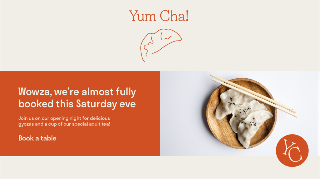
Inspired by this week’s material, I wanted to make sure that the text and concept was not just communicated through a digital design, but also through production methods. I have used a collection of mockups to illustrate my ideas.
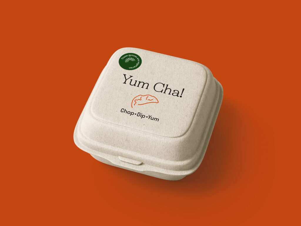
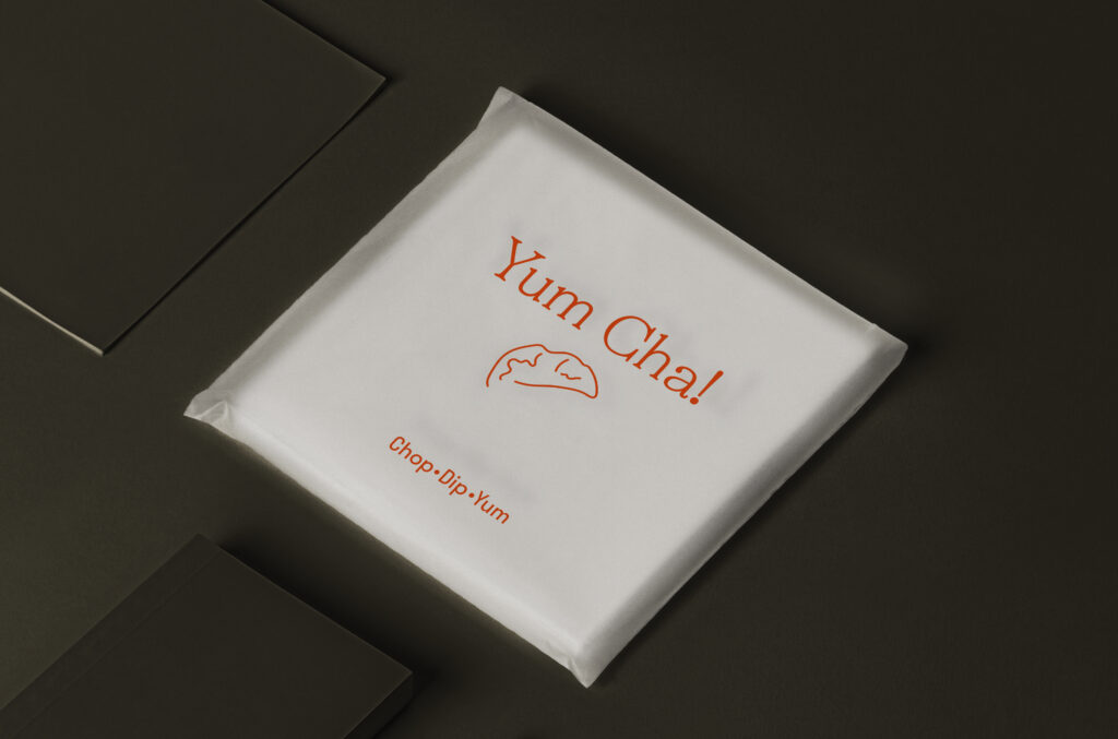
As the restaurant expresses care about the environment, I’ve used an organic take out box, on which one can place a vegetarian-sticker where applicable. On the business cards, I’ve made one of the sides look like a dipping sauces with sesame seeds on top. These are supposed to be embossed in printing to really make them look like seeds.
For the menu I wanted to reference the Chinese binding method from my research, using folded pages (which also represents the folding method used when making gyozas). This folded menu is packed inside a translucent beige folder, representing the dough layer of a gyoza, which holds the stuffing and flavour.
The photographs used in this work were collected from websites with a creative commons license, and were not created by me.
The mockups used in this work were collected from websites with a creative commons license, and were not created by me.
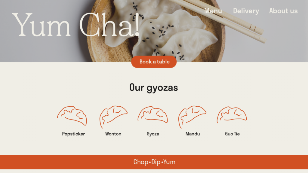
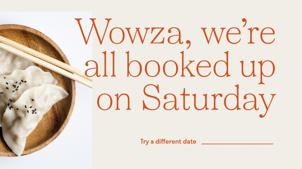
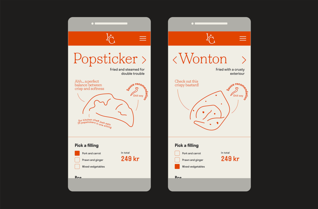
As the restaurant is targeted towards a young audience I also wanted to experiment with it’s online presence. The physical menu has been translated into wireframes for a delivery app, where I’ve tried to maintain the tone of voice from my written text.
The text piece also had to be visualised, and so I decided to create an article on the website, which announces the launch of the brand. This could also work as an about page.
The photographs used in this work were collected from websites with a creative commons license, and were not created by me.
In conclusion
This week I have discovered a new research method – to design based on a piece of writing. I have really enjoyed this week’s process and will try to incorporate this way of establishing a tone of voice as I am designing for future branding projects. I have always considered the importance of a brand’s tone of voice, but perhaps not how it can inform visual design decisions like typography and colour. Thus I think my choice of creating a branding identity sketch was a good way of tackling the visual part of this week’s challenge.
Although this week has been about writing, I have looked at a lot of visual work, both in therms of provided material and the workshop challenge. Thus, it seems to me as if visual writing is not just writing about visual work, but the combination of a piece of writing and a piece of design. I look forward to exploring the correlation between words and visuals (and how they can inform each other) further over the next couple of weeks.
If I had more time this week, I would have liked to work further with words by creating a more comprehensive tone of voice system. Although I have tried to transfer the tone of voice from text to my design, I think I could have come up with more creative text details had I created such a system. Looking back I also would have liked to include the act of sketching into my process. I think this could have led to a clearer concept in terms of logo and production methods. The folding concept is an example of what I would have liked to explore further in order to make it a part of the whole visual identity. I also would have liked to explore animation as I think this could have communicated the expressiveness in my visuals, as done in the written text.
REFERENCES:
Adrian Shaughnessy (2017) The graphic designer as writer, editor and publisher. (Element Talks). Available at: https://www.youtube.com/watch?v=RL1W3YdCasQ&ab_channel=ElementTalks (Accessed: 20 February 2021).
Anna Gerber and Britt Iverson (2011) Visual Editions: Part Revolution, Part Reinvention… (TOC 2011). Available at: https://www.youtube.com/watch?v=JADarGx17Ok&ab_channel=O%27Reilly (Accessed: 20 February 2021).
Craig Oldham (2015) Craig Oldham on Books. (Nicer Tuesdays). Available at: https://www.youtube.com/watch?v=rToKzDMIRPs&ab_channel=It%27sNiceThat (Accessed: 20 February 2021).
Jeremy Leslie (2021) ‘Magazine-y: Werk #28’, Mag Culture, 17 February. Available at: https://magculture.com/werk-28/ (Accessed: 21 February 2021).
Stuart Tolley (2021) ‘Visual Writing’. Canvas Falmouth Flexible [online], 19 February.
Unit Editions (2018) ‘Spin/Adventures in Typography 2’. Available at: https://www.uniteditions.com/products/spin-adventures-in-typography-2 (Accessed: 21 February 2021).
LIST OF FIGURES:
Figure 1. Jonathan Safran FOER. 2010. Tree of Codes. Visual Editions [online]. Available at: https://www.visual-editions.com/
Figure 2. Craig OLDHAM. 2015. In Loving Memory of Work. In Loving Memory of Work [online]. Available at: https://www.inlovingmemoryofwork.com/
Figure 3. SPIN. Ca. 2015. Spin 360°. Medium [online]. Available at: https://medium.com/@bookprescom/unit-editions-an-independent-publisher-from-london-producing-high-quality-books-on-graphic-4a8498658641
Figure 4. Ciara CORDASCO. 2020. Quarentimes #1. Magculture [online]. Available at: https://magculture.com/quarantimes-1/
Figure 5. Theseus CHAN. 1904. Werk #28. Magculture [online]. Available at: https://magculture.com/werk-28/
Figure 6. SPIN. 2018. Spin/Adventures in Typography 2. Unit Editions [online]. Available at: https://www.uniteditions.com/products/spin-adventures-in-typography-2
Figure 7-11: Ingrid REIGSTAD. 2021. Yum Cha! Experiments. Private collection: Ingrid Reigstad.
Figure 12. Unknown maker. ca. 5th century BC. No title. [Sutra-style Binding]. View of China [online]. Available at: https://www.viewofchina.com/book-binding-technology/ [accessed 24 February 2021].
Figure 13. Unknown maker. ca. 618 to 907. No title. [Policy Briefing-style Binding]. View of China [online]. Available at: https://www.viewofchina.com/book-binding-technology/ [accessed 24 February 2021].
Figure 14: Ingrid REIGSTAD. 2021. Yum Cha! Brand identity sketch. Private collection: Ingrid Reigstad.
Figure 15-18: Ingrid REIGSTAD. 2021. Yum Cha! Brand identity sketch. Private collection: Ingrid Reigstad.
Figure 19: Ingrid REIGSTAD. 2021. Yum Cha! Brand identity sketch. Private collection: Ingrid Reigstad.
Figure 20: Ingrid REIGSTAD. 2021. Yum Cha! Brand identity sketch. Private collection: Ingrid Reigstad.