Lecture notes
Lecture reflection
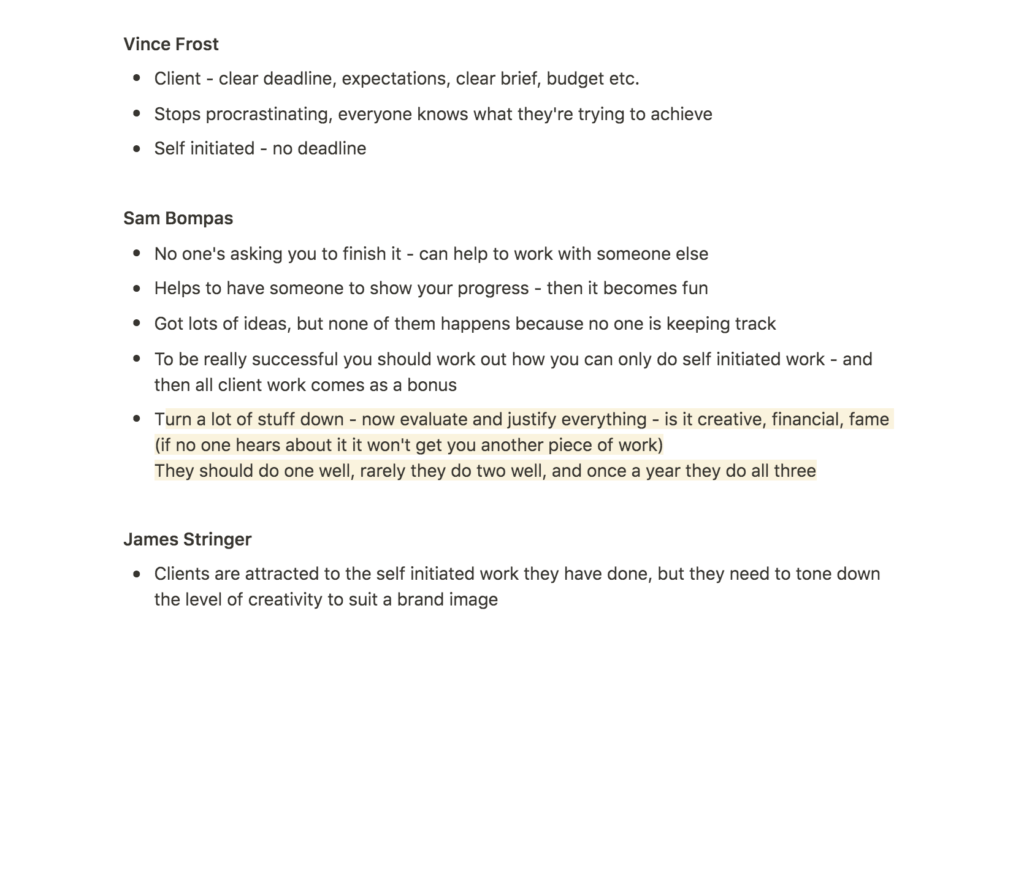
I think Christoph Miller explained the importance of self-initiated projects well when he said that they define how they like to work and what they like to work with (Christoph Miller et al., 2021). I also like what he said about them being like business cards as they attract new clients (Christoph Miller et al., 2021). This seemed to be a recurring theme amongst the case study practitioners.
I’ve previously thought about self-initiated projects as something designers do for themselves, but this lecture made me realise how important they are for professional practice. I also never considered how studios can have self-initiated projects as a collaboration amongst employees, as I’ve for some reason thought about them as solo-projects – something you do in your spare time.
I wonder wether self-initiated projects are common practice amongst most studios, and if not, how they could potentially help studios develop and grow. If I ever was to start my own business I’d be eager to make self-initiated work part of the practice as it seems like a great way to learn, but also to gain attention.
Resource notes
Resource reflection
The Wayback
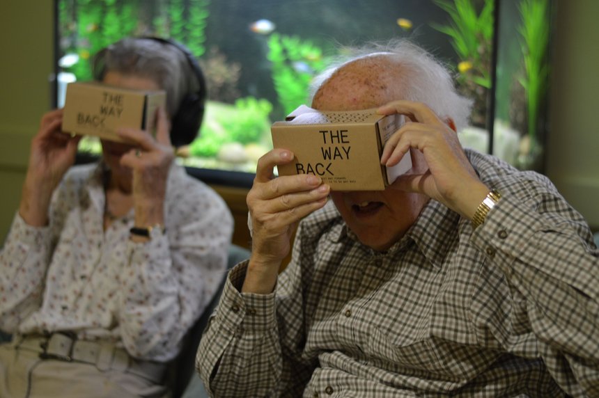
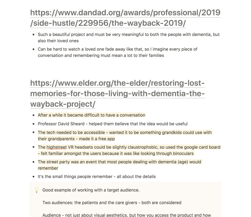
The Wayback was such a beautiful project and I imagine it being very meaningful to patients and their loved ones. When I’ve had dementia in the family, one of the most difficult things has been to have a conversation, and thus I really value how the Wayback made this easier.
I was also very interested in how the Wayback team developed their product in line with their audiences. On one hand, they made sure that the physical product and the movie worked for the patients (using the Google cardboard rather than the more claustrophobic VR headset, and choosing a moment in time that most people with dementia would have experienced) (Elder, 2018). On the other hand, they ensured that care givers and loved ones would be able to access the product (easy technology and free app) (Elder, 2018). Thus, the team considered all users of their design.
This project shows how considering an audience is not just about aesthetics, but also accessibility and choice of medium. As reflected on in prior weeks, I will have to take non-designers into consideration when it comes to accessing my typeface, as about half of people buying typefaces are not designers. As I finalise my project this week I’ll attempt to create a solution for this aspect.
Further research
Grilli Type
In order to learn more about accessibility and choice of medium in relation to type design, I wanted to take a look at Grilli Type’s website. In order to show off what their typefaces can do, Grilli hosts individual websites for each of their typefaces (I love the GT Flexa and the GT Super). In addition they also let users download trials in order to see if the typefaces actually work for projects. These features help designers evaluate wether a typeface is right for them (and thus, audience accessibility as been considered).
As if this wasn’t enough, Grilli also has it’s own blog presenting case studies where their typefaces are in use. They also offer advice to users, for example on how to make your own typeface, and how to use typefaces in web projects. This provides value to their audience, beyond usability, and I imagine this contributing to them being a top of mind foundry amongst new designers, but also non-designers looking to learn about typography (who as we established last week contribute to half of typeface purchasers).
IKEA: Kitchen quick quoter
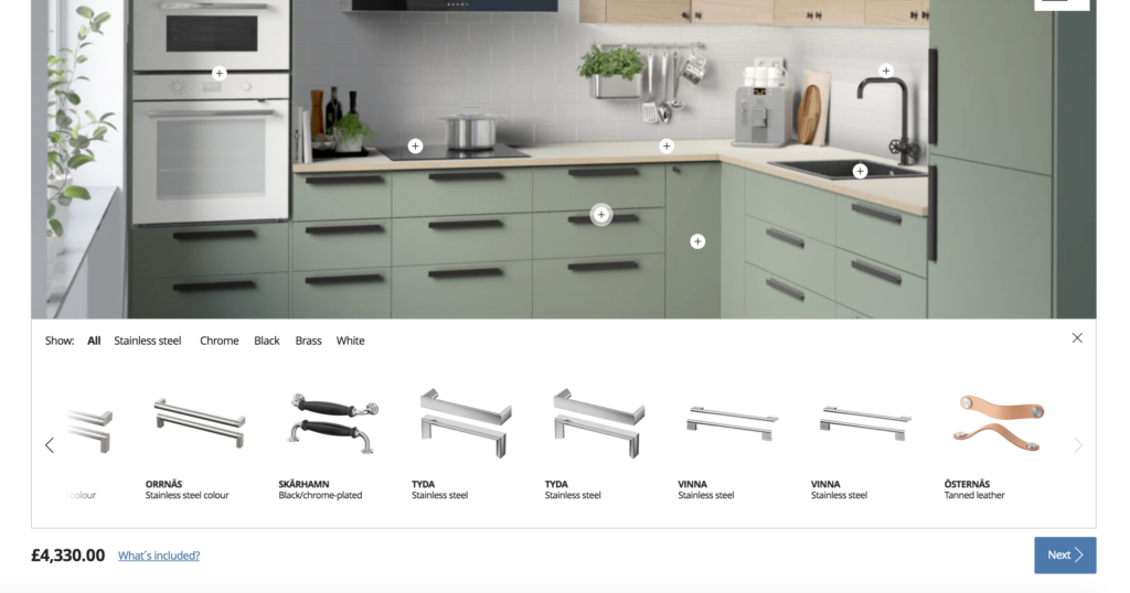
Nothing really reminds me more of modular systems (and Scandinavian furniture) than IKEA, and I therefore wanted to check if they had any digital compiling systems that I could use for accessibility reference. Their Kitchen quick quoter let you build a kitchen quickly in order to figure out a rough estimate of costs, but it also lets you view different aesthetic options. This is done with simple plus-buttons on each section of the kitchen, which opens a menu of component options for this particular section. It’s very easy to use, and I wonder if I could potentially adopt a similar structure for my website prototype.
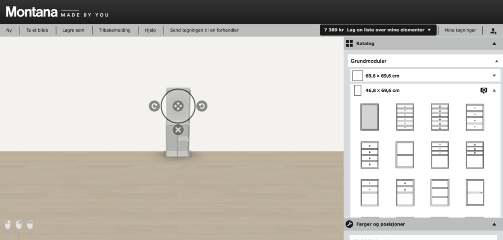
Another example of furniture compiling services is Montana’s shelving softwear:
Workshop challenge
Finalising typeface
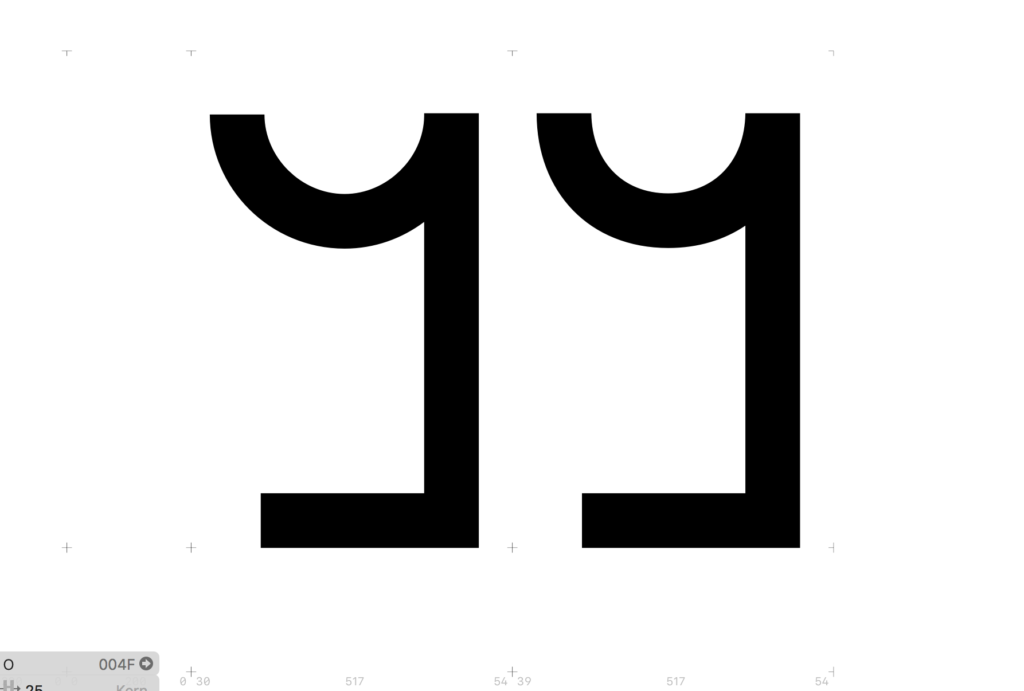
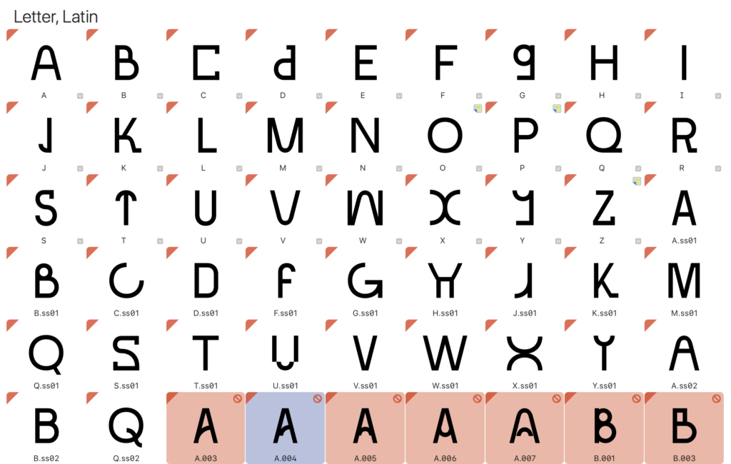
I started the workshop challenge by making some final adjustments to my typeface, using the #ohnotypeschool (looked at last week) as reference. The diagonals were looking too slim, and so I decided to make them a little wider – this was possible because none of the letters needed the edges of a horizontal to intersect with the edges of a diagonals (if they did, there would be a gap of a few pixels). I also made all of my rounds a little more square, which made a big difference.
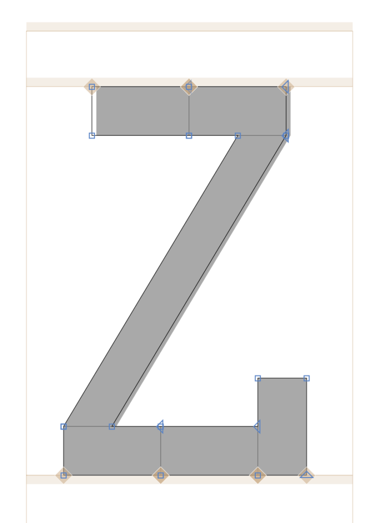
Bellow are two examples of how altering the rounds made the typeface a little less pointy.
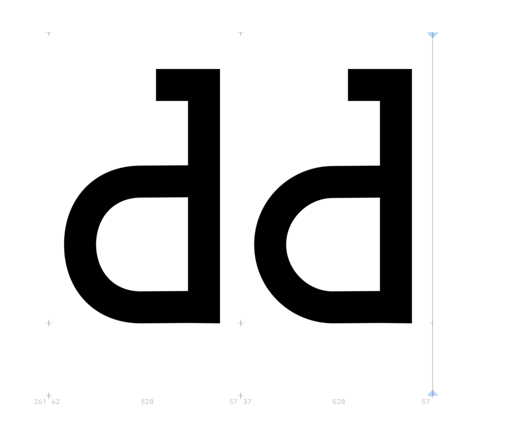
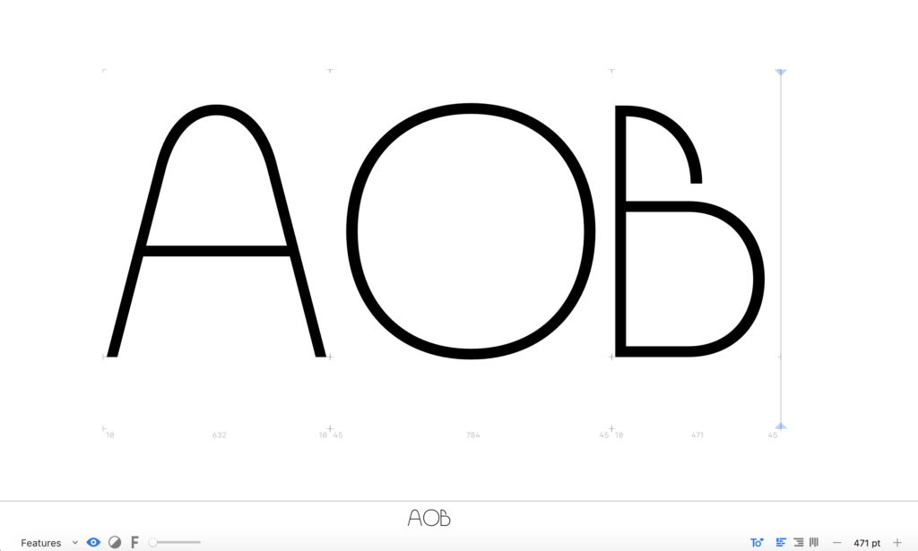
Further, I also wanted to see if I could create different weights for my typeface. I initially thought this could be an easy task as I could simply change the components and build letters in the same way as with the regular. However, I quickly discovered that it wasn’t as easy as that (see the B below), and due to time limitations I couldn’t go ahead with this for the current brief.
Having done the final adjustments, I went on to export my typeface.
Visual presentation of typeface
In order to present my final result I wanted to feature the typeface in a selection of posters, but also in a quick prototype of what the compiling tool could look like. As established in prior weeks, about half of font-purchasers are not graphic designers, and it was therefore important that users could access the letter building concept without adobe software.
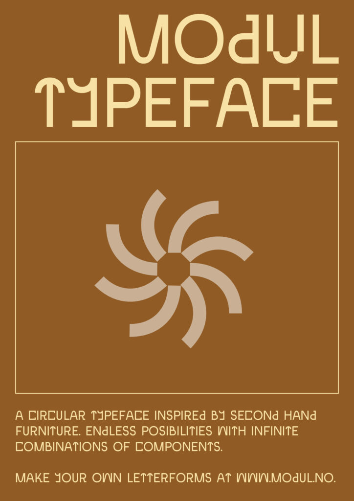
Posters
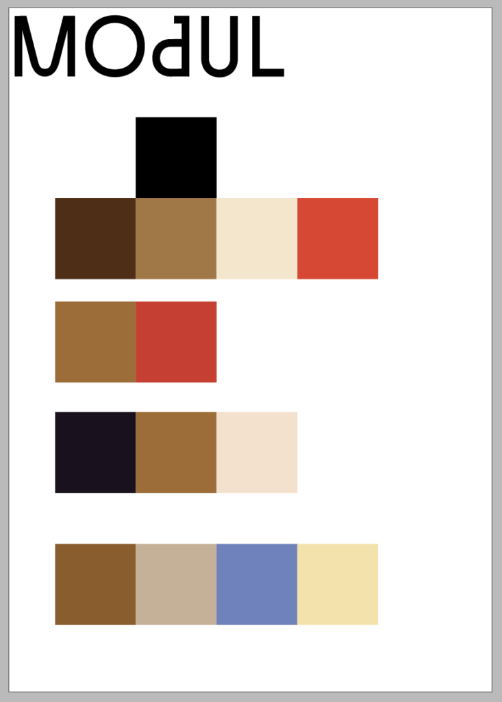
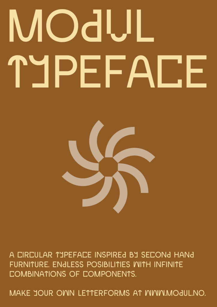
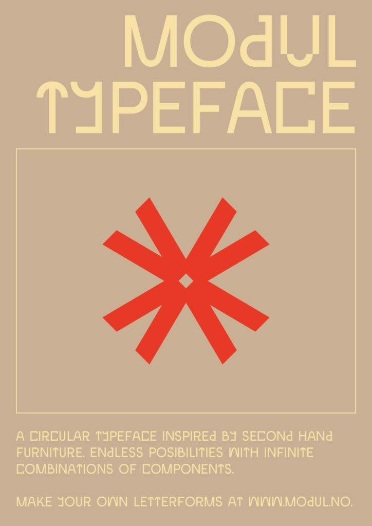
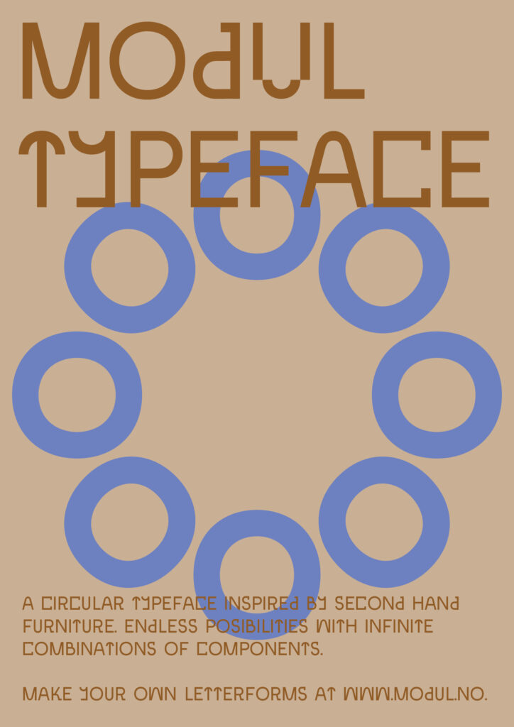
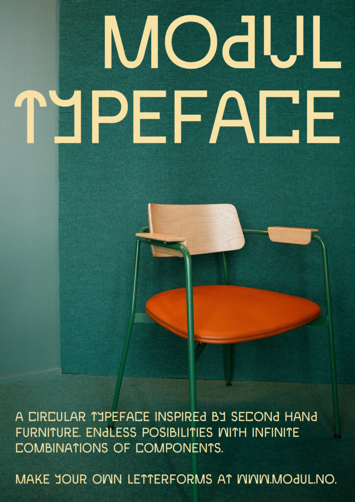
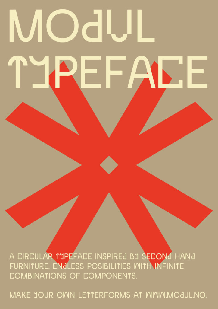
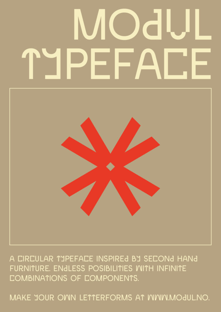
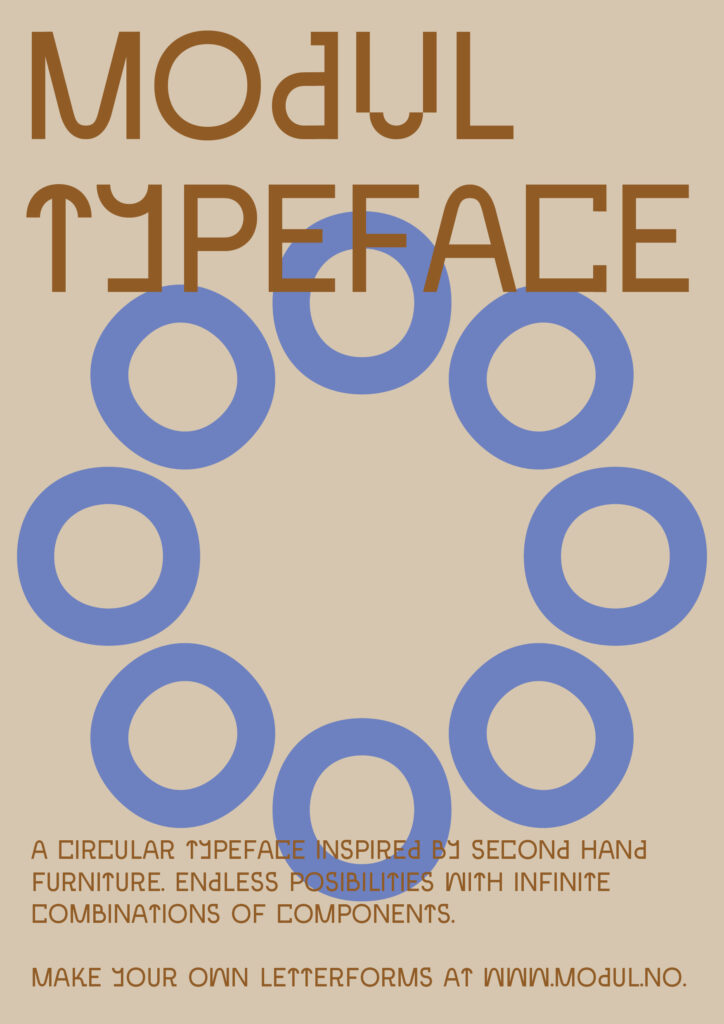
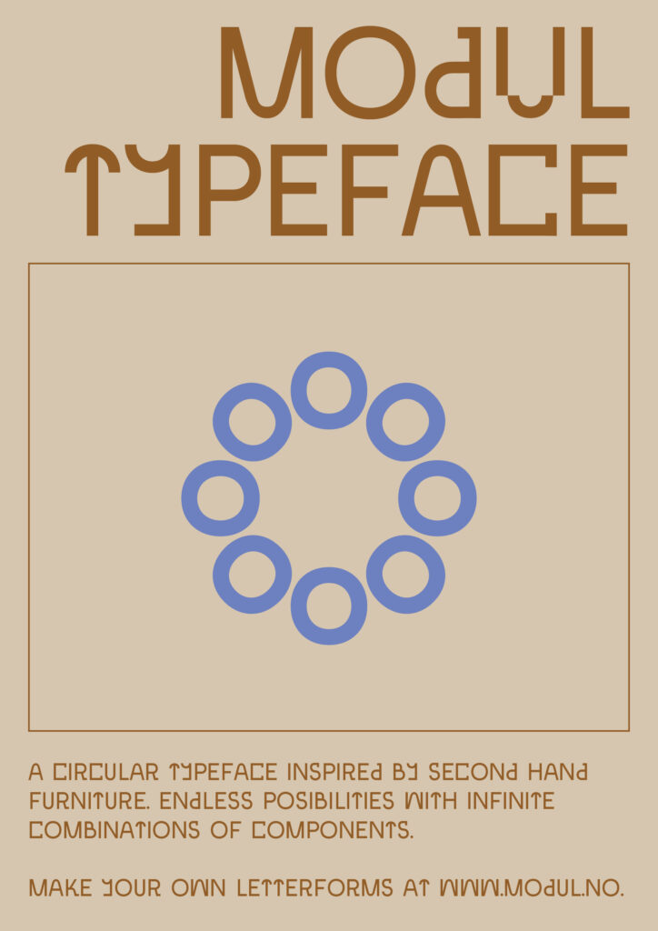
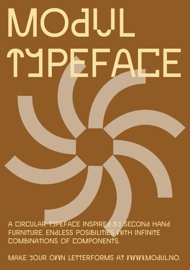
As I didn’t have too much time to spend on my posters, I decided to jump straight into InDesign. I wanted the focus to be on the typography, as the aim was to showcase the letterforms. However, I also wanted the poster design to represent my concept. I decided to develop a colour profile inspired by images of vintage furniture that I had used as visual references during the typeface development. I also wanted to represent the aspects of modularity and circularity, which is why I decided to use the type components to build a variety of illustrations.
By experimenting with layout, I managed to establish a system where colours and symbols could be changed within three sets of poster layouts:
I also experimented with overlaying the text on photographs of furniture:
After a bit more tweaking I landed with the following posters as finals:
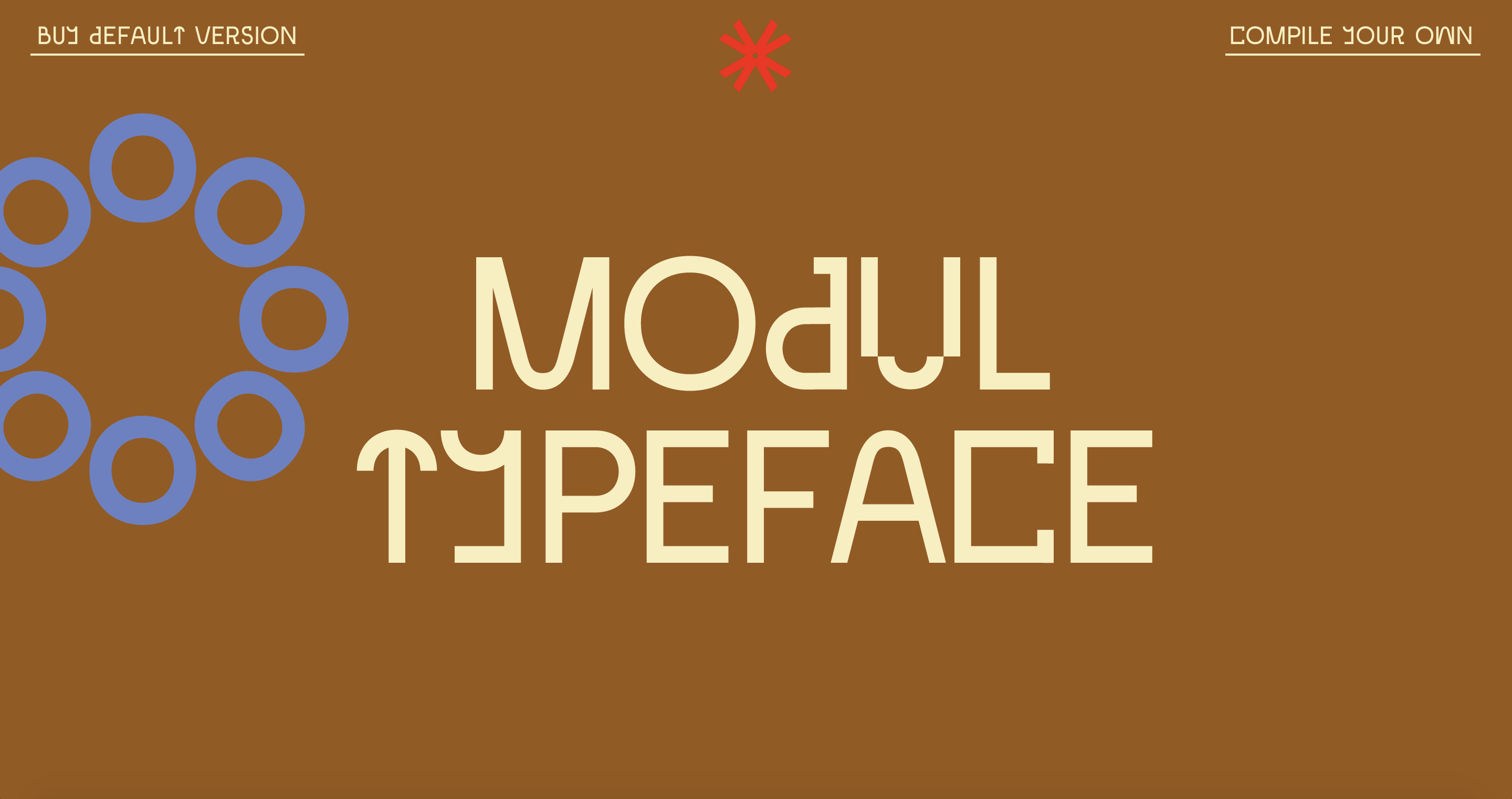
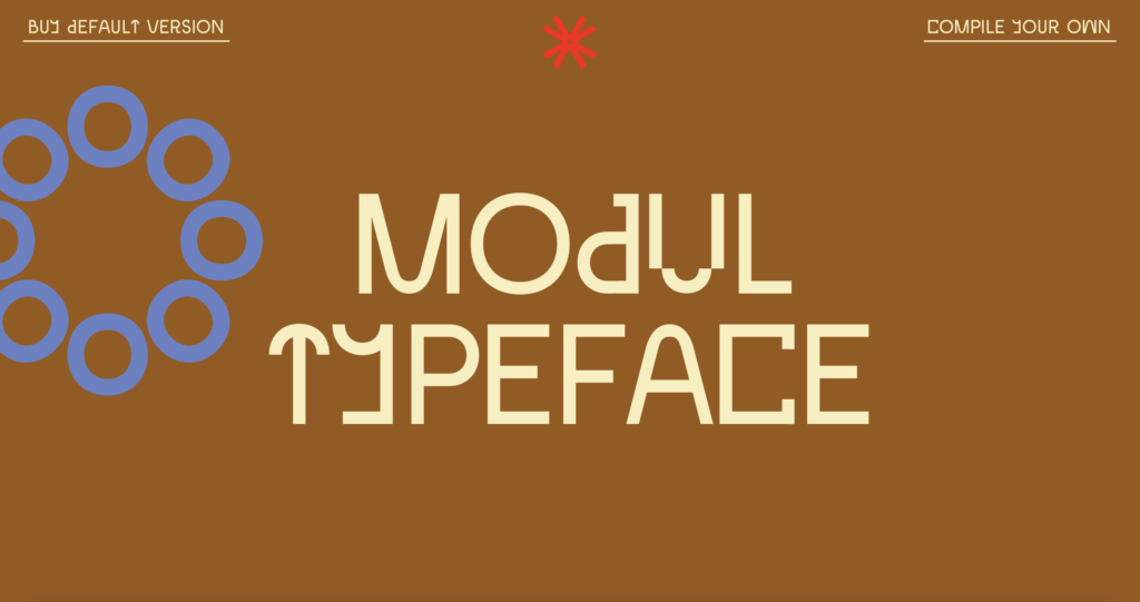
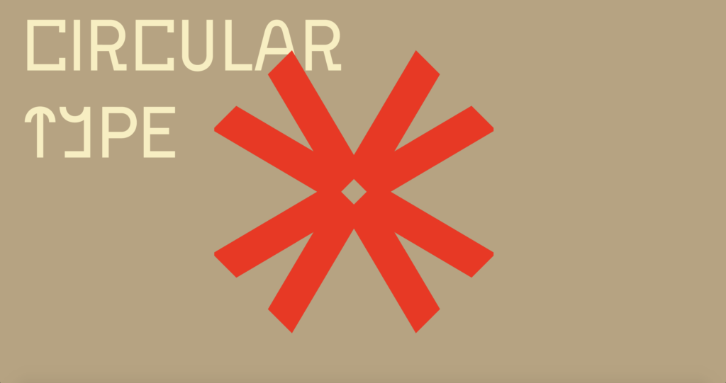
Website
For the website, I wanted to use the branding system that I had developed for the posters, but in a more interactive way. Due to time limitations, I focused on creating a simple landing page with the goal of communicating the essence of Modul through visual communication. The movement (see videos further down) is in line with the experimental essence of the typeface, and also the fun and creative act of compiling your own letters.
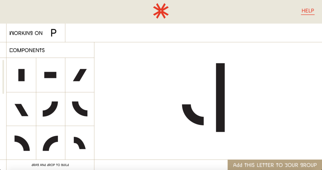
I wasn’t really able to get the letter builder tool to look good, as there was very little time left at this point. However, the main goal of this design was not to look sleek, but rather to explain my idea of user compiling. If I had more time I would have liked to develop this further visually, but also in terms of user experience by testing it on my target audience.
Inspired by the way Grilli Type presents their typefaces (as discussed in my further research above), I wanted to make a quick animation that showcased the compiling aspect of Modul. By using the Y, I was able to show how the letterform is built, but also how one can create a range of alternates for the same letter using the component system.
Below is a screen recording of my prototype. Do also feel free to visit the live prototype here.
Gathering feedback
In order to reflect on my work I went on to gather feedback from my target audience. I asked three friends (two UX-designers and one PR-agent) to reflect on any concerns they might have, but also what sort of vibe they were getting from the typeface. Below are the key points from their feedback:
Positives and reflections on vibe
- The combination of curves and straight lines
- It’s fun that you can make your own typeface, similar to how you re-use vintage furniture – this gives you more possibilities
- The straight lines and fluid curves gives off a 60s vibe
- The colour profile works well in reference to Scandinavian furniture design
Could be improved
- The typeface works best for headlines as it’s hard to read on smaller scales
- Although there are several interesting letters on their own, the typeface is missing some cohesiveness – e.g. the G is quite different from other letters
I also wanted to use the feedback from this week’s crits, which I’ve attempted to sum up below:
- It could be interesting to re-use the letterforms to create furniture, as a way of taking the project back to the beginning
- The interesting aspect about this project is not the finished typeface on it’s own, but the design language you’ve created and the methods/processes used – this typeface is just one potential output for this language
- It’s a modern typeface which also has traces of history – so many typefaces today lack traces of humanity, but this does not
- A nice combination of unique letters and more basic ones
I really liked Ben’s reflections on design language, and looking at my project again, I realised that I agree with him – the real strength of the project is not the default typeface, but rather the design tool that encourages collaboration and creative circularity.
Personal evaluation
As asked for in the workshop challenge I then went on to evaluate my project, by reflection on each stage of the project:
Week 1: Brief analysis
What went well?
- It was successful to look at more conceptual references, like old calendars and Scandinavian season statistics.
- Was able to dig deeper into the context of vintage furniture by looking at the act of circularity, rather than only the visual language of the references.
What could have been improved?
- I struggled to find depth in my ideas – the topics were more general like “make a typeface”.
- Could have taken the time to look further into target audience by actually identifying their issues and needs. Also, for this project I mainly targeted the audience through the choice of medium, and not much in terms of aesthetics.
Week 2: Ideas, craft and context
What went well?
- Sascha Lobe’s presentation was hugely helpful as it helped me understand how to translate the visual language of a piece of visual culture into graphic design.
- The range of research led to interesting conceptual ideas.
- Great to find inspiration in other areas than graphic design by looking at the conceptual side, rather than the visual one.
- Through sketching I was able to start building a design language based on furniture references – this was also achieved my distinguishing 5 descriptive words (modular, geometric, angled, asymmetrical, multi-functional) – this was successful because I had something to refer to in my typeface development.
- Discovering that 58% of font purchasers are not graphic designers was an important discovery for the final product (browser tool, rather than something you have to make in Adobe software).
What could have been improved?
- Although I created five moodboards, the range of ideas could have been larger – I created one comprehensive concept, and then tweaked it into five directions, rather than looking at the brief with five different approaches.
- Could have explored different directions for the type aesthetic – did it have to be regular in weight and a sans serif? Could it have been more conceptual or perhaps physical in some way?
Week 3: Development
What went well?
- I was able to experiment to a larger extent after establishing which components I would be using.
- Printing out each letter was a great way of editing down versions of each letter – it also let me discover general areas that could be improved.
- Looking at type principles (#ohnotypeschool) was a successful reference because I was able to do important improvements like making the rounds slightly less circular.
What could have been improved?
- At this stage I could have involved the target audience by testing and asking for feedback.
- I received feedback that the stenciled S wasn’t working well with the other letters, which I agreed with (I was able to fix this in my final design).
Week 4: Outcome and ambition
What went well?
- The biggest success of the project is probably the creation of a graphic design system/language for Norwegian second hand furniture, visually, but also conceptually as it refers to circularity and availability. As Ben mentioned, the typeface is only one outcome of this language, as the components can also be used to create other types of symbols like the illustrations I’ve made.
- I think I have managed to capture the furniture language by representing the five descriptive words I established (modular, geometric, angled, asymmetrical, multi-functional) in my design.
- I like the quirky aesthetics of the typeface, and it feels like how a from-old-to-new design should be – slightly strange and unbalanced, but also unique and a product of having fun.
- I’ve learned a lot:
– Making a typeface doesn’t necessarily mean that you have to follow every type principle, or that it has to be legible to be interesting. In fact, I think it could be interesting to experiment with how far one can move away from traditional type principles, whilst still making a “successful typeface”
– Even though type principles haven’t been implemented all the way through the typeface, I have learned a lot about the ones I have used (e.g. making rounds slightly less circular than a circle)
– Translating a piece of visual culture into graphic design isn’t necessarily about copying aspects of it, but rather about trying to capture it’s spirit, conceptual value, methods, techniques, etc.
What could have been improved?
- Although I like the foundation of the typeface, it’s not a complete and polished piece. It could have been more cohesive and I could have worked more on making it legible (especially on smaller scales).
- I could have included my target audience to a larger extent throughout the project. Although I have asked friends for feedback, I have not spoken to practitioners that deal with themes like circularity and sustainability. This was my established target audience, and involving them could probably have informed the project further.
- One way of including an audience would be to get a selection of users to create their own versions of the typeface by using the components. This could have illustrated the potentials of the developed design language, and enhanced the the democratic and circular value of the project.
- In terms of presentation, I could have taken the aspect of play and variety further – for example by making the headline letters shift between alternates, but also by exploring new visual concepts.
- The compiling tool is not looking great and it’s not on the same visual level as the front page of the website prototype. It’s simply a page that illustrates the concept of the project, and I think it could have been great to explore new concepts for this tool by looking further into UX and experience design. This could have helped me demonstrate that the real success of the project is the new design language, and not the default typeface in itself.
Video presentation
Having made the reflections above I went on to write a summary script of process and analysis. I then recorded the script and combined it with images and animations from my project:
Unfortunately I had to re-record a section, which is quite noticeable. If I can find time over the next weeks I might re-record the whole presentation, in order for it to be more cohesive.
In conclusion
Since this week’s challenge consisted of reflection and analysis of the final outcome, I’ll rather use this conclusion to discuss how I’ve met the brief from week 1. First, the brief asks for a typeface inspired by vintage furniture, and this has of course been achieved. Further, the brief states that the typeface’s aim should be to put our focus on sustainable solutions and present these solutions as elegant and favourable. In theory, I think I have achieved this because the very concept of the typeface is built on circularity. However, one could also state that the typeface isn’t encouraging sustainable solutions (unless you read about the concept), but rather collaboration and re-use of a visual language.
I also discuss the needs and wants of my target audience, which includes aesthetics, expression, accessibility, variability and price. The feedback collected this week hints to the fact that although the audience appreciates the aesthetics and expression, there’s still areas to improve like cohesiveness and legibility on smaller scales. In terms of accessibility I have catered the website to the target audience by letting them build their own versions, but also by letting them download the default version if that’s what they’d prefer. I have also made a hypothetical browser tool which means they won’t need any extra software to compile their letters. In terms of variability, I could have created more weights, and also italics. However, I’d say that the endless possibility of the tool somewhat makes up for this.
This project is my first complete typeface, and even though it’s not close to being finished, the brief has been very rewarding. In my brief I mentioned that the goal of the project should be no create the beginning of a self-initiated project that I can keep working on after the deadline. I think I’ve definitely achieved this and moving forward I’ll consider continuing the project, or perhaps initiate a new type project.
REFERENCES:
Christoph Miller et al. (2021) ‘Lecture’. Canvas Falmouth Flexible [online], 8 October.
Elder (2018) ‘Restoring Lost Memories for Those Living with Dementia: The WAYBACK Project’, Elder. Available at: https://www.dandad.org/awards/professional/2019/side-hustle/229956/the-wayback-2019/ (Accessed: 10 October 2021).
LIST OF FIGURES:
Figure 1. Dan COLE. 2019. The Wayback. D&AD [online]. Available at: https://www.dandad.org/awards/professional/2019/side-hustle/229956/the-wayback-2019/
Figure 2. GRILLI TYPE. 2020. GT Flexa. GT Flexa [online]. Available at: https://www.gt-flexa.com/
Figure 3. Unknown maker. ca. 2018-2021. Kitchen Quick Quoter. [digital interface]. IKEA [online]. Available at: https://www.ikea.com/gb/en/planner/configurable-room-kitchen/ [accessed 16 October 2021].
Figure 4. Unknown maker. ca. 2018-2021. No title. [digital interface]. Montana [online]. Available at: https://madebyyou.montana.dk/vividweb?lan=no&country=NO¤cy=NOK#stay [accessed 16 October 2021].
Figure 5-6: Ingrid REIGSTAD. 2021. Modul iteration. Private collection: Ingrid Reigstad.
Figure 7-8: Ingrid REIGSTAD. 2021. Modul iteration. Private collection: Ingrid Reigstad.
Figure 9: Ingrid REIGSTAD. 2021. Modul iteration. Private collection: Ingrid Reigstad.
Figure 10: Ingrid REIGSTAD. 2021. Modul Glyphs. Private collection: Ingrid Reigstad.
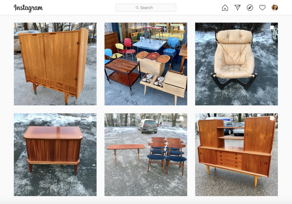
Figure. 11. @Antikkvarehuset.oslo on Instagram 16 October 2021. [screenshot by the author]
Figure 12-13: Ingrid REIGSTAD. 2021. Modul presentation process. Private collection: Ingrid Reigstad.
Figure 14-16: Ingrid REIGSTAD. 2021. Modul presentation process. Private collection: Ingrid Reigstad.
Figure 17: Ingrid REIGSTAD. 2021. Modul presentation process. Private collection: Ingrid Reigstad.
Figure 18-23: Ingrid REIGSTAD. 2021. Modul posters. Private collection: Ingrid Reigstad.
Figure 24-26: Ingrid REIGSTAD. 2021. Modul website process. Private collection: Ingrid Reigstad.
Figure 27: Ingrid REIGSTAD. 2021. Modul website animation. Private collection: Ingrid Reigstad.
Figure 28: Ingrid REIGSTAD. 2021. Modul website animation. Private collection: Ingrid Reigstad.
Figure 29: Ingrid REIGSTAD. 2021. Modul website screen recording. Private collection: Ingrid Reigstad.
Figure 30: Ingrid REIGSTAD. 2021. Brief 1 presentation video. Private collection: Ingrid Reigstad.