Lecture notes
Lecture reflection
Lecture 1 – case studies
The importance of voice interactions
Working with people from around the world is an obvious benefit from globalisation in my opinion, but as more and more text driven ways of communicating becomes available, I think it’s important to think about what House and Talbot said: when something gets difficult, call or set up a meeting, don’t just communicate via email (Manchipp et al. 2020).
Will we loose our individualism?
Regular Practice mentioned that globalisation may lead to visual culture becoming more uniform (Manchipp et al. 2020). As we are exposed to more and more of the same visuals, is there a chance of us loosing our individualism? Today, Netflix has a huge impact on the TV and film industry. Same with Spotiy in music. What impact might this result of globalisation have on the creative scenes?
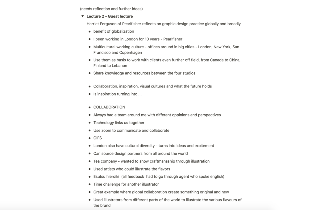
Lecture 2 – Harriet Beesley
Creating a better world
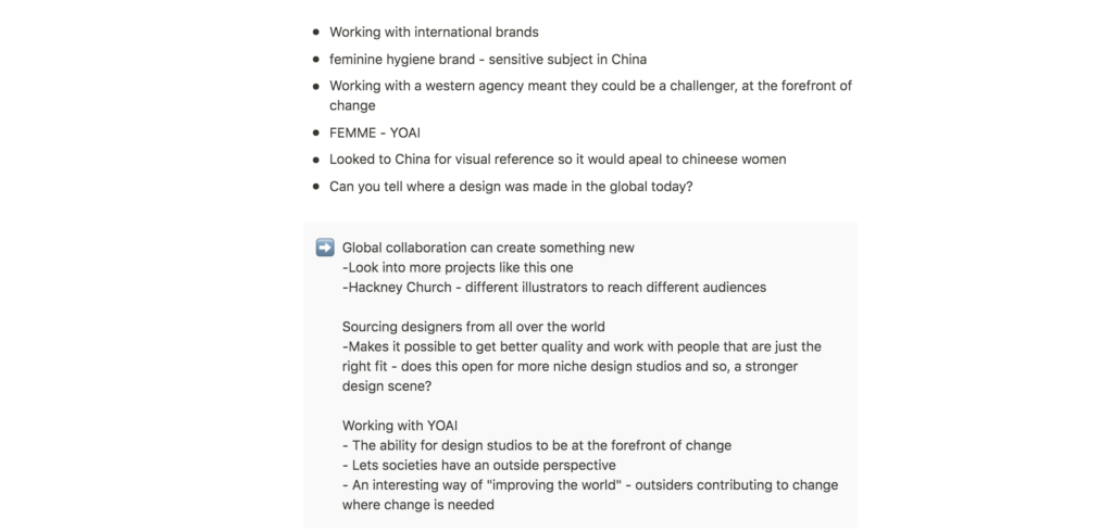
When looking at globalisation, I think it’s important to be aware of both the positive and negative effects, in order to control the negative ones. In her lecture, Harriet talks about the possibilities of global collaboration (Beesley 2020). If we can use this, not only to enhance diversity and originality in graphic design, but to help evolve societies around the world for the better (like FEMME did (Beesley 2020)), I think globalisation can be looked at as something amazing.
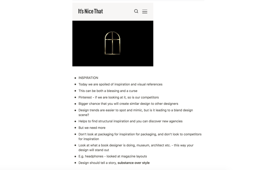
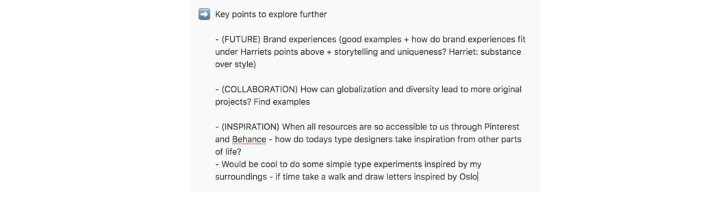
How can we source unique inspiration in a globalised society?
When it comes to inspiration and the increased availability of resources, I think it’s important, as Harriet mentions, for designers to make an effort to find new and original sources (Beesley 2020). Perhaps we should ask ourselves: what do I have access to, which others don’t? What is unique to me? Nature, identity and cultural history is still unique to the individual, and might be good areas in which to start the search for original references.
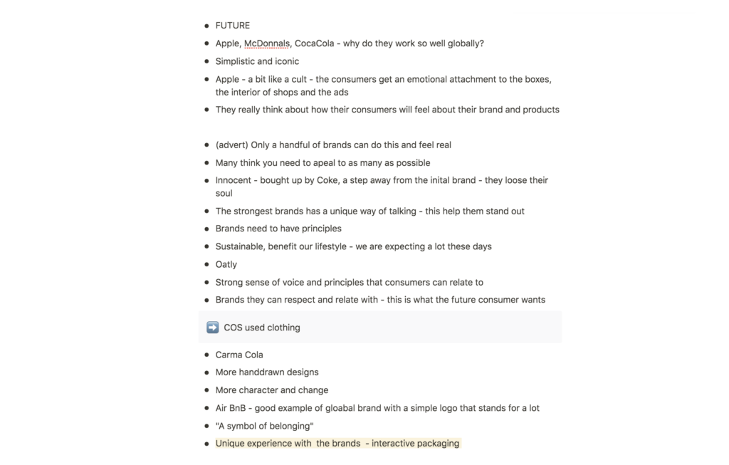
The new brand experience
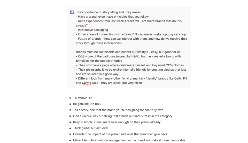
As for the future, I found the aspect of storytelling and uniqueness in a brand interesting (Beesley 2020). How can designers create areas where consumers are able to connect with a brand? Today these areas are available through social media, online shops and in physical shops, but how can we go further in creating a unique experience?
Refill interactions
Last week, I briefly touched upon the possibility of refill experiences becoming more important in branding. This holds a range of possibilities for interactions with brands. Do you create a programme where the consumer leaves the bottle outside the door, which get’s filled up during the day, facilitating for a seamless experience? Or do you create a physical refill centre where the consumer can choose between a variety of colours, smells and properties for the next batch of product?
Resource notes
Resource reflections
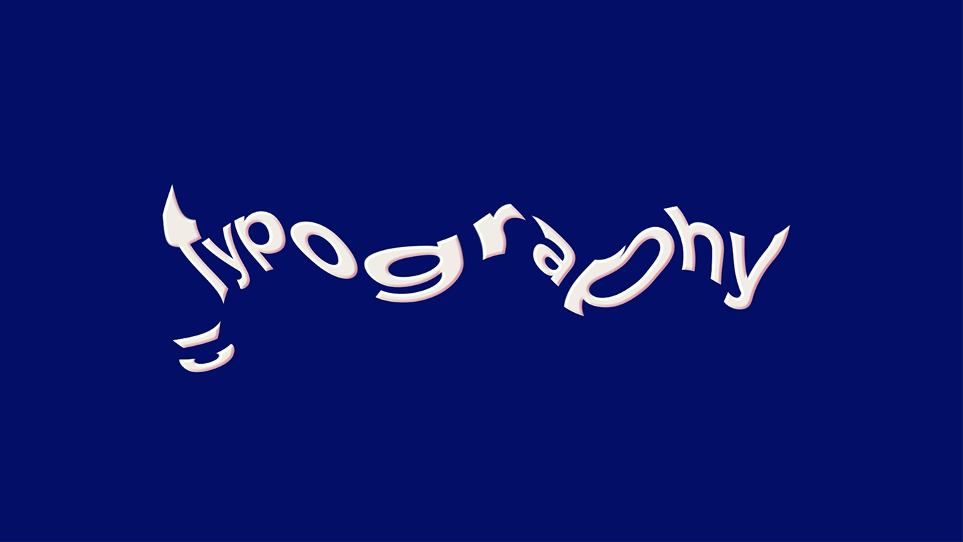
Where do we draw the line between graphic design, illustration and typography?
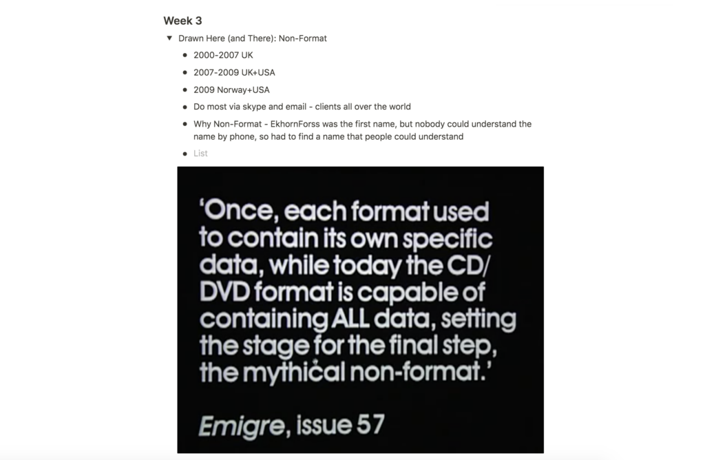
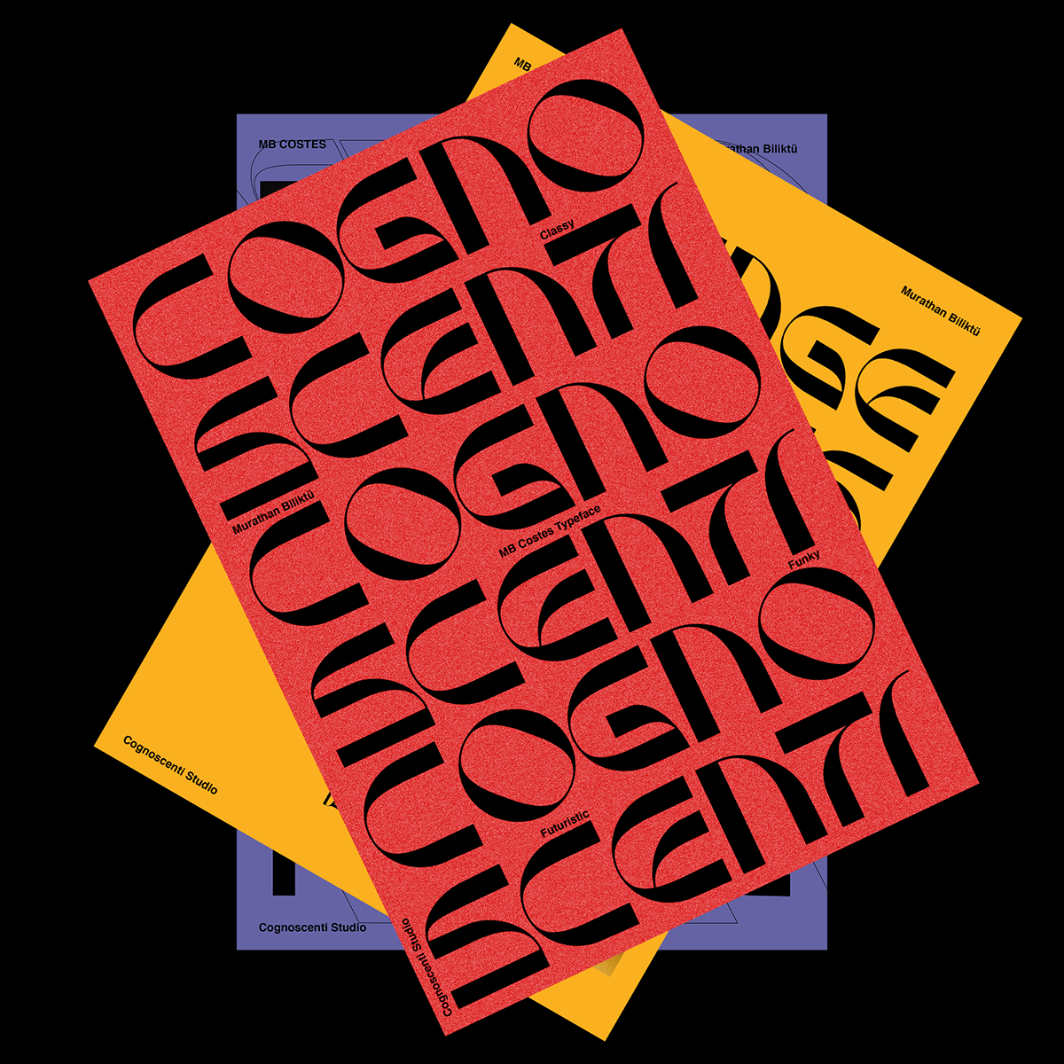
Part of this week’s workshop challenge is to look at the blurred boundaries of areas in graphic design, and I therefor found it interesting to see how Non-Format blurred the lines of graphic design, illustration, photography and type design. This week, I had an interesting discussion with Weronika on the ideas wall, and she mentioned that typography is just like illustrating, but with a different process. This is particularly evident in Facetype Font, a typeface created by Arjun Makawana, where the letters consists of illustrated faces.

Do quirky trends lower the demand for proper education?
With todays availability of technology and access to knowledge, it’s easier than ever to create custom type as a designer. There also seems to be a trend going on, where type can be quirky and odd, perhaps making it easier for designers to create custom type, without having to be fully educated on the history and rules of typography. This also seems to be the case in photography and film, where the storytelling and object seems to be more important than a photograph being produced technically perfect.
Practice as project
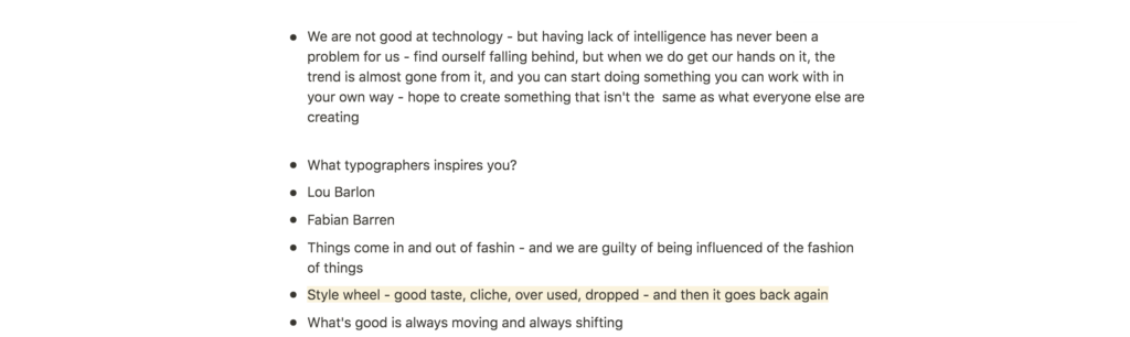
To me Non-Format’s practice almost seemed like a decade long project, where client briefs acts as tests and experiments. Constantly evolving, their work seem to be a constant forward moving set of projects. This seems to be in line with what they mentioned about the style wheel (Ekhorn and Forss 2010). Trends are constantly shifting and so is their work (Ekhorn and Forss 2010).
Further research
How can global and diverse collaboration lead to something new?
Showcasing African artists to international clients
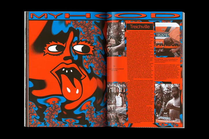
Nice Magazine is a project which fights stereotypes thanks to globalisation. African culture has often been wrongly portrayed, generalising the whole of Africa as one (Boddington, 2018). The magazine is created by graphic design studio Hammer and photographer Flurina Rothenberger. The content is created by young African artist, resulting in a magazine reflective of real African culture today (Boddington, 2018). The magazine also acts as a portfolio for African artists, showcasing them to international clients (Boddington, 2018).
Practice mindful sourcing
Although it might not be about globalisation, as much as the importance of diversity, It’s Nice That article Behind the screen: evolution, innovation, and inclusion with MTV’s digital design team, shows the benefits of a having a diverse team. Head of the Team, Rick Tu, mentions how it’s important to have a diverse team if you want to speak to a diverse audience (It’s Nice That, 2020). As we get more globalised, brands might want to speak to a diverse group of people, from different cultures and countries around the world. If a brand want to reach these groups of people, it’s important for creative teams to embrace diversity, either by working with practitioners from around the world, or by sourcing employees with a varied set of cultures and backgrounds.
How do the type designers of today draw inspiration from the world around them?
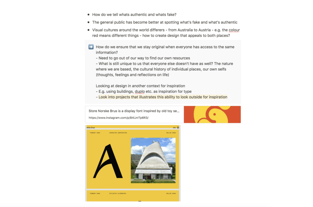
In her lecture, Harriet explained how the access to Pinterest, and other global sources of references, might lead to a bland design scene (Beesley 2020). Further she mentioned that graphic designers should aim to find inspiration in other areas than graphic design (Beesley 2020). This made me want to look into design inspired by objects and specific surroundings. I have chosen to focus on typography, as I imagine type might show clear resemblance to the objects it’s referring to.
Endless posibilites
In his typeface Store Norske Brus, Arve Båtevik takes inspiration from DUPLO, a toy set similar to LEGO. The typeface is playful and bulky, much like the toy set. The letter’s consists of shapes, attached by round dents and wholes, resembling the way DUPLO works. I find this work very inspiring, as it proves one can experiment with creating typefaces from anything. This was also evident in Non-Format’s presentation, where the duo had created a typeface from Norwegian cheese slicers (Ekhorn and Forss 2010).
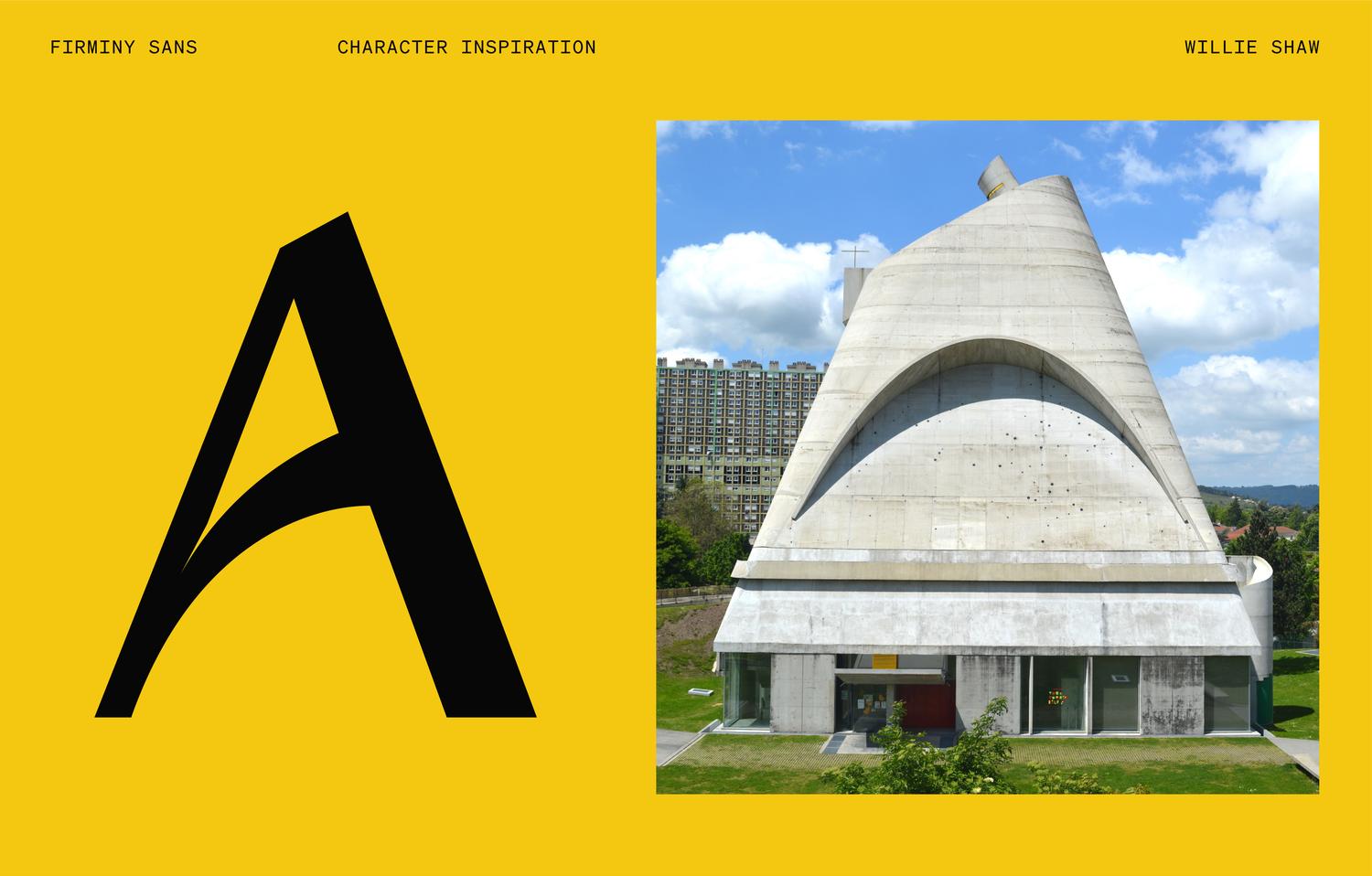
From building to letter
Firminy Sans is a typeface created by Willie Shaw, inspired by the church of Saint-Pierre in Firminy. The capital A shows clear resemblance to the church front, proving how one can easily use the shapes of architecture as reference in type design. The simplistic, yet effective use of a curved crossbar and a skewed apex, creates an experimental look, which expresses fun and uniqueness.
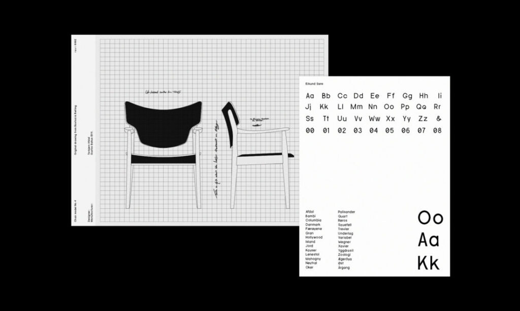
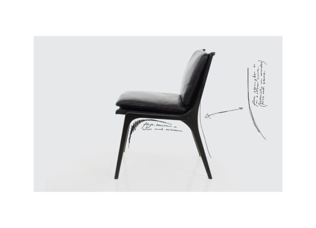
An extension of the product
Eikund, a typaface created by Bleed for a furniture branding project, is another example of how one can use the curves of a physical piece of design in type. With it’s simple lines and soft curves, Eikund becomes an organic typeface, rooted in the same Scandinavian roots as the furniture, thereby becoming one with the product it represents.
Type experiments: how can I use Oslo as a reference in my own work?
Seeing how the type design above inspired me to do a few type experiments of my own, where I would refer to my own surroundings. I went to Oslo’s main library, Deichman Bjørvika and photographed various design and architecture I found interesting, from which I later tried to create letters from. I don’t have a lot of experience with designing type, so it was fun to have a go at that. Photographing shapes around me and then later using the shapes as inspiration was also a new and exciting way of working that I might revisit at a later time.
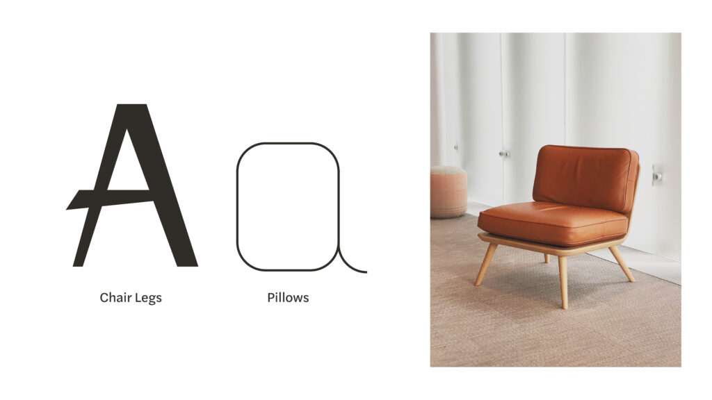
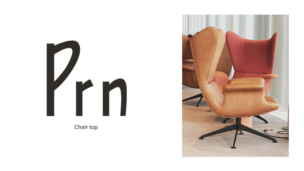
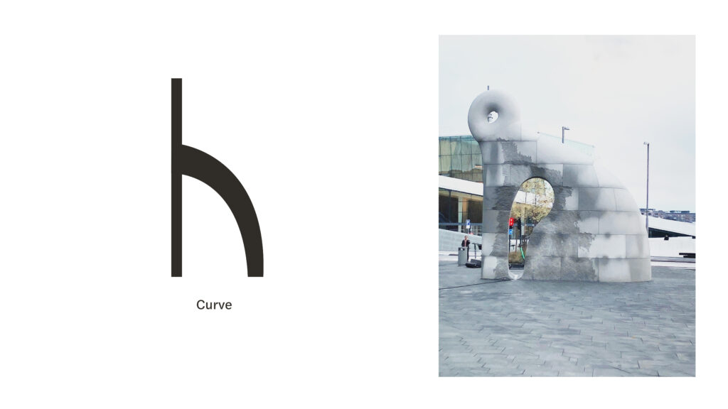
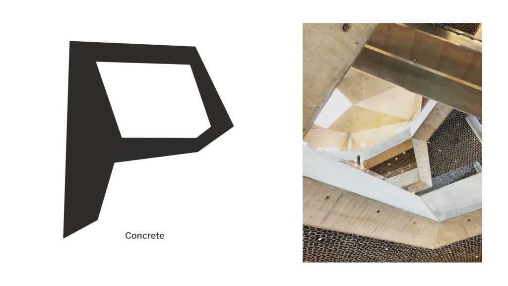
Fig. 8: Reigstad 2020. Type experiment 2.
Fig. 9: Reigstad 2020. Type experiment 3.
Fig. 10: Reigstad 2020. Type experiment 4.
Fig. 11: Reigstad 2020. Type experiment 5.
Workshop challenge
A closer look at some of the winners
Art or design?
As I looked through various types of work from the D&AD winners, the first thing that struck me was how varied the different projects were. Printed by Parkinson’s, a collection of 3D printed artworks, was one of the projects who was awarded a yellow pencil in the category Graphic Design.
People with Parkinson’s were asked to name an object that becomes difficult to use, due to the illness, which were then 3D printed by printers which portrayed each persons kinetic or neurological data (D&AD, 2020c).

Seeing this project makes me wonder why it is described as graphic design instead of art. The imagery seems like pieces of art to me, but I suppose, as the images were used in an awareness campaign, that the project can be described as graphic design due to it’s context.

This sense of calling something graphic design makes it graphic design, reminds me of Marcel Duchamp’s Fountain from 1917, which became art the moment Duchamp chose to place it in a gallery. Although Printed by Parkinson’s is not as drastic, this makes me wonder if a designer could, in theory, refer to everything as graphic design, when put in a graphic design context.
The ability to reimagine
Design transformation is an interesting category to me. It seems to reflect innovation and a strong need of new ways of thinking. Apple are experts as this – haven changed the way we interact with people, take photographs, listen to music, and now how we use our credit cards. They have previously offered the possibility to add credit cards to the Wallet app, but now they also offer Apple Cards, a virtual type of credit card which users can access instantly (D&AD, 2020d).
The ability to reimagine the way we do things is a difficult skill to obtain, but valuable to have. As technologies move in a fast pace, I suppose designers would be smart to reflect upon how they might obtain this type of skill.
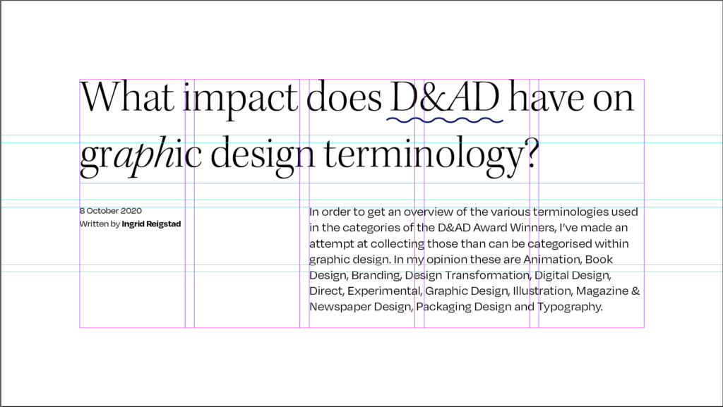
Synopsis – What impact does the D&AD categories have on my views on graphic design terminology?
In order to get an overview of the various terminologies used in the categories of the D&AD Award Winners, I’ve made an attempt at collecting those than can be categorised within graphic design. In my opinion these are Animation, Book Design, Branding, Design Transformation, Digital Design, Direct, Experimental, Graphic Design, Illustration, Magazine & Newspaper Design, Packaging Design and Typography.
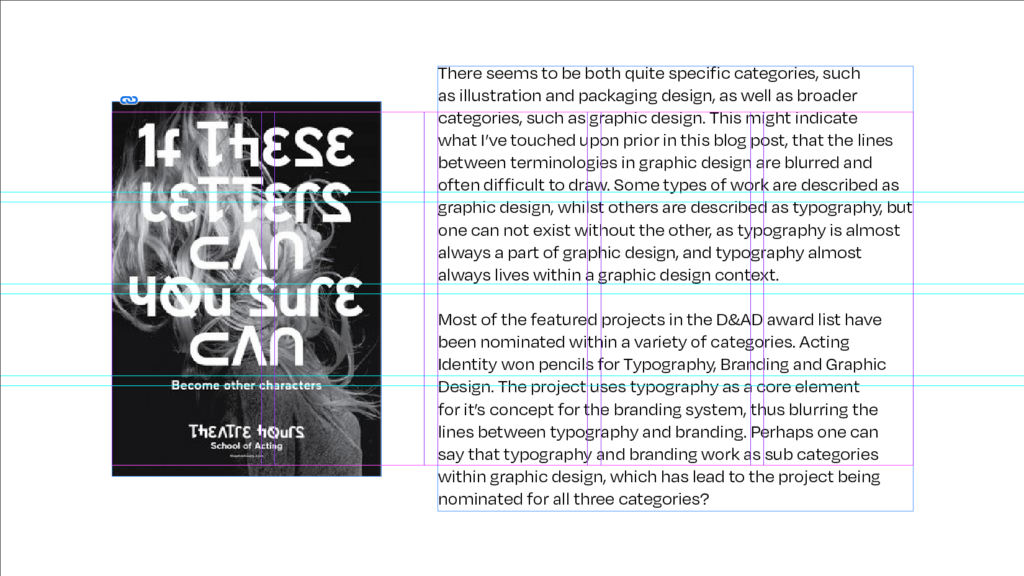
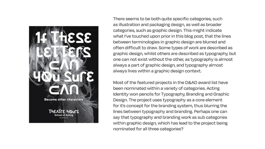
There seems to be both quite specific categories, such as illustration and packaging design, as well as broader categories, such as graphic design. This might indicate what I’ve touched upon prior in this blog post, that the lines between terminologies in graphic design are blurred and often difficult to draw. Some types of work are described as graphic design, whilst others are described as typography, but one can not exist without the other, as typography is almost always a part of graphic design, and typography almost always lives within a graphic design context.
Most of the featured projects in the D&AD award list have been nominated within a variety of categories. Acting Identity won pencils for Typography, Branding and Graphic Design. The project uses typography as a core element for it’s concept for the branding system, thus blurring the lines between typography and branding. Perhaps one can say that typography and branding work as sub categories within graphic design, which has lead to the project being nominated for all three categories?

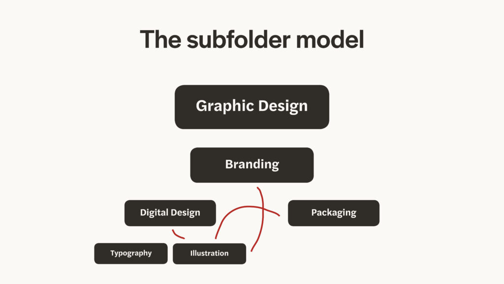
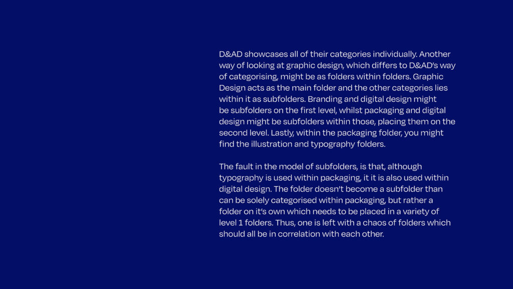
D&AD showcases all of their categories individually. Another way of looking at graphic design, which differs to D&AD’s way of categorising, might be as folders within folders. Graphic Design acts as the main folder and the other categories lies within it as subfolders. Branding and digital design might be subfolders on the first level, whilst packaging and digital design might be subfolders within those, placing them on the second level. Lastly, within the packaging folder, you might find the illustration and typography folders.
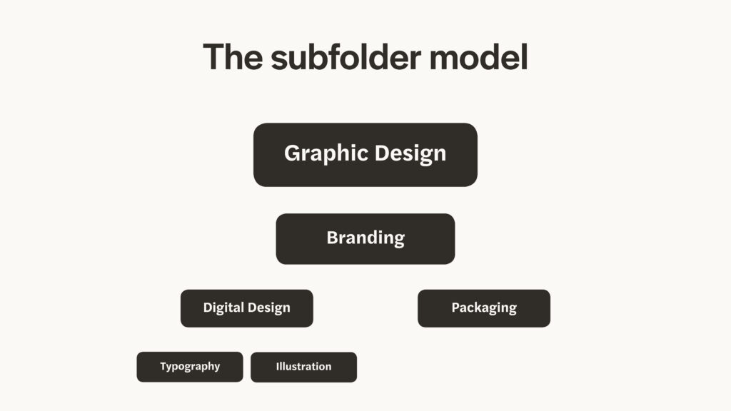
The fault in the model of subfolders, is that, although typography is used within packaging, it it is also used within digital design. The folder doesn’t become a subfolder than can be solely categorised within packaging, but rather a folder on it’s own which needs to be placed in a variety of level 1 folders. Thus, one is left with a chaos of folders which should all be in correlation with each other.
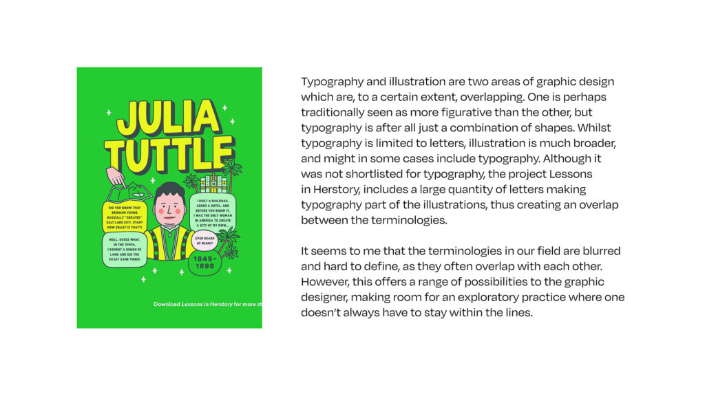
Typography and illustration are two areas of graphic design which are, to a certain extent, overlapping. One is perhaps traditionally seen as more figurative than the other, but typography is after all just a combination of shapes. Whilst typography is limited to letters, illustration is much broader, and might in some cases include typography. Although it was not shortlisted for typography, the project Lessons in Herstory, includes a large quantity of letters making typography part of the illustrations, thus creating an overlap between the terminologies.

It seems to me that the terminologies in our field are blurred and hard to define, as they often overlap with each other. However, this offers a range of possibilities to the graphic designer, making room for an exploratory practice where one doesn’t always have to stay within the lines.
10 areas of graphic design practice today
I started this list by having a brain storm of areas I could think of. I considered the importance of including traditional design, like type design and editorial design, but I also wanted to make sure that digital design was included. Lastly, I wanted to include more experimental design that lives in the gallery. I have called this Art design. The first draft of my list includes 14 points, so next I had to look at overlaps.
First draft
- Type design
- Layout design / editorial design
- Ad and Marketing design
- UX-design
- UI-design
- Games design
- Branding
- Packaging
- Digital design
- Illustration
- Book design
- Art design
- Motion graphics
- Environmental graphic design
I think Ad and Marketing Design can be described as an individual term. Yet, this category could also be placed in the Branding category, and so I chose to remove Ad and Marketing Design.
Although UX- and UI-design can be seen as two separate terms, one could describe both as Digital Design. Therefor, those were also removed from the list.
Lastly, I have chosen to remove Games Design, not because I don’t believe it is related to Graphic Design, but because the areas of Games Design which can be described as Graphic Design shows strong resemblance to UI- and UX-design. Of course, many other aspects goes into games design, like illustration and motion graphics. Therefor, I believe that most aspects that goes into Games Design are featured in the final list, in one way or the other.
Crossed out list
- Type design
- Layout design / editorial design
Ad and Marketing designUX-designUI-designGames design- Branding
- Packaging
- Digital design
- Illustration
- Book design
- Art design
- Motion graphics
- Environmental graphic design
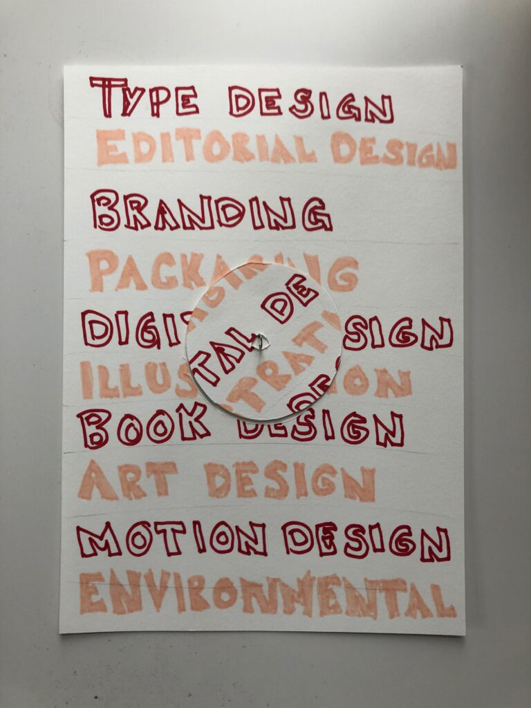
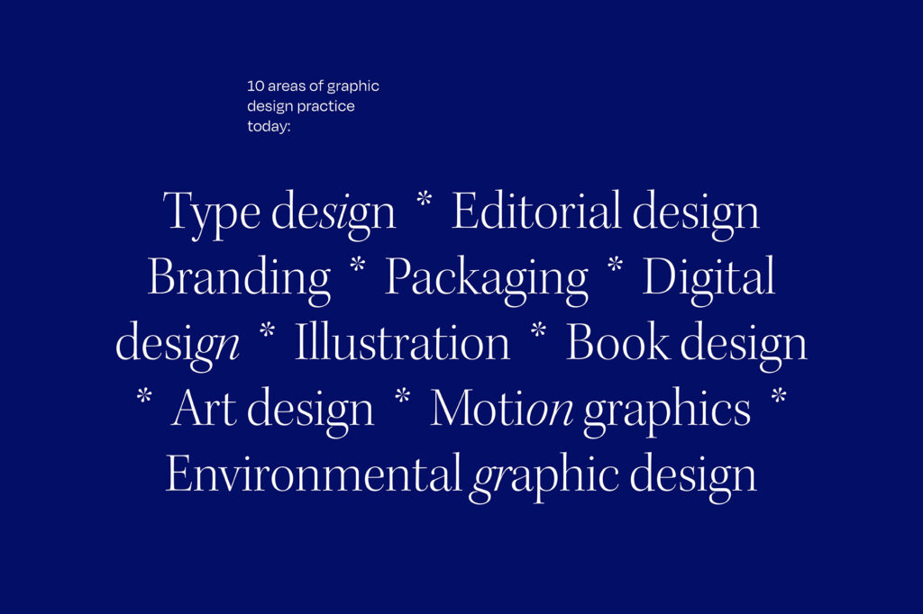
I assume this list will look different depending on the designer creating it, and I’m sure there are several other terminologies that could have been included. Bellow you can find my final list of 10 types of graphic design practice today:
Final list
- Type design
- Layout design / editorial design
- Branding
- Packaging
- Digital design
- Illustration
- Book design
- Art design
- Motion graphics
- Environmental graphic design
New terminology: Experience Design
As I looked through various winners of the D&AD awards, I found a couple of interesting projects, which focused on a certain type of experience, where the physical and digital spheres are morphed, creating a new type of experience, using digital design.
Experiencing the physical through digital design
Burn That Ad, a campaign by Burger King, is an interactive feature in the Burger King app that let’s users burn McDonnalds adds (on screen), turning them into Burger King ads with Burger King discount coupons (D&AD, 2020b). The ad forces users to take take an active part in choosing the brand over it’s competitor, creating an experience at the same time, which morphs the physical and digital sphere.
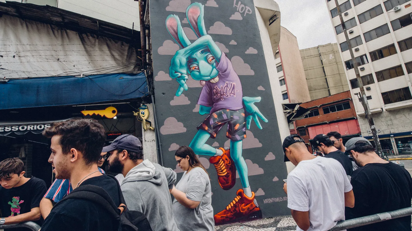
Digital shops in the streets of São Paulo
Air Max Graffiti Stores also blurs the lines between physical and digital. For the campaign, Nike got graffiti artists to create art works in the streets of São Paulo, which users had to physically visit and geotag, in order to get access to a limited pre-sale of the new Air Max’s (D&AD, 2020a). The art works became a mix of digital and physical Nike shops, forcing customers to take part of the streets, rather than simply portraying street style through images in traditional ads (D&AD, 2020a).
Future experiences
As touched upon in last week’s blog post under further research, physical refill stations might also become more important in the future. I imagine that these refill stations might also consist of an experience created by a mix of physical and digital interactions, much like what we’ve seen in Burger King’s and Nike’s ads.
Experience Design
What Burger King’s and Nike’s ads proves, is that today’s technology makes it possible to create digital experiences, which are not limited to the online sphere, but have the ability to interact with our physical world.
One could probably place this type of experience design within a number of already established design terminologies (UX-design, Product Design etc.). However, having designers specialising in this type of experience design, might become important as our society becomes more and more sustainable. As brands start using less packaging and physical materials, designers might have to find other ways of communicating a brand’s story and vision than the printed surfaces we use today.
If the morph of physical and digital experiences becomes the new branding key point, I suggest the term Morphed Experience Design for this practice. Based around the creation of physical experiences through digital design, this practice results in a new type of connection between the brand and the consumer.
Morphed Experience Design – Description
Morphed Experience Design is about creating physical experiences through the use of digital design. By using digital tools like apps, websites or social media, physical experiences are being created or enhanced significantly, leaving the user with a unique experience somewhere in-between the digital and physical sphere.
Design and Layout: Research and sketches
One thing that seems to keep coming up as I reflect upon terminologies in graphic design, is how blurred the lines are between the different terms. I therefor thought it would be interesting to use some kind of blur when developing my concept for the editorial spread.
Physical puzzle
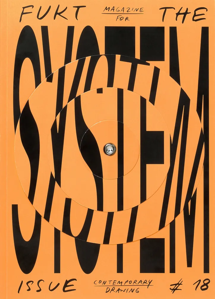
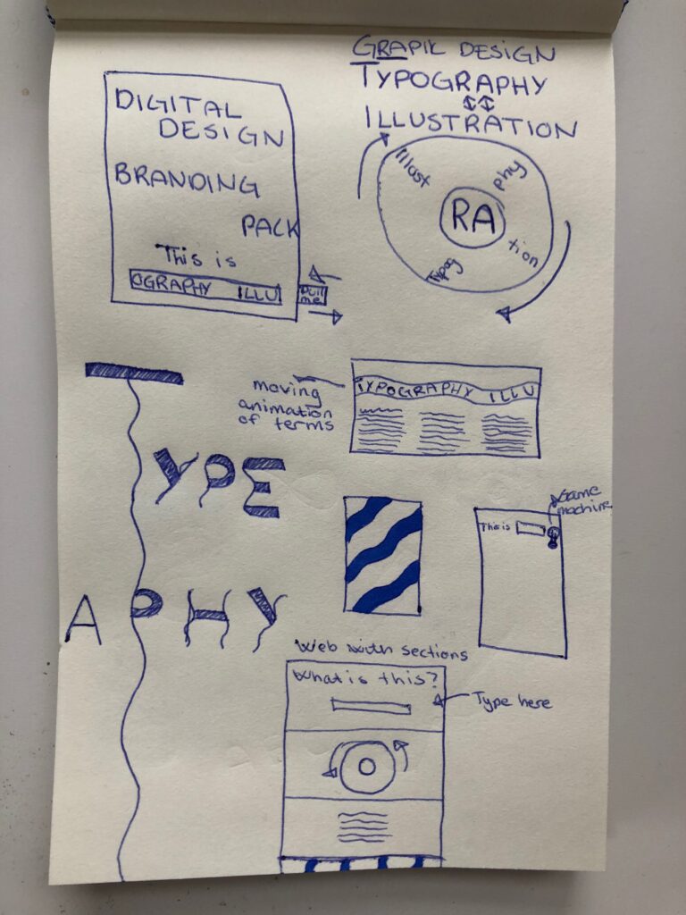
To illustrate the overlaps between different terms, I thought it could be cool to create a physical puzzle where the user has to engage with the object to create different types of pages. The image below sparked the idea of creating a type of spin wheel, to indicate that what one chooses to call a piece of graphic design is almost a coincidence, depending on who’s work it is, who’s discussing the work and in which context it was created in.
Unfortunately, I wasn’t able to create this using the time and equipment I had available. I therefor decided to create a digital version (which can be seen in the final result). This also inspired me to create a digital editorial with animated content, rather than a physical spread.
Further sketching
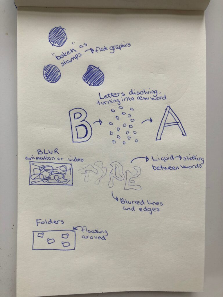
In order to create more animations for my digital editorial, I made a few sketches, from which I later took the best ideas from over to After Effects. I am new to motion graphics, and unfortunately I wasn’t able to create exactly what I wanted. If I had more time, I would have experimented further with liquid type. I wanted to create letters looking like water, which sort of moved into different words. Instead, I had to create a type of glitch to make it look like the words “illustration” and “typography” morphed together.
EyeJack Creator
When posting my terminology for this week’s workshop challenge on the ideas wall, Harvey advised me to have a look at EyeJack, who creates similar experiences to those of Nike and Burger King. EyeJack offers software where you can create your own real life animations (see video below). This would be interesting to utilise in order to blur lines or images for this assignment. Perhaps printed images and type could be out of focus and the phone camera could turn them sharp? Unfortunately, I didn’t have time to explore EyeJack further, but I would like to get back to this at a later time.
Blurred lines in type
Unfortunately this is another idea I didn’t have time to explore, but if I had more time, it would have been interesting to work with blur as a theme in letters. Perhaps by adding wavy lines to letters, or by twisting and altering letters to have a blurred look.
Grid and layout
I wanted my editorial to be easy to read with a simplistic grid system. However, I also wanted to include my animations, which are not as simplistic. I decided on a 5 column grid with wide margins. The animations and colour blocks should fill the whole page, whilst other text and images are restricted to the margins. As the layout is quite simple, I wanted to divide the content into sections, varying between white and blue backgrounds, in order to let the work breath a bit more.
In my synopsis I discuss both traditional and contemporary terminologies. I therefor wanted the typography to feel like a mix of old and new. I went with a classic serif for my headings and a modern sans serif for my text. I didn’t want my final list of design areas to feel set in stone as I talk a lot about the lines being blurred. To avoid this, I set some of the heading letters in italics to give a sense of unusualness and “still motion” if you will.
Final result
Looking at my final result, I would have liked to include more animations (for example on the underline of D&AD in the title). This might have made the editorial feel more cohesive. I would also have liked to build the editorial as a webpage mockup, in Sketch or Figma. I might look more into these softwares in the future as I haven’t used them before. Currently the result consists of separate images and videos (which is also why there are gaps between the elements – these are not meant to be there). Lastly, it would have been great to create a spread that worked for all platforms, especially mobile. These two problems probably would have been solved by using a website software.
In conclusion
This week has been very inspirational and I have enjoyed experimenting with type design and motion graphics. Discovering that I am amble to create design inspired by my surroundings, rather than from resources such as Pinterest and It’s Nice That, was an eye opening experience, which I hope to evolve further as the weeks pass.
I have not paid much attention to terminologies in graphic design in the past, and so it was great to reflect upon this topic. Creating a new terminology was especially interesting as it made me realise that there are many exciting techniques to try as a designer, beyond traditional design. However, I am definitely a designer who enjoys a varied practice, so I am not sure that I am ready to define my own work.
Lastly, it was good to get to know Non-Format, who I had a quick look at last week. Seeing how they work definitely inspired me to experiment more, which is initially what I love about working with design. I hope to take with me this sense of play and exploration into my own work as we move forward.
RESOURCES
Beesley, H. (2020) ‘The effect of globalization on graphic design (part 2)’. Canvas Falmouth Flexible [online], 2 October.
Boddington, R. (2018) ‘It’s Nice That’, Nice Magazine nurtures and honestly represents young talent from the African continent, 20 March. Available at: https://www.itsnicethat.com/articles/nice-magazine-publication-200318 (Accessed: 5 October 2020).
D&AD (2020a) Air Max Graffiti Stores, D&AD. Available at: https://www.dandad.org/awards/professional/2020/232550/air-max-graffiti-stores/ (Accessed: 5 October 2020).
D&AD (2020d) Apple Card, D&AD. Available at: https://www.dandad.org/awards/professional/2020/231883/apple-card/ (Accessed: 5 October 2020).
D&AD (2020b) Burn That Ad, D&AD. Available at: https://www.dandad.org/awards/professional/2020/232521/burn-that-ad/ (Accessed: 5 October 2020).
D&AD (2020c) Printed by Parkinson’s, D&AD. Available at: https://www.dandad.org/awards/professional/2020/233118/printed-by-parkinsons/ (Accessed: 5 October 2020).
Ekhorn, K. and Forss, J. (2010) ‘Drawn Here (and There): Non-Format’, Drawn Here (and There): Non-Format. Walker Art Center. Available at: https://www.youtube.com/watch?v=96R2vgcFg_Y&ab_channel=WalkerArtCenter (Accessed: 3 September 2020).
It’s Nice That (2020) ‘It’s Nice That’, Behind the screen: evolution, innovation, and inclusion with MTV’s digital design team, 8 September. Available at: https://www.itsnicethat.com/features/mtv-digital-design-team-behind-the-screen-opinion-digital-sponsored-content-080920 (Accessed: 5 October 2020).
Manchipp, S. et al. (2020) ‘The effect of globalization on graphic design (part 1)’. Canvas Falmouth Flexible [online], 2 October.
LIST OF FIGURES:
Figure 1. Arjun MAKWANA. ca. 2000-2020. Facetype Font. Handmade font [online]. Available at: https://handmadefont.com/shop/facetype-font/?v=dd65ef9a5579.
Figure 2. Murathan BILIKTÜ. 2020. Costes. Aiga portfolios [online]. Available at: http://portfolios.aiga.org/gallery/99935267/Costes-Funky-and-Futuristic-Typeface
Figure 3. KLAYM. 2018. Nice Magazine issue 2. It’s Nice That [online]. Available at: https://www.itsnicethat.com/articles/marie-ducrocq-graphic-design-250619
Figure 4. Arve BÅTEVIK. 2019. Store Norske Brus. Instagram [online]. Available at: https://www.instagram.com/p/B4iJFqThdrQ/
Figure 5. Willie SHAW. ca. 2017-2020. Firminy Sans Character inspiration. Willie Shaw [online]. Available at: https://willieshaw.com/Typefaces
Figure 6. BLEED. 2017. Eikund. Bleed Design Studio [online]. Available at: https://bleed.com/work/eikund
Figure 7: Ingrid REIGSTAD. 2020. Type experiment 1. Private collection: Ingrid Reigstad
Figure 8: Ingrid REIGSTAD. 2020. Type experiment 2. Private collection: Ingrid Reigstad
Figure 9: Ingrid REIGSTAD. 2020. Type experiment 3. Private collection: Ingrid Reigstad
Figure 10: Ingrid REIGSTAD. 2020. Type experiment 4. Private collection: Ingrid Reigstad
Figure 11: Ingrid REIGSTAD. 2020. Type experiment 5. Private collection: Ingrid Reigstad
Figure 12. Berlin INNOCEAN. 2020. Printed by Parkinson’s. D&AD [online]. Available at: https://www.dandad.org/awards/professional/2020/233118/printed-by-parkinsons/
Figure 13. Marcel DUCHAMP. 1917, replica 1964. Fountain. Tate [online]. Available at: https://www.tate.org.uk/art/artworks/duchamp-fountain-t07573
Figure 14. APPLE. 2020. Apple Card. Apple [online]. Available at: https://www.apple.com/apple-card/
Figure 15. THEATRE HOURS. 2020. Acting Identity. D&AD [online]. Available at: https://www.dandad.org/awards/professional/2020/232952/acting-identity/
Figure 16. GOODBY SILVERSTEIN & PARTNERS. 2020. Lessons in Herstory. D&AD [online]. Available at: https://www.dandad.org/awards/professional/2020/232678/lessons-in-herstory/
Figure 17: BURGER KING. 2020. Burn that Ad. Available at : https://www.youtube.com/watch?v=740Rxv2I3xw&ab_channel=Wix.com [accessed 8 October 2020].
Figure 18. AKQA. 2020. Air Max Graffiti Stores. AKQA [online]. Available at: https://www.akqa.com/work/nike/air-max-graffiti-stores/
Figure 19. FUKT MAGAZINE. 2019. The System Issue . Fukt Magazine [online]. Available at: https://www.fuktmagazine.com/fukt-18
Figure 20. Pamela SEE. 2019. Virtual animation. Instagram [online]. Available at: https://www.instagram.com/p/B1jAIT6jq4_/
Figure 21. Marie DUCROCQ. ca. 2017-2019. Le Horla. It’s Nice That [online]. Available at: https://www.itsnicethat.com/articles/marie-ducrocq-graphic-design-250619