Lecture notes
Lecture reflections
I was intrigued by what Harriet said about the peach emoji and how only 7% of it’s use on Twitter are in conversations about fruit. To me, this shows how we as humans have an urge to put meaning into images, but also how imagery can communicate very different meanings dependant culture, context etc..
Correlation vs. Absolute truth
When using pictorial content to convey meaning, I believe we must remember that imagery, perhaps to a larger extent than the written word, have the ability to confuse and portray false information as well as the truth. Even if this is not the maker’s intension, statistics usually points to a correlation, rather than causation, which isn’t necessarily equal to the truth.
Of course, not all infographics use statistics as their foundation, but I do think it’s important to question infographics’ power to portray the absolute truth, as opposed to the written word. This is not to say that I do not believe in the power of infographics. After all, infographics has the ability to make big data available and it’s usage can be a great way to inform and educate.
Where can we draw the line between art and infographics, and do we need to?
Studio Greyworld’s sculpture based on live data was interesting to me as it did not seem to make big data understandable, but rather interesting and beautiful (Ferguson, 2021). I wonder if information design can be of importance, even if it’s sole function is to be visually pleasing. Can one use information to create art, rather than using art (design) to portray information, and still refer to the product as an infographic?
Resource notes
Resource reflections
David McCandless: The beauty of data visualisation
It was rewarding to listen to McCandless TED talk, as up until now, I hadn’t considered the data visualisation’s ability to inform new discoveries (McCandless, 2010). I had simply looked at it as a design method used to portray already established information.
Solving information problems
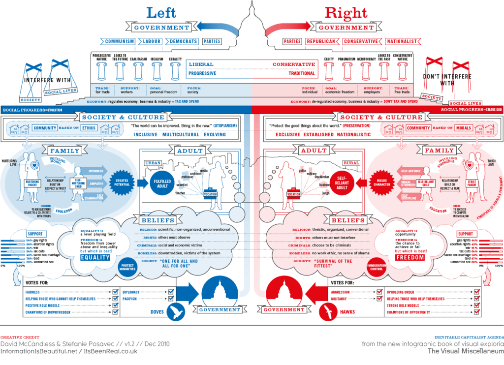
Drawing on my lecture reflections, I think McCandless’ notion on the importance of seeing the full picture is important (McCandless, 2010). I appreciate infographics’ ability to give context to facts, and I was particularly fascinated by McCandless’ example of visualising the ideas between left and right wing politics in America (McCandless, 2010).
If we can use infographics to gain better understanding of the people we do not agree with, we might be able to start living together peacefully. The polarisation we are seeing in America seems like an example of what McCandless refers to as a information problem – and if infographics can solve this problem, one can not do other than admire the design method and it’s abilities (McCandless, 2010).
Looking at the Left&Right infographic, I myself find it representing the joy of being different. In society we need people who are strong AND people who are moral. The infographic seem to humanise both sides, portraying personality and values rather than extreme characters such as Donald Trump, which we are usually confronted with in the media sphere.
Nicholas Felton: Transforming data into meaningful stories
Coming from a photography background myself, I found Felton’s talk very interesting. The technical aspect data in photography is intriguing, but I’m wondering if one could also look at photography data in a more abstract way.
When I photograph, I try to use my analogue camera, which means that I have to develop the photographs. Thus, I wonder if one could use this process and routine as a way of collecting data which speaks about my life in any way. This could be in regard to the development process, objects photographed, number of images that came out black due to technical error etc.
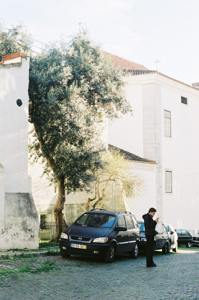
Fig. 3: Reigstad 2021. Iphone images screen shot
Fig. 4: Reigstad 2019. Lisbon
It could also be interesting to look at connections as well as differences between my analogue camera use and my iphone camera use. What importance does the analogue images document as apposed to the iphone ones?
Further research
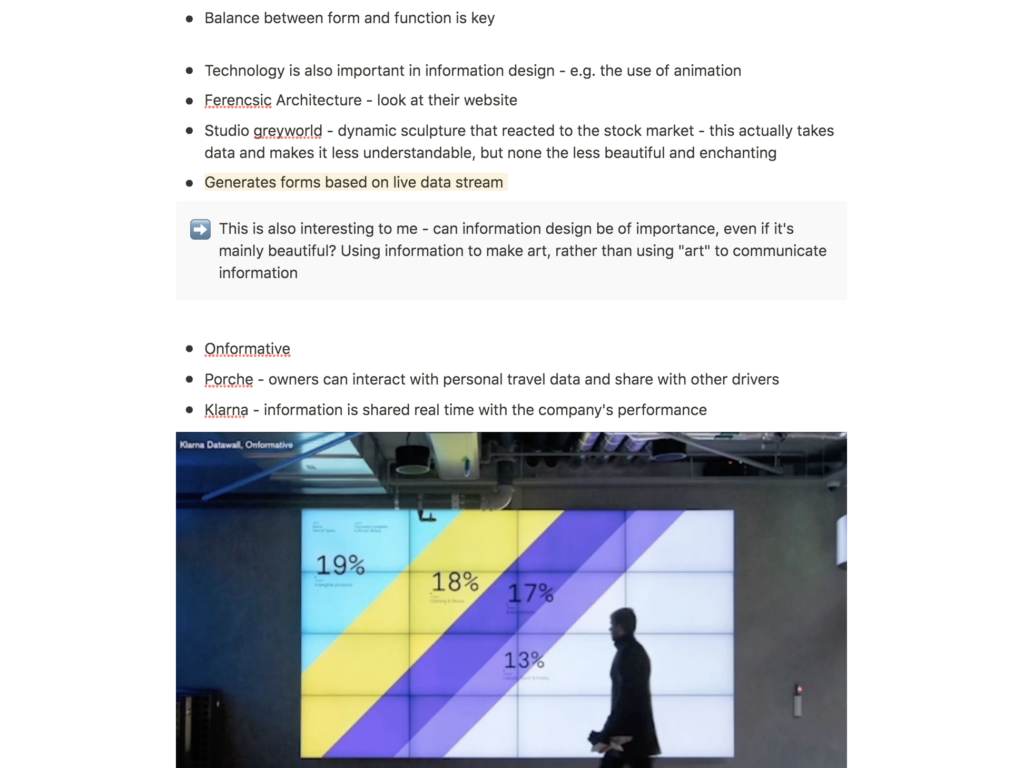
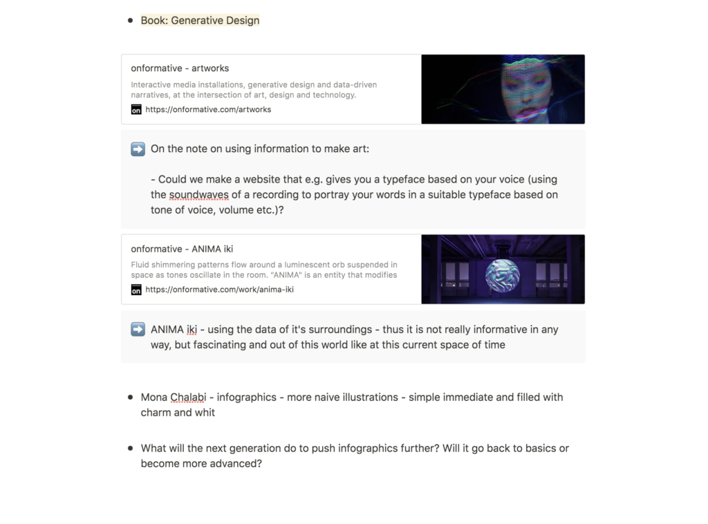
Onformative: ANIMA iki
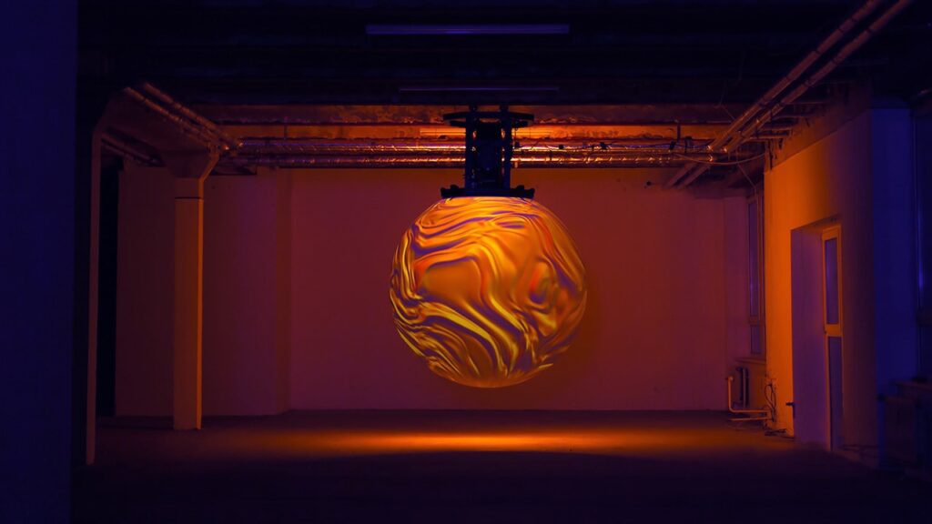
After hearing about Onformative in Harriet’s lecture, I discovered their installation, ANIMA iki, which uses the data of it’s surroundings to portray shimmering patterns inside a light orb (Onformative, 2014).
As mentioned in my lecture reflections, I am curious about the use of big data in pieces of art, and wether or not these art pieces can be seen as infographics. To me, this is a lovely way of portraying data, which does not really serve any apparent function, other than to fascinate. I must admit that I am slightly more drawn to this mysterious “infographic” than to those which sole purpose is to convey information, perhaps due to it’s out-of-this-world essence.
Using big data to inform design decisions
Onformative’s approach to data visualisation makes me wonder if there are ways of portraying data within a more graphic design related context. Perhaps one could create a product that records the user saying something, and that then writes out what is being said, using a custom typeface that matches the tone of voice, volume etc. of what has been recorded? Or maybe one could use the subtlety of the user’s touch on a mouse/trackpad to depict the background colour of a website?
Made in Fukushima
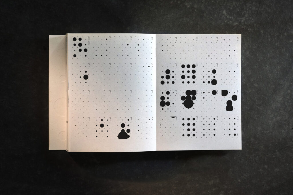
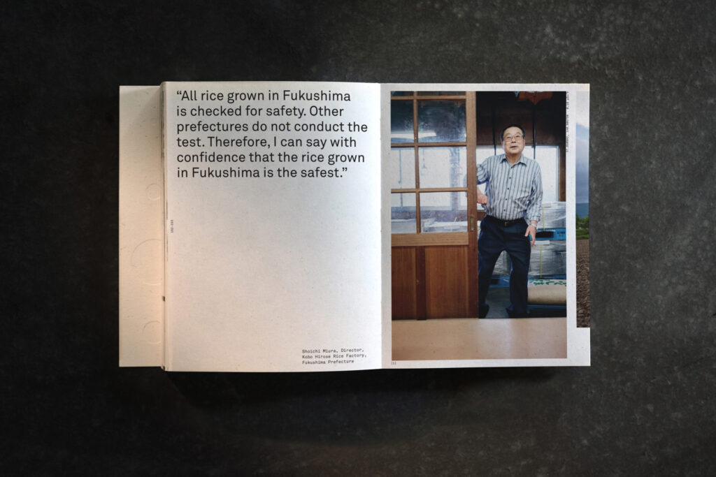
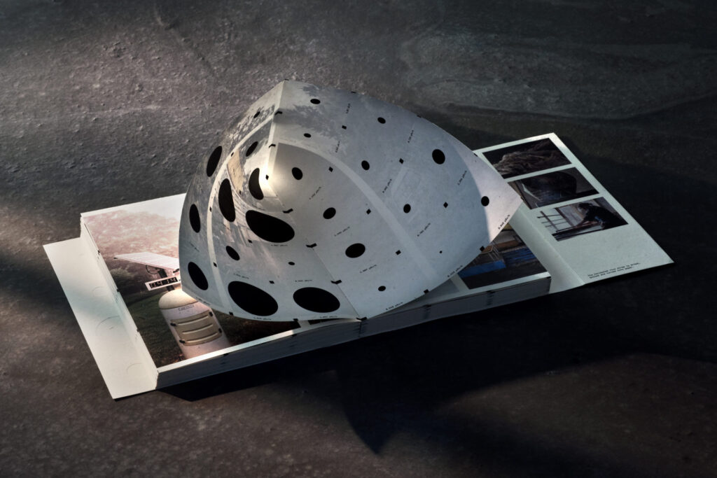
Made in Fukushima is a collaborative project by METER, Serviceplan Innovation, design studio Moby Digg and photographer Nick Frank, which documents a project of soil decontamination in Fukushima, Japan (It’s Nice That, 2019). The people of Fukushima has avoided to purchase rice from the local farmers, in fare of it being contaminated (It’s Nice That, 2019), and the book uses photography, text and infographics to communicate that the rice is safe to eat (It’s Nice That, 2019).
A lovely balance between emotional value and facts
The combination of photography, text and infographics seems to me like the ultimate photo journalism approach, as you get the best of both worlds. The photographs provides an emotional element through a human connection and the infographics serves hard proof that the soil is safe. As I come from a photography background, I think it could be very interesting to attempt a similar approach if I am to embark on a big data project.
A tactile approach to infographics
It seems as if a lot of infographics are animated or technically interactive in some way, judging from what I’ve seen previously, but this book features an interactive, yet physical infographic experience (the infographics are featured behind the images on hidden pages, which you physically have to open) that I find very interesting. I also think the black and white style of the geometric infographics suits the Japanese culture well, and the whole book seems to hold beautiful connotations to Japanese culture, like the rice paper of which the book is made.
Workshop challenge: synopsis
I started the workshop challenge by taking notes about each of the five pre-selected examples.
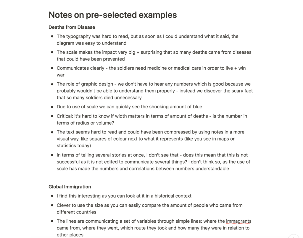
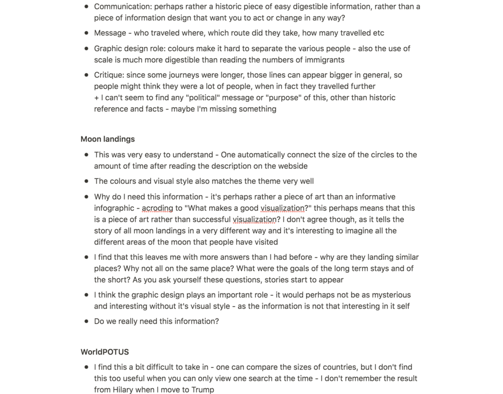
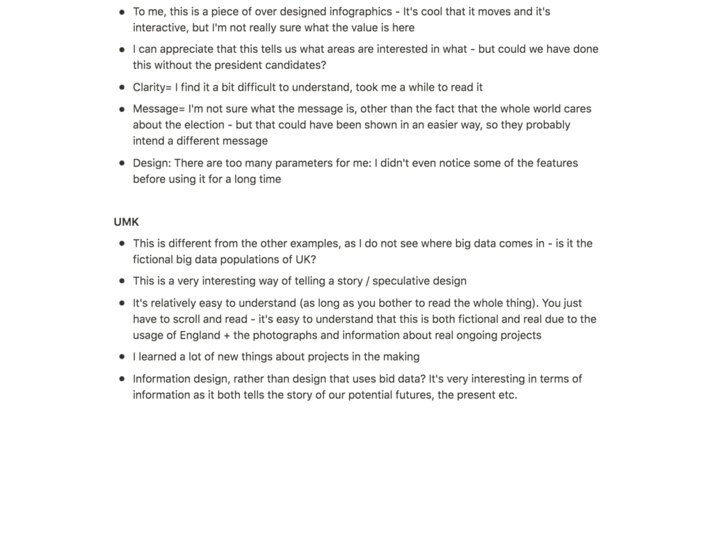
After taking notes on all five examples, I found myself drawn to Moon Landings by Accept and Proceed. To me this is an interesting piece of design that sits on the edge of art and information design, much like some of the pieces I’ve looked at in my research. I’m therefor interested in analysing wether or not this is a “good” piece of information design, or rather a piece of art which uses big data as it’s source.
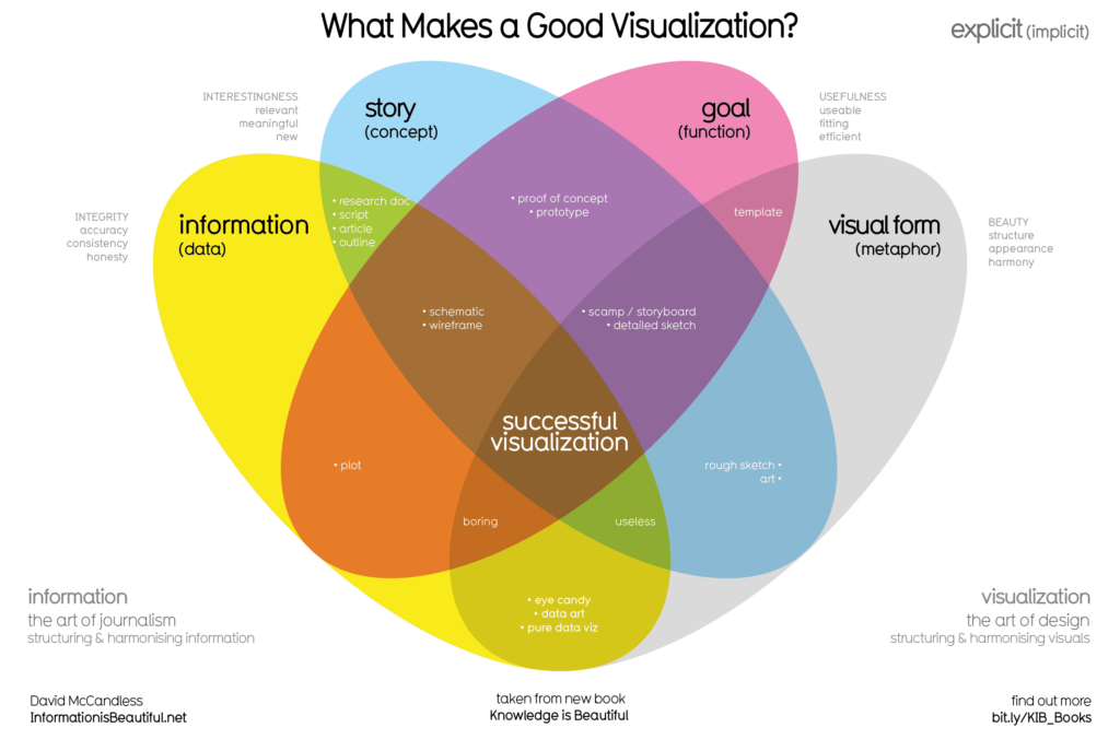
David McCandless: What Makes a Good Visualisation?
The infographic below, What Makes a Good Visualisation by David McCandless (presented in the workshop challenge video), seemed like a good foundation for my workshop challenge synopsis. Thus, I decided to use the categories information, story, goal and visual form to structure my analysis as I moved on to take further notes on my chosen design.
After taking the notes above in order to analyse the design, I moved on to write them into my 500 word synopsis.
Final synopsis
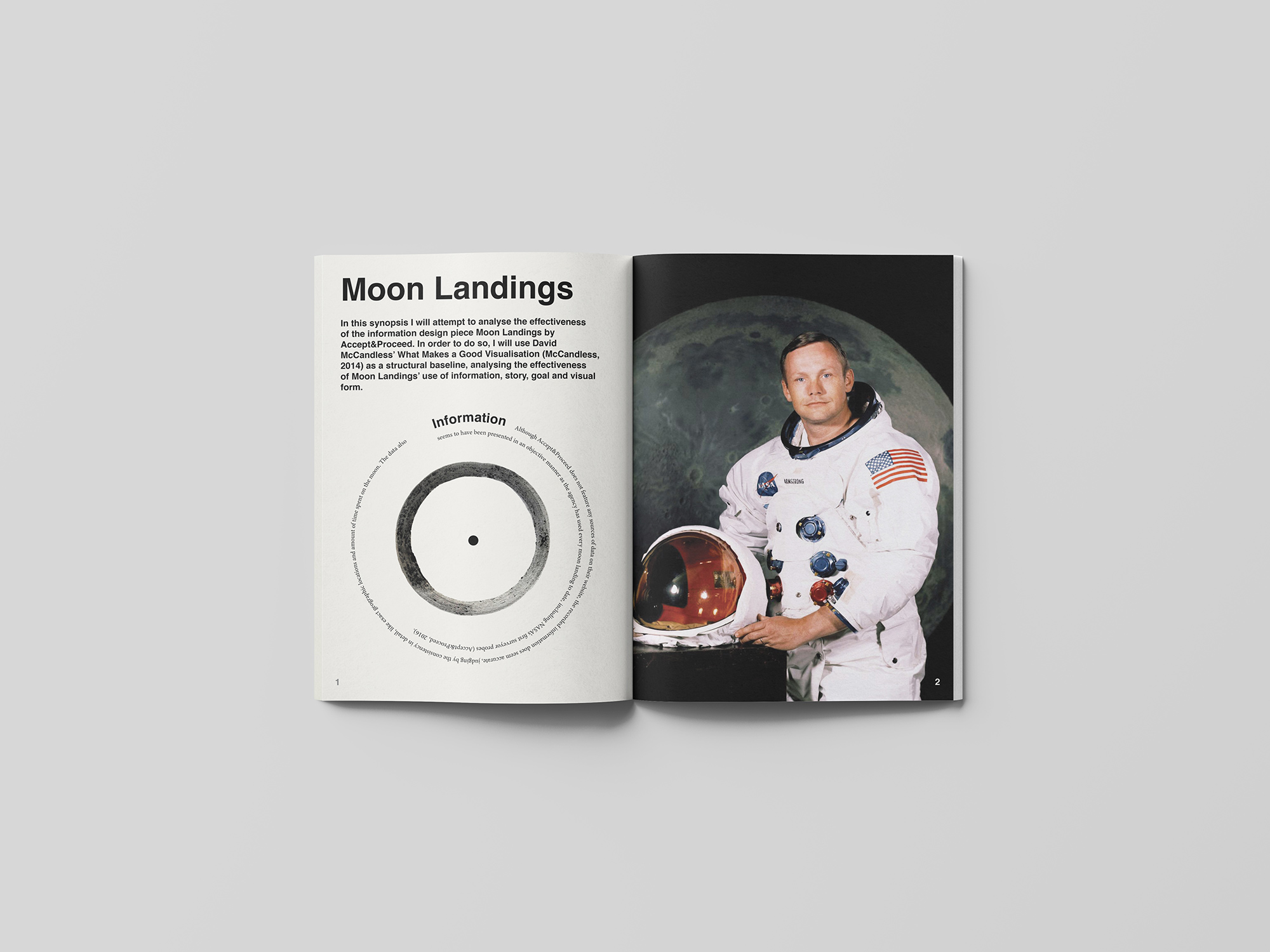
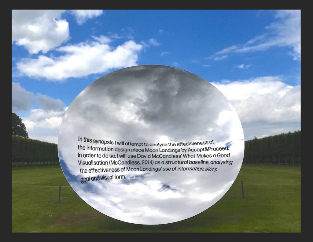
In this synopsis I will attempt to analyse the effectiveness of the information design piece Moon Landings by Accept&Proceed. In order to do so, I will use David McCandless’ What Makes a Good Visualisation (McCandless, 2014) as a structural baseline, analysing the effectiveness of Moon Landings’ use of information, story, goal and visual form.
Information
Although Accept&Proceed does not feature any sources of data on their website, the recorded information does seem accurate, judging by the consistency in detail, like exact geographic locations and amount of time spent on the moon. The data also seems to have been presented in an objective manner as the agency has used every moon landing to date, including NASA’s first surveyor probes (Accept&Proceed, 2016).
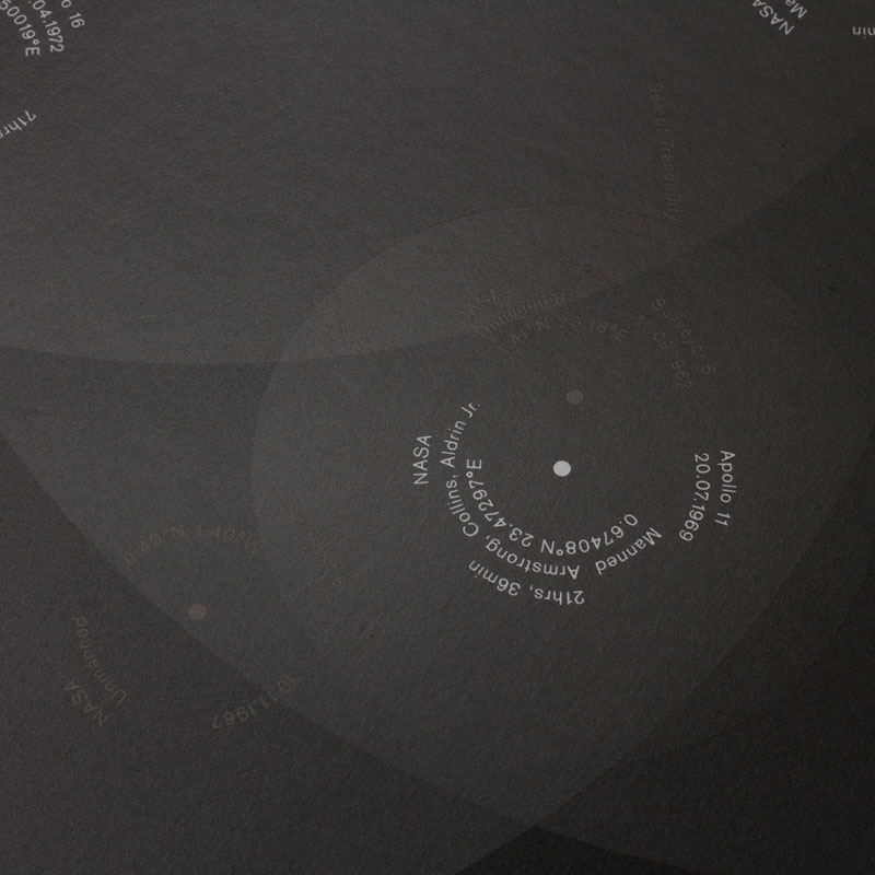
Fig. 10: Accept&Proceed 2016. Moon Landings. [printed infographic]
Story
Looking at the infographic, I personally find myself intrigued by the presented data, as I immediately start to ask questions about the individual landings. What where they doing, why did they land at that exact point and what was the experience like? Thus, I would argue that the data presented does not tell a relevant story in itself. Instead, it makes the viewer come up with his or her own new and meaningful story about the mysterious landings.
If we are to solely look at the presented data, I still think the infographic presents relevant pieces of information. Most people have most likely never thought about the landing positions of moon landings, nor the time spent there. For those interested in history, technology and space, I would argue that this design might become a spring board onto further investigation on space travel, thus making the story highly effective.
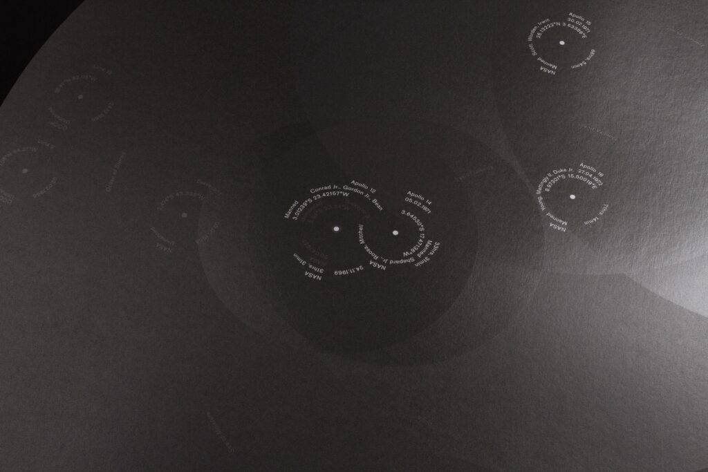
Fig. 11: Accept&Proceed 2016. Moon Landings. [printed infographic]
Goal
In order to measure the effectiveness of Moon Landings’ goal, one would have to state wether it’s goal is to be a piece of art or a piece of journalism. According to McCandless’ figure, a good visualisation sits on the line between the two (McCandless, 2014), and so I guess one could argue that Moon Landing does not serve an immediate societal service, like educating people on climate change or economy. However, art and culture does play an important function in society, and if we are to look at this piece of design’s goal as being beautiful, I would argue that it’s effectiveness in this area is exceptional.
Fig. 12: Accept&Proceed 2016. Moon Landings. [printed infographic]
Visual form
What Moon Landings suffer to serve in terms of societal function, it makes up for in visual form. The visual language is inspired by video footage of the first moon landing (Accept&Proceed, 2016), with it’s light-like, transparent circles placed on top of it’s dark background foundation. This mysterious visual language might be one of the reasons for the journeys of my own imagination, which is triggered by the presented space travel data.
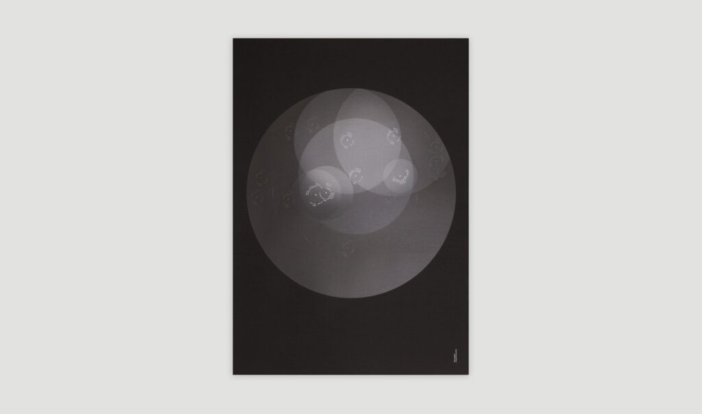
Fig. 13: Accept&Proceed 2016. Moon Landings. [printed infographic]
The consistent use of typography creates a lovely repetition to the transparent circles, and the functions of each element is easy to grasp having read the design agency’s description of the project. The combination of circle repetition, transparency overlap and subtle colour palette results in an elegant harmony, proving the fact that data can be used to make beautiful pieces of art, and perhaps also stunning infographics.
Workshop challenge: editorial
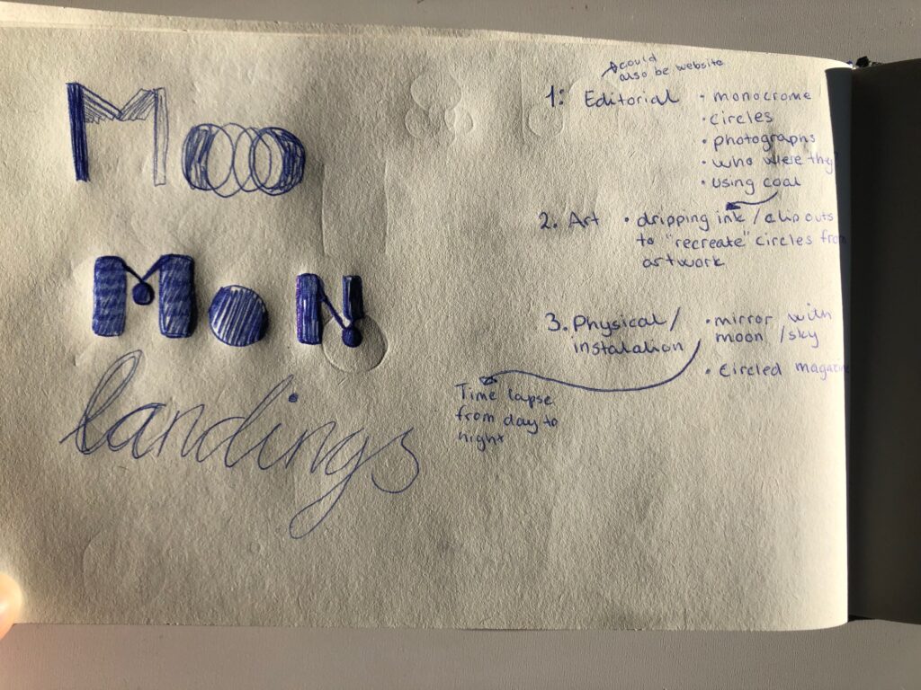
In my synopsis I talk a lot about the mystery of the landings and the visual beauty of the piece. Thus, I knew that I wanted to include these aspects through the concept of my editorial design. I also knew that I wanted to make a design that differed from the original art work (in order to create something original), but that still maintained the visual essence.
NASA brand guidelines
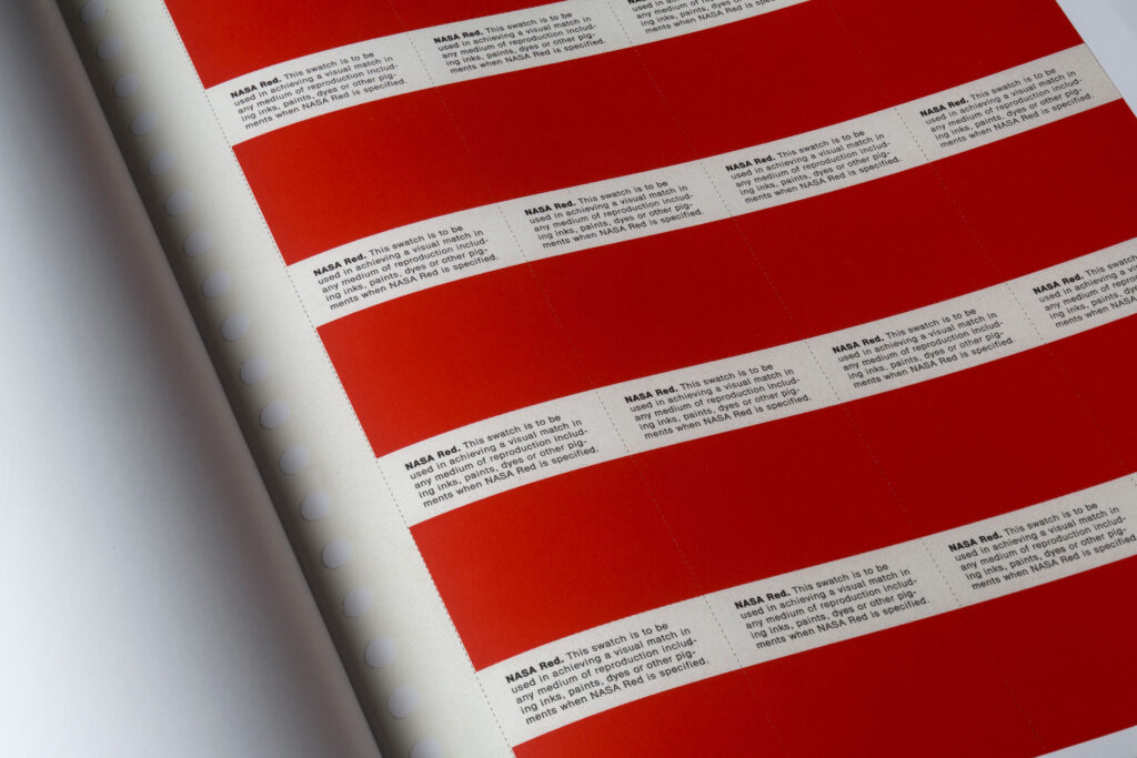
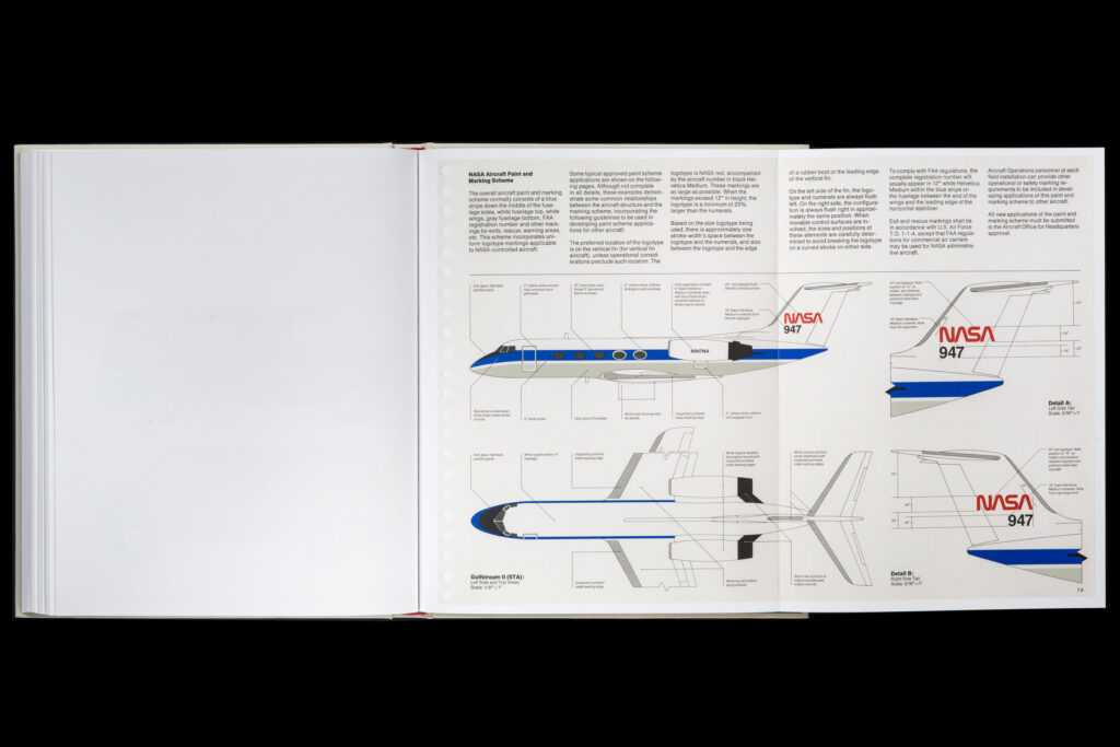
When working with space and mystery I think there are a lot of cliches one can fall into. Accept&Proceed has managed to avoid these, by opting for a clean and contemporary design. Reflecting upon their approach, I got the idea of creating a clean grid design, which led me to look at NASA’s brand guideline book from 1975.
To me, the brand book represents a certain place in time where space travel perhaps had reached it’s peak in terms of global interest. It’s also from the time when a lot of the moon landings took place, and so I decided to use these visuals as inspiration for my editorial
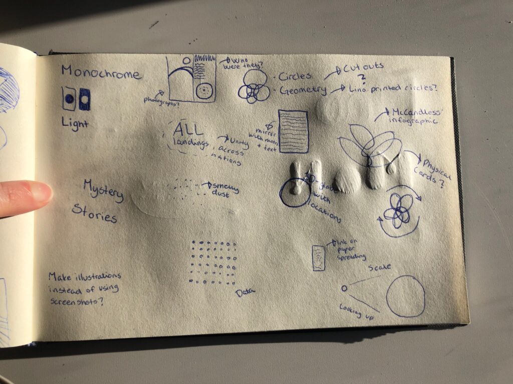
Sketches
At this point I decided to visit my sketchbook to reflect further on concepts and ideas. Inspired by the NASA guideline book I was interested in creating a physical editorial, however I was also interested in inspecting digital and even more tactile experiences.
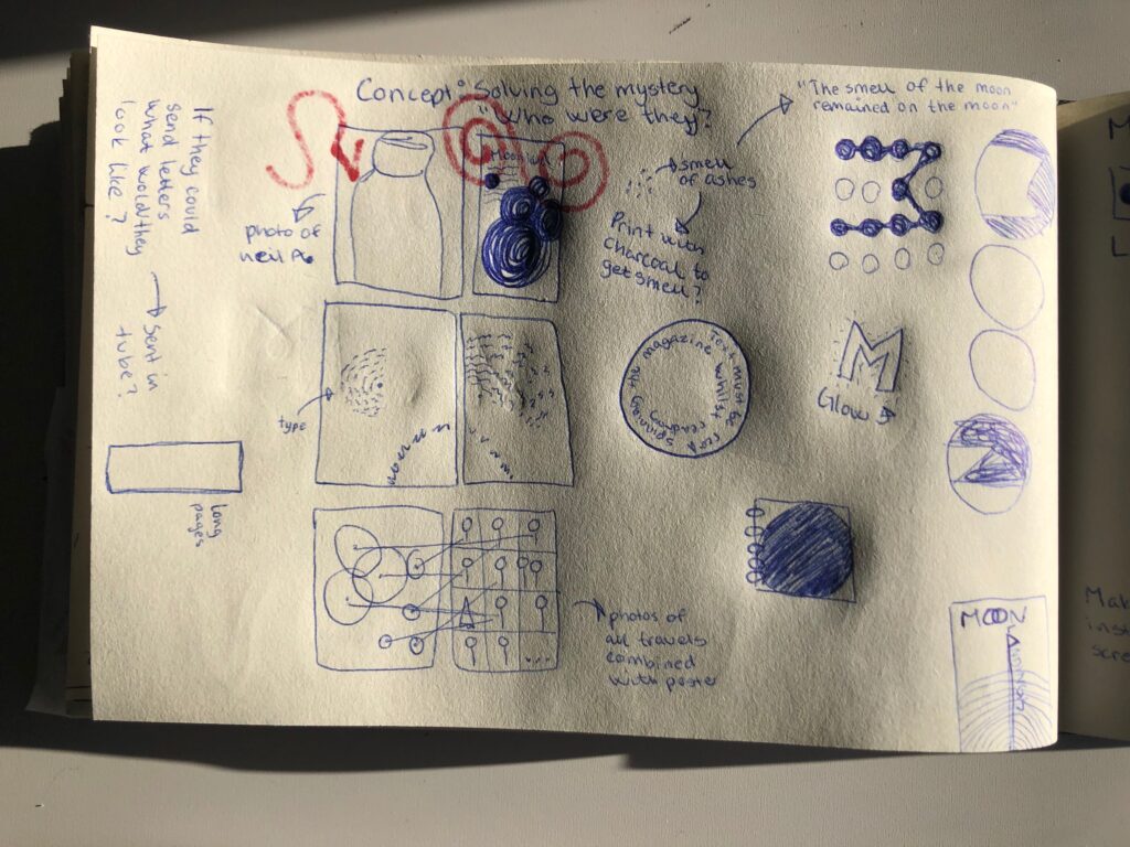
As mentioned in my further research reflection, I find the combination of photography and infographics very clever, as it adds a human element to cold data. Combining this with my questions from the synopsis, I got the idea of “humanising” Moon Landings by using photographs of astronauts. This could also be a way of visualising the intrigue created in me by the infographic, as it would be an attempt at answering my questions, whilst maintaining mystery.
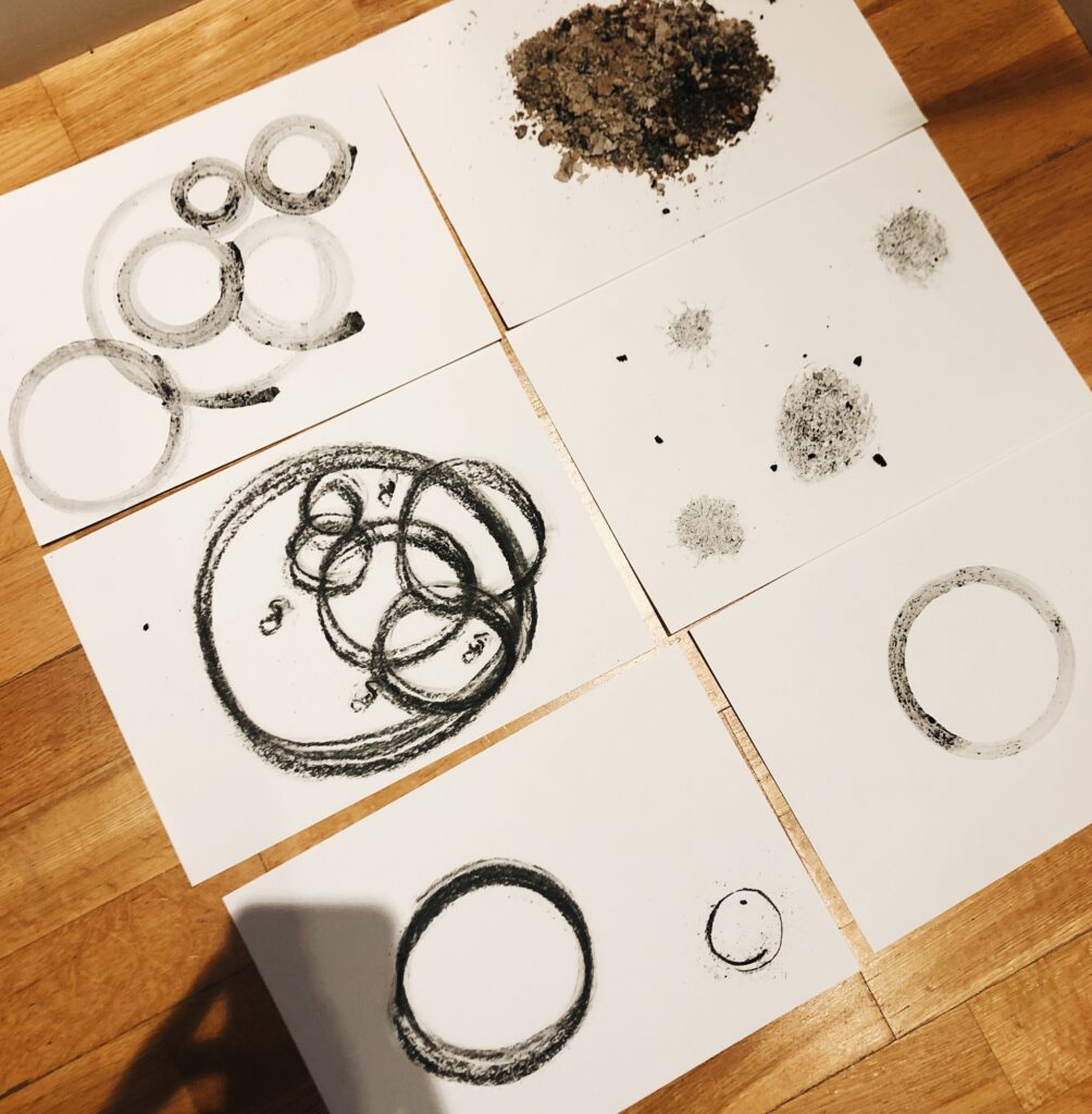
Whilst sketching, I also tried to find some fun facts about the moon landings. I discovered that the dust of the moon had a burnt smell (History.com, 2020). On their space journey, the Apollo 11 astronauts brought back samples of dust, but when they got back to earth, the smell had disappeared (History.com, 2020). This mysterious happening made me wonder if I could use a powder of some sort to create visuals for my editorial. Since the smell was referred to as burnt I got the idea of using coal from the fireplace.
Experiments
I decided to experiment with coal as a way of creating circles, which would later become a visual interpretation of Accept&Proceed’s original artwork.
I also had the idea of creating an installation, rather than a typical editorial. I think it could have been interesting to experiment with printing my editorial on glass, having the sky reflected in it as it went from day to night and the moon would appear. This would symbolise me looking up at the sky, trying to find answers to my questions about the moon landings. Unfortunately this idea was a bit too ambitious, and so I decided to move on with my first editorial idea.
(Original artwork, Fig. 18: Kapoor 2018. Sky Mirror. [glass]
I initially wanted to create a strict grid based editorial, drawing on the NASA brand guideline book. However, through experimenting with circles in InDesign, decided to base my whole editorial on circles, referencing the original artwork. The headlines are set in Helvetica, referring to brand books from the 70s era, but I chose to pair it with a sans serif as I found that read better in my circle based type layout.
Result
My final editorial is hugely based on the original artwork created by Accept&Proceed, in it’s use of circles. In order to make the design my own, I’ve included ash painted circles, which refers to fun facts about moon dust, which smells of burnt ashes. The visual aesthetics is inspired by brand guideline books (NASA’s in particular) from the 70s era when moon landings were perhaps at the peak of global interest. Further I have used photography to humanise the moon landing data. The photographs also fits the mysterious aspects that I touch upon in my synopsis. I have kept the colour palette from the original art work. However, I have inverted it, and added a red in some places, inspired by the NASA red.
I really wanted to set up an interactive digital version of the editorial as well, as is common amongst larger magazines. I think the circles could have worked nicely with animations and it could have been cool to explore the mysterious element further through user experience. Unfortunately I didn’t have enough time to see this through.

The mockup used in this work was collected from a website with a creative commons license, and was not created by me. (https://www.anthonyboyd.graphics/mockups/open-magazine-mockup/)
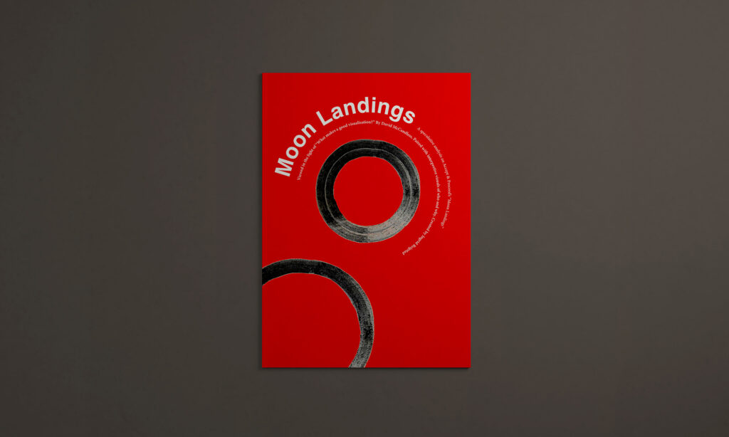

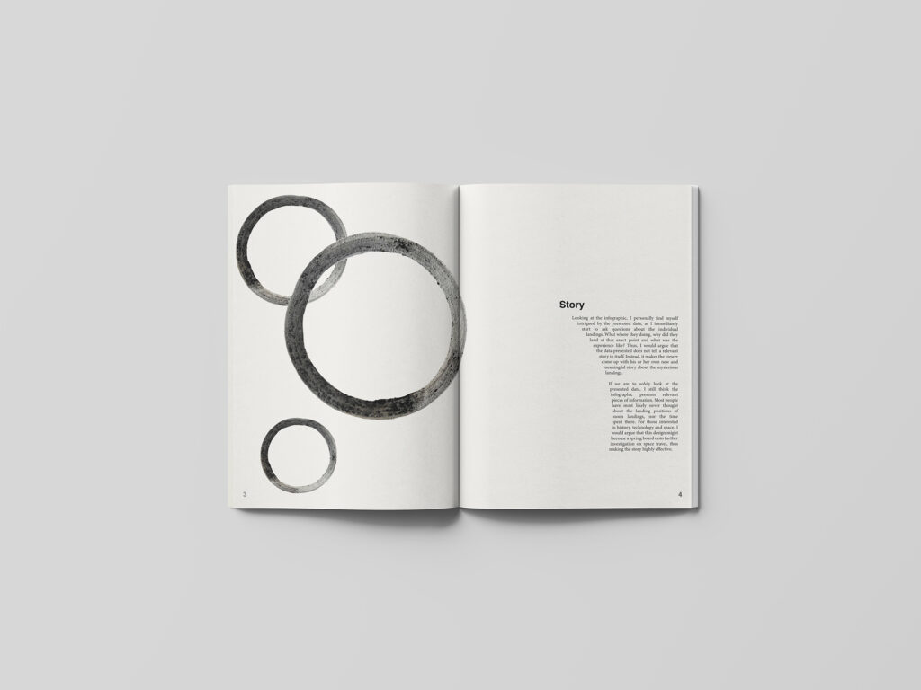
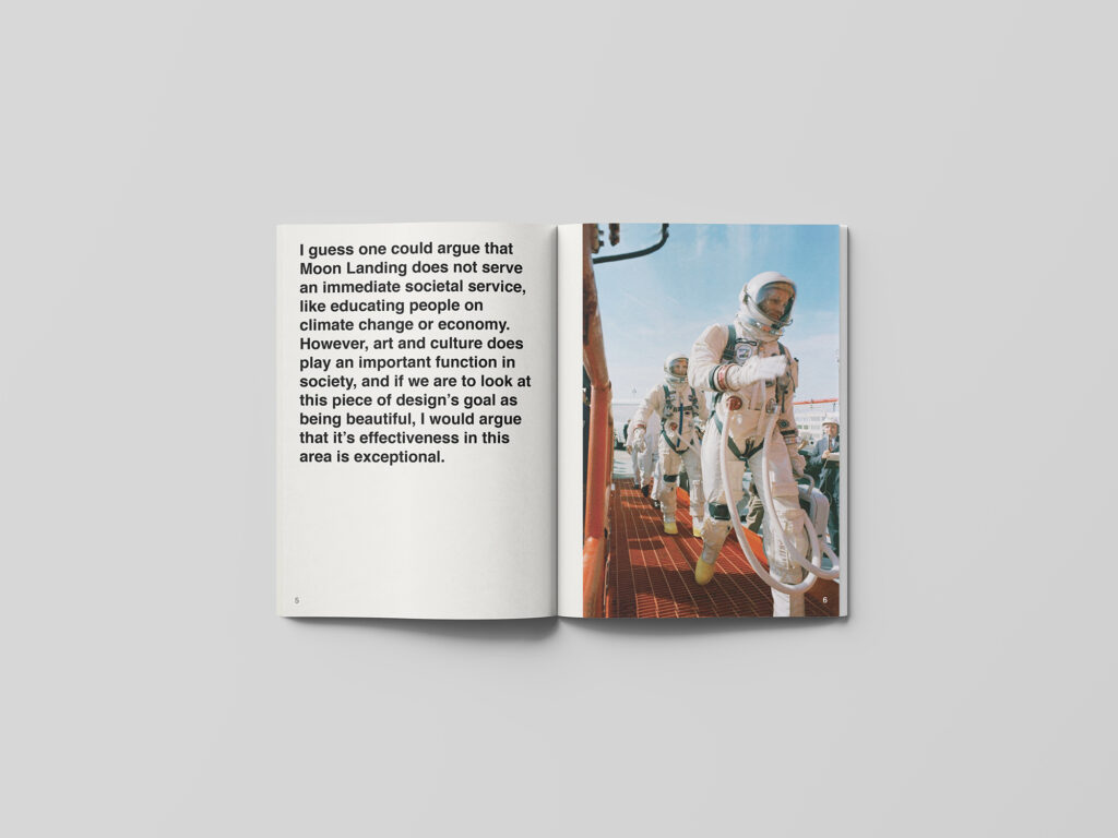
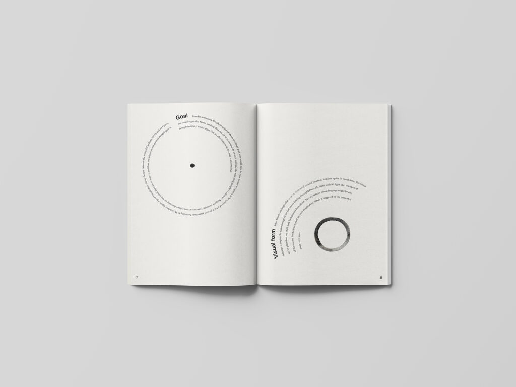
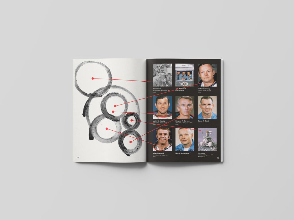
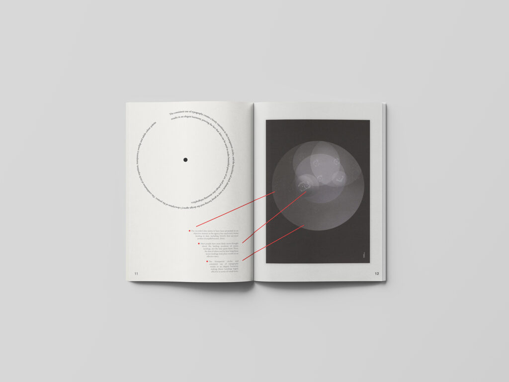
Fig. 22-28: Reigstad 2021. Moon Landings editorial
The mockup used in this work was collected from a website with a creative commons license, and was not created by me. (https://www.anthonyboyd.graphics/mockups/open-magazine-mockup/)
Image references for all figures used in editorial:
Fig. 29: Unknown maker. ca. 1967-1969. Neil Armstrong official portrait [colour photograph]
Fig. 30: Unknown maker. ca. 1960-1975. Neil Armstrong preparing to board the Gemini-Titan VIII [colour photograph]
Fig. 31: Unknown maker. ca. 1960-1967. NASA’s Surveyor spacecraft [black and white photograph]
Fig. 32: Unknown maker. ca. 1969. The Apollo 11 astronauts after their successful moon landing [colour photograph]
Fig. 33: Unknown maker. ca. 1967-1969. Neil Armstrong official portrait [colour photograph]
Fig. 34: Unknown maker. ca. 1970-1974. Apollo 16 Prime Crew [colour photograph]
Fig. 35: Unknown maker. ca. 1970-1974. Gene Cernan. [colour photograph]
Fig. 36: Unknown maker. ca. 1960-1980. Astronauts David R. Scott (left) and Neil A. Armstrong (right) with a model of the Gemini Spacecraft [colour photograph]
Fig. 37: Unknown maker. ca. 1970-1972. Alan Shepard Apollo 14 [colour photograph]
Fig. 38: Unknown maker. ca. 1960-1980. Astronauts David R. Scott (left) and Neil A. Armstrong (right) with a model of the Gemini Spacecraft [colour photograph]
Fig. 39: Unknown maker. ca. 2016. Luna-16 [lego]
Fig. 40: Accept&Proceed 2016. Moon Landings. [printed infographic]
In conclusion
This week has been an interesting journey for me, as I was a little sceptical to the topic big data to begin with. I had never thought about using data to create visual pieces, but rather a tool for communicating statistics. Luckily I have come to understand that big data can be used to tell stories and to create beautiful pieces of art. I’m particularly drawn to the more art based area of information design, and I hope to investigate this further in week 4.
The goal for this week seemed to be to analyse the effectiveness of data visualisation. This was done through my Moon Landings analysis, but looking back I probably could have spent more time analysing, as my synopsis did end up being quite positive, rather than critical.
I enjoyed my semi-tactile approach to my editorial design, and if I had more time I would have liked to investigate the physical experiments further. I am quite happy that I managed to create my own visual language for the editorial, although I could also question weather or not I’ve taken it too far from the original art work. If I had another week for my editorial design I would have loved to explore a digital translation of my editorial using interactive experiences, and I think the circle elements in particular would have translated well to animation.
Lastly, I would have liked to work further on communicating my concept through visuals. I think it still might be a bit too vague, and I wonder if readers will make the connection between the images and my writings on the story of the infographic. Either way, I’ve learned a lot about data visualisation this week, and I will take with me the method of using big data to create visual pieces as we move on to next week.
REFERENCES:
Accept&Proceed (2016) Moon Landings. Available at: https://www.acceptandproceed.com/project/moonlandings (Accessed: 8 February 2021).
Cheng, J. (2014) ‘Analyzing Minard’s Visualization Of Napoleon’s 1812 March’, Thoughtbot, 8 June. Available at: https://thoughtbot.com/blog/analyzing-minards-visualization-of-napoleons-1812-march (Accessed: 6 February 2021).
Felton, N. (2016) ‘Transforming data into meaningful stories’. The Conference 2015, 14 January. Available at: https://www.youtube.com/watch?v=bVEIMtpARPI&ab_channel=TheConference%2FMediaEvolution (Accessed: 6 February 2021).
Ferguson, H. (2021) ‘Big Data’. Canvas Falmouth Flexible [online], 5 February. History.com (2020) ‘8 Little-known Facts about the Moon Landing’, History.com, 17 July. Available at: https://www.history.com/news/moon-landing-apollo-11-facts (Accessed: 10 February 2021).
It’s Nice That (2019) ‘Made in Fukushima visualises the decontamination of rice fields in the wake of nuclear disaster’, It’s Nice That, 12 June. Available at: https://www.itsnicethat.com/articles/meter-serviceplan-moby-digg-made-in-fukushima-graphic-design-publication-sponsored-content-120619 (Accessed: 7 February 2021).
McCandless, D. (2010) ‘The beauty of data visualization’, July. Available at: https://www.ted.com/talks/david_mccandless_the_beauty_of_data_visualization?nolanguage%3Den%2529#t-1072774 (Accessed: 5 February 2021).
McCandless, D. (2014) ‘What Makes a Good Visualization?’ Information is beautiful. Available at: https://informationisbeautiful.net/visualizations/what-makes-a-good-data-visualization/ (Accessed: 8 February 2021).
Onformative (2014) ‘ANIMA iki’, Onformative. Available at: https://onformative.com/work/anima-iki/ (Accessed: 6 February 2021).
LIST OF FIGURES:
Figure 1. GREYWORLD. 2003. The source overview. Vimeo [online]. Available at: https://vimeo.com/10133295
Figure 2. David MCCANDLESS and Stefanie POSAVEC. 2010. Left VS. Right (US). Information is beautiful [online]. Available at: https://informationisbeautiful.net/visualizations/left-vs-right-us/
Figure 3: Ingrid REIGSTAD. 2021. Iphone images screen shot. Private collection: Ingrid Reigstad.
Figure 4: Ingrid REIGSTAD. 2019. Lisbon. Private collection: Ingrid Reigstad.
Figure 5. ONFORMATIVE. 2014. ANIMA iki. Onformative [online]. Available at: https://onformative.com/work/anima-iki/
Figure 6-8. Moby DIGG. 2019. Made in Fukushima. Design made in Germany [online]. Available at: https://www.designmadeingermany.de/2019/164984/
Figure 9. David MCCANDLESS. 2014. What Makes a Good Visualisation?. Information is beautiful [online]. Available at: https://informationisbeautiful.net/visualizations/what-makes-a-good-data-visualization/
Figure 10. ACCEPT&PROCEED. 2016. Moon Landings. Accept&Proceed [online]. Available at: https://www.acceptandproceed.com/project/moonlandings
Figure 11. ACCEPT&PROCEED. 2016. Moon Landings. Accept&Proceed [online]. Available at: https://www.acceptandproceed.com/project/moonlandings
Figure 12. ACCEPT&PROCEED. 2016. Moon Landings. Accept&Proceed [online]. Available at: https://www.acceptandproceed.com/project/moonlandings
Figure 13. ACCEPT&PROCEED. 2016. Moon Landings. Accept&Proceed [online]. Available at: https://www.acceptandproceed.com/project/moonlandings
Figure 14-16. Richard DANNE and Bruce BLACKBURN. 1975. National Aeronatics and Space Administration Graphics Standards Manual. Standards Manual [online]. Available at: https://standardsmanual.com/products/nasa-graphics-standards-manual?utm_source=pinterest&utm_medium=social
Figure 17: Ingrid REIGSTAD. 2021. Coal circles. Private collection: Ingrid Reigstad.
Figure 18-19: Ingrid REIGSTAD. 2021. Reflection experiments. Private collection: Ingrid Reigstad.
Original artwork, Figure 18. Anish KAPOOR. 2018. Sky Mirror. Forbes [online]. Available at: https://www.forbes.com/sites/joanneshurvell/2020/07/20/anish-kapoors-largest-outdoor-sculpture-exhibition-now-open-at-houghton-hall-norfolk/?sh=6350dd0c2f37
Figure 20: Ingrid REIGSTAD. 2021. Grid experiments. Private collection: Ingrid Reigstad.
Figure 21: Ingrid REIGSTAD. 2021. Moon Landings editorial. Private collection: Ingrid Reigstad.
Figure 22-28: Ingrid REIGSTAD. 2021. Moon Landings editorial. Private collection: Ingrid Reigstad.
Figure 29. Unknown maker. ca. 1967-1969. Neil Armstrong official portrait. [colour photograph]. The Verge [online]. Available at: https://www.theverge.com/2012/8/25/3268016/astronaut-neil-armstrong-has-died [accessed 11 February 2021].
Figure 30. Unknown maker. ca. 1960-1975. Neil Armstrong preparing to board the Gemini-Titan VIII. [colour photograph]. The Verge [online]. Available at: https://www.theverge.com/2012/8/25/3268016/astronaut-neil-armstrong-has-died [accessed 11 February 2021].
Figure 31. Unknown maker. ca. 1960-1967. NASA’s Surveyor spacecraft. [black and white photograph]. NASA [online]. Available at: https://solarsystem.nasa.gov/missions/surveyor-6/in-depth/ [accessed 11 February 2021].
Figure 32. Unknown maker. ca. 1969. The Apollo 11 astronauts after their successful moon landing. [colour photograph]. The Verge [online]. Available at: https://www.theverge.com/2012/8/25/3268016/astronaut-neil-armstrong-has-died [accessed 11 February 2021].
Figure 33. Unknown maker. ca. 1967-1969. Neil Armstrong official portrait. [colour photograph]. The Verge [online]. Available at: https://www.theverge.com/2012/8/25/3268016/astronaut-neil-armstrong-has-died [accessed 11 February 2021].
Figure 34. Unknown maker. ca. 1970-1974. Apollo 16 Prime Crew. [colour photograph]. NASA [online]. Available at: https://www.nasa.gov/image-feature/apollo-16-prime-crew [accessed 11 February 2021].
Figure 35. Unknown maker. ca. 1970-1974. Gene Cernan. [colour photograph]. NASA [online]. Available at: https://solarsystem.nasa.gov/missions/surveyor-6/in-depth/ [accessed 11 February 2021].
Figure 36. Unknown maker. ca. 1960-1980. Astronauts David R. Scott (left) and Neil A. Armstrong (right) with a model of the Gemini Spacecraft. [colour photograph]. The Verge [online]. Available at: https://www.theverge.com/2012/8/25/3268016/astronaut-neil-armstrong-has-died [accessed 11 February 2021].
Figure 37. Unknown maker. ca. 1970-1972. Alan Shepard Apollo 14. [colour photograph]. NASA [online]. Available at: https://commons.wikimedia.org/wiki/File:Alan_Shepard_Apollo_14_(cropped).jpg [accessed 11 February 2021].
Figure 38. Unknown maker. ca. 1960-1980. Astronauts David R. Scott (left) and Neil A. Armstrong (right) with a model of the Gemini Spacecraft. [colour photograph]. The Verge [online]. Available at: https://www.theverge.com/2012/8/25/3268016/astronaut-neil-armstrong-has-died [accessed 11 February 2021].
Figure 39. Unknown maker. ca. 2016. Luna-16. [lego]. Flickr [online]. Available at:https://www.flickr.com/photos/87587140@N07/28193801673/ [accessed 19 April 2011].
Figure 40. ACCEPT&PROCEED. 2016. Moon Landings. Accept&Proceed [online]. Available at: https://www.acceptandproceed.com/project/moonlandings