Lecture notes
Lecture reflection
Looking at design in relation to societal situations
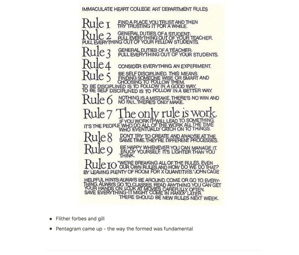
An initial thought that came to mind when listening to this week’s lecture was the correlation between the current political situation in a society and graphic design. Maziar Raein mentions that in the 80s there was a cultural shift in politics (Raein and Edwards 2020). The right wing increased in popularity and there was a focus on the individual, which led to designers starting to work in new ways (Raein and Edwards 2020). A sense of independence emerged and suddenly people talked about individual practices (Raein and Edwards 2020). Pentagram got established and brought new and fundamental ways of running a studio to the design industry (Raein and Edwards 2020). Thus, it becomes clear that looking at social history is important in order to understand the design history. This is not limited to politics. Technology, pop culture, economics etc. is also relevant.
Will the development of technology lead to a decrease in design knowledge?
Raein and Edwards (2020) goes on to talk about the emerging of the computer in the 90s and how Raein had to reflect on what one was to teach students in such a fast pacing design scene. As he mentioned, this is also an important issue today as more information is available (Raein and Edwards 2020). Today a designer can can learn almost anything online, and so today, animation and coding are often asked for in graphic designer job listings.
Although I love learning new skills, I am worried that this availability of learning might contribute to the weakening of the graphic designer role. If we get to a point where the graphic designer is expected to have such a broad set of skills, that the core, graphic design, don’t get enough attention, a poorer set of design skills might become the norm in the design industry.
History seen in context
I take with me one message in particular from this week’s lecture: that it is important to know history and the context in which historic works were created (Raein and Edwards 2020). Today there are an endless availability of material online, but in order to understand historic works, one also have to look at where the work comes from – what is the concept behind it and what are the thoughts behind the aesthetic choices that were taken (Raein and Edwards 2020)?
Looking beyond social media
Closing up the lecture, Raein og Edwards talks about the younger generation and how they seem to be misunderstood, actually caring about much more than what is happening at their phones (Raein and Edwards 2020). I think it’s safe to say that todays younger generation have interests that reaches far further than social media and technology. This is evident in everything from millions of students striking for climate, to this years “It’s Nice That”’s graduate lists, which includes designers who bring attention to important political issues, such as diversity, refugee conflicts and the economy in China (It’s Nice That 2020).
Resources notes
Resource reflection
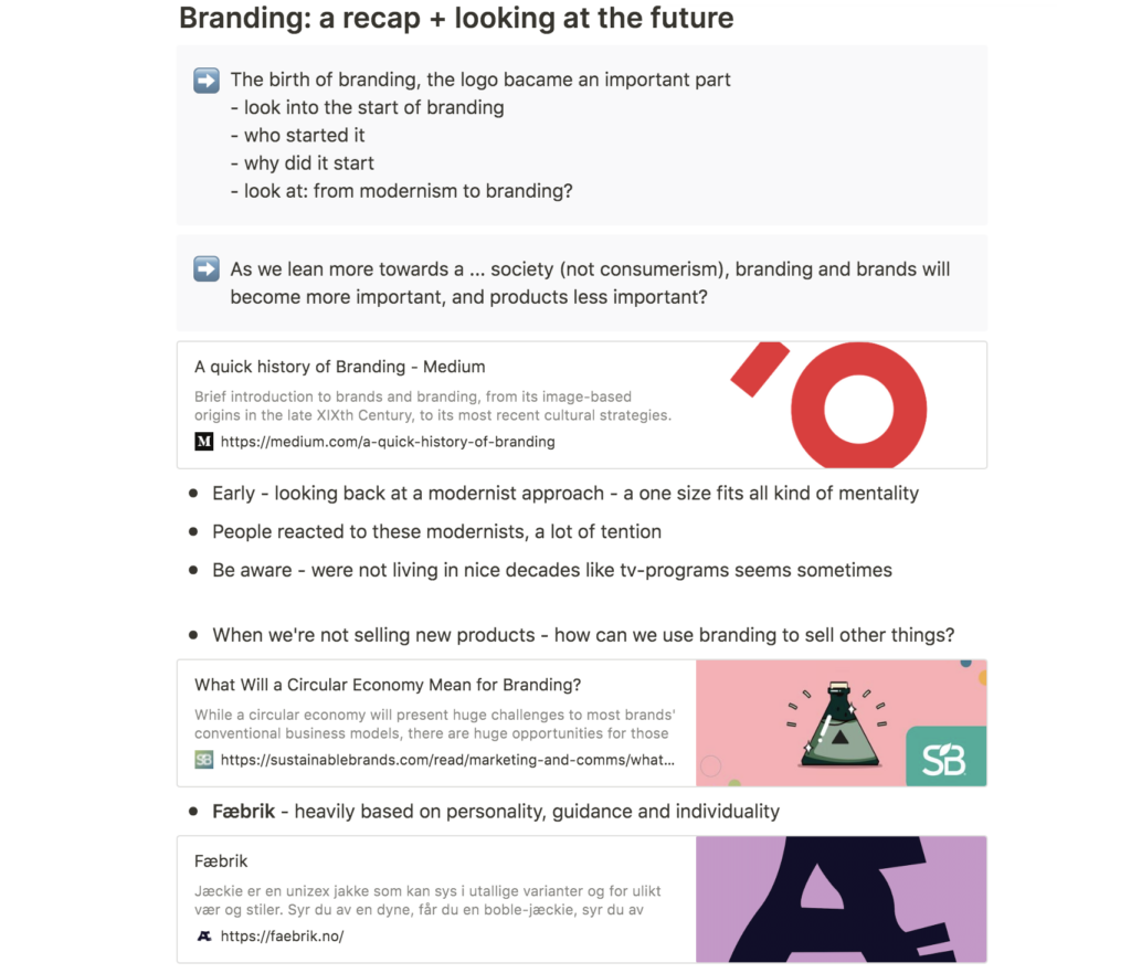
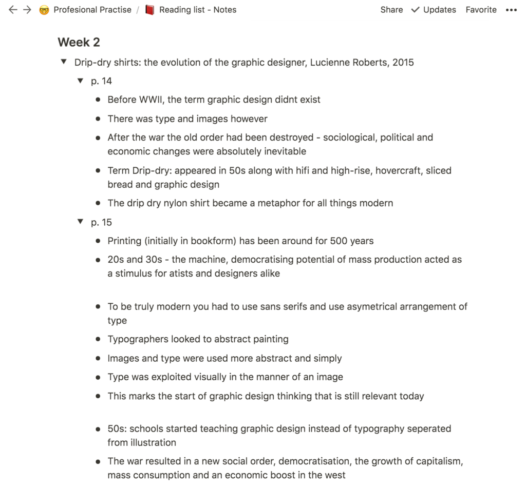
This week’s resource was an interesting read as it gave me a sense of overview of the history of graphic design. It seems to me that the end of WWII was an important turn point for graphic design as the growth of capitalism created a an increasing need for advertising (Roberts 2005). Mass consumption and an economic boost in the west meant that packaging and advertising material had to be made (Roberts 2005).
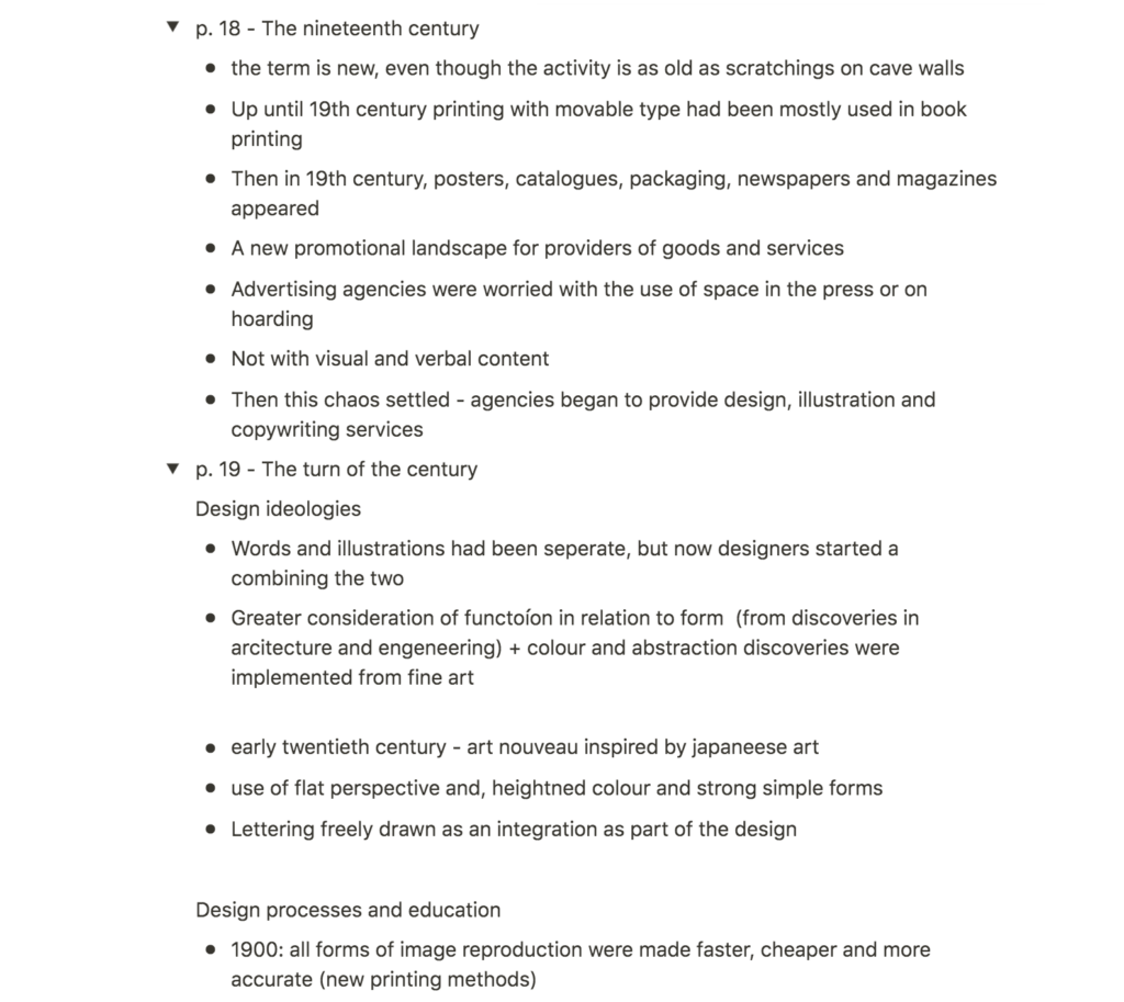
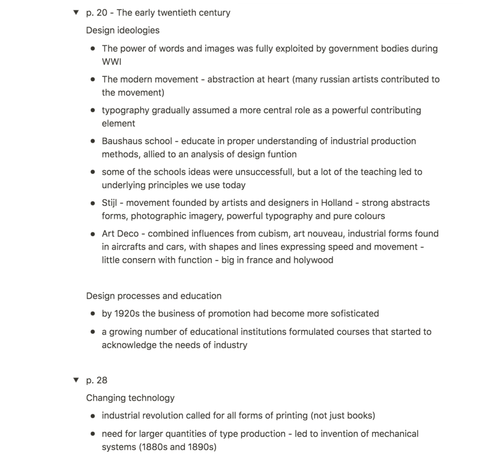
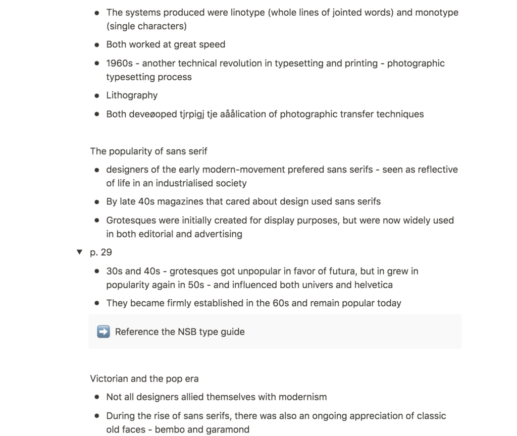
To me, it was especially interesting to read about the correlation between the growth of capitalism and the development of corporate identity. As more and more companies emerged, companies discovered the importance of identity, and so, designers started creating identity systems with memorable visuals beyond the logo (Roberts 2005). Today, graphic designers are still using this systematic approach in branding work.
The modernist movement and the notion of corporate identity is demonstrated further down in this blog post through the visual identity of NSB (Norwegian railways) from the 70s. A brand book guide was created and the typography was heavily influenced by the modernist movement, with Helvetica as the main typeface.
Further research
Women who played an important role in the history of graphic design
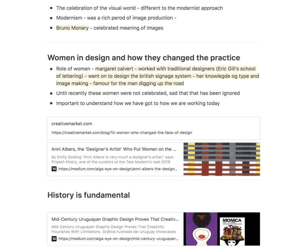
As mentioned in the lecture, women who played an important part in design were not celebrated until recently (Raein and Edwards 2020). I therefor wanted to be conscious in this week’s search for historic practitioners and have chosen to look at women in particular.

Corita Kent
Corita Kent came from a poor family and entered the Immaculate Heart of Mary order at 18 (Corita Art Center 2016). She practiced art and taught herself silk screening (Corita Art Center 2016). It was important to Corita to talk to people where they are, and so, she adapted the language of consumerism, which people could understand (Corita Art Center 2016). In the 60s, Corita started commenting on societal injustice though her humanist design, commenting on poverty, racism and the Vietnam war (Corita Art Center 2016).

Anni Albers
Although, not a graphic designer per se, Anni Albers many designers have been influenced by the artist and her use of the grid, according to curator Priyesh Mistry (Gosling 2016). Albers studied at the Bauhaus, and as most women were not allowed to take classes like painting, printing and architecture, she was being left with the loom, which limitations work well with structuralism (Gosling 2016). At Bauhaus she met several pioneers of the modernist movement and the structural essence of her works, indicates that she was also heavily part of the movement from which principles the school taught (Tate 2018).
Ashley Booth
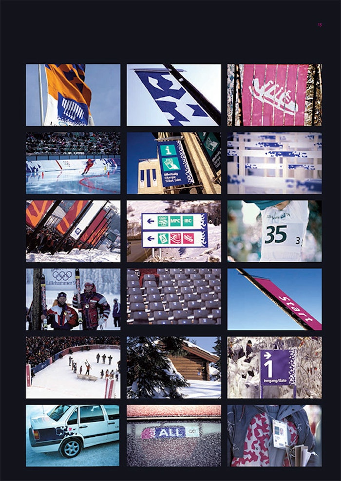
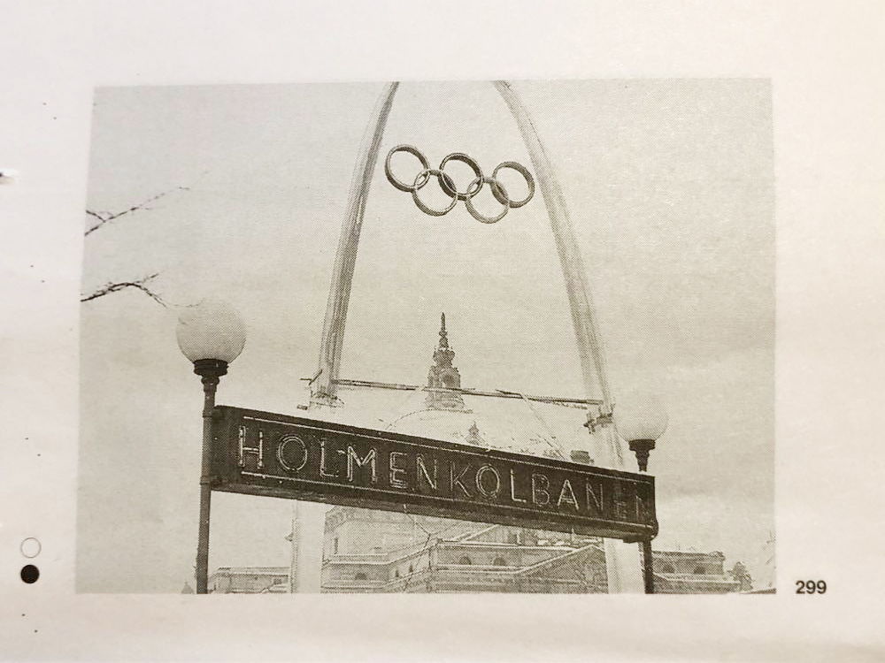
For the 1994 Olympics, held at Lillehammer, Norway, a team of designers were formed, in order to create the visual identity (Bore 2015). This is one of the biggest Norwegian graphic design projects in newer and graphic designer Ashley Booth, was head of the design team (Bore 2015). She later started her own design studio, working with several clients of the Norwegian government (Bore 2015). Bore (2015) claims that although the 1994 Olympics project is well known amongst designers in Norway, few know about Booth and the fact that she led the design team.
Exhibition: skrift i Oslo (type in Oslo)
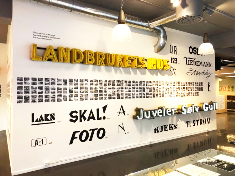
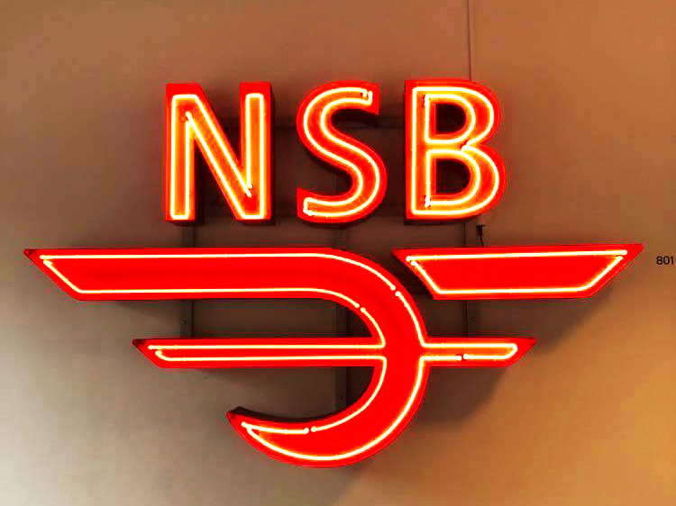
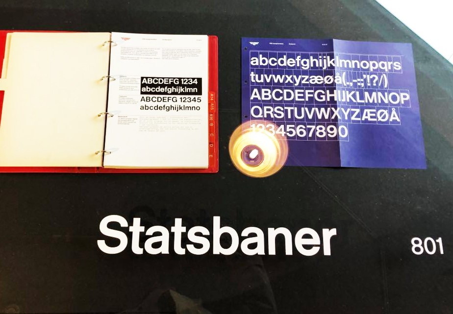
This week I was fortunate enough to find an exhibition on typography seen in Oslo through 100 years. There were no descriptions with the type works, but small black and white images which all included some type of typography. Part of the visual identity for NSB, from the 70s was on display and it was interesting to see Helvetica in the branding guide book.
Designers today and their influences
As I’m learning about the importance of historic referencing in design, I think it would be interesting to investigate how some of today’s designers use history as a reference in their work. This list could probably go on forever, and so I have chosen to look at the works of Pedro del Corro and Jonathan Hoefler.
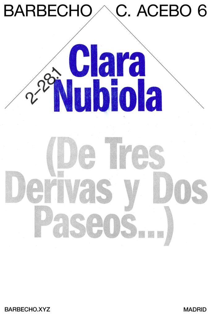
Fig. 5: Del Corro ca. 2015-2020. Barbecue c.acebo 6. [digital and 2/0 risograph]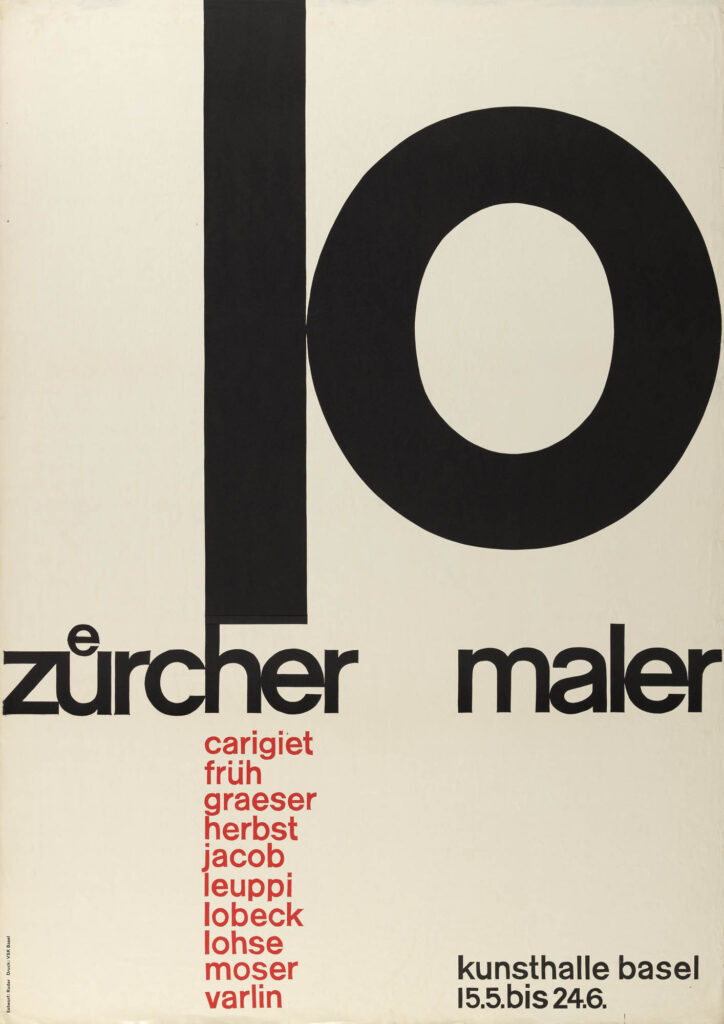
Fig. 6: Ruder 1957. 10 Zürcher Maler – Kunsthalle Basel. [poster]
Pedro del Corro
Pedro del Corro has stated that he is heavily influenced by Emil Ruder’s type experiments (ref). Corro’s work is heavily type based and his use of shapes and composition through letters, much like Ruder’s work. The fact that he has worked for Apple and Dropbox, suggests that his work is still modern and relevant in todays design practice.
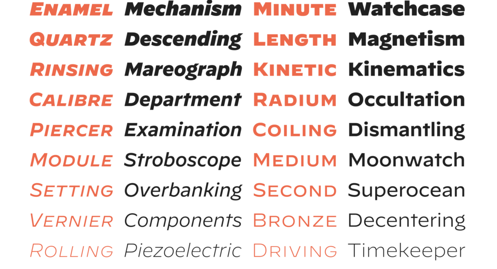
Fig. 7: Hoefler 2019. Decimal. [typeface] 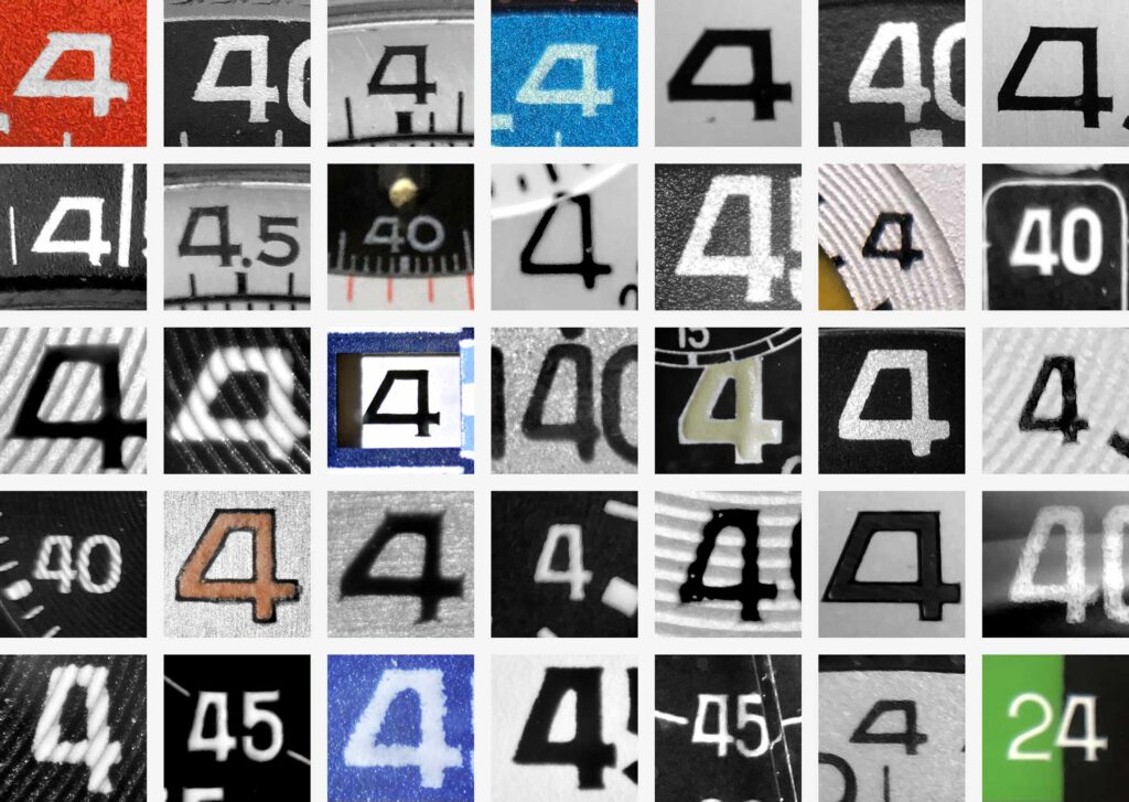
Fig. 8: Hoefler 2019. Untitled [wristwatches]
Jonathan Hoefler
Jonathan Hoefler is a type designer at Hoefler&CO, the type foundry behind typefaces used on iphones and Coca Cola cans. Hoefler’s typeface decimal is inspired by type from old wristwatches (Hoefler&Co 2019), demonstrating how a piece of history can act as foundation for a modern typeface.
Branding in the future
AI curated design
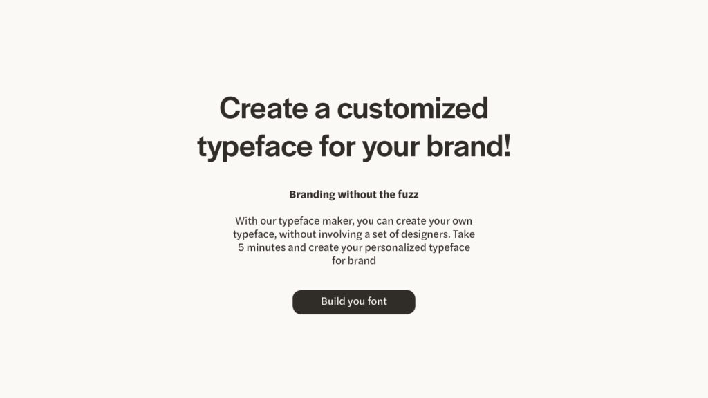
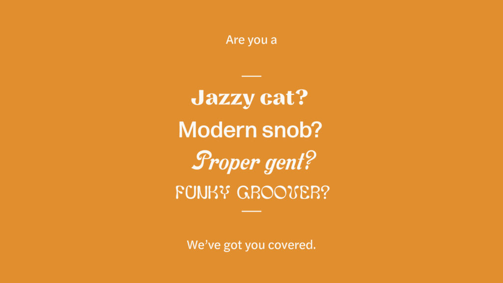
Through this week’s lecture and resources it’s become evident to me that todays design practice is a result of the evolvement of new technologies. Today this evolvement of technology is maybe going at it’s fastest pace ever. How will this affect the future of graphic design? Even today, there are softwares like Wix Logo Maker, where you can generate a custom logo for your business, without using a real graphic designer. Will future design work revolve around creating softwares like these, where one creates a system of icons, shapes and typography, which is later curated through an AI, in order to meet the users needs? And if the curatorial part of design is lost, how will the sense of wit and humour live on in graphic design? Will an AI manage to play on words and metaphors like a human designer, or will the design scene evolve towards a much more literal state?
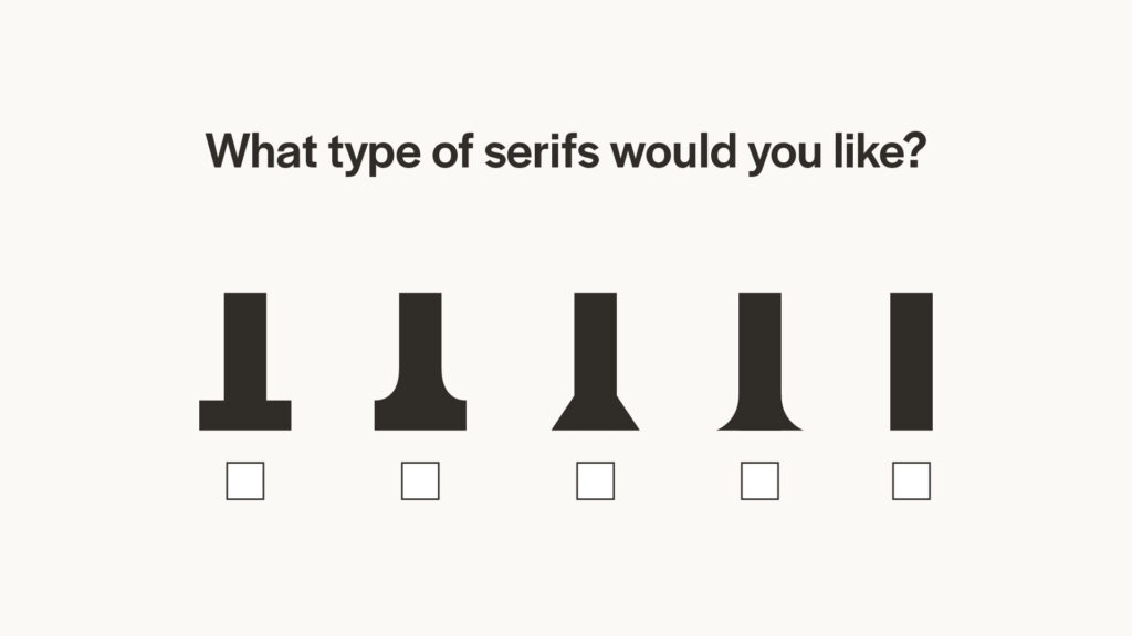
I think it would be an interesting project to create a similar software to Wix Logo Maker, but for typefaces. One could create a library of type details and then create a similar software to Wix’s, where the user chooses his or her preferences for type of serifs, widths, styles, proportions and modelling. In the end the user would end up with a custom typeface, with details from the type detail library, curated by the software. Below I have created some quick mockups of the idea.
The emerge of refill
Looking at the economic systems of the world, might also be interesting when discussing the future of design. If today’s need for branding stems from consumer culture, what role will branding play if we are to shift towards a more circular economy? In his article “What Will a Circular Economy Mean for Branding”, Tom Tapper (2020) claims that a circular economy holds a range of branding possibilities, emphasising the importance of storytelling and product quality in an economy of such type. Tapper (2020) also suggests that refill experiences will play an important role in branding and that there will be electric trucks in the streets where you can refill prebought bottles with new product. This refill method of selling products has already been set to life through businesses like Fill, a laundry and household cleaning company, which offers refillable eco products.
Workshop challenge
Choosing design studios
My impression of the design industry in Oslo is that it’s small, but interesting. There are not as many studios and practitioners here as in large cities like London and New York. However, there are plenty to choose from. I think the design scene in Oslo can be described as simplistic and modern, with certain exceptions. My impression is that design studios in Oslo usually can be placed in one of two boxes: fun and colourful or cool and edgy. Some studios are, of course, somewhere in the middle.
My approach when choosing design studios for this challenge, was simply to go for my three favourite Oslo based studios. In retrospect I probably could have tried to find studios I hadn’t heard about before, but I think, as Oslo’s design scene might not be familiar to most people, that they are most likely new to several people on the course. I have other favourites as well, like Netlife, Haydays and Bielke&Yang and I think these fall under the fun and colourful box. I would say that the ones I’ve chosen fall under the cool and edgy box and this time I decided to go for cool and edgy, which was merely a choice of personal preference.
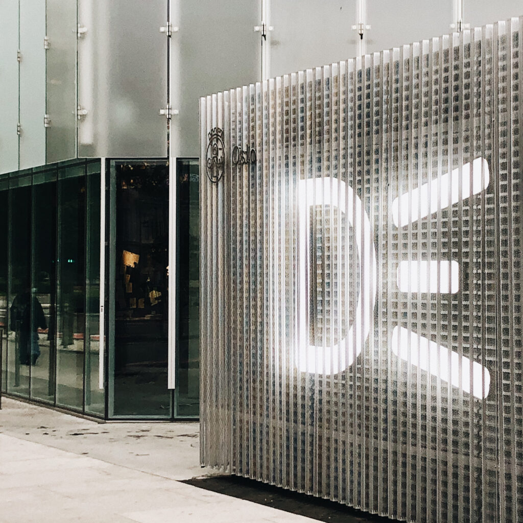
Bleed
Why Bleed?
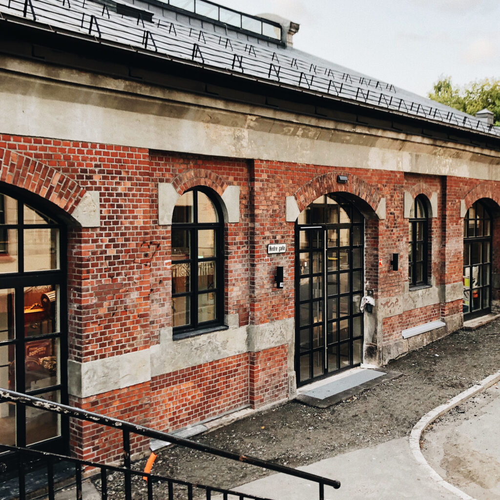
I’ve followed Bleed for a few years and they are one of the main studios I look to for design inspiration. They make a lot of type based work, which I find simplistic and modern, and also in line with the concepts they are created in. In a branding project for a furniture company, for example, they created a custom sans serif typeface, where the lines of the characters refer to the lines of the furniture. My main interests in graphic design are typography and branding, and I would say that these are the main areas of design of which Bleed operates in. I admire how they manage to create such simplistic yet communicative projects and of course I like their raw and modern aesthetic style.
Location
Bleed’s studio is based in an old industrial building in Grunnerløkka, Oslo. This area is known for being hip and cultural. It used to be up and coming, but has, in later years, become more main stream. In their company statement they claim to be blending the boundaries of design, technology, art and strategy. This sense of blur, I think, is very evident in the way they represent themselves physically. The building is old and industrial, which is in line with the raw and experimental sense of the studio, but it is also renovated (the building won the price of architecture in Oslo in 2013), which indicates that this studio is concerned with modernity and luxury.
Reflection
Bleed creates branding identities and are based in both Oslo and Vienna. The studio was founded by Dag Solhaug Laska and Svein Haakon Lia. Today the studio consists of 15 designers.
Bleed’s landing page consists of white text on a black background. Their company statement is written in large sans serifs and above it: the studios name, the sort of music currently playing in the studio and a contact button. Already, we can start to form an impression. The studio seem to have a minimal approach to design and to be very type based. The fact that they are showcasing what type of music they are playing indicates that they are interested in culture. Music preference is often related to one’s identity, so their aim might also be to depict a certain identity by showcasing the current song.
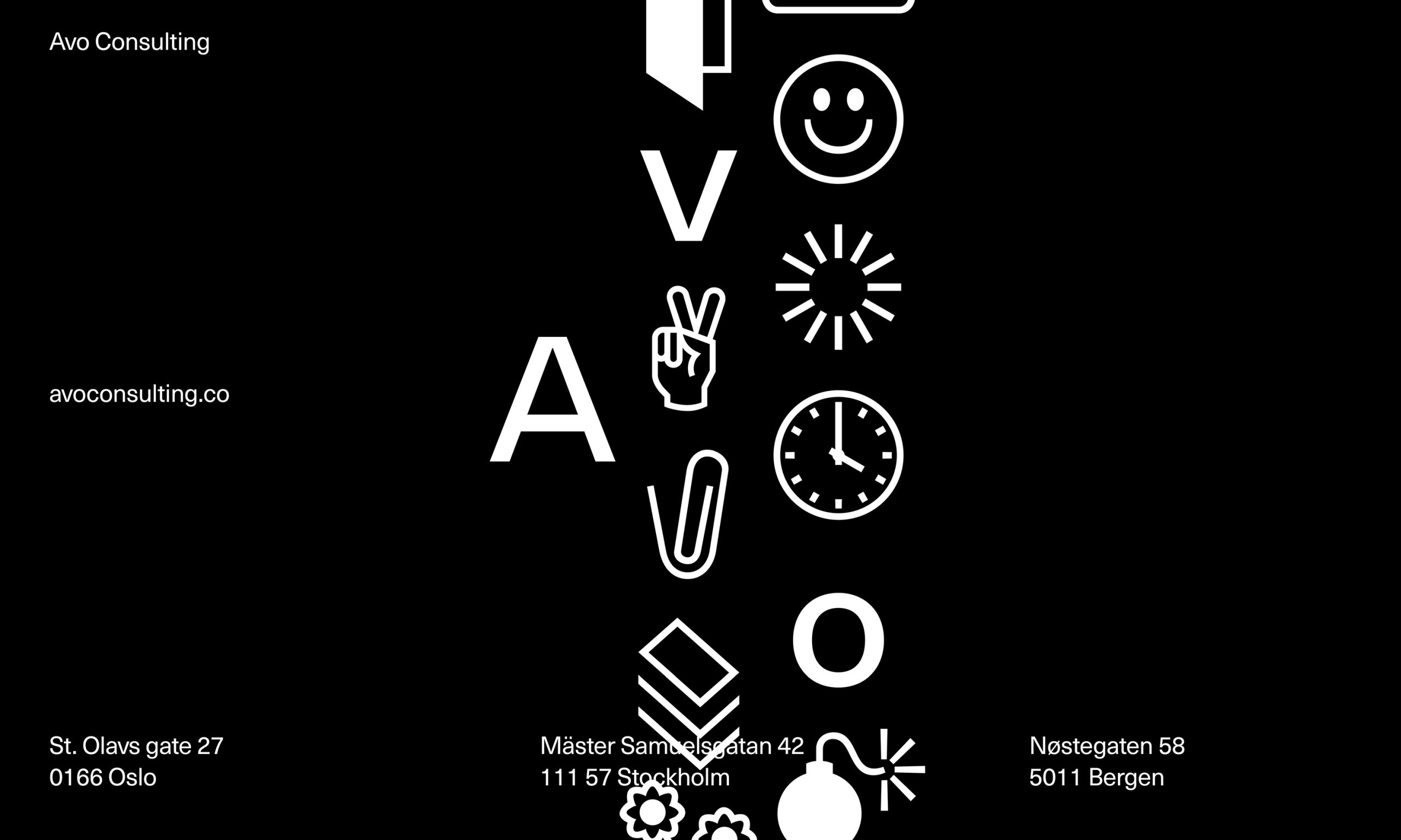
The way Bleed represents themselves is in line with the type of work they create. On one side, they seem to be very experimental. Their work with more corporate brands often have a sense of play, like in their new identity for Avo Consulting. For Avo’s logo, they created a custom typeface where the A is constant and the next two letters consists of symbols, from which the user chooses to use. Bleed also tend to incorporate a sense of modernity and simplicity in their works – most of their projects consists of few, yet effective elements, often with the combination of images and type. Bleed seem to be heavily involved with the cultural sector, haven worked with museums, music labels and the national broadcasting company.
I think the way Bleed portrays themselves is slightly mysterious – there are no information about the employees or founders on their website and their company statement is quite abstract. They refer to themselves as a design studio, which I think, correlates with the way they choose to let their design speak for them as a brand. The name bleed, also refers to the medium of design, and might indicate that they tend to step outside the box as bleed in a print context means the area outside of the trimmed edge.
Company statement
Design & its orbits. BLEED blurs design, technology, art & strategy to create compelling visual identities, services and experiences for our clients.
Summary
Bleed creates branding systems and identities for both both cultural and corporate clients. They are based in Oslo and Vienna and was founded by Dag Solhaug Laska and Svein Haakon Lia. Today the studio consists of 15 designers.
Scandinavian Design Group (SDG)
Why SDG?
SDG was probably one of the first design studios I discovered when I shifted from photography to graphic design. Their projects are sophisticated, often with a sense of play to them and I admire their ability to maintain the balance between the two. As they are quite a big design studio in Oslo, they have a big variety in clients and type of projects. I find it interesting that they manage to create such different projects, whilst maintaining a specific visual style. I especially like their use of shapes which they often set into large branding systems.
Location
SDG is sat in Deichman Bjørvika, Oslos new main library. It’s situated in an area which has grown to become a posh neighbourhood the recent years with exclusive bars and restaurants. The building is meant to be an open space where the public can come to work, read or attend events. Some of SDG’s clients can be described as exclusive, whilst others might be described as innovative. The library building might just be the perfect balance between the two, as they offer 3D printers, sewing machines, books and events to the public, whilst being situated next to some of Oslo’s most exclusive buildings such as Oslo’s opera house and the new Munch museum.
Reflection
By deciding to describe themselves as a design agency, SDG might try to portray the variety of services they offer. Beyond brand design, they also offer service and experience design. The name Scandinavian Design Group, correlates with their processes, which they refer to as being rooted in Scandinavian Design heritage. It’s commonly known that Scandinavian design is focused around simplicity and the name therefor goes will with the studios aim to simplify in their work. The usage of words such as “herritage”, “enrich” and “holistic” in their “about” page, indicates that they are speaking to a more traditional and sophisticated audience, than, say Bleed, who uses more edgy words like “boundries” and “orbits”.
The design agency consists of 37 employees, with roles ranging from graphic designers to service designers to creative strategists to business designers. This is in line with the way they portray themselves: a multidisciplinary design agency which offers a variety of design services for exclusive and innovative clients.
Company statement
(I have chosen to cut this short as their “about” page is quite detailed)
To cut a 30-year long story short, we’re a design agency and always have been. As our industry has progressed, we have evolved, and so has the importance of design.
People-centric
It’s our job to understand the people we design for. That’s why we work at the intersection of rational and emotional thinking.
Sustainability
We are passionate about developing sustainable solutions. We aim to be a partner for knowledge and inspiration for a brighter future.
Effect
We are committed to moving quickly from thought to testing and action as we contribute to all forms of value creation.
Digital first
Our solutions should meet people in their natural habitat. That’s why everything we do starts with digital.
Summary
Scandinavian Design Group creates branding systems and identities for Norwegian and international clients. Their design is rooted in Scandinavian heritage and their approach focuses on simplifying in order to focus on what’s important. The studio was founded in 1987 and today they have 37 employees.
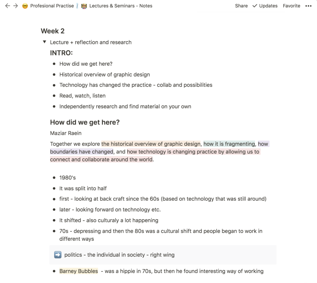
ANTI
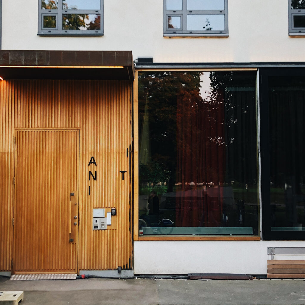
Why ANTI?
I think ANTI is sort of the underdog in my selection of design studios. Their services go far beyond graphic design and they have studio in several Norwegian cities, yet their style feels edgy and underground to me. Despite haven worked with some big clients like the Deichman library and DNB (The Norwegian Bank), I think they manage to portray themselves as up and coming, almost as if their saying “we are the next big thing”, even though they’ve been around for a while. To me it seems as if their work always pushes the boundaries just the right amount for each client, and I particularly like their more experimental type work.
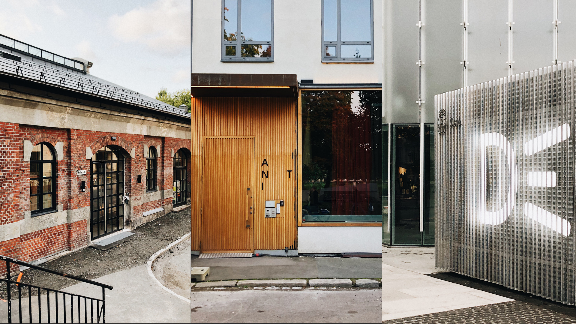
Location
ANTI is based in Grunnerløkka, like Bleed, but perhaps in a slightly less trendy part of the area. The walls towards the street consists of glass windows, stretched from floor to ceiling, separated by straight wooden lines. Their door is made up of narrow wooden lines with the logo beside it. The use of wood and geometry might hint to a type of craftsmanship and modern approach.
Reflection
Similar to Bleed, ANTI’s landing page online consists of a black background with white sans serif text. However, they have also included an image from their portfolio at the top of the page. Their logo consists of capital sans serifs, AN grouped together, with the T further to the right and the I one line down. It’s simple, yet communicative, perhaps suggesting modernity and originality.
The agency was founded in 2008 and today they have 74 employees with a variety of roles, such as ux-designers, creatives, account managers, advertising consultants etc. The agency seem to have a varied set of clients, as they have worked with museums, magazines and libraries, as well as with more established enterprises such as Norwegian grocery chains and phone companies. ANTI’s services goes beyond graphic design as they offer advertising, content and entertainment, in addition to visual identities and integrated idea platforms. They describe themselves as a multi-disciplinary agency, and this is evident in everything from their varied client base to the differentiating type of projects produce.
Company statement
ANTI is a multi-disciplinary agency offering creative solutions to clients from every part of the world. We believe in simplicity, storytelling and creating fans.A New Type of Interference — a philosophy that forms our culture, guiding our process and how we are organised. We firmly believe in the potential of the unexpected, the power of interference, and that diversity generates the most impactful ideas. From the intersection of creativity, business, culture and technology we create visual identities, integrated idea platforms, advertising, content and entertainment that lead brands into awareness and cultural conversation. Together with our Swedish strategic agency partner Abby Priest we cater for both Scandinavian and global clients.
Summary
ANTI is a multi-disciplinary agency who creates brand identities, strategy, advertising, content and entertainment for both Norwegian and international clients. They were founded in 2008 by Kenneth Pedersen and Robert Dalen and today they have offices in Oslo, Bergen, Trondheim and Hamar. They currently have 74 employees.
In conclusion
All of the above agencies create brand identities and they all seem to have a varied set of clients. Bleed seems to be hugely design oriented, with the craft at it’s core in the way they portray themselves. SDG seems to be more focused on tradition and the simplistic approach to a problem. ANTI seem to have a sense of variety to them, taking part in areas outside of design such as TV production. Although my initial thought when looking at their work, is that they all focus on creating simplistic branding systems, my previous reflections prove that they are all working with different types of clients. They also have different identities and ways of portrayal. Bleed is slightly mysterious, whilst ANTI has a sense of coolness. SDG comes off as more sophisticated than the other two.
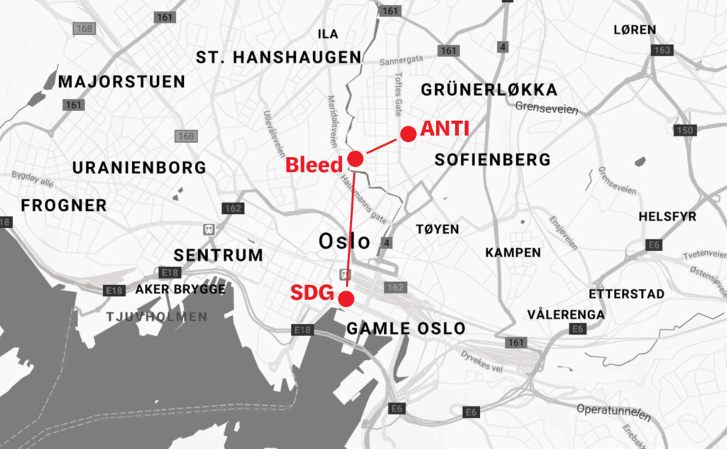
I have already discussed the location of the studios separately, but in conclusion, I think the above map is a good visualisation of the relation between the three design studios. SDG is located in a separate area than the other two, closer to the city centre and the harbour. Bleed is located by the river, slightly outside of the busiest streets of Grunerløkka. ANTI is in Grunerløkka as well, but closer to Sofienberg, which I assume is cheaper than the other studio’s locations. Draw a line from ANTI, to Bleed, to SDG, and you get a line which increases in sophistication, but decreases in undergroundness and edge.
Design production in Oslo
Unlike big cities like London or New York, Oslo is not packed with design production facilities, as the city is small and so is the design scene. However, this does not mean there aren’t any at all. This selection is hugely based on google searches for design production and my final edit consists of varied types of production, from physical crafts to digital services. Fellesverkstedet was a particularly interesting find, as I wasn’t aware that there were facilities in Oslo where you can work with letter press and laser cutting.
- Animer – animation studio
- Kult design – creative agency offering services like web development, UX design, digital marketing, branding and strategy and analysis
- Fellesverkstedet – Production lab in Oslo open to the public with various facilities including printer press, letter press and laser cutting
Written task: 4 key design steps that contributed to the identity of Norwegian design culture
Norwegian graphic design history has often been neglected as a topic in academia and to this day one need to perform thorough research in order to find documentation of the topic. Although Scandinavia is known for it’s design of furniture and glass work, Norwegian graphic design has not been nearly as popular, neither abroad or nationally, at least until recent years. The reason for this lack of documentation might be that graphic design was seen as trivial and unexciting (Bore and Raein 2013). Another reason might be the late emergence of publishers, due to Norway not being an independent nation until 1905 (Bore and Raein 2013).
There is, however, one designer who has started the documentation. Aslak Gurholt, graphic designer at Yokoland, has over the last years set up several retrospective exhibitions of Scandinavian historic graphic designers, in collaboration with Grafill, Norways industry organisation for designers and illustrators. As I have not been able to find any sort of list or overview of Norwegian Graphic Design history, my selection of key steps in Norwegian graphic design history is very much based on my own reflections, as well as on information provided by Grafill and The Great Norwegian Encyclopida’s articles on Norwegian art history.
Gras: political design through silk screening
The term graphic design, was not used in Norway until the 60s. According to Gurholt, there was a shift in the mid 60s. Silk screening was introduced and people started working in new ways (Bore and Raein 2013). In 1970, Gras, a graphic collective, was created and in the early years of silk screening, they were the ones associated with the technique in Norway (Store Norske Leksikon 2020).
Gras used politics in their works and played an important role in the development of Norwegian visual arts. They fought for better rights in the arts industry as well as the availability of bigger grants and a broader access to eduction in the arts (Gras 2017).
Scandinavian design: a social democratic movement
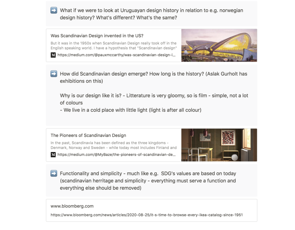
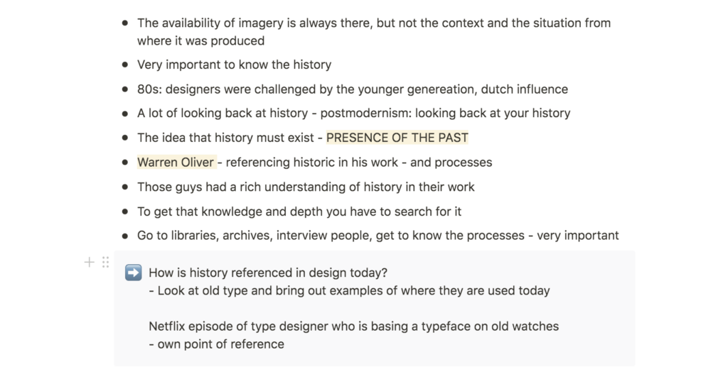
After WWII, Norway received economic support from USA and in the 50s, Norwegian economy began to stabilise (Låte et al. 2020). People started looking abroad and particularly looked at USA as a destination of exportation (Låte et al. 2020). A softer version of functionalism evolved in Scandinavia, and through an exhibition in USA and Canada, under the same name, the movement was named Scandinavian design (Låte et al. 2020).
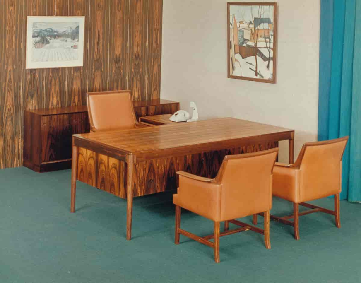
The foundation of Scandinavian design lies in the form of social democracy that emerged in the time period, and there was a notion of creating functional and affordable furniture for everyone, which were in line with the democratic social values (MyBaze 2015). As discussed prior in this blog post, design history often correlates with political ongoings of the period and so this was also true with the Scandinavian design movement.
Although this movement was evolved around furniture and glass works, I believe it’s played a vital role on todays graphic design scene in Norway. The notion of simplicity and functionality can be seen in all of the graphic design studios I chose for this week’s workshop challenge, and in SDG specifically, who’s process is based on Scandinavian design heritage. As mentioned previously, SDG uses simplicity in their approach, in order to focus on what’s key, resulting in functional design, much like in the Scandinavian design movement.
Anisdahl & Christensen: Norways first graphic design studio
Anisdahl & Christensen was created in 1966 as the first Norwegian graphic design studio (Smeby 2014). They were pioneers in the Norwegian graphic design industry and contributed to the establishment of Graphic Design as a profession (Smeby 2014).
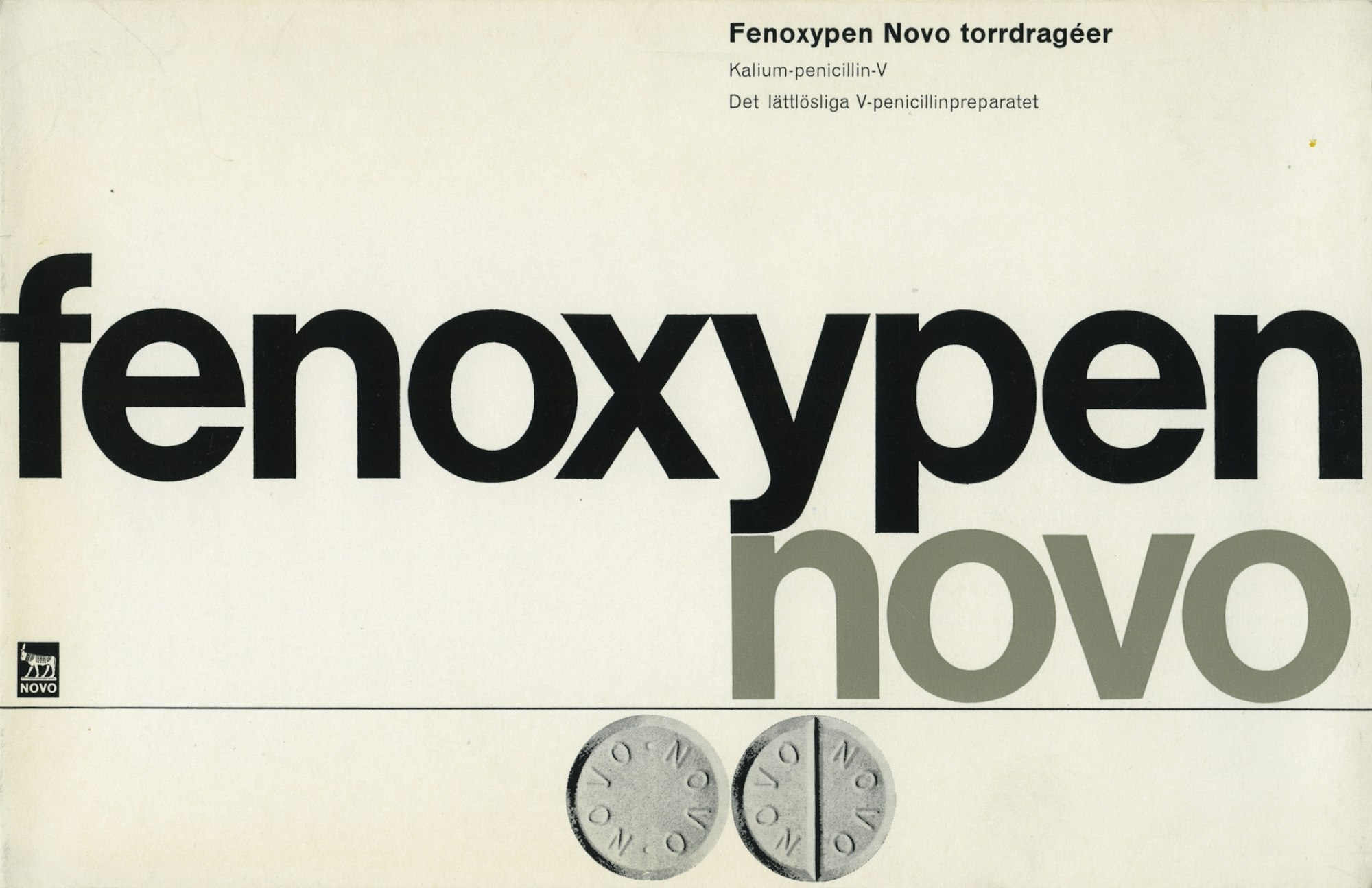
John Eggen: introducing corporate identity
One of the practitioners who initiated the ideas of corporate identity in Norway, was John Eggen (Grafill 2020). Today, the ability to create branding systems seem to be a given for Norways design studios, and so, I would claim that Eggen was a pioneer for the way Norwegian design studios work today. In 1973, Eggen worked with a team of designer on a new brand identity system for NSB (Norwegian railways), systemising all branding material in a brand book (Grafill 2020). An abstract of the guide book can be seen further up in this blog post in Further Research.
Tutorial with Paul
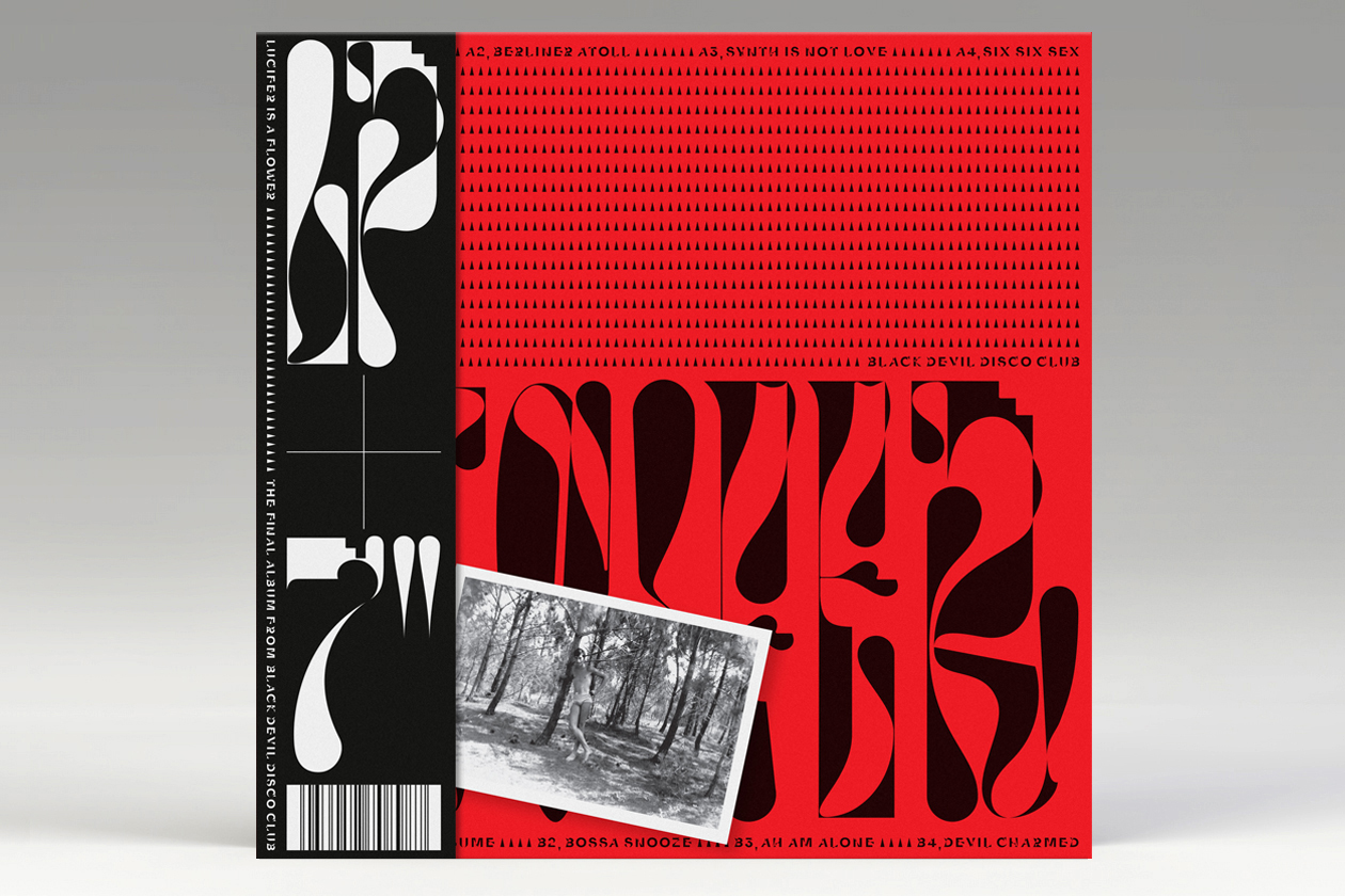
This week I scheduled a tutorial with Paul as I had a few general questions and wanted to get a sense of wether or not I was heading in the right direction with my work. Paul had some interesting suggestions of what I could research further like: what are the influences of the design companies from the weekly challenge?, how can you visualise your research? and what are you learning that you didn’t already know? He also suggested to look into a design studio, Non Format, and a record label, Small town super sound.
I found Non Format very interesting after having a look at what they do, and it turns out that they are actually partnered with ANTI, one of the design studios I looked at for the workshop challenge. Last week, I even looked at a collaborative project by ANTI and Non Format, so it was interesting to have a further look at Non Format. I particularly liked how experimental and expressive Non Format’s type work is.
Unfortunately I wasn’t able to take all of Paul’s comments into this blogpost, but I will keep them in mind for the next weeks. However, I have tried to answer the question “what are you learning that you didn’t already know” in my conclusion (as well as in some of the previous sections of this post). For the question “how can you visualise your research”, I’ve tried to use the map of the three design studios to visualise my conclusion. The question also inspired me to create mockups for the Typeface maker, which made me very keen to explore this project at a later time.
In conclusion
This has been a week of learning to me. I don’t believe I have ever looked into the history of graphic design, but I found it very interesting to read and learn about it this week. Finding good resources on Norwegian design was difficultly, but very interesting. Having to look for certain information meant having to look at a lot of irrelevant information as well, which was good, as it introduced me to new topics. This was how I discovered that there was an ongoing exhibition on typography in Oslo through 100 years, which was a great experience to attend. Seeing how typography used to look in the same streets that I walk today made me wonder about the streets of the future.
An important discovery this week, was my own reflection on branding of the future. The reflections on AI produced design and branding in a circular economy is something I would like to explore further in another project. Perhaps it could be interesting to create a system which produces custom typefaces? The refill experience is also interesting, and it would be great to explore this in a separate project as well.
The workshop challenge this week was an eye opener for me. Going into the challenge I wanted to look at three design studios that I thought of as very similar, but after reflecting and analysing them in detail, I realised that they were all very unique and quite different from each other.
In conclusion, this week has opened my eyes to graphic design history and made me realise that I have a lot more to learn about it. I think it’s important that I take the time to learn, especially about typography, as this is a big interest of mine.
REFERENCES:
BORE, Kristina Ketola and Maziar RAEIN. 2013. ‘Grafisk design som historie’. Grafill [online]. Available at: https://www.grafill.no/magasin/grafisk-design-som-historie [accessed 28 September 2020].
BORE, Kristine Ketola. 2015. ‘KVINNER I NORSK GRAFISK DESIGNS HISTORIE: ASHLEY BOOTH’. Grafill [online]. Available at: https://www.grafill.no/magasin/norsk-grafisk-designs-kvinner-ashley-booth [accessed 27 September 2020].
CORITA ART CENTER. 2016. Corita Kent Biography [Educational content]. Available at: https://www.youtube.com/watch?v=dPrdHnHrlnk&ab_channel=coritaartcenter [accessed 27 September 2020].
GOSLING, Emily. 2019. ‘By breaking the limitations of her medium—and those placed on women–Albers rewrote the rules for design’. AIGA Eye on design [online]. Available at: https://eyeondesign.aiga.org/anni-albers-the-designers-artist-who-put-women-on-the-grid/ [accessed 27 September 2020].
GRAS. 2017. ‘Gras’. Gras September 2017. Available at: http://www.grasgruppa.no/index.html [accessed 28 September 2020].
HOEFLER&CO. 2019. ‘Introducing Decimal’. Typography.com September 2019. Available at: https://www.typography.com/blog/introducing-decimal [accessed 28 September 2020].
IT’S NICE THAT. 2020. ‘The Graduates continued! Meet some more of the class of 2020’. It’s Nice That August 2020. Available at: https://www.itsnicethat.com/features/the-graduates-2020-continued-the-graduates-2020-170820 [accessed 27 September 2020].
LÅTE, Jon, Jan-Lauritz OPSTAD, Katrine KALLEKLEV and Mats LINDER. 2020. ‘Kunsthåndverk og design i Norge’. Store Norske Leksikon [online]. Available at: https://snl.no/Kunsth%C3%A5ndverk_og_design_i_Norge#-Scandinavian_design [accessed 28 September 2020].
MYBAZE. 2015. ‘The Pioneers of Scandinavian Design’. Medium April 2015. Available at: https://medium.com/@MyBaze/the-pioneers-of-scandinavian-design-feffe35c52d [accessed 28 September 2020].
RAEIN, Maziar and Susanna EDWARDS. 2020. ‘How Did We Get Here?’ [lecture]. GDE710 for MA Graphic Design Online Part-Time. Falmouth: Falmouth University, 25 September 2020.
SMEBY, Dorthe. 2014. ‘Intervju: Leif Frimann Anisdahl’. Grafill [online]. Available at: https://www.grafill.no/visuelt/magasin/intervju-leif-frimann-anisdahl [accessed 28 September 2020].
STORE NORSKE LEKSIKON. 2020. ‘Norsk kunsthistorie’. Store Norske Leksikon June 2020. Available at: https://snl.no/Norsk_kunsthistorie [accessed 28 September 2020].
TATE. 2018. ‘Anni Albers’. Tate October 2018. Available at: https://www.tate.org.uk/press/press-releases/anni-albers [accessed 27 September 2020].
LIST OF FIGURES:
Figure 1. Corita KENT. 1972. Come home America George McGovern. Corita Art Center [online]. Available at : https://corita.org/piece/72-17.
Figure 2. Anni ALBERS. 1962. Intersecting. The Josef and Anna Albers Foundation/Artists Rights Society (ARS), New York/DACS, London. Available at : https://www.artsy.net/artwork/anni-albers-intersecting
Figure 3. Unknown maker. 1994. Visual profile for the Olympics 94 [branding, photographed]. Grafill [online]. Available at: https://www.grafill.no/magasin/ashley-booth [accessed 28 September 2020].
Figure 4: Arve BÅTVIK. 2020. Skrift i Oslo [exhibition details]. Oslo: Grafill 21. Exhibition 24 September to 11 October 2020: Skrift i Oslo. Photograph taken by Ingrid Reigstad 26 September 2020.
Figure 5: Pedro DEL CORRO. ca. 2015-2020. Barbecue c.acebo 6. Pedro del Corro [online]. Available at : https://p-del.co/#top
Figure 6: Emil RUDER. 1957. 10 Zürcher Maler – Kunsthalle Basel. Typeroom [online]. Available at: https://www.typeroom.eu/in-grid-we-trust-emil-ruder-aka-the-iconic-pioneer-of-swiss-style
Figure 7: HOEFLER&CO. 2019. Decimal. Hoefler&Co [online]. Available at : https://www.typography.com/blog/introducing-decimal
Figure 8: HOEFLER&CO. 2019. untitled. Hoefler&Co [online]. Available at : https://www.typography.com/blog/introducing-decimal
Figure 9: WIX.COM. 2020. Create Your Own Logo with Wix Logo Maker. Available at : https://www.youtube.com/watch?v=740Rxv2I3xw&ab_channel=Wix.com [accessed 1 October 2020].
Figure 10: Ingrid REIGSTAD. 2020. Typeface Maker 1. Private collection: Ingrid Reigstad
Figure 11: Ingrid REIGSTAD. 2020. Typeface Maker 2. Private collection: Ingrid Reigstad
Figure 12: Ingrid REIGSTAD. 2020. Typeface Maker 3. Private collection: Ingrid Reigstad
Figure 13: FILL REFILL CO. 2020. Promotional animation for Fill. Fill Refill Co. [online, instagram]. Available at : https://www.instagram.com/p/CELx6T4nh70/
Figure 14: Ingrid REIGSTAD. 2020. Bleed entrance. Private collection: Ingrid Reigstad
Figure 15: BLEED. 2019. Big changes, easy peasy. Bleed Design Studio [online]. Available at : https://bleed.com/avo-consulting
Figure 16: Ingrid REIGSTAD. 2020. SDG entrance. Private collection: Ingrid Reigstad
Figure 17: Ingrid REIGSTAD. 2020. ANTI entrance. Private collection: Ingrid Reigstad
Figure 18: Ingrid REIGSTAD and Adam KROGH. 2020. Map of design studios. Private collection: Ingrid Reigstad
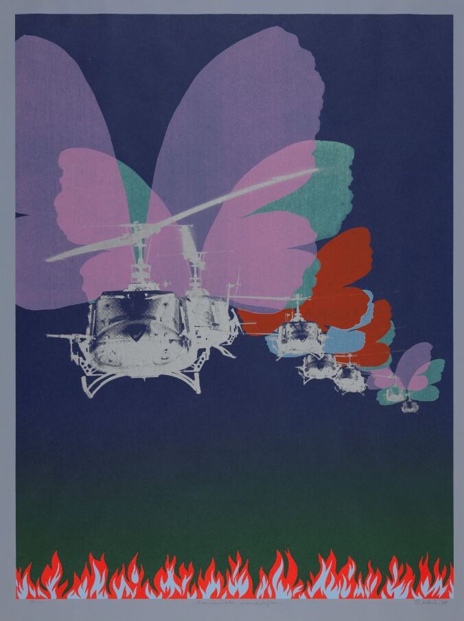
Figure 19. Per KLEIVA. 1971. Amerikanske sommerfuglar. Nasjonalmuseet [online]. Available at : https://www.nasjonalmuseet.no/samlingen/objekt/NG.K_H.1971.0266
Figure 20. Unknown maker. ca. 1960-1980. No title. [wood, leather]. Store Norske Leksikon [online]. Available at: https://snl.no/Kunsth%C3%A5ndverk_og_design_i_Norge#-Scandinavian_design [accessed 28 September 2020].
Figure 21. ANISDAHL and CHRISTENSEN. ca. 1966-1980. Fenoxypen Nevo. [visual identity]. Grafil [online]. Available at: https://www.grafill.no/visuelt/magasin/intervju-leif-frimann-anisdahl [accessed 28 September 2020].
Figure 22: NON FORMAT. 2020. Black Devil Disco Club — Lucifer Is A Flower. Non Format [online]. Available at : http://non-format.com/
[…] experiences As touched upon in last week’s blog post under further research, physical refill stations might also become more important in the […]