Since I had a limited amount of time for uni work in week 17 I have merged the blog post for week 17 and 18.
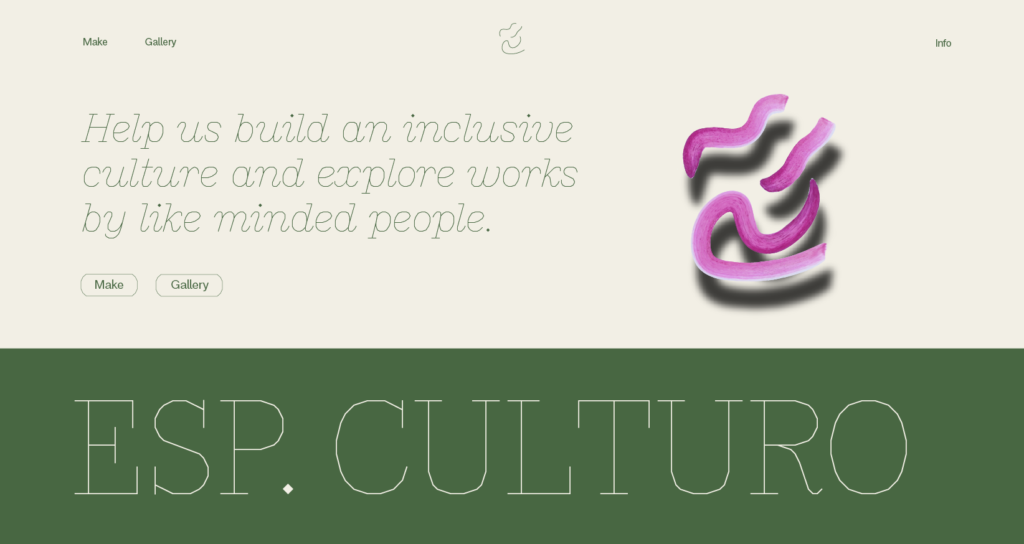
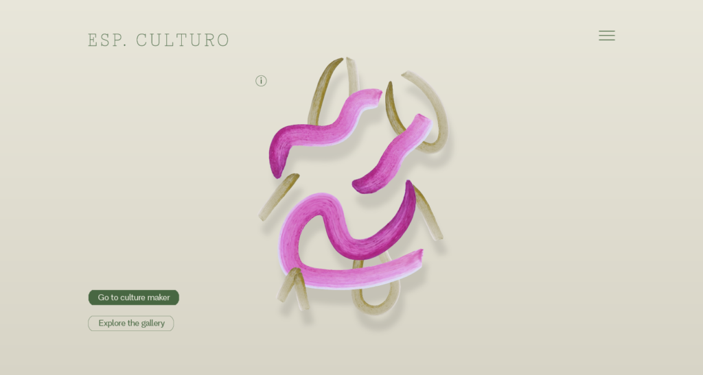
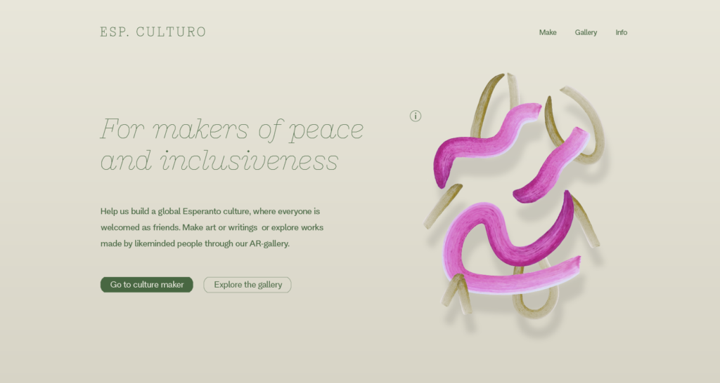
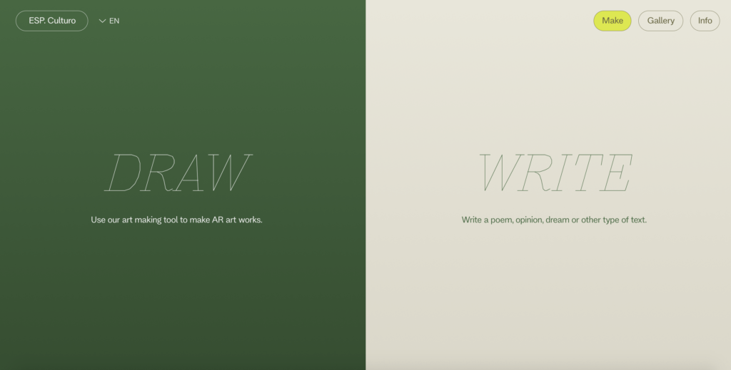
According to my outcome development plan it was now time to start working on the website prototype. Although I had established the main element of my project’s visual identity last week I still wanted to experiment with layout, in order to maintain a balance between edgy and welcoming (in order to target my personas, whilst also representing Esperanto).
I started by sketching various solutions for the front page:
Which I then used to develop digital sketches:
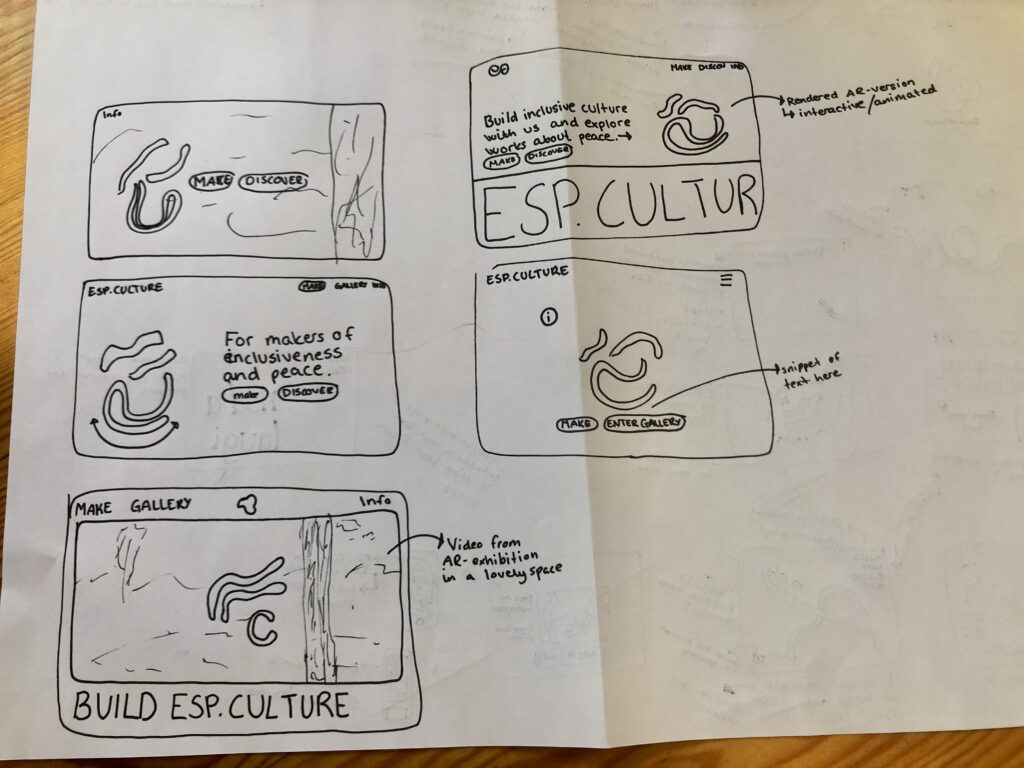
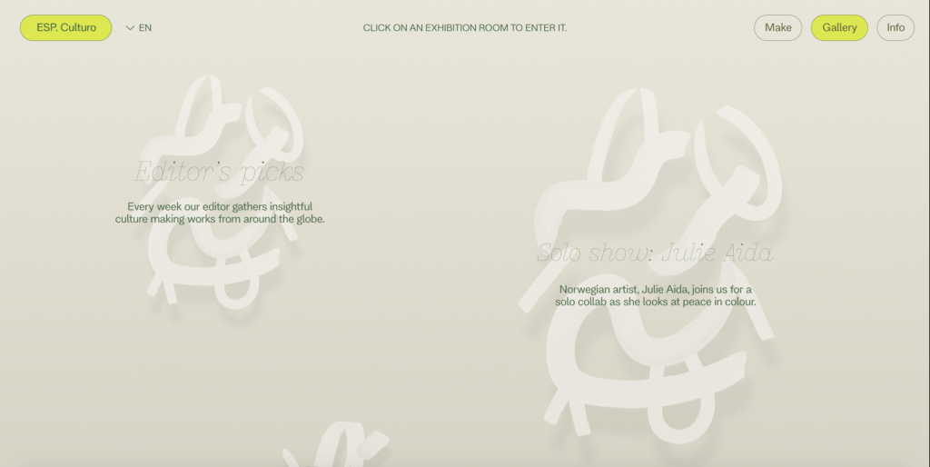
Having established a front page layout I went on to sketch solutions for the exhibition entering / room picking interface:
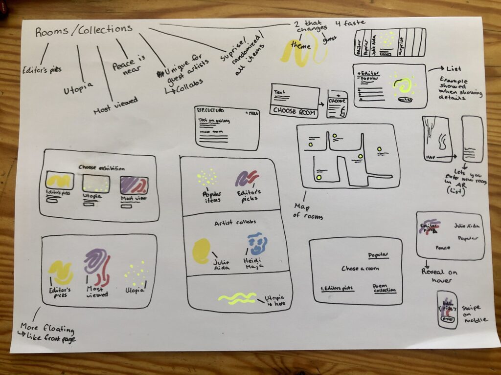
Some of these were also turned into digital sketches:
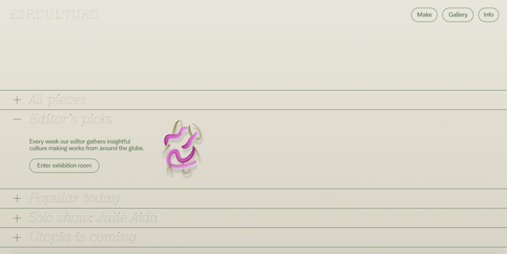
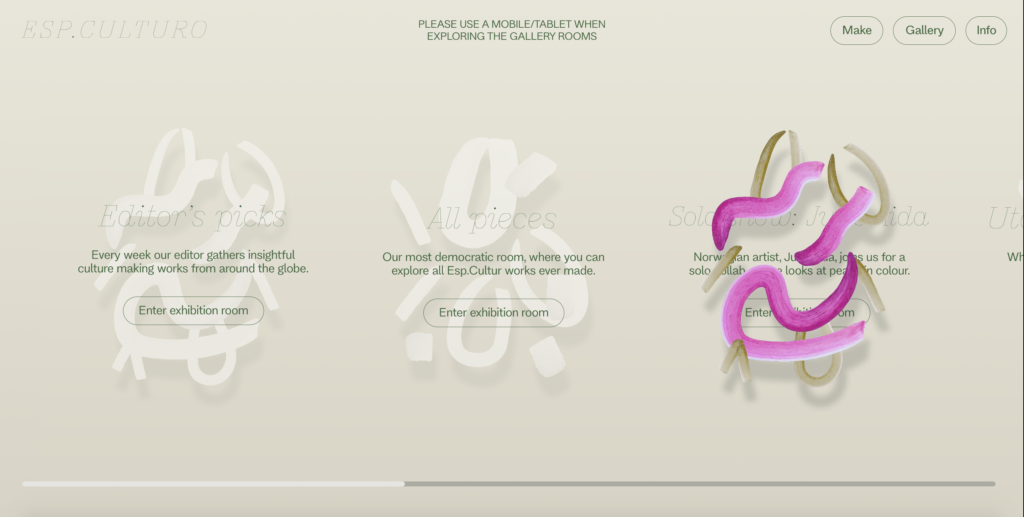
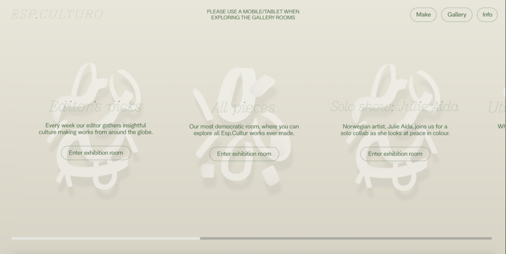
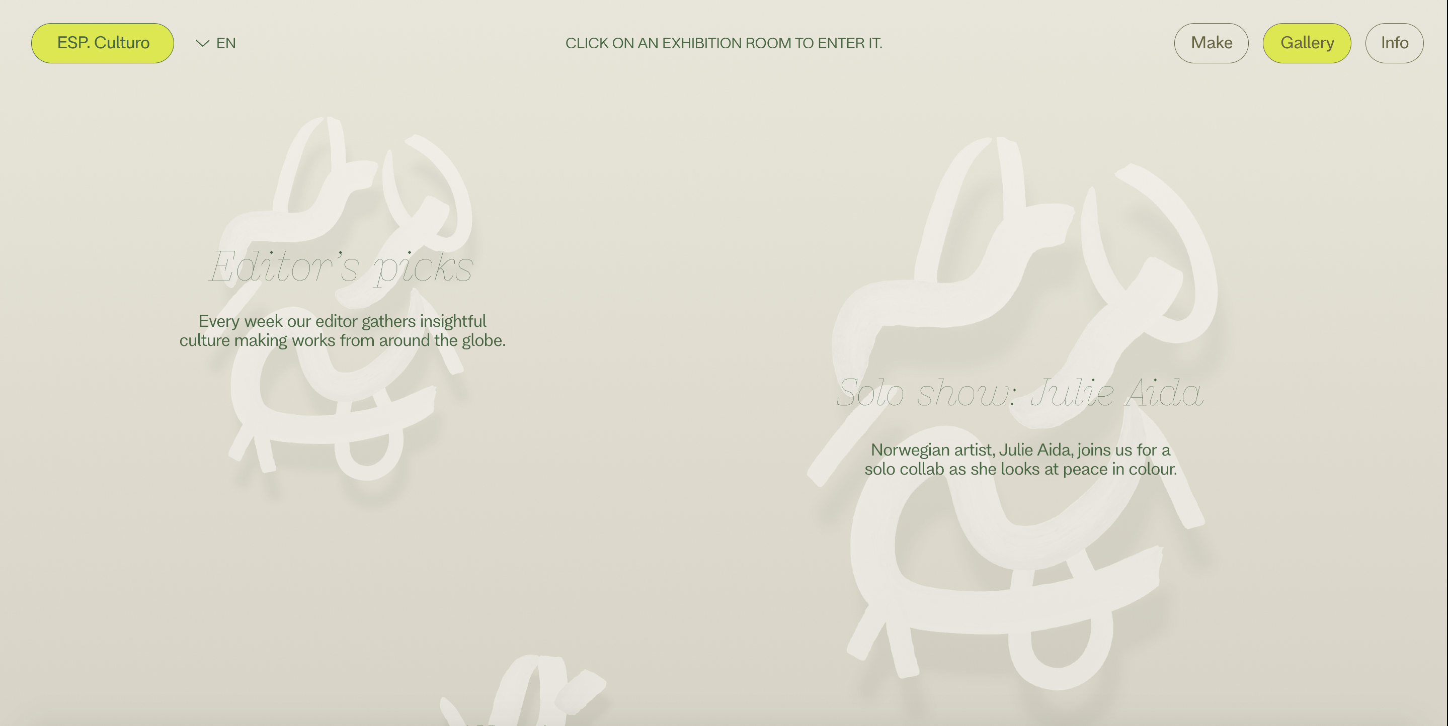
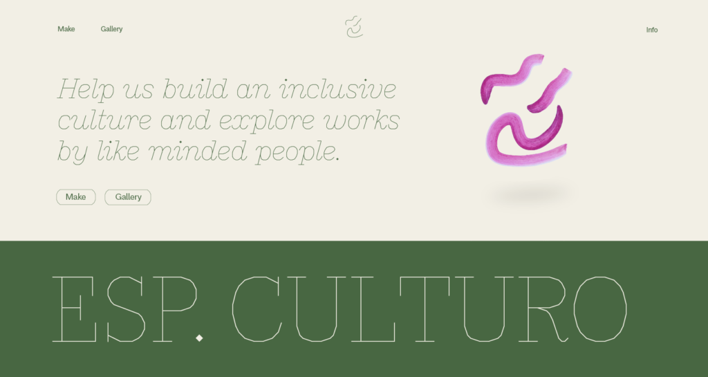
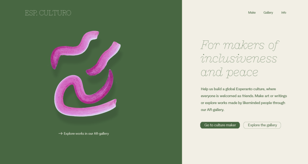
By experimenting with various layouts in Figma I eventually landed on a horisontal scroll where users would hover over each exhibition room to reveal a selected art work from that room (and then click on it to enter if they’d like to):
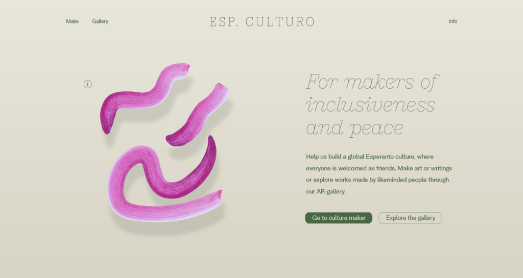
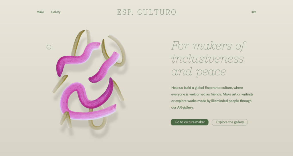
I was happy with the look of the white strokes and the hover effect, and thought it added a sense of uniqueness to the site. The horisontal grid layout however, felt a bit too rigid for the brand (as discussed previously, the brand should have a sense of fluidity). I also wasn’t feeling entirely satisfied with the colour profile as it felt a bit too bland. I therefore went on to experiment further with the design:
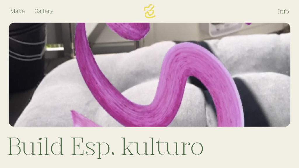
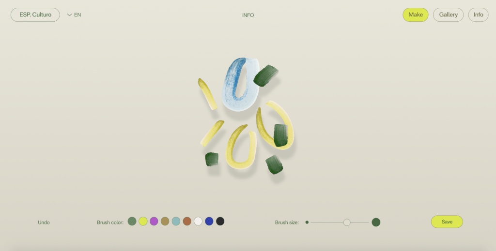
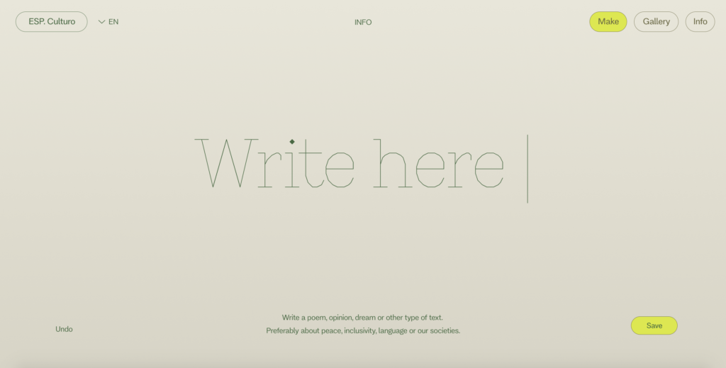
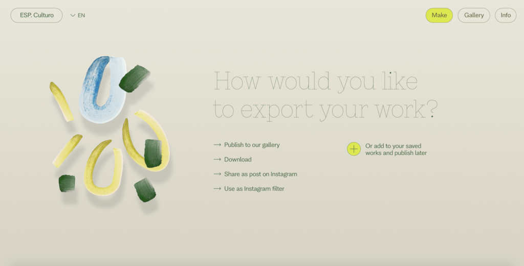
Further I went on to work on the making interface:
In conclusion
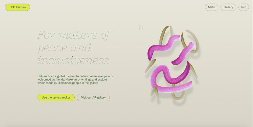
At this point I’m starting to feel quite happy about the visual identity of my project. The use of green hues ties in nicely with Esperanto’s historic colour use, whilst the neon details give the design a contemporary look which I think would resonate with my personas. The pointy heading typeface links nicely to the topic of maps and borders, resulting in a contrasting element to the more fluid illustrations. I hope the simplicity of the website can help users get to the gallery and the making tool easily and effectively.
My current worry for the design is that it’s not experimental and dynamic enough, considering it should really encourage play, idea development and societal discourse. I think branding issue comes down to my design process, which has been revolved around the idea of culture making, rather than the development of a strong brand in itself. If I can find the time I would like to experiment even further with the overall visual identity. There are however some key steps which I will have to prioritise in the following weeks, before I can expand on the visual design:
- Finishing my report
- Developing the AR interface and exhibition rooms
- Animation (I would at least like the flat illustrations to swirl or float around – this will also help make the website feel more dynamic)
- Gathering user outcomes (I have already reached out to friends, and moving forward I will make this an even larger priority)
LIST OF FIGURES:
Figure 1-8: Ingrid REIGSTAD. 2022. Prototype tests. Private collection: Ingrid Reigstad.
Figure 9-11: Ingrid REIGSTAD. 2022. Prototype tests 2. Private collection: Ingrid Reigstad.
Figure 12: Ingrid REIGSTAD. 2022. Prototype tests 3. Private collection: Ingrid Reigstad.
Figure 13-14: Ingrid REIGSTAD. 2022. Prototype tests 4. Private collection: Ingrid Reigstad.
Figure 15-18: Ingrid REIGSTAD. 2022. Prototype tests 5. Private collection: Ingrid Reigstad.