
Lecture notes
Lecture reflection
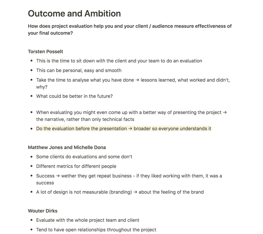
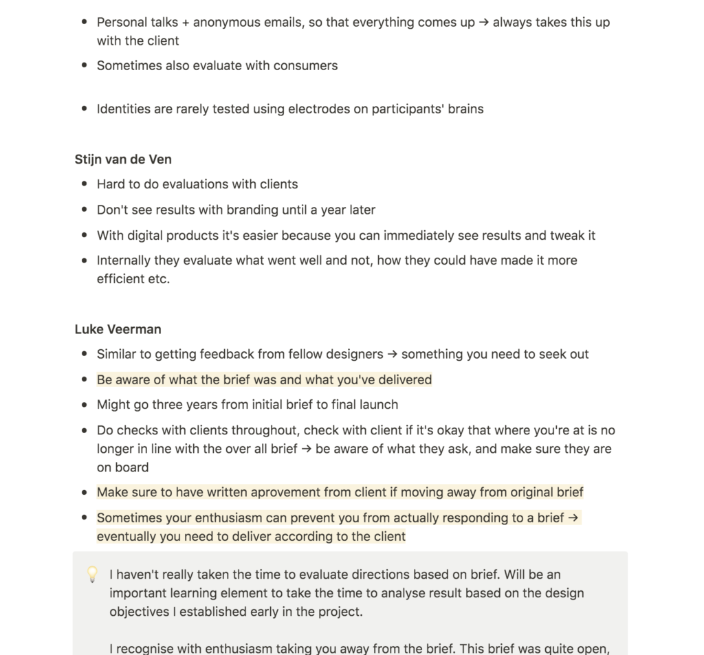
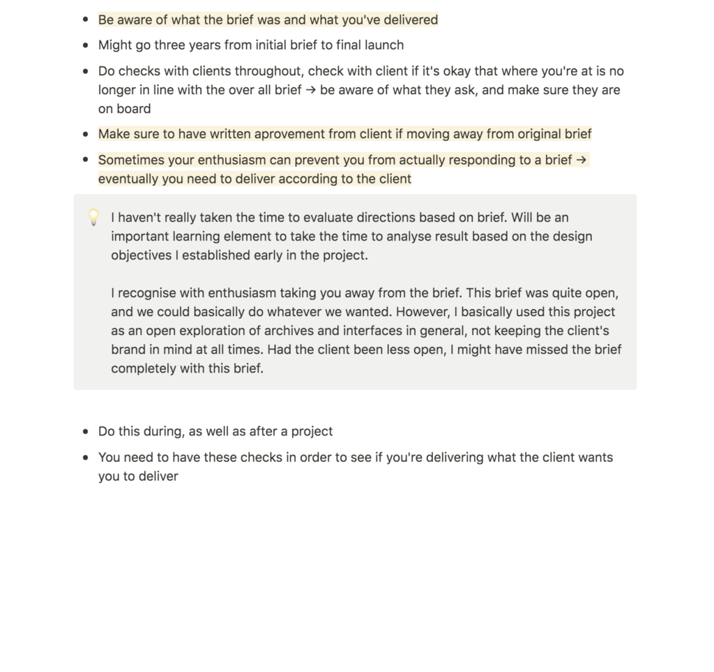
It was interesting to hear how differently each designer from the lecture evaluates their work and project successes. Luke Veerman had particularly interesting points, in that you should reflect on how well you’ve met the brief (Torsten Posselt et al., 2021). His discussions made me realise that I haven’t actually taken the time to reflect on my design objectives since week 8, and that it would have been good to do so.
We have had the crit sessions with John, who has seemed excited about my concepts. Had this been a real brief however, I think it could have been smart to follow Veerman’s advice of getting written sign offs on development, as my current project is of the more experimental sort. Although I think it’s at an interesting place, I know it’s not directly targeted at all audience groups, and this will be important to reflect on in this week’s workshop challenge.
Resource notes
Resource reflection
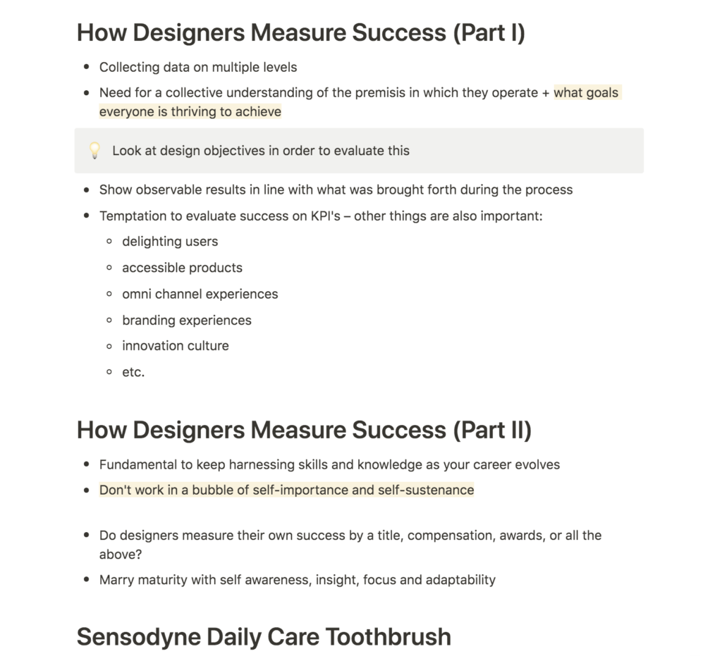
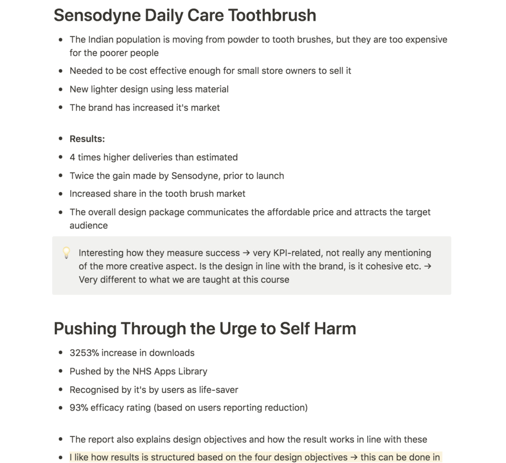
What I found interesting when looking at the three reports from this week’s resource list was how they measured success based on KPI’s, design objectives, user feedback and target audience adaption. The KPI success feels particularly abstract, as these sort of results are very different to how we evaluate our work on this course, where perhaps process, concept, communication and aesthetics are more important. Yet, I can of course understand why this is important to measure, as it speaks of the more specific success factors of a project (sort of as a right or wrong answer, rather than reflection).
Of course for this project, we’re not able to reflect on KPI’s, as the projects are hypothetical. What I’d like to do however, is to reflect on the project success based on my design objectives from week 6. This will be a good way of reviewing wether or not the project’s in line with the brief, but it might also teach me about how I work in regards to evolvement of my projects. Inspired by the self harm avoidance app report, I’m also eager to evaluate my project based on feedback collected over the last couple of weeks.
Workshop challenge
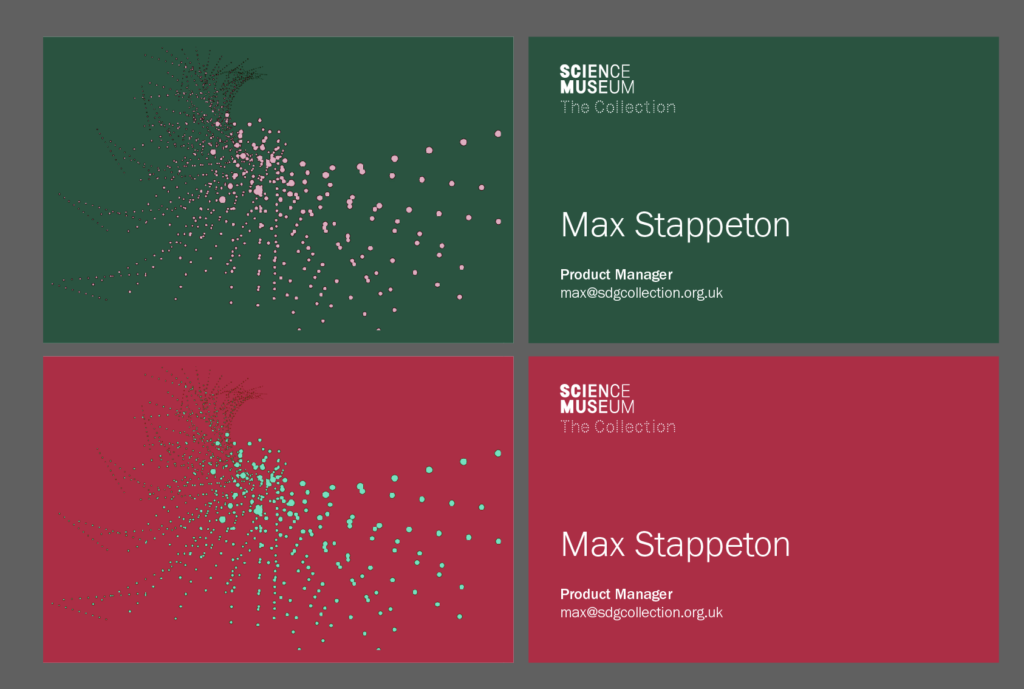
As mentioned in my conclusion last week, I felt like my final presentation (particularly the outside of internet applications) felt a bit flat and dark. I therefore wanted to experiment briefly with colour and lighter backgrounds, as well as overlays of the patterns.
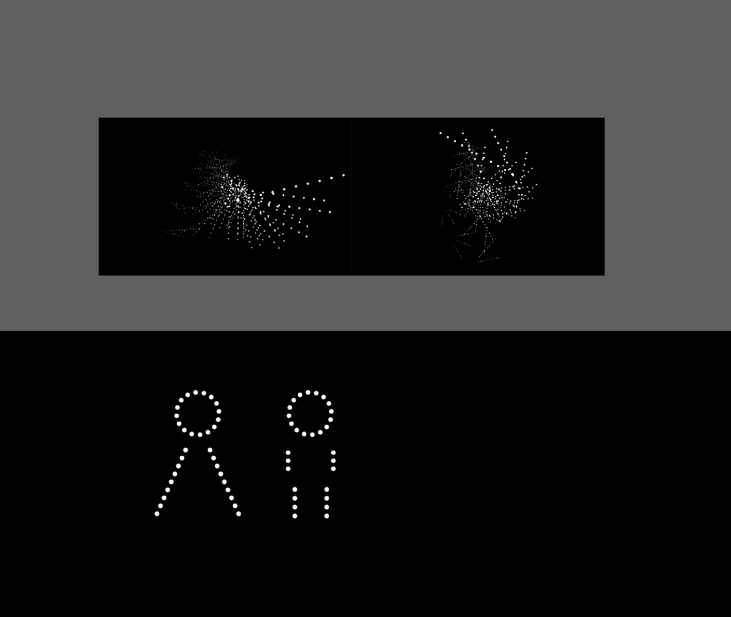
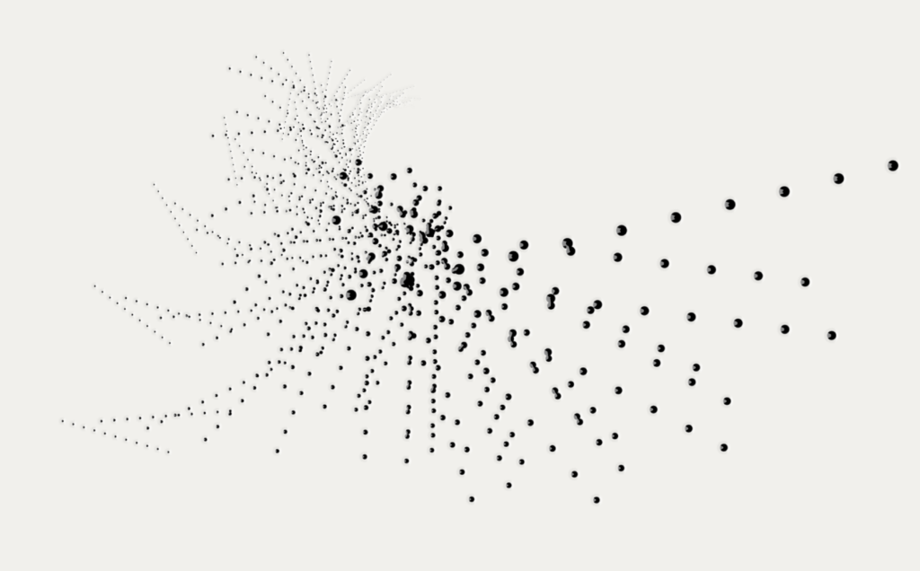
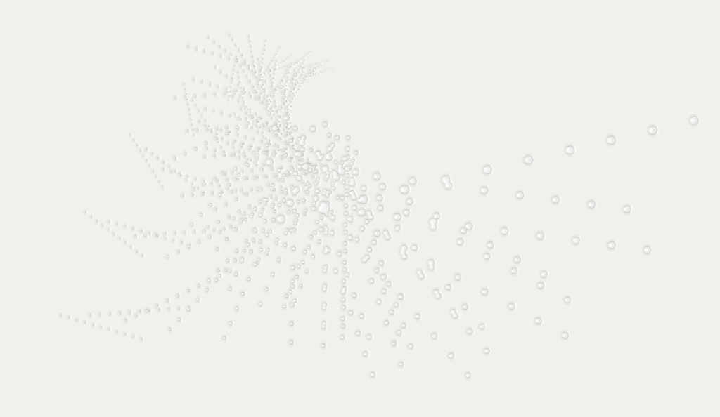
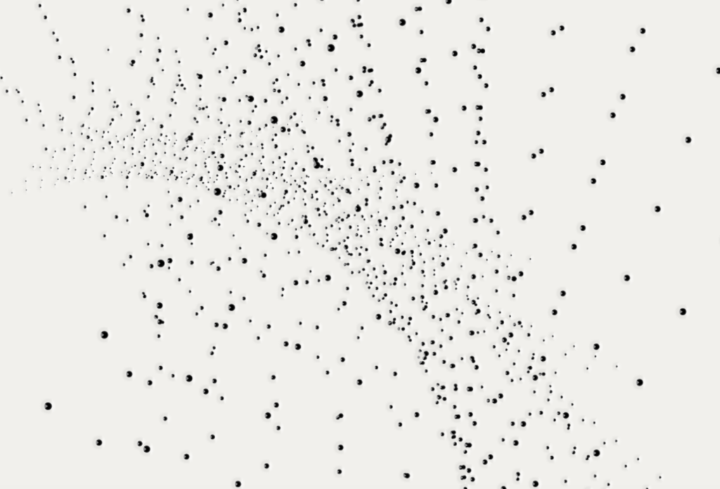
I was interested in bringing in a sensorial aspect as this was a large part of my concept. The above design by Kellenberger White made consider business cards which would react to touch – meaning colour would appear as a point cloud, reacting to the heat of users’ fingers.
I wasn’t feeling entirely sure about the designs, as they were drifting away from the interface design, and so I decided to ask for feedback on the ideas wall. People were generally positive, but Harriet suggested to explore adding an extra level to enhance the idea of movement. Wes suggested to use holographic foil to add colour.
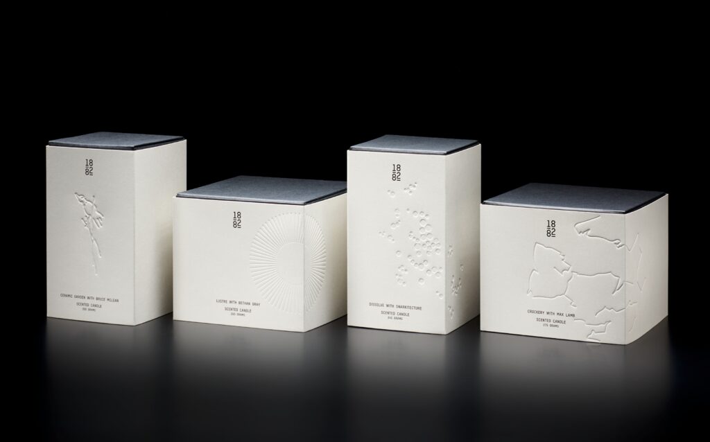
I liked the idea about using printing techniques to enhance the sensorial aspect in physical applications. I wondered wether I could use embossing rather than ink to illustrate the point cloud patters. As a reference I discovered the below design by Pentagram, with beautifully debossed packaging.
I went into photoshop ti experiment with ways of illustrating sensorial printing techniques, where I discovered the pillow embossed function. I thought this was a really nice way of adding a sense of touch experience to the business cards, and by keeping the ink, the pattern was also adding a visual element.
If I had more time I would have loved to experiment further with the physical applications, particularly by exploring various senses and how they could affect printed materials. I also would have liked to look at way finding and pictograms, in order to expand the visual identity system.
Evaluation notes and video
Having finalised my project (see Final result further down), I went on to write a list of evaluation notes, as asked for in this week’s challenge. The brief also asked us to gather feedback. However, I still had a range of feedback points from the session with John Stack, which I hadn’t had time to respond to. The teacher’s feedback, revolving around analytical users, was also very relevant still. Considering I had more than enough feedback to use in my evaluation, I prioritised spending my last bit of time refining the physical applications.
The time limitation of the video meant I couldn’t include the full evaluation in my presentation. I have therefore included all evaluation notes in the below Notion document:
Having written the above notes, I went on to summarise the evaluation in light of my concept process, which I then presented as a video:
Final Result Brief 2
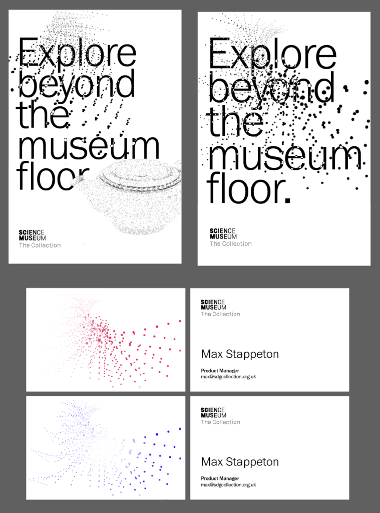
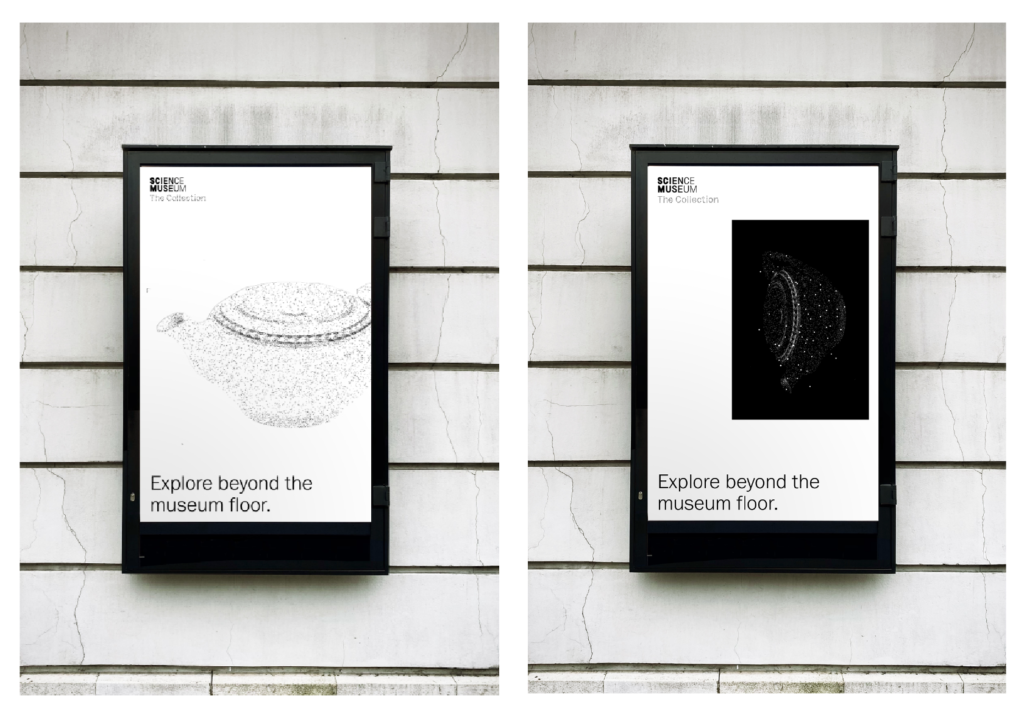
In response to the Science Museum brief, I have designed a digital interface, taking a sensorial approach to web design. I have also explored a holistic approach where I’ve expanded the project into a visual identity system for the archive, attempting to develop a stand alone system that also works within the Science Museum Group umbrella.
The final prototype can be seen and used here. Please keep in mind that the GIFs might take a while to load properly. Due to limitations in Figma, the hovered dots are not clickable. Please do therefore use the blue circle to enter the object page (not part of the actual design, but solely included to enable object page entry).
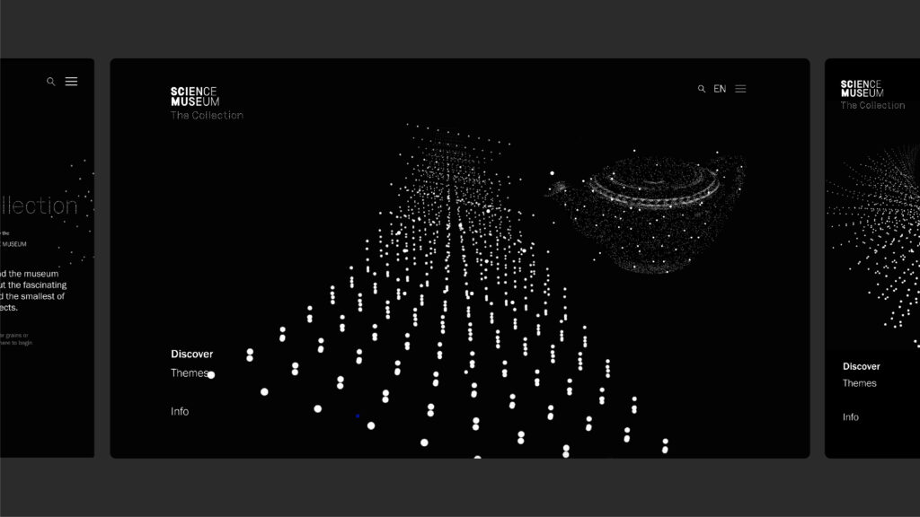
Fig. 12: Reigstad 2021. The Science Museum Delivery
Fig. 13: Reigstad 2021. The Science Museum Delivery
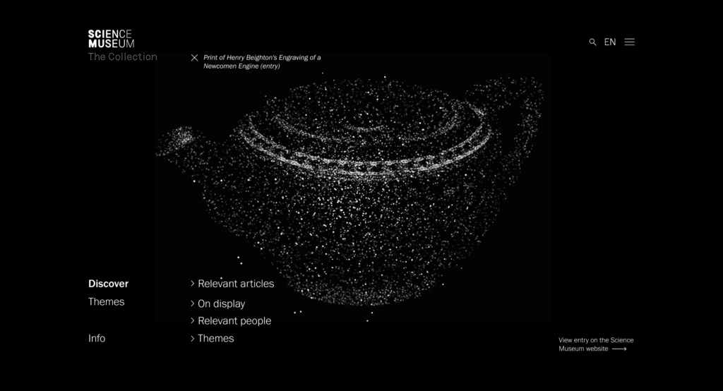
Fig. 14: Reigstad 2021. The Science Museum Delivery
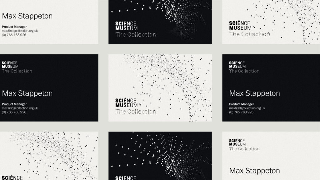
Fig. 15: Reigstad 2021. The Science Museum Delivery
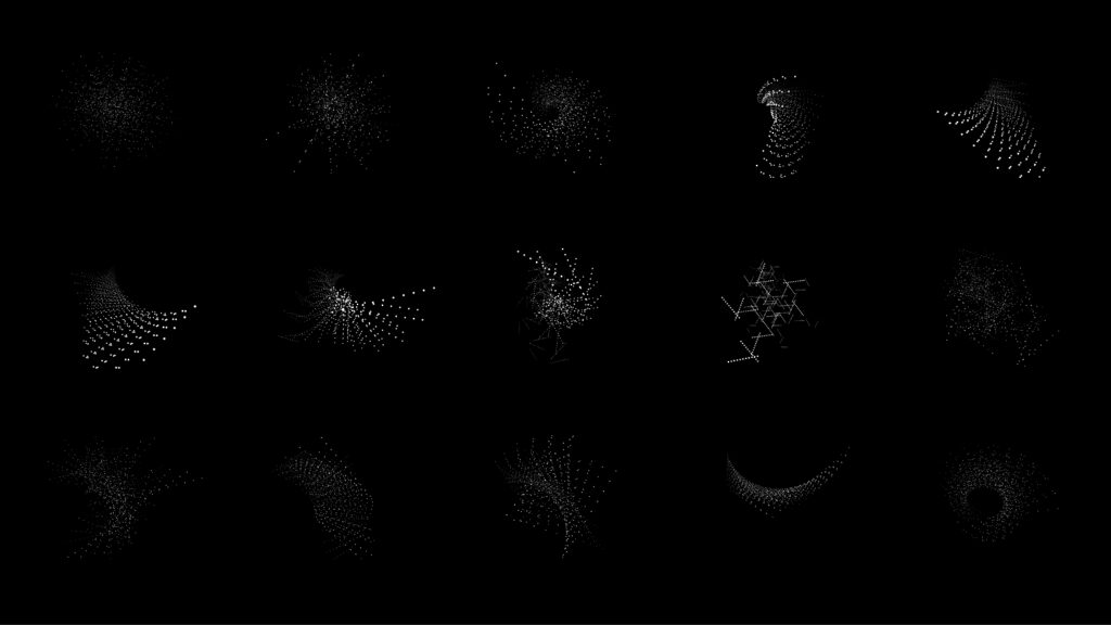
Fig. 16: Reigstad 2021. The Science Museum Delivery
Fig. 17: Reigstad 2021. The Science Museum Delivery
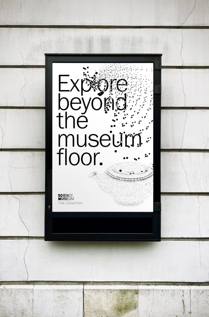
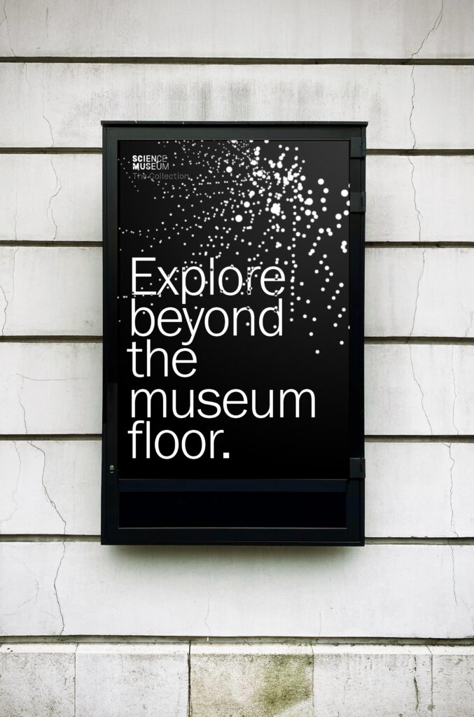
Fig. 18-19: Reigstad 2021. The Science Museum Delivery
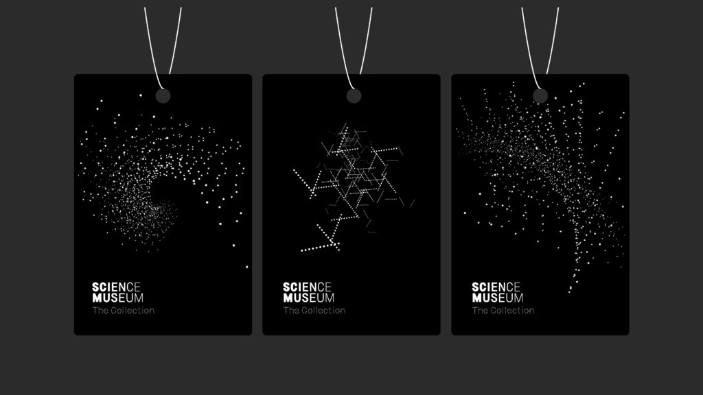
Fig. 20: Reigstad 2021. The Science Museum Delivery
Fig. 21: Reigstad 2021. The Science Museum Delivery
Fig. 22: Reigstad 2021. The Science Museum Delivery
In conclusion
This project has been an amazing learning experience as it’s challenged my comfort zone on so many levels. I have expanded my skillset in web design and animation, as well as in visual identity development and systematic approaches. It’s been challenging to stick with such a long project, but it’s also been rewarding to have the time to develop it to the extent where I’ve created a working prototype, as well as the beginning of a visual identity.
If I had more time I would have loved to explore ways of addressing both snackers and vultures, as well as analytical users, who might not want to use a visually based interface. I’m not sure if it would have been possible within the concept restrictions, yet it would have been vital for a real life project. An organisation’s website should really be targeted towards all of their audiences, which mine currently isn’t. As an expansion I would have liked to user test my final prototype in order to see wether or not a point cloud actually works as a discovery tool. It is possible that the current website is too confusing for people to use.
Technically it would have been great to experiment further with animations and programming, as a way of making the explosion of point clouds more realistic. I also would have liked to adopt more sensorial approaches in my physical applications, especially by looking at projection and installation for the sensorial aspect of the project.
I think the three stages of audience and stakeholder feedback has been vital to the successes of this project. Without Ben’s advice on point clouds and photography avoidance, the interface would have been way less successful. Stack’s observation of how you begin to see something of the form also made me realise that solely using point clouds offers a new way of looking at objects, which I think is the main strength of the project.
Moving forward I hope to take with me the explorational and systematic approaches to design that I have used for this project. I also take with me the importance of collaboration and involving others in your process, even if you’re not at a finished stage within your project.
REFERENCES:
Torsten Posselt et al. (2021) ‘Outcome and Ambition’. Canvas Falmouth Flexible [online], 3 December.
LIST OF FIGURES:
Figure 1. KELLENBERGER WHITE. 2017. Accidental Records. Kellenberger White [online]. Available at: https://kellenberger-white.com/project/ellen-gallagher-accidental-records/
Figure 2-6: Ingrid REIGSTAD. 2021. Science Museum iterations. Private collection: Ingrid Reigstad.
Figure 7. Domenic LIPPA. Ca. 2010-2021. 1882 Ltd. Pentagram [online]. Available at: https://www.pentagram.com/work/1882-ltd
Figure 8-10: Ingrid REIGSTAD. 2021. Embossing experiments. Private collection: Ingrid Reigstad.
Figure 11: Ingrid REIGSTAD. 2021. Week 12 Presentation. Private collection: Ingrid Reigstad.
Figure 12: Ingrid REIGSTAD. 2021. The Science Museum Delivery. Private collection: Ingrid Reigstad.
Figure 13: Ingrid REIGSTAD. 2021. The Science Museum Delivery. Private collection: Ingrid Reigstad.
Figure 14: Ingrid REIGSTAD. 2021. The Science Museum Delivery. Private collection: Ingrid Reigstad.
Figure 15: Ingrid REIGSTAD. 2021. The Science Museum Delivery. Private collection: Ingrid Reigstad.
Figure 16: Ingrid REIGSTAD. 2021. The Science Museum Delivery. Private collection: Ingrid Reigstad.
Figure 17: Ingrid REIGSTAD. 2021. The Science Museum Delivery. Private collection: Ingrid Reigstad.
Figure 18-19: Ingrid REIGSTAD. 2021. The Science Museum Delivery. Private collection: Ingrid Reigstad.
Figure 20: Ingrid REIGSTAD. 2021. The Science Museum Delivery. Private collection: Ingrid Reigstad.
Figure 21: Ingrid REIGSTAD. 2021. The Science Museum Delivery. Private collection: Ingrid Reigstad.
Figure 22: Ingrid REIGSTAD. 2021. The Science Museum Delivery. Private collection: Ingrid Reigstad.