
Lecture notes
Lecture reflections
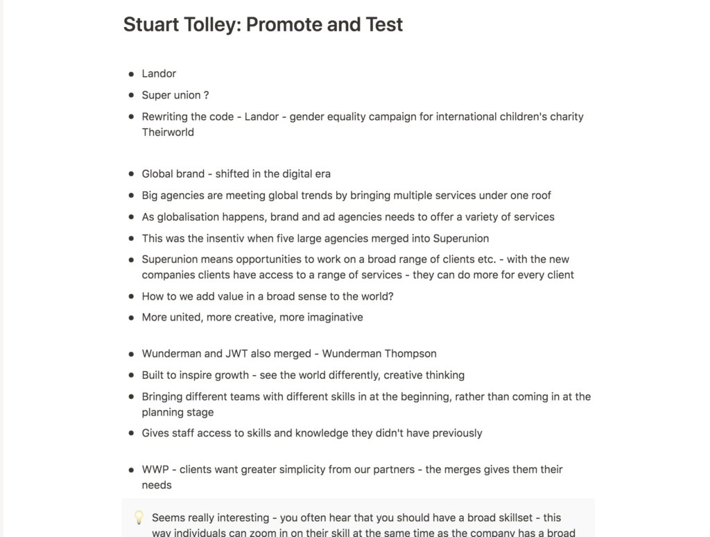
Tolley’s discussions on the merging of design studios was very interesting in light of designers’ skillsets (Stuart Tolley, 2021). As a young designer, I often get the impression of one having to adopt a broad set of skills in order to be successful. However, when studios with different specialisations merges, it’s almost as if they become this ideal of the multi skilled designer, but without each individual having to work in a broad manner.
Designing for your audience
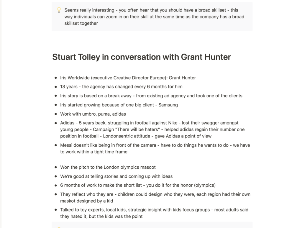
I also enjoyed hearing about Hunter’s work with the London Olympics mascot (Stuart Tolley and Grant Hunter, 2021). By gaining strategic insights from kids, Iris was able to create a mascot that worked for their target audience (Stuart Tolley and Grant Hunter, 2021). The fact that most grown ups hated the mascot (Stuart Tolley and Grant Hunter, 2021) goes to show why user insight is so important – certain people might love your design, but if your target audience doesn’t, the design is essentially bad.
Even though I might not get the time, I would have liked to test my design amongst the target audience for SAMLA. Luckily I did get a chance to perform a brief test by text last week, but I imagine that doing a face to face test would have helped me discover more issues, rather than just positive feedback.
Resource notes
Resource reflections
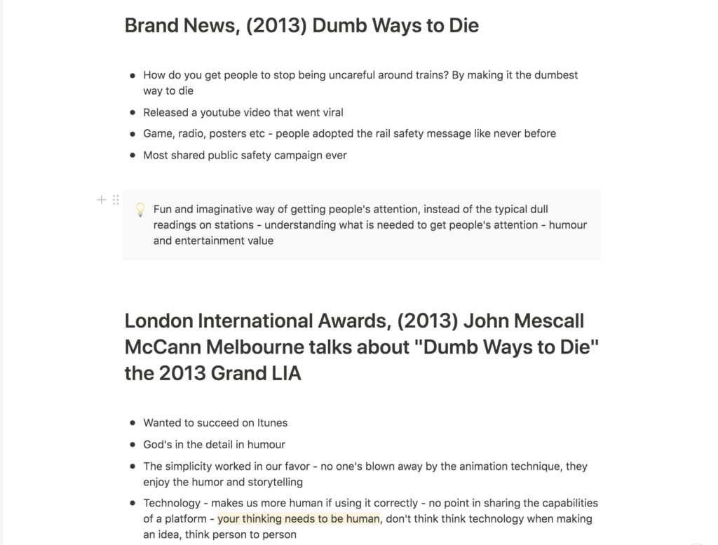
Dumb Ways to Die
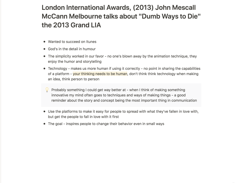
I think the Dumb Ways to Die campaign was a fun and imaginative project which, through humor, managed to get people’s attention on a much broader scale than what Metro Trains would have gotten by simply reading out a notice message on train stations. I’m inspired by how they managed to give such an otherwise dull message such great entertainment value.
Story first
I personally love to experiment with design techniques, and so I do often find myself thinking about technology when developing an idea. Mescall’s notion of human thinking was therefore an important reminder that it’s the story that plays the real difference in good communication (John Mescall, 2013). Looking back at my process for this brief, I wonder what would have happened if I considered SAMLA’s story before developing ideas of it’s technical features, like the sizing calculator and filtering options.
Further research
Inspired by Tolley’s mentioning of case study videos, I decided to research further into design case studies, but also short videos in general and how one might play with this medium.
Superunion: The Breakup Coloring Book
Fig. 1: Superunion 2021. The Breakup Coloring Book.
In light of Mescall’s discussions on human thinking, this project by Superunion is very interesting. By designing a coloring book for the heartbroken, Superunion appeals to the human benefit of coloring, meditation, which one might look at as a cure for feeling low in itself. The global aspect of displaying different nationalities’ consolation sayings, also suits Tolley and Grant’s discussions on global design, and how our ways of communicating human feelings changes from culture to culture (Stuart Tolley and Grant Hunter, 2021).
La Matriz
Fig. 2: Superunion 2020. La Matriz.
This case study video, also by Superunion, is a great example of how one could create a more exciting presentation of a design solution. The upbeat tempo emphasises the project’s liveliness, and suits the energetic solution. This has really inspired me to create a case study video which fits the atmosphere and core values of SAMLA for this week’s workshop challenge.
Arket: selling a feeling
Fig. 3: Arket 2020. Every Day Denim – 100% Organic Cotton.
I really love Arket’s ability to convey a feeling through their video ads. To me, they are like pieces of art, rather than clothing ads, which somehow makes them more appealing (perhaps because I’m not noticing that I’m being sold something). The videos are not just selling a jacket or shirt, they are selling a mood, feeling and lifestyle.
The way the Upcycled Down video uses sounds of the material is very cleaver. The sounds are calming, and since they represent the garment, they are in a way communicating how this jacket can bring calmness to your life. It’s focus on nature also fits the sustainable theme. The Everyday Denim Campaign is more fun and I love the 70s styling of it. If I had time to film models for my video, it would have been very cool to play with fashion eras through styling, in order to make vintage appear fun and stylish. By combining fun and diverse video recordings with short messages set in white letters, Arket manages to say a lot, without giving the viewer too much verbal information. This has got me wondering wether I could try to make a case study video with minimal amounts of wording by focusing on more aesthetic ways of communication.
Workshop challenge
This week’s task asked us to analyse our product through a video case study, yet it also asked us to look at ways of selling your brand. My initial impression was therefore to look at the video in two parts (which could work together): a video ad for the brand and a case study analysing the issue and solution details.
After seeing Arket’s Upcycled Down video, I got the idea of experimenting with juxtaposing sound and image. The calm sounds of the materials almost stroke me as the models’ mental state. This was something I wanted to explore further.
Harley Weir
Harley Weir is a photographer who also produces lovely films. I love her atmospheric approach to both formats, and the way she juxtaposes sounds and image is fascinating. In my tutorial with Paul this week, we discussed ideas of communicating the feeling of SAMLA, rather than being too literal. Weir’s videos often have a surreal feeling, which adds a lot of atmosphere. Since fashion balances between the worlds of function and art, it has the advantage of getting away with being experimental, and I therefore think surrealism suits fashion branding well.
Concept development
This week’s ideation was more literal than visual as I mainly brainstormed ideas by writing and reflecting in my digital notebook. I knew that I wanted to experiment with sound and image juxtapositions, and through my literal reflections I came up with the two following ideas for narratives:
A collection of sounds
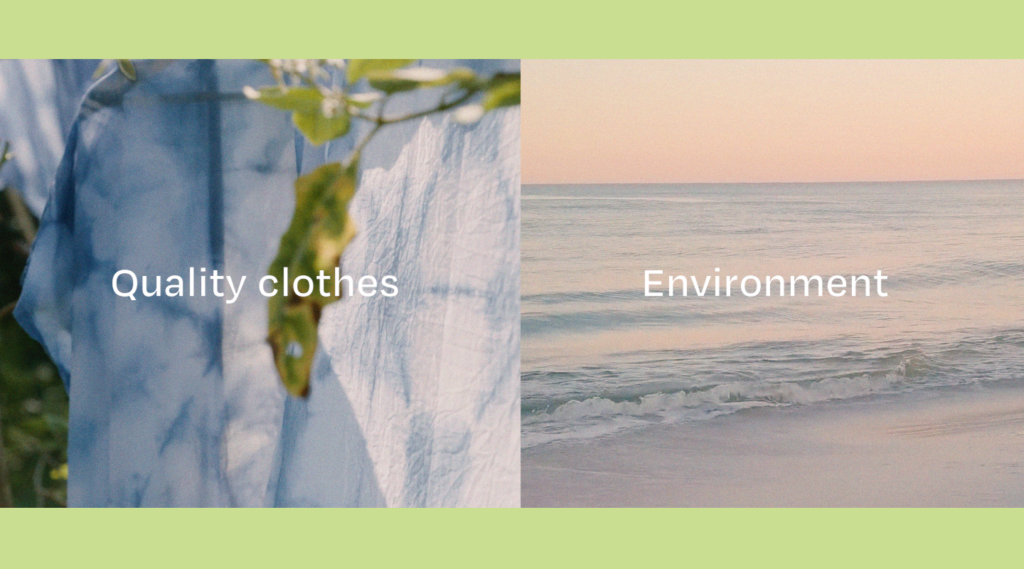
Since SAMLA means collected/gathered, I got the idea of collecting sounds from people’s lives. These sounds would be traces of the previous owners’ lives, just like the clothes themselves have traces from the previous owners’ lives. The sounds could build up to lots of overlaid sounds which would eventually “turn” into a song, or they could be calm sounds of people and nature, representing the worry free act of shopping second hand (as one is saving the environment, but also as SAMLA is designed to be easy and low risk for consumers).
The imagery could consist of modern people wearing the clothes. Thus, the sounds and imagery results in juxtapositions of different places in time, both of which the clothes have experiences.
I also had the idea of only using one video recording, of a garment blowing carefully in the wind. The sounds would then represent the time passing, whilst the garment stays the same as people’s lives pass.
Mirroring effects
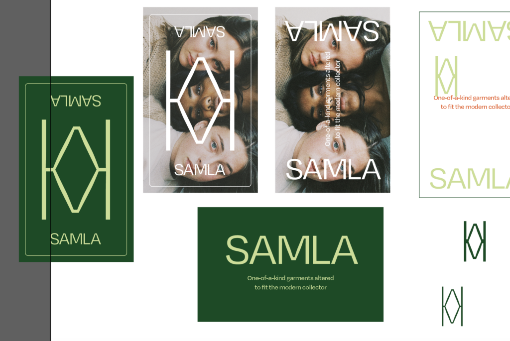
Through discussions with Paul, I also considered looking at mirrors, inspired by the mirrored M-symbol from last week’s experimentation. I really liked the idea as it works as a metaphor on several levels: the “2nd” in second hand, the idea of a garment being used again, the mirroring in a clothing shop etc. I could reflect both graphics and video, which could result in some fun experiments. The image below is a great example of how one can use mirroring to create beautiful and intriguing visuals.
Video development
I decided to go with the Collection of Sounds concept, as I thought this had the most potential to communicate the atmosphere I want SAMLA to convey. I downloaded a bunch of sounds and started putting them together, trying to build a rhythm, which would eventually translate into a song. I’ve never worked with sound design in this way, and so I struggled with building the atmosphere I was looking for. There was not as much of a build up as I was hoping for and the sounds did not transition into the song smoothly.
The visual clips have been collected from the creative commons license website, Pexels, since I wasn’t able to set off enough time to film these myself. I tried to look for clips which could represent small aspects of people’s lives (a hug, listening to music in your room, exploring nature etc.), following up on the idea of juxtaposing different moments in time. I also edited the clips to look analogue, using colour and grain, so they would be in line with SAMLA’s established photography style, elaborated on last week.

The video recordings used in this work were collected from websites with a creative commons license, and were not created by me.
The video recordings used in this work were collected from websites with a creative commons license, and were not created by me.
After creating my draft for the ad section of the video, I went on to work with the case study. I started off by writing a script for my narration, where I tried to highlight the issues, my solution and potential pitfalls of SAMLA. The video had to follow the visual identity of the SAMLA platform, so the visual work mainly consists of experimentation with layout, size and combinations of text, image and sound. I tried to emphasise my narration by using text and symbols so that the user wouldn’t zone out of the video. The imagery is a combination of screen recordings and atmospheric video, collected from Pexels. I have tried to shift between these in order to keep the video dynamic and varied.
The video recordings used in this work were collected from websites with a creative commons license, and were not created by me.
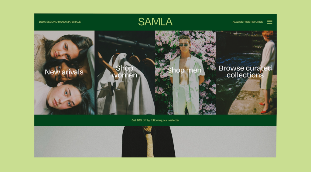
The result is a case study video with two sections: a video ad and a case study analysis. The ad features a collection of sounds from people’s lives, which suits the brand as SAMLA means collected/gathered. These sounds represent traces of the previous clothing owners’ lives, just like the clothes themselves have traces of previous wear. The imagery consists of moments from the new owners’ lives. Thus, the sounds and imagery results in juxtapositions of different places in time, showing the timelessness of the garment as an object. By focusing on the feeling of SAMLA, the ad is designed to be an extension of the platform itself. The case study section of the video goes into detail about my design process. It analyses the issues discovered, my solution and potential flaws with the service platform.
The video recordings used in this work were collected from websites with a creative commons license, and were not created by me.
In this week’s webinar, I realised that I had misinterpreted this week’s challenge slightly. We were not actually supposed to create an ad without narration and the time restriction was stricter than I had thought. I therefore cut down my video to consist of the case study only, which led to my final result.
Final result
In my final case study video, I have attempted to portray my design process and final result for brief 3. I have followed SAMLA’s visual identity in my video design, in order to create cohesiveness.
The video recordings used in this work were collected from websites with a creative commons license, and were not created by me.
In conclusion
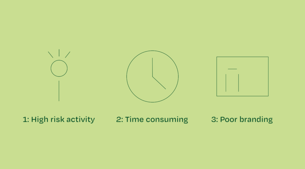
Since I spent most of my development process on the video ad concept this week, the case study video lacks a unique concept. If I hadn’t misunderstood the priorities of this week’s challenge, I would have loved to spend more time on motion graphics. This could have let me come up with ways of portraying the narrative in a more unique way, perhaps by bringing in creative solutions to conveying information. The La Matriz case study video by Superunion would have been a great reference point for this type of work.
In terms of my video ad, I would have loved to shoot my own video footage if I had the time and resources. I also would have liked to experiment more with sound design in order to create a more professional result. Further, the link between sound and imagery could have been clearer for users to understand the concept better. I also think the video looks and feels a bit too similar to my reference video from Arket. I therefore would have liked to experiment further with sound, imagery and graphics in order to move away from this. Although we weren’t actually supposed to use video without narration, I would have loved to work further on combining the concepts for the ad and the case study sections, in order to enhance cohesiveness (if only for personal development).
In terms of testing for potential pitfalls, I could have worked harder. Although I performed a quick user test of my visual identity last week, it would have been useful to test the UX on users, but also to do a face to face interview about the branding. This could have helped me discover further issues with SAMLA.
Although the SAMLA ad didn’t make it to my final case study video, I have really enjoyed making it. It was fun to develop a video concept and I think the video has helped elongate the branding of SAMLA by establishing a brand feeling and atmosphere. The sound design is not super professional, but I am quite happy with the surreal and experimental essence of it. Over all I think the video content developed this week has been successful in showing the functions and visuals of the SAMLA platform, and it’s been interesting to work with a different medium from what I’m used to.
REFERENCES:
John Mescall (2013) John Mescall McCann Melbourne talks about ‘Dumb Ways to Die’ the 2013 Grand LIA. London International Awards. Available at: https://www.youtube.com/watch?v=RrGWwSJL0yI&ab_channel=LondonInternationalAwards (Accessed: 24 April 2021).
Metro Trains (2013) DUMB WAYS TO DIE – case study. Available at: https://www.youtube.com/watch?v=IxZ_ZznO2ek&t=1s&ab_channel=BrandNews (Accessed: 24 April 2021).
Stuart Tolley (2021) ‘Promote and Test’. Canvas Falmouth Flexible [online], 23 April.
Stuart Tolley and Grant Hunter (2021) ‘Stuart Tolley in conversation with Grant Hunter’. Canvas Falmouth Flexible [online], 23 April.
LIST OF FIGURES:
Figure 1. SUPERUNION. 2021. The Breakup Coloring Book. Vimeo [online]. Available at: https://vimeo.com/519878833
Figure 2. SUPERUNION. 2020. La Matriz. Vimeo [online]. Available at: https://vimeo.com/420225134
Figure 3. ARKET. 2020. Every Day Denim – 100% Organic Cotton. YouTube [online]. Available at: https://www.youtube.com/watch?v=7YbdMjGgpIk&ab_channel=ARKET
Figure 4. Adrian LEVANDER. 2020. ARKET – Upcycled Down. Vimeo [online]. Available at: https://vimeo.com/channels/1511950
Figure 5. Harley WEIR. 2016. Depth – Christine Sun Kim. YouTube [online]. Available at: https://www.youtube.com/watch?v=oM5fnbfWlUE&ab_channel=VICEJapan
Figure 6: Ingrid REIGSTAD. 2021. SAMLA: Visual identity development. Private collection: Ingrid Reigstad.
Figure 7. Robin LOPVET. 2020. La d ‘ou je viens. 1854 Photography [online]. Available at: https://www.1854.photography/2021/04/robin-lopvet/?utm_source=ig_grid_organic&utm_medium=content_promo&utm_campaign=jwf439%7Ebjp_editorial%7Ebjp_online_editorial%7E27_apr_2021%7Eig_grid_organic%7Econtent_promo%7E%7E&utm_content=later-16645797
Figure 8-9: Ingrid REIGSTAD. 2021. SAMLA Case study: colour correction. Private collection: Ingrid Reigstad.
Figure 10: Ingrid REIGSTAD. 2021. SAMLA Case study: ad draft. Private collection: Ingrid Reigstad.
Figure 11-14: Ingrid REIGSTAD. 2021. SAMLA Case study: screen grabs. Private collection: Ingrid Reigstad.
Figure 15: Ingrid REIGSTAD. 2021. SAMLA Case study: long version. Private collection: Ingrid Reigstad.
Figure 16: Ingrid REIGSTAD. 2021. SAMLA Case study. Private collection: Ingrid Reigstad.