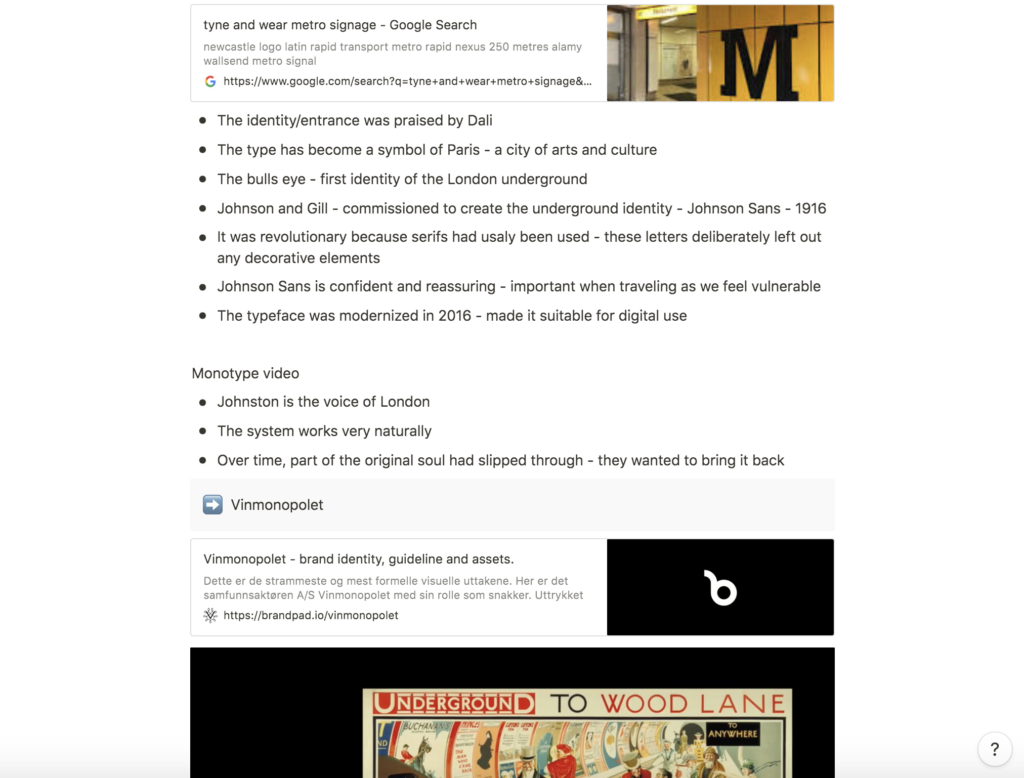
Lecture notes
Lecture reflections
Typography has become a big interest of mine since starting this course and I really liked what Paula Scher said about the way type can say something in a variety of ways (Tolley, 2021). Further, I am keen to learn more about typography and how different typefaces and type settings can communicate different messages, to the extent that it can form whole visual identities.
Is it possible to communicate personality in public transport?
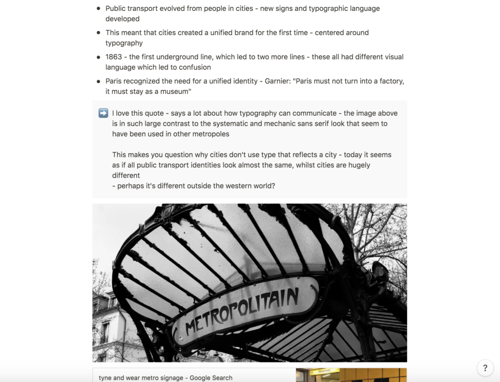
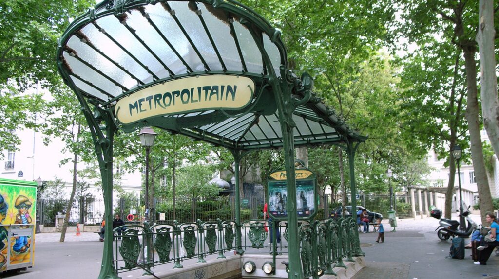
I loved hearing about the emerge of visual identities in underground systems across big cities. I particularly enjoyed seeing the entrances in Paris, that very much became a symbol of the city’s art and culture connotations, as mentioned in the lecture (Tolley, 2021). Garnier’s quote on Paris staying a museum and not turning into a factory (Tolley, 2021), made me wonder why today, the norm of public transport is to use a sans serif. Although I do understand that a simplistic visual system is key to effective communication, I find it strange that cities do not use these visual identities to communicate who they are as a culture. I would have loved to explore how one might create lettering with personality, that maintain an effective way of communicating. Public transportation is a huge part of both the public’s and tourist’s interaction with a city, and I imagine it being great to have a visual identity that the public could feel a part of.
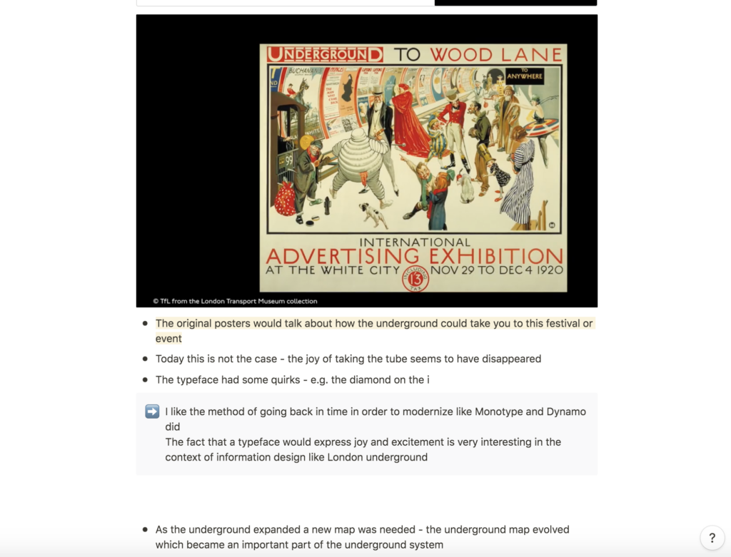
The importance of being consistent
It was interesting to learn about the New York subway before it got it’s visual identity (Tolley, 2021). The work of Unimark is a good reminder of the importance of typography and how designs must be consistent in their work on visual identities.
Resources notes
Resources reflections
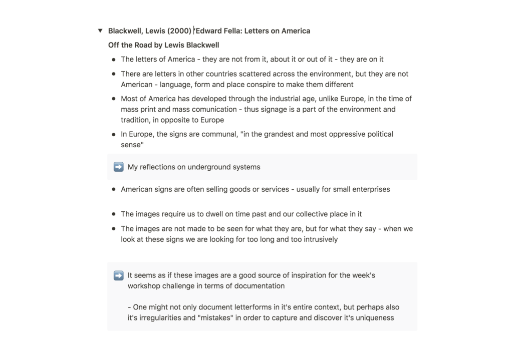
Lewis Blackwell: Edward Fella: Letters on America
In his book, Edward Fella: Letters on America, Blackwell made some interesting points about lettering and place. He suggests that American signage correlates with the country’s capitalist philosophy, as the signs are often selling goods or services (Blackwell, 2000). Further, he says that in Europe, signs are communal in an oppressive way (Blackwell, 2000).
Although I can not say I agree with the fact that the European, slightly more informative (one might say boring in some cases) signs are oppressive, I do find it interesting that the lettering on signs reflect our different cultures and politics. I think it could be interesting to look the correlation between sign lettering and political systems in Europe, and particularly in Norway, which has a very different political philosophy than America.
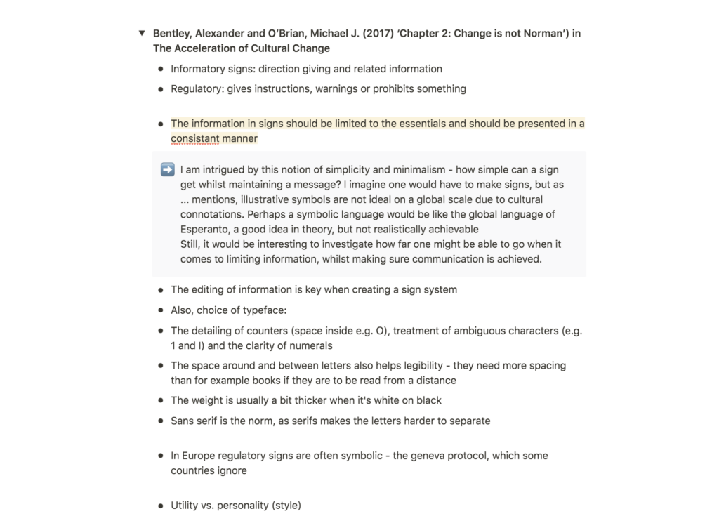
Phil Baines: Signs, Lettering and Environment
Although Baines seemed to have a very straight forward approach to covering signage in his book, he made several points that sparked reflections for potential topics of lettering analysis.
How simple can a sign get whilst maintaining a message?
I was intrigued by Baines notion of simplicity as he said that an important part of signage is to limit information to the essentials. This made me wonder how little information one might use, whilst maintaining that the basis of a message is communicated. One might assume that symbolic signs would be the answer, but as Baines mentions, illustrative symbols have different connotations in different cultures (Baines, 2003). So to only use symbolic signs could perhaps be compared to the global language of Esperanto, a good idea in theory, but difficult to obtain. Yet, I think it would be an interesting study to investigate the boundaries in simplistic communication, and how far one might go without the message being lost.
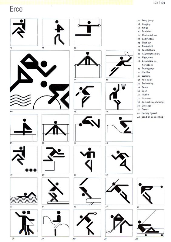
As Baines mentions, language can be exclusive (Baines, 2003), and I think Aicher’s pictograms for the Olympics below is a great example of how one might use as little information as possible in a sign, whilst maintaining the message (imagine if one were to write “rowing” in the language of all Olympic nations):
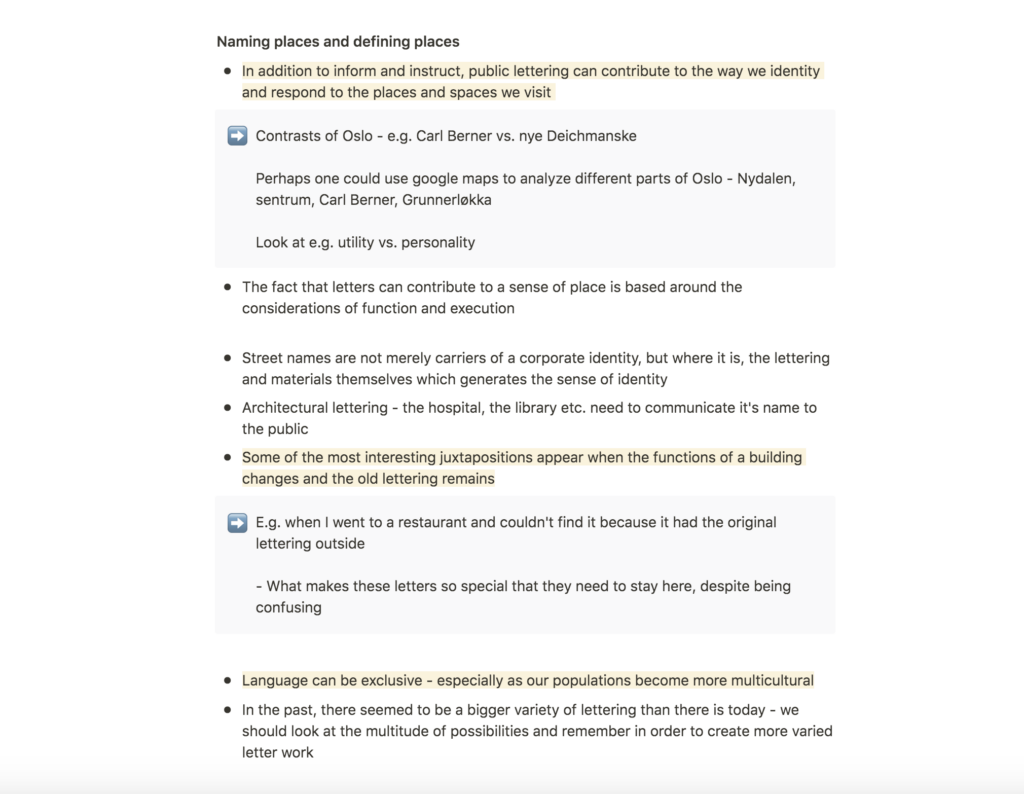
How can public lettering contribute to a sense of place?
Further, I found Baines notion of correlation between public lettering and sense of place interesting (Baines, 2003). It would be interesting to look at public signage in various districts in Oslo, and how they correlate with the identity of the specific district. If I was to complete this study, I think it would also be natural to consider utility vs. personality in signage, which Baines refers to in his book as interesting contradictions in signage (Baines, 2003).
Juxtapositions between buildings and lettering
Lastly, I found Baines point on the interesting juxtaposition between a buildings function and letter remains intriguing (Baines, 2003). In Oslo we have some interesting examples of this, and I think the juxtaposition could make for fun discoveries. What makes the old letters so special that they need to be preserved, despite contributing a confusing element to the public?
Further research
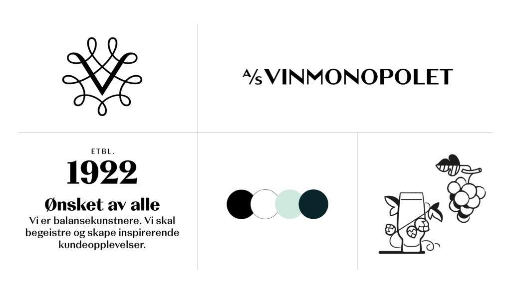
Dynamo’s rebranding of Vinmonopolet
I think design studio, Dynamo’s, rebranding of Vinmonopolet (The Norwegian retailer for alcoholic beverages) is interesting when looking at typography, especially in terms of looking at historic lettering in order to create lettering for the future. The new logo is rooted in Vinmonopolet’s historic signage, yet it feels modern and sophisticated with it’s clean lines and relevant context as it’s paired with contemporary illustrations and colours.
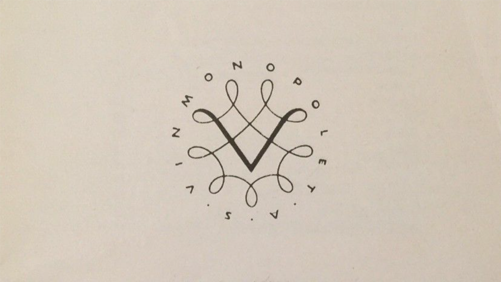
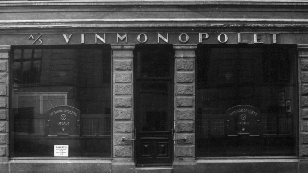
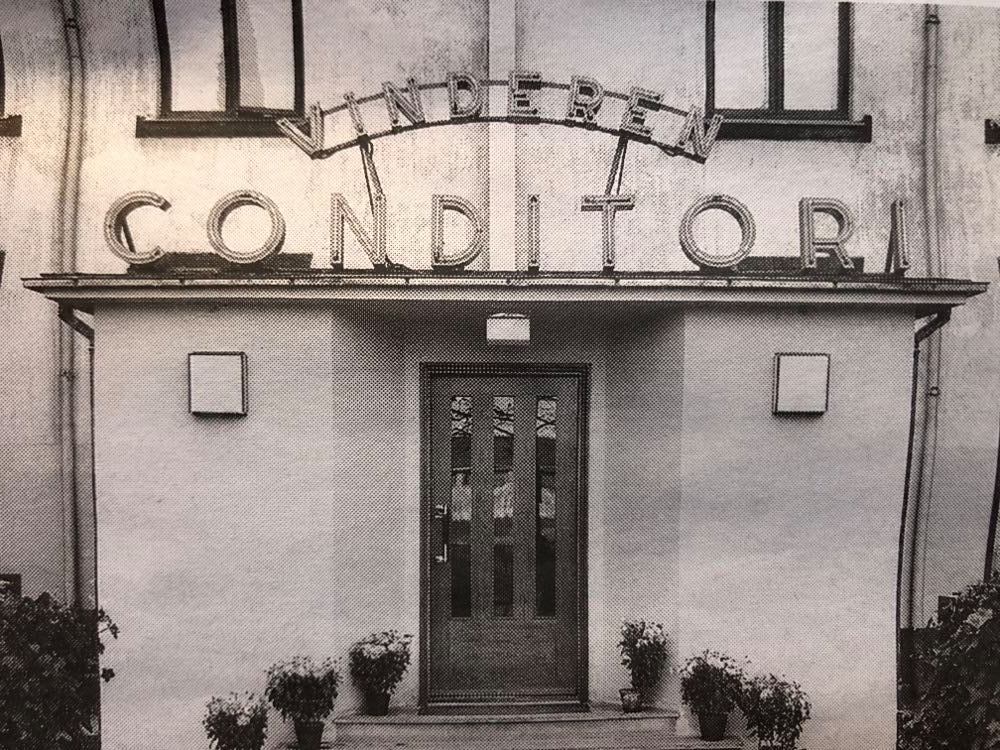
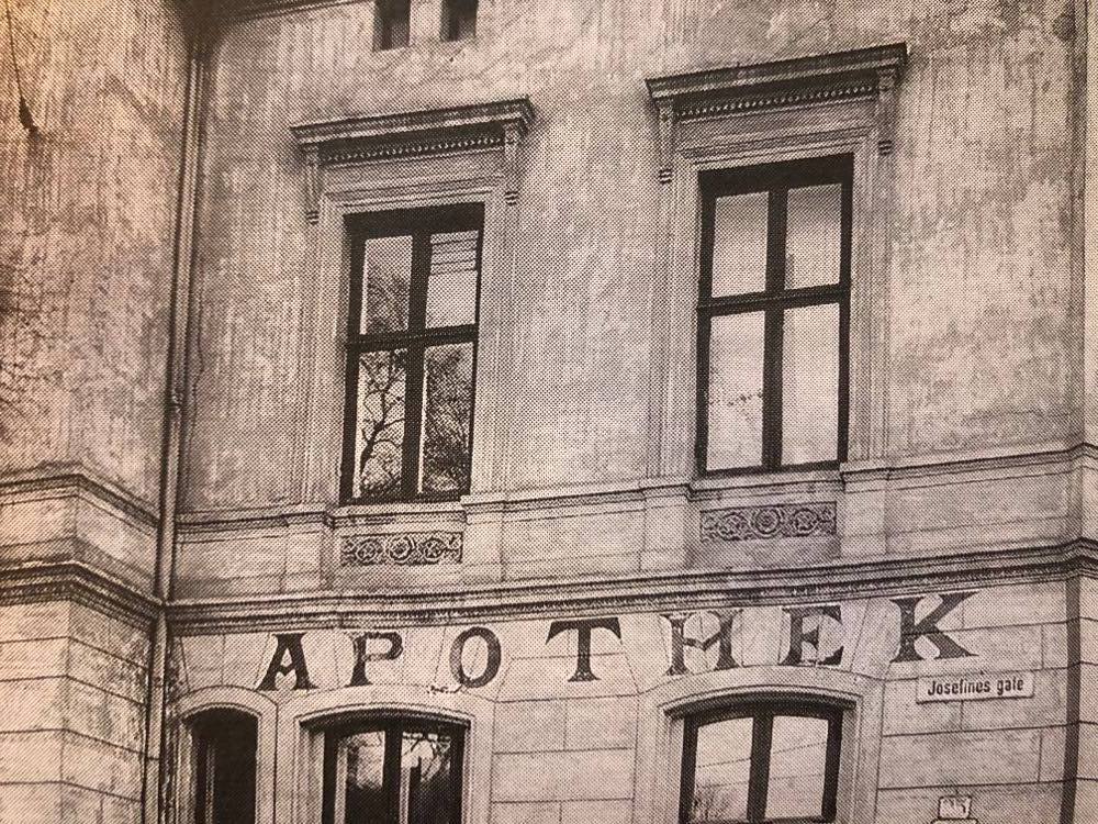
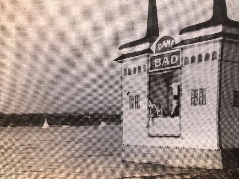
Type in Oslo: revisit
Although I looked at this in module one, I think the exhibition Skrift i Oslo (Type in Oslo) is an interesting resource for type and place. Below I’ve included some of my favourite images from the exhibition catalogue, which includes a number of old photographs of typography in Oslo through 100 years. As I move on with the workshop challenge, I hope to find some remaining typography from this era as I think it would be wonderful to create modern type based on these unique letterforms. I could also be interesting to simply base type on the images in the catalogue.
James and Karla Murray
James and Karla Murray have made several books on typography in the streets of New York. Their Instagram account is packed with beautiful letter forms, which to me seem quite exotic as they seem very different to what you can find in Oslo. I think this would be a great place to look for inspiration for future logo design and other type work.
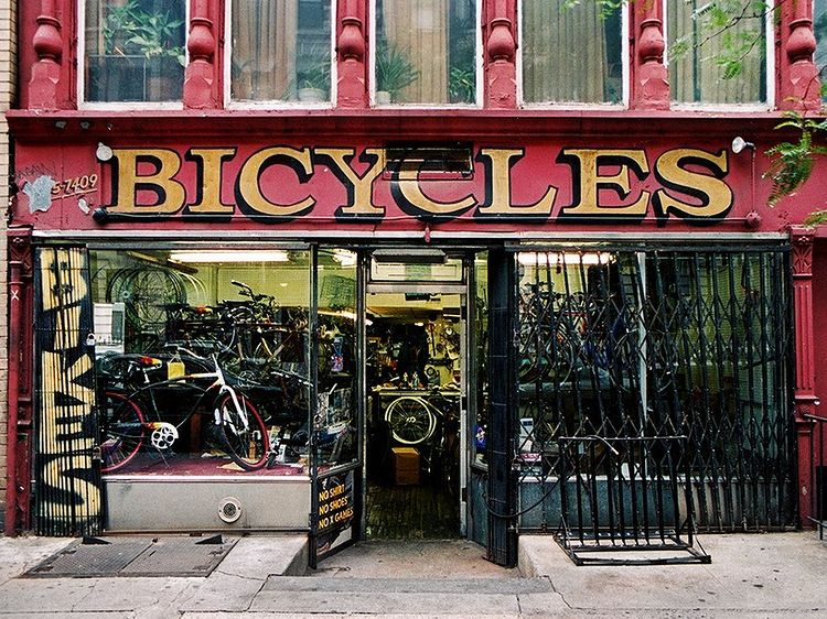
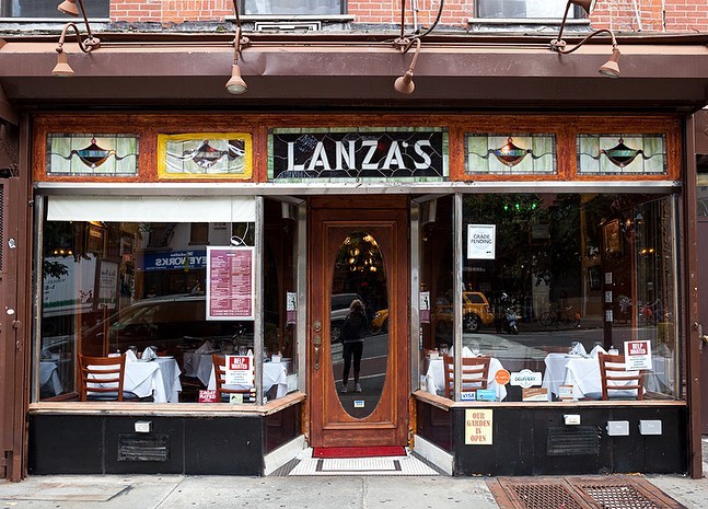
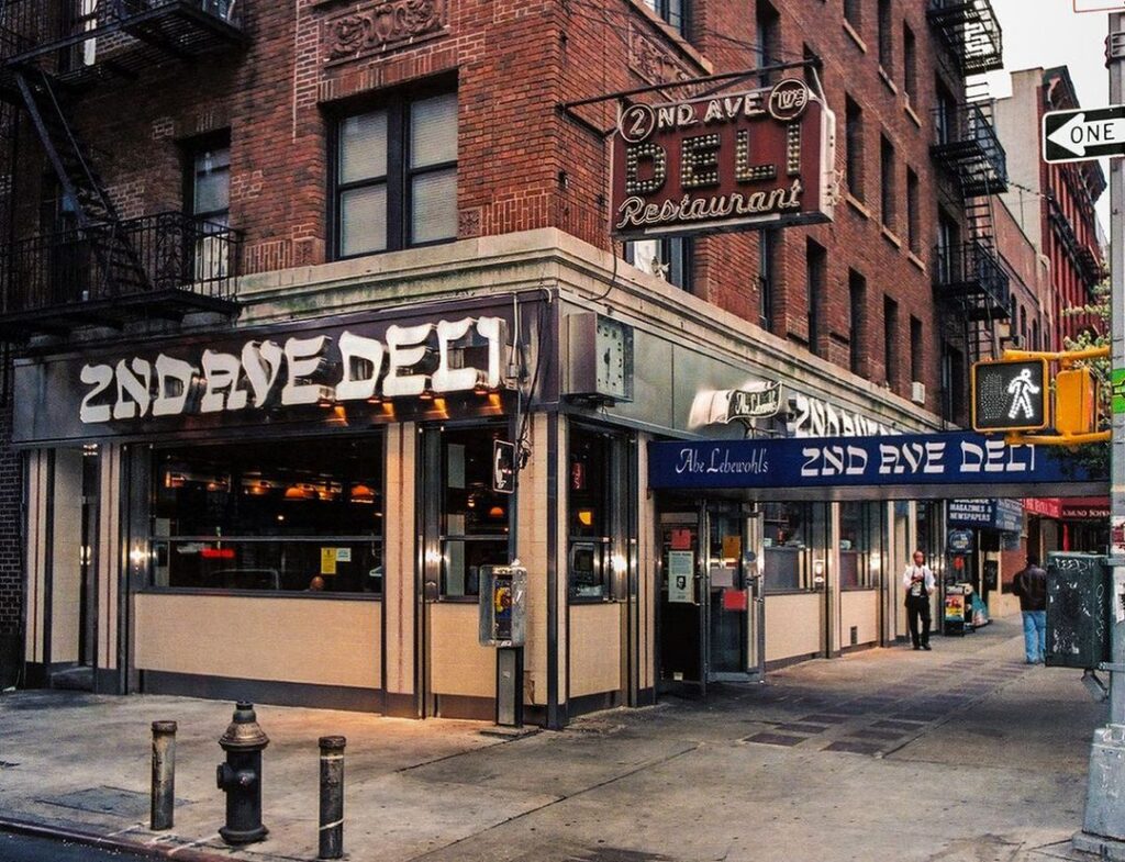
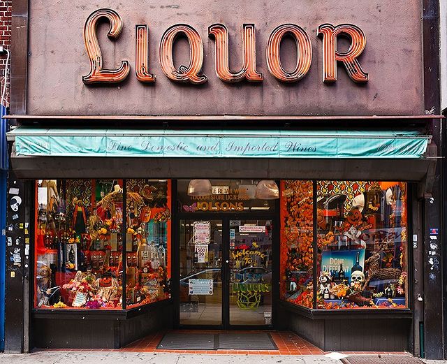
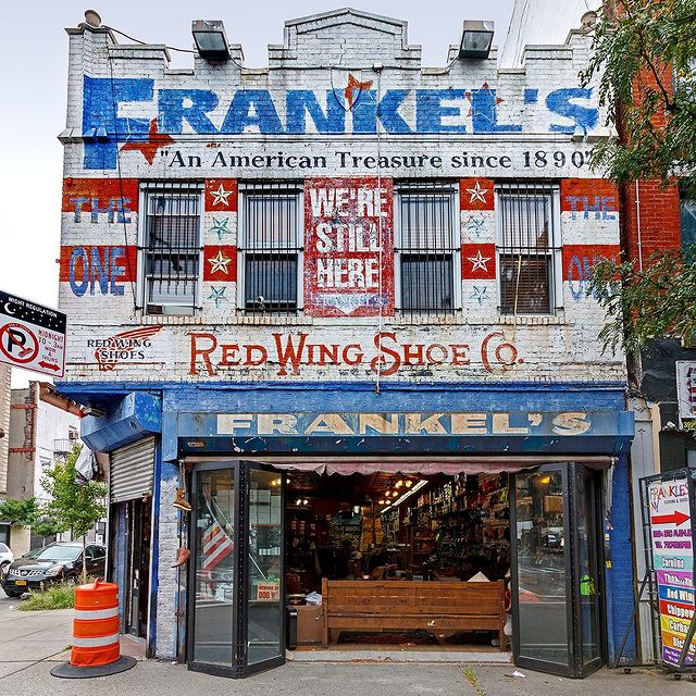
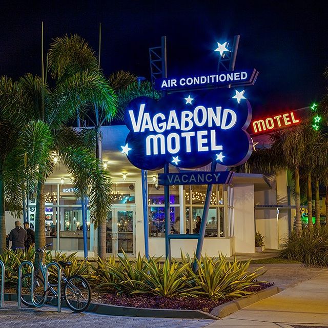
Fig. 6: J. Murray and K. Murray Ca. 2010-2020. Lanza’s Restaurant. [photography]
Fig. 7: J. Murray and K. Murray Ca. 2010-2020. The 2nd Avenue Deli. [photograph]
Fig. 8: J. Murray and K. Murray Ca. 2010-2020. Jolson’s Liquors. [photograph]
Fig. 9: J. Murray and K. Murray Ca. 2010-2020. Frankel’s. [photograph]
Fig. 10: J. Murray and K. Murray Ca. 2010-2020. Vagabond Hotel. [photograph]
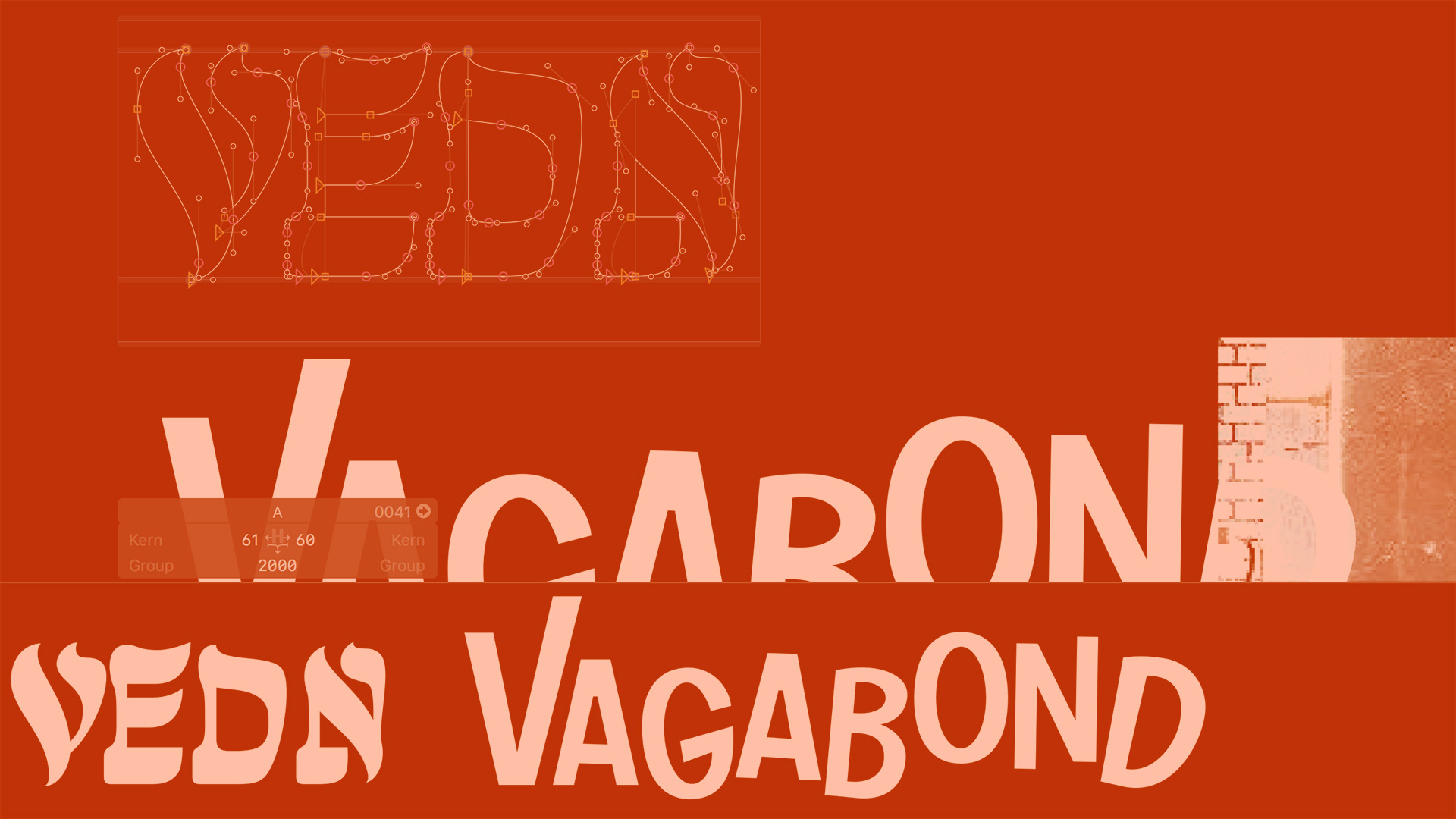
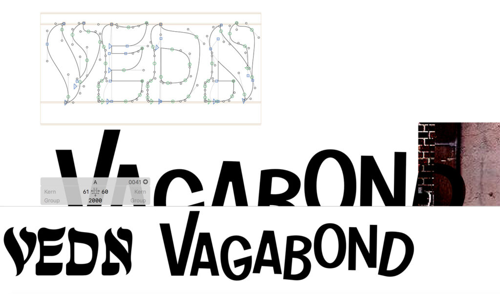
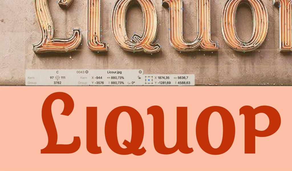
Building a letterform library
During our first module on this course, Personal Practice discussed how they usually collect typography inspiration in Glyphs. I thought that was a great way of making a piece of lettering your own, rather than simply collecting a bunch of photos and other people’s work. As we are currently collecting typography inspiration, I thought this would be the perfect time to start my own letterform library in Glyphs, by trying to build out some of my favourite letterforms from the images above. This way, I will have something to come back to when the right brief comes along.
I’m still new to drawing letterforms, so I wasn’t 100% happy with the results or my pace. However, this was a valuable experiment that I hope to keep working on, in order to get better at hand drawn typography.
Workshop challenge
Type on google maps
As it’s not currently possible to use public transport in Oslo due to covid, I started my search for letterforms on google maps. It was great to be able to “travel” across various districts, but unfortunately it was quite difficult to get a good view of letterform details. However, I still managed to find some interesting signs.
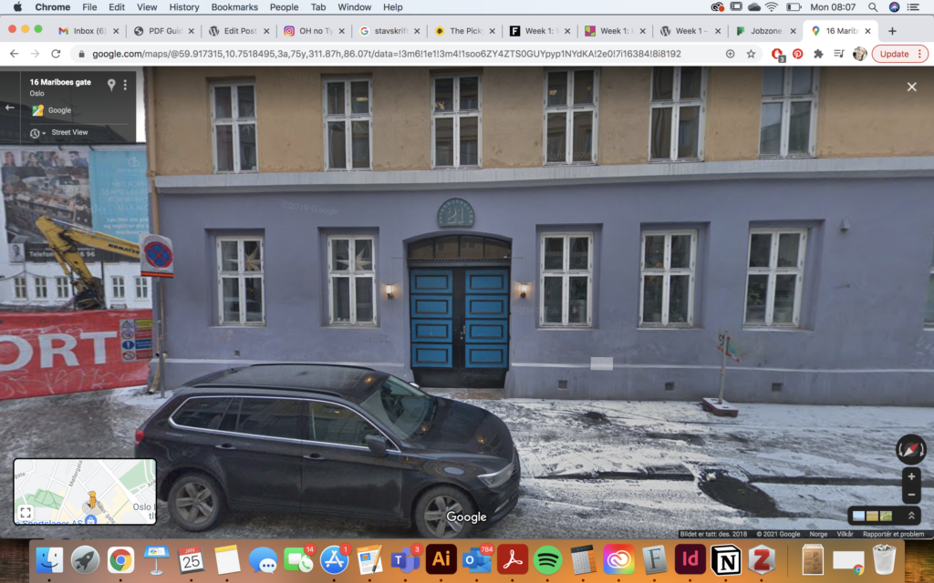
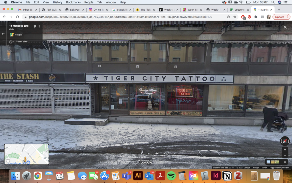
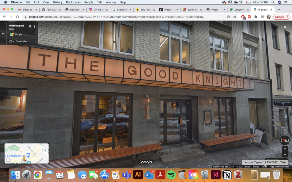
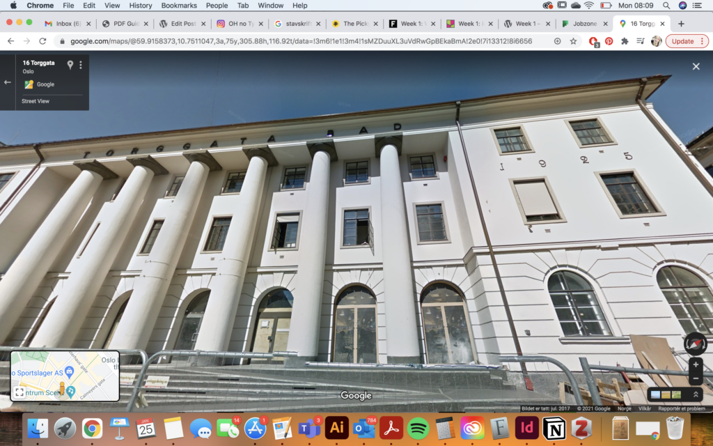
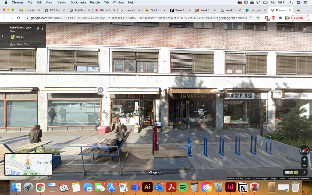
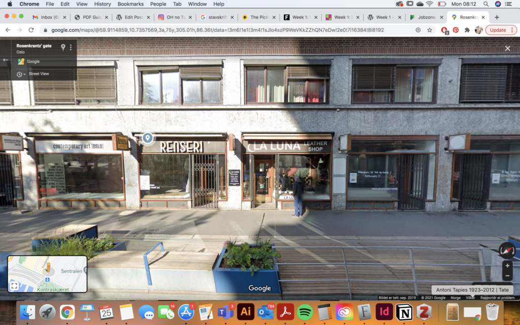
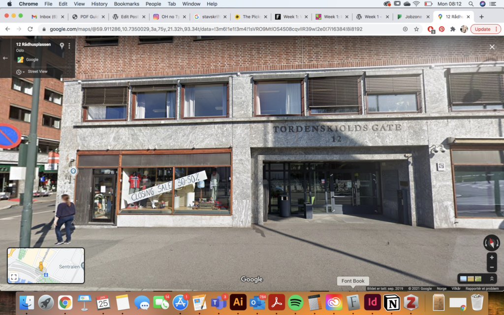
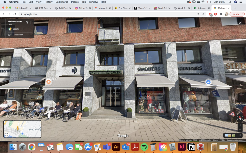
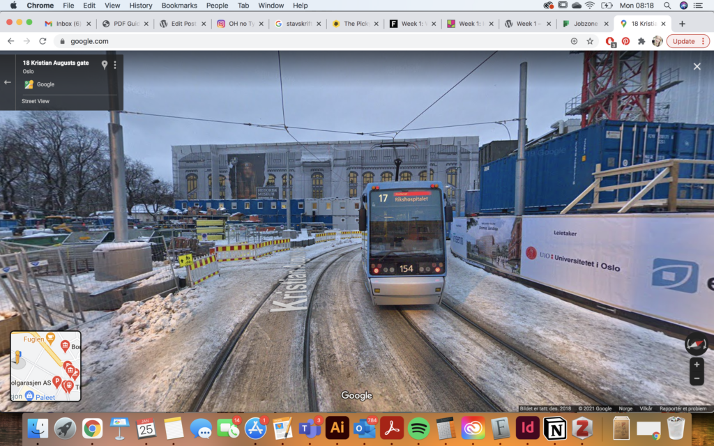
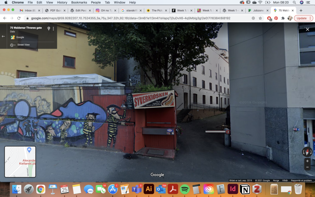
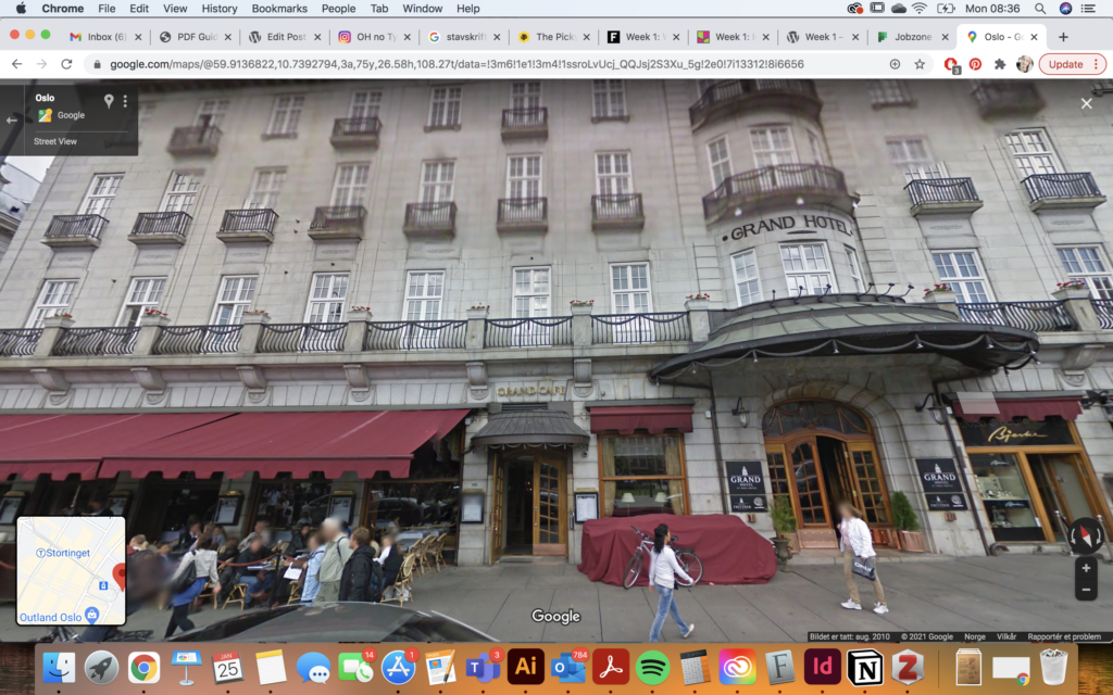
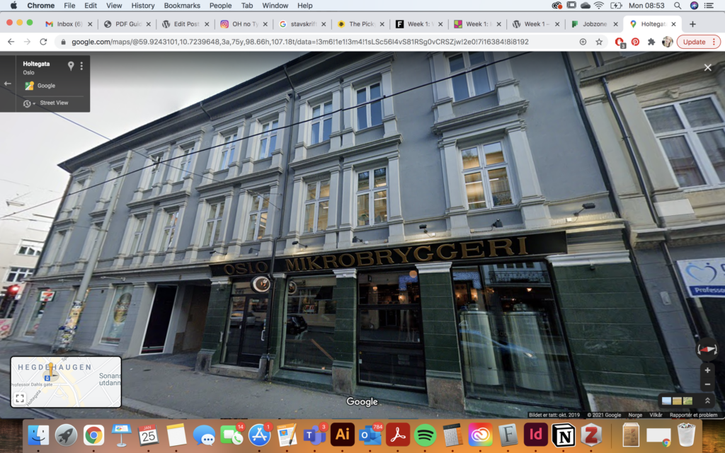
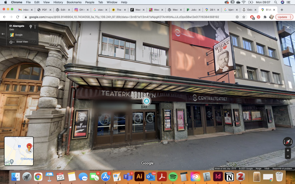
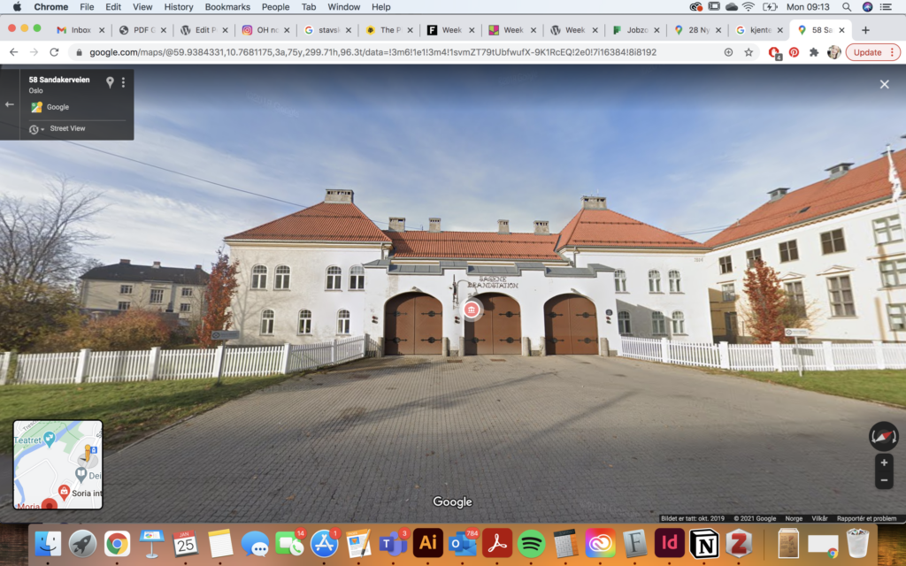
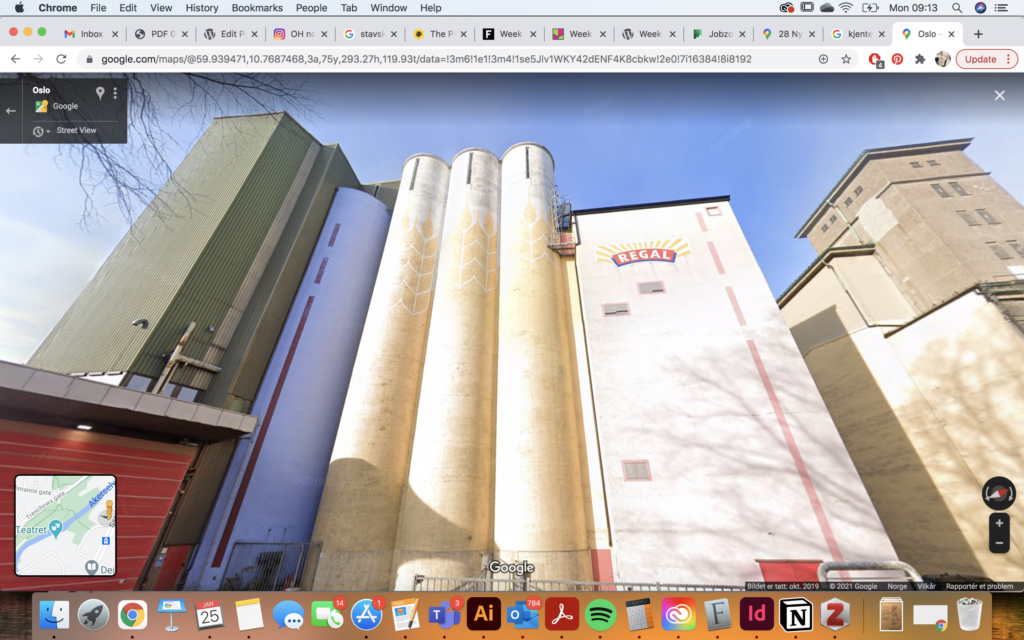

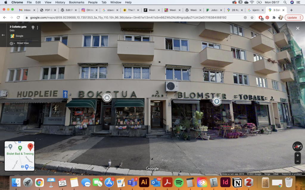
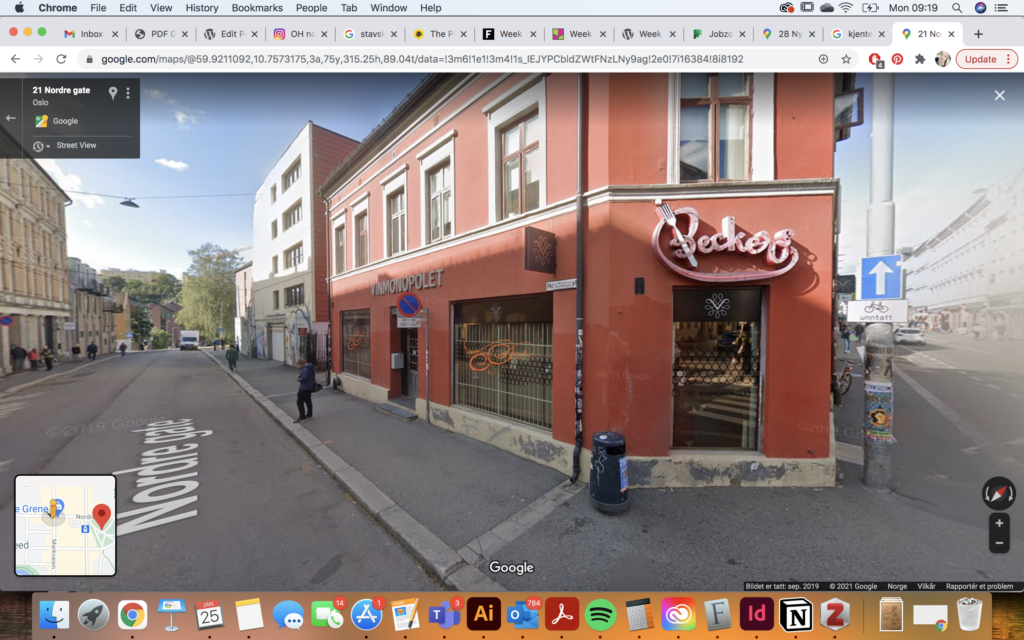
Fig. 12-29: Google Maps 2021. Letterforms in Oslo. [screenshot of online maps]
Type walk: Grünerløkka
After looking at google maps, I decided to take a walk outside, focusing on my local city district, Grünerløkka. The district is a trendy Oslo-area, yet some parts of it (like the area where I live) has yet to become so. Thus, it has an interesting contrast between hip and shady.
Initial reflections
Going outside to record was much easier as I was able to see sever details that I wouldn’t have been able to see on google maps. The recordings below are quite interesting to me, as they don’t really represent what Oslo is to me. In my mind, the city is modern and sleek. Yet the letterforms below makes me wonder about the life in Oslo a hundred years back. They were much poorer than Norwegians are today, and I think this shows through the letter forms below which, for some reason, reminds me of a working class society, who perhaps spent much of their days in factories.
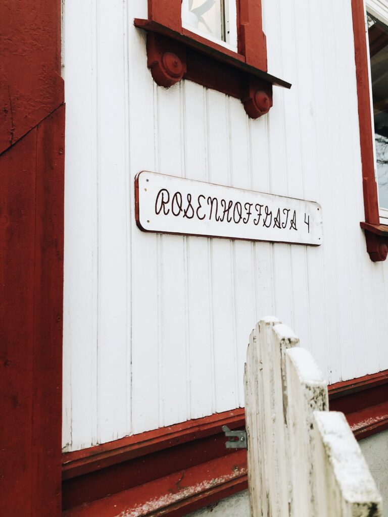
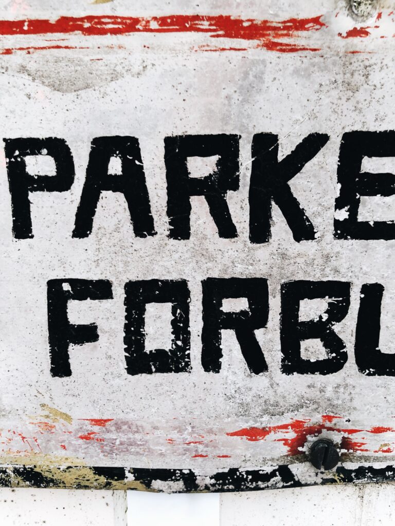

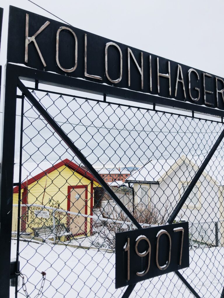
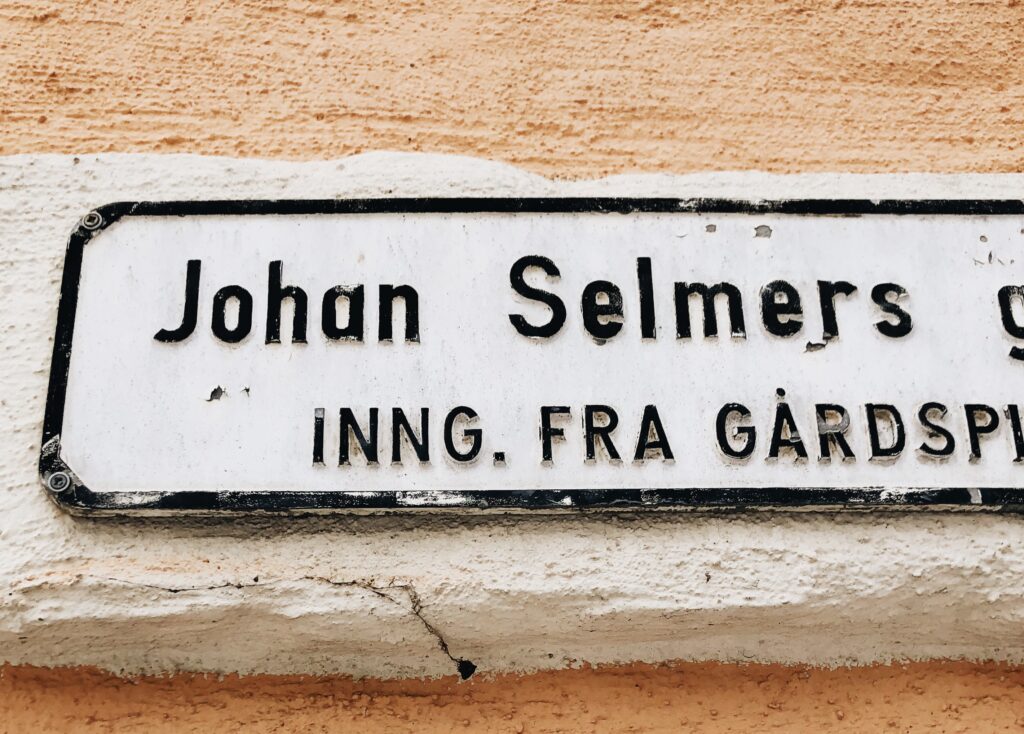
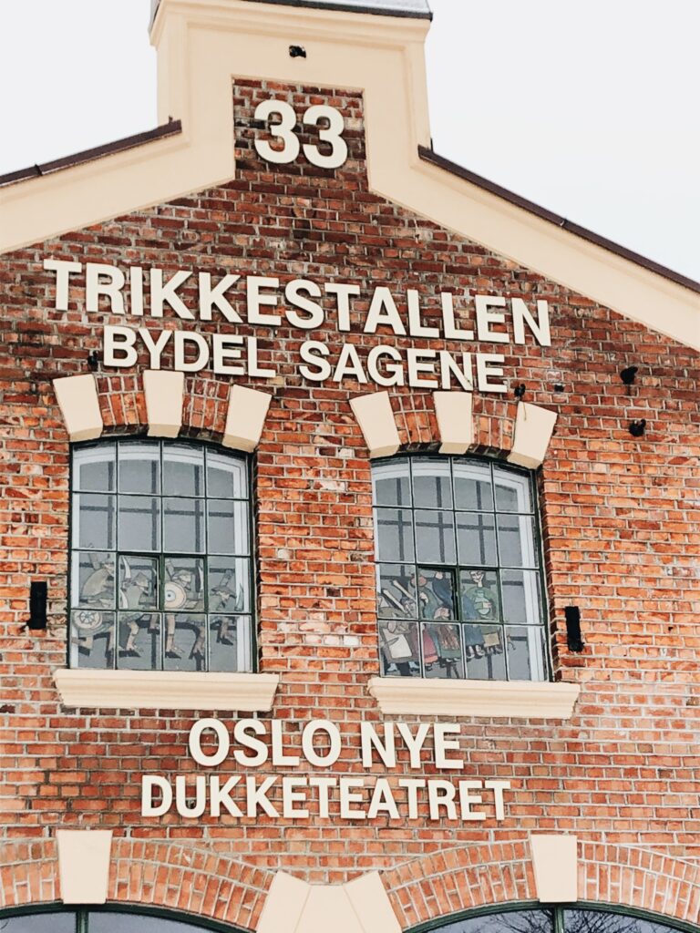
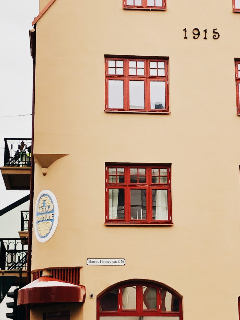
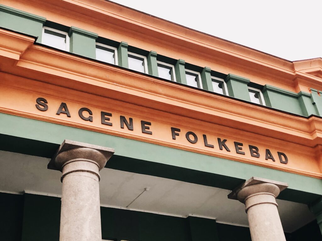
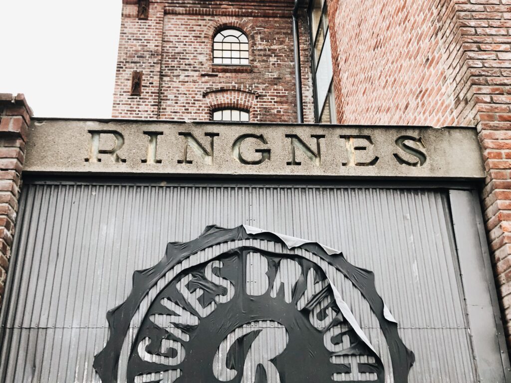
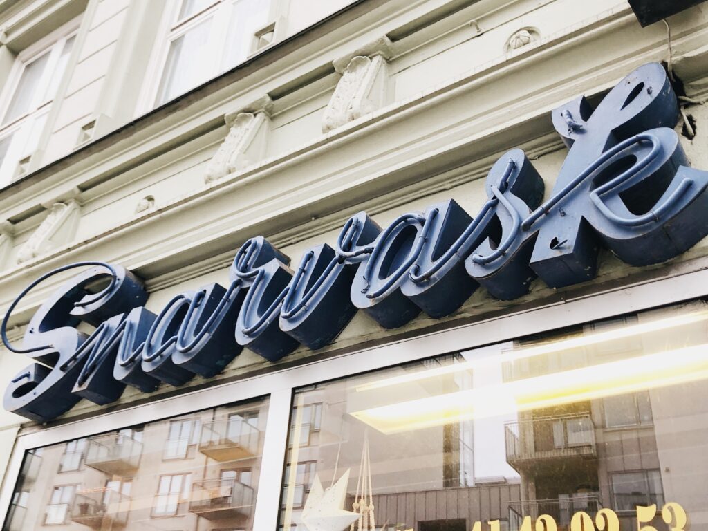
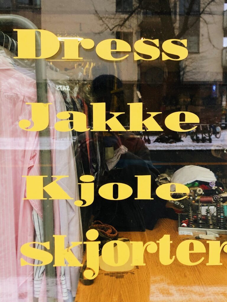
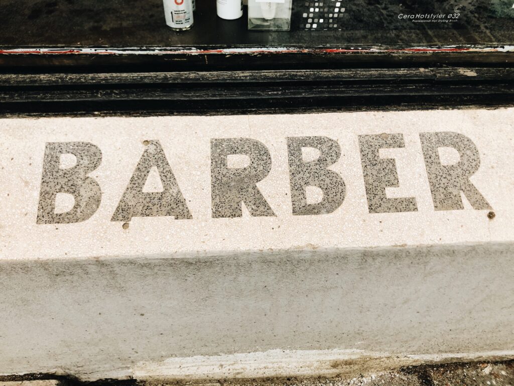
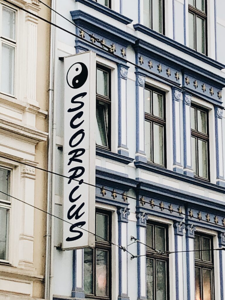
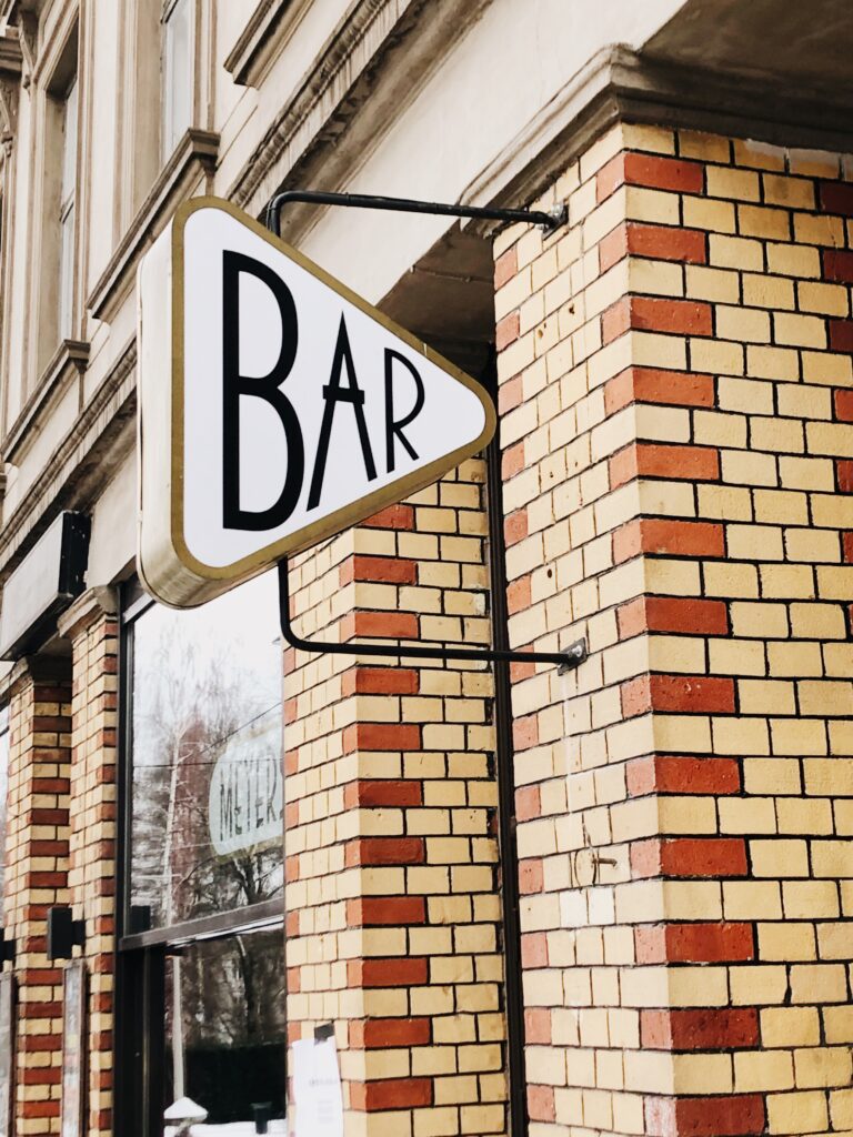
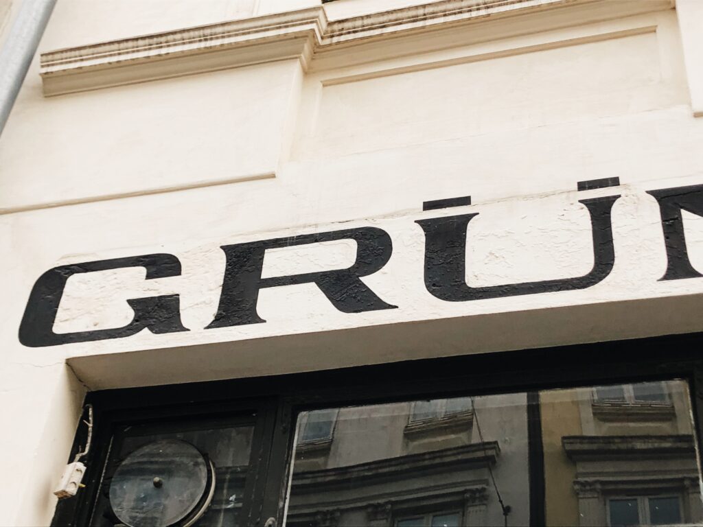

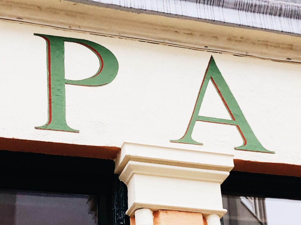
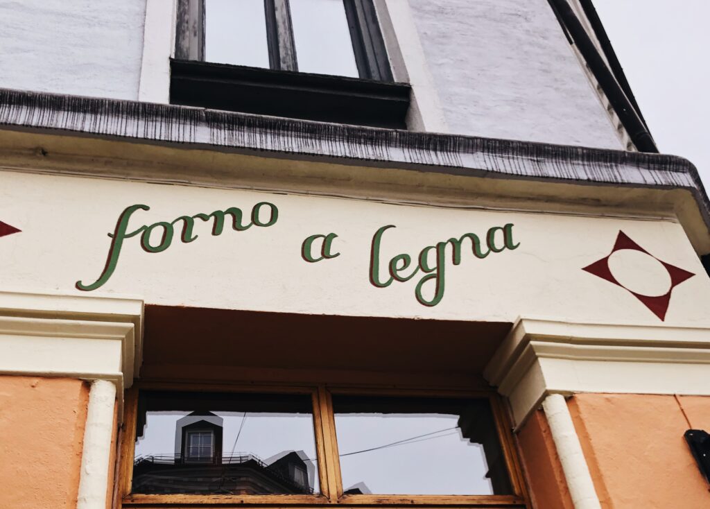
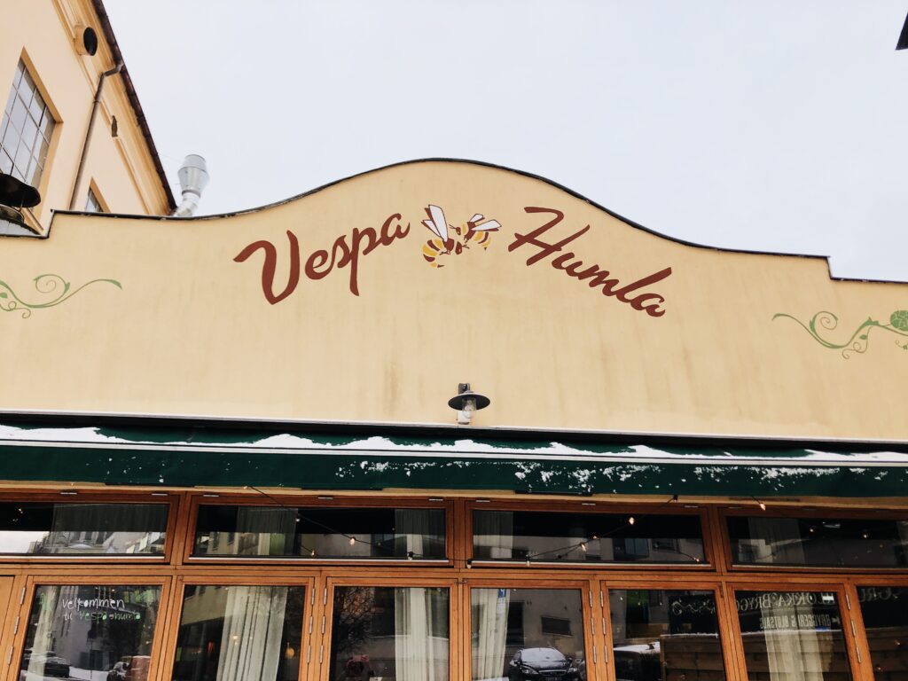
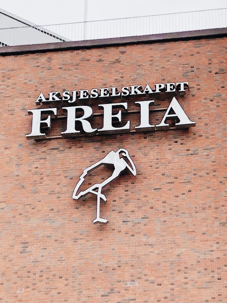
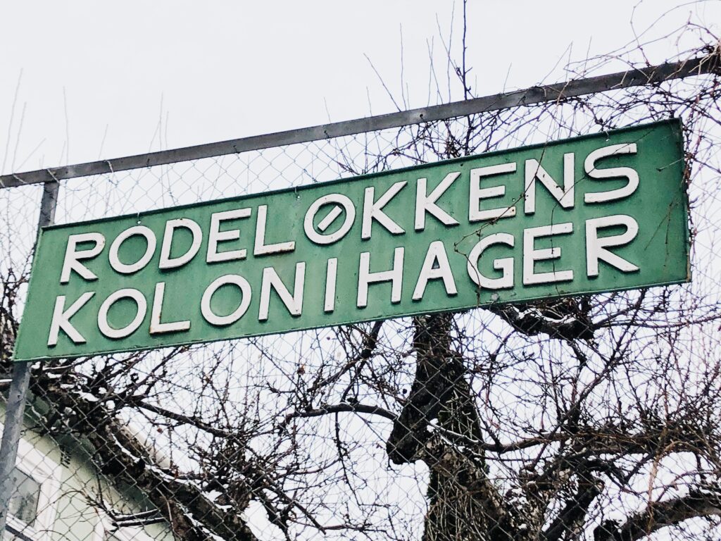
Fig. 30-54: Reigstad 2021. Letterforms in Grunnerløkka, Oslo
Grünerløkka history
After my initial reflections above, I decided to look into the history of Grünerløkka as I wanted to find out more about the history of the industrial, yet naive and simple look of the letterforms. I decided to have a look at Store Norske Leksikon (large Norwegian encyclopedia) for information.
In Norway, many houses are made out of wood. However, when Grünerløkka became part of Oslo in 1859, buildings had to be made out of brick to avoid fires (Godal and Askjer, 2020). The district became an industrial area with several factories across the river in the 1800s (Godal and Askjer, 2020). One of the most famous factories was a iron foundry (Godal and Askjer, 2020), which might explain why I found so many iron letterforms (like the numerals in image below).
In the 70s, the district was renewed (Godal and Askjer, 2020). House facades were renovated (Godal and Askjer, 2020), which might explain why I wasn’t able to find much evidence from painted advertising on brick walls. Since the 90s, the district has become one of Oslo’s most sought after areas to live (Godal and Askjer, 2020). Today there are many restaurants and cafes in the main area.

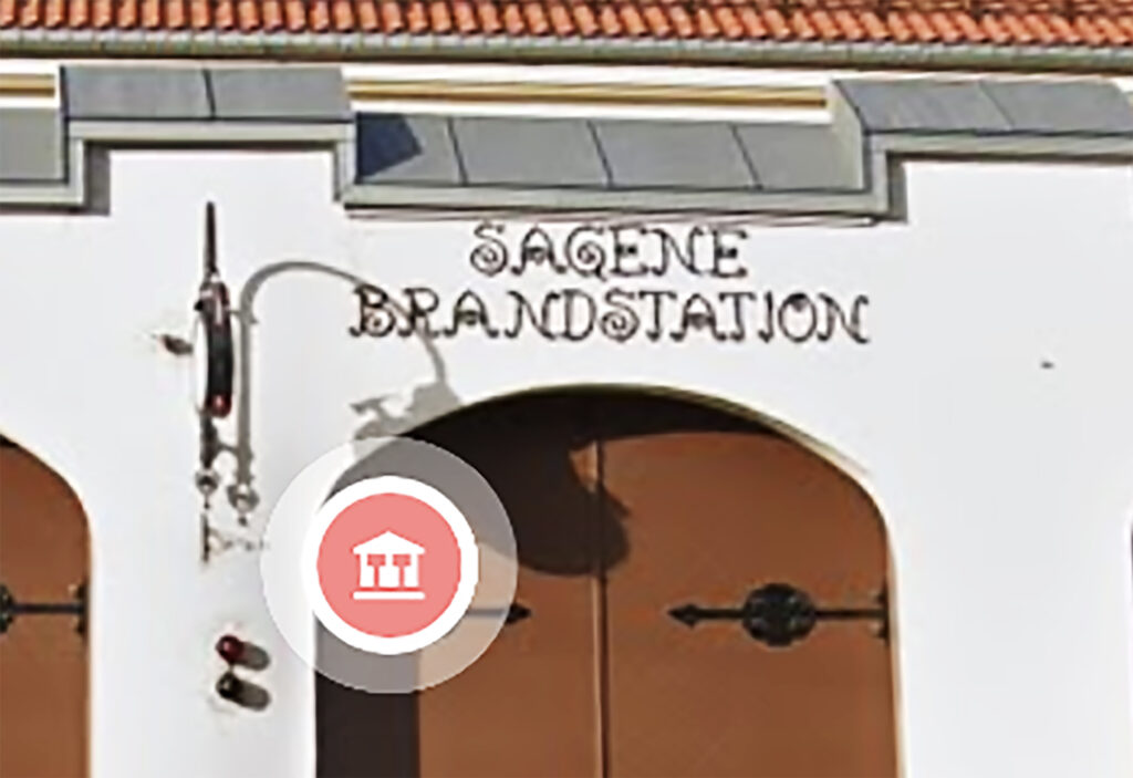
Final 5 letterforms and accompanying analyses
When choosing my final letterforms, I found it important to choose letterforms that symbolises both the history and present of Grünerløkka, particularly in terms of culture and society. Therefor, I haven’t necessarily chosen the letterforms I find most interesting aesthetically.
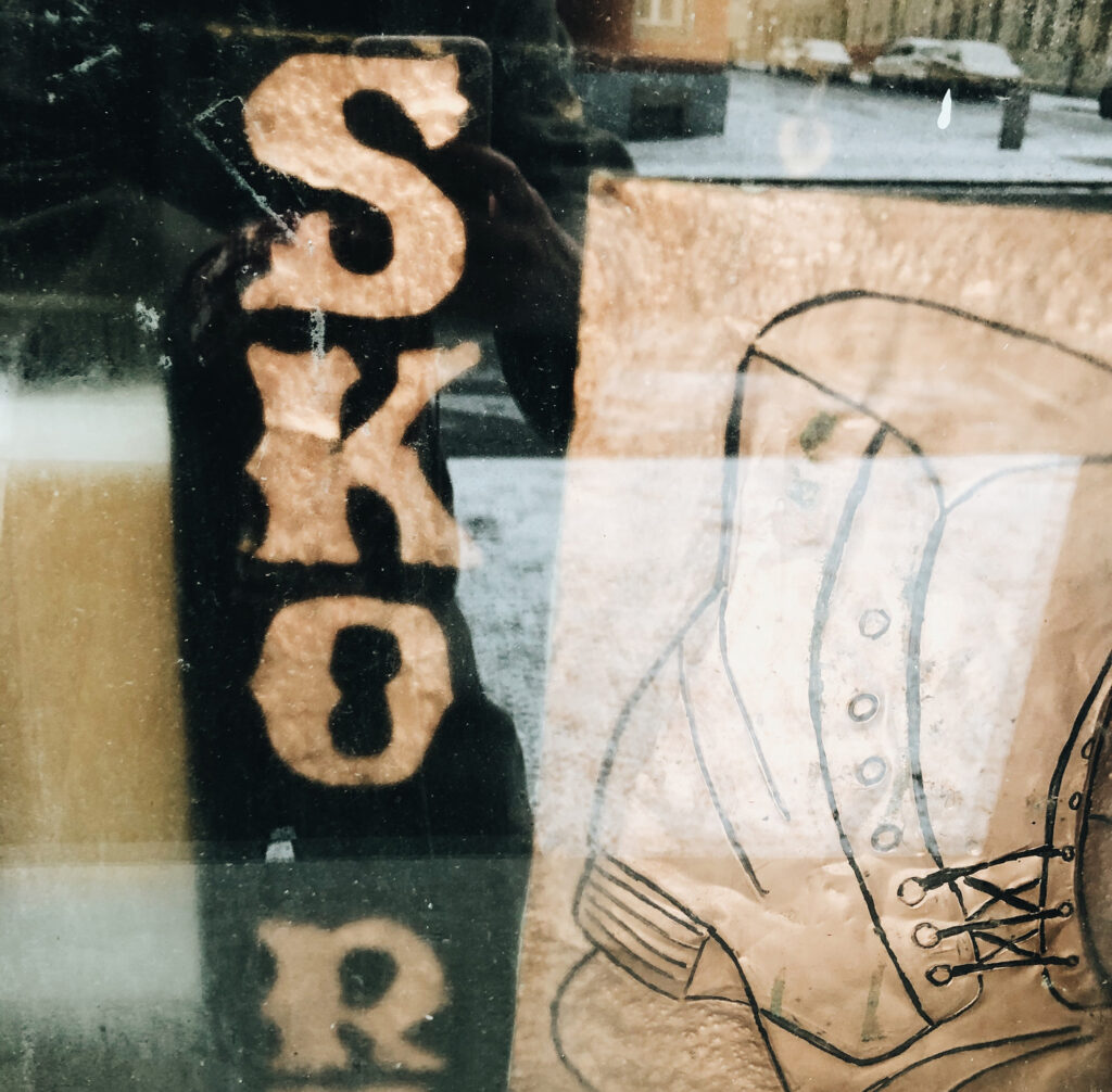
Evidence from an industrial past
Grünerløkka became Oslo’s industrial district in the 1800s (Godal and Askjer, 2020). One of the most famous factories was an iron foundry (Godal and Askjer, 2020), which might explain why I found so many iron letterforms during my recordings. Thus, these letterforms can be viewed as a representation of Grünerløkka’s industrial past. I decided to go with this particular image of Sagene fire station as I found it ironic, considering Grünerløkka had to build their buildings out of brick instead of wood, in order to avoid fires. Although the letterforms represent the historic part of the district, they hardly represent the contemporary identity, which I find more trendy and modern. Yet, the quirkiness of the letterforms could be seen as a reflection of the excitement and buzzing feel of Grünerløkka.
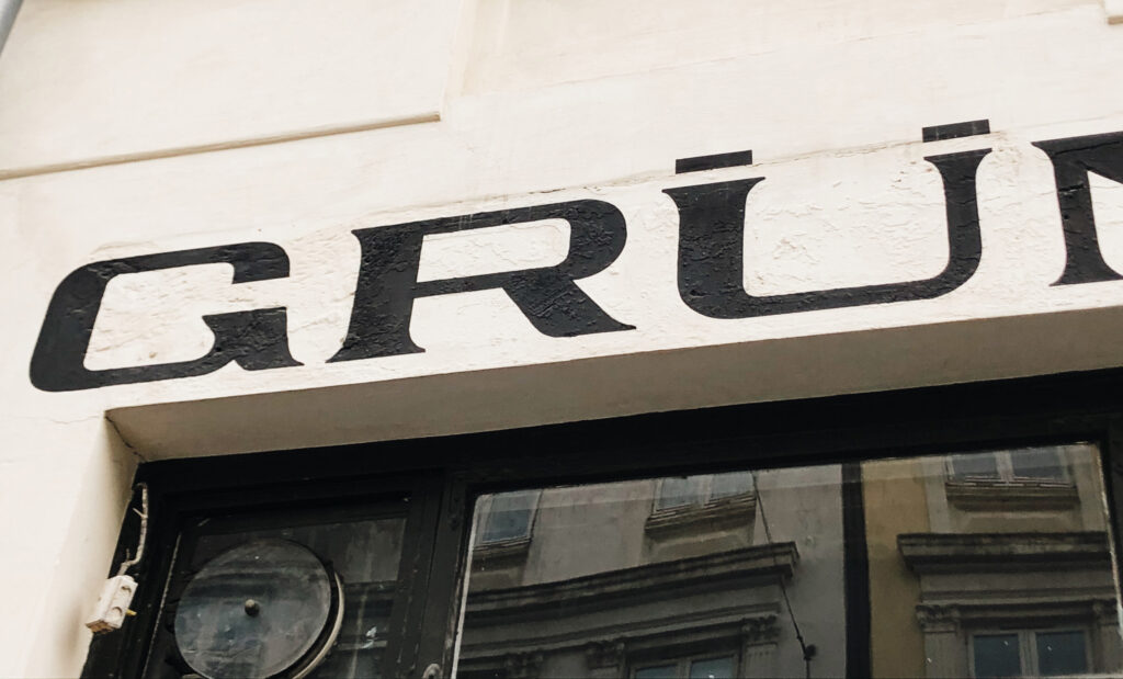
A previous working class society
In the 70s, Grünerløkka was renewed and the local house facades were therefor renovated (Godal and Askjer, 2020). I assume this might be the reason for why I couldn’t find much evidence of painted advertising on brick walls, despite the district’s industrial past. Although I do not know whether or not this sign actually stems from Grünerløkka, I imagine it to be a representation of the advertisements that might have been part of the district in the past. Thus, at least on a personal level, these letterforms become a representation of the people who used to live in Grünerløkka, working in the factories, before it became a trendy area.
Conflicting function and lettering
In his book Signs, Lettering and Environment, Baines mentions the interesting juxtaposition that emerges when there is a conflict between the lettering on a building and the building’s function (Baines, 2003). These letterforms is an example of that, as what they spell out does not resonate with the function of the building (the housing of a noodle bar). This strange contradiction reminds me of how the youth of Oslo has intertwined with historic parts of the town. The buildings are very old, packed with history and evidences of a different time, but the style of these buildings have now become very trendy. The bold letters are also an interesting representation of the modern citizens of Grünerløkka, who typically wears bold fashion statements.

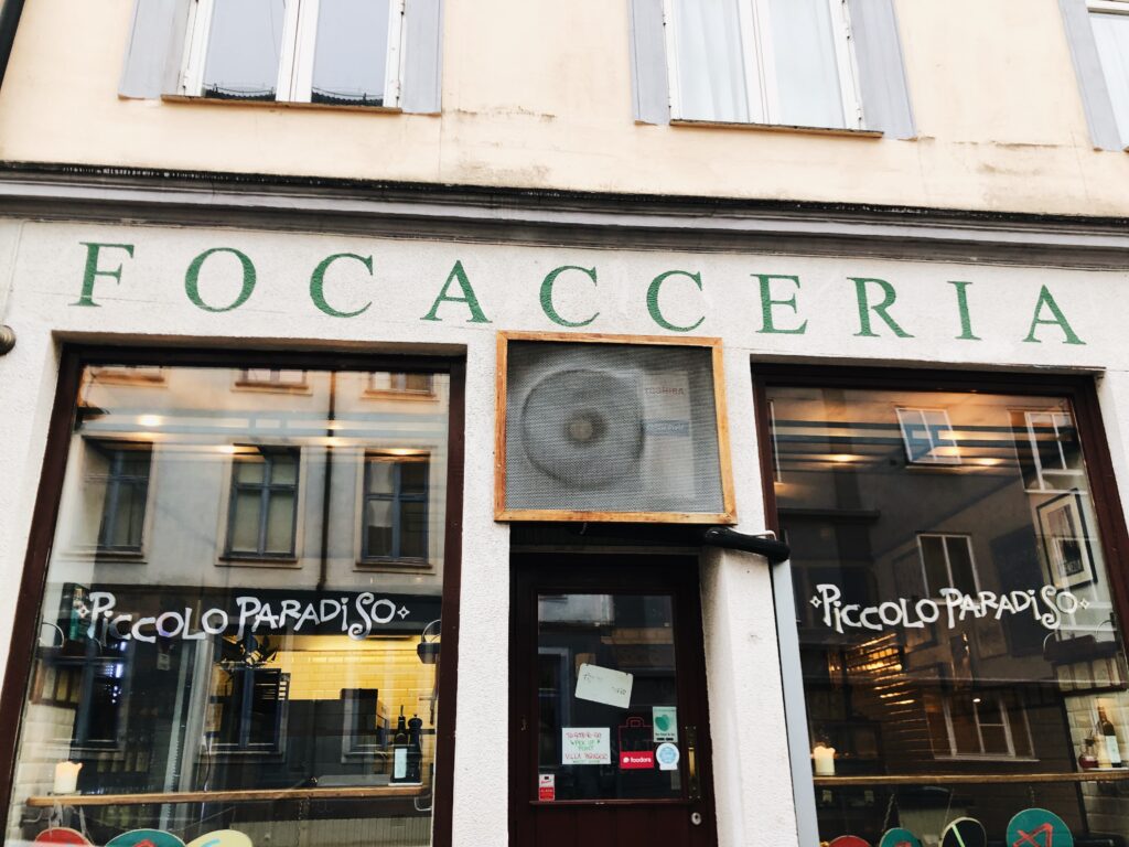
Buzzing city life
Since the 90s, Grünerløkka has become very trendy and today it is one of Oslo’s most sought after places to live (Godal and Askjer, 2020). There are many bars and restaurants here, and these letterforms make up the signage of one of the popular restaurants, Villa Paradiso. Thus, these letterforms represent the buzzing city life of today’s Grünerløkka. The letters have been painted using red, green and white, most likely to insinuate the restaurant’s Italian cuisine. Yet, the hand painted application feels very much in line with the local surroundings, as other signage in the area has been done in a similar way.
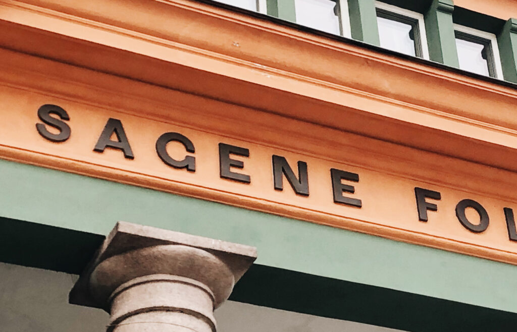
A monumental representation of Norway’s political philosophy
Sagene Folkebad is a communal bath were the public can go for a swim. Although communal bath’s are not specific to Norway, I think there is something about the concept that goes well with Norway’s social democratic philosophy. The fact that the public building is beautifully preserved, shows that the government “takes care” of the people. The sans serif letterforms are simple and perhaps slightly anonymous, compared to the building itself. This anonymous look goes well with the simple identity of other communal signs in Oslo. I also think they represent an objectiveness, almost as if the letterforms are in service to the public.
In conclusion
Since starting this course I have developed a big interest for typography, and so it was wonderful to start off the module with a type project. The lecture was one of the highlights as I found it both informative and inspirational, and it gave me some ideas for potential future typography projects. I particularly enjoyed seeing the entrance of the Paris Metro, as it made me reflect upon why there are so many public transport identities that look the same.
I also enjoyed collecting letterforms in Oslo, although I have to admit that I wish I would have been able to create a more varied collection. I think my final five images are interesting in terms of place and identity, but I don’t think they represent the sense of experiment and play I would have liked to see, visually.
My favourite part of this week has definitely been the beginning of a personal typography resource library. It was challenging to create the letterforms from the image references, but hopefully this will become easier with time. If I had more time, I would have liked to work further on these experiments, perhaps by trying to adapt them into my own. I also would have liked to create letters for the individual collections which were not featured in the reference images, in order to create something of my own.
Looking back at this week’s outcome, I think it would have been helpful to analyse and research further into the connection between letterforms and place. Although I have touched upon this in my analyses, I think more research could have led to further interesting observations.
REFERENCES:
Baines, P. (2003) Signs, Lettering and Environment. London: Laurence King.
Blackwell, L. (2000) Edward Fella: Letters on America. New York: Princeton Architectural Press.
Godal, A. M. and Askjer, H. (2020) ‘Grünerløkka – boligstrøk i Oslo’, Store Norske Leksikon [online]. Available at: https://snl.no/Gr%C3%BCnerl%C3%B8kka_-_boligstr%C3%B8k_i_Oslo (Accessed: 25 January 2021).
Tolley, S. (2021) ‘History Revealed’. Canvas Falmouth Flexible [online], 22 January.
LIST OF FIGURES:
Figure 1. Steve CADMAN. ca. 2005-2016. Parisian metro station. The culture trip [online]. Available at: https://theculturetrip.com/europe/france/paris/articles/behind-the-subway-stops/
Figure 2. Otl AICHER. 1972. Olympics Pictograms. Notes on design [online]. Available at: https://www.sessions.edu/notes-on-design/iconic-icons-aichers-pictograms/
Figure 3. DINAMO KOMMUNIKASJON. 2020. Visual identity Vinmonopolet. Brandpad [online]. Available at: https://brandpad.io/vinmonopolet
Figure 4: Arve BÅTVIK. 2020. Skrift i Oslo [exhibition details]. Oslo: Grafill 21. Exhibition 24 September to 11 October 2020: Skrift i Oslo. Photographs taken by Ingrid Reigstad 28 January 2021.
Figure 5. James MURRAY and Karla MURRAY. Ca. 2010-2020. Bicycle shop. Instagram [online]. Available at: https://www.instagram.com/p/B-BK06wn11H/
Figure 6. James MURRAY and Karla MURRAY. Ca. 2010-2020. Lanza’s Restaurant. Instagram [online]. Available at: https://www.instagram.com/p/B_dJs6tHFrX/
Figure 7. James MURRAY and Karla MURRAY. Ca. 2010-2020. The 2nd Avenue Deli. Instagram [online]. Available at: https://www.instagram.com/p/CItMrOintHE/
Figure 8. James MURRAY and Karla MURRAY. Ca. 2010-2020. Jolson’s Liquors. Instagram [online]. Available at: https://www.instagram.com/p/B4DuSn4HvSh/
Figure 9. James MURRAY and Karla MURRAY. Ca. 2010-2020. Frankel’s. Instagram [online]. Available at: https://www.instagram.com/p/CCPa0JHHmFR/
Figure 10. James MURRAY and Karla MURRAY. Ca. 2010-2020. Vagabond Hotel. Instagram [online]. Available at: https://www.instagram.com/p/B7v8GOEHEAR/
Figure 11: Ingrid REIGSTAD. 2021. Glyphs experiments. Private collection: Ingrid Reigstad.
Figure 12-29. GOOGLE MAPS. 2021. Letterforms in Oslo. Google Maps [online]. Available at: https://www.google.com/maps [Accessed 25 January 2021].
Figure 30-54: Ingrid REIGSTAD. 2021. Letterforms in Grunnerløkka, Oslo. Private collection: Ingrid Reigstad.
Figure 55: Ingrid REIGSTAD. 2021. Letterforms in Grunnerløkka, Oslo 2. Private collection: Ingrid Reigstad.
Figure 56: Ingrid REIGSTAD. 2021. Letterforms in Grunnerløkka, Oslo 3. Private collection: Ingrid Reigstad.
Figure 57. GOOGLE MAPS. 2021. Workshop challenge week 1: Letterforms in Oslo 1. Google Maps [online]. Available at: https://www.google.com/maps [Accessed 25 January 2021].
Figure 58: Ingrid REIGSTAD. 2021. Workshop challenge week 1: Letterforms in Oslo 2. Private collection: Ingrid Reigstad.
Figure 59: Ingrid REIGSTAD. 2021. Workshop challenge week 1: Letterforms in Oslo 3. Private collection: Ingrid Reigstad.
Figure 60-61: Ingrid REIGSTAD. 2021. Workshop challenge week 1: Letterforms in Oslo 4. Private collection: Ingrid Reigstad.
Figure 62: Ingrid REIGSTAD. 2021. Workshop challenge week 1: Letterforms in Oslo 5. Private collection: Ingrid Reigstad.