
Lecture notes
Lecture reflection
Installation vs. Working environment
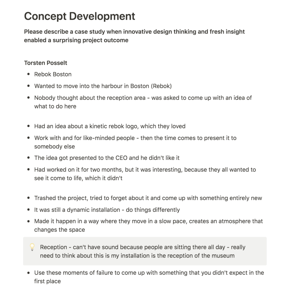
I quite liked all of the projects described in this week’s lecture. The reebok installation was very cool. Posselt’s discussions on the reception area needing to be a working environment was important (Torsten Posselt et al., 2021), as I had thought about developing a reception installation concept for the museum (if I choose to do so it shouldn’t be too immersive).
User friendly, but magical
Jones’ discussions on letting people discover the story was also interesting (Torsten Posselt et al., 2021). On one side I want people to be able to find information quickly (particularly after last week’s feedback from the teacher), but on the other hand I wouldn’t want to take away the “magic” of the serene and minimal floating grain. I’d like to experiment with ways of letting people understand the interface, whilst still making it user friendly enough for them to stay on the page. Perhaps there could also be little easter eggs within the interface, similar to Rapha’s way of working.
The right medium
Veerman also proved an important point about choosing the right medium and production method. Although the Science Museum brief discusses digital interfaces, I’d be really interested in either expanding the interface in a holistic way, or consider other mediums, for example by solely focusing on the installation/projection idea. I’m also interested in gaining further experience with print, and so I’d like to look into ways of including that as well.
Resource notes
Resource reflection
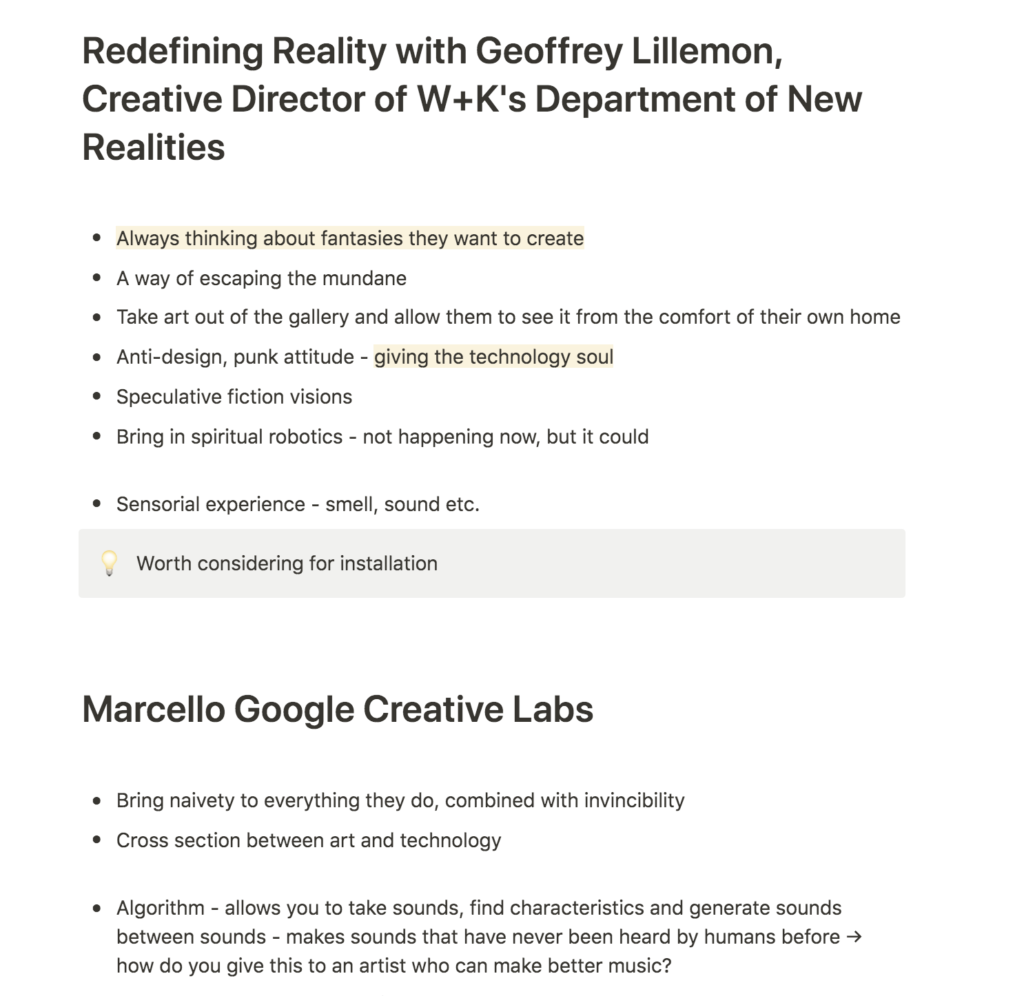
Redefining Reality with Geoffrey Lillemon
Although some of Lillemon’s work was a bit outside of my general interests, I quite liked his discussions on thinking about fantasies they’d like to create (Geoffrey Lillemon, 2019). The Science Museum project is starting to feel like it’s very much about world building, even if this world is just a certain mood. Perhaps a way of developing my concept further would be to reflect on the world I’m hoping to create? What sensorial elements would be present, what pace would it have and what sort of mood would it convey?
Imagination is innovation: Google Creative Lab
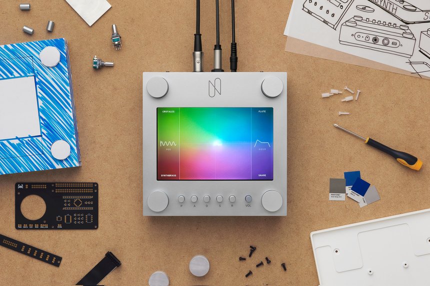
Vranakis’ discussion on the Nsynth Super was fascinating and I loved how playful and surprising it seemed to be (Steve Vranakis, 2019). For my project, I want to make an interface that is usable and helpful, but in order to succeed I also think it needs to be able to surprise users with unexpected content. To me, this is the essence of meaningful browsing – to find something you love, and that you weren’t looking for.
This is already a present notion of the SAND concept, but I’d like to explore ways of discovery further. Perhaps I could look into ways of portraying connected items to the one you’re hovering over for example? At the moment I think the connection between items is missing, and this is something I’d like to feature as a way of telling a narrative.
Further research
FELD: Kinetic rain
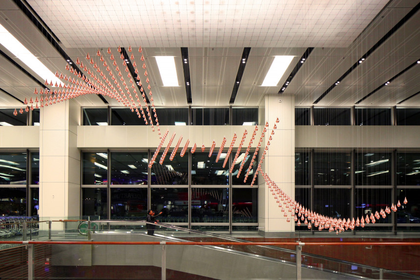
Since I liked the Reebok installation from the lecture, I wanted to look further into FELD’s installation work. I’d never heard the term kinetic sculpture before, and after reading about it I was fascinated. Up until this point, the physical installation for my project had been in the shape of a projection. However, I think it could be really amazing to make it physical, with motors being connected to global audience’s collections.
Kinetic Rain by FELD is a beautiful installation which mirrors the business of the airport. The physical drops are so nice, and I like that it looks different from different perspectives. According to Tate, kinetic art introduces the element of time (Tate, 2017). I love this as an approach for the museum, as it feels like time is such an important essence of an archive.
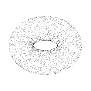
Sand grains

In order to develop my concept, I wanted to read about the structure of sand grains, and also how sand dunes are created. During my research I found the beautiful image above of enlarged grains of sand, which made me wonder wether I could play with scale somehow. Perhaps a product page consists of an enlarged grain? Or maybe users can zoom in on the grain interface in order to reveal more information?
IDEO: Design thinking
I saw that the workshop challenge mentioned researching design thinking, and I thought it could be a good idea to read up on the term. I discovered a page by IDEO which discussed how design thinking considers “the needs of people, the possibilities of technology, and the requirements of business success” (IDEO, 2018). In other words, using user insight and testing and consider a range of production methods, whilst also doing what’s right for the client.
If I am to use design thinking (which I guess we’re already doing on this course), I have to be honest with myself and question wether my designs are user friendly. At the moment, the SAND idea is working aesthetically, but the teacher did mention potential issues which I’ll have to cater for. This week I’ll have to figure out how I can cater for meaningful browsing, whilst also allowing quick finds for those who are just looking for information.
Workshop challenge
The workshop challenge this week asked us to choose a direction for our projects, and to announce our intentions on the ideas wall. Since I had already done this last week, I went straight to the part which asked us to do further research, in order to gain new insight and perspective.
SDG: Fremtind identity
Design studio, SDG’s work for Fremtind is a beautiful branding project where large complex systems are built based on a simple square. In addition to logo and way finding systems, they have also used the squares as pattern makers where changes in size shows a range of illustrations.
This way of making patterns/illustrations could definitely be adopted into my concept of sand grains. Perhaps users could design their own patterns using their mouse or by sliding bars. During my research into sand (in my further research above), I read that sand dunes are created because sand grains will stick to other sand grains, rather than different surfaces where they are more likely to bounce off. Perhaps instead of simply having floating grains, they could be drawn together somehow?
Tutorial with Ben
Although I had a tutorial with Ben last week, I felt as if my concept had changed so much that I wanted to have a new talk.
Viscerality
We started by discussing my idea of linking the digital interface with a physical projection or installation at the museum. Ben mentioned several projects where the online sphere would affect a physical sphere – for example in a project where users would type words, and the words would be showcased in water for a second before it disappeared, referring to the busyness of the internet.
We also discussed how the connection between physical and digital in my project was feeling like a bit of an after thought. The connection was not the main idea of the project, but rather an extension of a digital interface (that wasn’t quite developed). It therefore became important to reflect on wether I wanted to make this connection the main concept, or if I wanted to focus on developing the digital interface first. I also had to figure out what the purpose of the interface would be, in order to give it meaning – what does the interface to that other systems doesn’t, and what does it not do?
Creating calm by focusing on one
I explained to Ben how my concept had come from wanting to develop a calm experience as a response to the stressful amount of objects in the collection. He then suggested looking into point clouds, and that I could consider using the grains to develop illustrations of objects where a users still mouse would generate more and more detail of one object. This could be a way less stressful concept than simply being presented by thousands of objects at once.
I liked the idea of forcing users to spend time on one object and how this sort of rebels against internet information overload. As Ben said, this notion of micro to macro is very interesting, particularly as I was already looking for a way of playing with scale. The gathering of grains also works well with the physical science behind how sand dunes are created – being attracted to each other as opposed to their surroundings.
Bleed: Wien Museum Online Sammlung
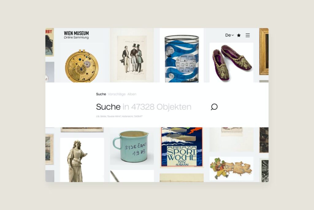
As a contrast to my discussion with Ben, I also had a look at Bleed’s work for the Wien Museum where they have developed the interface for their digital archive. The interface seems to be catered to a range of users and needs, giving them the option to search, view suggested items or browse curated albums.
I like how they’re always giving users suggestions (even in the search bar) as this gives people an indication on how to browse + what one might be able to find. The multi browsing aspect is also nice, and it would definitely be relevant in light of last week’s teacher feedback.
Moving forward I had to reflect on wether I wanted to make an interface with one meaning (ref. the point cloud idea), or if I wanted to do a multi-functional interface where the focus would mainly be on usability. I also wanted to find out if it could be possible to do both, by combining a range of viewing options.
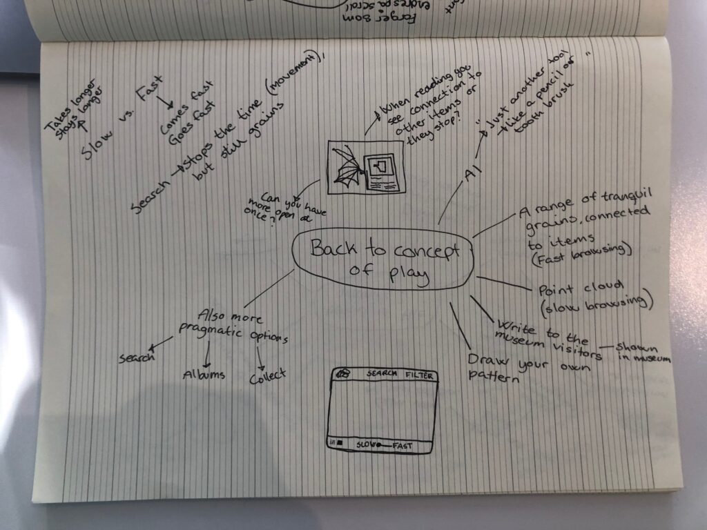
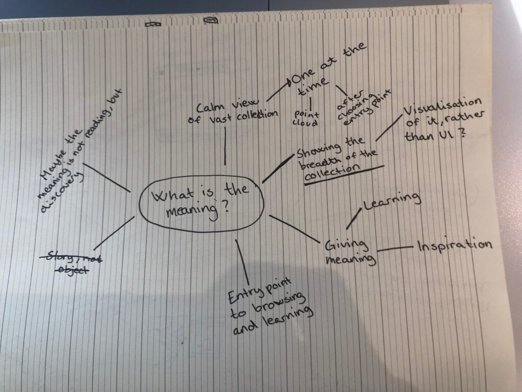
Ideation and restructuring
At this point I was slightly confused about what I actually wanted my project to be about. Was the meaning behind the interface to provide a calm experience, to increase discovery, or to show the breadth of the collection? As an attempt to structure my thoughts, I decided to do some sketching a mind mapping:
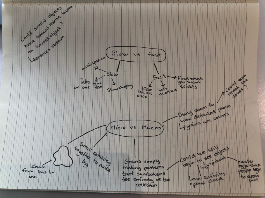
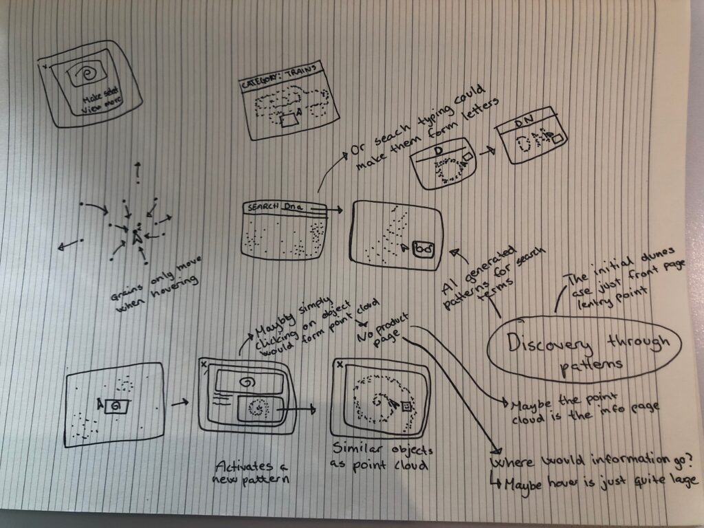
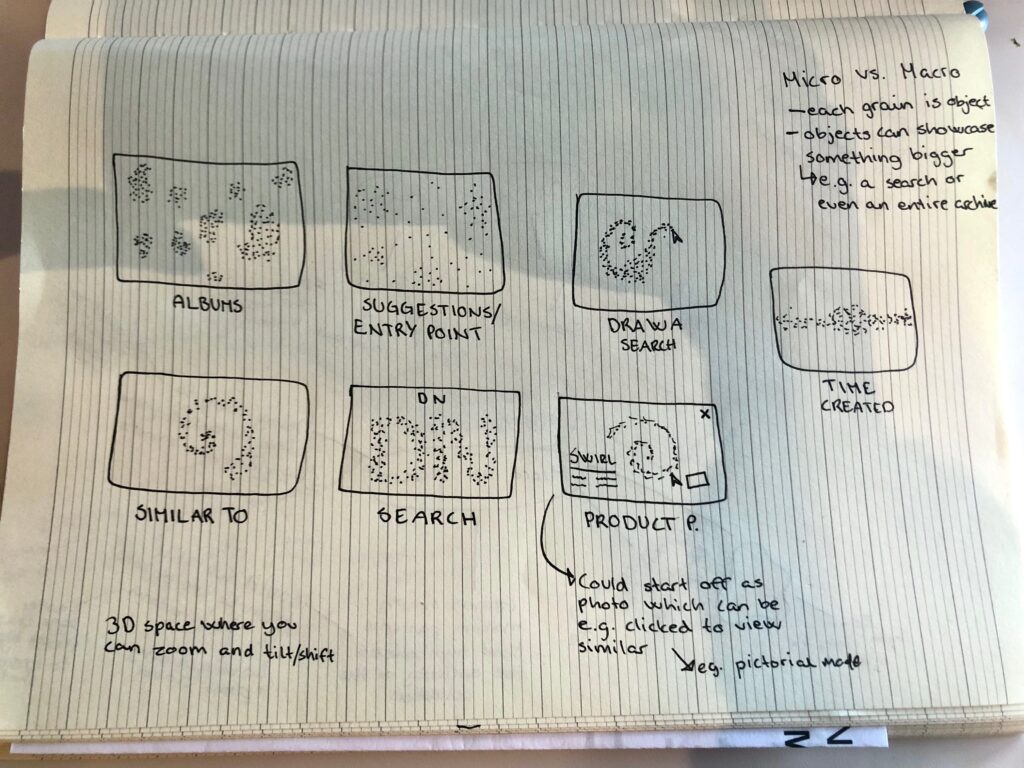
After my ideation session I was leaning against doing a combined approach of Ben’s point cloud idea and the original concept. The idea was to use the original idea as an entry point in which users could chose an object to explore. They would then be taken to a product page, in which they could choose to go on to a “similar items” browse mode. In this browse mode, the grains would be displayed as a point cloud of the object they are viewing similar items to. This point cloud idea could also be utilised when filtering or searching, for example by making points form the letters of a search. They could at any point break up the cloud and thus go back to the front page entry point.
This concept would use patterns as visualisations of your search. It could be interested to let viewers create their own patterns as a way of searching – similar to google’s project where you can draw in order to discover art. Below are a few visualisations of suggested views / browse mode where grain patterns can be used as entry for discovery:
What the idea does not do
As mentioned by Ben, the original idea (and the extended one) was still missing a purpose. It wasn’t actually able to provide a calm space, even though that was the original intention behind the idea. Ben’s suggestion of letting users discover one item at the time, by letting grains form into objects would have suited this idea of calm. However, I wasn’t quite ready to give up on the idea of the project also being a discovery tool where you could access a range of objects. I wanted it to be usable, whilst also providing value.
In order to move on in my project, I decided that it might be easier to focus on aspects of micro vs. macro, and ways of showcasing the breadth of the collection. I still wanted to provide a calm experience, but by using visual and sensorial methods, rather than solely showcasing one object at the time in a slow manner. As an attempt to give myself a focus I came up with the following research question:
How can an interface visualise the breadth and diversity of the Science Museum’s archive within a calm digital space?
Point cloud sand box and 3D tutorials
In order to develop my concept over the coming weeks, I will have to utilise some sort of technology which lets me animate grains, and turn them into objects. Ben suggested to look into 3D programs, and in my research I discovered Point Cloud Sandbox, a browser software which lets you distort and export 3D models into point clouds. The software let me visualise how particles might come together to create a shape. The technology behind it also shows that one can turn png images to point clouds, meaning the idea of browsing similar objects from a point cloud of the object could be possible.
In order to develop the visualisations for the interface however, I might have to use an actual 3D program like Blender (Ben mentioned that it might be hard to do this in AE and processing). I was able to find this video, which might let me do what I’m hoping to achieve.
Arts experiments with Google
In order to figure out how I could go about solving some of the problems I was having with my concept, I went to have a look at digital interface experiments developed by Google Arts and Culture.
Plastic in the air
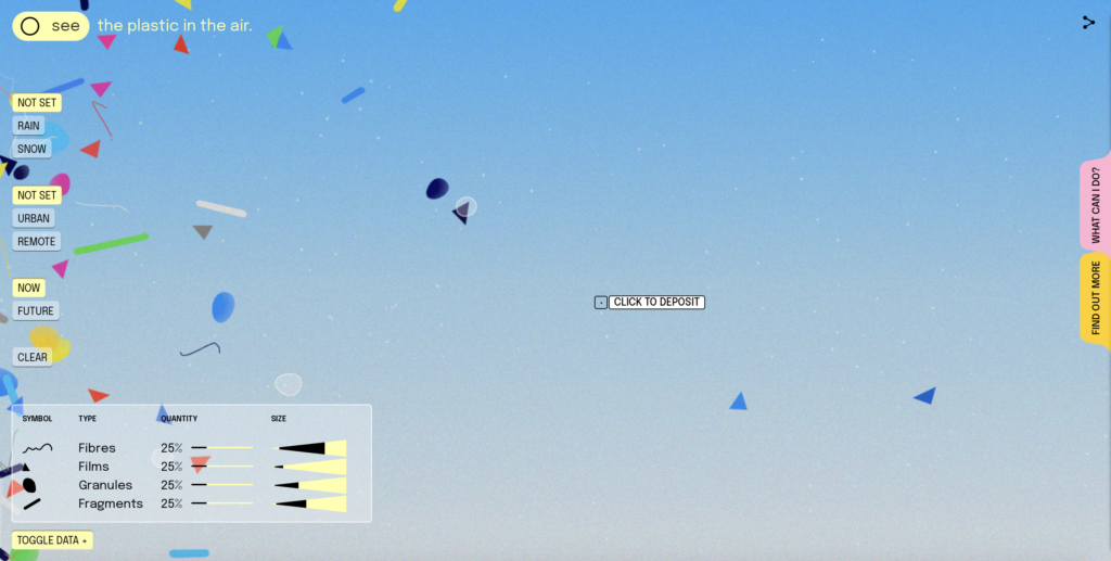
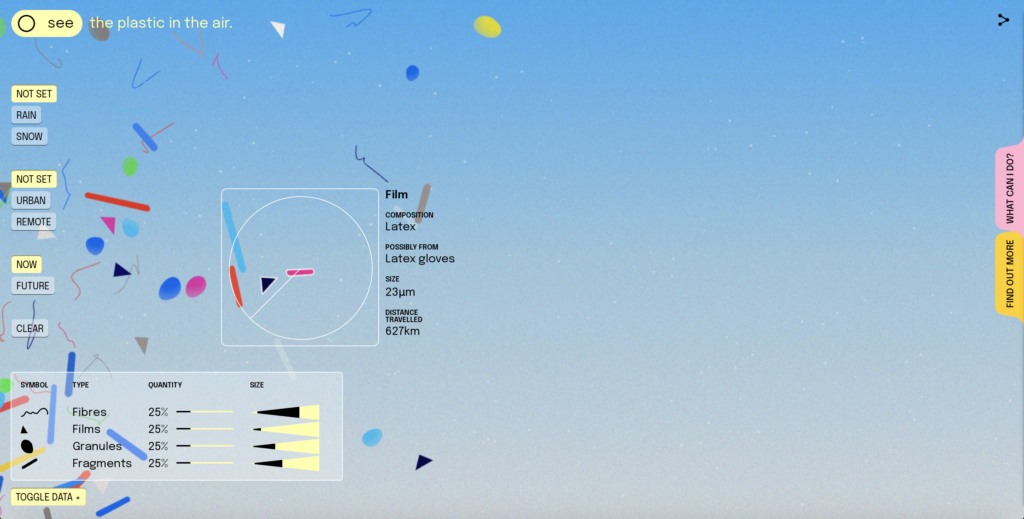
This project was doing some similar things to what I wanted to do, in a very nice way. For example, the hovering over items presents an illustration and some brief information, and I really liked how it managed to understand what you were trying to hover over. The interface menu was also of big inspiration as it gave a lot of possibilities, whilst still being very minimal. For my project I want to give users options, but I don’t want to overwhelm them as that would be the opposite of what I’m hoping to achieve.
Visually, I like how light it is. I’ve imagines my interface as dark, but perhaps I could explore other options in order for the interface to stand out from the typical “bright dots on black” aesthetic. I. also like how the shapes have different meanings, which are very easily explained in the interface. This is a really nice way of differentiating objects without overwhelming people. However, I do wonder wether it is actually useful, as users might not be able to learn what means what within this sort of setting.
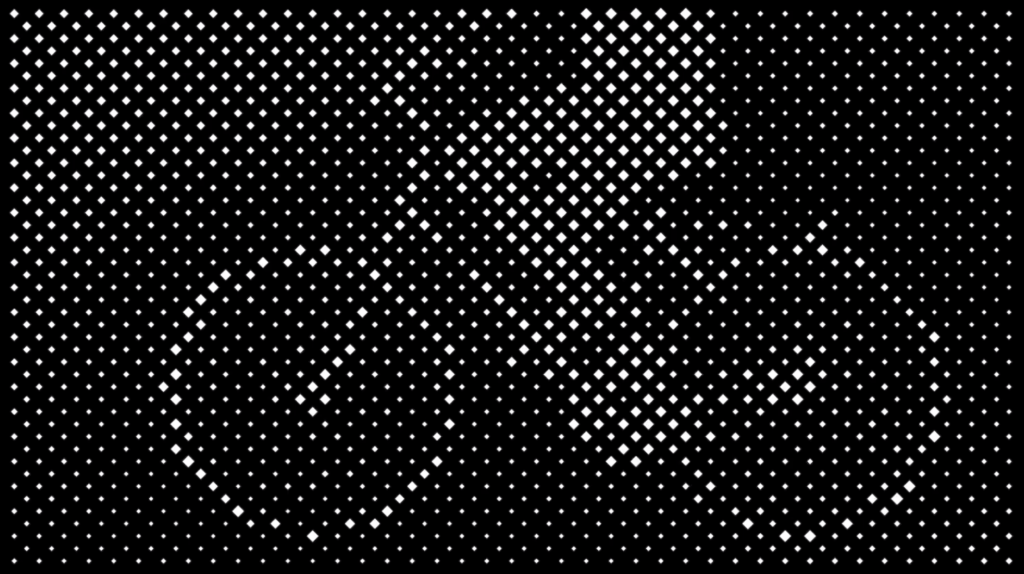
Medusae
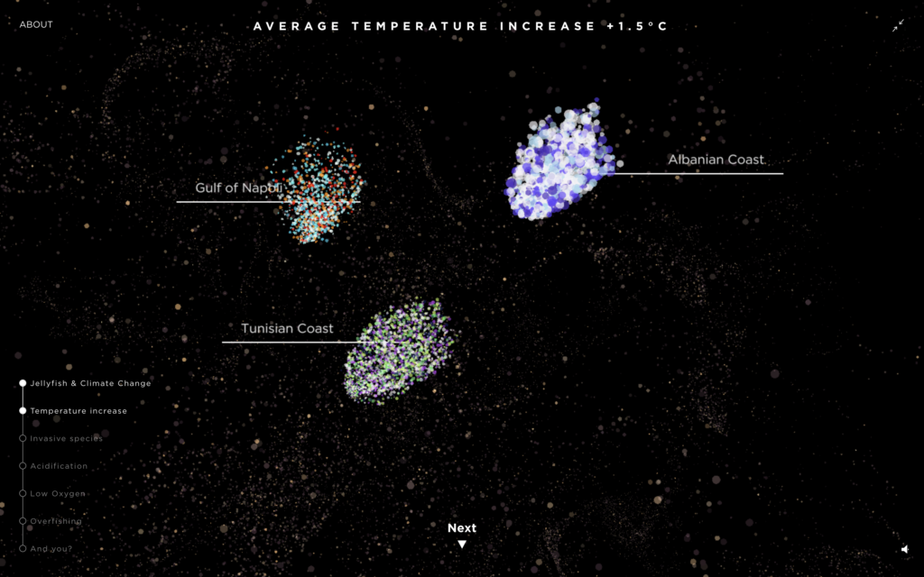
This information graphics website has actually found solutions to most of my problems in the way they showcase smaller groups of dots in front of the main group of dots. Additionally they have used type and a simple line to inform users of what group is, which is so simple, yet effective. The aesthetic and movements are in fact almost exactly what I was hoping to make, and so I might want to explore new directions, at least in terms of colours. I want the interface to be unique, and not a replica of something that’s already out there.
Although the 3D look is fascinating, this also made me wonder if I could go back to the two dimensional direction I was first pursuing. This might help make it less overwhelming, as it gives users slightly fewer options.
Art emotions map
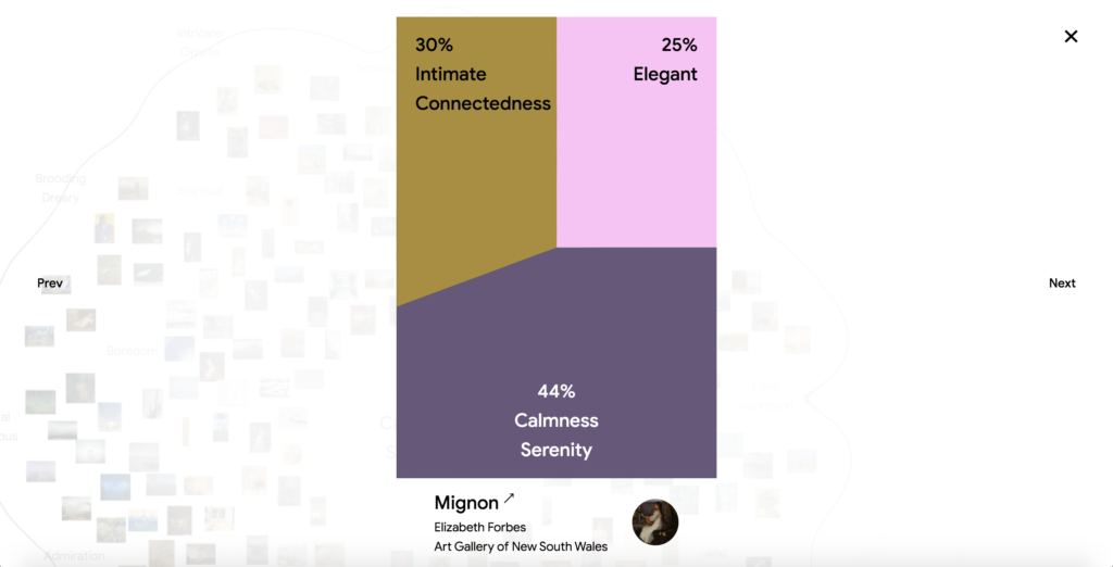
The art emotions map has a solution to another issue – I had been wondering about how I could guide users forward after having discovered an interesting object. Although they can choose to discover from a new group/point cloud, I’d also like them to be able to browse onwards with more ease. A simple Previous/Next option could be the solution to this problem.
Also, the way this guides you to the gallery page is great. I’m not currently seeing my interface as one which would hold lots of information about each object. If choosing to link them to the museum’s product page could be nice, as this could make my interface a tool for discovery, rather than discovery+learning. By focusing on this solely, I could potentially improve the project as it would narrow down the focus.
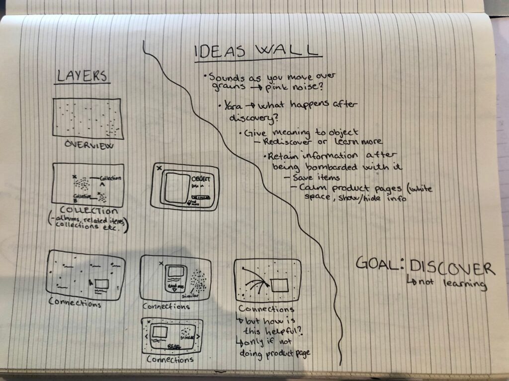
Digesting information
In order to digest the information above, I went on to draw some more small sketches, and note down some feedback from the ideas wall. At this point, the most important reflection was that I’d decided on a main goal for my project, and that it should mainly be a tool of discovery, not learning or storytelling (at least not intentionally – all objects tell a story, but the tool will not be developed with an intention of focusing on stories).
Visual exploration
Although I had enjoyed my explorations into 3D, I was starting to imagine certain aspects of my interface in 2D. The whole project aesthetic was beginning to feel quite conflicting in my mind, and I decided to make two moodboards as an attempt to discover the possibilities each aesthetic could provide.
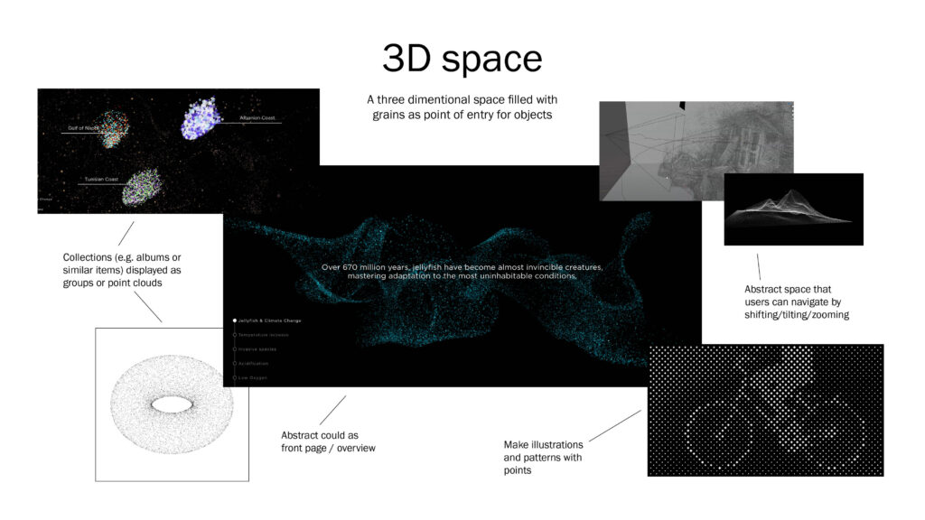
My “default thoughts” had imagined the interface as glowing grains on a dark background, with a three dimensional look. I had also considered how users might tilt, shift and zoom into the point clouds, giving them one more way of discovering the collection. This concept would provide a very mesmerising environment, however I also think it could feel overwhelming as it feels a bit much. As I’d seen a range of white dots on black background during my research, I was slightly unsure about going for this look, as I didn’t think it felt quite unique enough.
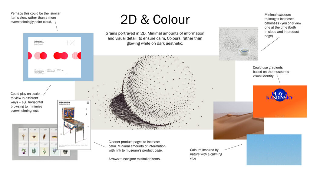
Choosing to do the interface in 2D / flat graphics would make the designing of product pages a lot simpler. The whole concept could in fact be more minimal, which could be more in line with the calming approach I was hoping to take. A two dimensional space could also present a range of scales in terms of grains, in a simpler way, meaning that I could potentially play with a horizontal scroll view (as visualised in the top left corner of the moodboard).
When developing the moodboards, I also got the idea of portraying the overview page as one unified cloud of grain, rather than having them randomly floating. This is in line with how sand dunes emerge. Additionally, it could also be more calming since users would have to look at one unified thing, rather than a million different ones. Calmness would also be ensured by only showing one image at the time (both in cloud/grain mode and on the individual product pages).
Since I was. exploring visual directions, I thought it could also be worth exploring different symbols for grains:
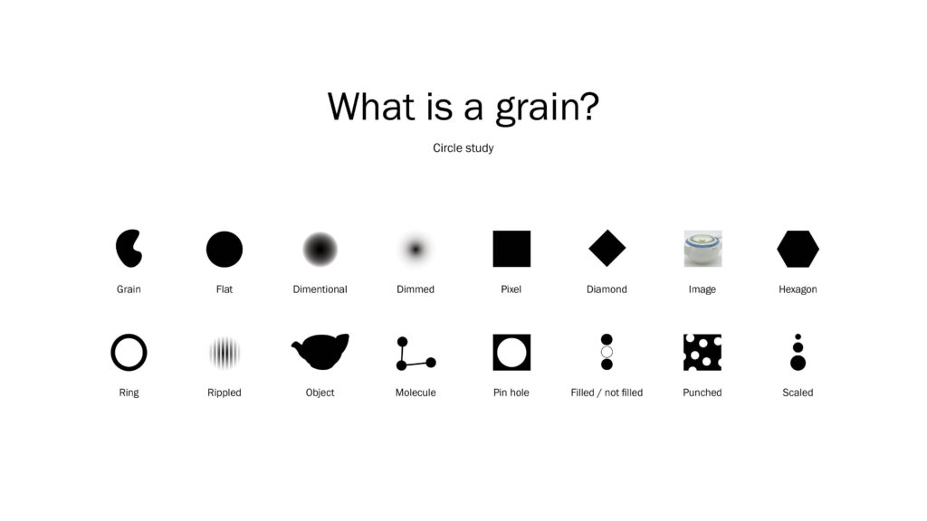
The flat circle is still my favourite, but I would also like to consider the filled / not filled and scaled, in order to depict patterns.
In conclusion
This week has really pushed me to reflect on my project direction, which has been challenging, but also needed. I started off by looking at physical sculptures, which I still find very interesting, but that perhaps didn’t actually add any new dimension to my concept. The talk with Ben was very important for realising this, and also for pushing me to reflect on what my concept actually was.
I can’t say that I’m completely content with where my project is at at the moment. The concept is still not entirely focused on calmness, and I feel like it hasn’t quite “clicked” into place. However, I do think it holds a great deal of potential for visual exploration. Working with patterns next week will be interesting, and I hope to manage to produce visuals whilst also adopting new technical skills.
Looking back at the week, and how I’ve struggled to refine and conclude my concept, I’m realising that some of the reason for why I’m finding it challenging might be my lack of experience in UI design. My focus as a designer has previously been on branding and identity systems, and thus, trying to develop a meaningful concept which is also user centred feels new. I am used to developing visual elements based on conceptual reflections, but perhaps not more abstract user journeys like this one.
Moving on to next week I think it will be important to just get on with the project, even if I don’t feel like the concept is as refined as it should be. I’ve chosen to embark on a technically challenging direction (another approach outside of my comfort zone), and I will try to be as patient with myself as possible, as a way of following my obstacle plan from the week 5 project plan.
REFERENCES:
Geoffrey Lillemon (2019) Redefining Reality | Geoffrey Lillemon Creative Director of W+K’s Department of New Realities. Awwwards. Available at: https://www.youtube.com/watch?v=AUuTjsbNvpk&ab_channel=awwwards. (Accessed: 12 November 2021).
IDEO (2018) ‘DESIGN THINKING DEFINED’, IDEO: Design Thinking. Available at: https://designthinking.ideo.com/ (Accessed: 12 November 2021).
Steve Vranakis (2019) Imagination is innovation | Google Creative Lab. Glug. Available at: https://www.youtube.com/watch?v=LdCBnqbCtm8&ab_channel=GlugEvents%E2%80%94TalksandNotworking (Accessed: 14 November 2021).
Tate (2017) ‘Kinetic Art’, Tate. Available at: https://www.tate.org.uk/art/art-terms/k/kinetic-art (Accessed: 14 November 2021).
Torsten Posselt et al. (2021) ‘Concept Development 2’. Canvas Falmouth Flexible [online], 5 November.
LIST OF FIGURES:
Figure 1. FELD. 2018. Impulse. Feld Studio [online]. Available at: https://www.feld.studio/work/impulse/
Figure 2. Geoffrey LILLEMON. 2016. Bitmap Banshees. Geoffrey Lillemon [online]. Available at: https://commercial.geoffreylillemon.com/BITMAP-BANSHEES
Figure 3. GOOGLE CREATIVE LAB. 2018. NSynth Super. D&AD [online]. Available at: https://www.dandad.org/awards/professional/2018/product-design/27149/nsynth-super/
Figure 4. FELD. 2014. Kinetic Rain. Feld Studio [online]. Available at: https://www.feld.studio/work/kinetic-rain/
Figure 5. Alexander KLEPNEV. 2018. Sand grains of yellow building sand. Wikipedia [online]. Available at: https://en.wikipedia.org/wiki/Sand#/media/File:%D0%9F%D0%B5%D1%81%D1%87%D0%B8%D0%BD%D0%BA%D0%B8-1.%D0%96%D0%B5%D0%BB%D1%82%D1%8B%D0%B9%D1%81%D1%82%D1%80%D0%BE%D0%B8%D1%82%D0%B5%D0%BB%D1%8C%D0%BD%D1%8B%D0%B9_%D0%BF%D0%B5%D1%81%D0%BE%D0%BA.jpg
Figure 6-7. SDG. 2019. Fremtind. SDG [online]. Available at: https://www.sdg.no/work/fremtind
Figure 8. Lucas VIEIRA. 2012. A point cloud image of a torus. Wikipedia [online]. Available at: https://en.wikipedia.org/wiki/Point_cloud#/media/File:Point_cloud_torus.gif
Figure 9. BLEED. 2020. Wien Museum Online Sammlung. Kreativt Forum [online]. Available at: https://www.kreativtforum.no/arbeider/bleed-designer-digital-museumssamling
Figure 10. Quentin LENGELE. 2019. Point Cloud Sandbox. Point Cloud Sandbox [online]. Available at: https://pcsb.quentinlengele.com/
Figure 11-12. Giorgina LUPI, Telia COTTON and Phil COX. 2021. Plastic in the Air. Google Arts and Culture [online]. Available at: https://artsexperiments.withgoogle.com/plasticair/
Figure 13. Christina TARQUINI. 2021. Medusae. Google Arts and Culture [online]. Available at: https://artsexperiments.withgoogle.com/medusae/
Figure 14. GOOGLE ARTS AND CULTURE. 2021. Art Emotions App. Google Arts and Culture [online]. Available at: https://artsexperiments.withgoogle.com/art-emotions-map/
Figure 15: Ingrid REIGSTAD. 2021. Moodboard: 3D Space. Private collection: Ingrid Reigstad.
Figure 16: Ingrid REIGSTAD. 2021. Moodboard: 2D & Colour. Private collection: Ingrid Reigstad.
Figure 17: Ingrid REIGSTAD. 2021. Circle Study. Private collection: Ingrid Reigstad.