Lecture notes
Lecture reflection
Torsten Posselt was quite motivating in this week’s lecture, particularly during his discussions on making mistakes. So far, the Science Museum brief has been quite challenging, and all in all the second brief this module has been a little outside my comfort zone. Thus, it was very nice to hear about the value of making mistakes, and how failing is a part of the process (Torsten Posselt et al., 2021). Posselt’s advice on prototyping early was also good. At this point I feel like I’ve got quite a few ideas, but that they’re not quite making sense to me. I might therefore start doing prototypes this week.
In terms of specific advice, I liked Stijn van de Ven’s discussions. He mentioned sketching and writing as important methods for ideation (Torsten Posselt et al., 2021) – two methods that I personally feel like help a lot with understanding my own thoughts. What I’m not used to however, is to stick with sketching for a whole hour, but perhaps this could be an interesting thing to try this week.
Lastly, I think Luke Veerman’s notion on thinking holistically is important, and perhaps something I tend to forget. However, I think it could be really interesting to try and explore ways of taking my archive interface concepts into other aspects of the museum or physical archive somehow.
Resource notes
Resource reflections
Morag Myerscough on transforming spaces with colour and embracing the unknown
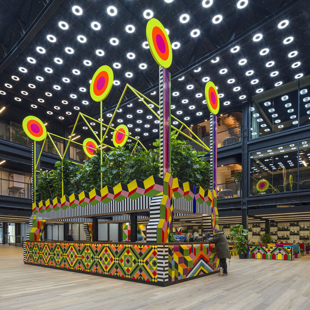
Although we have looked at Myerscough’s process in a previous module, it was great to see her talk, as it made me understand more about how she works with co-design (one of my directions from last week’s moodboards). From what I could tell, she seemed to have a set grid and colour range, and then workshop participants could pretty much make any type of pattern using these structures (Morag Myerscough, 2018). With these structures in place, she manages to get a diverse, yet cohesive combination of patterns, which I really like.
The video also made me reflect upon wether I might have taken an approach to the science museum that feels a bit too serious. The physical museum is all about play and learning by having fun. I still think it’s interesting to reflect on narratives and cultural representation, but I wonder wether I could possibly focus more on play. To me, the brief seems to be about translating the joy of the museum experience into digital, and I therefore think this could be an interesting route to explore further.
Moving forward this week, I will try to have more fun with my work and perhaps not take it too seriously, as inspired by Myerscough.
The Art of Looking Sideways by Alan Fletcher
What I found most interesting about Fletcher’s discussions was the fact that we think in pictures, not in words (Alan Fletcher, 2007). The way he seemed to be communicating in his book seemed very intuitive and visual, and I think this seemed very inclusive in a way.
As Tove mentioned on last week’s ideas wall, language can be exclusive. Therefore, I wonder wether the digital archive could potentially communicate without written language, as a way of catering to a global audience. This way of communicating could also be inspiring as it wouldn’t only be saying one thing – rather people could try to interpret objects how they’d like to. However, I do struggle to see how one might go about communicating complex notions of science using only imagery.
Further research
Hato: Transforming Sketch into a digital experience
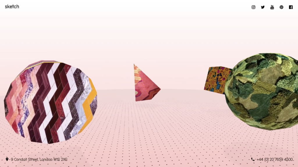
Inspired by my above reflection on play, I wanted to explore work by Hato, as I know that play is an important part of their process. In their work for Sketch London, the design studio has translated the restaurant into a digital experience by building multiple 3D environments.
Although I’m not totally convinced on their success in relation to the translation from physical to digital, I really appreciate the sense of play in this project. With a set of digital games, the interface lets guests explore the universe of Sketch through making. This made me wonder wether users could potentially do the same thing with the Science Museum’s digital archive?
The danger of play and interaction is of course if the archive becomes too childish, and thus not targeted towards the 18-30 year old target audience. Perhaps the importance would lie on creating a creation tool, rather than game?
Like Hato often does in their work, I could use the tool / creation interface to build the visual identity for the archive.
Lush’s commerce app
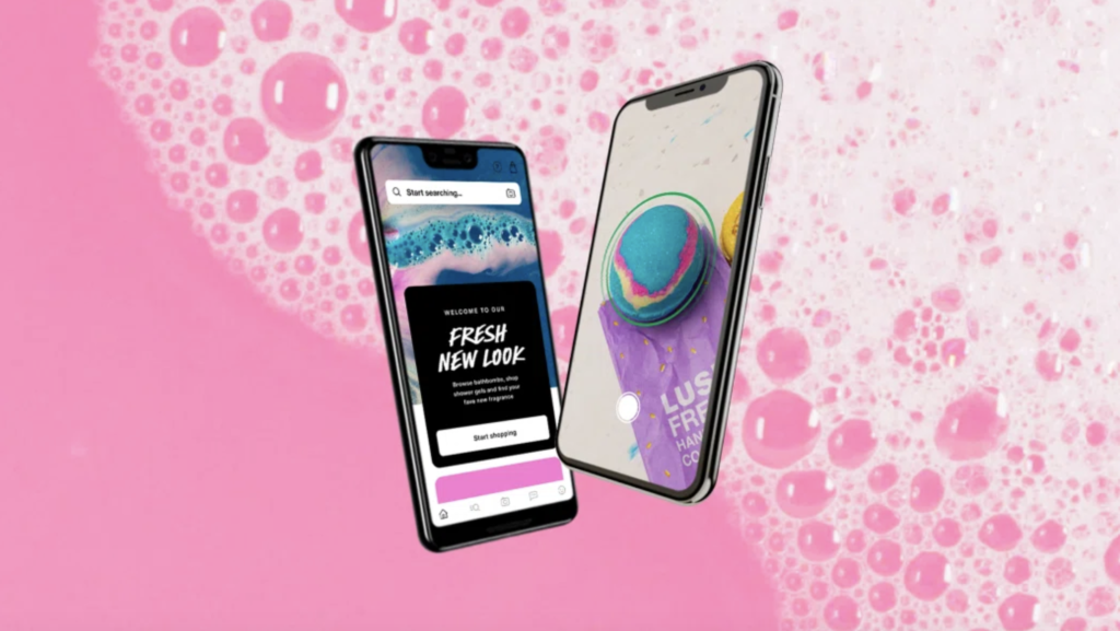
This article on It’s Nice That discusses how Lush has worked to develop their new digital retail experience, inspired by curation-led apps like Pinterest and Spotify (It’s Nice That, 2021). Although I don’t think the website itself is hugely innovative, I like how they’ve worked on reducing, reusing and recycling when working on their hardware (It’s Nice That, 2021). If I have time, I’d really like to get more into sustainable digital experiences for this project, as it would be in line with how the museum has build their physical archive building.
Workshop challenge
At the beginning of the week, my project focus was still quite vague and rather than jumping straight into concept development, I decided to discuss my project in a tutorial with Ben. He mentioned the exhibition, A hand is dealt, where visitors would make up stories informed by a deck of cards. As discussed in my resource reflections, I was considering taking a playful approach to co-design in my project. A hand is dealt made me realise that co-design doesn’t need to involve drawing and making – it can also involve writing and story building. This helped me open my mind as I moved on to ideate.
20-20-20 Mind map
Inspired by Stijn van de Ven’s suggestion on spending an hour sketching (Torsten Posselt et al., 2021), I decided to start out with a sketching session. However, I actually find that mind maps help me come up with more ideas than normal sketching, and I therefore chose this method instead.
According to my project plan, the goal for this week was to come up with three concepts. I therefore decided to ideate on three themes, based on last week’s ideation: 1. User generated narratives, 2. Interaction/co-design, and 3. Way finding systems. One sketching hour divided by three, meant that I would spend 20 minutes on each mind map, which I tracked using a timer.
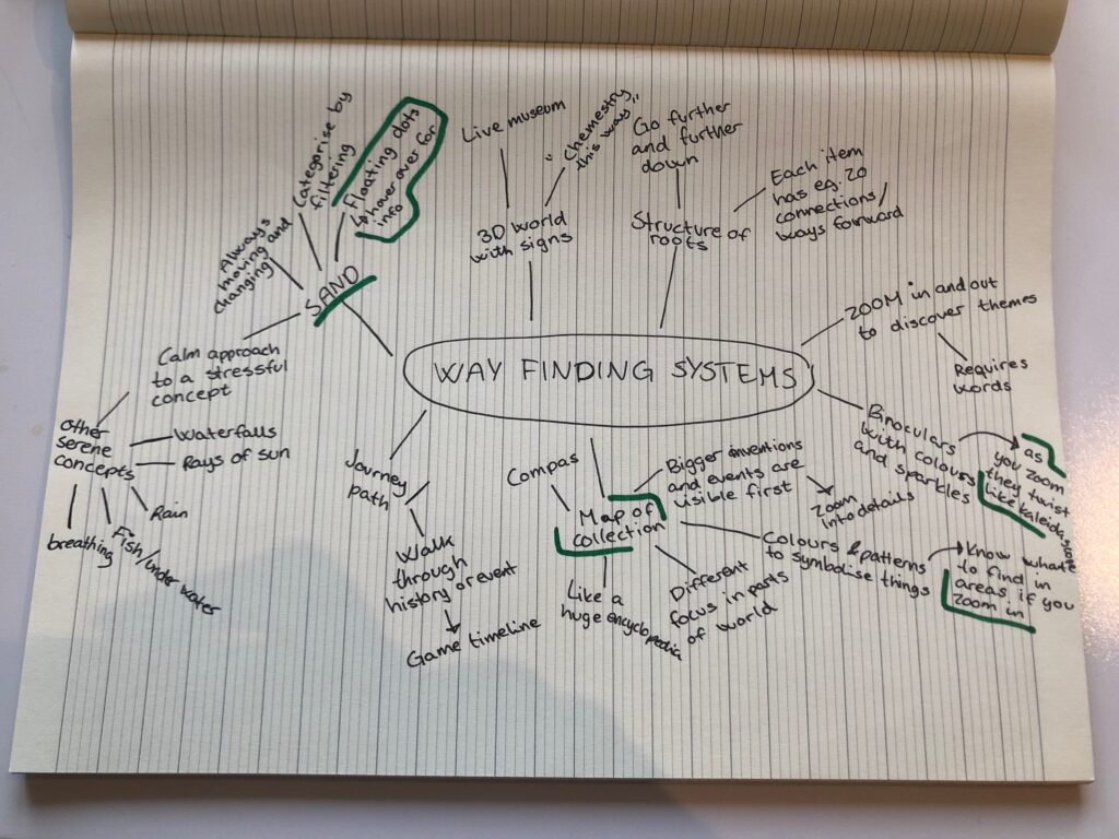
Way finding systems: ideas
A digital map of the collection
As discussed last week, I was interested in making a kind of digital map of the collection, where users could zoom in and out to gain a broader / more detailed perspective of a topic or moment in time. The zoom would be inspired by the Powers of Ten film by Charles and Ray Eames. When zooming in, users would see objects with fewer or no views, meaning that unpopular items with public interest would be pushed forward over time as people interact with and zoom in to the map.
Similar to actual maps, this digital “map” could use colours and patterns to symbolise type of content (similar to how green symbolises vegetation in normal maps, colours and patterns could be use to symbolise e.g. content medium, like video-content, or categories from the museum like physics and mathematics).
The shapes and colours from the physical archive could be re-interpreted here as cards for entries, inspired by the way a kaleidoscope works. When you zoom in, the shapes and colours could twist and turn, making beautiful visualisations – to represent the beauty of our world.
Actual maps are drawn from different perspectives depending on where you are in the world – perhaps this digital map could also take the user’s location into account by showing relevant objects to the story of that geographic place?
Sand
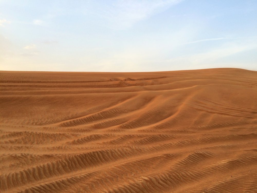
Whilst reading about GPS systems last week, I read on the Science Museum that navigating in a dessert can be very difficult, particularly because the sand dunes changes everyday due to wind (The Science Museum, 2018). The vastness of desserts reminded me of the vastness of the museum’s collection. It’s quite impossible to focus on each grain of sand, but at the same time the collection of them makes this beautiful geographical landscape.
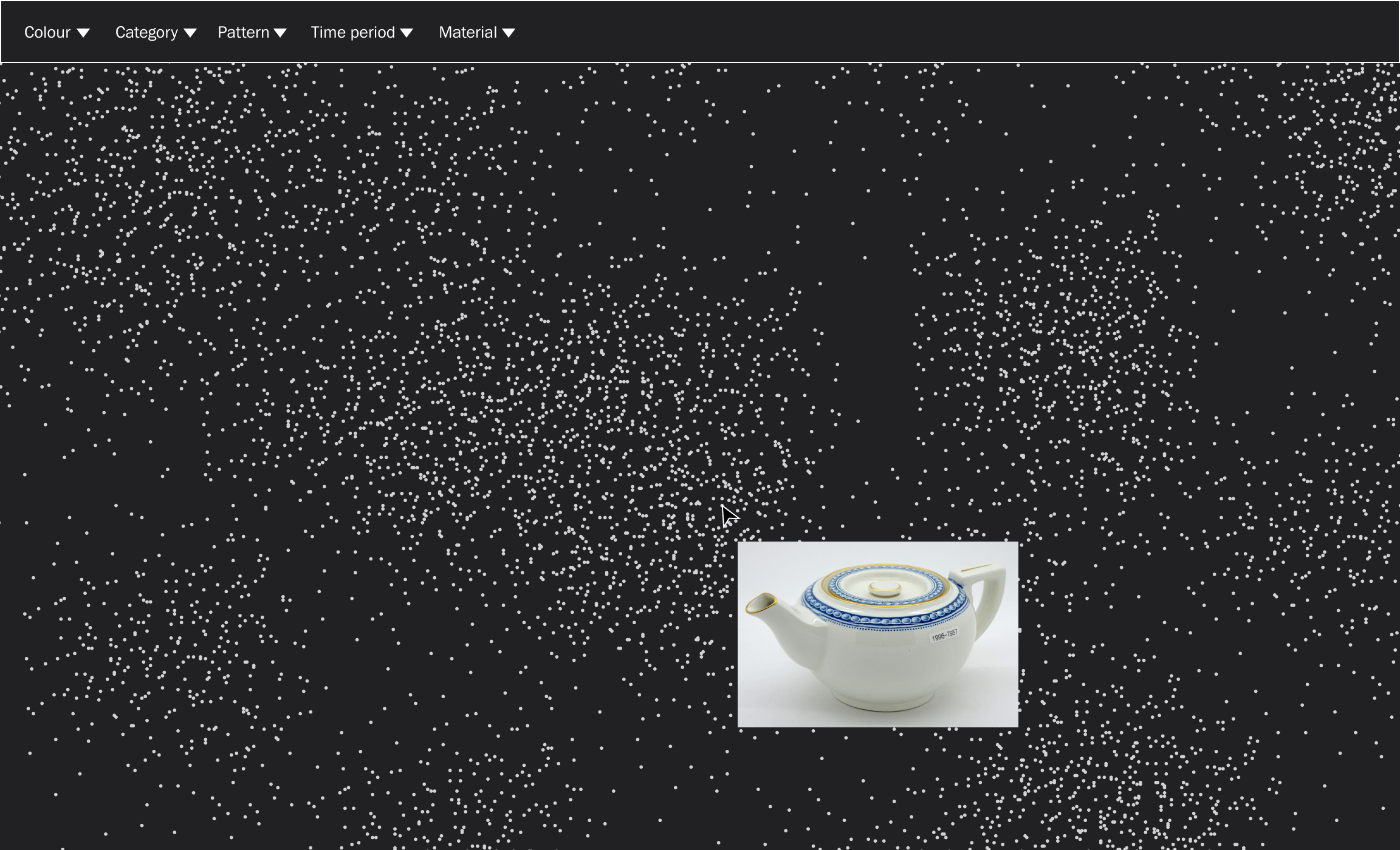
Referring back to last week’s lecture, I was interested in making a digital tool that is “good for you” – meaning that it’s not addictive or stressful, but rather a space of tranquility. Through mind mapping I got the idea of presenting the collection as a range of grains floating around in space, as a way of taking a calm approach to a stressfully large amount of information.
Users could for example hover over grains to view the objects, and as the grains are floating around, the scene would be in constant change, meaning users would be able to discover new objects every time they visited the website. In order to ensure meaningful browsing, users could also filter what type of content they’d like the “sand dunes” to entail (for example, by ticking “green”, the hovering would only show green objects).
Processing could potentially be used to create a system for the floating and arrangement of sand grain.
What I liked about this idea was that it could potentially let users curate or arrange their own workspaces, meaning I could intertwine it with other project ideas. Also, the layout wouldn’t need to be sand, it could also resemble other tranquility related scenes like rain, water falls, rays of sun, flying birds etc.
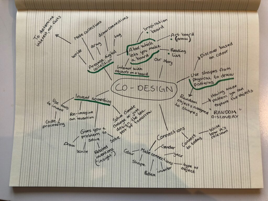
Co-design: ideas
Invent something
Rather than encouraging plain browsing, the digital archive could be a tool that encourages innovation and creativity. By presenting problems to be solved, the tool could encourage users to invent something new – be it a solution to global warming or just a sketch for a new tea-pot.
The tool could have a range of sub-tools (drawing, writing, etc.), including objects from the collection, which could provide insight.
Pattern discovery tool
Inspired by Myerscough, I wondered wether users could use shapes and colours to develop patterns. Each pattern element would be connected to a random object from the collection, and after generating a unique pattern, the user would be able to reveal the hidden objects, and perhaps draw or see connections between them. This tool would be a “random discovery tool”, quite similar to the function already created where one can see an object that has never been seen before.
User arrangement
Similar to the curation direction from last week, I got the idea of developing an interface where users would arrange, tag, draw and write, and in effect develop their own boards of inspiration. Rather than developing exhibitions and narratives (which requires a certain expertise), they would use the platform as a type of digital sketchbook, which could be anything from a visual inspiration board, to a reading list.
By letting users add tags and connection between objects, this tool would also add information to the entire archive, making the categorisation of objects a communal effort.
This idea is currently missing the element of exploration, as users would still have to find the objects before arranging them.
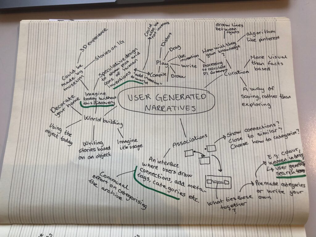
User generated narratives: ideas
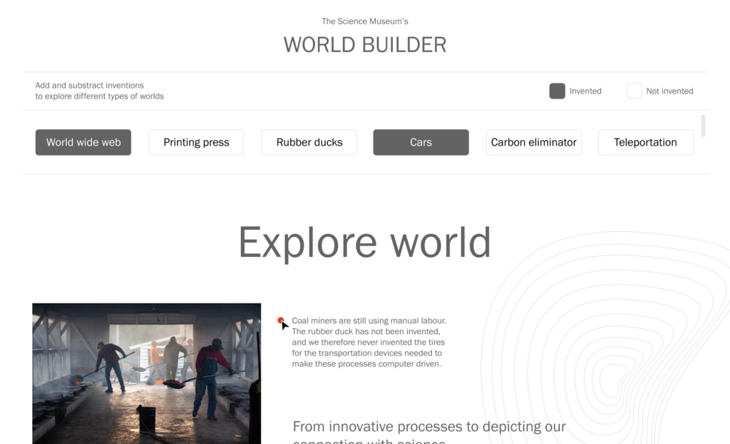
Speculative world building
In my tutorial with Ben, he mentioned that it only takes changing one thing from our world to build a new one. This made me wonder if I could use speculative design to develop worlds where certain inventions would or wouldn’t have been invented. This would tell the story of objects in an engaging way, and perhaps add an element to the “meaningful browsing” term mentioned in the brief.
Users could add and subtract existing and speculative inventions to the world, and experience how they would change the society. This would be a fun project, but also difficult as only one world/invention would require a lot of work and resources. Therefore, the idea would not show the entire collection, but rather the most important pieces.
Prototypes
Inspired by this week’s lecture discussions, I wanted to move on quickly from ideation to prototyping, in order to test out my ideas. Since part of my project plan for this week involved testing my concepts on users, this would also be important as a visualisation for this task.
I have created very simple prototype, with little attention to the design. These should be considered as initial tests, to be presented at crits for peer to peer feedback. Please refer to the idea descriptions above for context.
Digital map prototype:
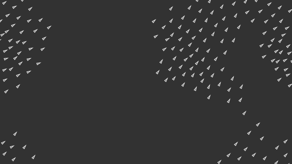
Sand grain prototype:

World building prototype:
Feedback on initial prototypes
As mentioned, part of my project plan for this week was to develop three concepts and then test them on my target audience). The workshop challenge also asked us to seek feedback from industry professionals, research groups or any relevant parties.
I decided to discuss the project with my partner, who’s a UX-designer. This was part of my plan for dealing with obstacles, and how I wanted to seek advice from UX-designers due to my lack of experience in working with digital interfaces. I also wanted to get initial responses to my concepts from a teacher, as a party who’s not interested in design, but rather interested history and knowledge (ensuring the interface would actually be useful, and not just pretty or conceptually good). On the ideas wall I was able to collect further feedback, and in the crit session I received feedback from John, who could count as a key stakeholder.
Feedback from a UX-perspective:
- The SAND concept could be interesting visually, as long as it builds on research, and isn’t just a superficial idea
- Perhaps notions from the digital map could be integrated with the SAND concept – at this stage it feels more beautiful than usable, and it should be both
- Could users potentially interact with the SAND idea? Collecting certain grains could be a game or challenge – for example you could announce the “find of the day”. Maybe it could also be a challenge from the museum of getting all entries viewed at least once – unseen objects could be marked in a certain colour, and users could come together collectively to view them all.
During our discussion I got the idea of the SAND concept also having a collection aspect, where users could collect sand grains, which would turn into their own “sand dunes” animated based on the collected data. Since the grains are constantly drifting by, you wouldn’t be likely to see the same item twice – this would give users an incentive to collect the one’s they’re into.
Our talk also made me consider the SAND idea holistically, and wether it could also be an installation, for example in the reception of the physical archive building. It could also be an IG filter, and perhaps turn into a visual identity for the archive (the black and white could work with the museum group’s over all identity).
Feedback from the ideas wall:
- The SAND idea got the most love on the wall, however the other two were also mentioned as favoured
- Harvey mentioned that the dunes could be different each time you refreshed the page (this would happen automatically as the grains would be animated) – and I liked the idea of the range of unique patterns that could be developed
- Wes suggested that maybe the sand and the map could be combined into one idea. He mentioned the look of the world and it’s light seen on satellite photos, and how one might zoom into grains to get closer to the map.
- Weronika mentioned that the SAND idea seemed like a calm approach to information seeking, and if I was to go for this idea I’d be interested in looking further into calming experiences.
- Kevin liked the speculative design project, but agreed it might be hard to actually develop
Feedback from the crit with John and peers
- John didn’t really seem to have a favourite idea out of the three, but he mentioned that the SAND idea could be a good way of balancing the contrast between light and heavy, which suits the nature of the collection
- John mentioned that it might be nice to have the sand dunes shift based on perspectives and other things, and that this could lead to some beautiful animations
- In terms of the world builder idea, John commented on the interesting notion of how innovation usually happens. He said that it’s often one idea building on another idea which is already out there, meaning that the loss of one idea can affect a lot of other ideas.
- Yara mentioned that the SAND idea could be a totally zen and really relaxing experience
- James mentioned that he was particularly taken with the world building concept and how it suggests that we’ve only just touched the surface of the potential of humanity
- Cat mentioned that she liked the map, but also the SAND
What was great about this week’s crit was that John’s feedback to others were also relevant to my project. Below are some points I wanted to consider in addition to my own feedback:
- The museum is interested in pushing the mix of physical and digital
- They are interested in exploring projections, as apposed to VR, because they are social experiences – this was relevant for my SAND idea, because it could potentially be a projection/installation
- People like having their things displayed in the museum – this made me wonder wether people’s individual collections of sand dunes could be presented in the physical installation, which would bring global audiences together in one physical space, adding a global connection to the project
- Layering of information is important – it needs to be light, but one needs to be able to dig into something if wanted (hiding information, but also making it very available)
- Taking the museum to where people are (this can be physically, but also the platform they use) is a good way of getting them to the page
- The museum’s work is more about asking questions than telling facts, and it’s also more about telling stories than the individual objects
Feedback from a teacher’s perspective
The teacher provided insight based on his own research habits, but also based on his observations on how students like to access information (particularly the younger generation who processes huge amounts of information each day).
- The teacher mentioned that younger students are very impatient when it comes to accessing information – they need clear instructions on what they’re expected to do, and they should only be given one task at the time (e.g. click on a SAND grain), before being presented with a new task
- The teacher preferred the world building idea, and he also mentioned that the other two have limitations due to him not being a “visual person”
- He said that his usage of the SAND and map ideas would depend on what he was seeking information for – would the discovery take more time than searching on google, and if so he wouldn’t use them for e.g. making a presentation
- At this stage it’s a tool you use if you have an interest that you want to explore in your spare time (this made me realise that the SAND and map ideas mainly appeal to vultures, rather than snackers)
- When he browses, he likes to have a structure where he can click on headings related to what he’s searching for (this was also described in detail in material presented in the brief, meaning that the museum had already found this insight/habit across audiences)
- If he was to use e.g. the SAND idea, he’s like some sort of list of contents where he could navigate, and then he could use images and more detailed info
- By combining a visual interface with a verbal structure one could cater to both analytically and visually driven users
Feedback reflection
The feedback didn’t really give me definite answer on which concept to go ahead with, as people seemed to enjoyed different aspects of all of them. However, quite a few mentioned how I could combine the map and SAND idea, by making the SAND idea more useful. The teacher’s perspective, which was really my main source of audience feedback, was that if this idea was to work, it also needed to appeal to analytical people in need of information fast.
Personally I had gotten quite attached to the SAND idea, both due to the calm contrast to the digital collection, and it’s holistic possibilities. I liked the idea of developing something which could potentially be a complete identity, and not just an interface system. This direction also had enough challenges (like attempting to learn processing), whilst still being relevant to my interests as a designer (branding, beauty, systems, and potentially aspects of co-design).
Objectives
Before deciding on the SAND project, I wanted to see if it was inline with my stated objectives.
- Create an interface that encourages meaningful browsing, with content that inspires and surprises users.
I still hadn’t reflected fully on the term meaningful, and thinking about it I realised that this was quite a vague point. Meaningful could be connected to users being able to collect certain objects (either as a challenge from the museum, or as an inspiration board), the beauty of the animation, having their collections showcased as a physical installation, or just discovering a range of object within a calm space. However, meaningful could also be the ability to find information quickly (discussed by the teacher), and at this point, the SAND idea didn’t have this function.
Also, there weren’t any huge surprise elements in this idea, unless you count seeing random objects as surprising. The surprise could perhaps appear in the information section of the individual items. Maybe you could even develop certain sand dunes that tells a specific narrative, used to surprise users?
- Target two different personas: “vultures” and “snackers”
During my audience testing with the teacher, I realised that the SAND interface is only appealing to those looking to explore, and not those in need of information quickly. However, it does somewhat cater to both vultures and snackers. At first glance you can explore pure visual objects, and by clicking into them you’d find more information. Also, you can either just use it as a visual browsing tool, or you can create personal sand dunes, which would make it a tool which can be used for a range of purposes.
- Create an interface that shows the breadth and diversity of the digital collection
This objective can definitely be ticked, as it shows a huge amount of objects at the same time.
- The tool/product-pages can be users’ first interaction with the museum. The final product should therefore represent The Design Museum both in terms of aesthetics and concept.
I definitely think the SAND idea has an aesthetic quality that can be used to tie in the Science Museum’s visual identity. At the moment, I imagine the grain being dissolving from the logo, or connecting to the museum’s logo in a unifying way.
Choosing a direction and planning the way forward
Although the SAND idea didn’t match all objectives or audience needs at this stage, I felt as if it could be altered to do so. Moving forward I therefore decided to go ahead with the SAND idea, and to develop this concept based on further research, feedback and objectives.
Based on the feedback, I also created a list of areas to explore, meant to help me next week as I go on to iterate on my concept:
- Combining visual and analytical users
- Layering information
- Different views (including verbal)
- Verbal navigation menu as part of interface (could they be met with a choice?)
- User interaction → brainstorm on challenges and tool usage
- Find of the day, personal dunes, find everything unviewed
- Light vs. heavy
- Use enlarged grains as product page?
- Look into physical structure of sand grains
- Animation
- Using processing
- Patterns/systems to adopt
- Concepts of mindfulness and tranquility
Further research
Having met the to-do’s of this week’s project plan, I also decided to do some brief further research.
Clever Franke: Globalance World
During the crit session, someone posted a link to this case study by Clever Franke. The interactive typography is made up of rain, which made me wonder wether I could do something similar with the museum’s logo and sand grains.
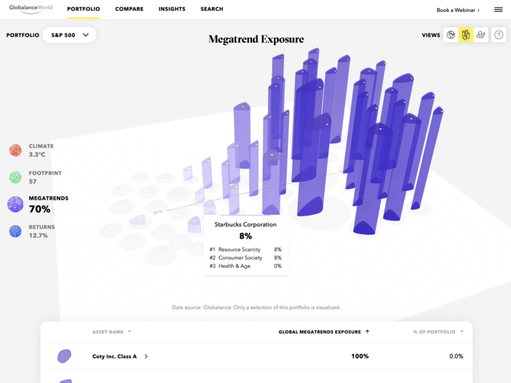
What was also interesting, was how they had created a range of views, which the users could use to explore data in a range of ways. For example, one can shift between the globe view, and the asset view. This is very much in line with the teacher’s feedback, about needing to also be able to access some sort of list of contents as navigation.
Daniel Shiffman: using processing to mimic flocking
In my tutorial this week, Ben was talking about processing and an example where Daniel Shiffman had used programming to mimic flocking. As mentioned previously, I might want to get into processing in order to develop the sand dune animations. I wouldn’t want to just have floating grains, I’d want the grains to behave in specific ways, perhaps even based on the perspectives and types of content represented.
Conclusion
After this week’s lecture, I decided to follow the advice of spending an hour on sketching, for then to write about the ideas, and then to lastly develop initial prototypes. I was able to come up with quite a few ideas by sticking to my mind maps for longer than what feelt natural, and I was also able to work on them further through written reflection. The prototyping was helpful when presenting ideas to others, particularly the SAND one, as it would have been quite difficult to explain without a visualisation.
Having gone through the process above, it was also very important to discuss my ideas with others. Through my conversation with an UX-design expert, I started thinking about holistic approaches. By discussing concepts with an analytical teacher, I was also able to discover potential issues related to the concepts. Being able to gain insight and perspective from John was also hugely beneficial, as it helped me realise what sort of directions they are taking the museum’s digital design.
This concept development process has really suited my way of working. Although aspects of it is already part of my practice, I want to make sure to adopt additions like sketching for an hour, and looking for different perspectives when asking for feedback. An analytical person will give very different feedback from an artist, but if they are both part of the target audience, both of their needs have to be catered to.
I could have worked harder on visual development this week, as my prototypes are very basic. I also could have spent more time exploring further concepts, and iterating on the one I decided on. Further, I also could have worked more systematically by attempting to follow last week’s mission statement, which I sort of decided to abandon when it wasn’t taking my ideas anywhere. Either way I’m currently quite excited about my idea, and I look forward to refining and elaborating next week.
REFERENCES:
Alan Fletcher (2007) The Art of Looking Sideways by Alan Fletcher. Available at: https://www.youtube.com/watch?v=meKUDU0sH5w (Accessed: 6 November 2021).
It’s Nice That (2021) ‘How Lush is applying its longstanding ethics to digital practices’, It’s Nice That, 22 June. Available at: https://www.itsnicethat.com/articles/lush-digital-ethicals-redesign-digital-sponsored-content-220621 (Accessed: 6 November 2021).
Morag Myerscough (2018) Morag Myerscough on transforming spaces with colour and embracing the unknown. Available at: https://www.youtube.com/watch?v=PgEX4Z9sH98&ab_channel=DesignIndaba (Accessed: 6 November 2021).
The Science Museum (2018) ‘GPS NAVIGATION: FROM THE GULF WAR TO CIVVY STREET’, The Science Museum: Objects and Stories, 2 November. Available at: https://www.sciencemuseum.org.uk/objects-and-stories/gps-navigation-gulf-war-civvy-street (Accessed: 1 November 2021).
Torsten Posselt et al. (2021) ‘Concept Development’. Canvas Falmouth Flexible [online], 5 November.
LIST OF FIGURES:
Figure 1. Morag MYERSCOUGH. 2019. Atoll. Morag Myerscough [online]. Available at: https://www.moragmyerscough.com/
Figure 2. HATO. 2018. Le Repas Frugal. Hato [online]. Available at: https://hato.co/projects/transforming-sketch-interior-into-a-digital-experience
Figure 3. LUSH. 2021. Lush website. It’s Nice That [online]. Available at: https://www.itsnicethat.com/articles/lush-digital-ethicals-redesign-digital-sponsored-content-220621
Figure 4. AIDAS U. 2015. Arabian Desert. Wikimedia commons [online]. Available at: https://commons.wikimedia.org/wiki/File:Arabian_Desert_-_panoramio.jpg
Figure 5-6: Ingrid REIGSTAD. 2021. Digital map – prototype. Private collection: Ingrid Reigstad.
Figure 7-8: Ingrid REIGSTAD. 2021. Sand grain – prototype. Private collection: Ingrid Reigstad.
Figure 9-10: Ingrid REIGSTAD. 2021. World builder – prototype. Private collection: Ingrid Reigstad.