
Lecture notes

Lecture reflection
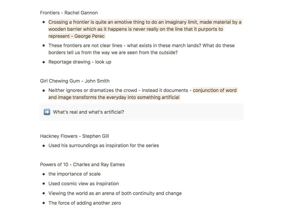
This week’s lecture was packed with resources of inspiration, which I haven’t seen before. Several interesting points were mentioned, like how John Smith used video to transform the everyday into something artificial, and Rachel Gannon’s exploration of borders (Edwards, 2020).
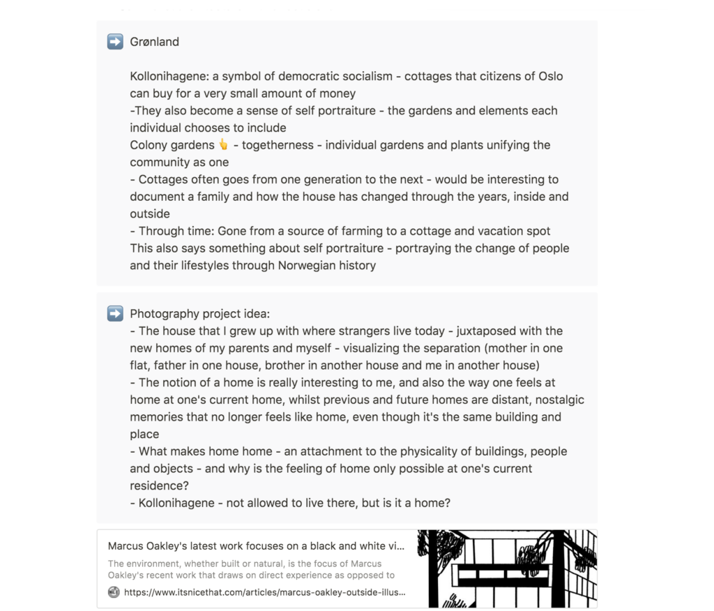
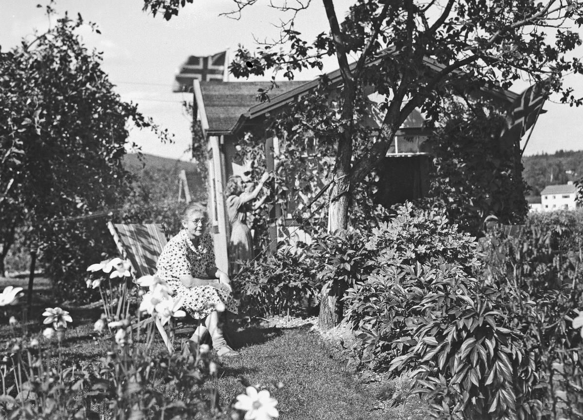
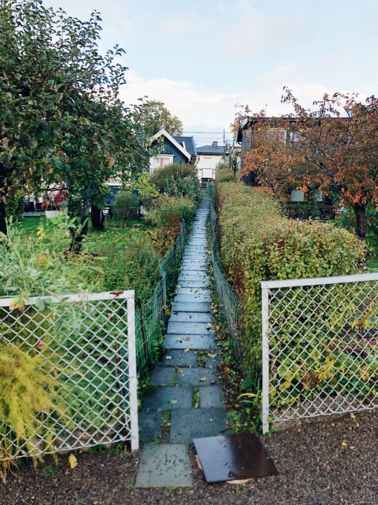
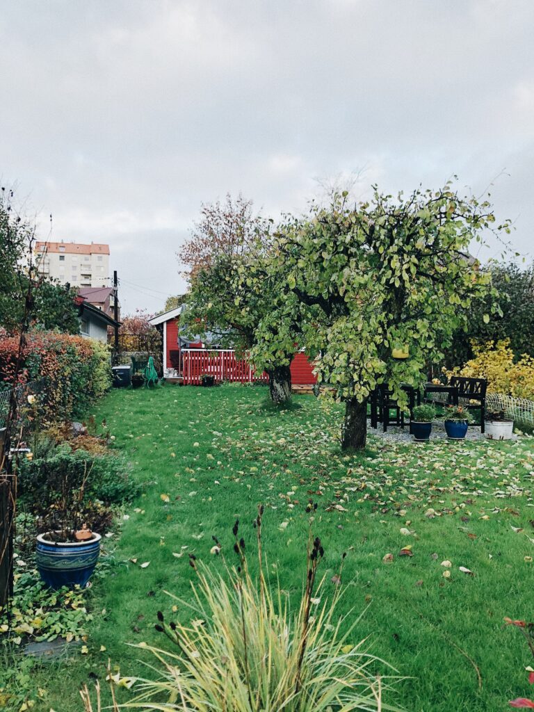
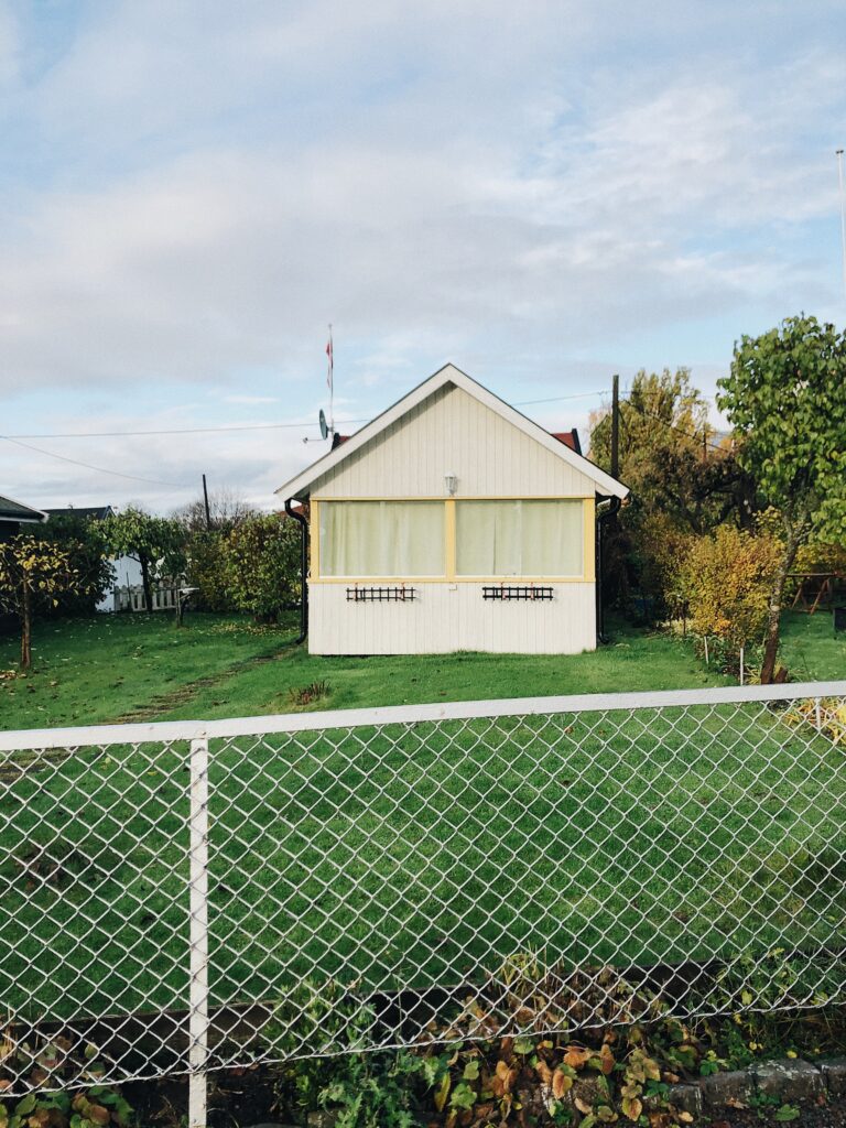
The allotment gardens
Memo Mori, by Emily Richardson and Iain Sinclair, was another interesting project, in which I would be interested in basing this week’s workshop challenge on. In the film, the voiceover discusses how the huts reminds him of sculptures and self portraits (Edwards, 2020). This made me think about an area close to my home, Kollonihagene (the allotment gardens), which I imagine could also be viewed as self portraits in a way. The allotment gardens usually get passed down from generation to generation, and so they act as family portraits in a way. Each garden and cottage is a result of several generations’ labor. I think this portrays a sense of community and togetherness.
The connection of feelings and physicality in the concept of home
Memo Mori also made me think about the concept of home. The house I grew up in, that I lived in for 18 years, now houses a family of strangers. It is no longer connected to the safe and unfamiliar that used to be. Instead, a new house has become what that old house once was. I find it interesting that one’s home is something physical, but also a feeling of attachment, which will eventually disappear after leaving the physical place. The old house, which used to house a mother, a father and two siblings, thus becomes a symbol of separation between these four people, who now live in four different homes with other people. The feeling of home would be interesting to explore through the allotments gardens.
Capturing unity
Start with a mark is a great example of how one can visualise a community. The unifying aspect of getting the attendants to contribute to the visual identity made me wonder how I could potentially visualise and include the community of my street in this week’s workshop challenge. Perhaps I could collect photographs, plants, vegetables or other objects from residents and use them in my visual presentation? Or perhaps I could record sound or video of a resident?
Resource notes
Resource reflection
Ways of Seeing – John Berger
To me, the most interesting part of Ways of Seeing, was the point of how we are now able to use images in order to communicate, as well as our ability to present a number of stories through the same image, through cropping, words, sounds and pairing with other content (Berger, 1972). The ability to use images makes graphic design possible and facilitates for a number of ways to see, and communicate.
Another interesting aspect was Berger’s point about how understanding how we see images from a different time today, can help us understand something about the times we are living in (Berger, 1972). This, as well as Susanna’s encouragement to visit our local archives, got me intrigued and interested to see if I could find works from a different time, that would say something about today.
The art of sketchbooks
Ways of capturing often starts with the sketchbook. Thus I think it’s interesting to see how other designers use sketchbooks in order to capture thoughts and ideas, and further, how I can use my sketchbook to find new ways of capturing.
As I am not a great drawer, I mainly use sketchbooks as a way of noting ideas, either through words or through awkward doodles. I love to use sketchbooks as a way of generating ideas, but I wonder if there are ways of improving my sketchbook routines. Seeing Alan Fletcher’s sketchbook pages, as well as the various pages of Sketchbooks; the hidden art of designers, illustrators and creatives made me realise that I should aim to utilise my sketching process in a more creative way. What would happen, for example, if I brought my sketchbook with me on a walk outside or if I took it to the movies?
Further research
Illustrating an audio recording: Just the Two of Us
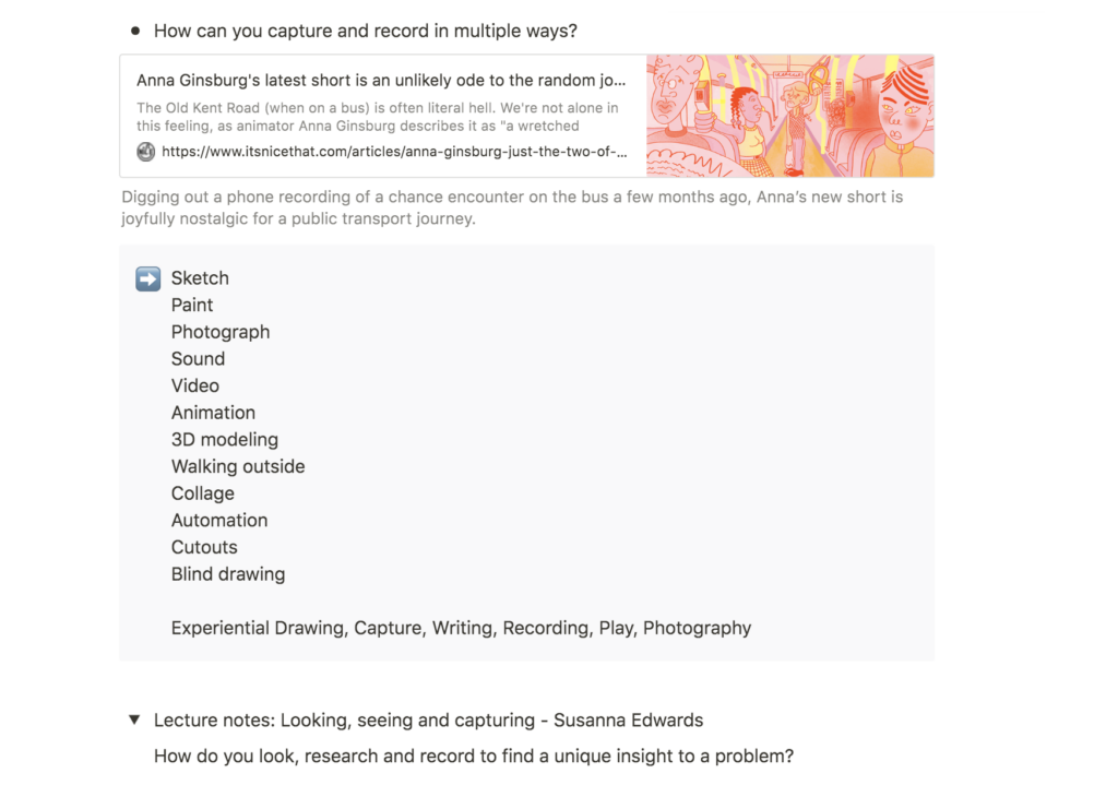
Anna Ginsberg’s video, Just the Two of Us, is a great example of noticing phenomenons around us. I think the idea of making a film based on a sound recording from an everyday situation is great. The concept of the video ads story and life to the mundane, reminding the viewer that everyone’s living in their own reality.
Ginsberg captures the other buss passengers’ reactions to the singing woman in a realistic way. We have all been one of them, rolling our eyes (or at least wanting to) in order to express how annoyed we are by the fact that someone cares to sing in public. The video makes me question why most of us get so annoyed by this. What differentiates sining from talking loudly on the phone for example? Even though the video makes me question the feeling of annoyance, I don’t feel like it is pushing this opinion on me. The observant and documenting point of view of the video rather lets the viewer decide on an opinion of their own.
I wonder if there are other ways of recording something from our surroundings, which can later be communicated through animation or video. Perhaps one could reverse the concept of Ginsberg, by filming a situation, leaving the sound out, and then adding sound to it later?
Visualising locations: Marcus Oakley
I think Marcus Oakley’s illustrations of various environments are great ways of visualising our surroundings. I like his raw drawing style and how the organic strokes become a contrasting element to the sharp geometric shapes.
Personally I am not very skilled at drawing, in the realistic sense, nor do I wish to be really. There is something beautiful about the ambiguity of an unperfect drawing. When removing the urge to be perfectly realistic, one is free to open up and communicate a message through the choice of a certain technique. Following up on my thoughts of the notion of home from my lecture reflection, I think it could be interesting to experiment with illustrations of homes this week, perhaps by bringing my sketchbook outside as reflected upon in my resource reflection.
Workshop challenge
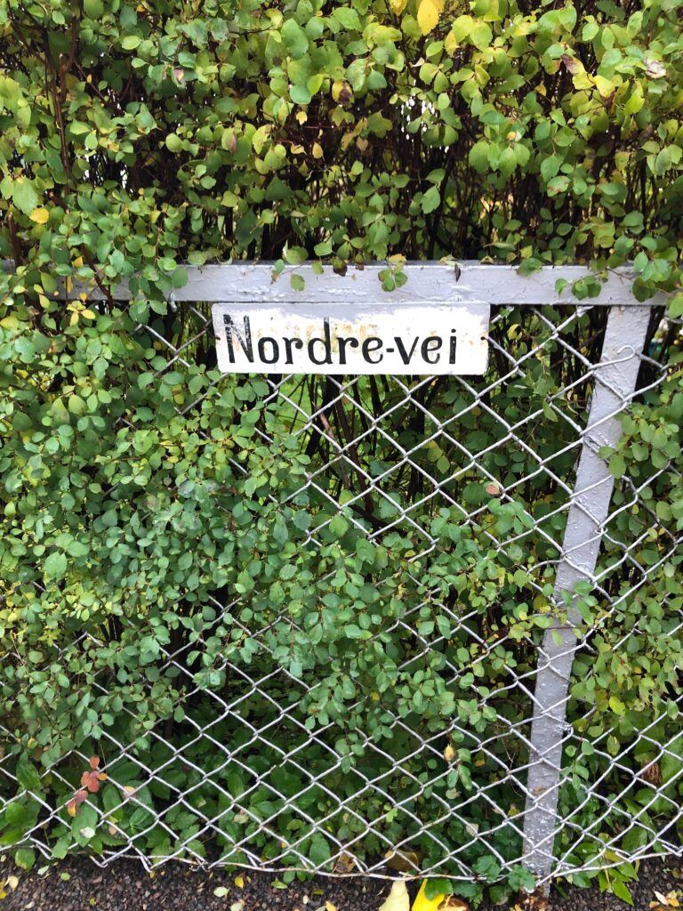
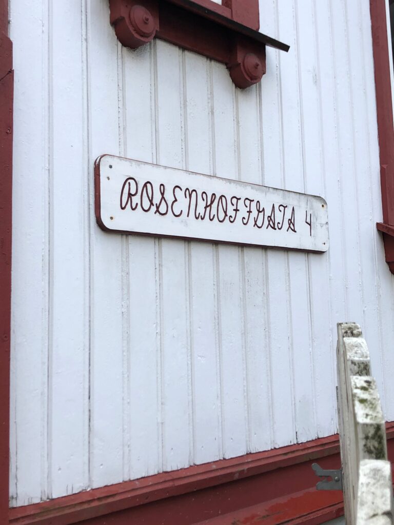
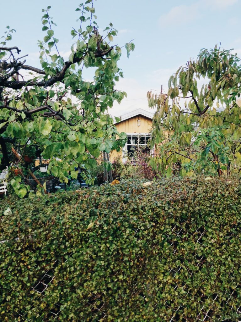
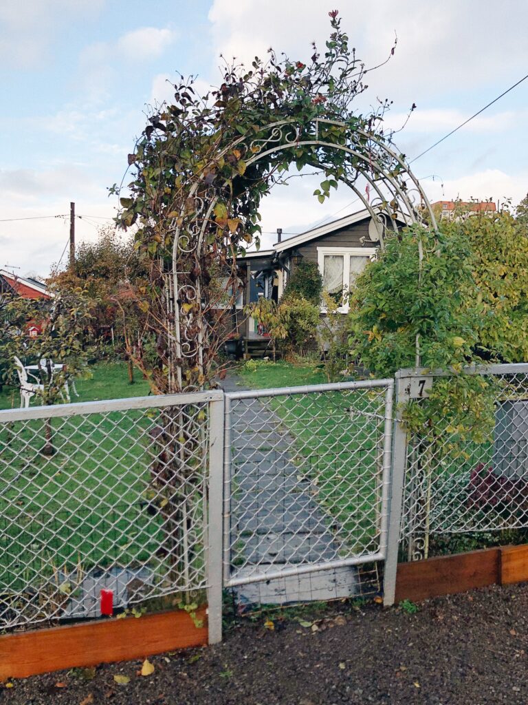
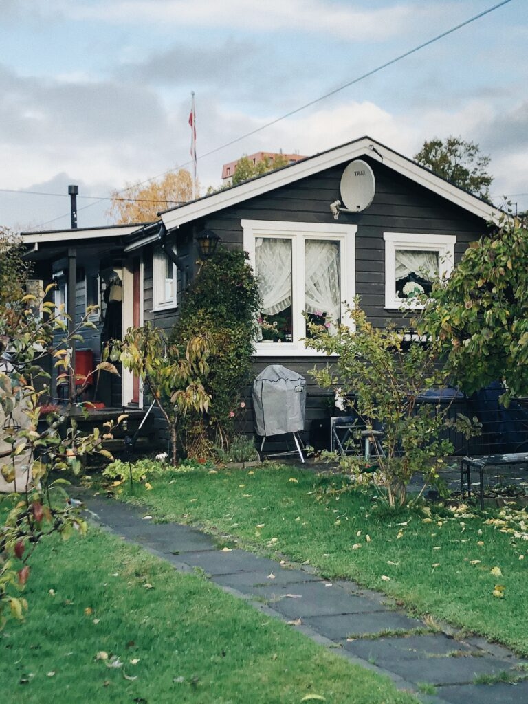
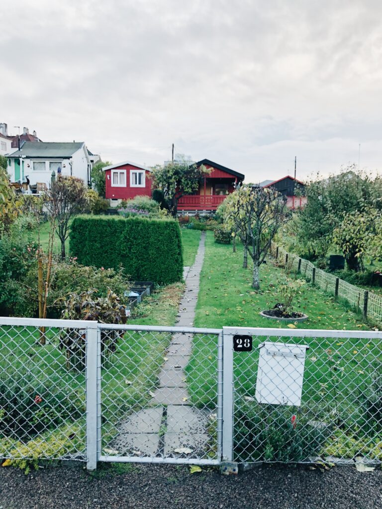
For my workshop challenge I decided to record and document the street I currently live in, Rosenhoffgata. It’s not a famous or extraordinary street, but I have a strong connection with it as it is my home. Besides, I think it could be interesting to explore a street which is not too special, as this will acquire me to really look for interesting aspects to focus on.
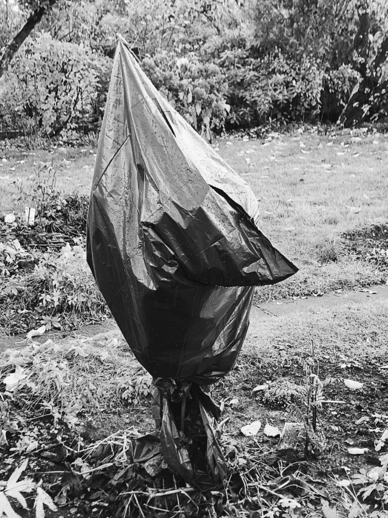
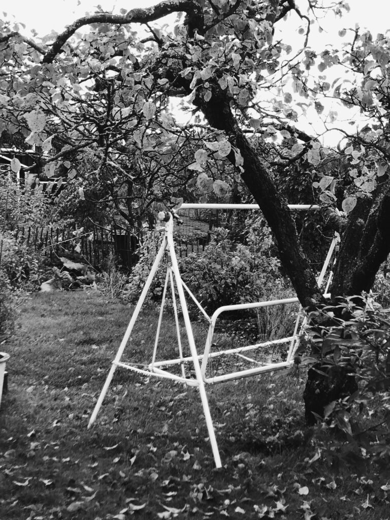
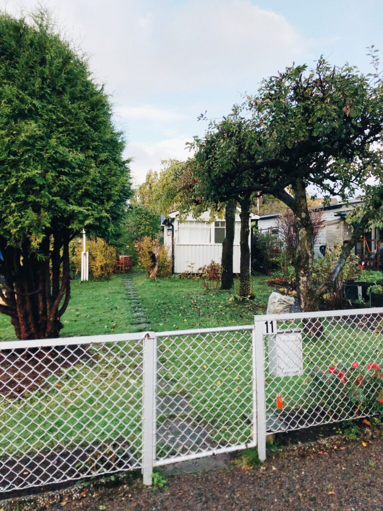
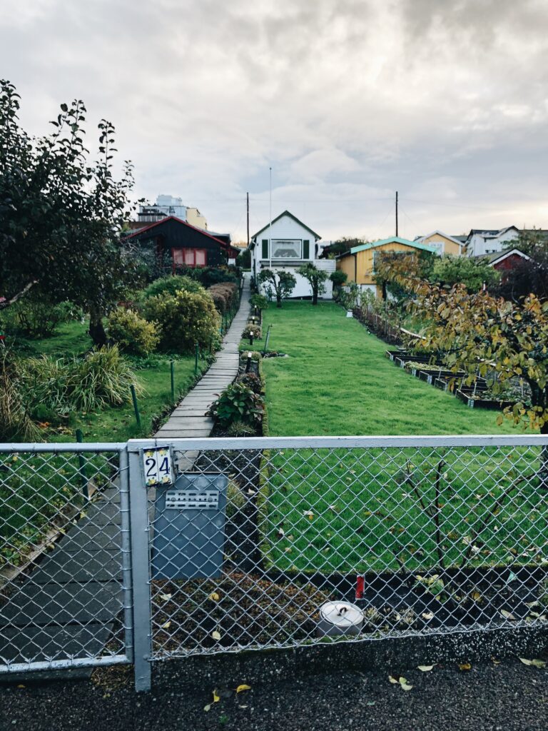
The allotment gardens mention earlier are located at the end of my street. They are currently closed for the winter (however I did managed to get inside), but I think it could be interesting to investigate them as part of this challenge.
Photography archive
After Susanna’s lecture, I was intrigued to see if there were any archives of my street or the allotment gardens. I managed to find a great archive with photographs of families working in the gardens from many years ago, as well as one photo that I found particularly interesting.
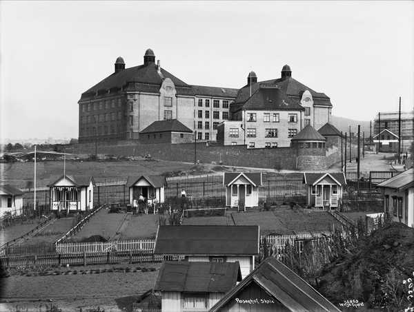
The image above shows a part of my street from 1919. Today the school (the big building on the top of the hill) and the cottages are still there today, but the surroundings have changed. Today the empty fields are filled with buildings, roads and other environmental objects. This image represents a different time – WW1 had just ended and many people struggled to find work. I’m not entirely sure how I would use this aspect of change and time through my work, but I think it could have been interesting to explore, had I had more time for this challenge.
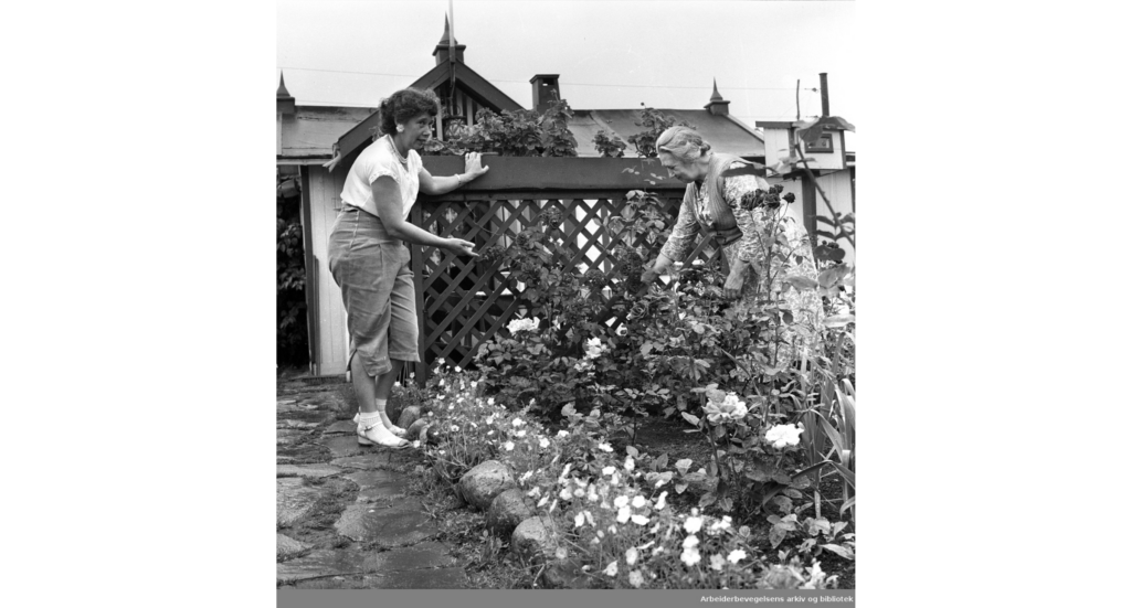
Unfortunately, as the allotment gardens are closed for the winter, I didn’t manage to get in contact with any residents. I think it could have been interesting to get an interview with a resident who’s family has had a garden and cottage for several generation. What stories does the allotment hold and what visual material would the resident be in possession of?
This could have been a good foundation for a family album zine, or perhaps a short film, either created with video, sound, images or animation.
Street walk
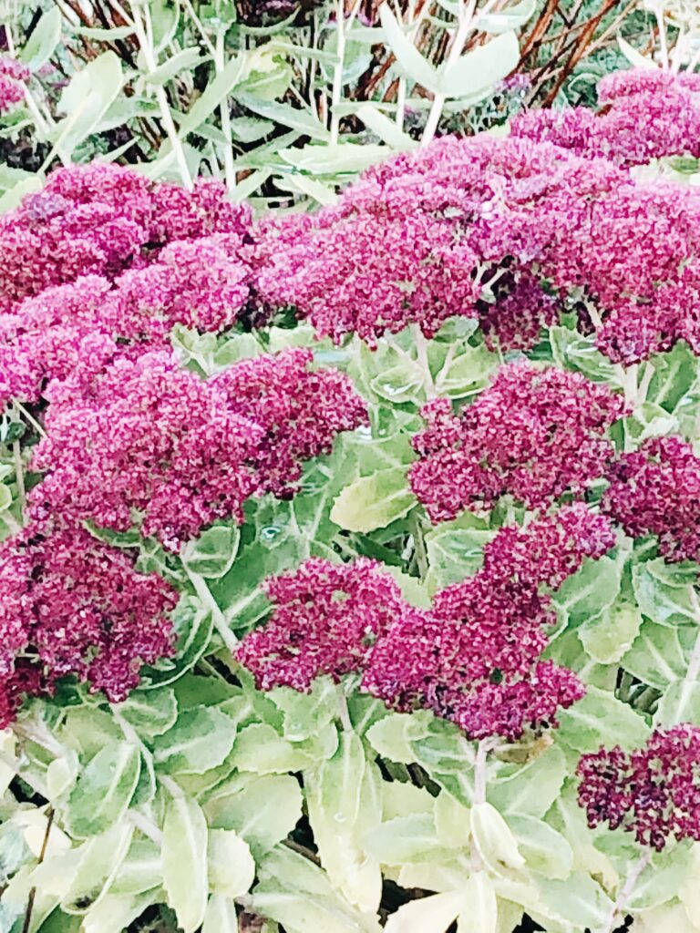
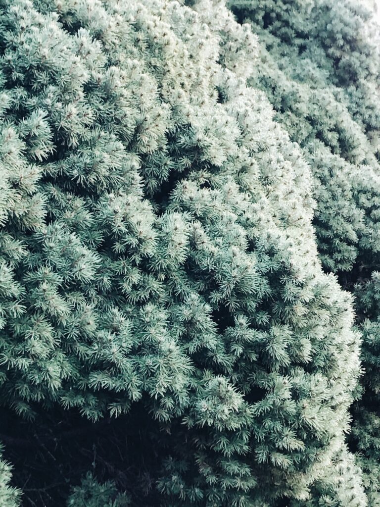
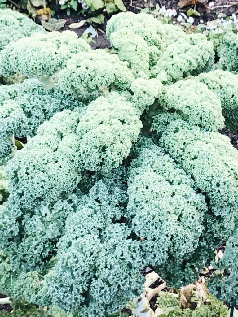
The shapes of plants
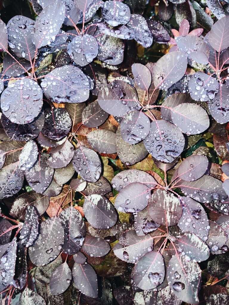
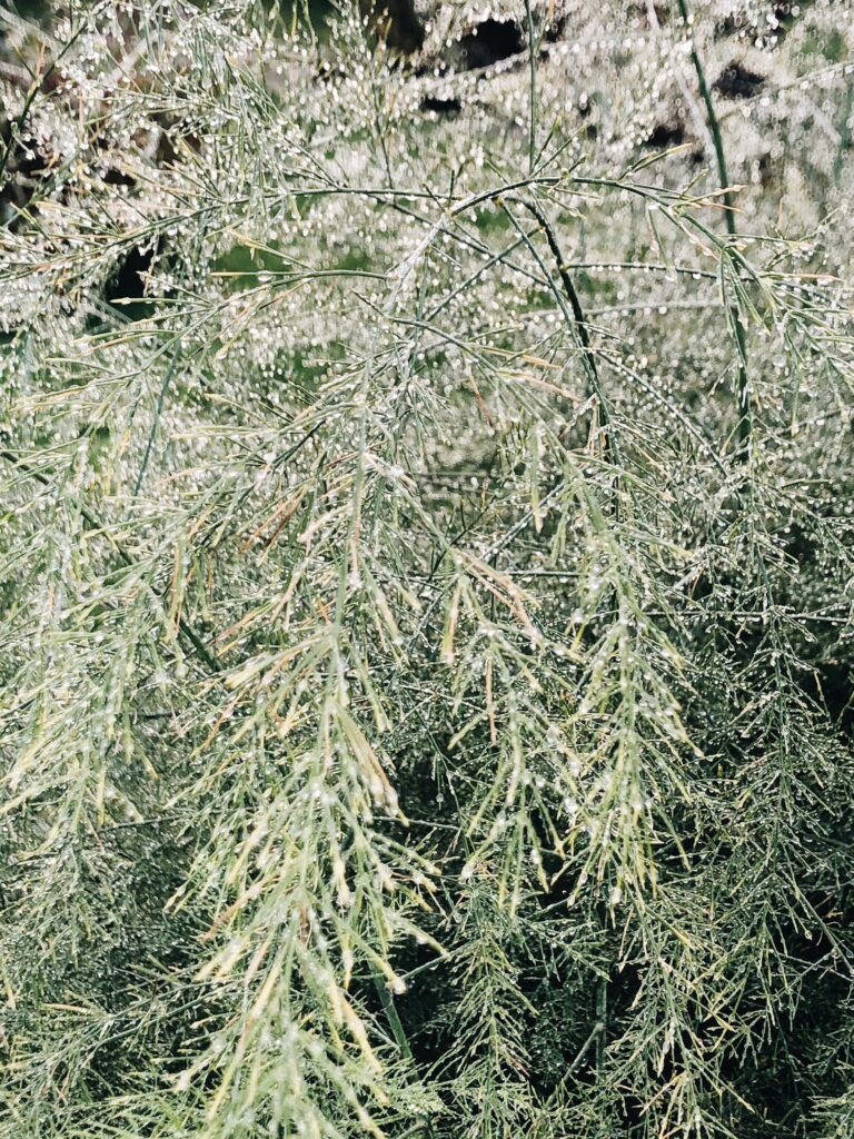
The season of flowers is over, but I still found plants that were beautiful in their own ways. I find the shapes and colours of the plants below very interesting and I think they would be great as topic for a zine or photo book, had I explored this further.
Shapes and patterns
Drawing on my works with patterns from the previous weeks, I couldn’t help but notice interesting shapes and patterns on my walk. I found some beautiful details which I would have liked to explore further through pattern creation.


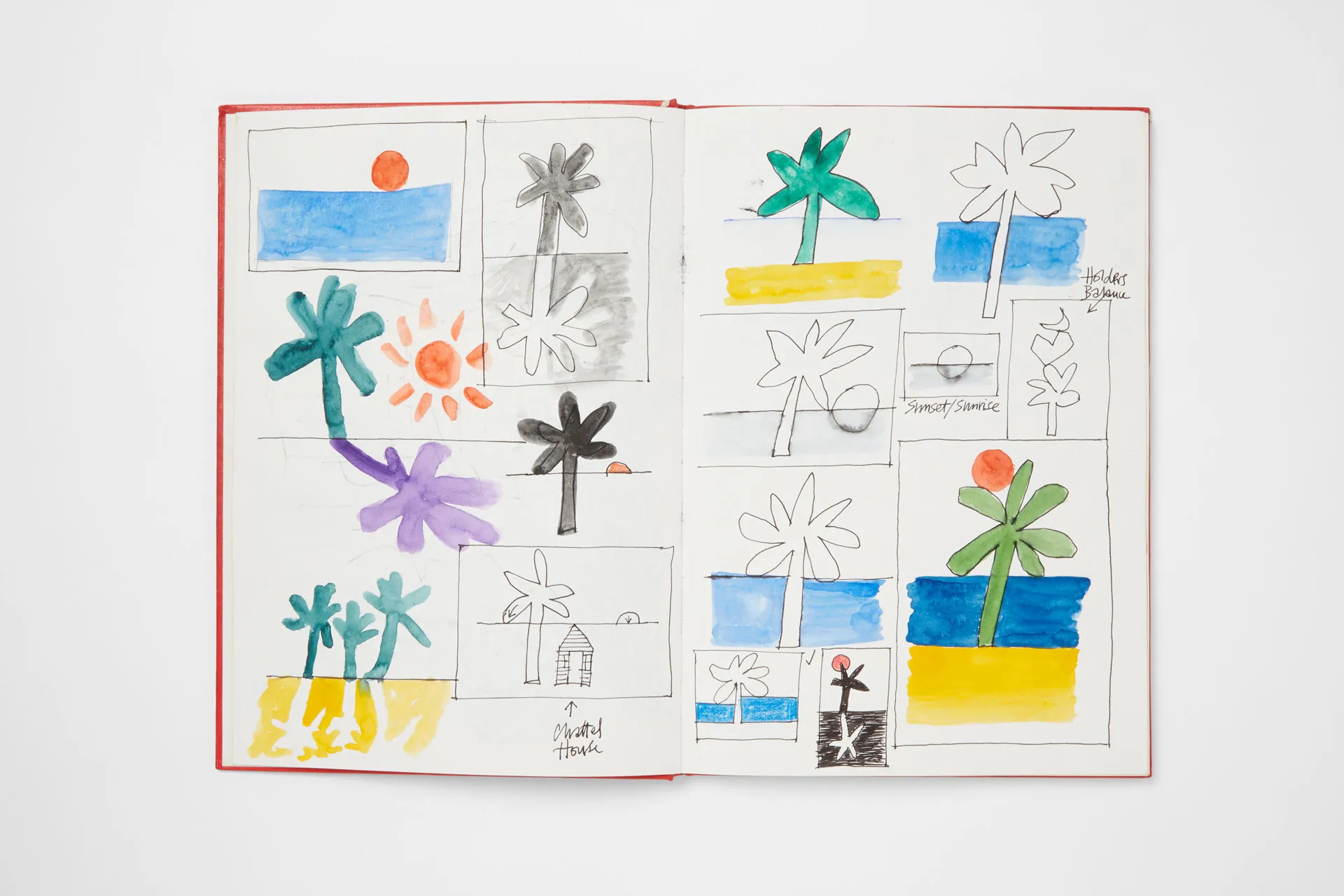
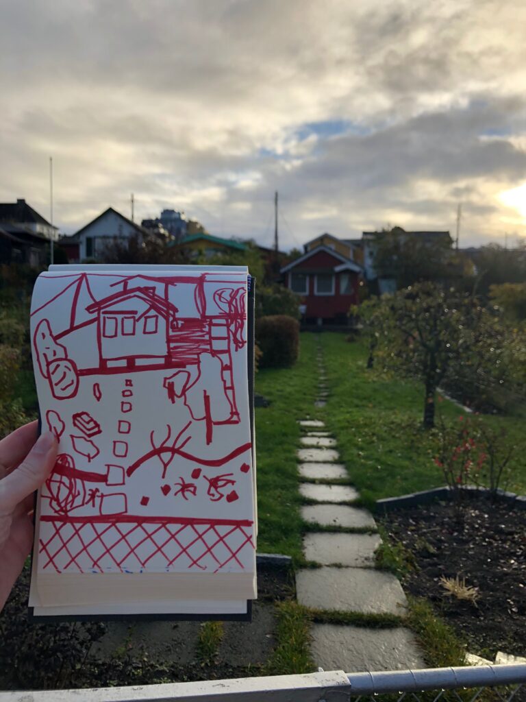
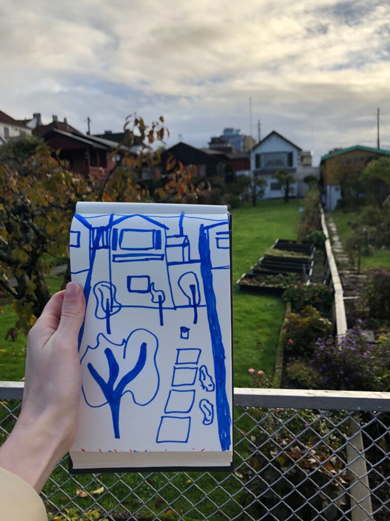
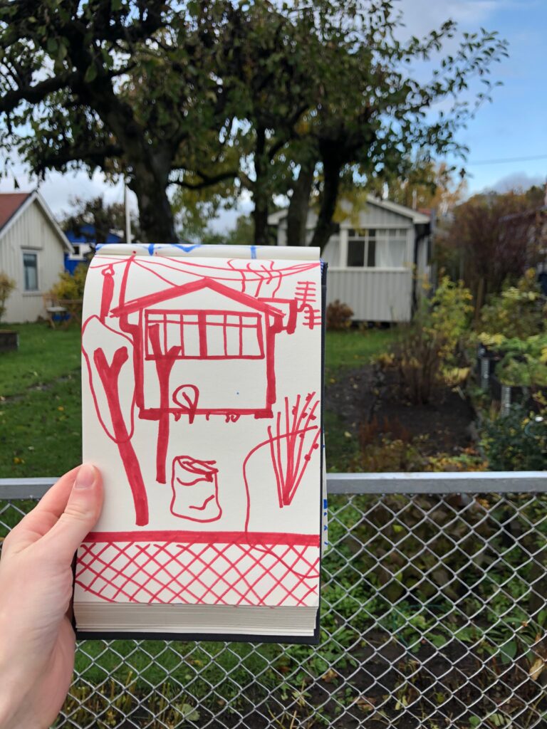
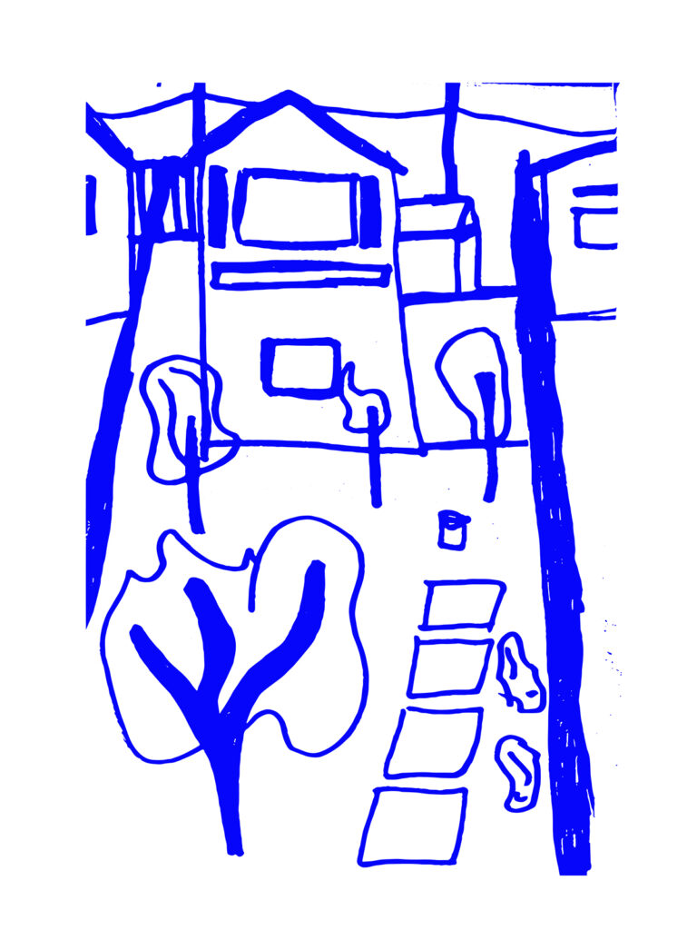
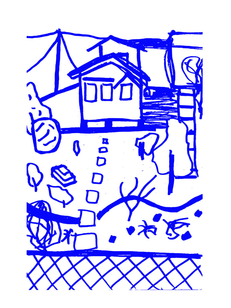
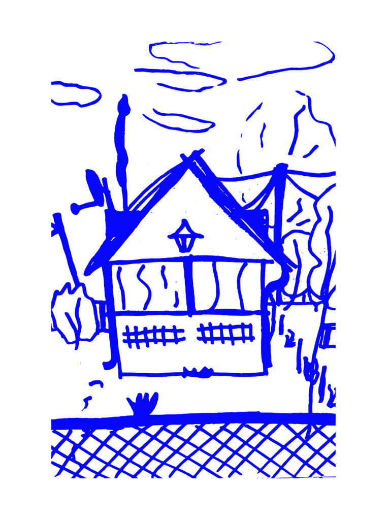
Sketching outside
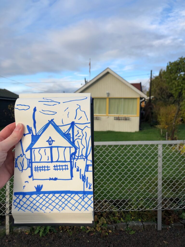
After studying the sketchbooks in this week’s resources and lecture, I wanted to experiment with outside sketching. I usually only use my sketchbook at a desk, in order to visualise my ideas. Thus, drawing what I could find outside was an exciting new experience.
Having to hold the sketchbook whilst drawing, as well as using a thicker pen than I normally use, led to a new (to me) type of sketch style. I also found myself noticing details as I was sketching, that I hadn’t noticed through only looking. Wires, gutters and TV antennas thus got incorporated into my drawings, leading to more distinct drawings. At the end of my walk, I found myself noticing more of these details, which I ended up finding quite beautiful.

Typography
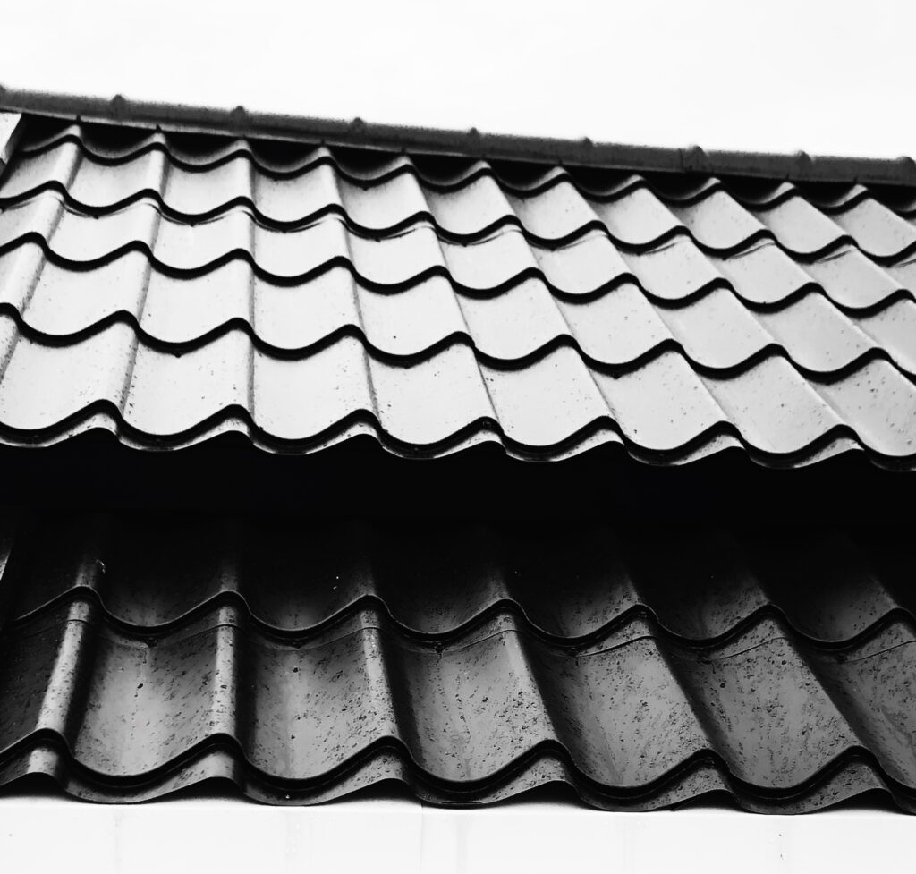
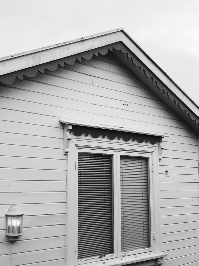
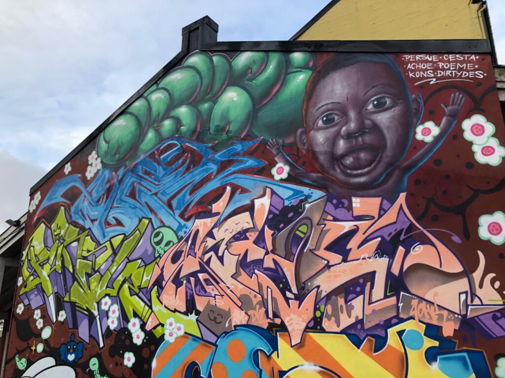
Rosenhoffgata, is sort of a strange street in terms of it’s content. Some buildings are old, traditional and well-preserved houses dating back to the early 1900s, whilst others are shady shops, many covered in graffiti. This variation in style and content means that there is a huge variation in lettering throughout the street. I think it could be interesting to study the variation in typography and perhaps create a typeface which communicates the differences, in order to visualise and comment on Rosenhoffgata as a street.

Video recordings
If I had more time for this project, I think it could have been interesting to create a film about the allotment gardens, communicating aspects discussed previously. Perhaps I could have audio recorded an interview with a resident, presenting the recording alongside different video clips of the area. Below are a couple of video clips from my walk. I think the sounds and aesthetics makes for a sinister look, which could have been exciting to investigate further, perhaps through looking at the history of the families who once lived here.
The allotment gardens: photo series
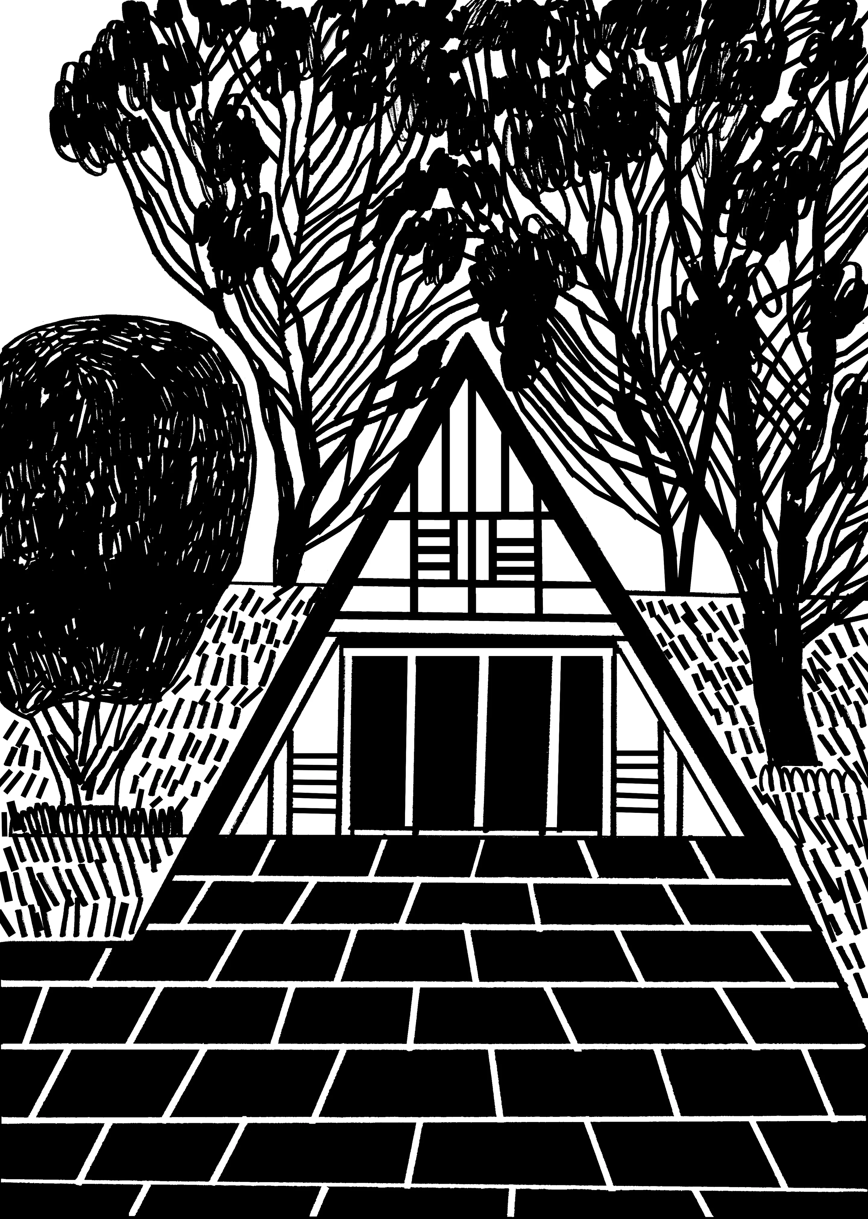
Following upon the idea of using the various houses and gardens as family portraits, I decided to document each house through photography. The images brought on a bunch of questions. What can be said about the residential families through the gardens and houses? What stories could be discovered if these houses could talk? And how has society changed through the hundred years that they have been here? I am not sure if these questions are more or less interesting when answered.


Concept ideas
If houses could talk
I would be interested in investigating the notion of home, and it’s different meanings, through the allotment gardens. Looking at the small houses that have been left for the winter, I started thinking about the amount of stories that must have taken place there. I got an idea of a poem project, which would feature small poems about imagined stories. The houses could have been drawn or photographed and put beside the written or spoken poems:
Contrasts
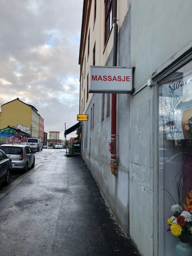
I find the variation of contents in my street strange and unique. There are several old houses and buildings from the 1900s which have been preserved and taken care of. However, the street is also filled with kebab shops, shady massage places, and a thrift market with a man who sells strange objects outside his house every day.
By using this contrast as a focus point, I could either document the variety through photography or illustration, or I could look at contrast in a more abstract way, not so much related to this specific street, but still a comment on one of it’s predominant features.
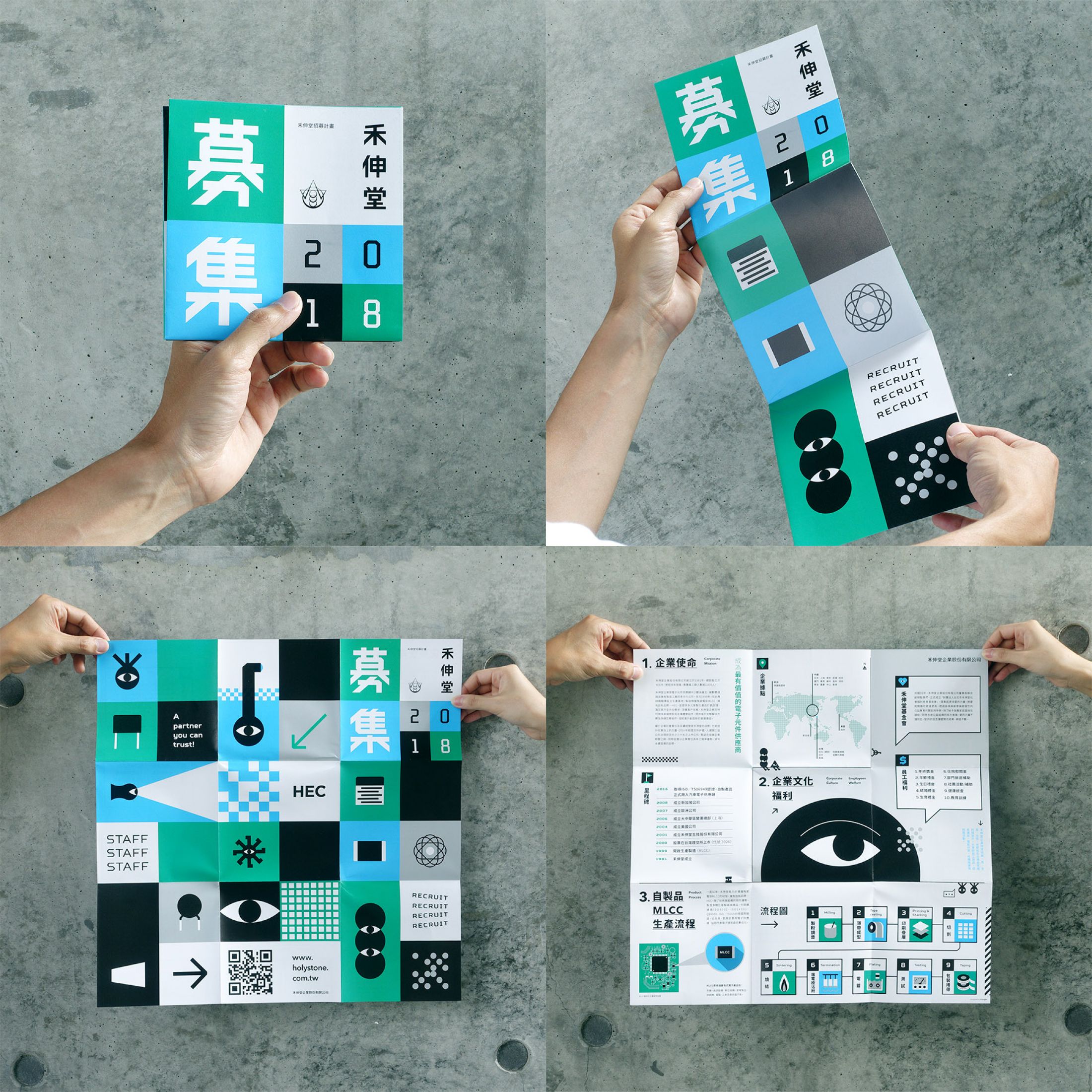
Typeface
As mentioned previously, this street holds a big variety of typefaces. It could be fun to make a typeface from the letters found in the street. This would perhaps not be a typeface of good legibility, or maybe usage at all, but a comment on the street, unifying the differences of Rosenhoffgata.
I imagine the typeface being presented in a colour block grid similar to the one in the image below. Or perhaps on cards held together with a ring of some sort, the ring representing the street, which is what unifies and ties us together.
Result
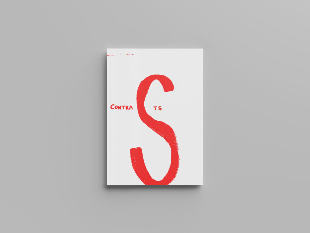
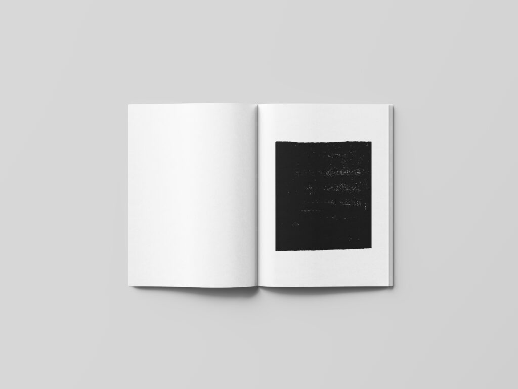
I decided to go for the concept of visualising contrasts, as a more abstract comment of something unique in my street. Inspired by last week’s guest lecture with Daniel Eatock, I wanted to create something simple, where the idea would act as the main element.
The art of sketchbooks, discussed previously, has influenced me this week, and so I wanted to create a piece of design where I could use sketching as an illustration method, in order to explore the technique used in my previous house illustrations. I thought this would work well with the theme of contrasts, as the texture of scanned sketches feels quite raw. In my opinion, a raw aesthetic resonates with contrast, as contrast can often feel quite extreme and in your face.
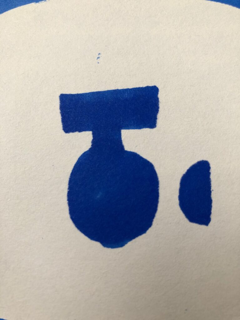
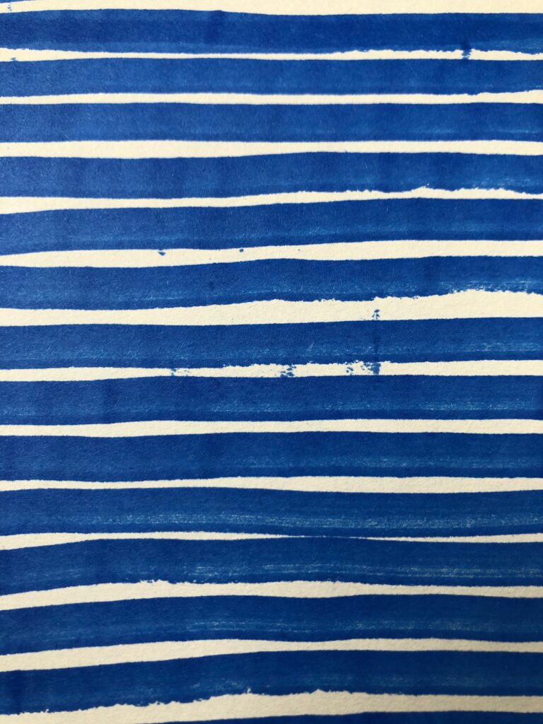
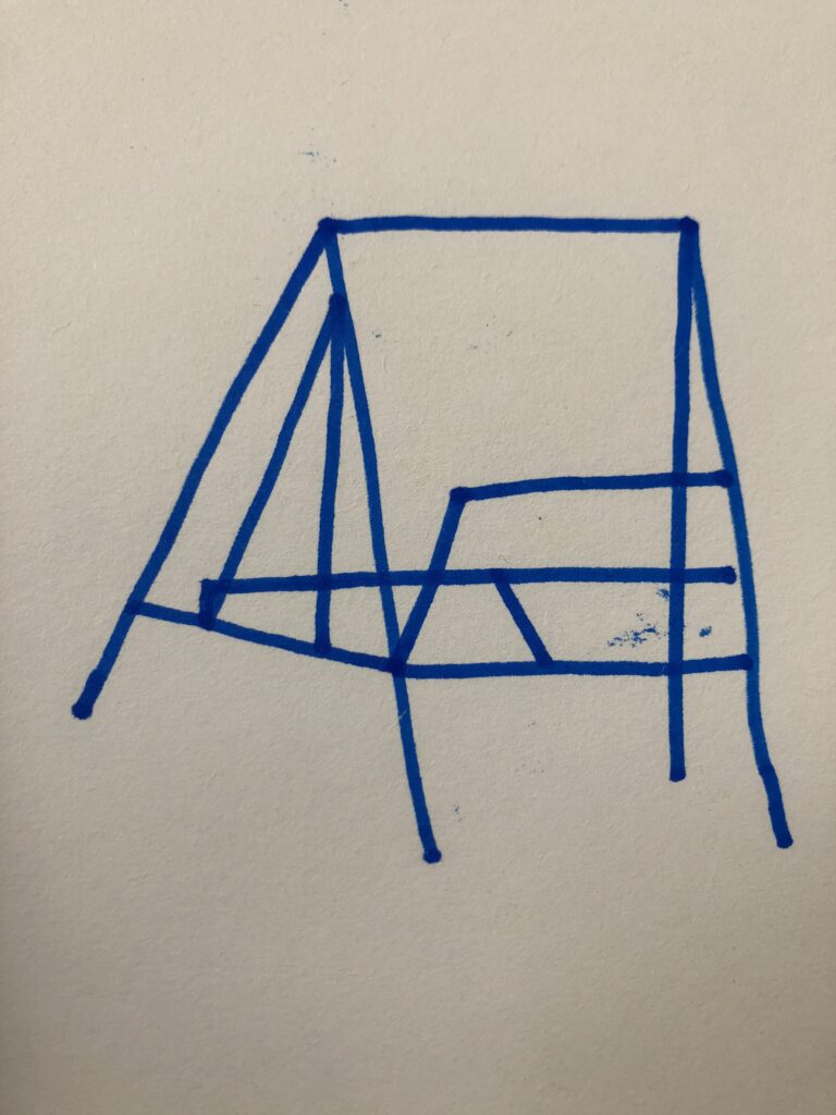
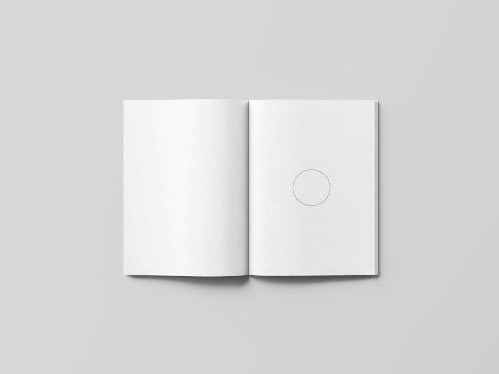
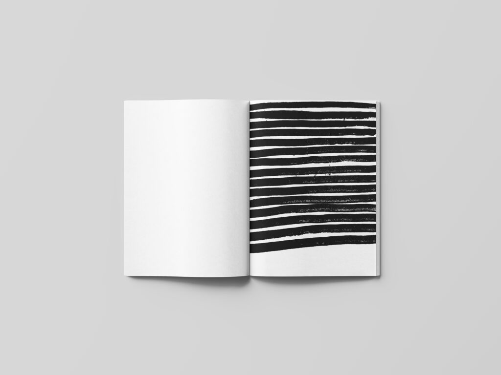
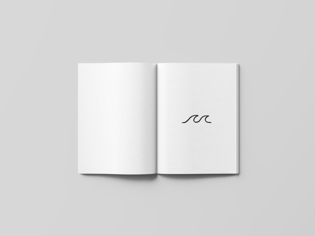
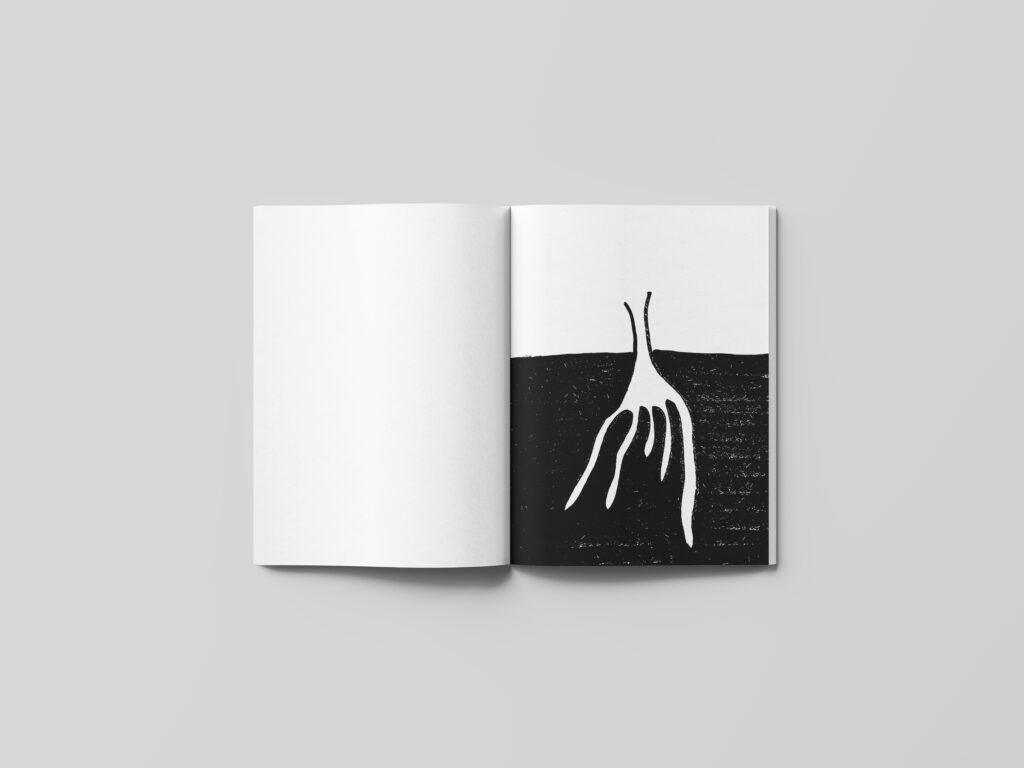
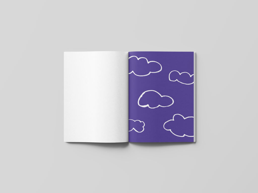
In order to build upon the rawness of my illustrations, I decided to make a zine where every page would act as a contrast to the previous page. I wanted to make a handmade zine, but after several at-home-printing errors, I had to use digital mockup files instead. The page with the “hole” is therefor illustrated with a vectorised circle. If I had managed to print the zine, the hole would have been a cut out circle, as a contrast to the previous solid, blank page.
Hopefully the reader is able to understand the reasoning for each page, but I will include the words for safety measure:
Red title – black and white block – empty page – hole (nothingness) – mass – spaced lines – waves – land – blue sky – yellow circle – sharp object


In conclusion
To me, this week has been filled with ideas and exploration. Reflecting upon the various ways of recording and portraying has forced me to really look at a street, which I normally take for granted. Although I’ve come up with a big amount of ideas, I have unfortunately not had the time to explore them properly, and so I hope to get the chance to come back to some of them at a later point.
I am interested to explore my usage of sketchbook in the weeks to come. The effects of my whereabouts when sketching is especially something I would like to explore, in order to come up with new ways of thinking and looking. One is due to get different ideas in different settings, and so I think it’s important that I try to explore sketching outside of my office and home. I would also like to explore new techniques, like painting and oil crayon drawing, perhaps by trying to utilise my sketchbook beyond simple visualisation of ideas using solely pen and paper.
In general I think this week has opened my eyes to the possibilities of mixing media in graphic design. I might have been to rigid in my way of thinking before, mainly working within the walls of adobe software. By stepping outside, as well as looking at video and audio as possible ways of recording and conveying a message, I am starting to realise that graphic design is much more than vectorised matter inside a computer screen.
RESOURCES:
Berger, J. (1972) ‘Ways of Seeing’, Ways of Seeing. BBC four. Available at: https://www.youtube.com/watch?v=0pDE4VX_9Kk&ab_channel=tw19751 (Accessed: 23 October 2020).
Brereton, R. (2009) Sketchbooks; the hidden art of designers, illustrators and creatives. London: Laurence King.
Edwards, S. (2020) ‘Looking, seeing and capturing’. Canvas Falmouth Flexible [online], 23 October.
LIST OF FIGURES:
Figure 1. Esther LANGBERG. 1936. Solvang Kollonihager. Oslo Mueum. Available at: https://www.aftenposten.no/osloby/i/1kReW/historiske-oslo-en-parsell-i-paradiset
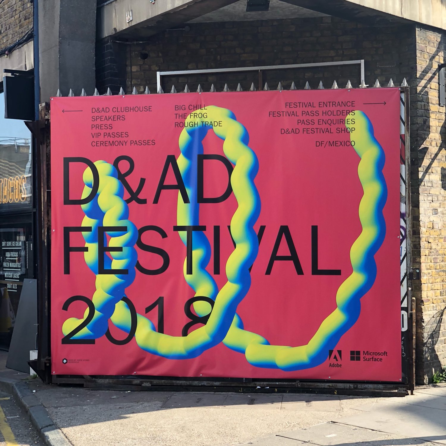
Figure 2. HATO. 2018. D&AD 2018 Festival Campaign. Tom Clayton [online]. Available at: http://claytontom.com/dad-festival-2018
Figure 3. Alan FLETCHER. ca. 1992-2006. Sketchbook spread. It’s Nice That [online]. Available at: https://www.itsnicethat.com/features/fletchers-sketchbooks-an-exclusive-insight-into-the-sketchbooks-of-the-late-great-alan-fletcher
Figure 4: Anna GINSBURG. 2020. Just the Two os Us. Available at: https://vimeo.com/422712385 [accessed 29 October 2020].
Figure 5. Marcus OAKLEY. ca. 2019-2020. Kinross Triangle. It’s Nice That [online]. Available at: https://www.itsnicethat.com/articles/marcus-oakley-outside-illustration-110220
Figure 6. Anders Beer WILSE. 1919. Rosenhoff skole. Oslo bilder [online]. Available at: http://oslobilder.no/OMU/OB.Y3505?query=Rodel%C3%B8kkens+kolonihager&count=20&search_context=1&pos=6
Figure 7. Unknown maker. 1957. Rodeløkka kolonihage. [black and white photography]. Arbeiderbevegelsens arkiv og bibliotek [online]. Available at: https://digitaltmuseum.no/011012601937/rodelokka-kolonihage-juli-1957 [accessed 29 October 2020].
Figure 8: Ingrid REIGSTAD. 2020. Photos of plants. Private collection: Ingrid Reigstad.
Figure 9: Ingrid REIGSTAD. 2020. Patterns. Private collection: Ingrid Reigstad.
Figure 10: Ingrid REIGSTAD. 2020. Patterns 2. Private collection: Ingrid Reigstad.
Figure 11: Ingrid REIGSTAD. 2020. House sketches and houses. Private collection: Ingrid Reigstad.
Figure 12: Ingrid REIGSTAD. 2020. House sketches. Private collection: Ingrid Reigstad.
Figure 13: Ingrid REIGSTAD. 2020. Typography in Rosenhoffgata. Private collection: Ingrid Reigstad.
Figure 14: Ingrid REIGSTAD. 2020. Winter gardens. Private collection: Ingrid Reigstad.
Figure 15: Ingrid REIGSTAD. 2020. Allotment gardens. Private collection: Ingrid Reigstad.
Figure 16: Ingrid REIGSTAD. 2020. If houses could talk. Private collection: Ingrid Reigstad.
Figure 17. TRIANGLER CO.. 1904. Holystone Recruitment. Creative Boom [online]. Available at: https://www.creativeboom.com/resources/a-design-awards-previous-winners-2019/
Figure 18: Ingrid REIGSTAD. 2020. Contrasts. Private collection: Ingrid Reigstad.