Resource reflection
As I enjoyed looking into unlegible typography last week, and how this could be suitable for my ideas, I wanted to research more typography case studies.
Przemek Bizoń: moreless.type
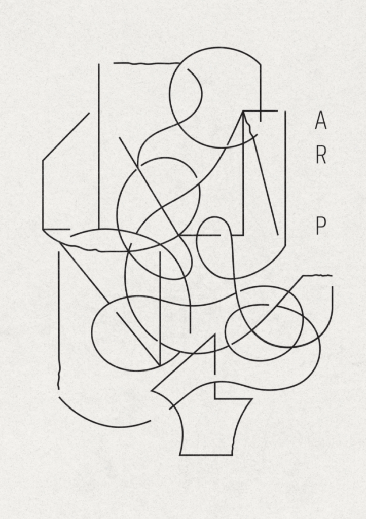
Przemek Bizon’s project, moreless.type, consists of lettform explorations inspired by the designer’s favourite architects and artists (Elfie Thomas, 2022). To It’s Nice That, Bizon explains how he uses typography “as a starting point to search for a different means of expression” (Elfie Thomas, 2022). Perhaps this act of morphing type and illustration could be a way of removing place-connected language from texts, and replacing it with a more intuition-dependent language?
It’s Nice That’s journalist, Elfie Thomas, further describes Bizon’s work as “form winning over function” (Elfie Thomas, 2022). As designers we are taught that our design choices should be informed, and that functionality is of most importance. So – are we even allowed to design form first and function second, or does this always lead to unsuccessful designs?
One can certainly question wether unlegible type serves any other function than the traditional illustration, and also wether one risks designing for other designers. However, if one chooses to view unlegible type as an illustrative piece of communication, I would dare to argue that the design serves aesthetic value, which communicates something of the subjective.
In relation to language this sense of subjectivity is interesting, as verbal languages often connects larger groups of people, and that it’s thus very objective. Subjectivity is also interesting in reference to feeling left out due to not knowing the language of a country. Perhaps a subjective/interpretive language could be used to comment on the notion of feeling left out?
Diaspora
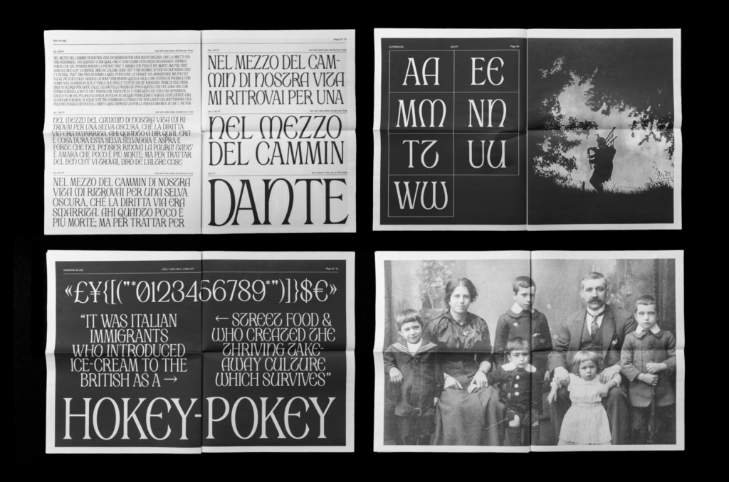
Diaspora is a typeface created by Apolline de Luca and Alessandro Prepi Sot for their MA project (Jyni Ong, 2020). The typeface is inspired by Italian immigration to Scotland between 1880 and 1920, tying it in nicely in with my project (Jyni Ong, 2020).
Although this typeface still has verbal function, I like the idea of morphing two cultures, using type. Perhaps an approach to my project could also be to develop a typeface inspired by all the cultures found in Norway today?
I further like how immigration is used as a reference in the alternate letterforms, adding something new to the original typeface / society (Jyni Ong, 2020). The notion of adding personality could be a great way of referring to immigration, whilst also making sure that my language speaks of Norway somehow. “Coexisting” (Jyni Ong, 2020) and harmony are potential key word that could be used in my visual translation.
Uønsket (“Unwanted” – Norwegian docu-series)
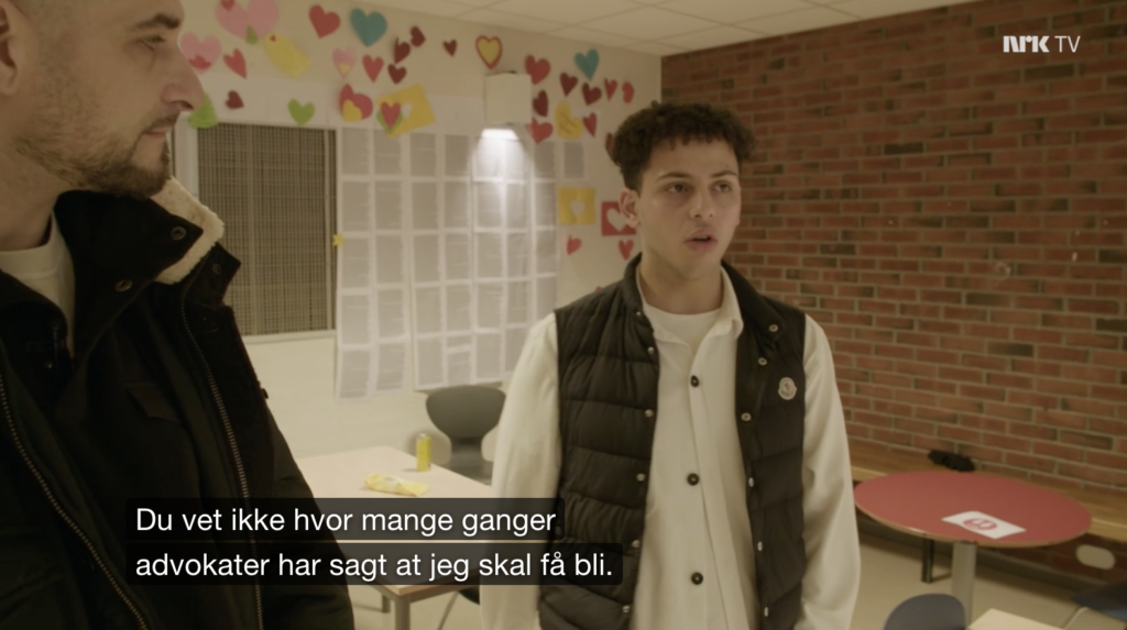
In the NRK documentary series, Leo Ajkic (TV host) looks at Norwegian immigration, and how children without Norwegian citizenship can be kicked out of the country at 18, having lived there from a very young age (NRK, 2022). Ajkic specifically documents the case of Mustaffa, whom’s case gained large amounts of media coverage last year, when he was due to be kicked out of Norway at the age of 18.
I was touched when seeing Mustaffa’s friendships and how his childhood friends included him in the Norwegian “russe celebration” – covering his economic expenses (NRK, 2022). The way they spoke about their friendship made me realise that their non-verbal language was of love and care. This was also visually evident on school walls, where students had hung paper hearts and signed petitions for him not to be kicked out.
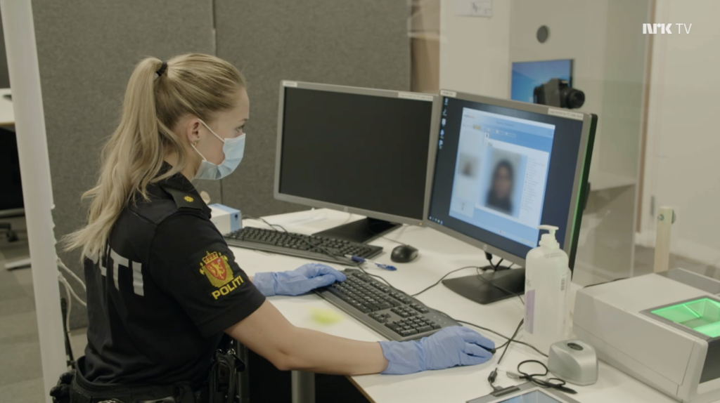
The visual language of an asylum centre
Going to visit a Norwegian asylum centre, we see a very different type of “language”, which I would describe as strict and non-personalised. Asylum applicants’ finger prints, heights, etc. are documented, and applicants’ belongings are searched for potential ID-documentation (NRK, 2022). Here, the identity of a person becomes solely about their state of origin and recognisable traits, which feels very clinical and almost objectifying.
I was surprised to see that applicants have to sleep in tents for three weeks, waiting for their application answers (NRK, 2022). Although it may not be compliant with the centre’s function as seen by the government, the physical environment made me wonder wether a visual language could somehow contribute to a feeling of safety or comfort. The series presents a woman who can’t read or write, and for her and those in similar situations, a visual (rather than verbal) language might be beneficial in the means of communication.
Rights follows place
The series further documents how Mustaffa’s lack of citizenship makes it hard/impossible to apply for universities and jobs (NRK, 2022). He doesn’t have “minID” (an ID-system that all Norwegians use to apply to various institutions, use our banks, do our taxes, etc.), meaning he can’t access foundational services that we as Norwegians take for granted (NRK, 2022).
This made me reflect on how national borders affect our opportunities in life, and also how banal the idea of national borders really is. Our verbal languages are direct symbols for these borders, and even when getting a citizenship, an accent or lack of Norwegian language speaks of these borders and the notion of not belonging (not saying that immigrants don’t belong, but rather that language can give a false illusion of not belonging, even after gaining citizenship, which theoretically proves that one belongs).
Tutorial w/Ben
My tutorial with Ben this week was helpful when it came to refining and choosing a final idea. We discussed how the project can act as a comment on borders and Norwegian immigration policies, rather than a definite solution to something. This was helpful as I don’t want to pretend that I can fix immigration issues, but rather speak of the meaning of borders and how it sepperates us from each other.
Before attacking the making stage, Ben advised me to rewrite a concept paragraph, as my current idea had developed quite a bit from the initial project proposal.
Concept paragraph
How can language be used to connect people with places?
Norway is a social democratic country, and as a Norwegian I have grown up being told that everyone here have equal opportunities in life, due to free education, health care and welfare systems. This has made me a proud Norwegian, appreciative of our so called welfare state. Looking at our immigration policies however, it becomes clear that we do not provide equal opportunities beyond our own borders. Instead, borders, both visible and invisible, separates us as people from the rest of the world, making us as Norwegians the “lucky ones”.
With nations comes languages, and therefore the lack of Norwegian fluency can speak of not belonging – not saying that immigrants do not belong, but rather that verbal language can create an illusion of being connected to another place.
In order to open up conversations about Norwegian immigration policies, I plan on developing a non-verbal language, which does not recognise borders nor nations. The language should be read using intuition and our senses – and by removing it from words, I hope for it to be felt rather than read. I will not be attempting to speak of an immigrant’s perspective or to create a perfect solution to immigration issues. Rather, I will attempt to comment on the banality of borders and citizenship, and how so much of our identity is dependent on chance.
What is typically Norwegian?
Moving towards the making phase of my project, I wanted to investigate what’s typically Norwegian, and thus what I should communicate in my language.
Shields of armour
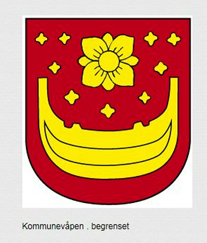
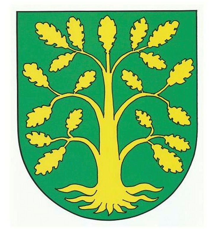
Fig. 6: Trætteberg 1904. Vest-Agder Fylke. [shield of armour]
I started by going through a long list of Norwegian shields of armour. Doing this, I was hoping to take note of recurring motifs, as a way of understanding Norwegian heritage.
Some popular motifs were:
- Flower/plant (found 19 times)
- The sea (found 12 times)
- Boat (found 15 times)
- Tree/leaf (found 9 times)
- Bird (found 13 times)
- Fish (found 9 times)
- Tools (found 15 times)
I also found various motifs related to kings and vikings like crowns, helmets and castles, as well as various animals like reindeer, horses, lions and mythical creatures.
Further down the project I could probably choose to analyse each of these motifs and their meanings. For now however, I was mainly interested in the fact that most motifs were connected to nature. Inspired by the article on native language in British Columbia, I was already interested in using nature as inspiration, and so this was a great affirmation of that direction.
The ocean seems to have been of most importance (which makes sense given our country’s long cost line), and it would be great to pay particular attention to this as a reference in my visual translation.
Brainstorming: Who is Norway
Given the subjective nature of my project, I also wanted to do a mindmap on what I think Norway is:
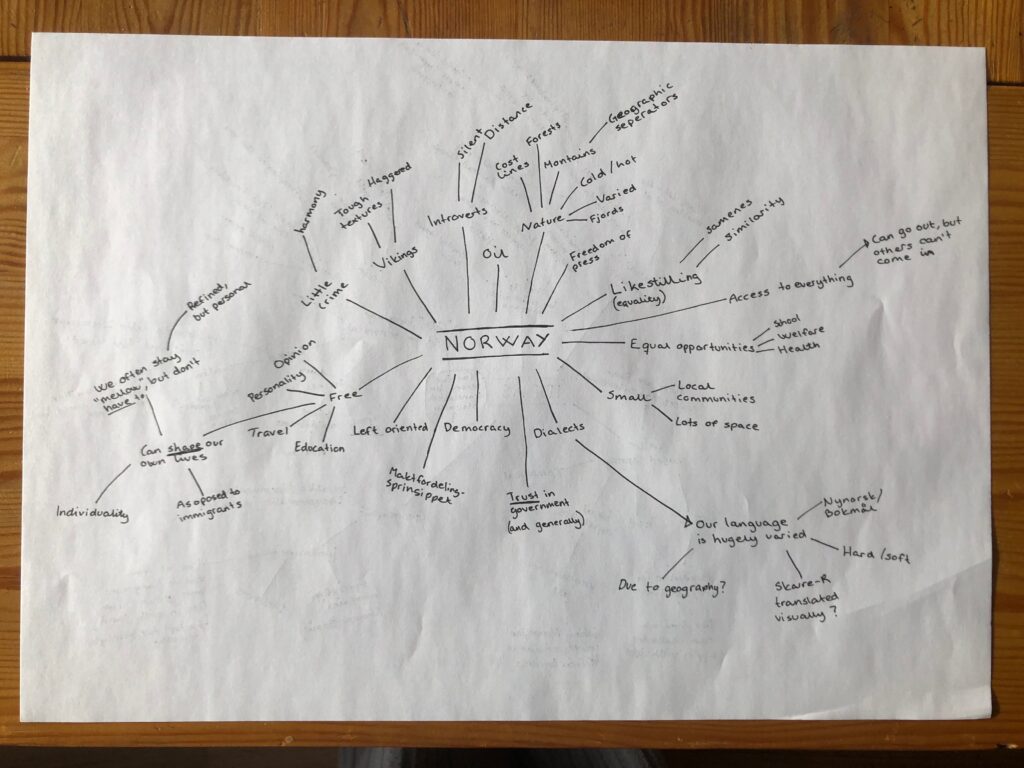
I was mainly able to come up with political concepts like democracy, trust in government and equal opportunities. These were not ideas, but rather larger themes that should be considered for my language. For example, developing a free language would be representative of Norway, but it would also be a contrasting element to Norwegian immigration policies. By using the values of Norway that I see as positive in my project, I could thus start to build arguments for why our immigration policies are non-Norwegian, claiming that they should be brought up for discussion.
Brainstorming: initial ideas
At this stage I was really eager to move on from over-all concept and argumentation to specific ideas and solutions. In order to get this process started I did another mindmap, and then proceeded to develop moodboards for some of it’s ideas.
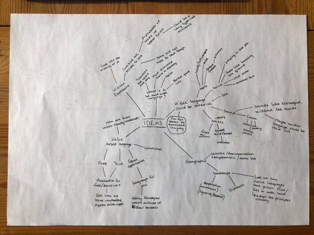
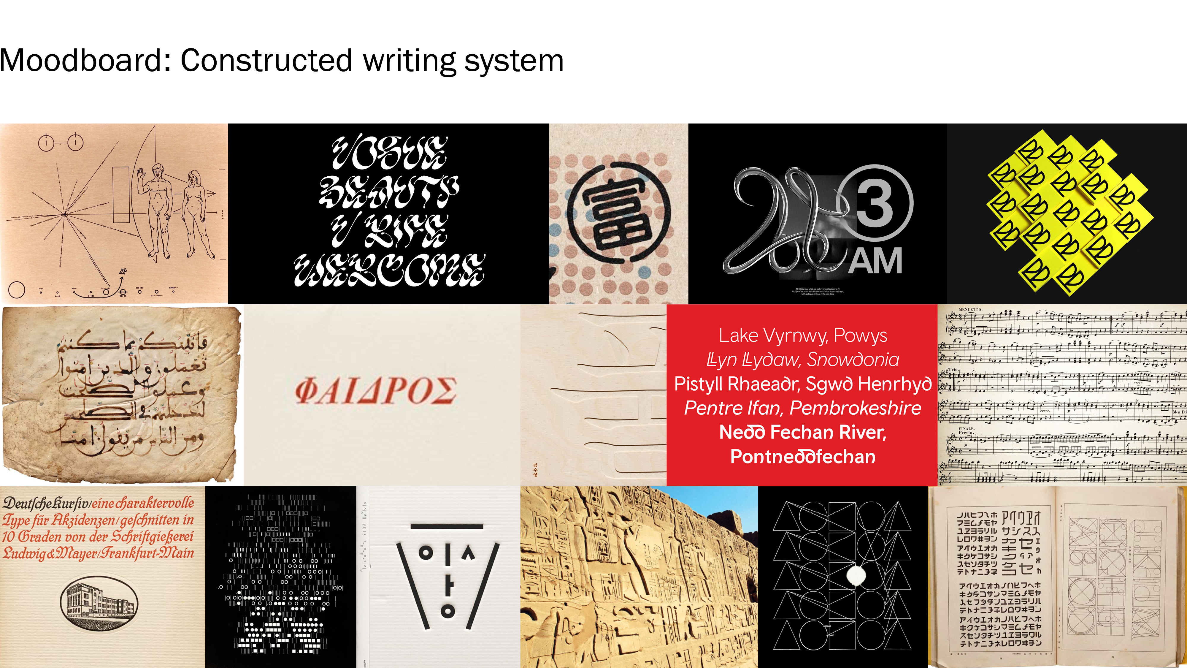
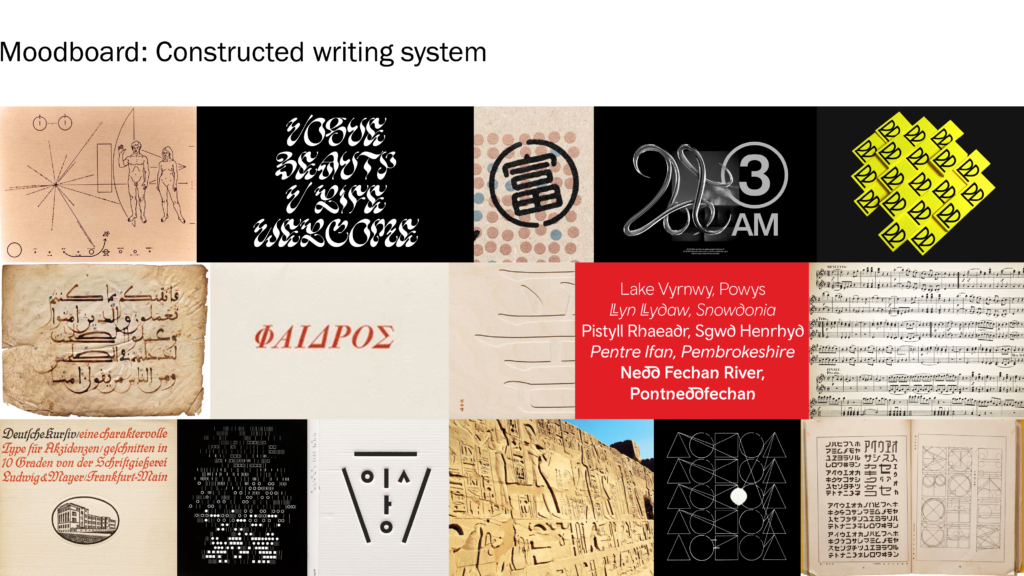
A visual take on Esperanto – develop a constructed visual language
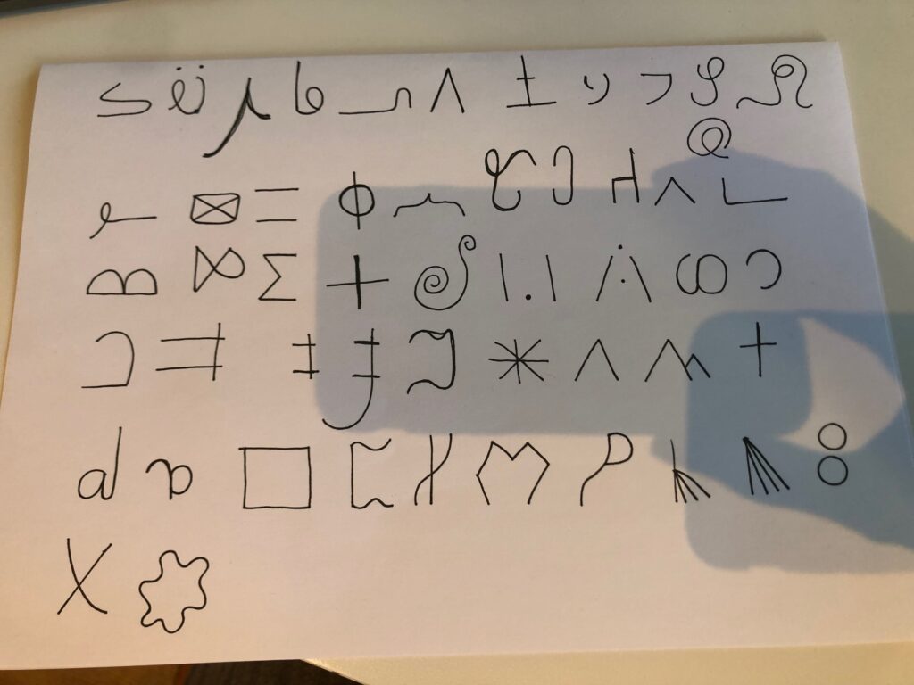
Rather than constructing a verbal language based on other languages, I could attempt to develop a constructed alphabet – using traits from the different writing systems of the world. This could be a very typographic outcome, which wouldn’t really be readable. It could also be a new writing system, to be used for Esperanto or another constructed language.
Even if I don’t go ahead with this idea, the method of using other writing systems as inspiration could be considered. Also, it would be interesting to research the making of Esperanto and other constructed languages, as a way of developing my concept.
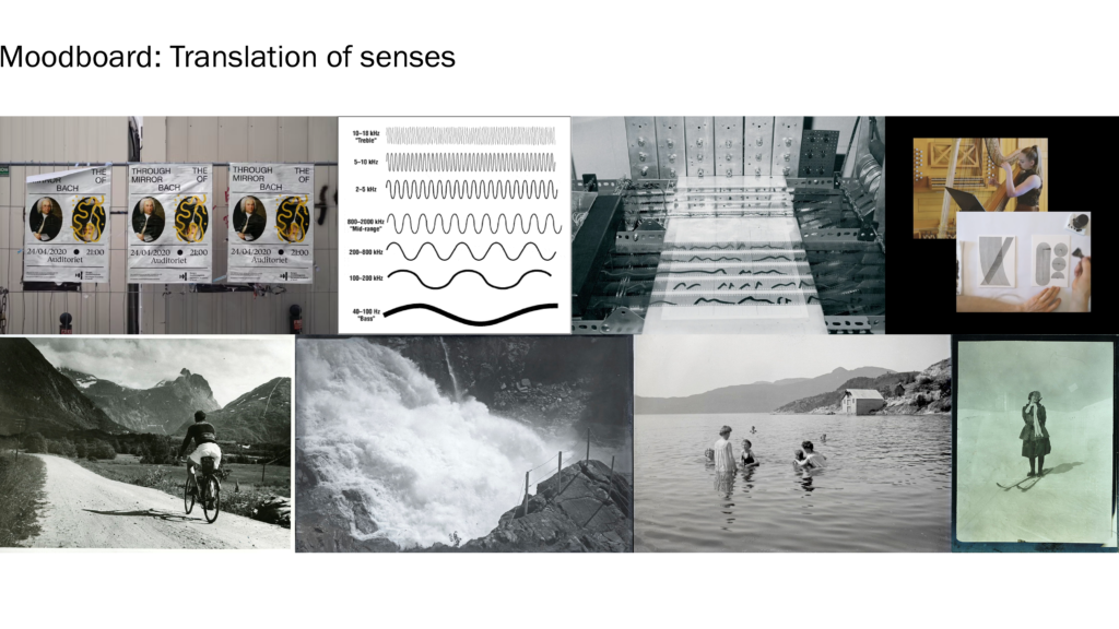
A visual translation of senses
In order to visually translate the land of Norway (which would let outsiders feel, rather than read, ref. last week), I could look to the four other senses for insight. By establishing what Norway sounds, feels (touch), tastes and smells like, I could perhaps also begin to establish what it looks like.
This idea would perhaps be less value centred. However, I could still use Norwegian language in my application, for example by making the language free to use for everyone.
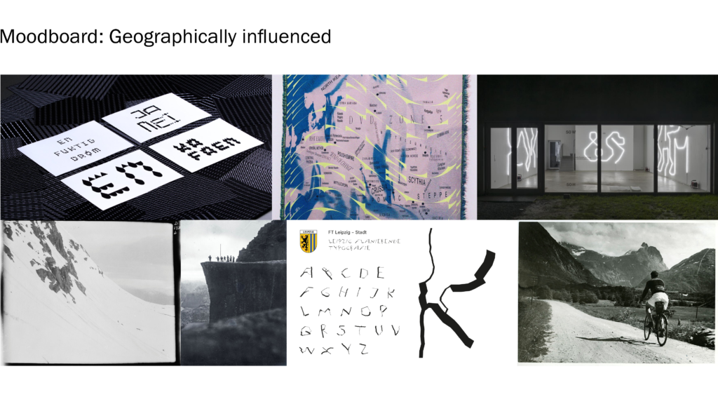
Geographically influenced
Looking at geography, I could use the land to collect data or systems, which could then inform graphic choices. Perhaps I could log walks, or establish a system where different shapes are connected to different objects found in nature. Drawing on the article on native languages, I could also study how verbal languages grow out of nature, adopting these principles in my visual work.
Another way of tackling geographic influences would be to tackle keywords such as separation/variation (due to our mountains we have a huge range of accents in Norway, and even two separate written languages) and distance (outside of the largest cities, people live quite far away from each other).
Quick sketches
At this stage I didn’t have time to test my ideas fully. I did however attempt some very quick sketches:
Constructed writing system:
Visually mimicking Norwegian mountain structures:
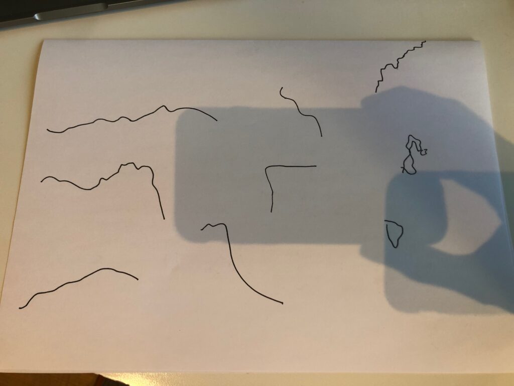
Although the last sketch was very brief, I found the uneven pointy line structures quite interesting – perhaps they could inform the look of symbols or letterforms somehow?
Weekly wrap up
At this stage I’m starting to feel confident in my direction conceptually. I like the idea of building a constructed language, and how this could relate to immigration and borders. I do however feel slightly unsure about what my concept could look like in terms of design, and I’m not quite sure how to attack my initial ideas yet. As of now we are supposed to be testing ideas, but unfortunately I’m not close to having any ideas ready for testing. I therefore think it will be important to spend most of next week making, so that I can kickstart the project properly.
In terms of industry professionals I’m also starting to feel a bit behind. This week I sent out a few emails, but as I haven’t heard back, it will be vital to step this up moving forward.
Looking back at this week I think I could have spent more time looking into constructed languages such as Esperanto. Researching into how Esperanto was constructed might help me on the way to constructing my own language – particularly if my language is going to be based on a constructed writing system. I also think it would be helpful to analyse various writing systems carefully. By taking the components of various systems apart I could perhaps begin to compile them in new ways.
REFERENCES:
Elfie Thomas (2022) Przemek Bizoń celebrates high art and “trashy” aesthetics through experimental type design. Available at: https://www.itsnicethat.com/articles/przemek-bizon-graphic-design-art-180222 (Accessed: 23 February 2022).
Jyni Ong (2020) Diaspora is a new display font expressing Italian immigration to Scotland between 1880 and 1920. Available at: https://www.itsnicethat.com/articles/diaspora-good-eggs-type-foundry-graphic-design-080720 (Accessed: 23 February 2022).
NRK (2022) ‘1. Ikke barnas feil’, Uønsket. Available at: https://tv.nrk.no/serie/uoensket/sesong/1/episode/1 (Accessed: 23 February 2022).
LIST OF FIGURES:
Figure 1. Przemek BIZON. 2022. Moreless.type ARP. It’s Nice That [online]. Available at: https://www.itsnicethat.com/articles/przemek-bizon-graphic-design-art-180222
Figure 2. GOODEGGS. 2020. Diaspora. It’s Nice That [online]. Available at: https://www.itsnicethat.com/articles/diaspora-good-eggs-type-foundry-graphic-design-080720
Figure 3: NRK. 2022. Uønsket. [film still]. Available at : https://tv.nrk.no/serie/uoensket/sesong/1/episode/1/avspiller [accessed 25 February 2022].
Figure 4: NRK. 2022. Uønsket. [film still]. Available at : https://tv.nrk.no/serie/uoensket/sesong/1/episode/1/avspiller [accessed 25 February 2022].
Figure 5. Trygve ERIKSEN. Ca. 1898-2018. Os Kommune. Riksarkivet [online]. Available at: https://foto.digitalarkivet.no/fotoweb/archives/5003-Kommunev%C3%A5pen/Kart%20og%20tegninger%20og%20segl/Os%20fra%20SNL.JPG.info#c=%2Ffotoweb%2Farchives%2F5003-Kommunev%25C3%25A5pen%2F%3Fq%3Dos
Figure 6. Hallvard TRÆTTEBERG. 1904. Vest-Agder Fylke. Riksarkivet [online]. Available at: https://foto.digitalarkivet.no/fotoweb/archives/5003-Kommunev%C3%A5pen/Kart%20og%20tegninger%20og%20segl/Vest-Agder%20fra%20Heraldry%20of%20the%20World.JPG.info#c=%2Ffotoweb%2Farchives%2F5003-Kommunev%25C3%25A5pen%2F
Figure 7: Ingrid REIGSTAD. 2022. Moodboards week 5. Private collection: Ingrid Reigstad.
Figure 8: Ingrid REIGSTAD. 2022. Moodboards week 5. Private collection: Ingrid Reigstad.
Figure 9: Ingrid REIGSTAD. 2022. Moodboards week 5. Private collection: Ingrid Reigstad.