Lecture notes
Lecture reflections
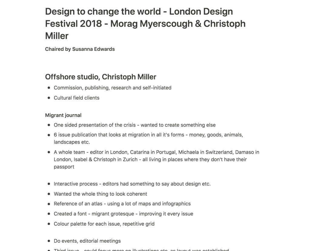
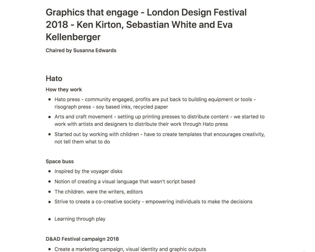
The lectures this week had several interesting talks, and I particularly enjoyed those from Hato and Kellenberger-White. Kirton’s comment on creating a visual language that wasn’t script based was interesting, and I think their concept of letting children assign meaning to symbols was very smart (Ken Kirton et al., 2018). By doing so, they were not just asking children to participate in visual development, but also facilitating for a personal language, made by and for the users.
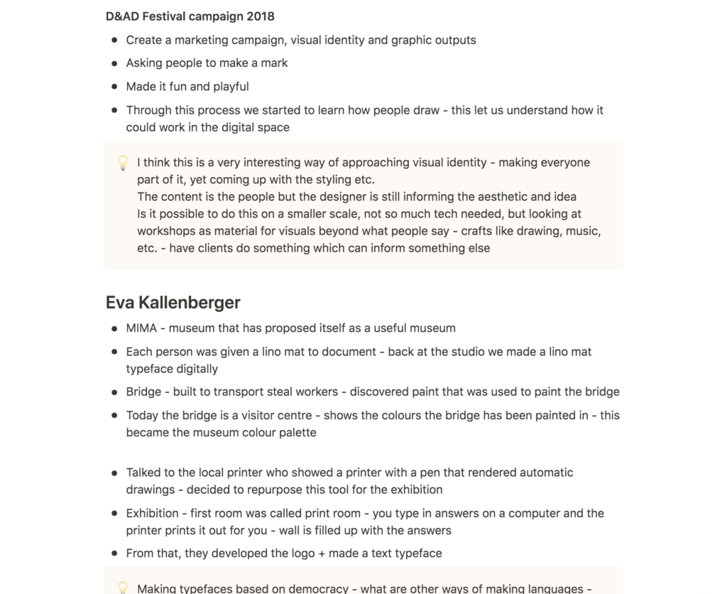
I also love Hato’s project with D&AD. By asking people to be creative through co-creation, they used creativity as a concept which fit perfectly with the client. Through a cohesive visual aesthetic they also unified the many received illustrations into one coherent identity (Ken Kirton et al., 2018). I would love to adopt a similar way of working for a branding project, where an audience creates the content, whilst the designer creates the visual system.
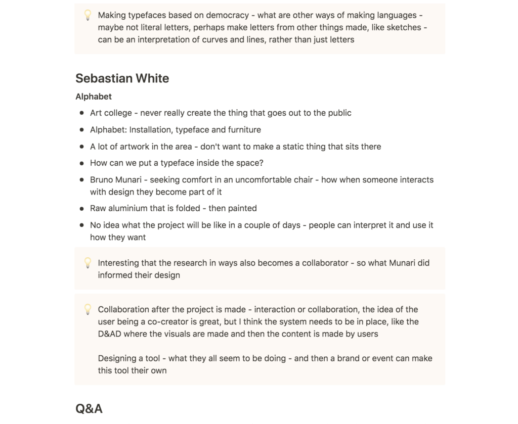
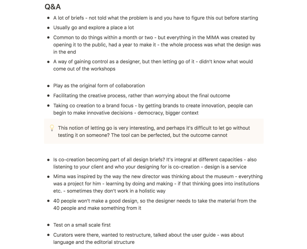
The notion of democracy in this way of co-creating design is particularly fascinating to me. Although one could perhaps question wether co-creation is the same as collaboration, I think the opportunity of letting a society inform the way they look makes sense. The workers at a company are who makes the company, and so they should feel represented in the branding. I’d be interested in exploring other ways of co-creation, rather than simple traditional craft making (drawing, Lino etc.). Could one adopt a similar way of working with sound, touch or something else?
Resource notes
Resource reflections
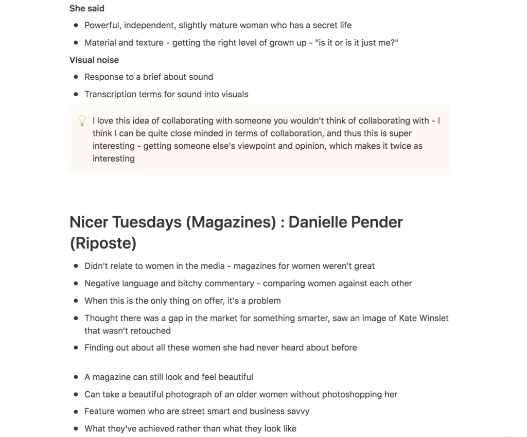
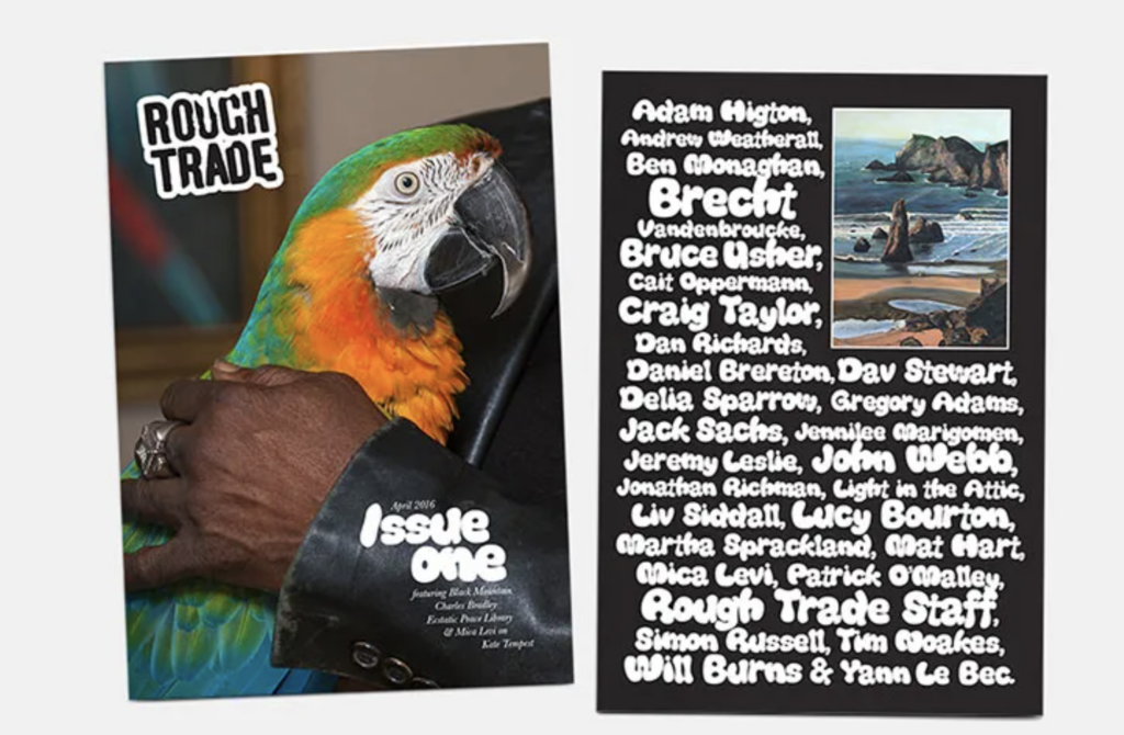
Nicer Tuesdays: Liv Siddall
Siddall’s approach to collaboration was very fun to hear about and I think she had a unique approach to commissioning (Liv Siddall, 2016). Her idea of having bands write the horoscope was such a fun idea and this candid (by the looks of it) way of getting people to make random and weird stuff could be interesting to adopt for more serious projects in branding. I’m not personally very good at making funny work, but I can definitely see this way of building a brand beneficial for the right companies.
I also imagine that Siddall’s approach to collaboration lets people relax and have fun, which probably leads to more relaxed and fun work. Perhaps this is true for every collaboration, that the work ends up reflecting the approach between the collaborators?
Nicer Tuesdays: Anna Lomax and Jess Bonham
Lomax and Bonham’s talk reminded me to stay open when it comes to collaboration. Their resistance to collaborating reminds me of my own approach to collaboration – that the collaborator needs to have the same vision as me. However, their differences definitely gave them an advantage, and it has inspired me to try and collaborate with someone different to me. Contrast is something I find very interesting in graphic design, so perhaps contrast between collaborators can lead to an interesting piece of work?
Further research
Tokens for climate
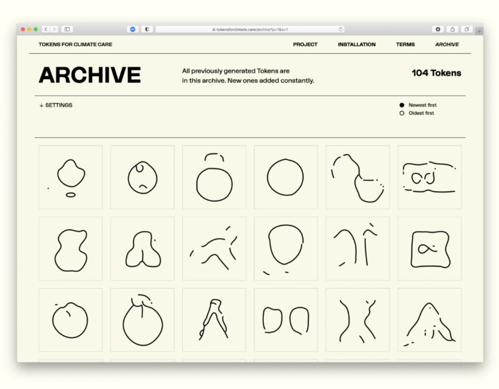
For their project Tokens for Climate, design studio Process created a logo generator for climate activism campaigns and brands (Jenny Brewer, 2021). The studio used 10 000 symbols to teach an AI what to make, and then labeled the symbols in order for the AI to generate symbols based on words (Jenny Brewer, 2021). The user can thus select three words in line with their campaign, and receive a token to be used for logo creation (Jenny Brewer, 2021). As AI becomes a larger part of our lives, I wonder if it could be seen as a collaborator in itself. The cold aspect on an in-human collaborator is perhaps not very tempting, but I think the notion of having a tool which helps you come up with unique concepts sounds promising.
Heydays: Generaxion
Drawing on the discussions on making design more democratic, I think Heydays’ visual identity for Generaxion is very interesting. By building a unique software for their client, Heydays let the employees of Generaxion develop their own variation of the X-symbol and thus make their own version of the company logo. The limitations of the logo developer ensures cohesiveness across variations, but still leaves enough room for personal variations.
Workshop challenge
I started the workshop challenge by brainstorming upon the workshop challenge question: What are the essential components of the collaborative mix?
Piotr posted an interesting quote from an interview with Paula Scher on the ideas wall this week, where she suggested that collaborating with other graphic designers leads to flat results because you end up correcting each other’s mistakes (Christopher Barker, 2017). I don’t think I have enough experience working with other designers to judge wether or not I agree with Scher, but I think the notion of flaws is very interesting and I think I might agree with her in wanting to leave certain mistakes as is. Scher goes on to discuss how she enjoys working cross-disciplinary (Christopher Barker, 2017), and judging from previous work experiences, I definitely think collaborations work best when each team member has assigned roles that doesn’t overlap too much.
Going back to Lomax and Bonham’s Nicer Tuesdays presentation, I also think a collaboration would benefit from having contrasting individuals who challenges each other. If all members contribute similar things, there wouldn’t really be a need for more than one person. However, in order for this to work, I think all team members need to have an understanding and respect for each other, as well as an open mind. I particularly imagine open-mindedness being important in any discovery phase, as shutting down ideas one doesn’t like might kill the collaborative potential quite quickly.
The co-creation processes discussed in the lecture also made me think about the importance of trust in a collaboration. If you’re not able to let go and trust both the process, and your collaborators, you might end up taking over the project, or you might end up deciding on a safer solution quite quickly, rather than being open to new and exciting directions.
Studio Lowrie: The Sundance Festival 2020
After reflecting upon the question above, I went on to look for projects by browsing the Nice Tuesdays archive. The video series gives great insight to how creatives have worked on certain projects, and I therefore thought it could be a good idea to choose a project presented through the series. I finally landed on Studio Lowrie’s presentation of their 2020 brand design for the Sundance Film Festival.
I first watched Studio Lowrie’s Nicer Tuesdays video during my second module of this course. I thought the project was amazing and I was genuinely moved when seeing how the branding worked across applications. The concept is so simple, yet thought through and the fact that their logo is designed to fit the standard poster size ensures cohesiveness in such a simplistic way. Since Studio Lowrie is a small studio (and therefore similar to my hypothetical studio from the business plan), I thought it could be interesting to look into their way of collaborating on such a large project.
After deciding on a project I went on to gather information for the workshop challenge key points.
Is the project exemplary and historically significant?
The Sundance Festival changes it’s visual identity each year (Ruby Boddington, 2020) and so Lowrie’s identity is not historically significant for being the Sundance identity in itself. However, 2020 was the first year that the festival asked smaller studios to pitch for the identity (Ruby Boddington, 2020), and so the project can be seen as historically significant in terms of supporting freelancers and small studios.
Relationship of collaborators and the roles they played
The two members of Studio Lowrie, Michael White and Callin Mackintosh, collaborated on the concept and development of the branding identity system for the festival. The duo created branding identity guidelines, which the in-house designers at Sundance used to implement across 1500 applications (Ruby Boddington, 2020). This is what made it possible for the small studio to take on such a large project (Ruby Boddington, 2020).
Lowrie also collaborated with animator Connor Campbell and the band Beach House, to create three cinema trailers for the festival screenings (Studio Lowrie, 2020). The trailers were meant to refer to the branding guidelines, but also to be a separate design that worked on screen (Studio Lowrie, 2020).
Although the client might not be seen as a truly equal part in terms of collaboration, I think the creative director of Sundance, Luis Felipe Farfán, should be mentioned as a collaborator in this instance. In a It’s Nice That article, the studio talks about their client as someone who trusts and loves to listen to the people they work with (Ruby Boddington, 2020). They also say that Sundance let them go ahead with what they wanted to do for the project (Ruby Boddington, 2020).
Challenges and outcome
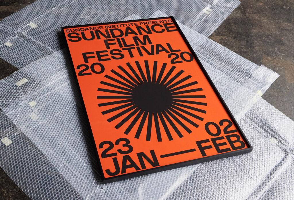
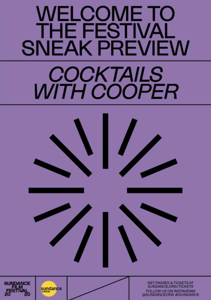
Farfán gave the studio a specific brief, asking for a minimal, yet fun design that would appeal to a young audience and that could be easily applied across formats and media (Studio Lowrie, 2020). By designing the logo in a standard poster format, Lowrie created a minimal design that could be scaled up and down without any additional designing (Studio Lowrie, 2020). Futher, they used colour, a modern sans serif and a simplistic set of circle symbols (representing the way our pupils reacts to the screen, but also a projector and the sun itself), which adds boldness and a sense of play to the identity (Studio Lowrie, 2020). Since the town where the festival is held is quite busy in terms of architecture and city elements, the identity also needed to stand out and catch people’s attention. The colours and simplicity of the design made this possible as well (Studio Lowrie, 2020).
As mentioned, the festival identity needed to be implemented across 1500 applications, from posters, to cars, to booklets (Ruby Boddington, 2020). Being only two people this was a challenge in itself for Lowrie. It was solved by letting the in-house designers of Sundance design the applications, based on the brand guidelines (Ruby Boddington, 2020). Other than Lowrie mentioning that the car design didn’t end up exactly as they had hoped (Studio Lowrie, 2020), I wasn’t able to find any particular information on the collaboration between the studio and Sundance’s designers.
When working with a range of films, the design needed to work for both long and short titles, and according to the studio it was hard to test for length as they didn’t know the titles when designing (Ruby Boddington, 2020). This was solved by making the layout flexible with the use of a line and a grid structure (Ruby Boddington, 2020).
Approaches, creative process and recording of ideas
Lowrie’s initial concept for the design came from looking at the way a light comes out of a film projector, as well as the way our eyes react to a film when watching it (Studio Lowrie, 2020). They then explored ways of communicating this through visual experiments with circles (Studio Lowrie, 2020). After deciding on a circle symbol, they went on to explore typographical lockups. Having created the logo/poster design, they went on to develop additional circle symbols and a bold colour profile (Studio Lowrie, 2020).
When pitching their ideas to their client, Lowrie used an interesting approach of persuasion. Even though they were only asked to present the concept across four applications, they created about 40 in order to communicate what the branding could look like across media (Studio Lowrie, 2020). This might have helped their client, which in some way can be seen as a collaborator, understand their vision, which again could have led to Lowrie getting to develop their final result in the way they hoped.
Speaking of the client’s role as a collaborator, I think it’s worth mentioning that Farfán was the one to bring in Beach House to create the music. The music adds a particular mood to the animations, which I think suits the branding really well, and thus this collaborative aspect played an important role. The collaboration between Lowrie and the animator Campbell has not been discussed in detail, but in their Nicer Tuesday video, the studio does refer to it “not being too difficult” to develop the animations with Campbell’s help (Studio Lowrie, 2020).
Final synopsis
Having done the research above, I went on to write my final synopsis by highlighting the areas of collaboration:
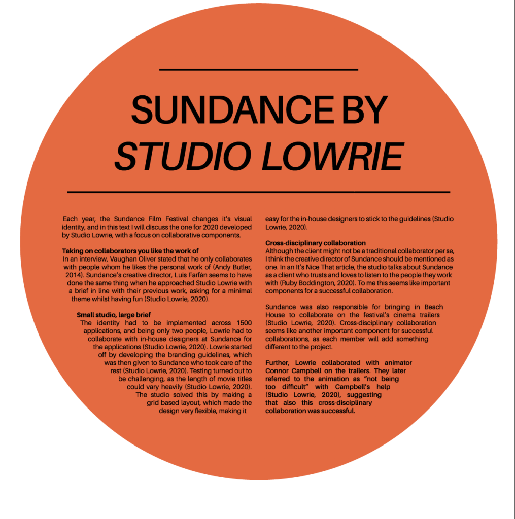
Studio Lowrie’s collaboration with The Sundance Film Festival
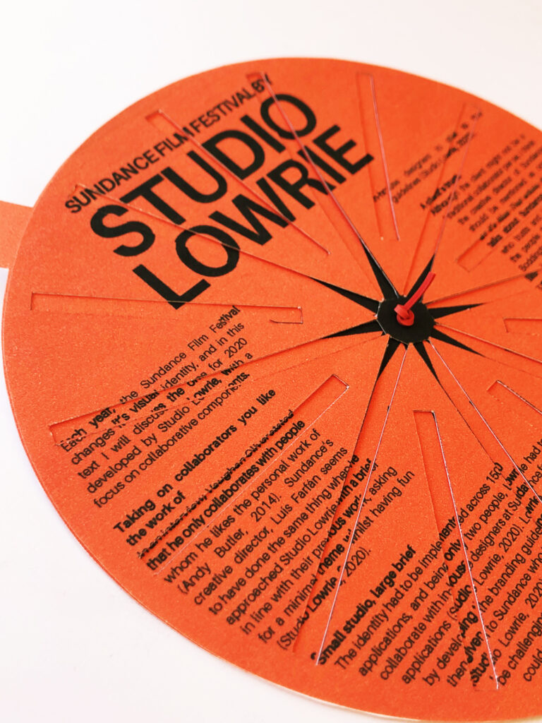
Each year, the Sundance Film Festival changes it’s visual identity, and in this text I will discuss the one for 2020 developed by Studio Lowrie, with a focus on collaborative components.
Taking on collaborators you like the work of
In an interview, Vaughan Oliver stated that he only collaborates with people whom he likes the personal work of (Andy Butler, 2014). Sundance’s creative director, Luis Farfán seems to have done the same thing when he approached Studio Lowrie with a brief in line with their previous work, asking for a minimal theme whilst having fun (Studio Lowrie, 2020).
Small studio, large brief
The identity had to be implemented across 1500 applications, and being only two people, Lowrie had to collaborate with in-house designers at Sundance for the applications (Studio Lowrie, 2020). Lowrie started off by developing the branding guidelines, which was then given to Sundance who took care of the rest (Studio Lowrie, 2020). Testing turned out to be challenging, as the length of movie titles could vary heavily (Studio Lowrie, 2020). The studio solved this by making a grid based layout, which made the design very flexible, making it easy for the in-house designers to stick to the guidelines (Studio Lowrie, 2020).
A client’s trust
Although the client might not be a traditional collaborator per se, I think the creative director of Sundance should be mentioned as one. In an It’s Nice That article, the studio talks about Sundance as a client who trusts and loves to listen to the people they work with (Ruby Boddington, 2020). To me this seems like important components for a successful collaboration.
Cross-disciplinary collaboration
Further, Sundance was also responsible for bringing in Beach House to collaborate on the festival’s cinema trailers (Studio Lowrie, 2020). Cross-disciplinary collaboration seems like another important component for successful collaborations, as each member will add something different to the project.
Further, Lowrie collaborated with animator Connor Campbell on the trailers. They later referred to the animation as “not being too difficult” with Campbell’s help (Studio Lowrie, 2020), suggesting that also this cross-disciplinary collaboration was successful.
Visual process
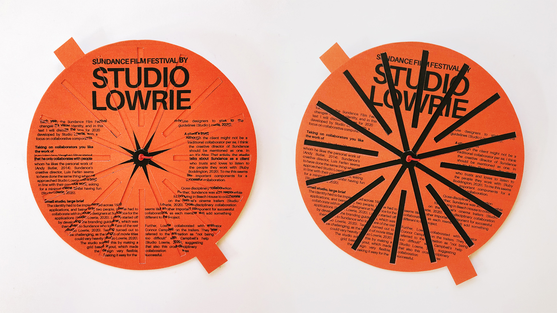
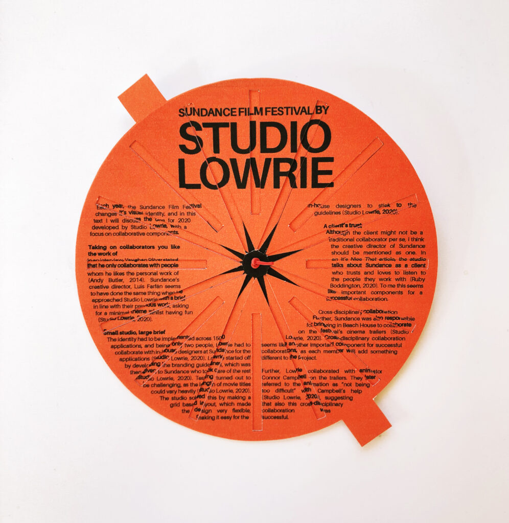
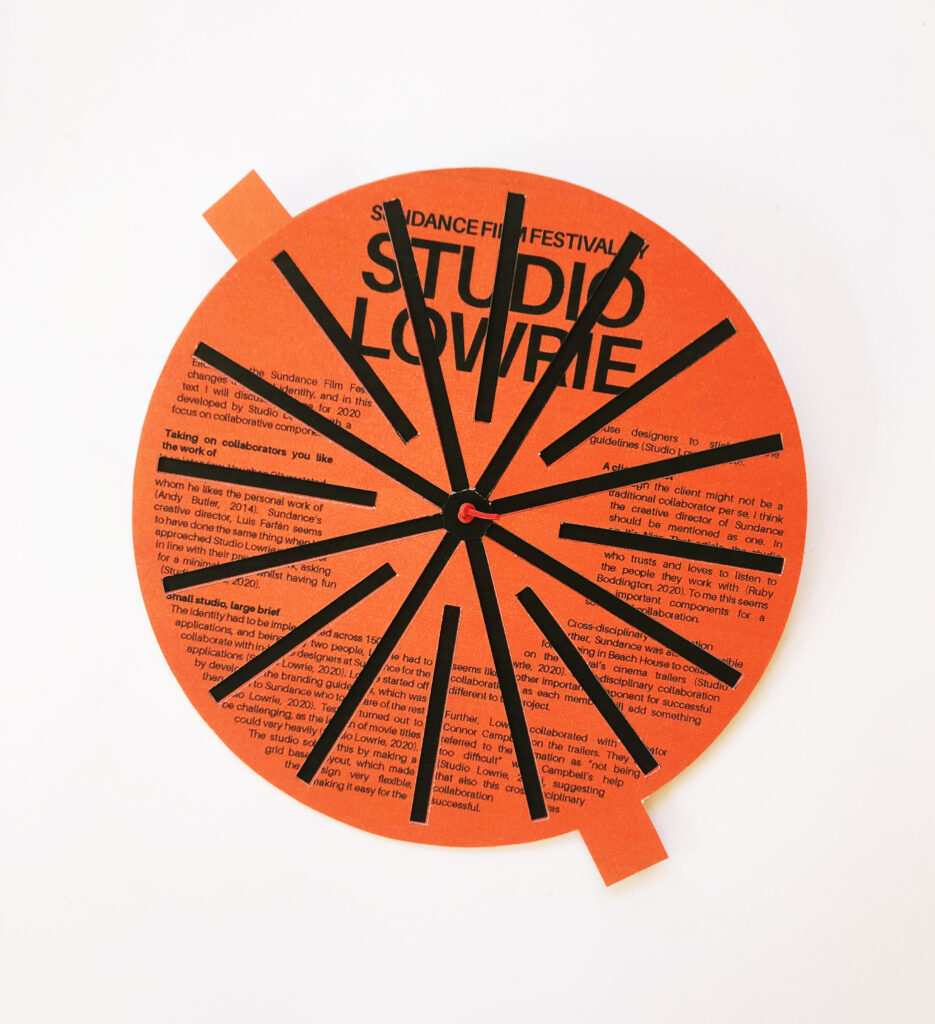
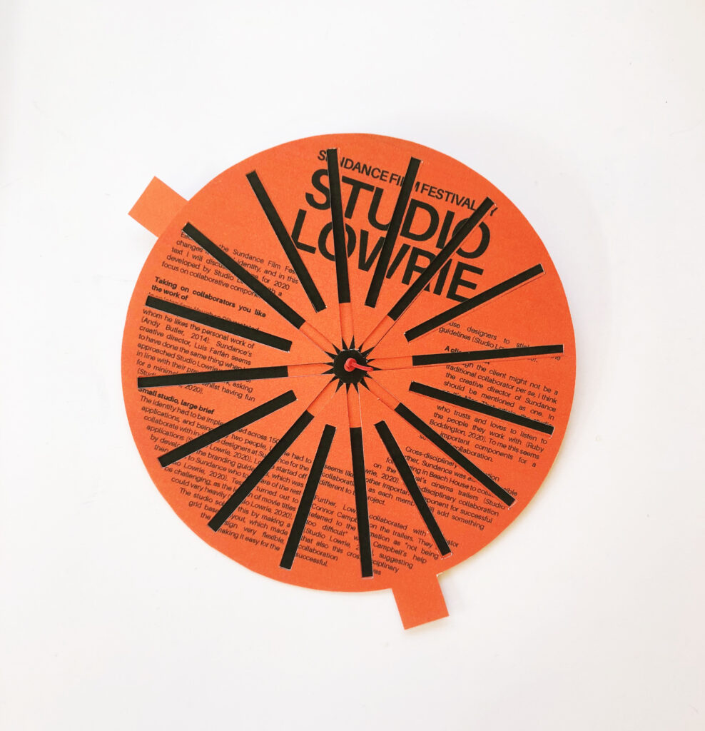
After writing my synopsis I went on to work on my editorial piece. The Sundance identity is so beautiful, and I therefore wanted to create something that used Lowrie’s original design, but in a new way so that I wasn’t just copying their work.
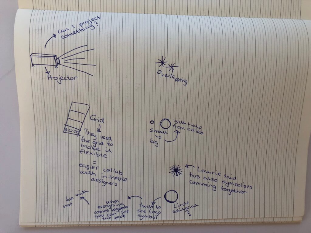
I first got the idea of using a projector to create a piece consisting of light, inspired by the fact that their first logo experiments was developed based on this. However, I didn’t actually have a projector and I also think this would have taken too much time. Further, I considered looking at scale contrasts, as Lowrie was only able to take on such a large project due to the collaboration with Sundance’s in-house designers.
I also started thinking about some of the things Lowrie had mentioned in their Nicer Tuesdays talk, which made me remember that the logo symbol represents people coming together for the festival (Studio Lowrie, 2020). As my text discusses collaboration, where different members of a team comes together, I thought it could be interesting to create a design based on the logo symbol.
In their talk, Lowrie shows animations of the symbol where rotating variations of it overlays each other, making new versions of the logo. This made me come up with the idea of a physical object that the user could rotate in order to reveal versions of the logo. Just like the collaborators of a project has to come together to make a piece of work, the pieces of the object would have to come together in order to create the final object.
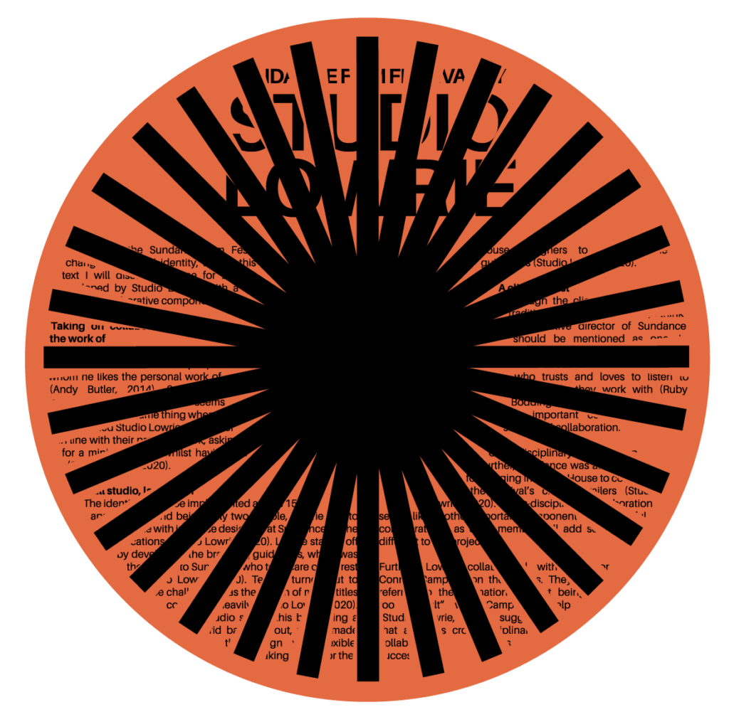
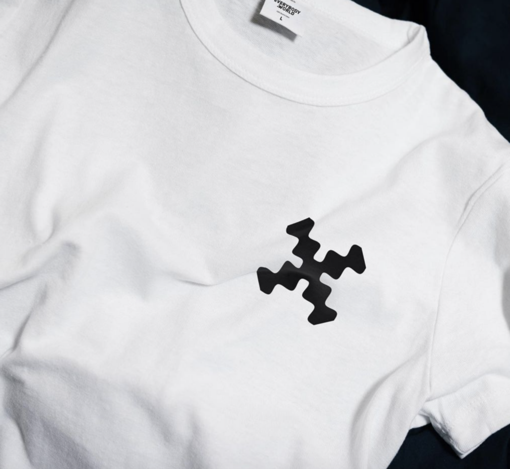
After establishing my idea I went on to try and figure out how to actually make the object. I decided on a circle shaped design as the logo is a circle and that it could therefore take up as much space as possible. I didn’t have the original typeface that Lowrie had used, so I experimented with finding a similar one and started working on the type setting.
I ended up spending a lot of time trying to understand what the two pieces needed to containt in order for text and logo to be revealed at different times. Initially I wanted to use the most used symbol (the one on the left above), but this turned out to be very difficult as the symbol would always be overlapping parts of the text. I therefore opted for one of the slimmer variations, which I got to work after quite a bit of testing.
Final result
My final piece for this week’s challenge is a written text on the collaborations in Studio Lowrie’s Sundance Film Festival identity project, displayed as a physical editorial object. The text discusses how a small studio could take on a large brief thanks to collaboration, but also how trust, cross-disciplinary working and working with people you like the work of, can act as important components in a successful collaboration.
The physical design is inspired by how the Sundance logo symbol represents everyone coming together for the festival. By physically rotating the piece, the user can make all components come together to reveal either the text or variations of the logo. This represents how collaboration depends on all members coming together to create one unified piece of work.
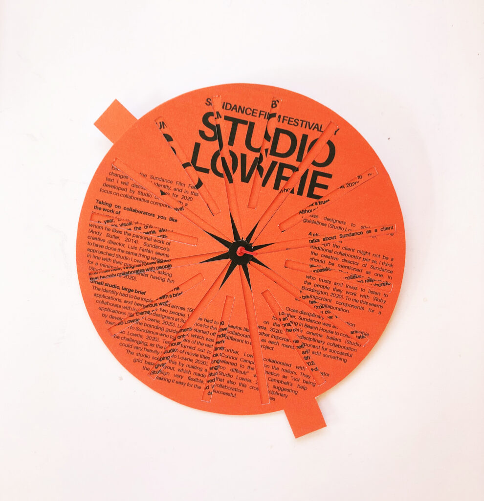
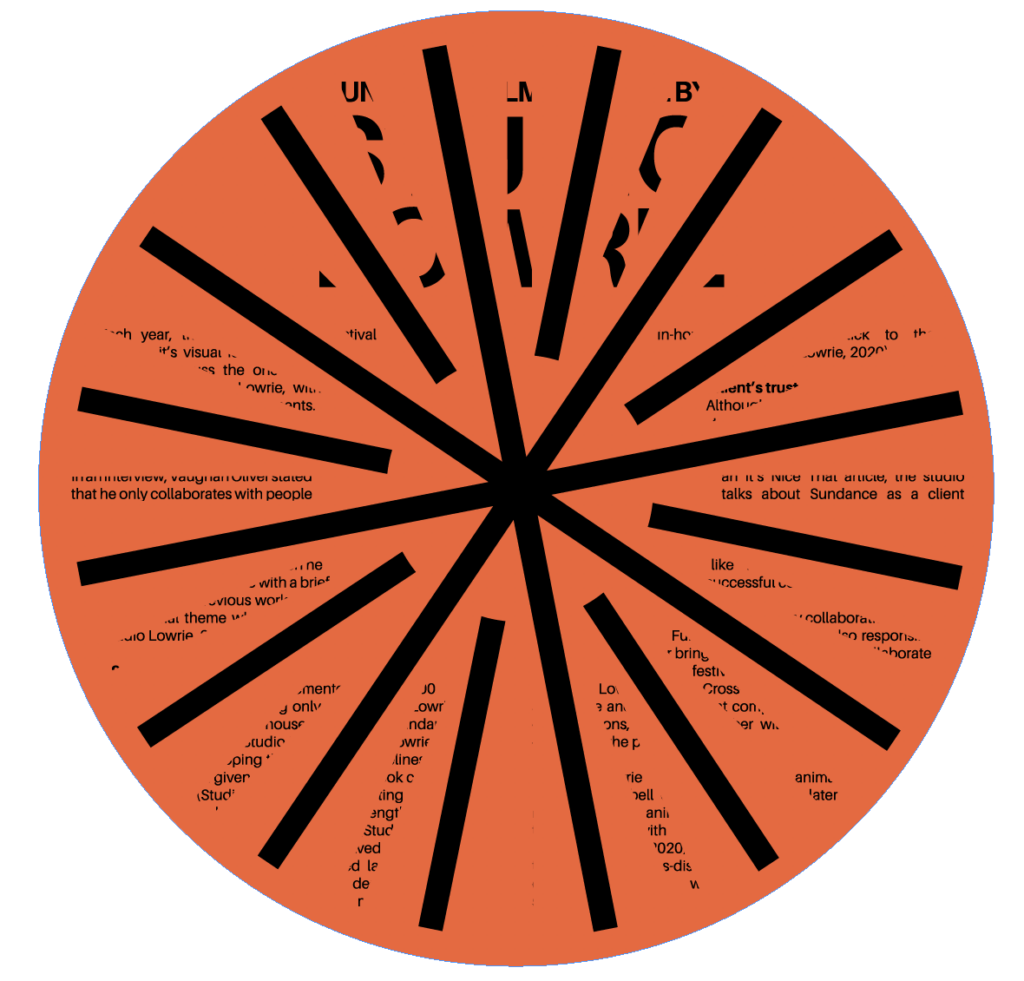
My text mentions Lowrie’s collaboration with Beach House and Connor Campbell, on the making of animated cinema trailers. When rotating the piece, a visual effect is created, and this effect mimics the digital animations that came from the collaboration. Thus, the piece attempts to showcase images of the project, but in a slightly different and more interactive way than simply laying them out on a page.
As I had to create the object by hand, it doesn’t align as perfectly as I had hoped. I therefore created a digital animation which visualises my vision. I do however prefer the physical object because it’s more tactile, and because it represents the collaboration between Lowrie and the in-house designers (as the in-house designers made the physical applications based on Lowrie’s brand guidelines). The fact that I am making a physical piece based on Lowrie’s branding system, thus almost makes me part of the collaboration as well.
In conclusion
I enjoyed the various case studies provided in this week’s material, particularly the ones on co-creation by Hato and Kallenberger-White. Looking back at my work this week, I think I could have looked further into these types of projects, as I would be interested in pursuing this for my final collaboration model for Brief 2. I might look into this further next week if relevant.
The topic of collaboration is quite an interesting one, and I do think I could have worked harder on finding more information on it. My synopsis haven’t actually provided me with much new insight on important components of a successful collaboration, and I therefore think I could have researched more, in order to develop a better and more insightful text.
Although I don’t think my text is as insightful as I would have liked, I really enjoyed working on my physical object. I usually tend to focus on the visual identity design of projects, but by adopting the visual style that was already there, I was able to experiment with physical application instead. This is something I would like to get better at, since I have an ambition of learning to design packaging.
If I had more time, I would have liked to experiment further with the optical illusions of my piece, perhaps by testing other formats or by trying to include more variations of the logo, so that the user could reveal more “images”. Further, I would have liked to develop a more sophisticated object, perhaps by making a frame which could hold the pieces better together. At the moment, the object is a little wobbly, and the text doesn’t align perfectly.
REFERENCES:
Andy Butler (2014) ‘interview with graphic designer vaughan oliver’, Designboom, 19 December. Available at: https://www.designboom.com/design/interview-with-graphic-designer-vaughan-oliver-12-19-2014/ (Accessed: 29 June 2021).
Anna Lomax and Jess Bonham (2016) Nicer Tuesdays: Anna Lomax and Jess Bonham. (Nicer Tuesdays). Available at: https://www.youtube.com/watch?v=Z1GjLDY80LA&ab_channel=It%27sNiceThat (Accessed: 28 June 2021).
Christopher Barker (2017) ‘AN INTERVIEW WITH PAULA SCHER’, Semi permanent, 7 December. Available at: https://www.semipermanent.com/stories/interview-paula-scher (Accessed: 29 June 2021).
Jenny Brewer (2021) ‘Climate activism has a branding problem and this logo generator is here to help’, It’s Nice That, 17 June. Available at: https://www.itsnicethat.com/news/tokens-for-climate-care-process-london-design-biennale-digital-media-partnership-170621 (Accessed: 28 June 2021).
Ken Kirton et al. (2018) ‘Graphics that engage’. London Design Festival. Liv Siddall (2016) Nicer Tuesdays: Liv Siddall. (Nicer Tuesdays). Available at: https://www.youtube.com/watch?v=mu6b0EOq3yc&ab_channel=It%27sNiceThat (Accessed: 28 June 2021).
Ruby Boddington (2020) ‘Studio Lowrie’s Sundance Film Festival identity proves small studios can take on projects of any scale’, It’s Nice That, 24 March. Available at: https://www.itsnicethat.com/features/studio-lowrie-sundance-film-festival-2020-identity-graphic-design-240320 (Accessed: 29 June 2021).
Studio Lowrie (2020a) Nicer Tuesdays: Studio Lowrie. (Nicer Tuesdays). Available at: https://www.youtube.com/watch?v=QRVTiiPXapM&ab_channel=It%27sNiceThat (Accessed: 29 June 2021).
Studio Lowrie (2020b) ‘SUNDANCE FILM FESTIVAL 2020 FILM TRAILERS’, Studio Lowrie. Available at: https://studiolowrie.com/ (Accessed: 29 June 2021).
LIST OF FIGURES:
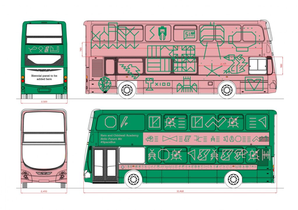
Figure 1. HATO. 2016. Space bus. Design Week [online]. Available at: https://www.designweek.co.uk/issues/27-june-3-july-2016/hato-joins-forces-school-kids-create-space-bus/
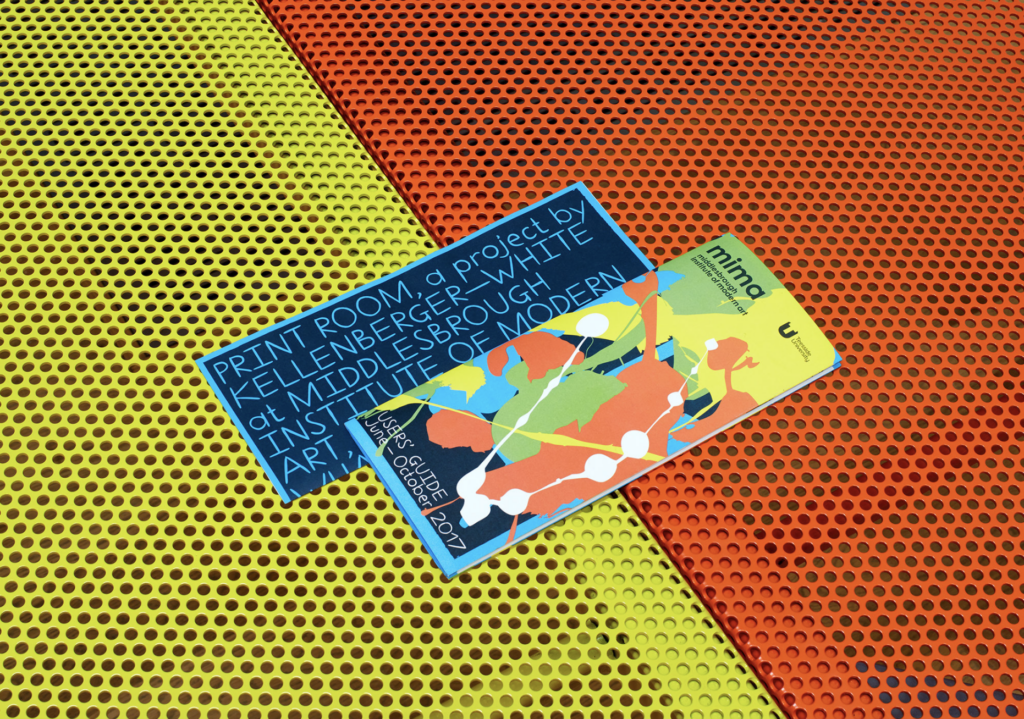
Figure 2. KALLENBERGER-WHITE. 2016. Middlesbrough Institute of modern art. Kallenberger-White [online]. Available at: https://kellenberger-white.com/project/middlesbrough-institute-of-modern-art/
Figure 3. ROUGH TRADE. 2016. Rough Trade issue 1. It’s Nice That [online]. Available at: https://www.itsnicethat.com/articles/bruce-usher-rough-trade-magazine-liv-siddall-040416
Figure 4. Jess BONHAM and Anna LOMAX. 2016. She said…. It’s Nice That [online]. Available at: https://www.itsnicethat.com/articles/jess-bonham-anna-lomax-she-said-dot-dot-dot-060616
Figure 5. PROCESS. 2021. Tokens for Climate Care. It’s Nice That [online]. Available at: https://www.itsnicethat.com/news/tokens-for-climate-care-process-london-design-biennale-digital-media-partnership-170621
Figure 6. HEYDAYS. 2021. Generaxion. Instagram [online]. Available at: https://www.instagram.com/p/CMw5sYUBaa2/
Figure 7. LOWRIE. 2020. Sundance Film Festival 2020. Studio Lowrie [online]. Available at: https://studiolowrie.com/
Figure 8. LOWRIE. 2020. Sundance Film Festival 2020. It’s Nice That [online]. Available at: https://www.itsnicethat.com/features/studio-lowrie-sundance-film-festival-2020-identity-graphic-design-240320
Figure 9-11: Ingrid REIGSTAD. 2021. Lowrie editorial design. Private collection: Ingrid Reigstad.
Figure 12: Ingrid REIGSTAD. 2021. Lowrie editorial design. Private collection: Ingrid Reigstad.
Figure 13-16: Ingrid REIGSTAD. 2021. Lowrie editorial design. Private collection: Ingrid Reigstad.
Figure 17: Ingrid REIGSTAD. 2021. Lowrie editorial design. Private collection: Ingrid Reigstad.
Figure 18: Ingrid REIGSTAD. 2021. Lowrie editorial design. Private collection: Ingrid Reigstad.