Lecture notes
Lecture reflection
System 1 decision making
In his lecture, Hosken mentions the theory from the book Thinking, fast and slow, by Daniel Kahneman, which suggests that the human subconscious has two decision making systems, system 1 and system 2 (Hosken, 2020). If system 1 is fast and error prone, whilst system 2 is slow and reliable, like Kahnman’s theory states, I’m assuming that traditional design work is created using system 2, as these decisions are effortful and complex (Hosken, 2020). This makes me wonder what types of design we could create if we were able to design using solely system 1.
In the surrealist movement, artists often used automatism in their work. The artist would disconnect from the subconscious mind, attempting to portray the unconscious mind through their art (Tate, ca. 2000-2020). This method was used by Freud as an attempt to reach the subconscious of his patients (Tate, ca. 2000-2020). If one were to visualise the self, in it’s completion, would one have to use a method like automatism? After all, when making conscious decisions, the designer is only using system 2, which, if we take Kahneman’s theory one step further, is only half of the self.
Designing for system 1
In his article Product Design Considerations for the Subconscious Mind, Mark Nemeth discusses how the mind tends to use System 1 when possible, as using system 2 is tiering, and therefor, it is important to create user interfaces with system 1 in mind (Nemeth, 2019). Although maybe obvious, this means that if one website showcases information clearly, whilst the competitor’s website showcases information as confusing and messy, the user will probably go with the first one, even if the competitor’s website contains better information (Nemeth, 2019).
Connecting an archetype to a target audience
Another point from Hosken’s lectureI fond interesting was archetypes and how they are rooted in us through evolution (Hosken, 2020). I am interested to investigate the use of archetypes in brands further, as I can imagine that the choice of archetype will set the tone of voice in a brand. I would also imagine that a brand would be clever to choose the type of archetype to which their target audience aspire to be.
A perverse need for products
Lastly, I found Hosken’s mentioning of Bernays’ ideas interesting. When correct advertising methods are used, Bernays claims that one could bypass the ego and sell directly to desire (Hosken, 2020). Thus, products become equal to the need for food and sex. Looking at consumerism in this way, I think our need for products seem animalistic and perverse.
Resource notes
Lecture reflections
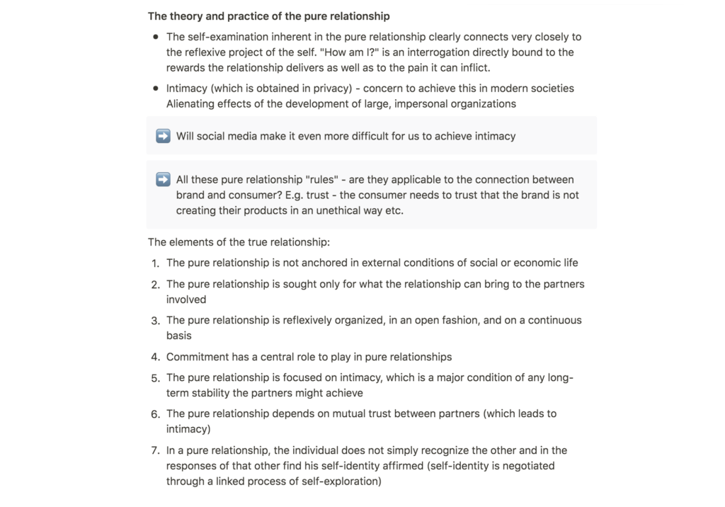
Should brands be working towards a pure relationship with their customers?
Giddens’ elements of the true relationship made me wonder if these “relationship rules” are applicable to branding. If we look at the connection between brand and customer as a relationship, the brand’s goal might ultimately be something similar to Gidden’s true relationship.
Take Giddens’ 6th point, “The pure relationship depends on mutual trust between partners” (Giddens, 1991). If the relationship between customer and brand is going to work, certain criteria has to be met. For example, the customer has to trust that the product or service, offered by the brand, is created in an ethical manner. The product or service also has to meet the expected quality requirements of the user. If the trust is broken, the customer might not continue his or her engagement to the relationship, which might result in him or her converting to a competitor’s brand.
Perhaps it would be beneficial for brands (and designers) to keep this point in mind: the connection between brand and consumer should be seen as a relationship (although perhaps slightly one sided instead of mutual like in human relationships), and therefor, the brand should work towards establishing a relationship as pure as possible.
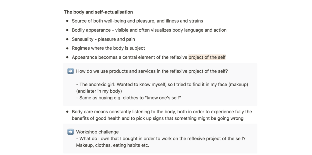
Is our need for products rooted in the need to move forward in our project of the self?
Further, Giddens’ term, the reflexive project of the self (Giddens, 1991), made me wonder how products might contribute to this project. As some of us struggle to find ourselves (or work on ourselves), we might be using products to get to know ourselves better, or perhaps to distinguish who we are from who we are not.
Further research
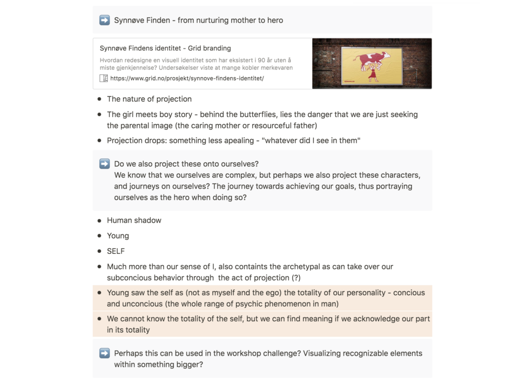
Shifting archetypes: Synnøve Finden
Synnøve Finden is a Norwegian dairy brand which up until it’s rebranding in 2019 by design studio Grid, has featured a blonde girl on a dairy farm in it’s logo. Grid’s rebrand becomes very interesting in the light of archetypes, as they seem to have shifted from The Innocent, to The Hero.
The old Synnøve seems rooted in place, holding a heavy jar of milk in a still position. The sun is either setting or rising, indicating that she lives on the farm. Her smile is kind and her character seem to be honest and pure, much like the archetype of the innocent. The new Synnøve is on a journey. Her milk jar is light enough to be portable, and the fact that she is looking upwards, indicates that the journey is exciting, rather than scary. She is adventures and on her way into the world in an energetic manner.
This shift in archetypes becomes especially interesting in the light of feminism. Whilst Synnøve used to be tied to the chores of the farm to which she belonged, she is now heading out in the worl, in charge of her own life. When designers assign archetypes, I think it is important that we become aware of whom we assign different roles. The hero for example, does not have to be a white male. The rebranding of Synnøve Finden is a great example of how we can empower minorities through archetypes.

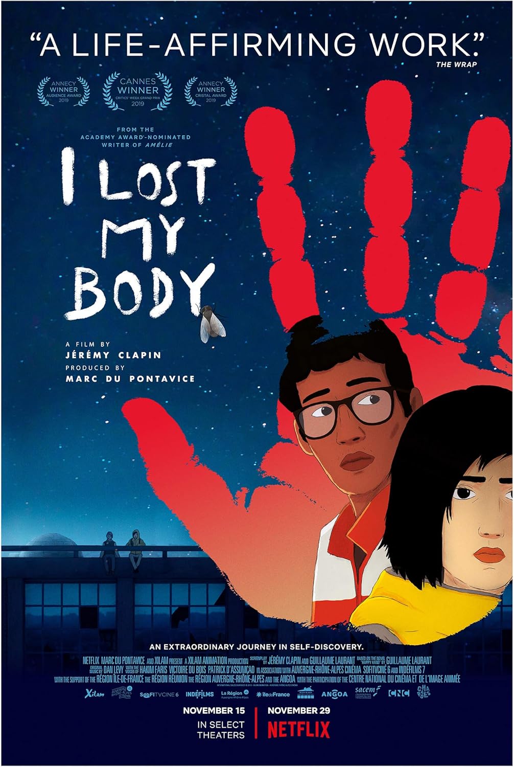
I lost my body: a visualisation of the search for the self
I lost my body is a French film, about a cut off hand which is trying to find back to it’s body. Through the hand’s memories from when it was still attached to it’s body, we receive a story about a boy searching for love and somewhere to belong.
When the hand realises that it has ben cut off from it’s body, it goes on a journey to find back to the body. The boy’s memories from before the cut off remains, but the hand is not connected to the body’s experiences after the cut off or of it’s awareness of the present. Thus, the search for the body becomes a journey of finding back to the self, not only in terms of body, but also the conscious and subconscious.
Surrealist Automatism
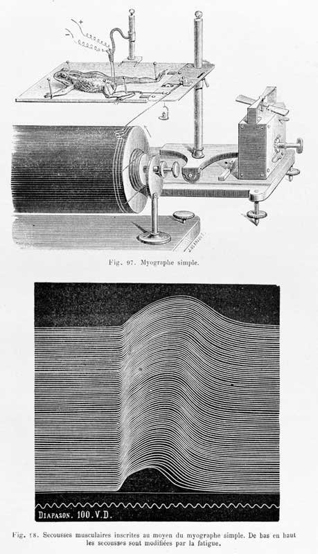
In his article Becoming Machine: Surrealist Automatism and Some Contemporary Instances, David Lomas investigates the idea of being machine-like through automatism art works (Lomas, 2012). The graphic method is one of the techniques Lomas discusses in his article (Lomas, 2012). The method captures dynamic phenomena and emerged as a reaction to industrial capitalism (Lomas, 2012).
Transalting the non-visual
Etienne-Jules Marey used the graphic method in order to visualise movement, often from within the human body (Lomas, 2012). Thus, he manages to translate non-visual phenomenons, into something visual, turning movement into still visual pieces (Lomas, 2012).
Visualizing the subconscious
I think automatism seems like an interesting method to use if one wants to visualise the self in a different manner than simply visualising what we first think of as answer to a question like “who are you?”. We must all be more than we are aware of, and although automatism might not be the solution to finding our whole selves, I think the method comments on the fact that we are more than our conscious thoughts and awareness.

Automatism experiments
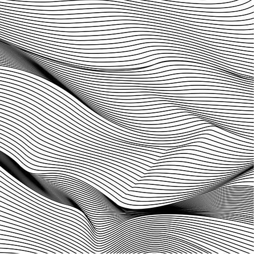
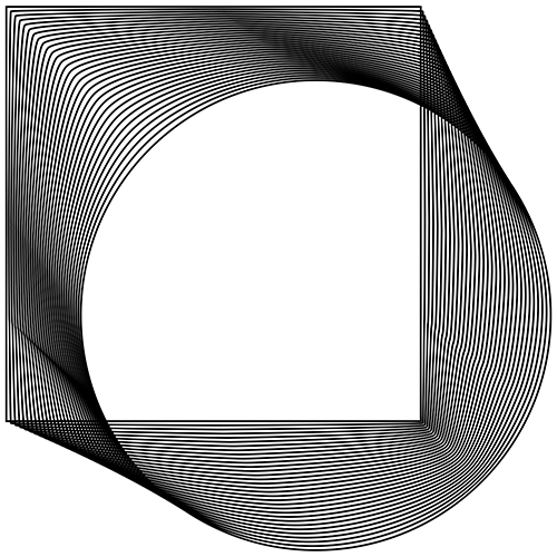
Reading about the method of automatism, inspired me to create some experiments. Initially, I thought I would try to make a physical system using objects from my home, in order to create a pattern machine. This turned out to be more difficult than first anticipated, and so I decided to experiments with sound waves.
Sound can be visualised through letters, but I was interested to find out if I could, for example, visualise my name, or my favourite sounds, in a systematic and geometric way than writing it out using letters. I recorded my boyfriend’s voice in order to create the tests.
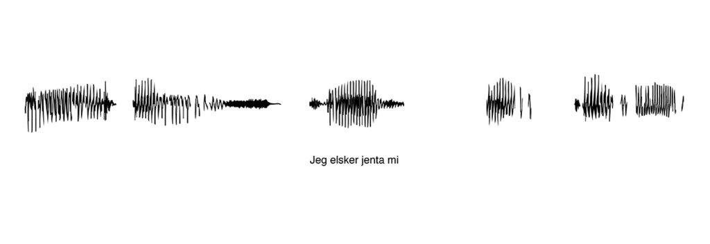
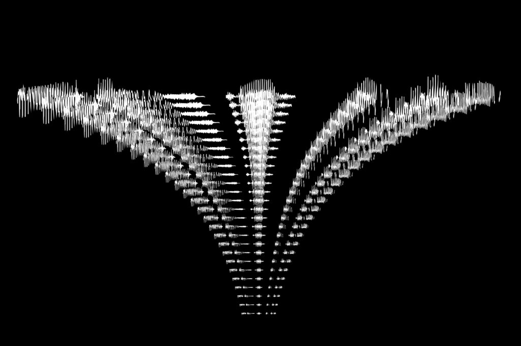
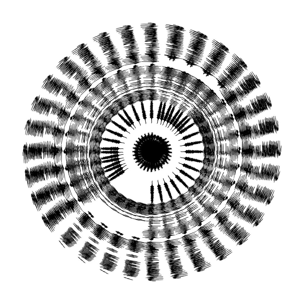
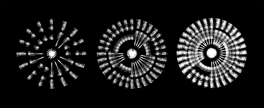
Fig. 6: Reigstad 2020. Sound wave experiment 2.
Fig. 7: Reigstad 2020. Sound wave experiment 3.
Fig. 8: Reigstad 2020. Sound wave experiment 4.
I think it could be interesting to take this experiment further, as I find the shapes created by the sound waves quite interesting. Initially I thought about using this method for the workshop challenge by making a small book or zine, named Sound Scapes. However, I also felt like this idea was a bit too complicated within the timeframe, so I decided to come back to this on a later date.
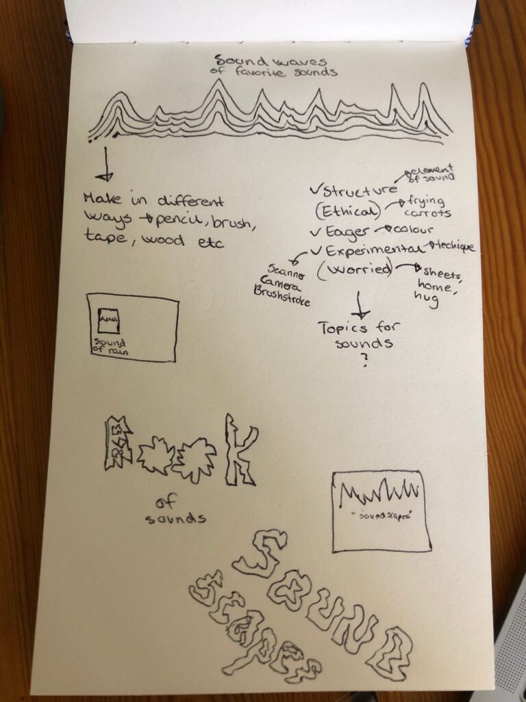
After posting my sound experiments on the ideas wall, I received some suggestions for further research on how to visualise sound. Paul also mentioned that he had created a typeface based on sounds, which I thought would be a great experiment to try at a later time. Perhaps also by referring to other body functions, like heart beats or rhythms from the way a person walks or moves.
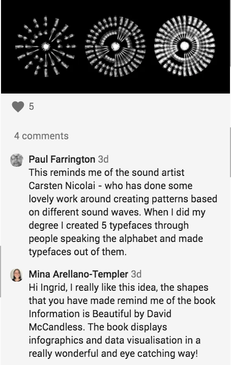
The work Secundenschlaf by Carsten Nicolai was particularly interesting to me. Whilst my work was created in 2D, Nicolai takes the sound waves further, into the three dimensional space, resulting in a clean and beautiful sculpture. To me, this piece feels solid, yet fragile, and I think the texture is a beautiful representation of the varying lengths of waves.

Workshop challenge
Finding my 5 words
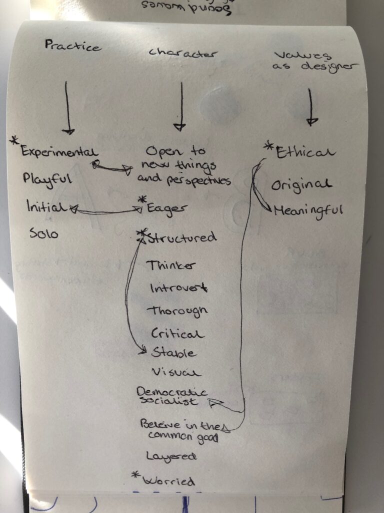
For my 5 words I wanted to make sure that there were words that described my design practice and way of working, but also words which describes who I am as an individual. In order to achieve this, I decided to assign each word I came up with to one of three categories: practice, character and values as a designer. I made sure to include some negative words, as well as strengths, in order to make sure that the words portray my true self, and not a glorified version.
My method for narrowing the list down to 5 words was to look for overlaps, and of course, to reflect upon which words resonated with me the most. I also made sure to run my final words by my boyfriend, so that I could get an outsider’s perspective.
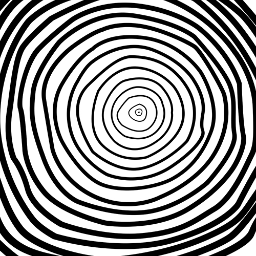
Ethical
The word ethical resonates with me in terms of design, as I aspire to create sustainable design that will not harm people, animals or the planet. I strongly believe that designers have a responsibility to be mindful of what they create and how they create it. I also feel a connection to the word on a personal level, as I care about practicing kindness and consideration in my life.
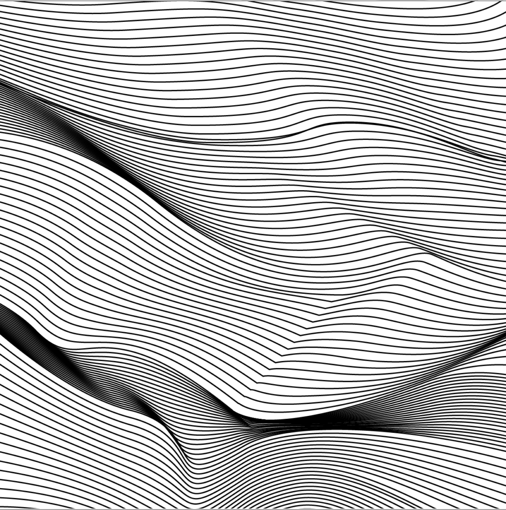
Experimental
Being creative brings me happiness and contentment, and I believe true creativity happens through experiments and by trying new things. I love to learn new techniques, but I also like to discover new perspectives and ways of thinking.
Worry
I definitely have a tendency to worry, wether it’s about other people’s opinions, the occurrence of a crisis or chances of failure. Luckily, I have people in my life who I can talk to and who help me rationalise when I worry too much. Knowing that I have a safe home and loved ones around me helps me step out of this worried state.
Eager
As a person I get easily engaged, both in my work life and personal life. Feeling eager is a great feeling, as it gets me going, but it can also mean that I sometimes jump into projects or jump to conclusions too quickly.
Structure
In order to keep sane, it is important for me to stay structured. I get easily overwhelmed, and so putting tasks and thoughts into systems helps me focus on one thing at the time. In terms of design I like a structured aesthetic, especially designs based on geometry.
Moodboards
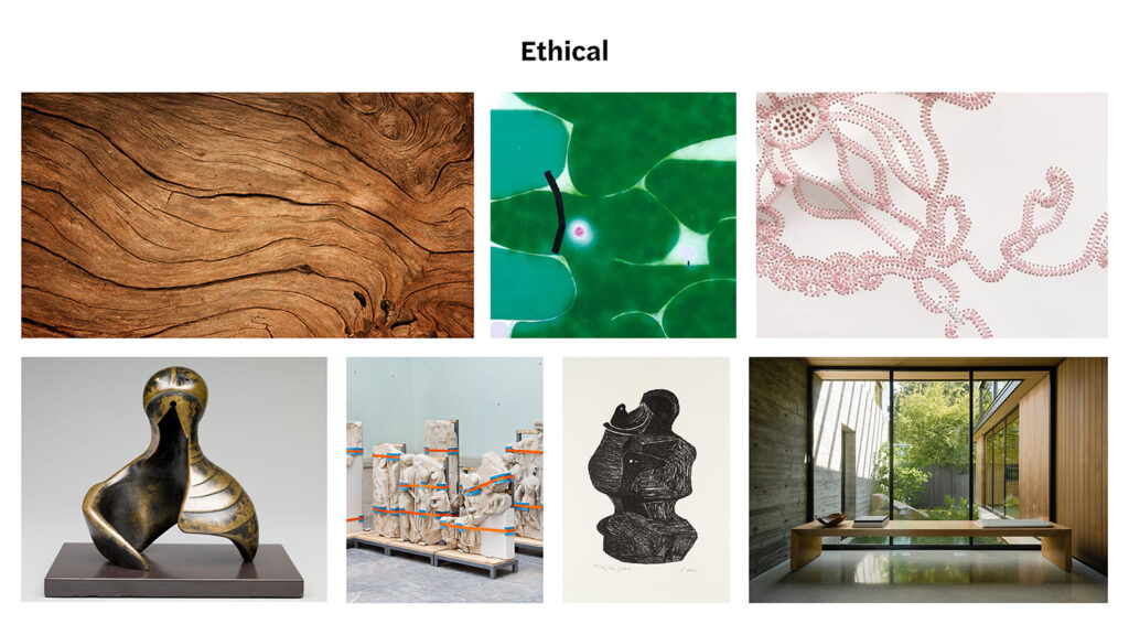
I have mainly looked at the word ethical in a sustainable context. I wanted to incorporate natural textures, colours and elements, but also art works that represent protection. The stitched work Ikhonkco, by Nicholas Hlobo, represents the need for us to take care of and repair the products we already have. Mother and child, by Henry Moore, represents the care and nurture of a mother, which we should aspire to have for our nature.
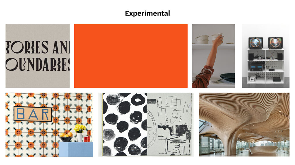
When I think of experimentation, my mind goes to the exploration of new techniques. I therefor wanted to include different patterns and textures. Typography is an area of graphic design I would like to get better at, and so I associate this with experimentation as well. The word experimental can also symbolise trial and error, as well as repetition of object or shape. Lastly, there are experiments of the scientific kind (which to me connects to an aesthetic of futurism and sci-fi), hence Nam June Paik’s work, Nixon.
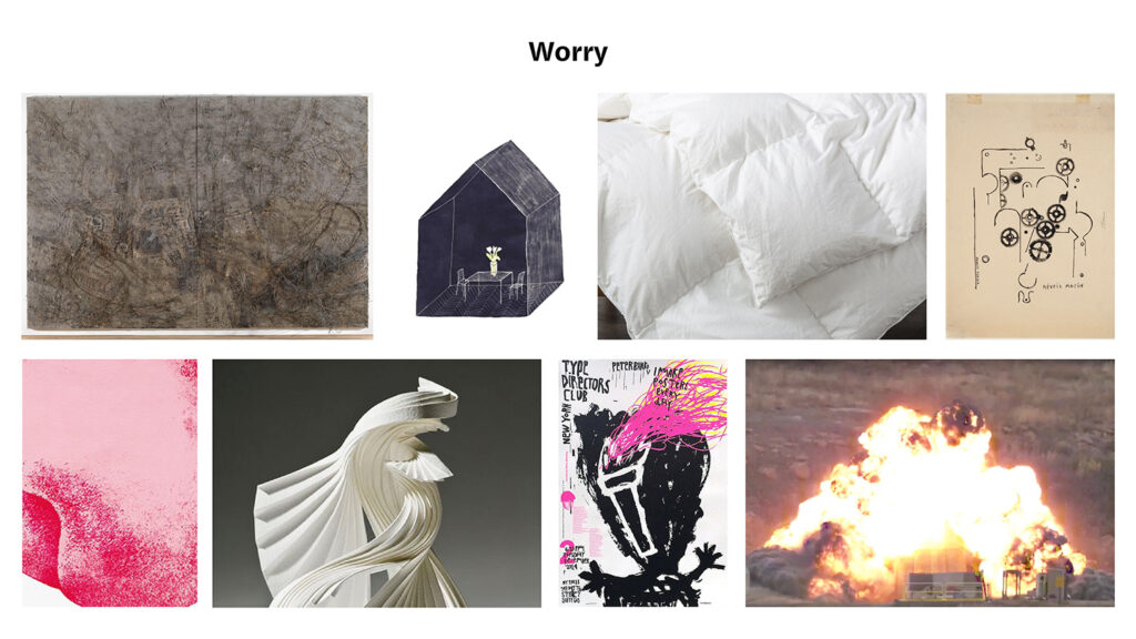
I didn’t want my moodboard for worry to solely convey negativity, and so I decided to incorporate the comforting elements of my life, as discussed previously in this blog post. The explosion has a sense of beauty to it in a visual sense, but it is of course a horrible phenomenon. I have also included some “messy” visuals which I associate with stress, as well as gears representing constant worrying thoughts.
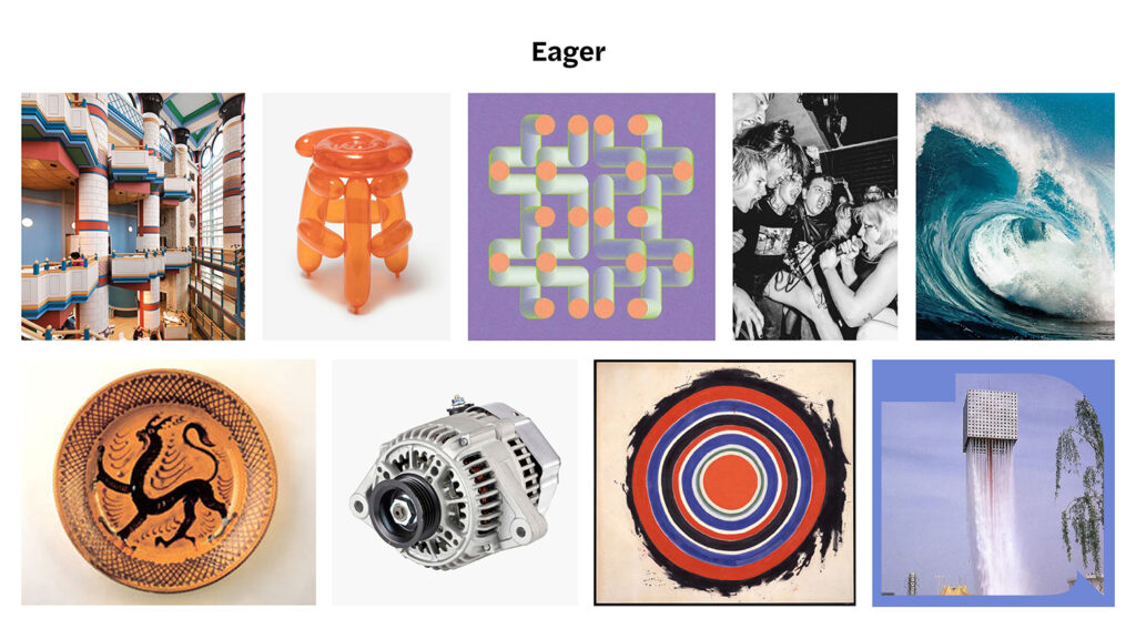
With eagerness comes waves of energy, and so I have focused on various sources of energy in this moodboard. Energy can be found in a dynamo, waves of water or spinning shapes. The photograph of people on a concert emotionalises the sense of eagerness to me, portraying it as a state, rather than a personality trait.
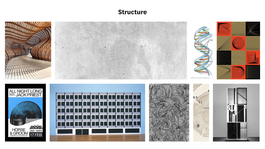
Structure is rooted in everything natural, but also in that which is humanly created. We can find it in buildings, machines, wood and in our DNA. To me, the word feels heavy as it is a fundamental concept, present in everything around us. Repetition seems to convey the appearance of structure in an evident manner, visualising many singular pieces as one connected unity.
Concept
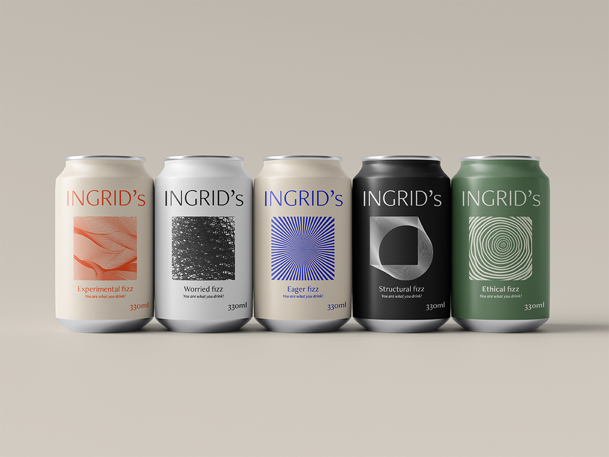
Looking back at my lecture reflections, I was still intrigued by the thought of people using products in order to work on their reflexive projects of the self. In attempt to comment on our “perverse” desire for products, I therefor decided to use soda packaging as medium for my visual piece. By creating a mock soda brand of my self, I hoped to create a representation of the ideal product, of which to complete the reflexive project of my self. Thus my piece becomes a comment on my own need for products, as well as that of our capitalist society.
Many artists have commented on consumerism. Andy Warhol, to Jeff Koons, to Tom Wesselmann are just a few. By focusing on my self as brand, I hope to create something that differs from the traditional works of these artists, hopefully obtaining a result which portrays self and product as one, rather than simply commenting on consumerism.
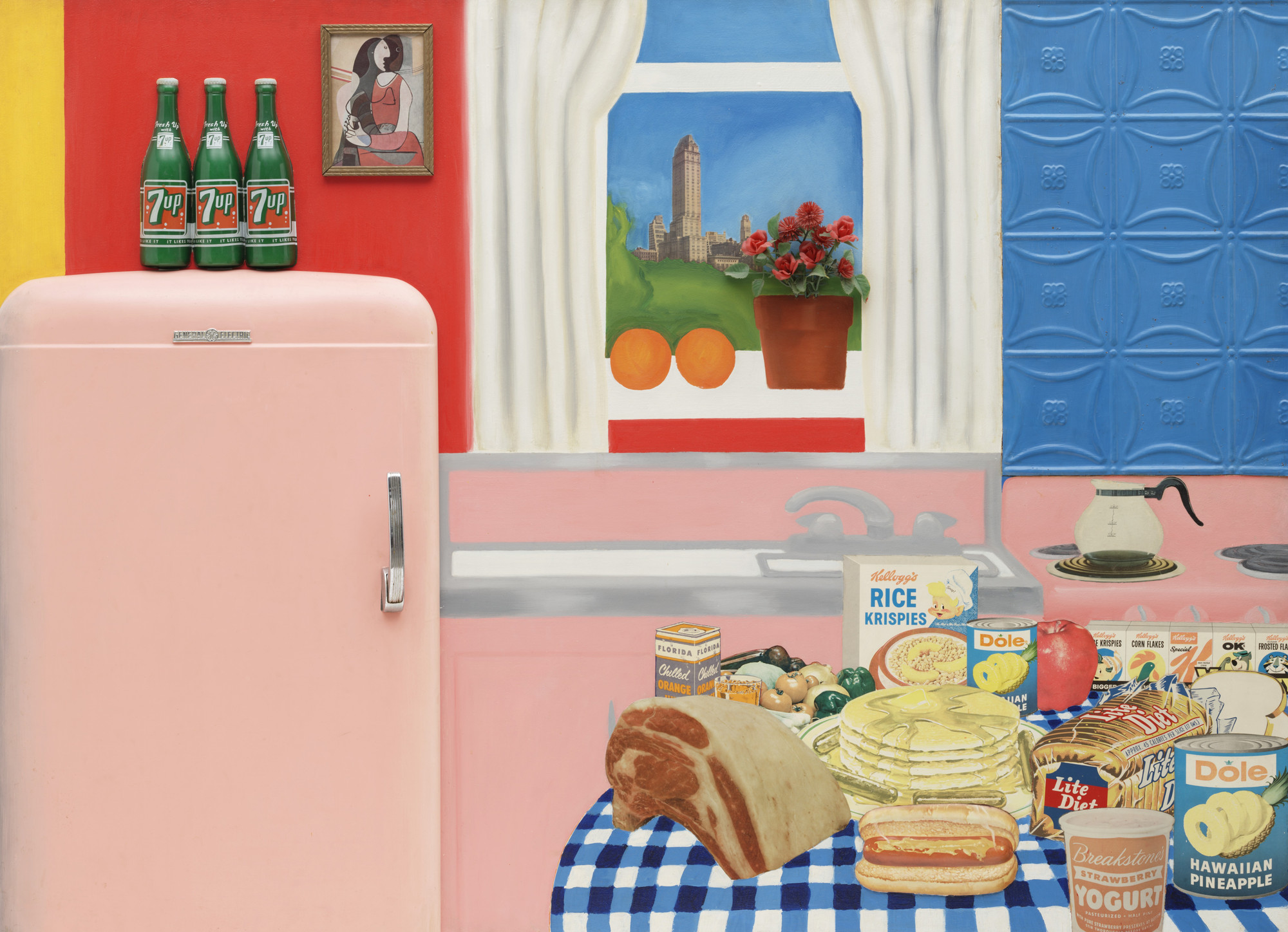
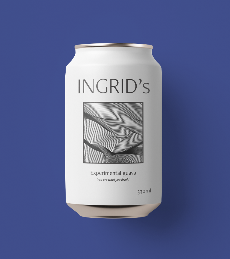
In order to choose a specific product, I tried to think of a product that is disposable, yet modern, in order to differentiate the product from classic consumerism art works. To me, the soda can feels like a modern version of Warhol’s soup cans. They are both made of metal, but the soda can feels very current. Cans filled with fizzy drinks or alcoholic beverages seem very trendy at the moment, and so I thought the soda can would be fitting for this task.
Process
I had a few ideas in mind for my soda can design, and so I decided to sketch out a few of them. I decided that I wanted to create either a pattern based design, a type based design or a illustrative design. With the time I had available, I figured the pattern based design was most realistic, and so I decided to test that idea in illustrator.
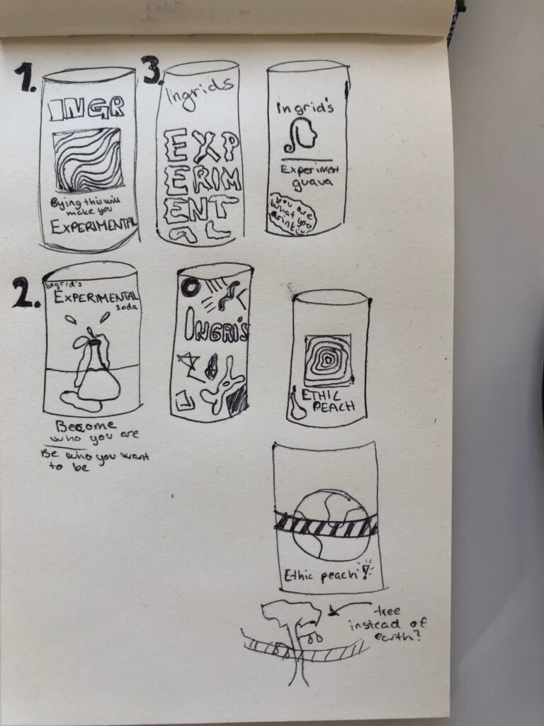
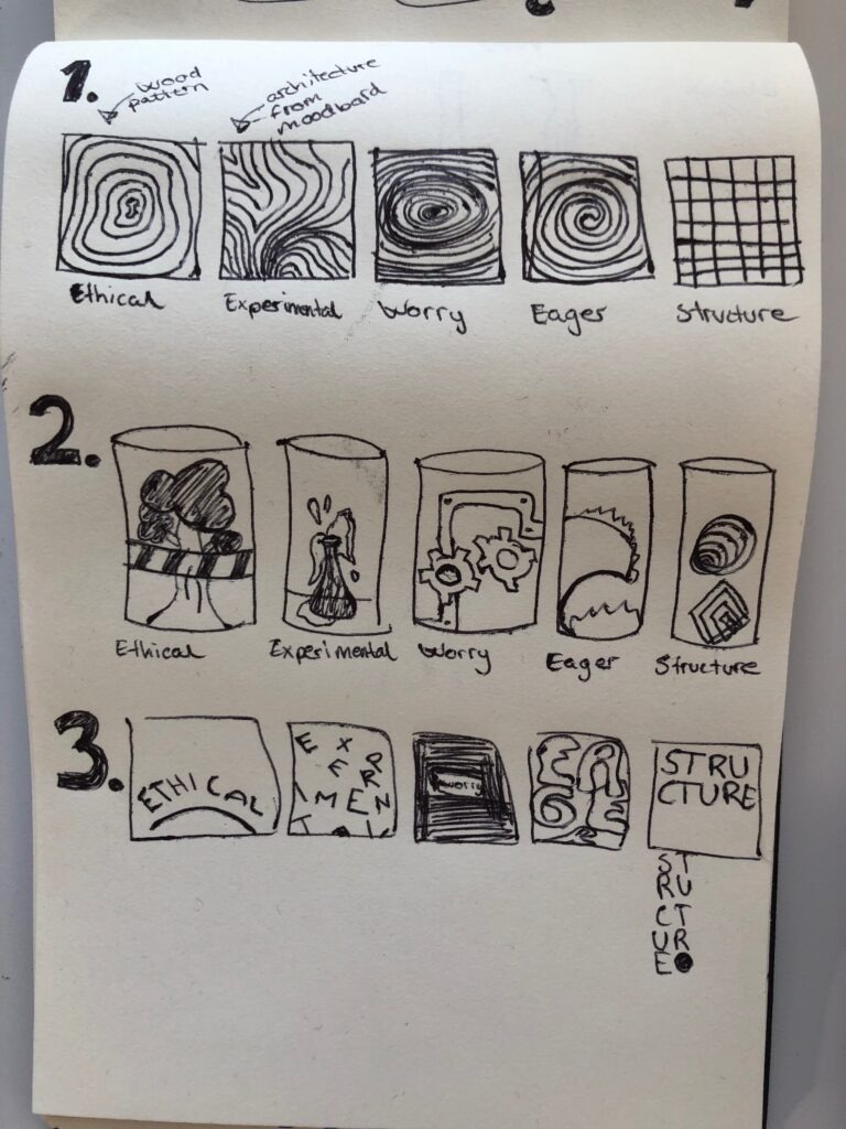
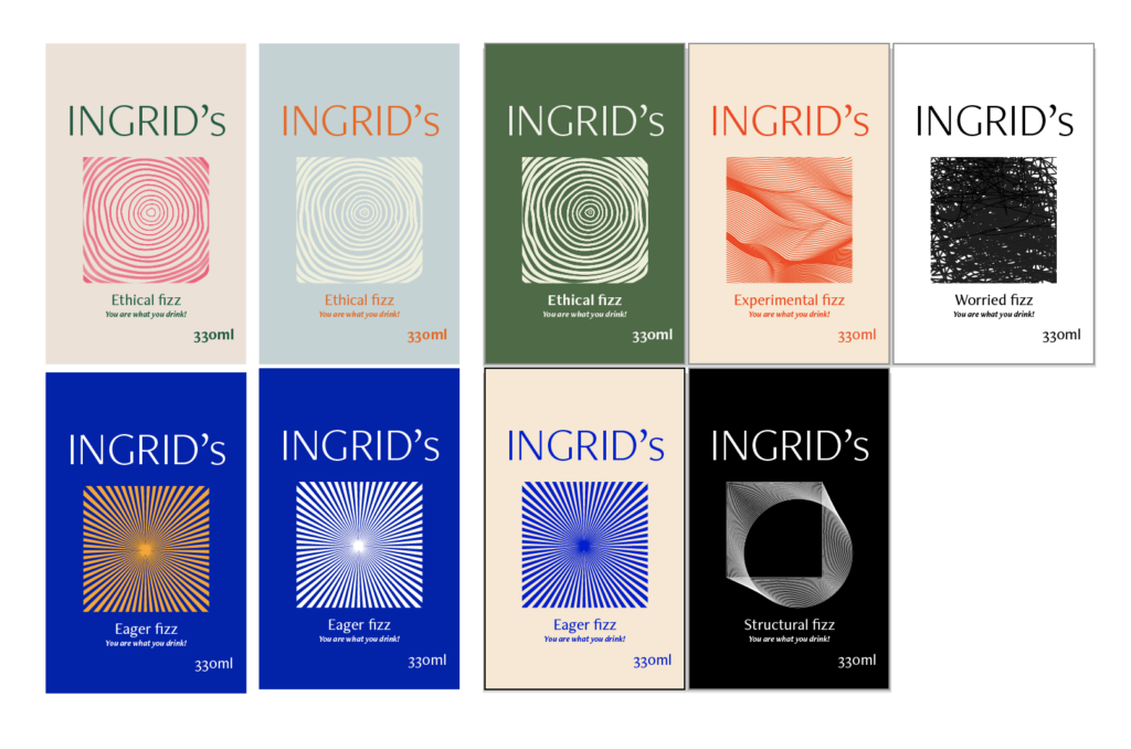
It was important that the patterns resonated with each word as they would be the main element of communication of the individual words. Each pattern refers to something from it’s designated moodboard. For example, the experimental pattern is inspired by an architectural piece from the experimental moodboard:
I wanted there to be enough variation between the patterns so that the viewer instantly would see the difference between the cans. Yet, I wanted them to feel similar enough to feel like they belonged to the same brand. In order to unify the patterns, I decided to put them into a rectangle clipping mask. This way I could still use different strokes and techniques for each pattern, whilst maintaining familiarity.
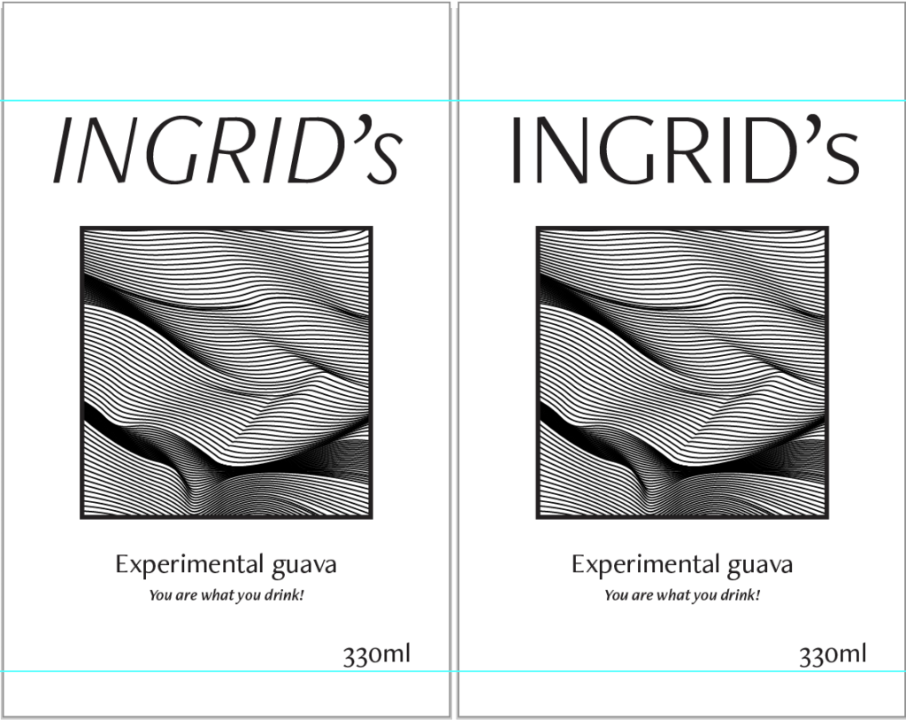
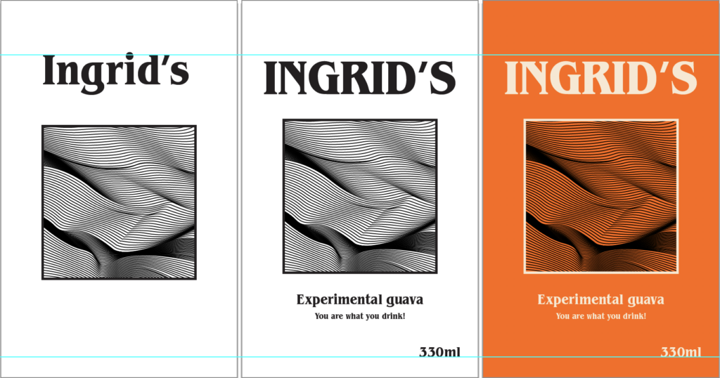
I had a fairly clear idea of how I wanted to lay out my label from sketching, so after creating the patterns, I focused on finding the right fonts and colours. For my typography, I wanted a typeface which felt like me. Something modern and simple, but also expressive and with a sense of significance. If I had more time, I would have developed the logo further, instead of just typing out the word mark with a pre-made font. This probably would have given the branding a more unique look.
I would also have liked to experiment further with colours. I think the collection of cans look a bit bland compared to what I imagined at first. It was important to me that each can’s use of colour represented it’s word and since the words are very different, I currently feel like the collection is still missing cohesiveness.
Result
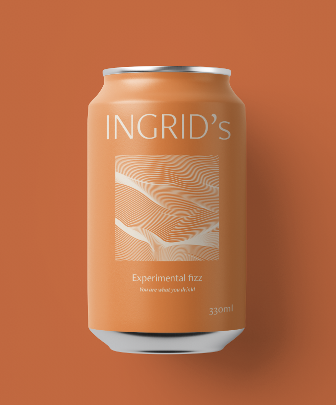
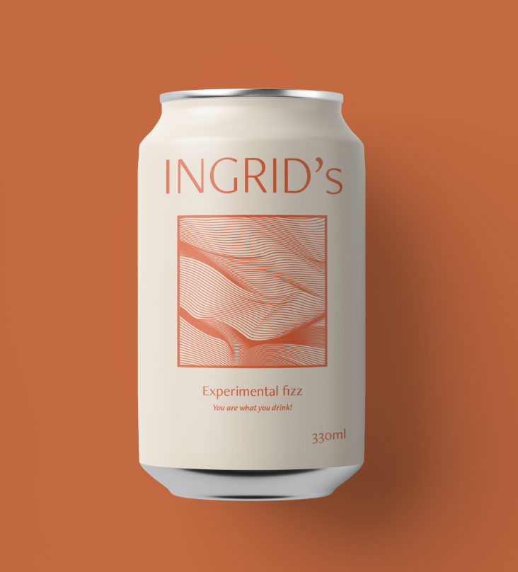
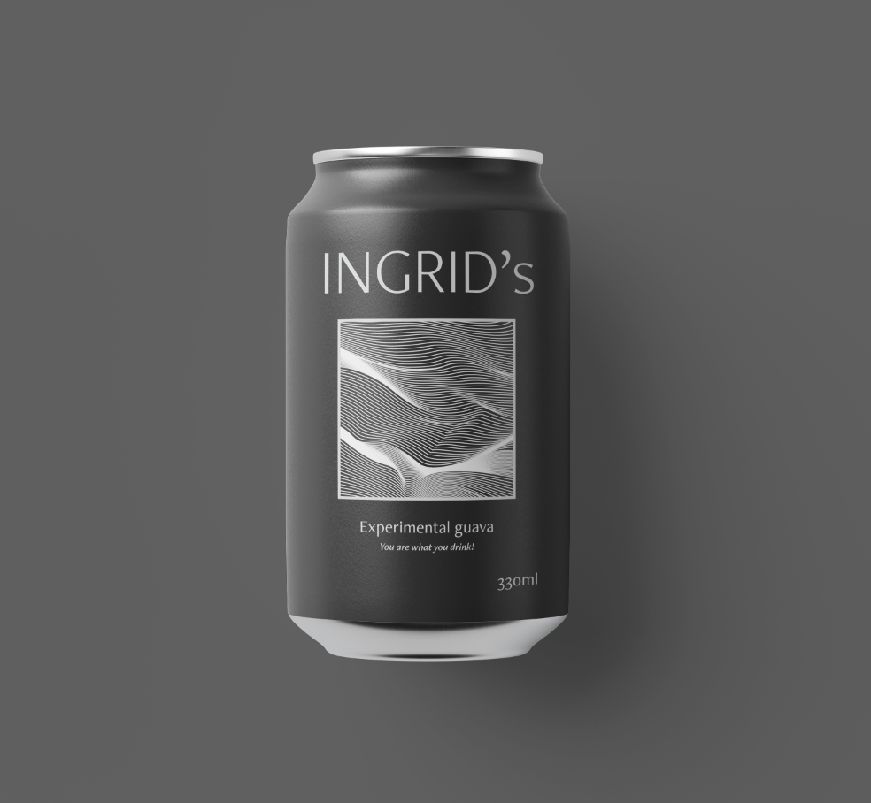
My result is 5 soda can designs, representing my self. The tagline “You are what you drink” represents the concept explained previously in this blog post, and the patterns represent each word.
If I had more time, I would have loved to bring the branding further. The logo could have been developed to something more unique and I could have made mockups for a website and other branding material. I also think it would have been beneficial to develop the copy further, as the cans don’t feel satirical enough at the moment. I wanted the cans to be a comment on our need for products in capitalist societies, which I’m not sure that they portray at the moment. Yet, this might also be due to it’s context. If they were in a gallery, with more supporting works, the cans might have communicated in a more effective manner.
Even though I don’t feel completely finished, I think this was a really fun project to do. Creating patterns based on words which describe myself was especially interesting, and I also think this project is more representative of me, than creating an installation (which I initially felt like we were expected to do this week).
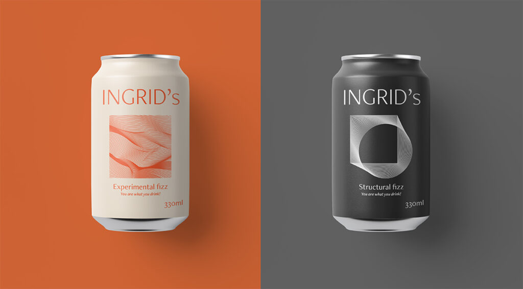
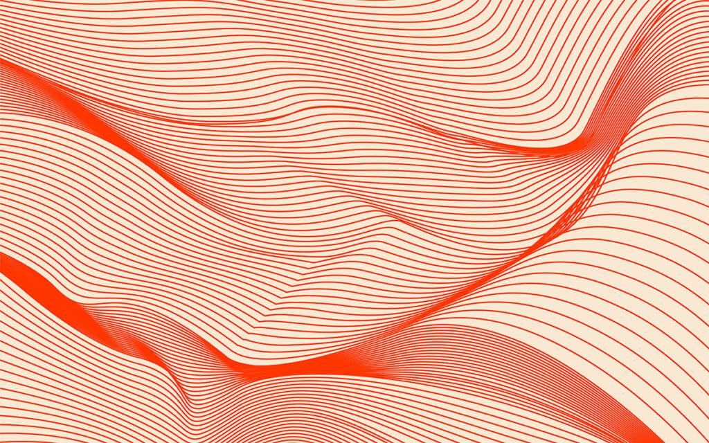
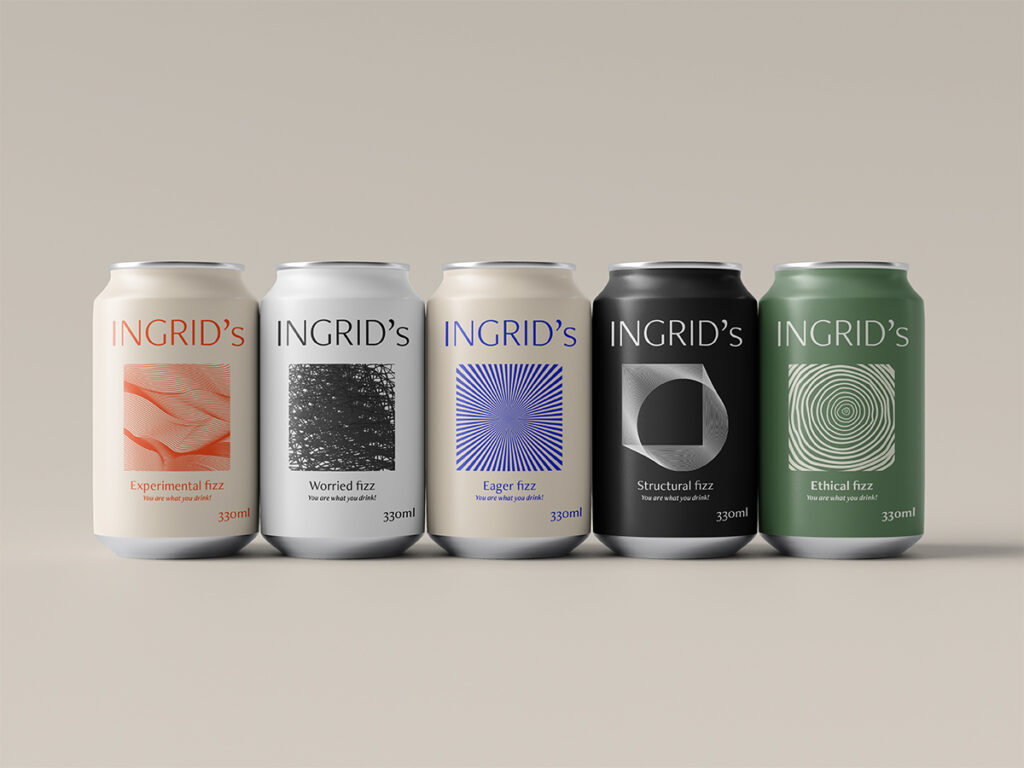
Fig. 16: Reigstad 2020. INGRID’s Fizz 2.
Fig. 17: Reigstad 2020. INGRID’s Fizz 3.
In conclusion
Branding is one of my key interests in graphic design, which might seem weird as I keep commenting on the problems with products and capitalism. However, as designers, I think it’s important that we try to find new sustainable ways to create branding, and so, I also believe it is important to be sceptical of what brands offer to our society. If we know what’s wrong, we can focus on finding what’s good for us.
Looking back at this week’s visuals, I initially thought that there had been a distinctive jump from sound visuals to soda cans. These are two very different types of design. However, looking back once more, I realised that this week has revolved around pattern design. First by using sound waves, and then by focusing on my 5 words. I really enjoyed both pattern exercises, yet I have to admit that creating the architectural inspired pattern was my favourite. The shapes in grand architectural pieces are very inspiring to me, and I think I will continue to look to this art form for references in the future.
Although I enjoyed creating my works this week, I still feel like I have left some questions unanswered. What is the self, and who am I? By turning my focus to products, I think I might have subconsciously shifted the focus away from my own self (although the words represent me) and onto our society. I believe it’s important to know one’s self in order to create work that represents it. Yet, I think this knowledge is something one obtains gradually with time, and so I will continue to search further for mine in the weeks, months and years to come.
RESOURCES:
Giddens, A. (1991) Modernity and self-identity; self and society in the late modern age. Stanford: Stanford University Press. Grid (2019)
Synnøve Findens identitet, Grid. Available at: https://www.grid.no/prosjekt/synnove-findens-identitet/ (Accessed: 11 October 2020).
Hosken, M. (2020) ‘The self’. Canvas Falmouth Flexible [online], 9 October.
Lomas, D. (2012) Becoming Machine: Surrealist Automatism and Some Contemporary Instances, Tate. Available at: https://www.tate.org.uk/research/publications/tate-papers/18/becoming-machine-surrealist-automatism-and-some-contemporary-instances (Accessed: 12 October 2020).
Nemeth, M. (2019) ‘Product Design Considerations for the Subconscious Mind’, Medium, 1 April. Available at: https://medium.com/ringcentral-ux/ux-design-considering-the-subconscious-mind-ae85e1242ca0 (Accessed: 11 October 2020).
Tate (2000) Automatism, Tate. Available at: https://www.tate.org.uk/art/art-terms/a/automatism (Accessed: 11 October 2020).
LIST OF FIGURES:
Figure 1: Etienne-Jules MAREY. 1875. From Etienne-Jules Marey. 1875. La Méthode graphique dans les sciences expérimentales et principalement en physiologie et en médecine. Paris: G. Masson, p.194
Figure 2. GRID. 2019. Synnøve Findens identitet. GRID [online]. Available at: https://www.grid.no/prosjekt/synnove-findens-identitet/
Figure 3. Unknown maker. 2019. I Lost My Body (J’Ai perdu mon Corps) 2019 Poster. [giclee print]. Amazon [online]. Available at: https://www.amazon.ca/Lost-Body-perdu-Corps-Poster/dp/B07YN3N73Y [accessed 15 October 2020].
Figure 4. Etienne-Jules MAREY. 1883. Joinville soldier Walking. Biofutures [online]. Available at: https://biofutures.wordpress.com/2014/08/19/musings-etienne-jules-marey-and-the-pre-history-of-tracking/
Figure 5: Ingrid REIGSTAD. 2020. Sound wave experiment 1. Private collection: Ingrid Reigstad
Figure 6: Ingrid REIGSTAD. 2020. Sound wave experiment 2. Private collection: Ingrid Reigstad
Figure 7: Ingrid REIGSTAD. 2020. Sound wave experiment 3. Private collection: Ingrid Reigstad
Figure 8: Ingrid REIGSTAD. 2020. Sound wave experiment 4. Private collection: Ingrid Reigstad
Figure 9. Carsten NICOLAI. 2018. Sekundenschlaf. Carsten Nicolai [online]. Available at: http://www.carstennicolai.de/?c=works&w=sekundenschlaf
Figure 10. Tom WESSELMANN. 1904. Still Life #30. The Metropolitan Museum of Art [online]. Available at: https://www.moma.org/collection/works/80004?sov_referrer=art_term&art_term_id=79
Figure 11: Ingrid REIGSTAD. 2020. Pattern process. Private collection: Ingrid Reigstad
Figure 12: Ingrid REIGSTAD. 2020. Pattern workshop challenge week 4. Private collection: Ingrid Reigstad
Figure 13: Ingrid REIGSTAD. 2020. Workshop challenge process 1. Private collection: Ingrid Reigstad
Figure 14: Ingrid REIGSTAD. 2020. Workshop challenge process 2. Private collection: Ingrid Reigstad
Figure 15: Ingrid REIGSTAD. 2020. INGRID’s Fizz 1. Private collection: Ingrid Reigstad
Figure 16: Ingrid REIGSTAD. 2020. INGRID’s Fizz 2. Private collection: Ingrid Reigstad
Figure 17: Ingrid REIGSTAD. 2020. INGRID’s Fizz 3. Private collection: Ingrid Reigstad