Lecture notes
Lecture reflections
Design history
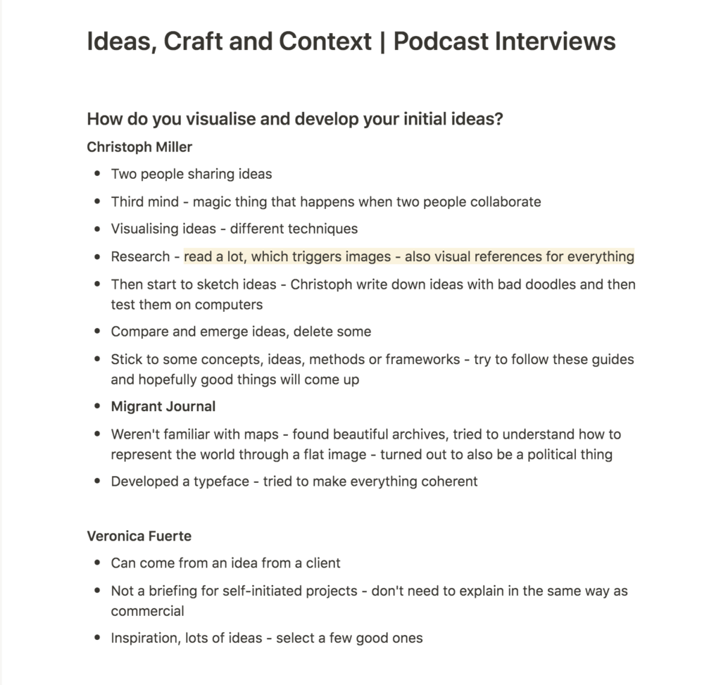
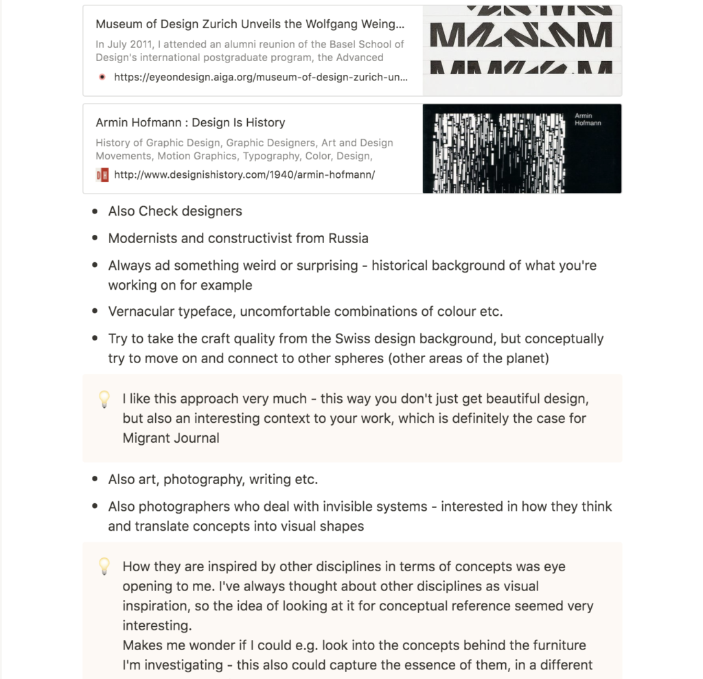
The interview with Christoph Miller was a highlight for me from this week’s lecture. He mentioned that he reads a lot during the research phase, and that he also finds visual references for everything, and I enjoyed his discussions on points of inspiration (Christoph Miller et al., 2021). The mentioning of the Swiss design heritage made reflect on what I actually know about design history, which isn’t a lot. I hardly know any design icons, and I think it’s time to learn more about these things.
The little I do know about Swiss design is interesting, and I might use this brief as a chance to learn more about the genre. Perhaps I could link Swiss design history to Norwegian furniture design in terms of point in time?
Conceptual references
Miller’s discussions on photography as reference was eye opening to me. I have used other disciplines as reference in my work previously, but mainly in a visual way. Miller however, explained how he took inspiration from the conceptual side of certain photographers. For typography, I might want to look into architects for example, as a source of inspiration for structural systems.
Resource notes

Resource reflections
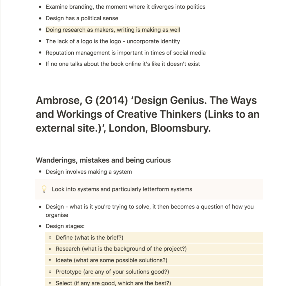
Design = putting things into a system
Throughout Design Genius. The Ways and Workings of Creative Thinkers there were several mentions of design involving the making of systems (Gavin Ambrose, 2014). I thought this was well put, and something to keep in mind for future work (particularly as I want to get into branding, which in effect consists of design systems). In terms of my self-initiated project, I think it will become important to think about my typeface as a system, in order to ensure a cohesive result.
Creative methods
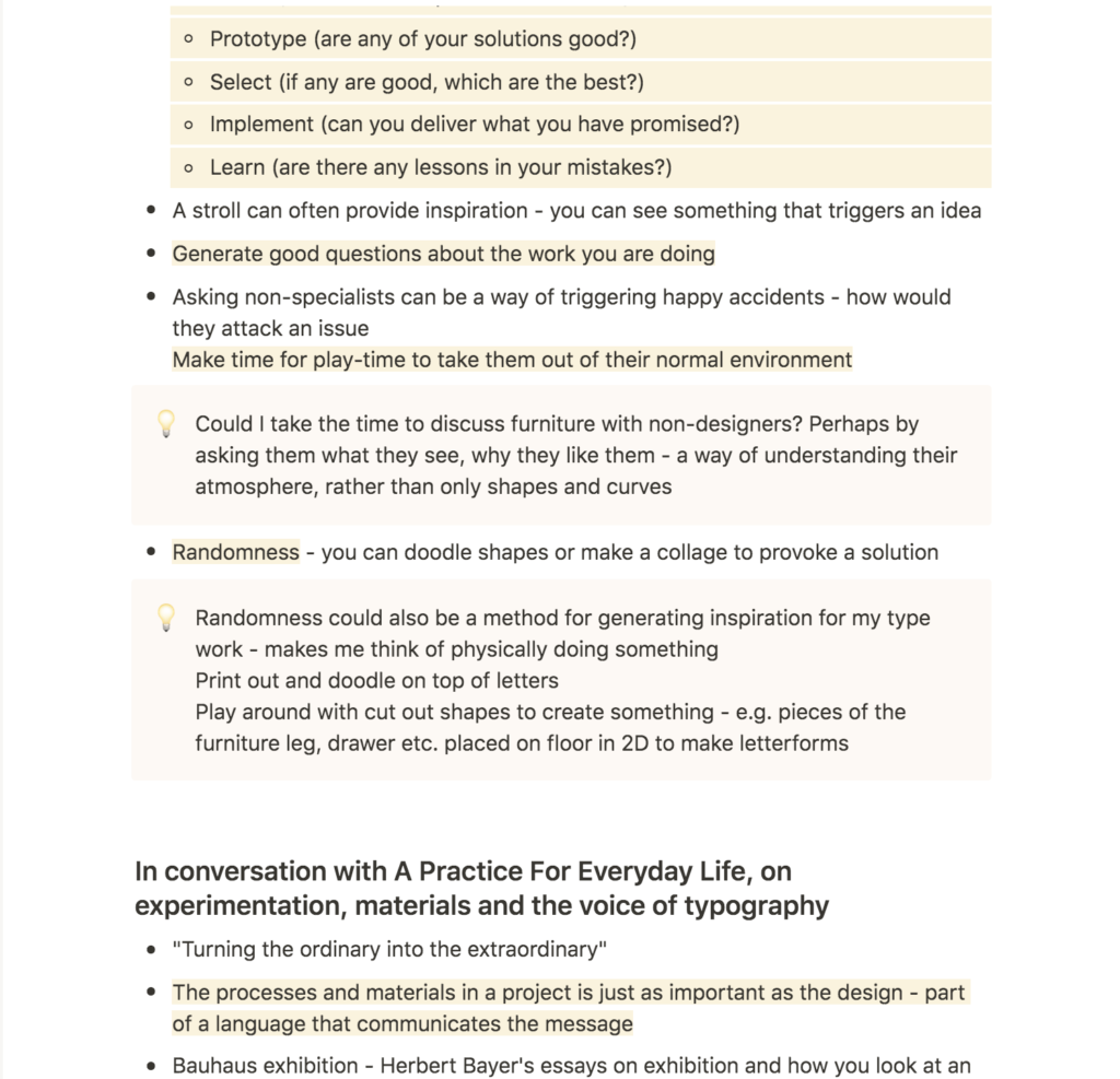
There were two methods mentioned by Ambrose that I took a particular interest in: happy accidents, and randomness (Gavin Ambrose, 2014).
In terms of happy accidents I thought the idea of involving non-specialists were interesting (Gavin Ambrose, 2014). In order to understand the essence of vintage furniture, I think it could be helpful to talk to non-designers about the way they see them. This might provide me with insight that isn’t so based on shapes, as it might have been had I looked at them alone.
Further, I think randomness could be used as a method for ideation by doodling based on furniture shapes. I also think a potential method could be to draw the individual pieces of furniture (legs, drawers etc.) and play with them physically in order to create interesting shapes or dimensions.
Further research
Nicer Tuesdays: Sascha Lobe
Last week, Wes mentioned Sascha Lobe’s work on the Bauhaus Archive as a potential reference. I’ve seen the video before, and it was great to rewatch it as it’s very relevant to my brief.
I was fascinated with Lobe’s way of working and how he attempted to capture the spirit of the archive, rather than being influences by the typical associations of Bauhaus (Sascha Lobe, 2018). “What do you feel when you see it?” (Sascha Lobe, 2018) is a question I’d like to adopt for my self-initiated project, in order to move past the point of solely looking at the furniture’s visual traits.
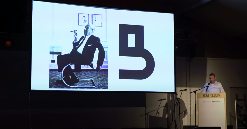
Seeing how he experimented with shapes based on photographs and archive content was very inspiring – a method to adopt for my own project.
Finally, I loved to see the typeface in context as Lobe presented the posters. This underpinned the importance of presenting a typeface in use, as discussed last week.
Sascha Lobe: Bibliotheque Nationale Du Luxembourg
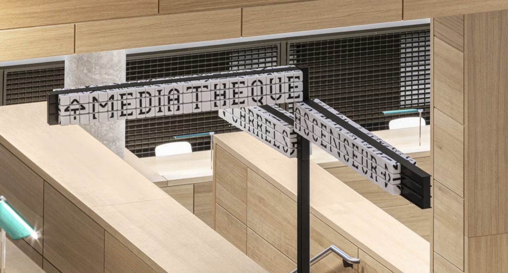
As I found Lobe’s talk above so inspiring, I decided to look further into his work. This led me to look at his way finding system for Bibliotheque Nationale Du Luxembourg. The signage consists of a cubed system, which refers to the architecture of the building (Lucy Bourton, 2020). When combined, the cubes can feature a range of letters, much like the way separate squares makes up the interiors of the building.
I admire how Lobe has created a typeface system that accentuate the architecture (Lucy Bourton, 2020), and this makes me wonder how furniture can become part of my own typeface system, beyond 2D shapes and curves. What formats could I use to communicate and build upon the “old to new” concept?
Workshop challenge
In my brief last week I ended up with the research question How can Norwegian vintage furniture design influence the creation of a modern typeface?. However, in my conclusion reflections I also touched upon the possibility of rephrasing it to How can I use typography to encourage a circular economy?. As I embarked upon this week’s challenge I wasn’t quite sure which question to go for, and I therefore decided to research in a broader sense, rather than focusing closely on furniture only.
Systems and concepts in architecture & sculpture
Inspired by Christoph Miller’s approach to conceptual references, I wanted to look to architecture for references on concepts and ideas. Architecture is very systematic, as is typography, and I therefore thought the medium could provide valuable insight.
Lena Henke. Schrei mich nicht an, Krieger!
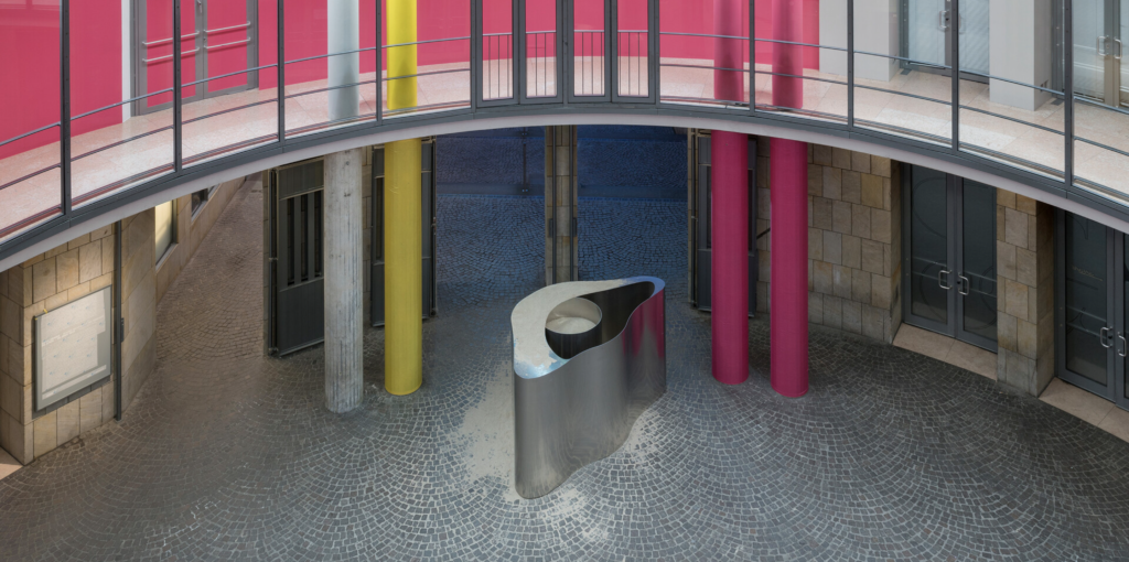
I enjoyed reading about Henke’s sculpture above, which “reacts to the surroundings of the space” (e-flux, 2017). The concept of inside and outside becoming one is suitable for my project where I’m attempting to merge old and new. However, what I also liked about the piece, is that users interact with the piece by walking around in circles (due to the circular building). This very straight forward approach to circularity is interesting, and it’s made me wonder wether people could interact with my project in a circular manner, in order to demonstrate concepts of a circular economy.
The concepts of circles as symbols are also interesting: where does a circle begin and end, and how does this relate to economic structures? Economy in itself is in fact circular as it is a constant matter that floats around the world – however, this is very different to the material (consumer products) it pays for.
bauhaus imaginista: Corresponding With

In an article on this exhibition, Filipa Ramos describes a sculpture by Takehiko Mizutani as “a flat brass sheet that, in being bended, becomes a volume” (Filipa Ramos, 2018). I like this way of looking at an object, as it suits the way one can use something old to make something new.
Ramos also discusses pieces of furniture, which she describes as domestic elements. The domestic value of vintage furniture is an important part of the objects, and perhaps this should be represented in the typographic design. This also presents the opportunity of looking at how people interact with the furniture in terms of movement, but also relationships and emotional values connected to the furniture.
Kengo Kuma in conversation with It’s Nice That
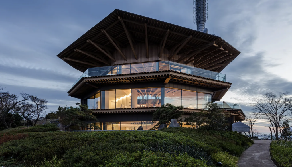
In an interview with It’s Nice That, architect Kengo Kuma discusses how economic expansion in Japan and the belief of industrialisation being good for society affected Japan’s architecture (Daniel Milroy Maher, 2019). Today, there’s a different situation and nature is becoming a larger part of architectural approaches (Daniel Milroy Maher, 2019).
The Scandinavian design movement was a result of the social democracy that emerged at the time, and the aim was to create functional and affordable furniture for everyone, in line with democratic social values (MyBaze 2015). Today, this consumerist way of thinking about furniture needs to change if we are to adopt a circular economy. An interesting question to ask is thus how can we shift the focus from democratic consumption to democratic circulation? In regards to my project, this also raises the questions what is a democratic typeface? and what is a circular typeface?
Social and sustainable design
The pioneer of social and sustainable design for the real world
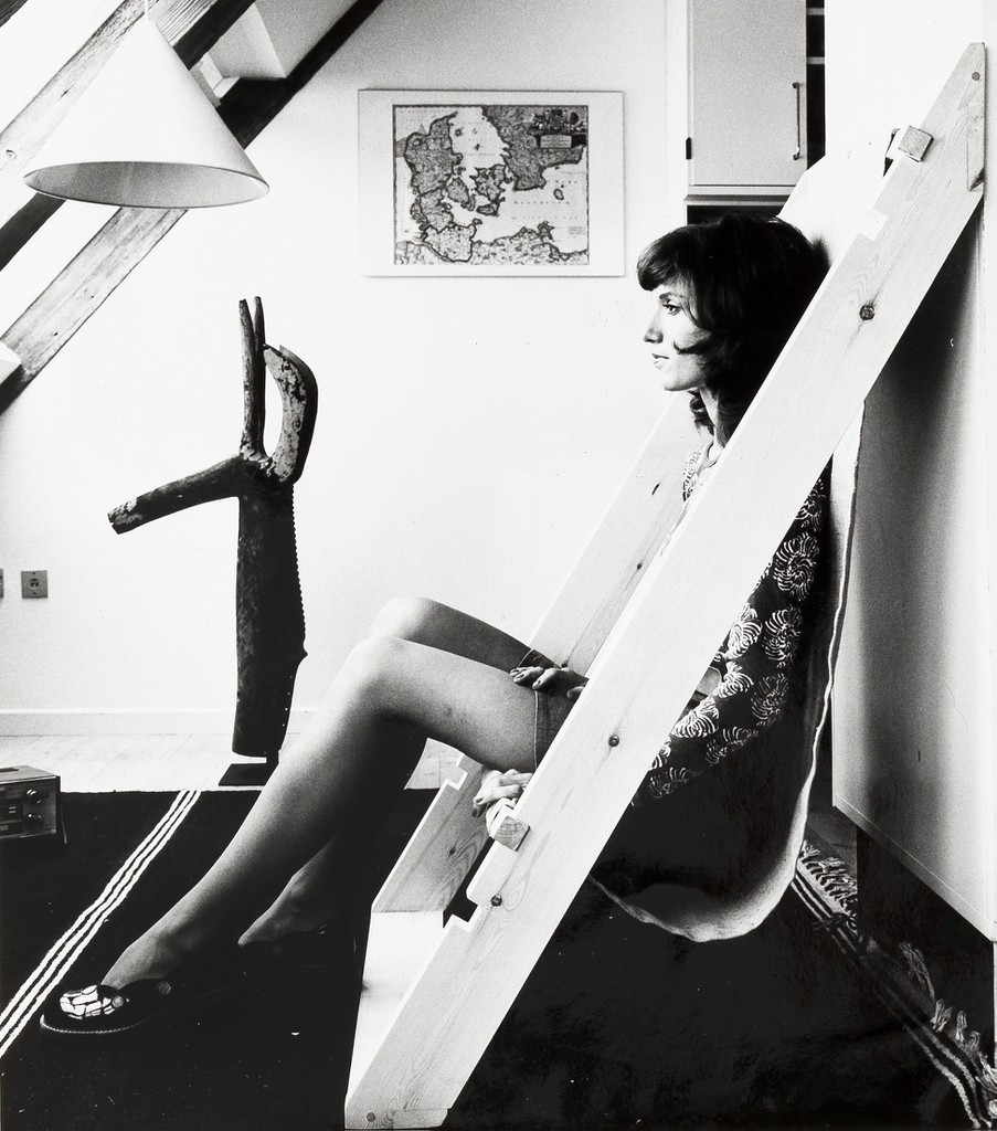
In an attempt to find answers to the questions above I went on to look at Victor Papanek’s work and philosophies. Papanek was against mass consumption and his designs built on modularity and the idea of an object having multiple functions (Patrizia Scarzella, 2020). Methods included making objects foldable, inflatable and stackable (Patrizia Scarzella, 2020).
These ideas made me wonder wether my typeface could be modular in some way, in order to fit multiple designer’s needs. This could also refer to the act of building something new from something old (or at least something that is already there).
Seats System
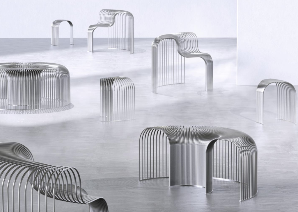
A modern example of design that builds on many of the same principles as Papanek’s, is the Seats System by Mira Bergh and Josefin Zachrisson. The pieces are modular and can integrated with each other, which encourages interaction and creativity from the user (Collide 24, 2021). The furniture itself is inspired by public spaces, both in terms of social values and how people move in these spaces (Collide 24, 2021).
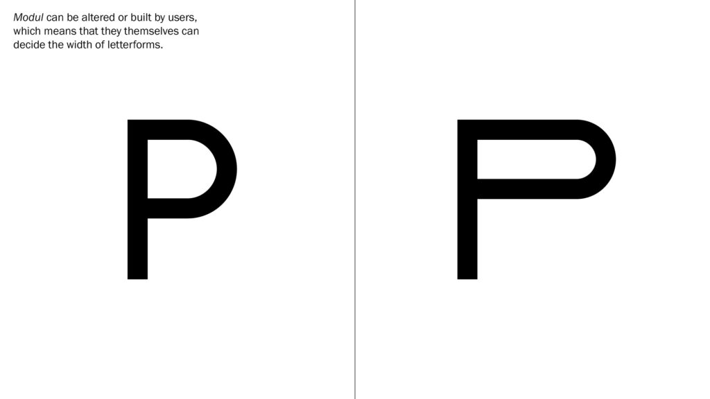
A modular type system
These concepts on modularity made me wonder wether I could create a typeface from modular components, and also wether these components could be given to users for them to compile the typeface for themselves. The components could be inspired by old furniture, and by giving the user a creative and interactive role, this system could also ensure that the typeface keeps evolving in the future. Thus, the present, which will once be the old, can be turned into something new in time to come.
This solution also works when referring back to the question of how we can build a democratic typeface. In order to enhance the democratic value, users’ compilations could be featured as part of the typeface, for example through a digital downloadable library.
Examining the furniture
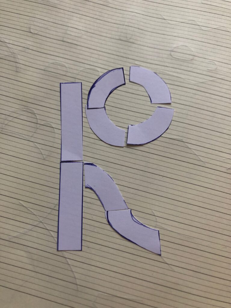
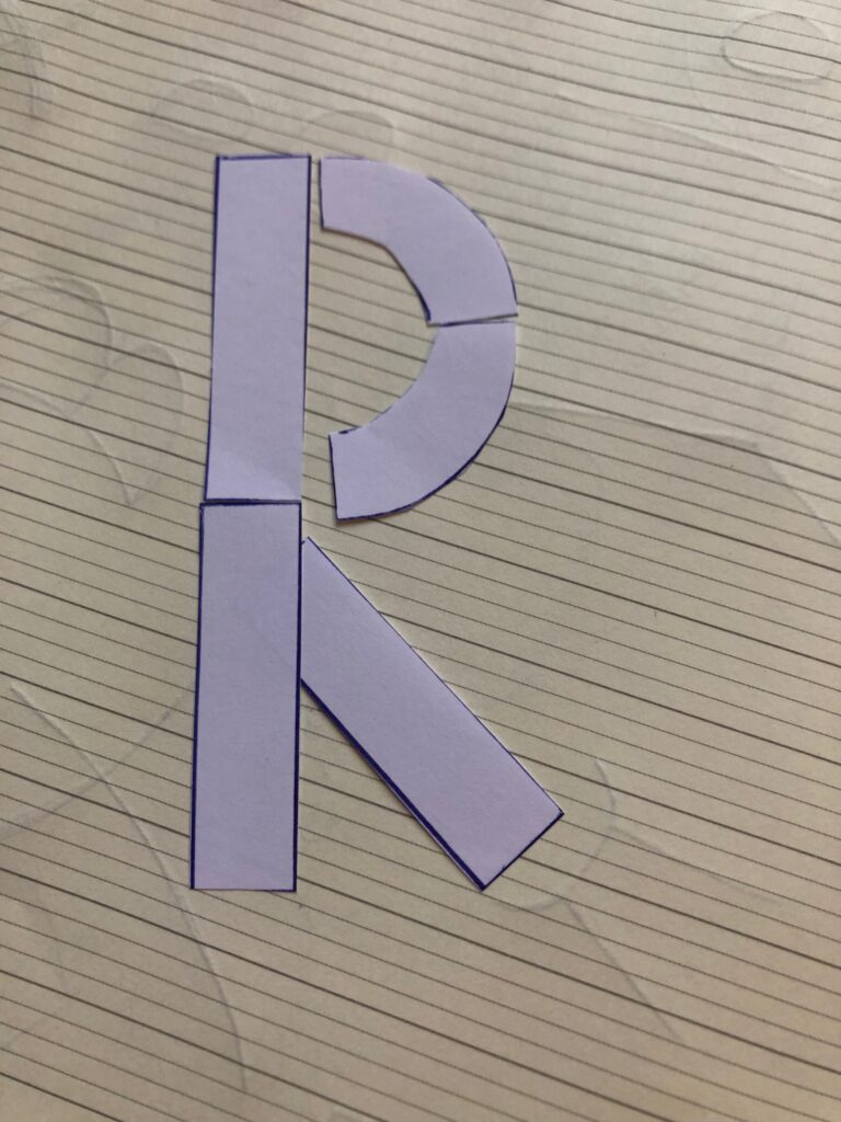
Inspired by Sascha Lobe’s approach to the bauhaus archive typeface, I wanted to analyse vintage furniture using doodles. I quite liked the way some of the experiments mixes lines and curves in slightly unexpected ways, and this is also a characteristic I recognise in the furniture itself.
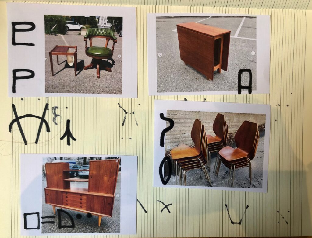
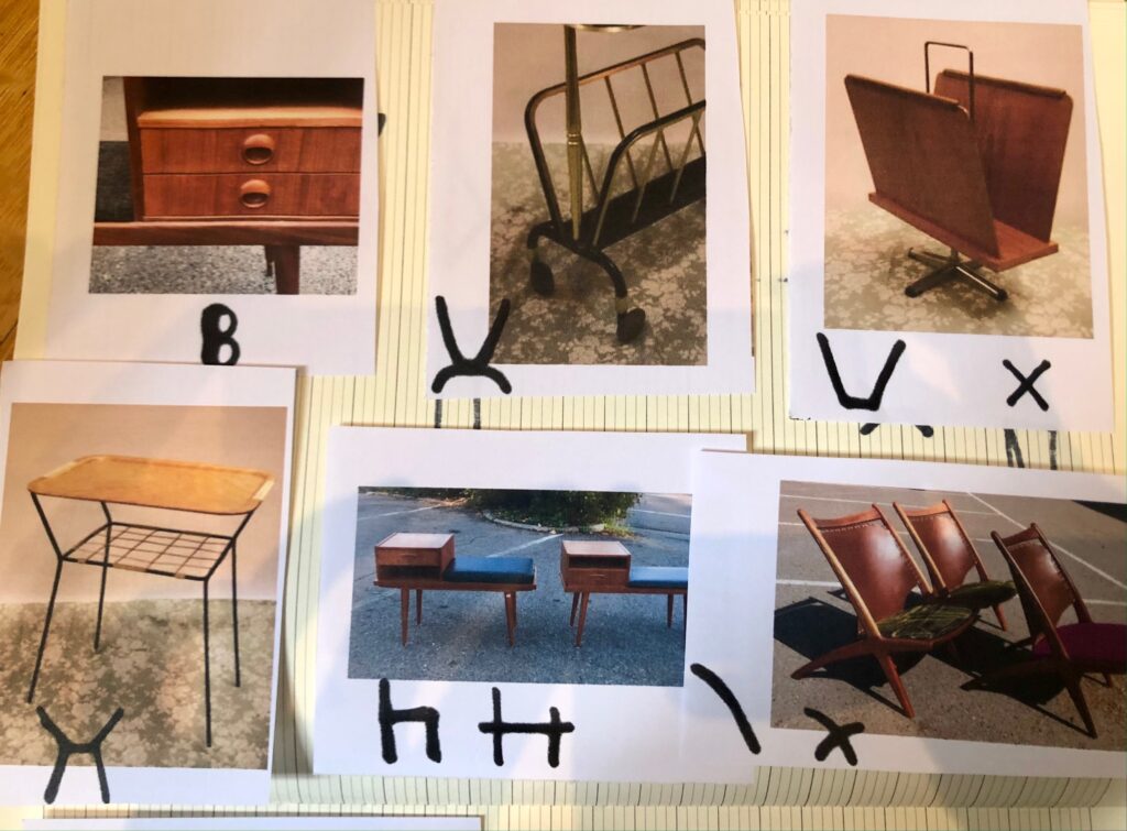
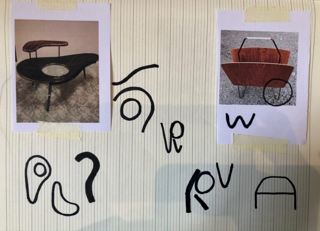
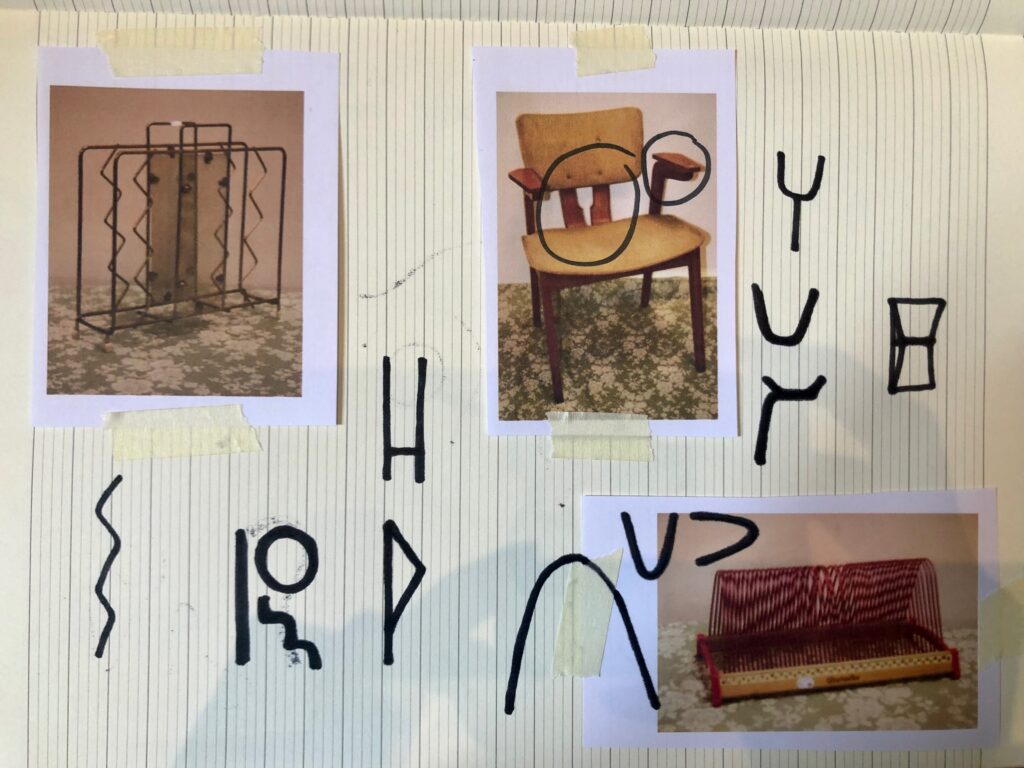
I initially planned to visit Antikkvarehuset, a local vintage furniture shop, in order to get a closer view on the furniture. However, due to time restrictions I decided to use their comprehensive digital library instead. In addition to doodling, I took notes of more general observations:
- Modular: Many pieces are modular, particularly seating groups and shelving systems
- Geometry: The components of the furniture is very much based on geometric shapes
- Angles: The legs for chairs, tables, dressers etc. are often angled inwards
- Asymmetry: Couches and shelving systems are often asymmetrical
- Multifunctional: The asymmetrical pieces often include a multifunctional piece – e.g. couches have side tables on one side, dressers have a space to sit on on one side
Moodboards
At this stage I felt confident that I had gathered enough references and reflections to create my moodboards. In order to contextualise the 5 directions, I did mind maps and image searches whilst making the moodboards. All directions are based on reflections from the research up until this stage of the workshop challenge.
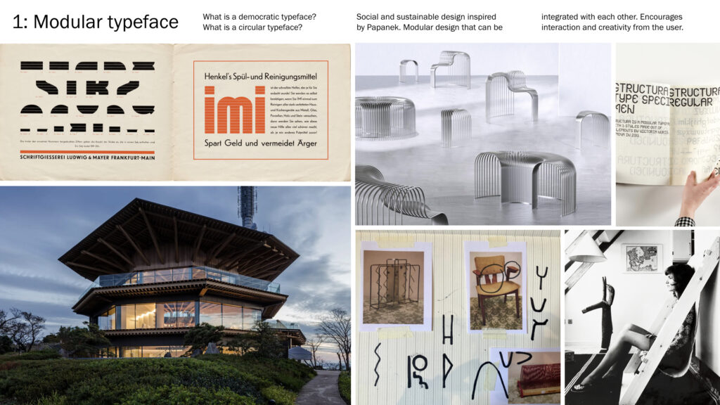
1: Modular typeface
The Scandinavian design movement was originally a result of the rise of social democracy, and the movement’s aim was to create functional and affordable furniture for everyone (MyBaze 2015). Today, affordable furniture is becoming less of a symbol for social democracy, and more of a symbol for mass consumption and climate change. In order to reflect on social democracy today, I’d like to look at the shift from democratic consumption to democratic circulation, and thus attempt to discover what a democratic and circular typeface could look like.
In this attempt I would adopt Papanek’s principles of modularity and multi-functionality, by building a modular typeface. Several references of Norwegian vintage furniture includes modular systems, and so this concept also refers to the furniture itself. The modular typeface’s components would be inspired by the furniture’s visual traits.
Further, users would be able to compile their own letterforms, using the typeface components, referring to the democratic values of the original Scandinavian design movement. The user compiling aspect ensures that the typeface keeps evolving in the future, when the present has become the old, and the developed version of the typeface has become the present.
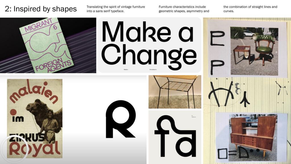
2: Inspired by shapes
As a slightly less conceptual approach, my second idea is to focus on typographic craft by attempting to make a sans serif inspired by the furniture’s shapes and details. I will adopt Sascha Lobe’s approach from his work on the bauhaus archive typeface, by experimenting with letterform construction based on the furniture aesthetics and spirit. The furniture characteristics I’m looking to adopt include geometric shapes, asymmetry, and the combination of sharp angles and fluid curves.
The act of using something old to make something new would still be conceptually present. However, the function of this typeface would be revolved around my personal and my audience’s usage, whilst the first concept would be centred around social values.
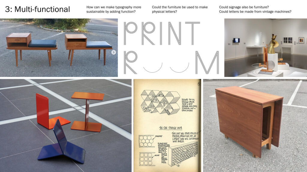
3: Multi-functional
Referring to Papanek’s principle of multi-functionality, I would like to look at how typography could become more sustainable by adding functions to it. Multi-functionality can be found in several of my vintage furniture references, like the top left image in this moodboard, where a dresser also has the function of a bench.
Possible solutions for this direction could be to create physical letters out of furniture, or to design furniture that also acts as signage for a certain space. Inspired by Kellenberger-White’s Print Room, I could also look into the possibility of making letterforms using vintage furniture machines like record players, radios or pianos.
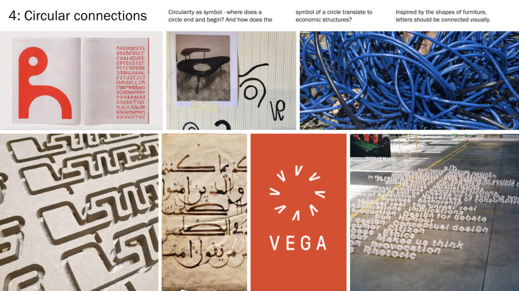
4: Circular connections
As a reference to the circular act of using old material to make something new, I could create a typeface where each letterform is tied together using circular connections. The circle as a symbol is interesting visually and I like that it has no beginning, nor end. This idea would be less centred around the furniture’s visual traits, and more around the circular economic concept the vintage furniture represents.
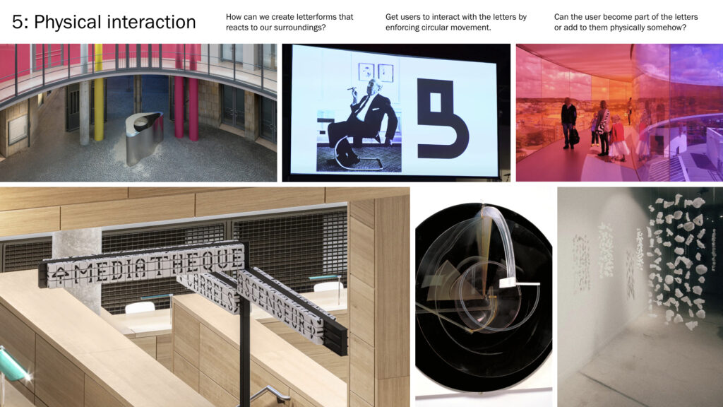
5: Physical interaction
As a nod to making the old new, I could also take a sculptural approach where I would make typography that reacts to it’s surroundings, or that encourages it’s surroundings to become part of itself. Users would be invited to interact with it’s physicality or space through circular movements, and I also think it would be interesting to merge letterforms and humans somehow.
Users could move through a designated route in the shape of a letterform, or they could use crafts to write statements through a suitable medium and format.
I decided to go for my first idea as it felt like the most thought out. I liked the way it linked to my research, but also how it would let users participate in it’s development.
2019 Font Purchasing Habits Survey
In order to find out what designers are looking for in a typeface, I had a look at the 2019 Font Purchasing Habits Survey results. According to the survey, many styles in the family, good spacing & kerning, and lots of alternates & ligatures, were the most important factors (other than aesthetic values) (Mary Catherine Pflug, 2020). I won’t have the time to make several styles, but the nature of the concept does result in many alternates (since people can construct their own versions of letters). Hopefully I will also have time to sort out my spacing and kerning.
A surprising insight from the survey was that 58% of typeface customers are not graphic designers (Mary Catherine Pflug, 2020). This means that half of my target audience might not work with design, and this should be considered in my audience targeting. Perhaps the compiling of new letterforms will have to happen in a web browser software for example, and not in illustrator.
Visual development
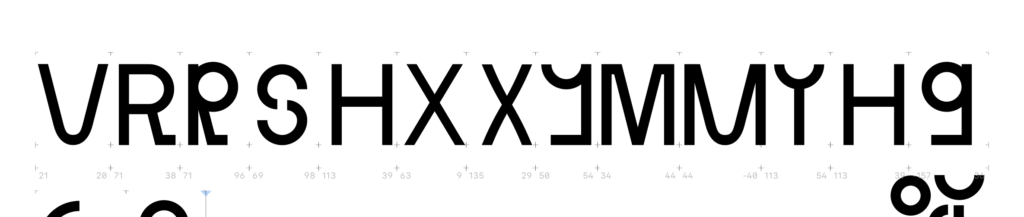
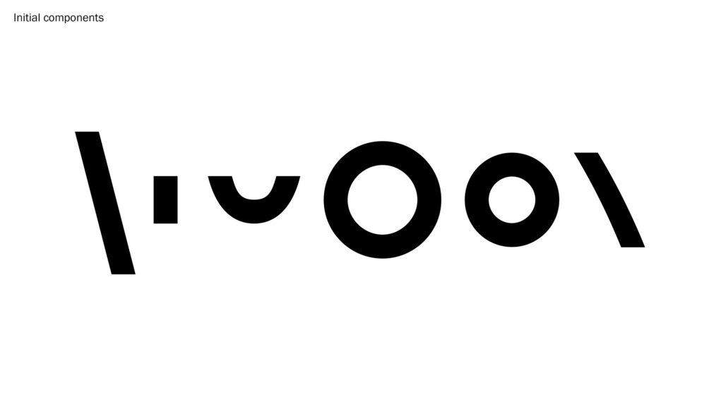
Having chosen my project direction, I went on to start working on the typeface. As discussed above, I had already done some sketching and analysis of vintage furniture, and so my second sketching session wasn’t as comprehensive. However, I did want to try to experiment with physical components in order to come up with interesting letter combinations. After doing this I went on to experiment in Glyphs.
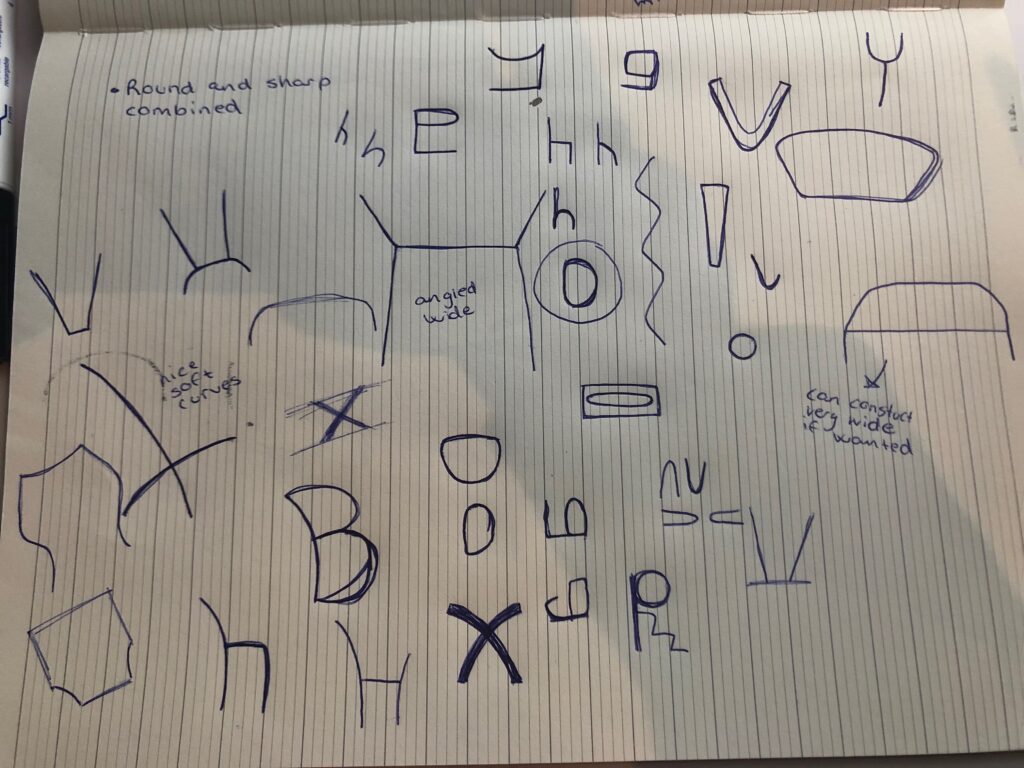
The furniture references were quite functional and minimal in terms of detail, yet, the shapes and compositions of the furniture was quite playful. This was something I wanted to adopt for my typeface – a clean, yet quirky aesthetic. I decided to do a sans serif as it felt natural given this choice of aesthetic.
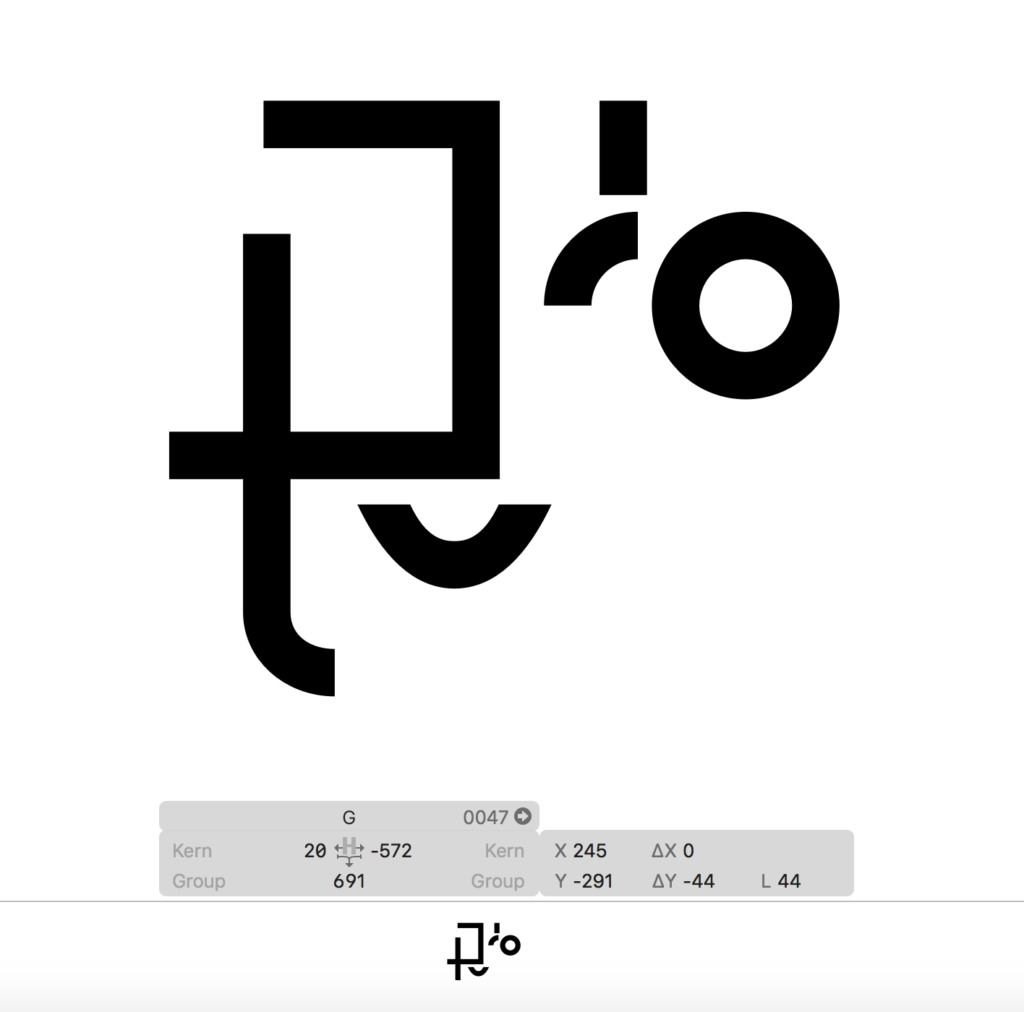
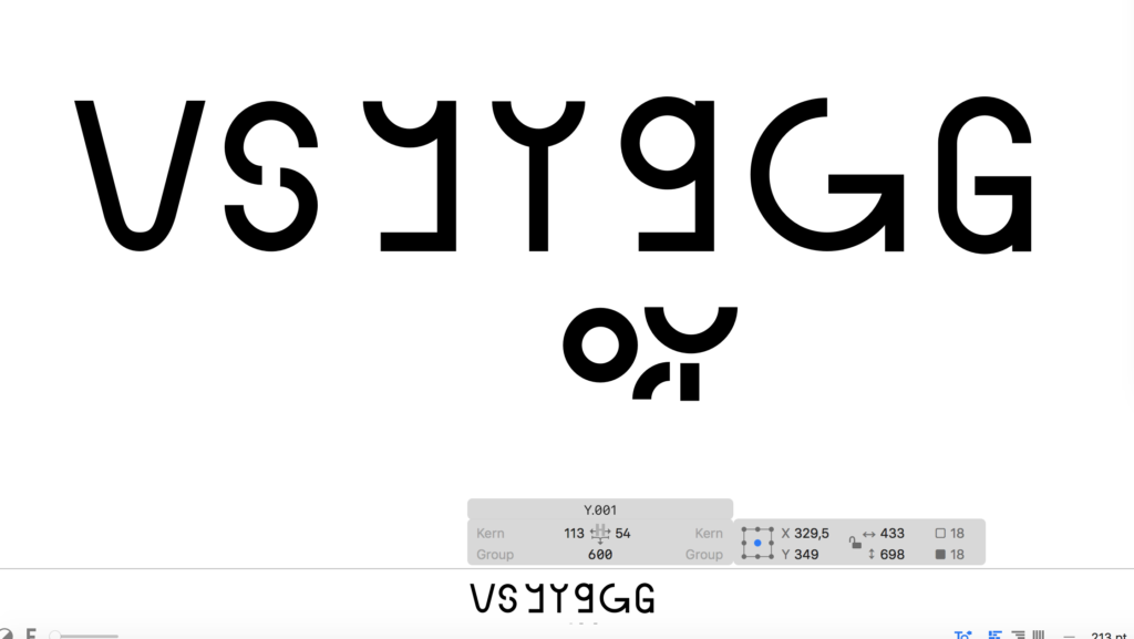
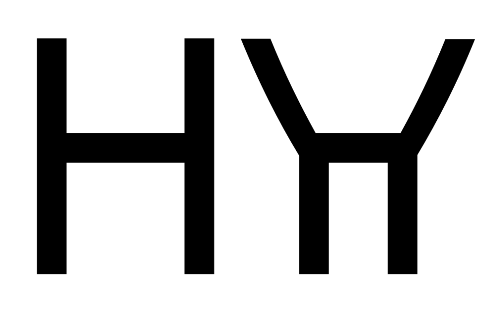
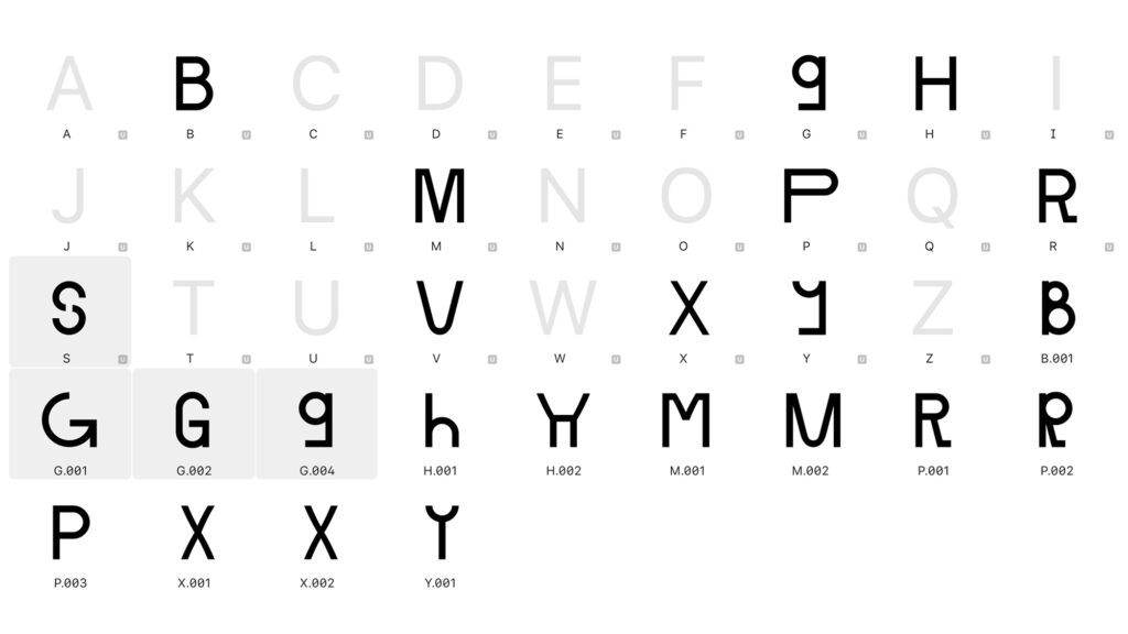
Since the typeface will be modular, I mainly spent the development stage trying to figure out what the typeface’s components could be. I liked the idea of having some more crazy and perhaps wavy shapes, but I also found that sticking to typical geometric shapes could lead to unconventional letterforms like the Y-s and G-s above. During my moodboard research I had seen a few all-caps typefaces that used small cap letters as caps. I really liked this idea as it could refer to using something old to make something new (as one often uses the old object for a different function that it was originally intended for).
I wanted to start out with a normal/medium weight, as I figured the typeface could easily be made into a range of weights when finalised since the components can easily be made thiner or bolder.
Although I’m pleased with the direction some of the letterforms are going, I still haven’t figured out the final look and visual concept. At this stage though, I tried not to worry too much about cohesiveness, as I wanted to experiment as much as possible.
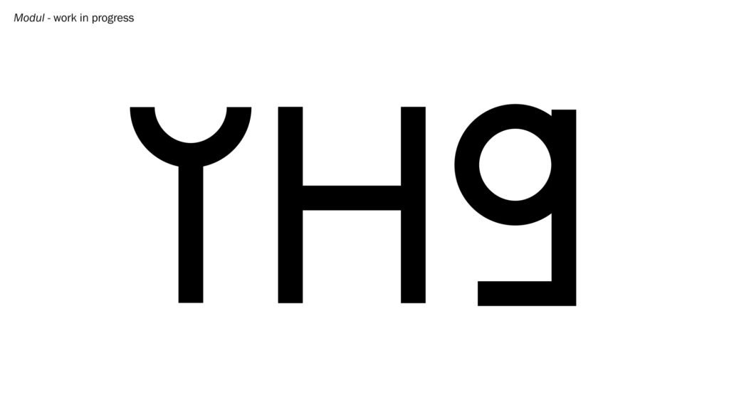
Final result
My final result this week is a selection of work in progress sketches of a typeface that I’ve named Modul (might change this later). Modul is inspired by Norwegian vintage furniture design, and comments on the act of using something old to make something new. The Scandinavian design movement initially grew out of social democracy, with the concept of making functional and affordable furniture. I therefore wanted the typeface to refer to democratic processes, but also circular ones.
My result in a typeface concept built on Papanek’s principles of modularity and multi-functionality. The final typeface will be created using a chosen set of components, and the user will also be able to build their own letter alternates, perhaps through a digital service of some kind.
Visually I have tried to capture the minimal, yet playful construction of the vintage furniture from my references. I loved the references’ combination of square and curved shapes, and this is also something I’ve tried to adopt in my letterforms. Below are my 5 final work in progress sketches:

In conclusion
Conceptual approach to research
Rather than focusing on visual insight for my research this week, I looked at the concepts and reflections behind art from other fields, as suggested by Christoph Miller. By self reflecting on these concepts and ideas, I really felt as if I was able to come up with several fascinating ideas, and I have really enjoyed this way of working. As mentioned in previous blog posts I am also starting to realise how much I value the act of writing when it comes to ideation. There is a chance that laziness might prevent me from continuing this habit when I graduate, but I think it’s important for my future development that I stick with it as part of my design process.
Lack of target audience research
Since I spent a great deal of time on my conceptual research, I wasn’t able to do uncover much information related to my target audience. If I had more time, I would have spoken to graphic designers, but also other typeface customers, like gallery owners and creatives, about what they are looking for in a typeface (perhaps with a focus on aesthetics). Although I wasn’t able to do any interviews on my own, I think the Font Purchasing Habits Survey helped me understand what people are looking for in a typeface. For example, several purchasers are not designers, and thus it will be important that users without access to design software can compile letterforms themselves, for example in their browser.
Further visual development
In terms of the typeface itself, I would have liked to spend more time sketching and figuring out the component shapes. Some letterforms are interesting to me at the moment, but I’m not sure wether there needs to be fewer components, or perhaps if I should introduce an element of fluidity somehow. Since the typeface is modular, I haven’t been able to introduce important type principles (e.g. adding space in the meeting of the B’s bowls). Next week I will have to consider wether this should be done to the original typeface (which might make users’ letterforms stand out from the original), or if I could introduce these principles whilst also sticking to the original components.
Moving forward I will also have to start thinking about cohesiveness. Although the users will be able to build their own letterforms, the original typeface should have a systematic look to it, and I will need to decide on letter widths, but also wether I’m going for a more structural or a more fluid look.
REFERENCES:
Christoph Miller et al. (2021) ‘Ideas, Craft and Context | Podcast Interviews’. Canvas Falmouth Flexible [online], 24 September.
Collide 24 (2021) ‘Mira Bergh and Josefin Zachrisson on Seats, a sculptural furniture system rethinking seats in the public environment’, Collide 24, 16 February. Available at: https://www.collide24.org/2021/02/16/product-design/mira-bergh-and-josefin-zachrisson-on-seats-a-sculptural-furniture-system-rethinking-seats-in-the-public-environment/ (Accessed: 27 September 2021).
Daniel Milroy Maher (2019) ‘“We should create a building that’s a symbol of a new age”: Kengo Kuma in conversation with It’s Nice That’, It’s Nice That, 17 June. Available at: https://www.itsnicethat.com/features/kengo-kuma-in-conversation-architecture-170619 (Accessed: 27 September 2021).
e-flux (2017) ‘Lena Henke. Schrei mich nicht an, Krieger!’, e-flux, 6 May. Available at: https://www.e-flux.com/announcements/100201/lena-henke-schrei-mich-nicht-an-krieger/ (Accessed: 27 September 2021).
Filipa Ramos (2018) ‘“bauhaus imaginista: Corresponding With”’, Art-Agenda, 1 October. Available at: https://www.art-agenda.com/features/241969/bauhaus-imaginista-corresponding-with (Accessed: 27 September 2021).
Gavin Ambrose (2014) Design Genius. The Ways and Workings of Creative Thinkers. London: Bloomsbury.
Lucy Bourton (2020) ‘Sascha Lobe’s latest signage project accentuates architecture through typography’, It’s Nice That. Available at: https://www.itsnicethat.com/articles/pentagram-sascha-lobe-bibliotheque-nationale-du-luxembourg-graphic-design-300920 (Accessed: 25 September 2021).
Mary Catherine Pflug (2020) ‘Results of the 2019 Font Purchasing Habits Survey’, Medium. Available at: https://medium.com/font-stuff/results-of-the-2019-font-purchasing-habits-survey-39339f591a6c (Accessed: 23 September 2021).
MYBAZE. 2015. ‘The Pioneers of Scandinavian Design’. Medium April 2015. Available at: https://medium.com/@MyBaze/the-pioneers-of-scandinavian-design-feffe35c52d [accessed 28 September 2020].
Patrizia Scarzella (2020) ‘Victor Papanek, the pioneer of social and sustainable design for the real world’, Lifegate, 24 January. Available at: https://www.lifegate.com/victor-papanek-design-real-world (Accessed: 27 September 2021).
Sascha Lobe (2018) Nicer Tuesdays: Sascha Lobe. (Nicer Tuesdays). Available at: https://www.youtube.com/watch?v=dYCk0CKSm1k&ab_channel=It%27sNiceThat (Accessed: 24 September 2021).
LIST OF FIGURES:
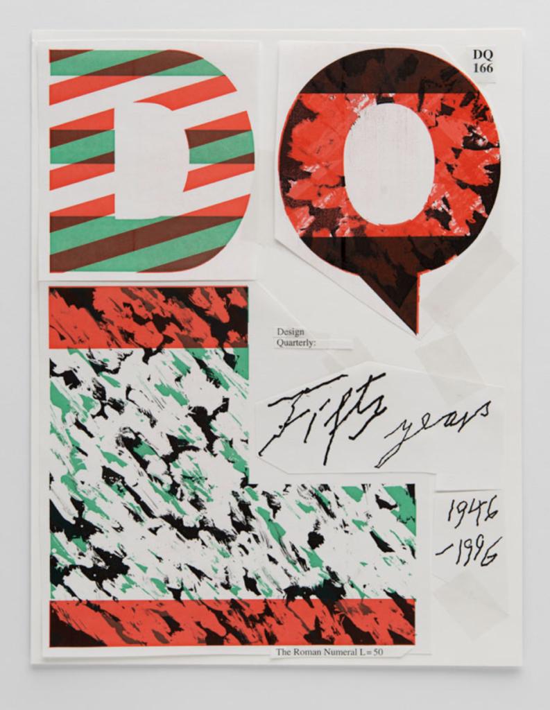
Figure 1. Wolfgang WEINGART. 1995. Cover design for the magazine Design Quarterly. AIGA: Eye on Design [online]. Available at: https://eyeondesign.aiga.org/museum-of-design-zurich-unveils-the-weingart-archive/
Figure 2: Sascha LOBE. 2018. Nicer Tuesdays: Sascha Lobe . Available at : https://www.youtube.com/watch?v=dYCk0CKSm1k&ab_channel=It%27sNiceThat [accessed 1 October 2021].
Figure 3: Sascha LOBE. 2018. Nicer Tuesdays: Sascha Lobe . Available at : https://www.youtube.com/watch?v=dYCk0CKSm1k&ab_channel=It%27sNiceThat [accessed 1 October 2021].
Figure 4. Sascha Lobe, PENTAGRAM. 2020. Bibliotheque Nationale Du Luxembourg signage system. It’s Nice That [online]. Available at: https://www.itsnicethat.com/articles/pentagram-sascha-lobe-bibliotheque-nationale-du-luxembourg-graphic-design-300920
Figure 5. Lena HENKE. 2017. Schrei mich nicht an, Krieger!. E-flux [online]. Available at: https://www.e-flux.com/announcements/100201/lena-henke-schrei-mich-nicht-an-krieger/
Figure 6. Takehiko MIZUTANI. 1927. Brass sheets cut into circular shapes and intersected. Art-agenda [online]. Available at: https://www.art-agenda.com/features/241969/bauhaus-imaginista-corresponding-with
Figure 7. Kengo KUMA. 2020. Nihondaira Yume Terrace. It’s Nice That [online]. Available at: https://www.itsnicethat.com/features/kengo-kuma-in-conversation-architecture-170619
Figure 8. Victor PAPANEK and James HENNESSY. 1974. Lean to chair. Lifegate [online]. Available at: https://www.lifegate.com/victor-papanek-design-real-world
Figure 9. Mira BERG and Josefin ZACHRISSON. 2019. Seats System. Mira Bergh [online]. Available at: https://mirabergh.net/Seats-System
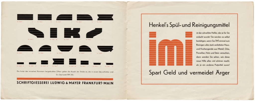
Figure 10. LUDWIG & MAYER. Ca. 1935. Kombi. The Letterform Archive [online]. Available at: https://oa.letterformarchive.org/item?workID=lfa_type_0236&targPic=lfa_type_0236_003.jpg
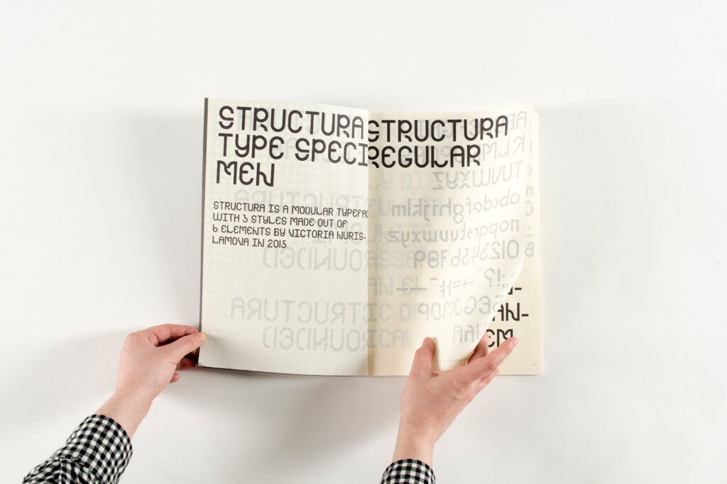
Figure 11. Vika NURISLAMOVE. 2015. Structura. Behance [online]. Available at: https://www.behance.net/gallery/41919357/STRUCTURA-Modular-Typeface?tracking_source=search_projects_recommended%7Cmodular%20typography
Figure 12-15: Ingrid REIGSTAD. 2021. Sketches. Private collection: Ingrid Reigstad.
Figure 16: Ingrid REIGSTAD. 2021. Moodboard 1: Modular Typeface. Private collection: Ingrid Reigstad.
Figure 17: Ingrid REIGSTAD. 2021. Moodboard 2: Inspired by shapes. Private collection: Ingrid Reigstad.
Figure 18: Ingrid REIGSTAD. 2021. Moodboard 3: Multi-functional. Private collection: Ingrid Reigstad.
Figure 19: Ingrid REIGSTAD. 2021. Moodboard 4: Circular connections. Private collection: Ingrid Reigstad.
Figure 20: Ingrid REIGSTAD. 2021. Moodboard 5: Physical interaction. Private collection: Ingrid Reigstad.
Figure 21-22: Ingrid REIGSTAD. 2021. Modul sketches. Private collection: Ingrid Reigstad.
Figure 23-24: Ingrid REIGSTAD. 2021. Modul sketches. Private collection: Ingrid Reigstad.
Figure 25-29: Ingrid REIGSTAD. 2021. Modul work in progress. Private collection: Ingrid Reigstad.