
Prototype ideation
My plan for week 15 was initially to start my typeface development, as I really wanted to incorporate custom typography into my project. However, having chosen the culture making idea, I realised that design development might take up a large part of the remaining time before the deadline. I therefore decided to wait with the typeface to the end of the project, so that I could potentially skip this part if needed.
With the typeface out of my way I could spend my week experimenting with the platform design. I started by exploring various ways of showcasing the gallery through sketches:
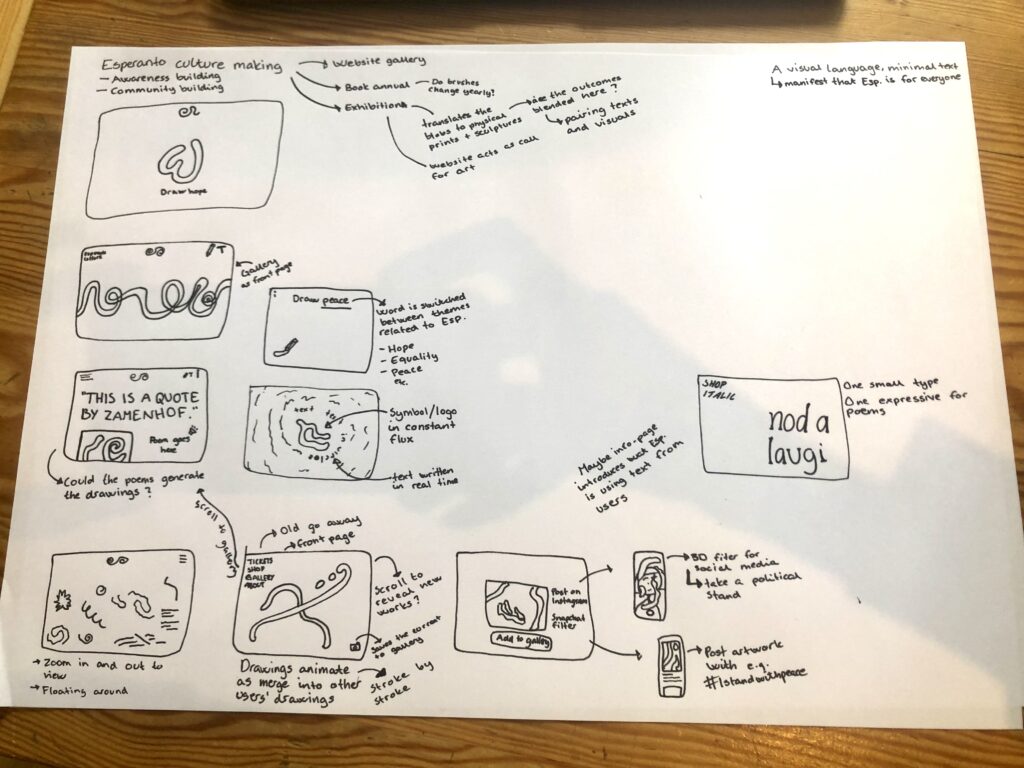
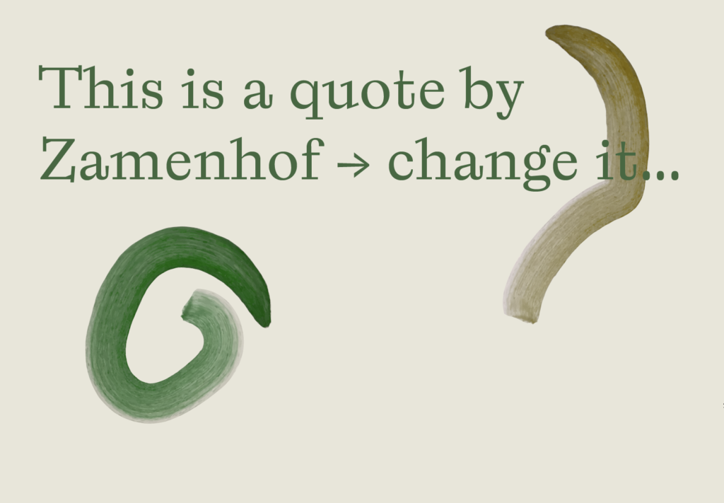
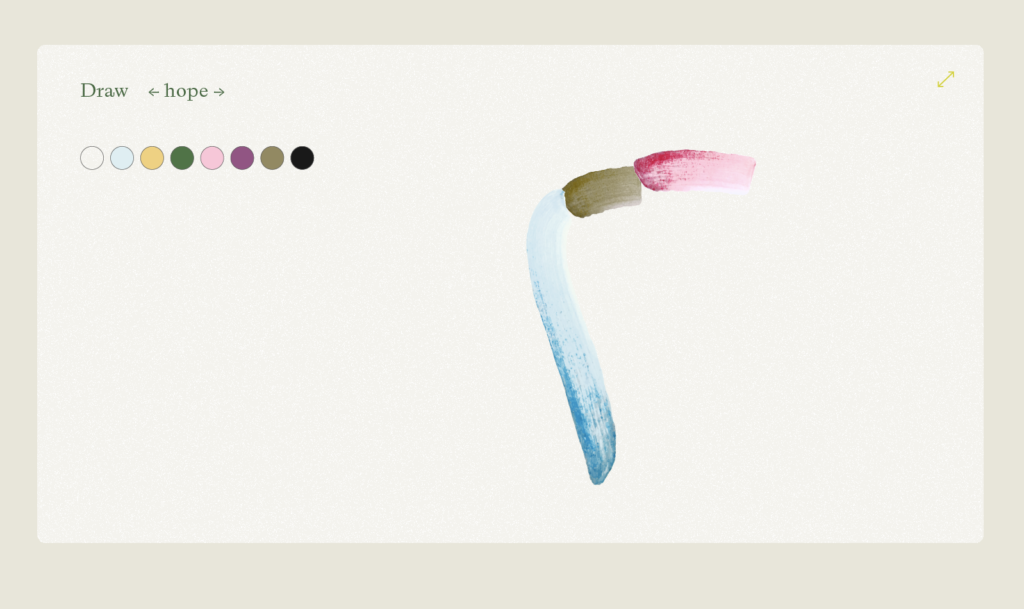
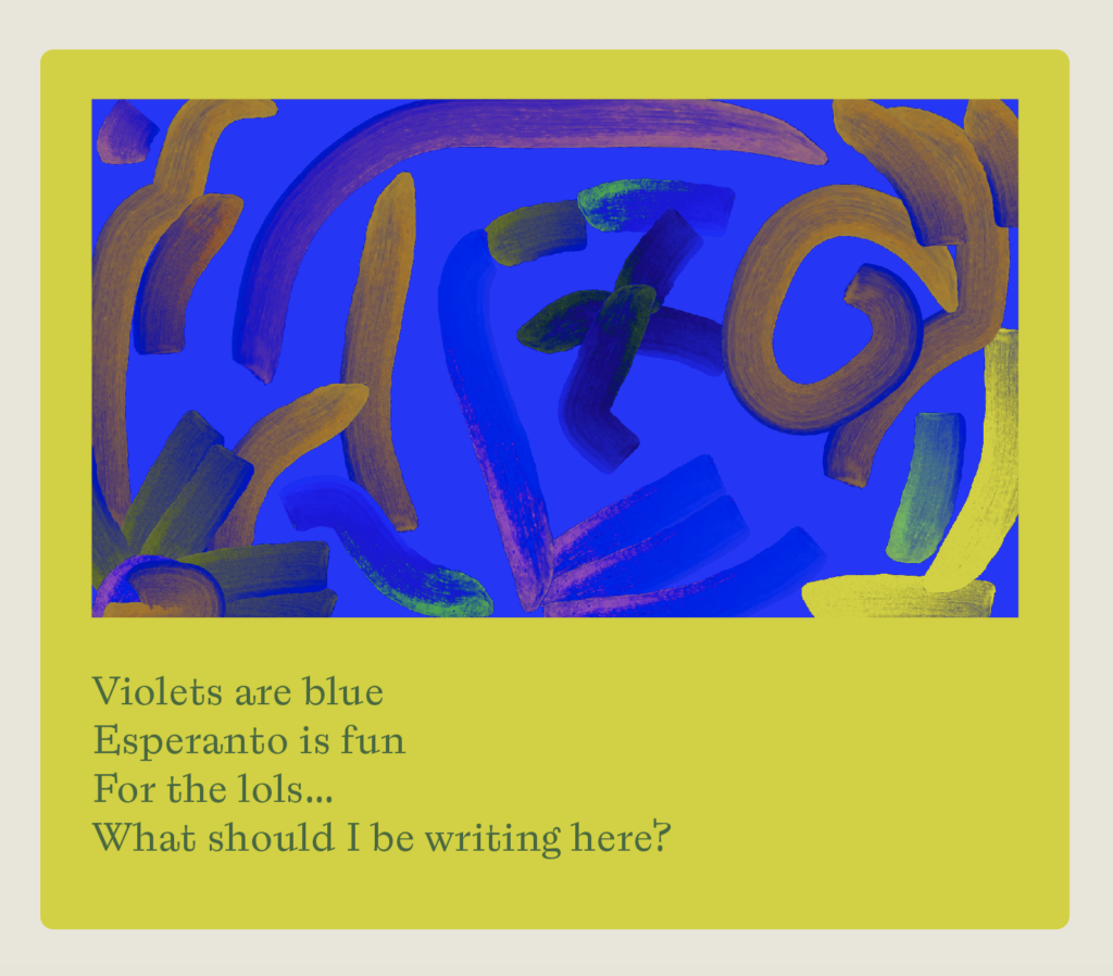
I think it will be important for the website to showcase the user generated outcomes, as this will be the “culture made”. It will also be important for users to draw/write easily and quickly, as this is a foundational element of the platform.
Typeface research
Wether I end up developing my own typeface or not, I thought it would be helpful to look at a range of typefaces, in order to start defining the visual identity of the platform.
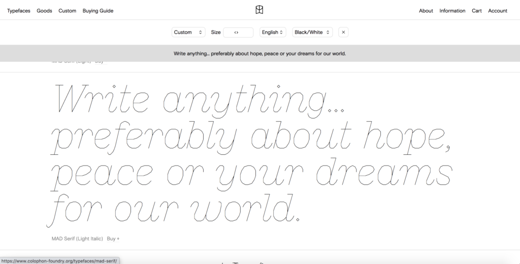
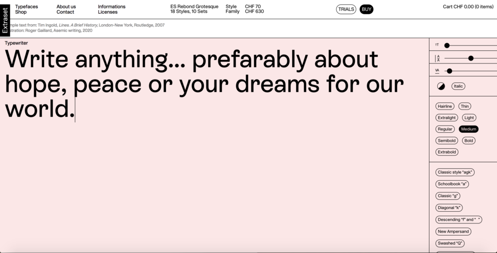
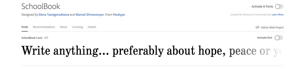
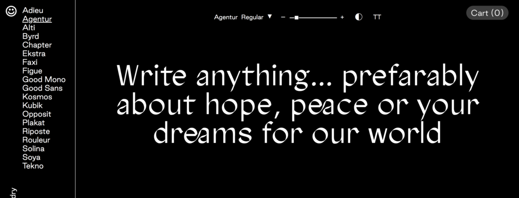
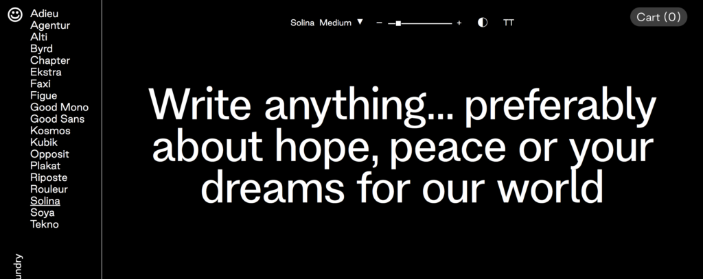
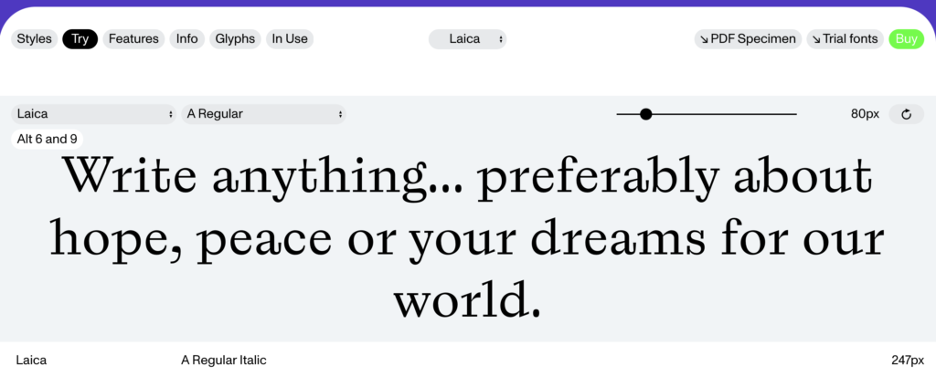
Fig. 2: Extraset Ca. 2018-2021. Rebond grotesque. [typeface]
Fig. 3: Tzaregorodtseva and Shmaconyan Ca. 1980-2000. SchoolBook. [typeface]
Fig. 4: Good Type Foundry 2016. Agentur. [typeface]
Fig. 5: Good Type Foundry 2021. Solina. [typeface]
Fig. 6: DINAMO Ca. 2013-2022. Laica. [typeface]
I wanted a typeface that was friendly, preferably with a human essence to it. Since the platform is all about play and expressing oneself I also figured the typeface should be somewhat expressive or unconventional.
Visual development
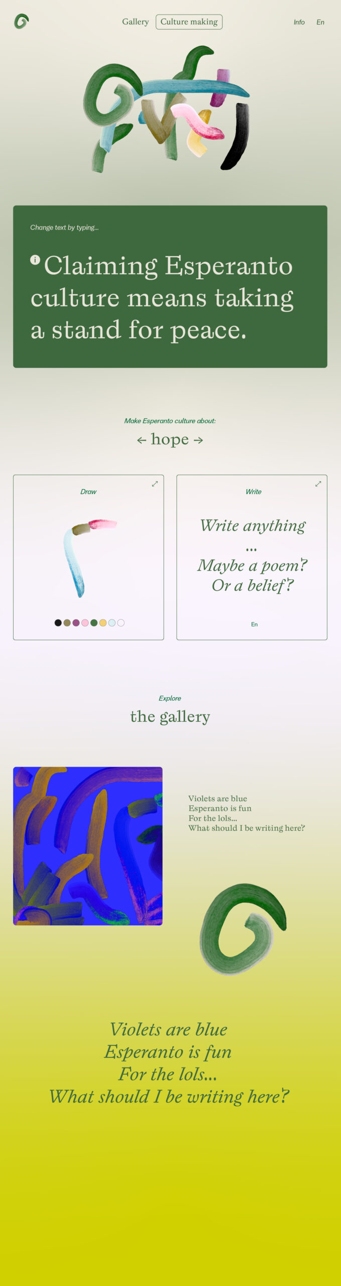
After looking at typefaces I went on to experiment with layout and colours. Based on prior reflections I knew that I wanted to develop a contemporary design that felt welcoming, but also had a slight edge which would appeal to the activist target audience. Text and pencil strokes are foundational elements to the platform, so they would need to be high up in the hierarchy.
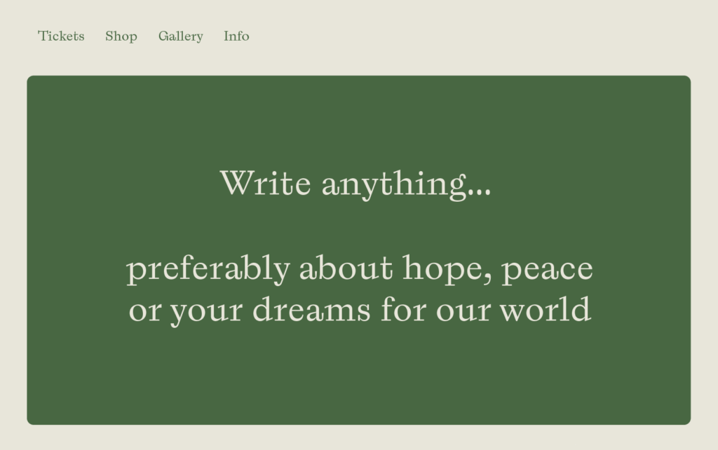
At this stage my process was simply to play around in illustrator, testing various looks and layouts in an intuitive manner.
Final result
The final result this week is a digital website sketch where I’ve attempted to incorporate making tools and a gallery.
The top formation of brush strokes would be in a constant flux, as new strokes would appear continuously whilst the ones in the back would disappear. This way users’ outcomes would blend together, resulting in a unified symbol of Esperanto, symbolising the way individuals’ cultures blend when entering the Esperanto space.
In conclusion
I’m pleased with the colours as green is traditionally associated with Esperanto (to symbolise hope). I also think the various hues of green gives the design a fresh and welcoming look. The typeface adds an expressive and friendly look to the design, but I’m wondering wether it would be better to use a typeface that’s even more organic.
The design is currently missing movement, which I really want to adopt as a reference to crossing borders freely. It would be cool if brush strokes could move around, and I would also like to play around with movement in typography (this is a nice reference).
Overall I think it would be great to experiment further with unconventional layouts and applications. The website feels a bit flat and boring at the moment, and I don’t think it screams make or culture. It would be great if the drawing and writing was more intuitive and tempting, and perhaps incorporated into the gallery somehow.
Moving forward I’ll have to solve these issues, but also start testing the brushes and text making by asking friends to generate outcomes.
LIST OF FIGURES:
Figure 1. COLOPHON FOUNDRY. Ca. 2018-2022. MAD Serif. Colophon Foundry [online]. Available at: https://www.colophon-foundry.org/typefaces/mad-serif/
Figure 2. EXTRASET. Ca. 2018-2021. Rebond grotesque. Extraset [online]. Available at: https://extraset.ch/typefaces/rebond-grotesque/
Figure 3. Elena TZAREGORODTSEVA and Manvel SHMAVONYAN. Ca. 1980-2000. SchoolBook. Adobe Fonts [online]. Available at: https://fonts.adobe.com/fonts/schoolbook?mv=affiliate&mv2=red#about-section
Figure 4. GOOD TYPE FOUNDRY. 2016. Agentur. Good Type Foundry [online]. Available at: https://goodtypefoundry.com/agentur/
Figure 5. GOOD TYPE FOUNDRY. 2021. Solina. Good Type Foundry [online]. Available at: https://goodtypefoundry.com/solina/
Figure 6. DINAMO. Ca. 2013-2022. Laica. Dinamo [online]. Available at: https://abcdinamo.com/typefaces/laica
Figure 7-10: Ingrid REIGSTAD. 2022. Tests week 15. Private collection: Ingrid Reigstad.
Figure 11: Ingrid REIGSTAD. 2022. Result week 15. Private collection: Ingrid Reigstad.