This week it was time to continue my ideation process, now with the remaining ideas, Democratic dictionary and Welcome to Oslo awareness campaign.
Idea development: Democratic dictionary
I started by doing a mind map, where I attempted to develop some of the previous ideas further.
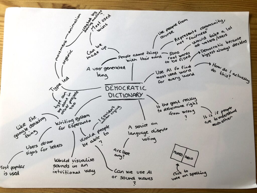
A user generated language
The first democratic dictionary idea would be for users to develop a community language, by having a range of people name things that have words. I learned that Esperanto has 5000 root words, and although this is not a high number, finding a word for each of those words through a democratic process would demand a huge amount of time from contributors. I do however see this process as more fair than how Esperanto’s vocabulary was actually developed – by one man, and based on Western languages.
A democratic writing system for Esperanto
Since Esperanto uses the Latin alphabet, I’d imagine that it’s a lot harder for non-Latin writing system users to learn the language. Therefore, I’ve been thinking about developing a unique writing system for Esperanto – based on the same vocabulary and grammar. By building a symbol making tool, I could ask users to draw letterforms or signs for Esperanto, and then combine the results in order to set one final writing system.
This idea would be cool in terms of typography, but seeing that I myself struggled so much trying to develop letterforms previously in the project, I don’t actually see users being eager to perform the task. Also, the aim of my project is to increase the number of Esperanto speaking people, and developing a new writing system might not result in this as it might only be fascinating to those with an interest for linguistics and typography.
I quickly realised that the democratic dictionary idea would be hard to pull through, and that it didn’t fit the aim of my project. It would be a fun direction in terms of typography, since I would have lots of time to develop a typeface. However, I could still develop a typeface using one of my other ideas, and in this way provide value to the user at the same time.
Idea development: Welcome to Oslo campaign
As with the first process, this was also kicked off with a mind map.
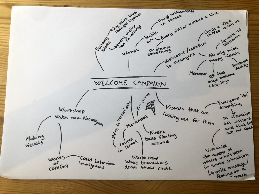
Since the welcome to Oslo idea is already quite specific, I wasn’t really able to come up with any new ideas for it. I did however ideate on directions for the campaign. One option could be to create an installation which has traces of previous immigrants and tourists, in order to comfort newcomers. Maybe people could write messages on it, draw their route on a map of where they have come from, or weave something into a huge wall hanging (carpets and textiles are warm and therefore associated with comfort).
Inspired by Studio Lowrie’s Sundance work, I could also fill the city with colour and symbols of Esperanto (ideated on last week). The aim would be to use happy and joyful designs, which users could scan in order to read more about Oslo and the Oslo Esperanto office. The campaign could for example be inspired by movement in terms of animation, or maybe it would consist of kinetic sculptures, spread around the city.
Whilst ideating I began to realise that this direction might not be enough on its own, but that it could be combined with some of the ideas from last week.
Choosing a direction
Having ideated on my four idea directions, the plan was initially to run them by peers and a tutor. Reading through them however, there was really only one that felt right to me, and I therefore thought it would be more beneficial to start feedback gathering once I had gone deeper into development.
I decided to go ahead with a combination of the two directions I explored last week: Esperanto culture building and rebranding Esperanto. My plan is now to develop a website for culture building, where users can draw symbols of Esperanto and write short poems/texts. I chose to limit the culture making to text and drawing because these activities can be performed by people without any particular expertise. This way, the culture making will be centred around play rather than knowledge, which feels welcoming and in line with Esperanto’s ideology.
As a designer I’m very interested in user generated identities, where the designer makes a tool rather than a finished product. I also enjoy developing custom typography, and this is something I could definitely do as part of the visual identity development. Therefore, I don’t just see this direction as the most suitable for my project aim, but also for my personal interests as a designer.
Initial design development
Having chosen a final project direction I could finally move on to design development. I decided to start with the brushes for the visual making platform, since the look of these would really be a foundational element of the visual identity (and thus guide type and colour decisions).
Brushes
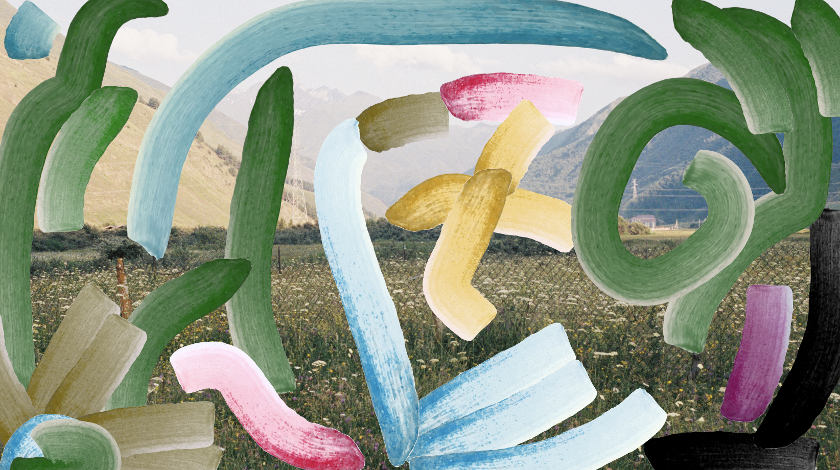
As ideated on previously, I wanted to create an organic aesthetic in line with the human aspect of Esperanto’s inner idea. Since the making platform would be digital, the visuals would need to have a sense of realism to them – mimicking art making in real life.
I began my brush experimentation by drawing a range of strokes on a paper, using water colour paint, acrylic paint, pencils and crayons. The moodboard from last week’s ideation helped me decide which materials to experiment with.
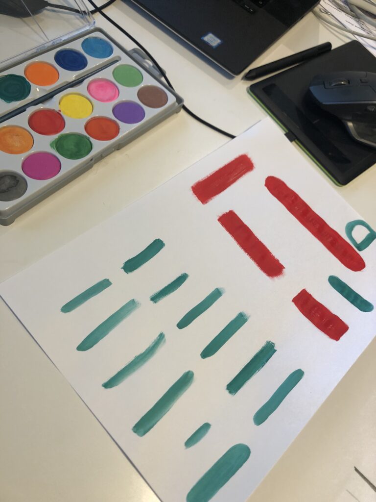
I then imported the brush strokes into illustrator, where I played around with a range of methods.
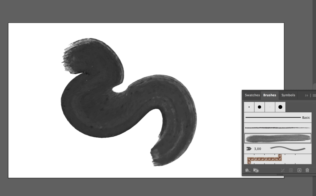
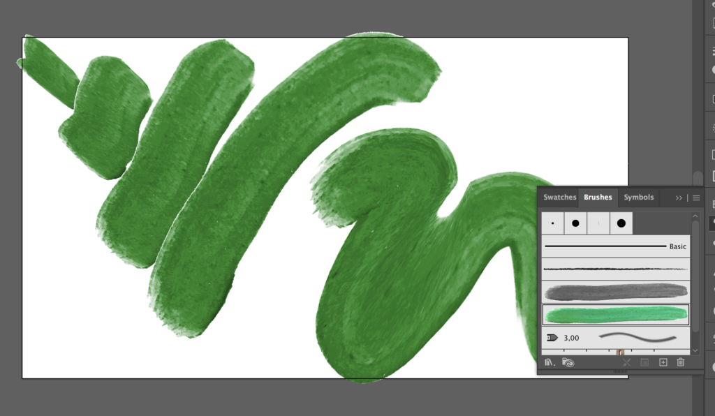
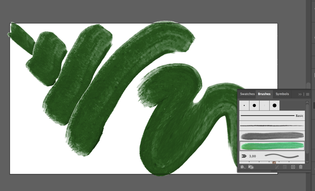
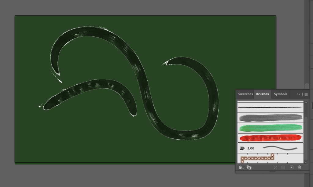
M goal was to develop a range of different brushes that went well together, which would allow users to play around with different techniques, whilst the visual identity remained cohesive.
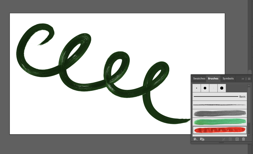
Below are the final illustrator brushes:
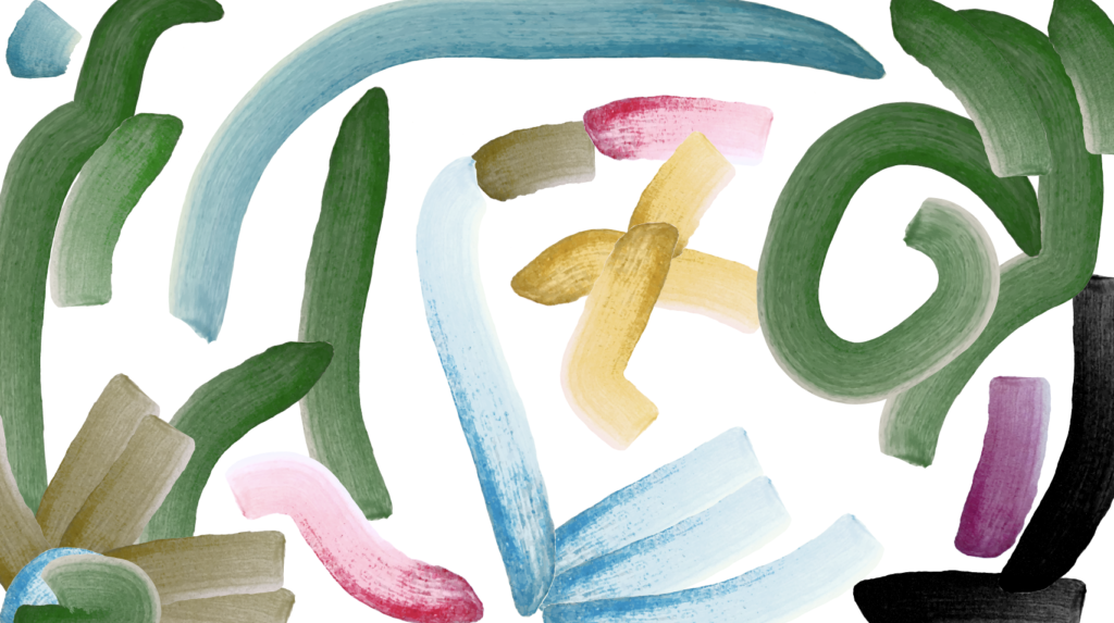
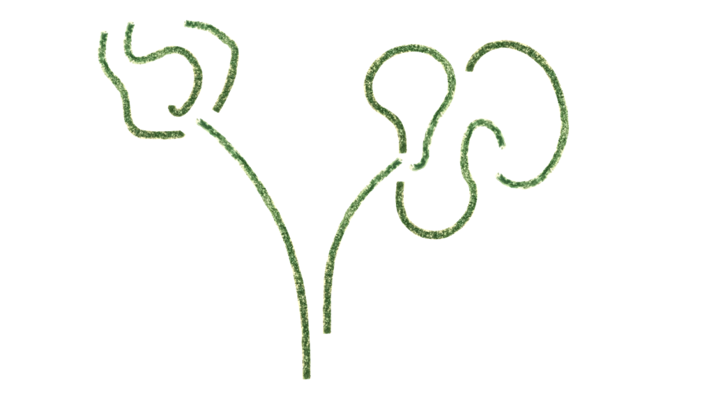
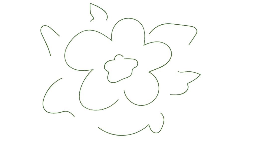
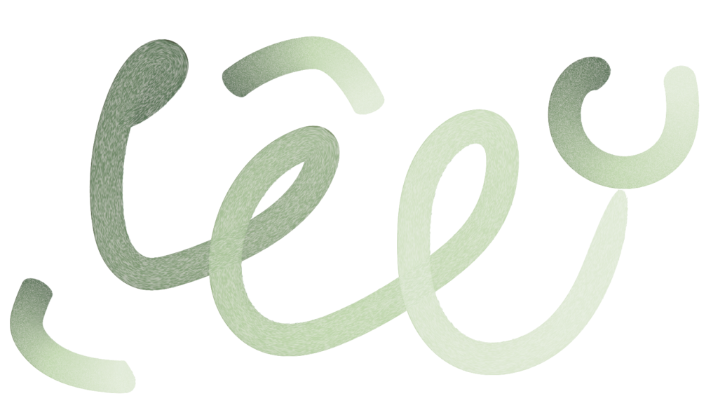
The brush strokes could be used by themselves in order to make paintings/illustrations. However, I also think it could be interesting to place them on top of imagery, combine them with other users’ art works, animate them, or use limitations that would lead to single shapes (logos) rather than full paintings.

(Personal photograph used for illustration purposes)
At the moment, the only thing that connects these brushes to Esperanto is the fact that they have a sense of humanity to them (they feel slightly flawed and also the texture mimics real painting/drawing). I’m not sure if this is enough of a connection.
Other ways of relating brushes to Esperanto could be to only use green hues (Esperanto uses green because the colour symbolises hope). It could also be interesting to imagine a drawing interface where users make by moving their body (e.g. in front of the webcam) – connecting the art to the physicality of Esperanto speakers. It might also work to limit the making to symbols instead of paintings since symbols feel more representative of specific messages that art work does.
In conclusion
If I had more time this week I would have spent it on further brush development. The process was fun and rewarding creatively, and I think it could have been interesting to see if I could develop textures that were more unique. Originally my plan for next week was to start developing a typeface for my project. I’m not sure wether I’m quite ready for that though, as it feels like the brush-aesthetic isn’t quite landed.
Moving forward I will continue my brush exploration, typography planning and perhaps reflect once more on my visual concept. I’m very happy about the culture making concept, but at the moment I’m not sure if the visual making feels entirely in line with the inner idea of Esperanto.
Next week I think it will be important to discuss my ideas and development with peers and tutors, as I’ve spent a lot of time designing in a vacuum.
LIST OF FIGURES:
Figure 1: Ingrid REIGSTAD. 2022. BTS week 14. Private collection: Ingrid Reigstad.
Figure 2-6: Ingrid REIGSTAD. 2022. Brush progress. Private collection: Ingrid Reigstad.
Figure 7-10: Ingrid REIGSTAD. 2022. Brushes week 14. Private collection: Ingrid Reigstad.
Figure 11: Ingrid REIGSTAD. 2022. Brush on photograph. Private collection: Ingrid Reigstad.