
In week 13 my goal was to experiment with with two of my four ideas from week 12: Esperanto culture making and Rebranding Esperanto.
Idea development: Esperanto culture making
I started off my doing a mindmap on ideas for Esperanto culture making:
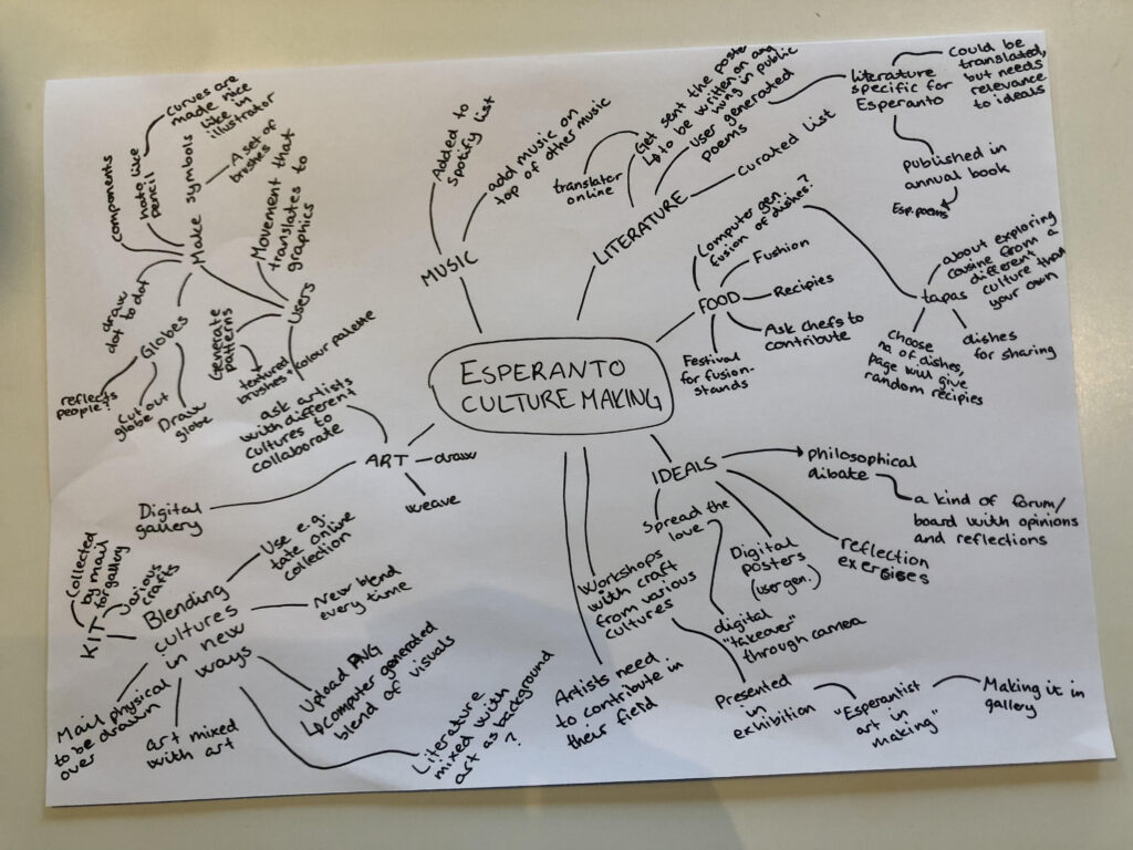
The foundation of this direction would be to create a culture for Esperanto by hybridising various cultures. It’s also important that this hybridisation includes user generation, since Esperanto is all about humanhood and it’s community.
Hybridising food, literature, music and art
Before coming up with ideas I wanted to reflect on what culture usually takes the shape of (in terms of tangibility). I established for myself that often this includes food, literature, music and art. In order to build an Esperanto culture, one might therefore begin my making Esperanto versions of these fields. My first idea is to create a digital makers platform, where users can contribute within any of these four fields. The contributions would then be blended with other contributions from the same field – either manually by a new user or using an AI. In literature for example, one user could write the first verse of a poem. Another user would write the next, and then another the third, and so on. In terms of visuals, users’ contributions could perhaps be overlaid, or they could be blended somehow using computer generation.
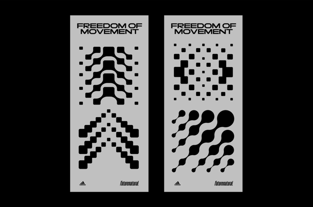
Art making tool
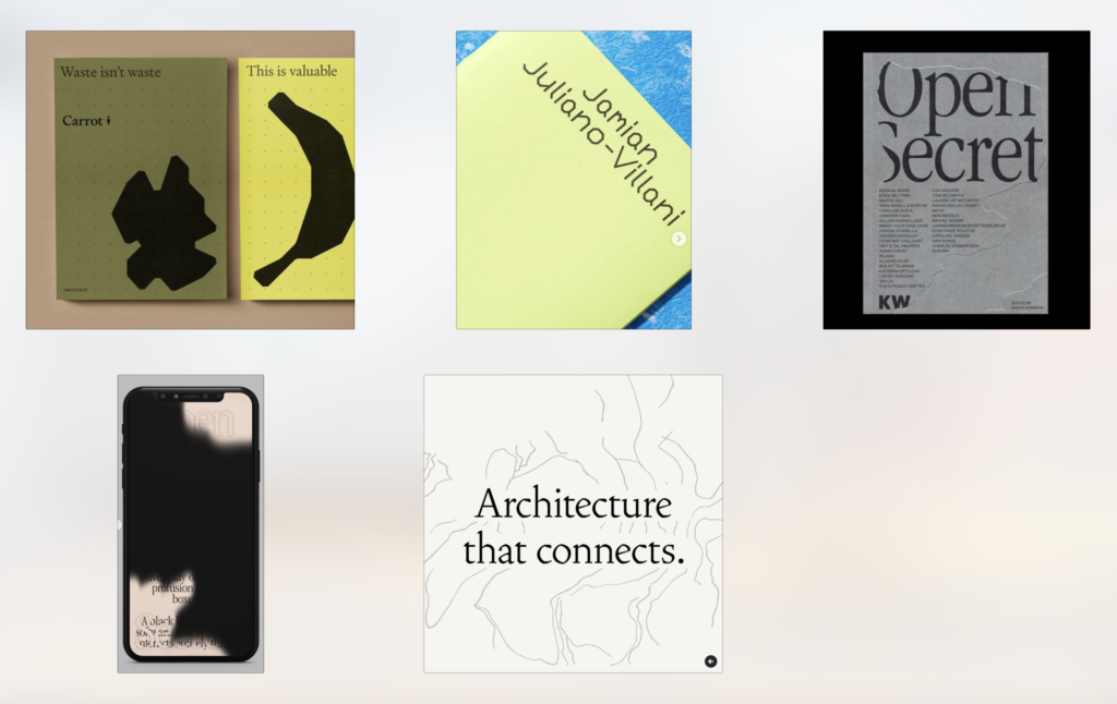
Inspired by many of Hato‘s projects, I would be interested in building a digital Esperanto art making tool, which could both contribute to culture making and Esperanto’s visual identity. The tool could consist of brushes, shapes/components, dot to dot drawing (the idea of connecting the people of the world), shape making, altering a symbol using sliders, or there could a visual element that is affected by human aspects in the user (e.g. a voice recording or track pad touch/clicking). Below are some visual inspiration images for potential brushes. I’d like for whatever this would be to have an organic and human aesthetic, to fit the inner idea of Esperanto.
Tapas randomiser
For food I had the idea of developing a tapas fusion tool, which would encourage people to try dishes from other cultures. The user could enter the amount of dishes, amount of people or similar, and then be presented by a set of random recipes from around the world, resulting in a hybrid tapas dinner.
Esperanto poems
In order to encourage Esperanto literature, the organisations could publish annual poem publications, containing user contributed poems. The poems could be translated from other languages, but should relate to Esperanto’s inner idea. In addition to a physical book, the poems could also be made available online.
Physical hybridisation kits
Since art is often created using physical methods it could also be interesting to develop a making kit or object, which is shipped around the globe. Maybe users could develop a backdrop online, for then to get sent a physical poster with their background to be written on using their hand lettering. The posters could be hund all around the world, resulting in a user generated poster campaign for Esperanto.
Cultural ideals
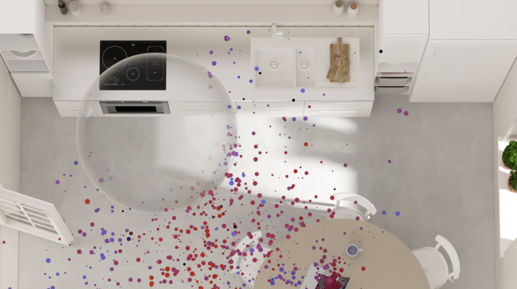
Another aspect of culture is ideals, and for Esperanto this links to the inner idea. In order to continue these ideals, I could for example build a philosophical debate board, digital self reflection exercises or digital posters (more activist approach than the first two). This direction could also be more abstract – for example I could build an AI filter which would showcase “the spreading of love in their environments” on users phones.
Idea development: Rebranding Esperanto
For this direction I started the idea development by noting down various directions for a rebrand, based on last week’s moodboards. I then did a mindmap for the ones I liked the most, and eventually I created a new moodboard for each idea. The following ideas are more focused on visuals than functionality, as apposed to the previous ideation session. They could either work on their own as a visual identity project, or they could be combined with a more functional idea.
Symbols of Esperanto
Mindmap:
Moodboard:
Idea:
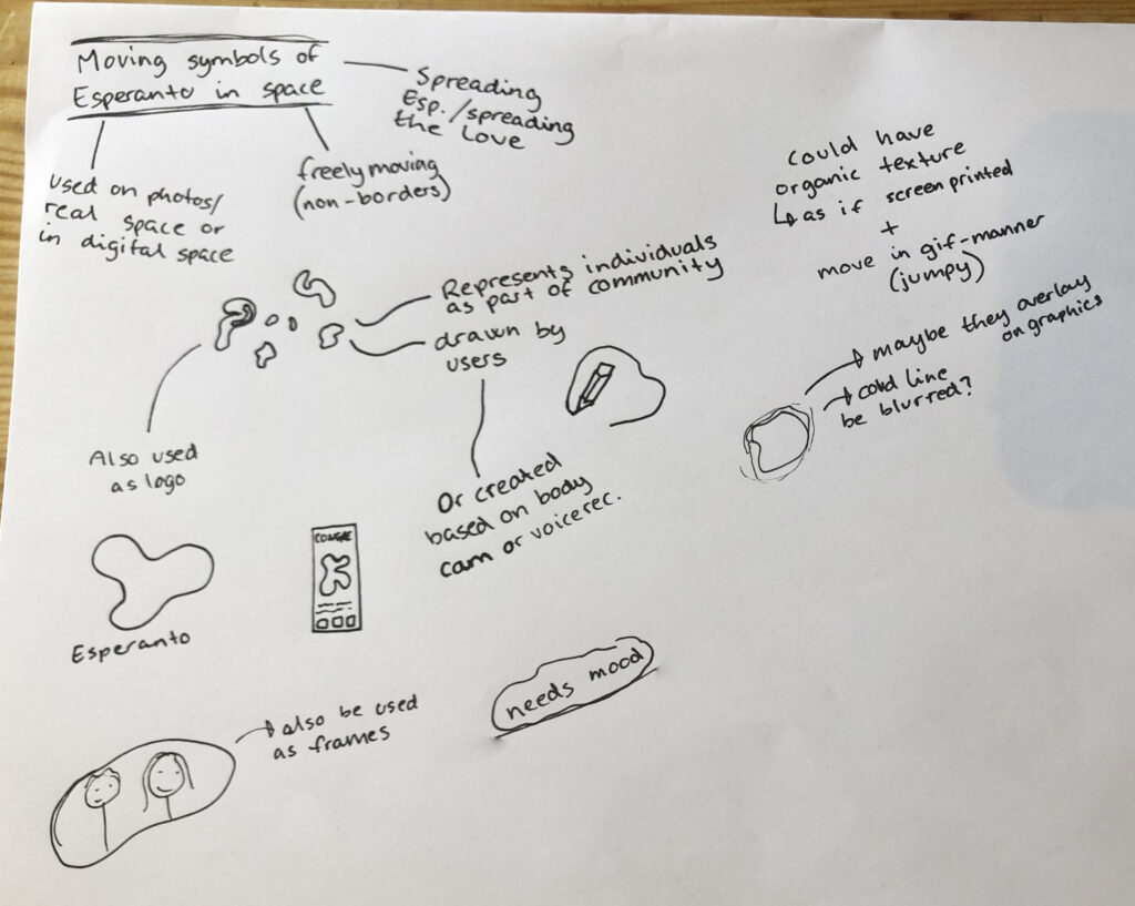
Inspired by the “spreading of Esperanto (love)” concept from my first ideation session I wondered if users could develop shapes which would move around in space. These shapes would represent the individuals of the Esperanto community, and together the community as a whole. This way I would attempt to symbolise how the language belongs to the people. The movement refers to being able to move across borders and if able to have the shapes distort other website content, I could refer to how Esperanto belongs to its users.
The shapes could be drawn by users, or they could be automatically generated based on users’ bodies (e.g. using hand movement through a web cam or sound waves of voice using a computer mic to record). By using the community’s actual bodies, the shapes could become a true representation of them.
I like the idea of experimenting with texture or same colour overlays (using shadows to differentiate), perhaps letting the shapes distort e.g. type content. We see flat shapes so often in todays web design scene, so it would be cool to take a slightly different approach.
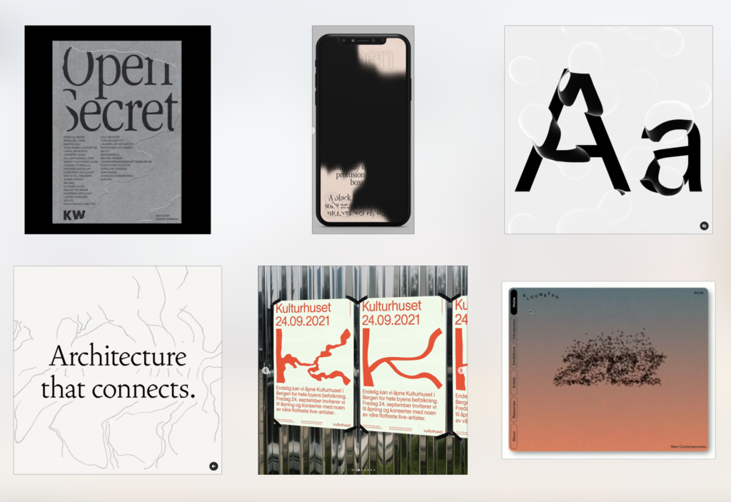
Type led identity
Mind map:
Moodboard:
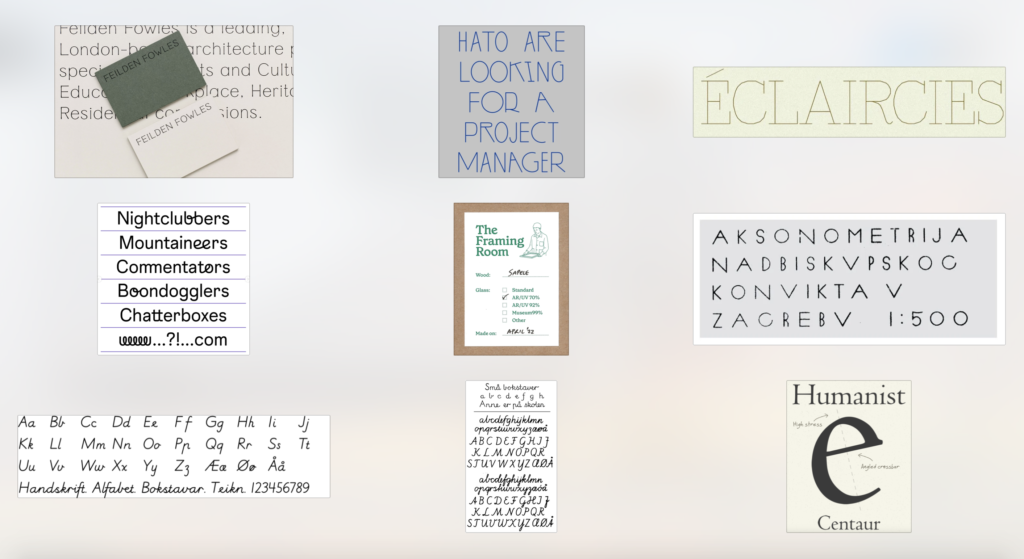
Idea:
Surely when working with the visual identity of a language, focusing on typography shouldn’t go terribly wrong. Particluraly if doing the democratic dictionary idea (to be ideated on next week), large type would be the obvious choice. I like the idea of using hand lettering as a reference, or at least something organic, like how ink bleeds into paper. Since Esperanto is about humanity, the typeface should be influenced by the human touch somehow. It should be slightly flawed and friendly. I also like the idea of modernising classic humanist typefaces.
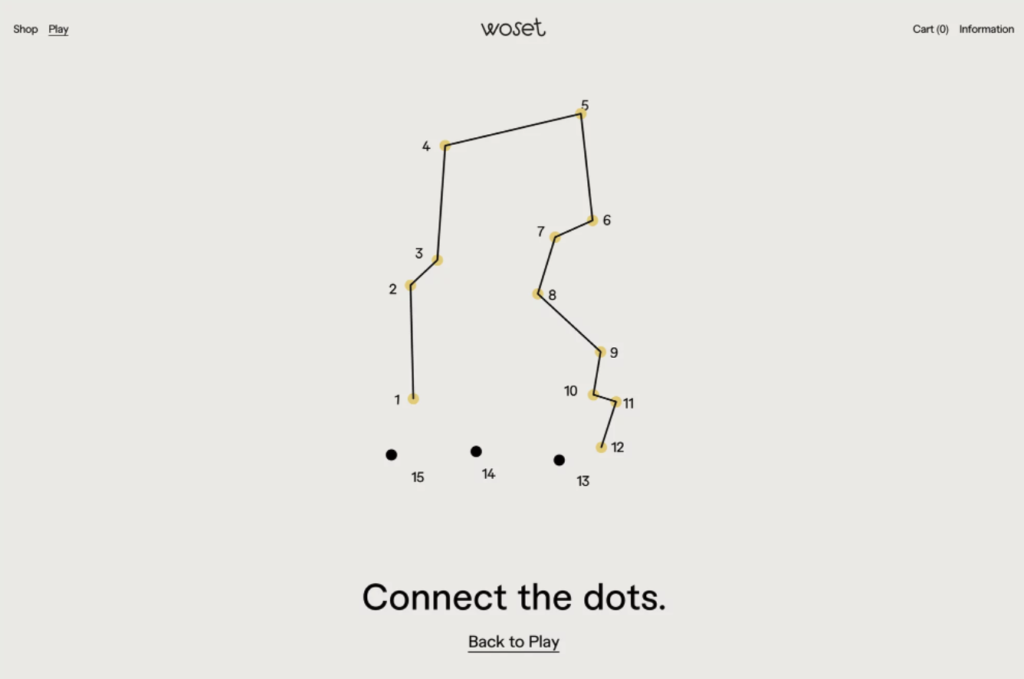
Movement (dot-to-dot)
Mind map:
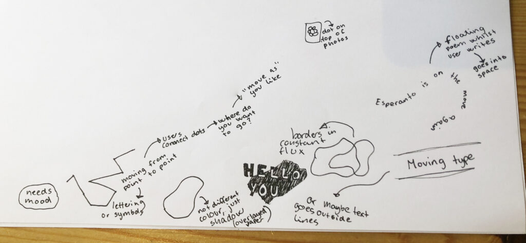
Moodboard:
Idea:
Perhaps also with an option of letting users generate the content, I got the idea of doing digital dot-to-dot illustrations and/or typography (could be combined with the Shapes of Esperanto idea). By letting users move from dot to dot, I would refer to the fact that Esperanto is stateless, and the idea of how Esperanto encourages free movement across national borders. I could also have one shape that is always on the website, which the user could alter by moving its points to other points in a grid. I think it would be nice if the shape was also moving on it’s own.
Art making tool (brushes)
Moodboard:
Idea:
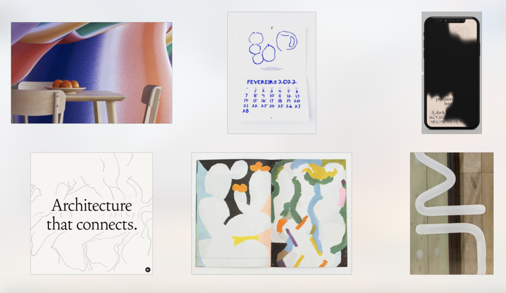
This is really just a further iteration of the art making tool idea from my first idea development round. Whether I choose to go ahead with the culture making direction or not, I like the idea of doing user generated illustrations / symbols, using organic brushes. If the illustrations could be animated that would be even better (as movement is such a relevant aspect of Esperanto’s inner idea). In order to bring the illustrations to life it would also be cool if they lived in a 3D space.
The illustrations could be made in workshops, but it would also be cool to develop a tool where users could make their own. Maybe the results could be exported as Instagram- or Snapchat filters, sent as posters, or be used in another marketing format somehow.
The link to Esperanto here is simply the human touch, as well as visualising the fact that Esperanto lies in the hand of its community.
In conclusion
This week has been very helpful since the ideation has made me feel like I’m finally moving towards some actual design ideas. At the moment I’m quite excited by the culture making idea, as I think it would be a fun website to develop design wise, which would provide users with value. I’m not sure how well it would work in real life to marked Esperanto though, as it would really need to become a hype to work. If deciding to move on with this idea, I’d like to develop a hybrid making website, where I would let users create visuals, sounds and literature, resulting in a digital Esperanto culture library. The outcomes could also be made into book(s) and exhibition(s).
In terms of the visual identity direction, I’m quite keen on all four ideas. I also believe that some could be combined (for example I could do a typeface and use it with the art making tool idea). I find the symbols of Esperanto interesting because they could be real representations of the Esperanto community. However, I also think it has a slight cross over with my previous project with the Science Museum, and I wonder if it would be wise to spread my skillset.
If I had more time this week I would have liked to make digital sketches for some of the ideas, in order to come even further in my development. However I also believe in my strategy of ideating on all four directions before spending time on actual design. At this stage I’m happy about where my project is going, and I look forward to ideating further in the coming week.
List of figures:
Figure 1: Ingrid REIGSTAD. 2022. Moodboard: Art making tool. Private collection: Ingrid Reigstad.
Figure 2. SPACE10. 2020. Everyday Experiments. Space10 [online]. Available at: https://space10.com/project/ee-privacy-trust/
Figure 3: Ingrid REIGSTAD. 2022. Moodboard: Symbols of Esperanto. Private collection: Ingrid Reigstad.
Figure 4: Ingrid REIGSTAD. 2022. Moodboard: Type led identity. Private collection: Ingrid Reigstad.
Figure 5: Ingrid REIGSTAD. 2022. Moodboard: Movement. Private collection: Ingrid Reigstad.
Figure 6: Ingrid REIGSTAD. 2022. Moodboard: Brushes. Private collection: Ingrid Reigstad.