Lecture notes
Lecture reflections
This week’s lecture made me realise how much I’ve changed when it comes to taking constructive criticism. Previously I tended to take this personally, but at the moment I’m at a stage where I’m moving towards a similar mindset to Posselt’s, where I see critical feedback as part of a process. During this module, the most valuable feedback has been negative, and it has really helped me alter the project and understand what I need to do moving forward. At the moment I’m looking forward to adjust my interface in response to the negative feedback from the UX-designer last week, as it will hopefully make the project better.
What I’m not as good at however, is showing unfinished work to peers and colleagues, as discussed by Veerman (Torsten Posselt et al., 2021). I find it uncomfortable to discuss and share ideas that I haven’t wrapped my mind around yet, especially in professional settings. However, I’m starting to realise that talking about an idea is often hugely beneficial. Veerman’s suggestion of doing a check in every day seems like a great idea, and moving forward I will try to get better at asking for feedback at all stages of a project.
Further, I was quite inspired by Dirks’ discussions and how his studio tells the client to be completely honest when responding to their work (Torsten Posselt et al., 2021). This is such a simple principle, yet it can be so uncomfortable to follow. However, I can imagine it being very helpful when working with clients – after all, the project will never be successful if the client isn’t happy, and so it really makes sense to try and get all their feelings and thoughts out there straight away.
Resource notes
Resource reflections
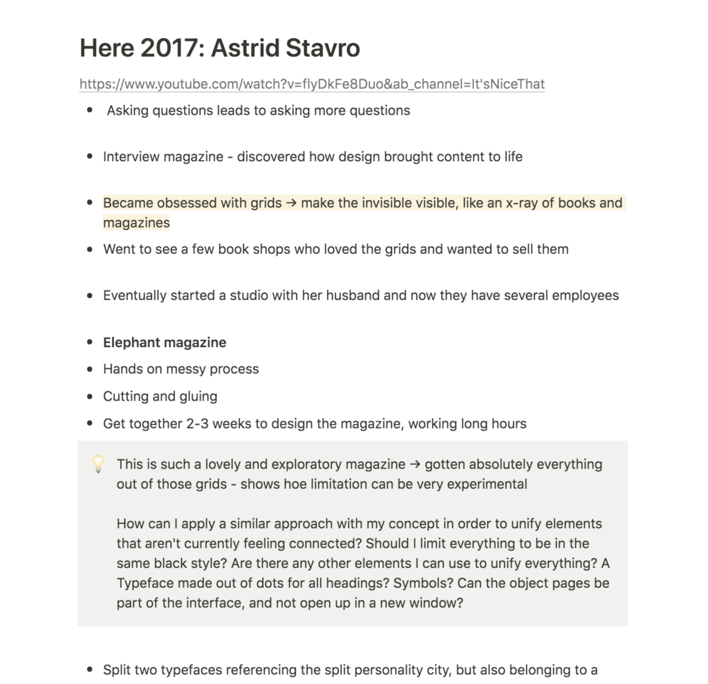
Here 2017: Astrid Stavro
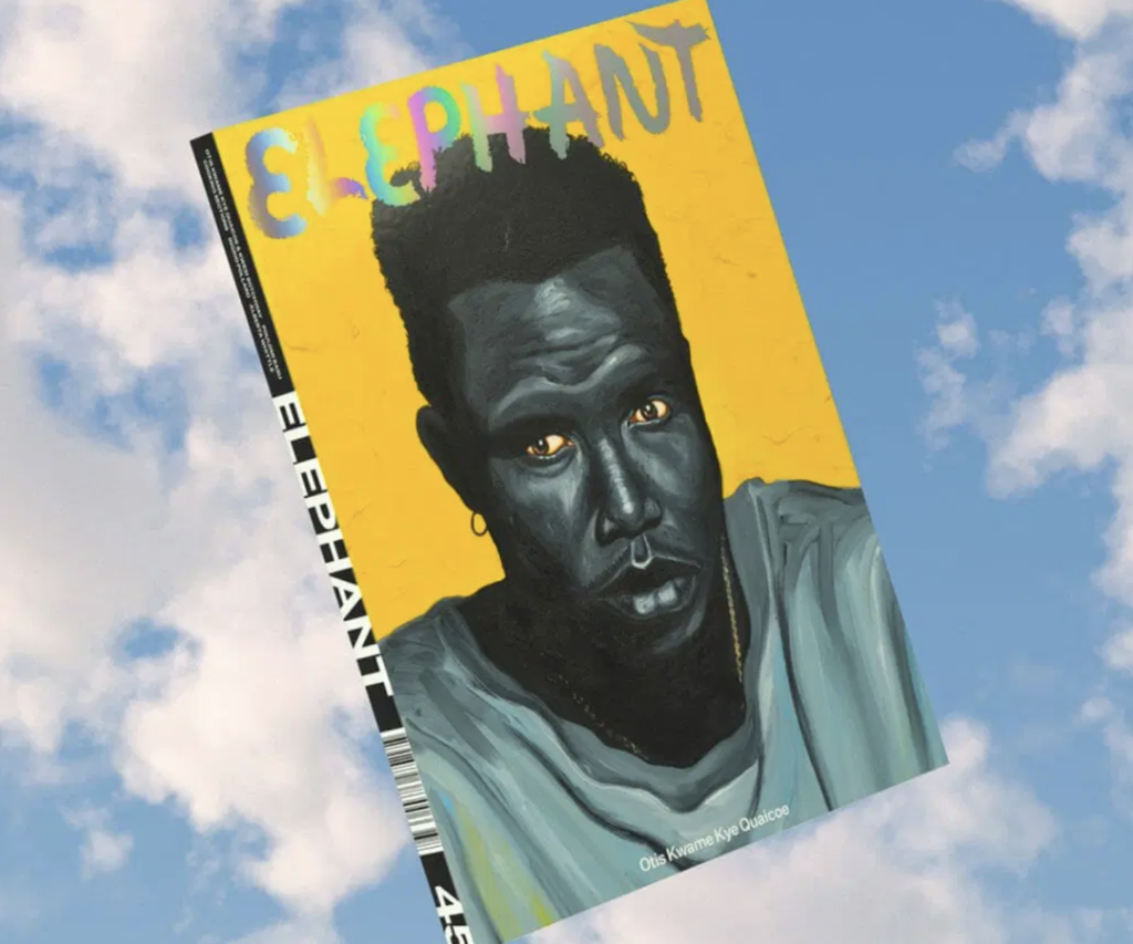
It was very inspiring to see Stavro’s work on Elephant Magazine, and how the studio managed to get absolutely everything out of the grid system. This made me think about how limitations can often lead to quite experimental work, and how I might need to set limitations in my own project in order to develop a feeling of cohesiveness.
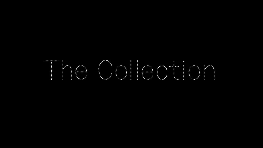
At the moment I have these white on black animations that are working well visually. However, the typography and object pages do not communicate the same type of playfulness and experimental vibe. Maybe as a way of bringing the interface together I could develop a headings typeface made out of floating grains, a set of animated symbols, or perhaps the object pages could be part of the front page, and not open up in separate boxes.
Although my project started out being focused on calmness, I think it has moved into a more experimental and sensory direction, rather than simply being calm with the goal of defeating overwhelmingness. Instead of trying to force calmness on users, I might be better off attempting to build sensory experiences, and giving users a feeling of connection to the digital archive through visual sequences.
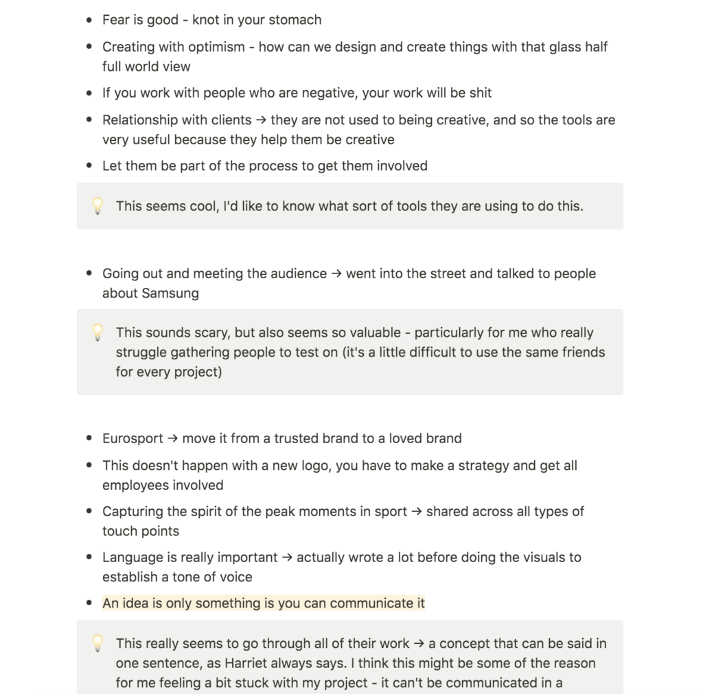
Glug London: DixonBaxi
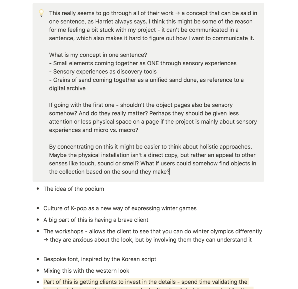
DixonBaxi’s talk was inspiring because their work always seemed to have a simplistic concept that could be communicated in one sentence (as often emphasised by Harriet in webinars). This made me think that part of the reason for why I’m struggling with my project might be that I can’t do this with my current work. I’m not sure about what I’m trying to say, or what the meaning behind the work is, which makes it hard to find out how I want to communicate it.
As a solution I attempted to write down sentences to describe my concept:
- Small elements coming together as one, through sensory experiences inspired by science and nature
- Sensory experiences as discovery tool
- AI generated patterns symbolising the digital archive
- The digital archive presented as grains of sand coming together as a digital unified sand dune
Having attempted to write a range of sentences, I resonated the most with the first one above. If this was my concept, shouldn’t the object pages be sensory somehow, rather than just as minimal as possible? And did the object pages really matter at all if the project is about sensory discovery?
By focusing on this one sentence, I hoped to provide a focus point for the week. Hopefully this would also make it easier to develop holistic design elements, such as an installation. If the focus is on senses rather than grains, one might want to reflect on how other senses can be used to discover the archive. What would happen for example, if users were to discover objects based on the sound they make?
Further research
I also decided to look into a few projects mentioned on the ideas wall last week, as elements for further reflections:
Workshop challenge
For this last week of development I wanted to focus on cohesiveness by bringing all elements together, communicating my established concept (as discussed in my resource reflection). I began by collecting feedback from Ben and the student I asked for feedback last week (see my blog post for week 10).
Feedback 1
Media and Communication Student
I wanted to find out if the student could identify any general issues, in order to gain a new perspective of my project. I asked for a broad interpretation without telling her too much about the project, which resulted in quite broad feedback:
- She liked the visual design of the object pages, but seemed confused about the fact that the different views could be used for different actions (rather than only having different views).
- She wasn’t so sure about the light mode, and she thought the concept and feeling got a little lost when the background was white
- She commented on the grains moving quite fast, worrying that she wouldn’t be able to hover over them before they disappeared (it should be mentioned that the grains are meant to stop when you hover, but this isn’t possible to do within figma).
- She thought the Table of Contents page was confusing and hard to read
- She suggested to have a welcome page which could help make the entry less confusing
- She liked the simplicity and there not being an overload of information or something distracting you from the main activity
The student’s feedback was very valuable, particularly because it confirmed some of the worries mentioned last week by the UX-designer. None of them suggested to loose the object pages, but the fact that they both found the views confusing made me wonder if I could rethink how objects are presented – maybe they don’t need to be separate boxes, but rather part of the sensory interface concept. The feedback also made me realise that a Welcome page could be valuable as a way of avoiding confusion.
Ben
The tutorial this week (as well as further comments from Ben on the ideas wall) was very valuable because it challenged my idea of what’s needed in an interface. I was quite set on using photographs, in order to cater for those wanting to research and perhaps collect objects as sources of inspiration.
Ben suggested to use point cloud illustrations rather than photographs, which I quite liked the idea of. However, it took me a while to get comfortable with the idea of using no photographs at all. In my projects I can sometimes struggle with finding the right balance between art and design. However, the feedback from Ben eventually made me realise that the urge for finding this balance shouldn’t stop me from going all in on a concept, and so I eventually started experimenting with dropping the photographs.
Ben’s feedback summed up:
- He didn’t think the opening page was confusing, as suggested in previous feedback from the student and the UX-designer
- The interaction should be in line with the overall concept, for example by having exploding point cloud illustrations rather than photographs when hovering
- He suggested to think about the structure of objects, and how they are ordered within the cloud
Iteration
Having gathered some feedback, I went on to iterate and further develop my concept.
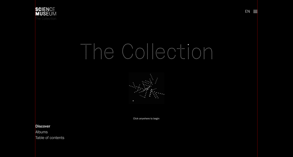
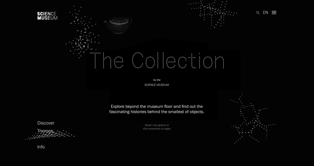
Welcome Page
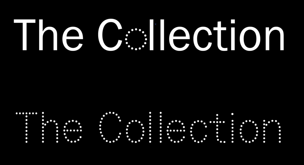
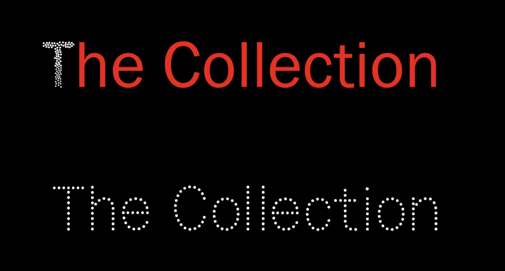
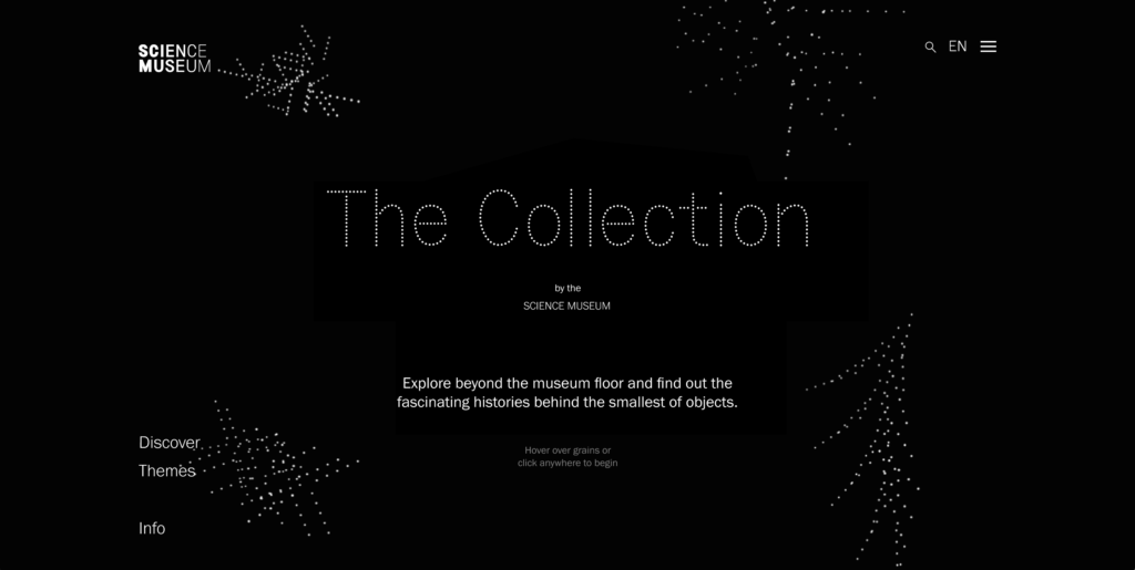
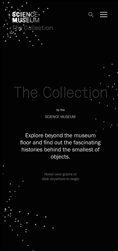
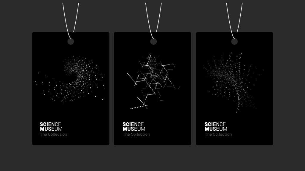
One point mentioned in the feedback was that the point of entry was confusing. I therefore began to work on a welcome page. As mentioned in prior weeks I wanted to develop an over all visual identity for the digital archive, using the grains and patters already developed. Thus, I wanted to create a logo or type system made out of dots.
My goal was to have the cloud form into abstract and somewhat distorted letters. After spending a lot of time trying to build this however, I decided to give up on it and rather write out the name in lined dots. If I had more time I would have worked more on animated letters, as I think this could have been a unifying element across digital and physical channels.

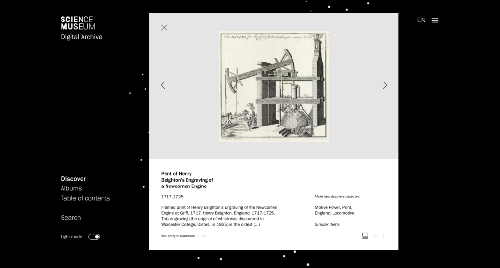
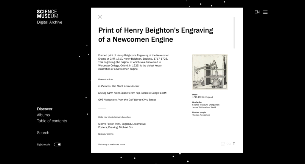
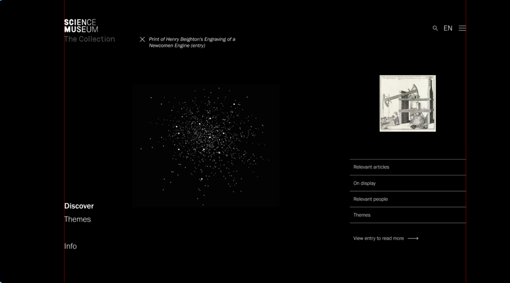
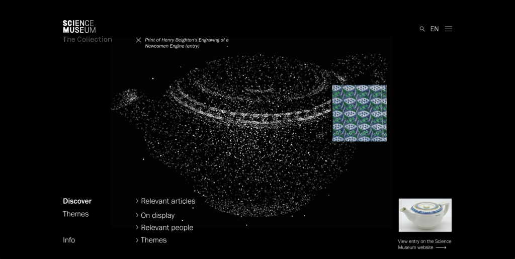
Object pages
I liked the simplicity of the current object pages, but the aesthetic didn’t fit in with the rest of the interface. It wasn’t really sensory, and since I had established this as my main concept they needed to change. Rather than giving users multiple viewing options I decided to make one object page layout where users could choose to reveal more information in a drop down menu. By sticking to the point cloud as a main element, I was starting to feel like the interface was getting more cohesive.

Following up on the feedback from Ben, I went on to experiment with technical methods for turning photographs of objects into visualisations of point clouds. My boyfriend, who’s quite skilled in Blender, tried to help me develop a 3D version. However, the aesthetic didn’t look like the main animation sequence I had already created. I therefore decided to experiment with photoshop effects and image tracing, which eventually gave me a decent still image result.
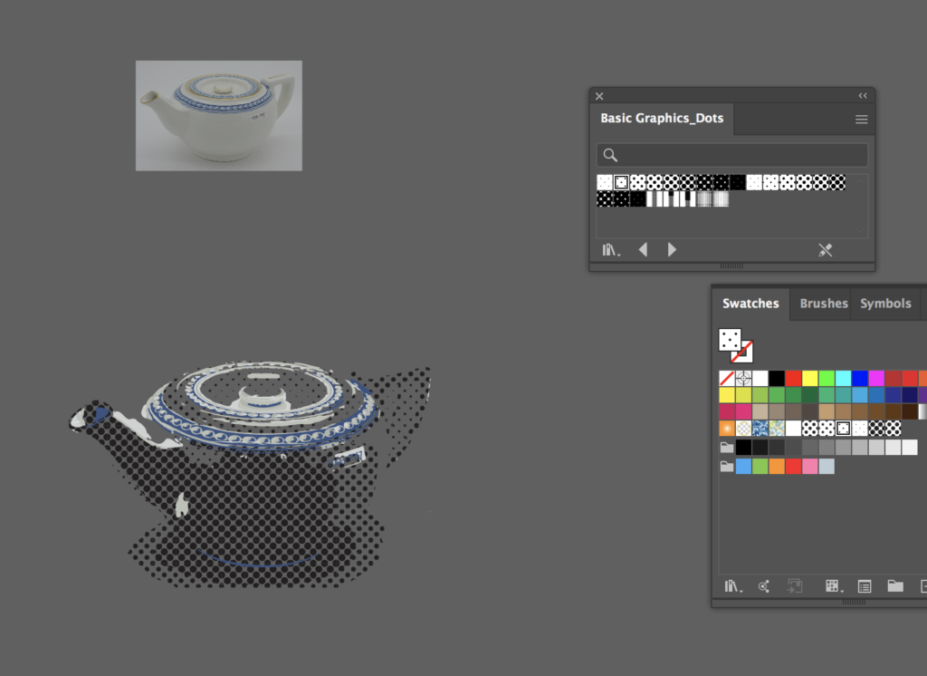
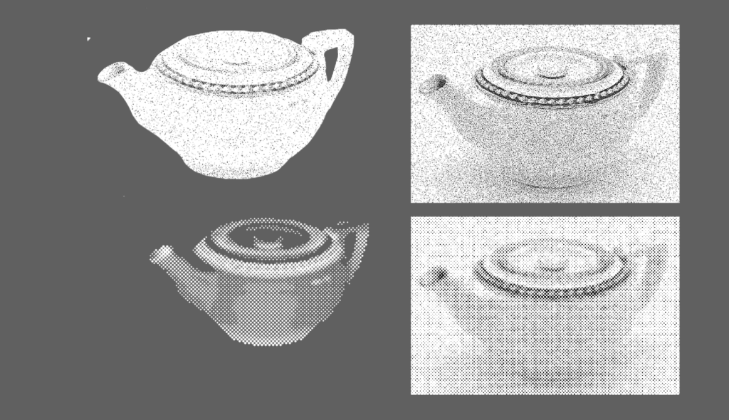
The issue with this method was that the image was pixelated, and not vectorised, meaning I had trouble animating it. Due to time restrictions I decided to overlay animated grains on top of the image, as a way of making it look like some of the grains were moving. This wasn’t ideal, and if I had more time I would have loved to find a way of actually turning the photograph into vectorised dots, morphing them in and out of the abstract cloud formation.
New user journey
During my development I eventually began to build a new and simplified user journey. I removed the filtering option from my menu, as feedback suggested it wasn’t needed. I also moved the search bar lower down in the hierarchy. Feedback, as well as Whitelaw’s principles (researched in prior weeks) suggested that search isn’t a valuable entry point for meaningful browsing.
Although I liked the idea of having a text page which commented on the hugeness of the collection by showing all 200 000 entries as verbal titles (Table of Contents), I realised I didn’t have time to develop the page enough for it to make sense. I therefore decided to remove it from my interface, rather than keeping it as an element of confusion.
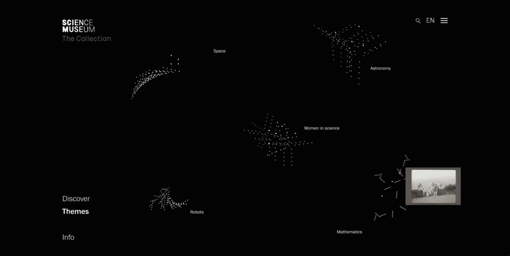
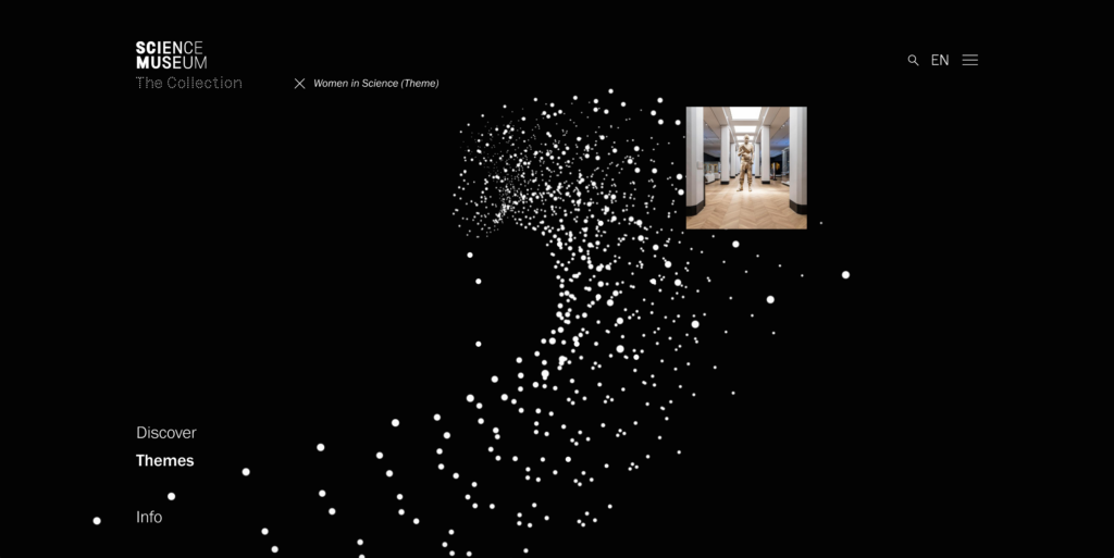
In order to make the browsing more in line with the overall system, I developed a tag system. Every time users click on a theme, search for something, or enter an object page, a tag will appear as an indication to “where the user is” in the interface. This way, they can either choose to exit by clicking on the cross (taking them back to the cloud or theme page), or they can keep discovering items by browsing new point clouds showing similar items to the entry they are currently in.

Below is a recording of how the prototype worked at this stage:
Feedback 2
Having done the iterations above, it was time for a crit with John Stack. I asked for advice on two things:
- What was John’s view on not including any photographs?
- Did John have any thoughts on how the object page could be improved?
Below is the summed up feedback from John:
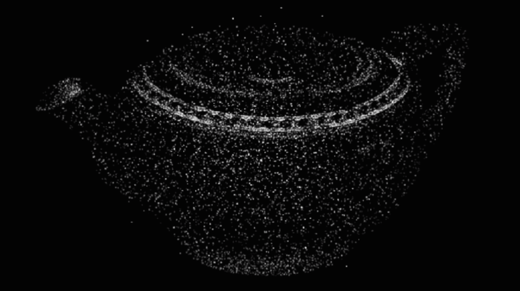
- Imagine if there were multiple tea pots morphing into each other – that way you could really began to see the commonalities in objects
- It’s interesting to think of what an animated advertising campaign might look like, on screens at bus stops or as projections on buildings
- It lends itself well to projections as the points are white
- Don’t worry about the photographs, by abstracting it you can begin to see things you didn’t see before, something of the form, which is good for parts of the collection, like product design
John had some really interesting points, and it was very interesting to think about how the clouds could help viewers see things they didn’t see before. I also really liked the idea of experimenting with animated advertising campaigns, as this could be a lovely way of thinking holistically about the visual identity.
Further iteration
In order to finalise my project I prioritised to respond to Ben and John’s feedback about not using photographs, and to experiment with holistic design, by expanding on the visual identity outside of the internet.
Moving away from photographs
As discussed I wanted to experiment further with exploding of points at the time of hover. I tried to use the animation I already had of the teapot, but unfortunately the animation was too small, meaning it didn’t look like it was emerging from the larger grains. Since it’s just an image overlay, the black edges also covered whatever I was hovering, making the interface look unfinished.
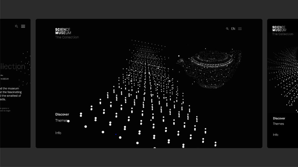
I also spent some time experimenting with ways of portraying the tea pot:
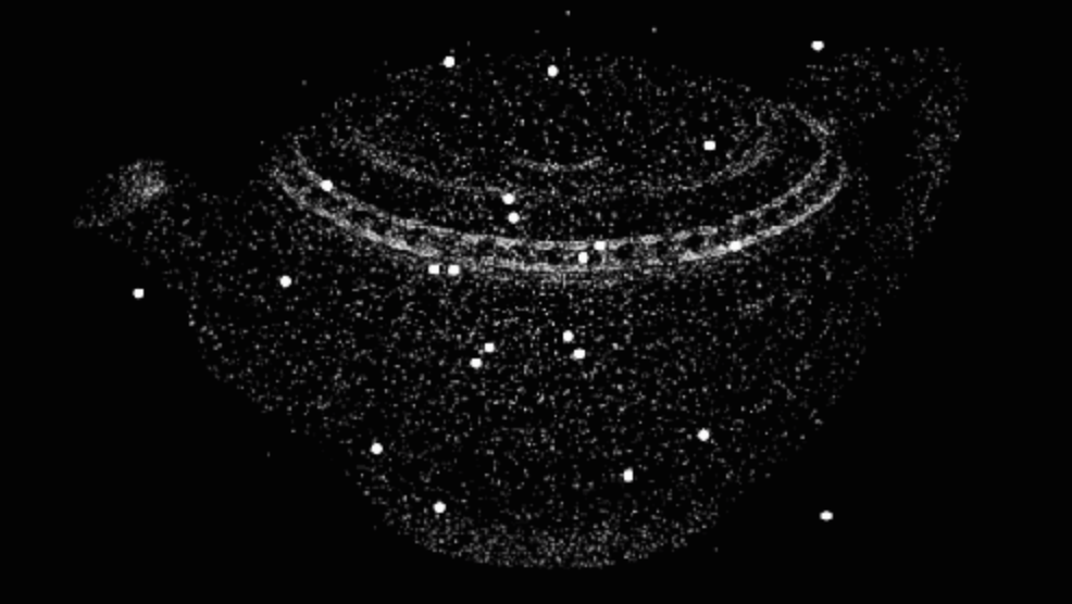

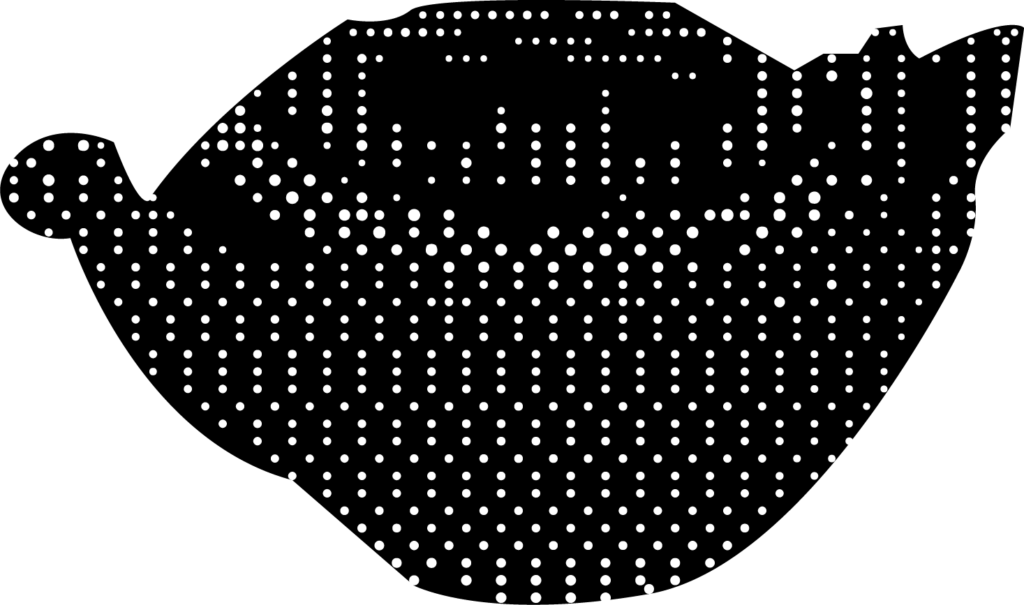
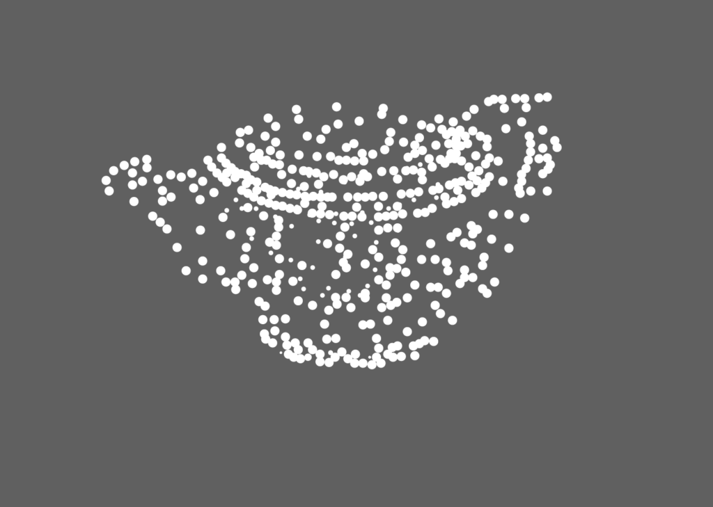
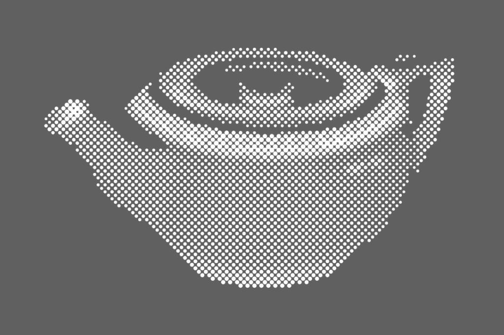
I didn’t quite manage to get to a place where I was happy, but I decided to leave it with the option below, as this was eating up my time. The illustration looks okay when showcased right next to the cloud, but once you start hovering towards the middle, the lines around the GIF become very visible. If the project was real and I had the skills, I would have liked the big cloud to make room for the small cloud, sort of reacting to hovering in the way it moves. I also would have liked to have grains from the large could explode into smaller grains, making up the tea pot cloud.
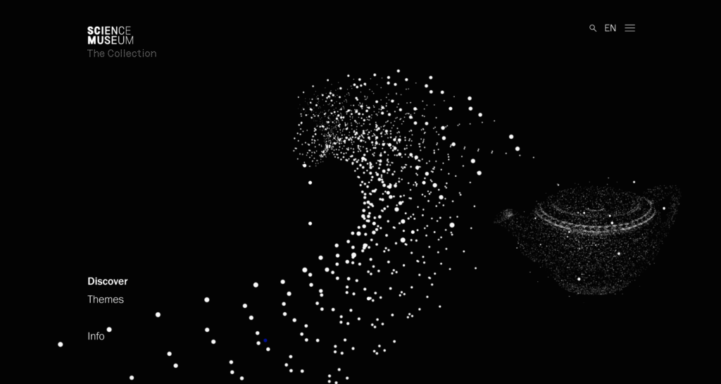
Building a visual identity
I wanted to demonstrate how the interface design could be translated into a holistic system, by experimenting with how it might be used outside the internet. I began to look at physical applications, like staff cards, but also digital advertising channels like digital billboards, Apple Wallet tickets, and building projections. The result can be seen in my final result below.
I also spent quite a bit of time trying to develop an animation morphing from abstract cloud, to tea pot cloud, to logo.
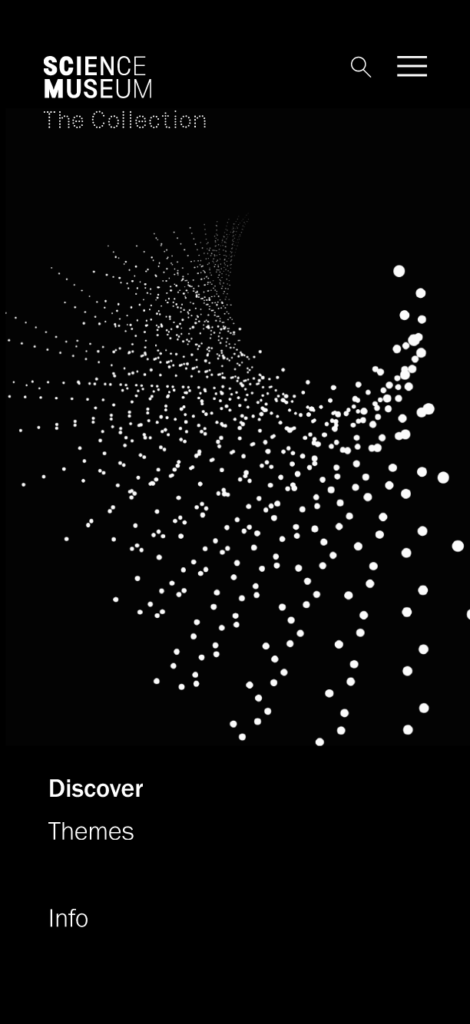
Unfortunately I wasn’t able to get it right in the time I had left. In order to make the presentation of my final result more cohesive, I also built some quick wireframes for what the interface could look like on mobile:
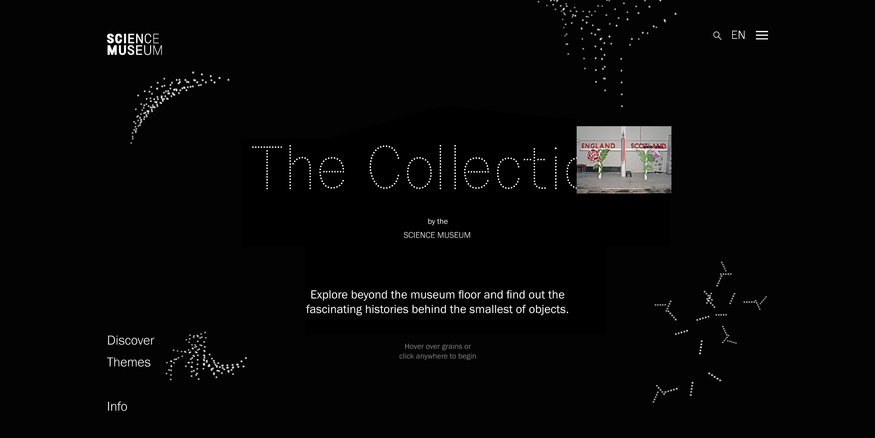
Final result
The interface prototype can be seen here.
In conclusion
This week has been valuable to my project in the sense of bringing everything together into one cohesive concept. Watching DixonBaxi’s talk was an important part of this work, as it made me realise that I didn’t have one set concept yet. By identifying a concept description sentence, I was able to make non-cohesive elements (object pages) part of the sensory design.
Gathering feedback from a range of people has helped me develop my project, but unfortunately there are still relevant points I haven’t been able to respond to. Ben suggested to consider the structure of objects within the cloud, and although this is done to some extent through the Themes page and the tag system, I could have experimented more. For example, if the exploded tea pot point cloud stayed on the page after hover, one could have browsed similar items on the page, without leaving the Discovery page. John mentioned that multiple object clouds could morph into each other, and thus letting us see commonalities. This would have been interesting to explore if I had more time.
Looking at my presentation material (final result), I’m thinking that it needs a sense of lightness to it. The dark mood works well online, but when seeing all applications together, I’m wondering wether I could add some colour to the identity. Some elements, like the animated billboard, is also lacking a sense of dynamics, and if I can find the time I would like to experiment further with layout and additional visual elements. In terms of the projection application I would have liked to think broader, perhaps by considering science and sensory experiences beyond the grain pattern.
My skillset has been a frustrating limitation during the work on finalising my project. I haven’t been able to develop the animations I’ve wanted, and the prototype doesn’t show the exploding point clouds that I’m imagining in my mind. It’s interesting to reflect on wether software like Processing could have made my project more realistic. If I had a few more weeks, it would have been great to experiment with this. However, since I’ve never done so before, using Processing could potentially have resulted in a less refined result, as I would have spent a lot of time trying to figure it out.
REFERENCES:
Astrid Stavro (2017) Here 2017: Astrid Stavro. (Here). Available at: https://www.youtube.com/watch?v=flyDkFe8Duo&ab_channel=It%27sNiceThat (Accessed: 27 November 2021).
DixonBaxi (2019) Glug London: DixonBaxi. (Glug London). Available at: https://www.youtube.com/watch?v=_kWkV3ArK5E&ab_channel=GlugEvents%E2%80%94TalksandNotworking (Accessed: 27 November 2021).
Torsten Posselt et al. (2021) ‘Design Development 2’. Canvas Falmouth Flexible [online], 26 November.
LIST OF FIGURES:
Figure 1. ELEPHANT. 2021. Elephant #45 – Spring/Summer 2021. Elephant Kiosk [online]. Available at: https://elephantkiosk.art/product/elephant-45/
Figure 2. DIXONBAXI. Ca. 2015-2019. Samsung Mobile. DixonBaxi [online]. Available at: https://dixonbaxi.com/samsung-mobile/
Figure 3-6: Ingrid REIGSTAD. 2021. The Collection – logo experiments. Private collection: Ingrid Reigstad.
Figure 7-9: Ingrid REIGSTAD. 2021. Object Page experiments. Private collection: Ingrid Reigstad.
Figure 10-12: Ingrid REIGSTAD. 2021. Cloud experiments. Private collection: Ingrid Reigstad.
Figure 13: Ingrid REIGSTAD. 2021. Cloud experiments. Private collection: Ingrid Reigstad.
Figure 14-18: Ingrid REIGSTAD. 2021. The Collection – interface process. Private collection: Ingrid Reigstad.
Figure 19: Ingrid REIGSTAD. 2021. The Collection – interface process video. Private collection: Ingrid Reigstad.
Figure 20-21: Ingrid REIGSTAD. 2021. The Collection – interface process. Private collection: Ingrid Reigstad.
Figure 22-27: Ingrid REIGSTAD. 2021. Cloud experiments. Private collection: Ingrid Reigstad.
Figure 28: Ingrid REIGSTAD. 2021. The Collection – interface process. Private collection: Ingrid Reigstad.
Figure 29-30: Ingrid REIGSTAD. 2021. The Collection – mobile interface process. Private collection: Ingrid Reigstad.
Figure 31-37: Ingrid REIGSTAD. 2021. The Collection – final result week 11. Private collection: Ingrid Reigstad.