
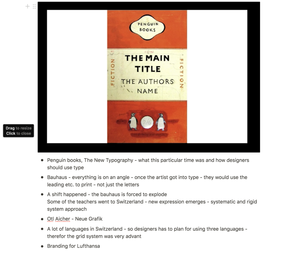
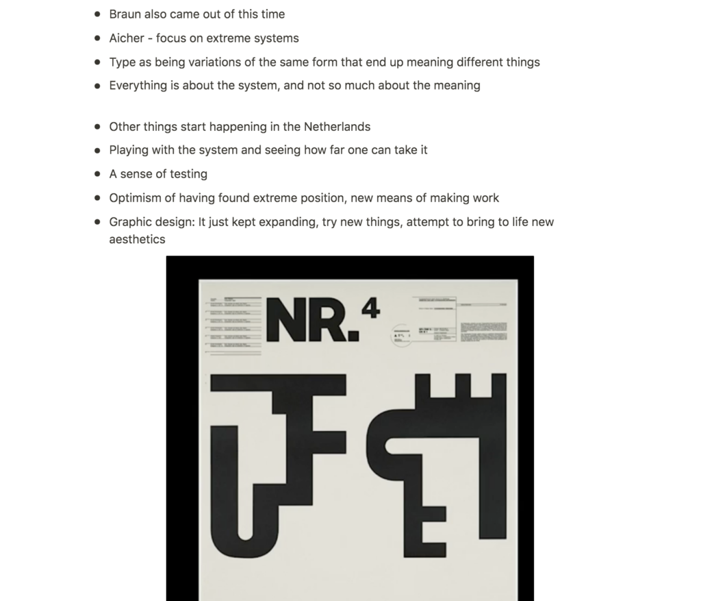
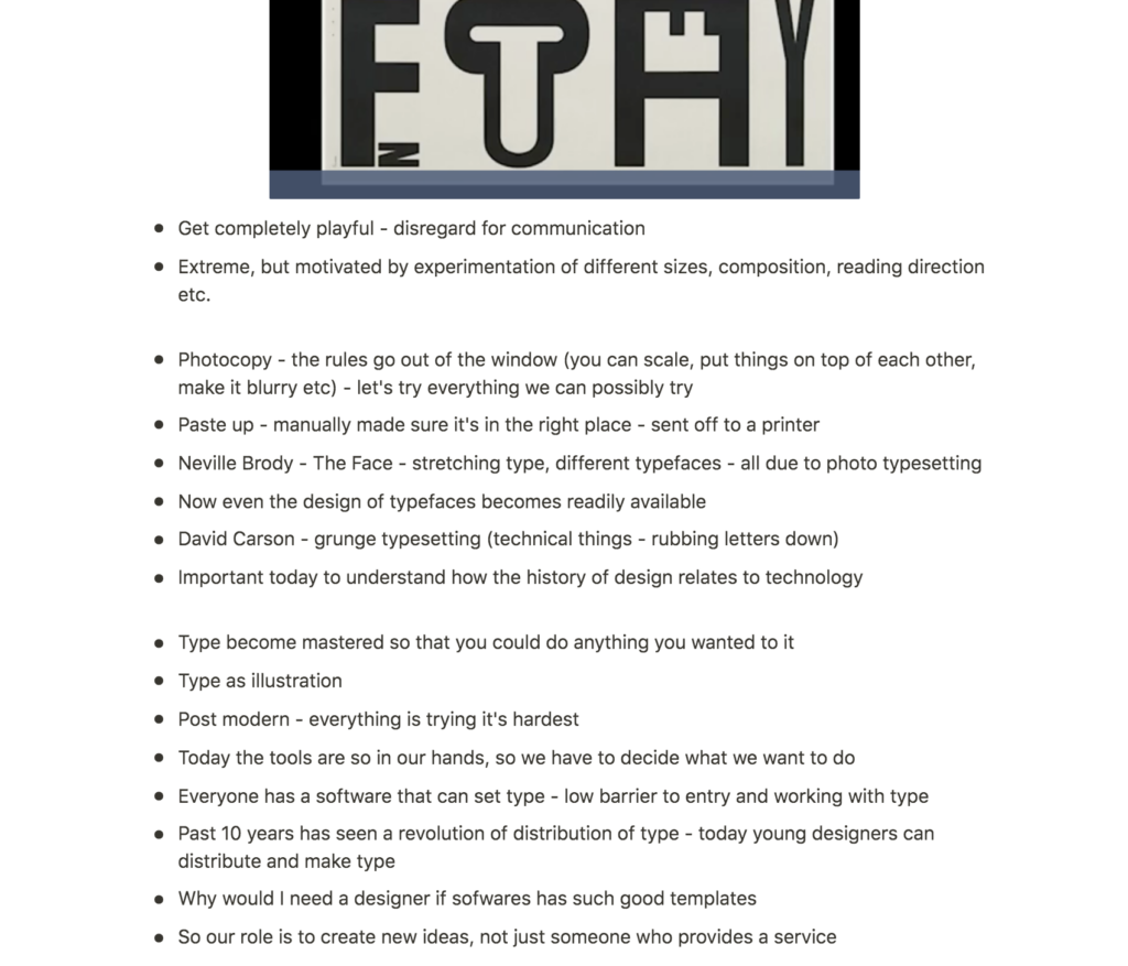
Lecture notes
Lecture reflection
I really enjoyed this week’s lecture and the brief overview of history it provided. I was particularly interested in some of the printing techniques mentioned by Soelling, like letterpress and photo type setting (Soelling, 2020).
Could I do letterpress at home?
I have of course heard about and seen works created with letterpress, but I have never tried the method myself. It might be difficult to test during covid, but I wonder if there are other ways of printing in a similar manner, using what I have available at home. For example, I think it could be interesting to create letter blocks from lino.
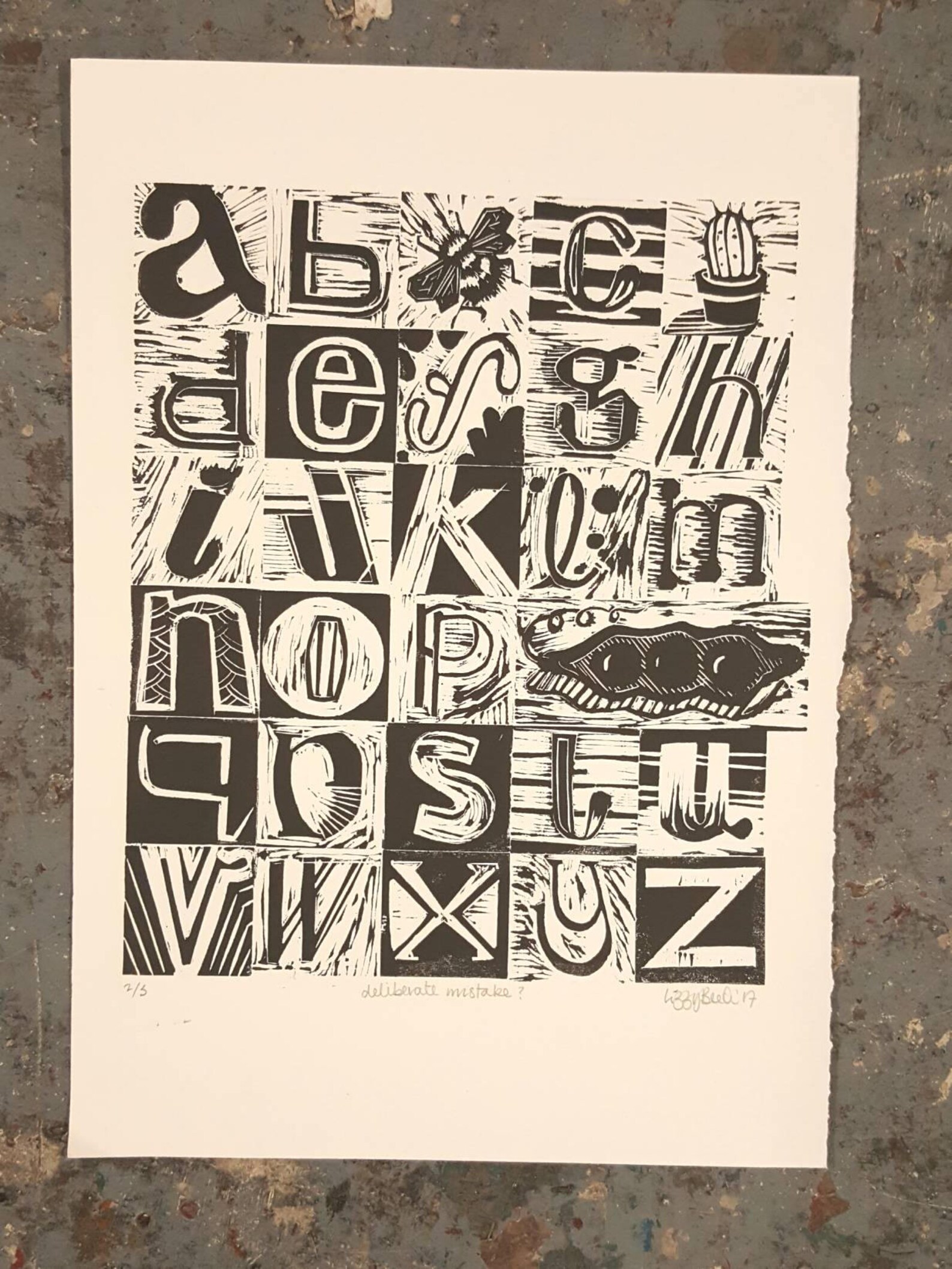
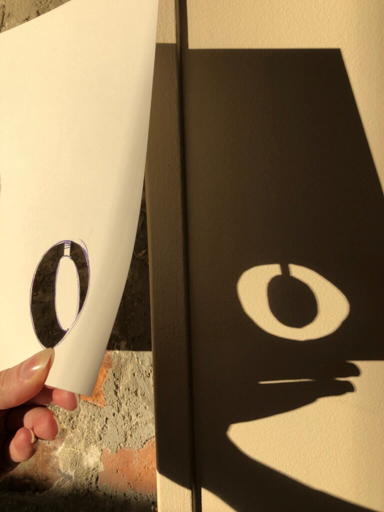
Photo type setting in a dark room
Further, I was very intrigued by the way photo type setting works. I found the technical aspect of this method fascinating, perhaps due to my background in photography. I wonder if one could use this method in a very basic way in a dark room, or perhaps by using light and a camera. Below I have done some quick tests, but unfortunately I didn’t get time to explore this idea further.
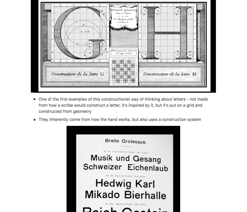
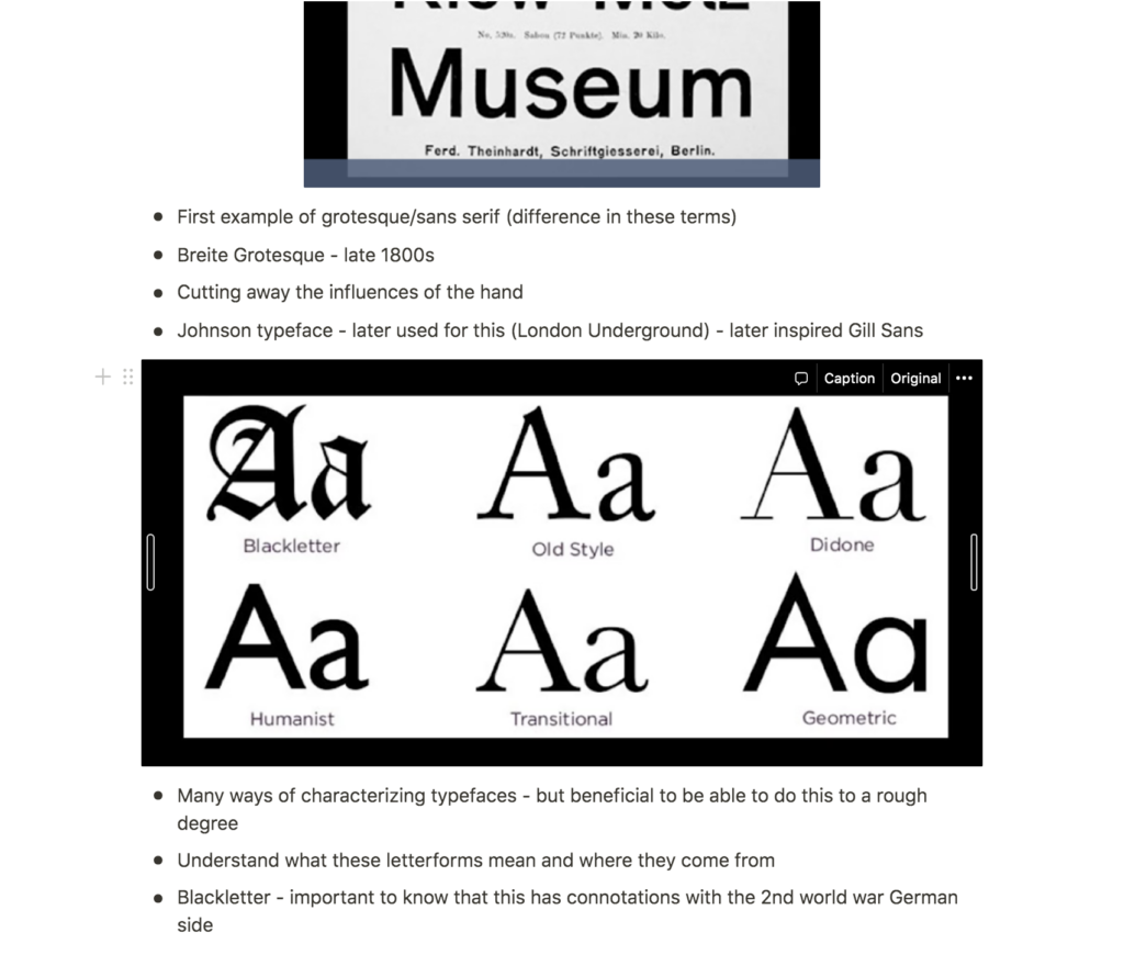
The emergence of grid systems
In terms of works showed in the lecture, I quite liked hearing about Otl Aicher and the emergence of the rigid systematic approach, as well as the grid (Soelling, 2020). The fact that the grid was a result of the many languages in Switzerland was a fun anecdote, and it got me thinking of how one might use the grid to communicate a variety of messages simultaneously. For example, one could create a book which could be read in two directions, by turning half of the paragraphs upside down.

Resource notes
Resource reflection
A unifying approach to typography
The book Type: New Perspectives in Typography had some interesting insights to typography and it’s relevance in today’s societies. I particularly liked the project Typographic Matchmaking in the City, which was based around bilingual typography, resulting in typefaces for the public space that consists of several letter systems. (Kubel and Williams, 2015). I think the fact that many scripts has similar origins is a great foundation for cultural connections, as mentioned in the book (Kubel and Williams, 2015). This notion of us all stemming from the same place in history is quite beautiful, and I love this unifying approach to typography (Kubel and Williams, 2015).

Does typography matter?
Another interesting point from the resource, was how average people don’t necessarily pay attention to typefaces and it’s connotations (Kubel and Williams, 2015). As designers, we don’t only invest effort into the choice of type, we also create type from scratch in order to get it just right. Logos and letters are tweaked and altered to perfection, and so I wonder: could all this effort be for nothing?
As a designer I have to assume that typography does affect non-designers on at least a subconscious level. Although a non-designer might not be aware of typography’s importance in communication, it is safe to say that the type work in the examples below does play an important role in what they portray. On one side you have a surreal and adventurous set of letters, on the other you have clean and modern letters with no sense of adventure (at least in the traditional sense of the word). If I was to switch the letters, surely non-designers would have to interpret the two images differently than they would if viewed in their current state. This could be an interesting research topic for a bigger project.
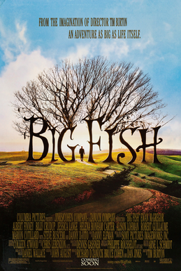
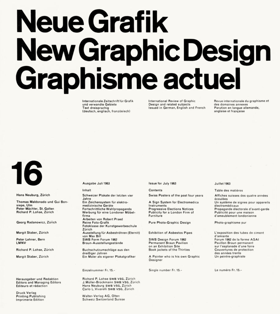
Fig. 6: Vivarelli 1963. Neue Grafik cover. [magazine cover]
Further research
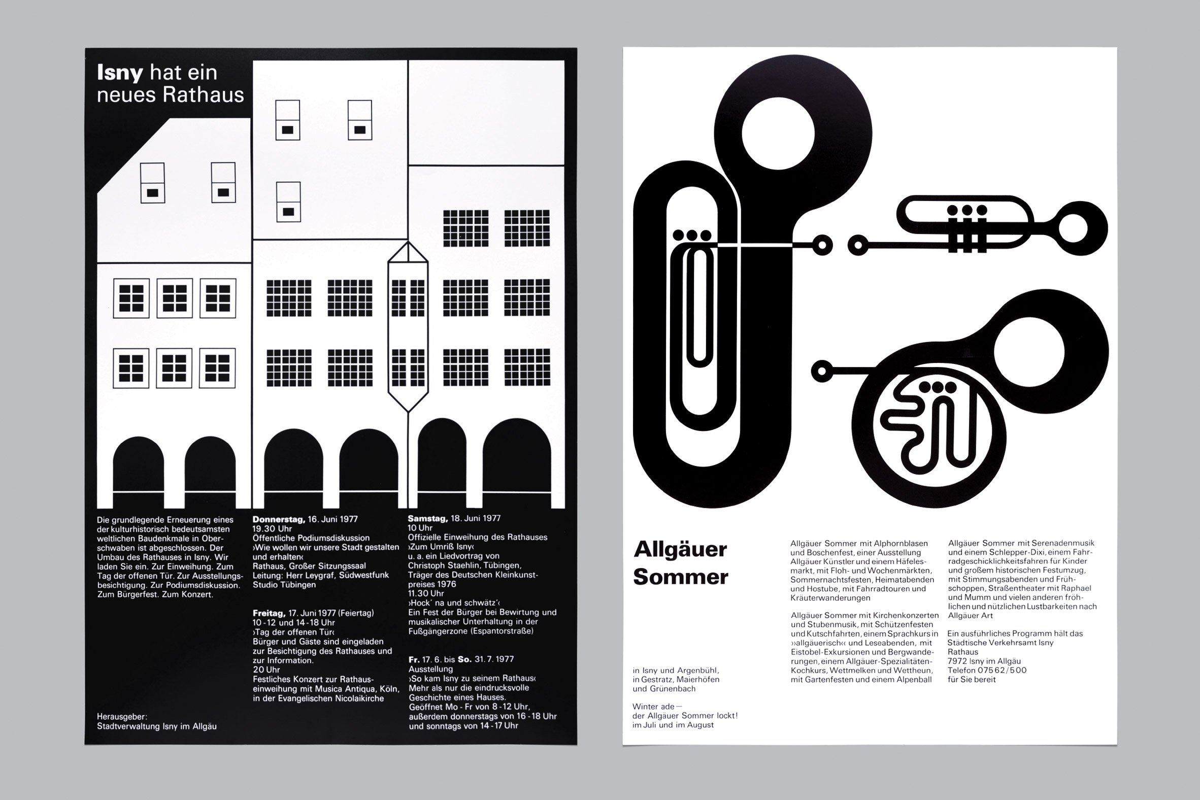
Otl Aicher: Isny
Although this branding project is very much based on illustration, I quite like Aicher’s systematic approach. Perhaps stretching it a bit far, one could almost consider Aicher’s use of illustrated symbols as typography. After all, a system of letters and a system of symbols are both systems with visual connotations to objects or phenomenons.
Aicher’s use of the grid is very simple, but I love his clever way of utilising the it in the illustrations, particularly in the house in the image below. When working with typography, I think I can sometimes go too bold, and so this project has reminded me to try to not go overboard with my typography this week.
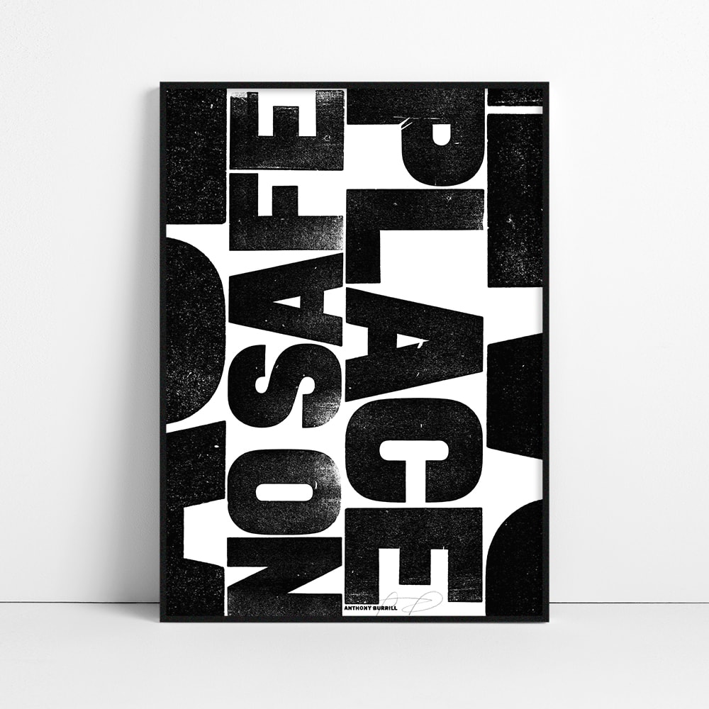
Anthony Burrill
On the note of simplicity, I was very inspired by last week’s lecture by Anthony Burrill. The textures in his work are beautiful and I admire how he manages to create such bold work using very few components. I also really like how Burrill’s work makes you notice the shapes of the letters, which can often go unnoticed when one uses a bunch of elements in one design.
Workshop challenge
Research
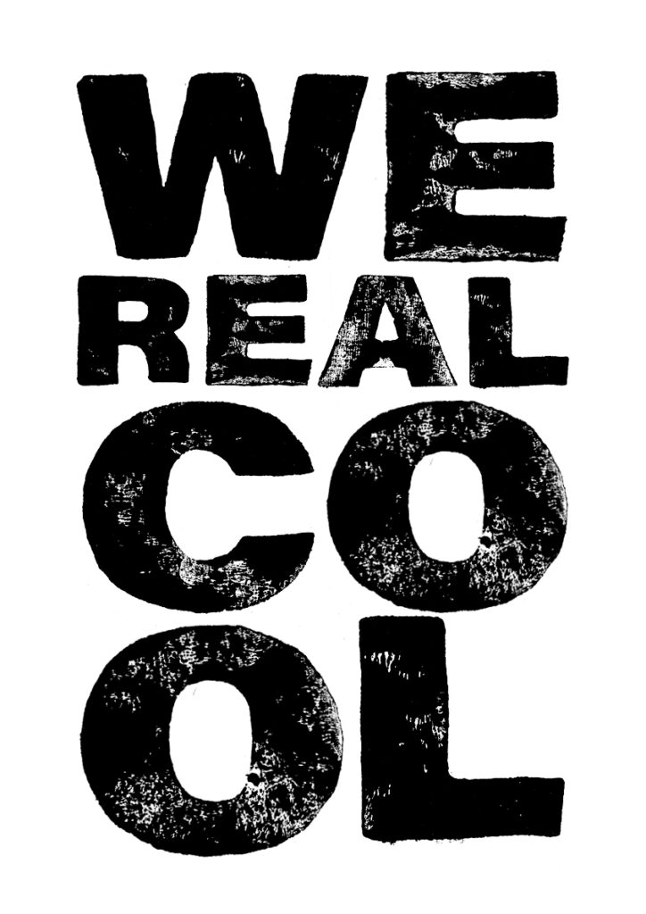
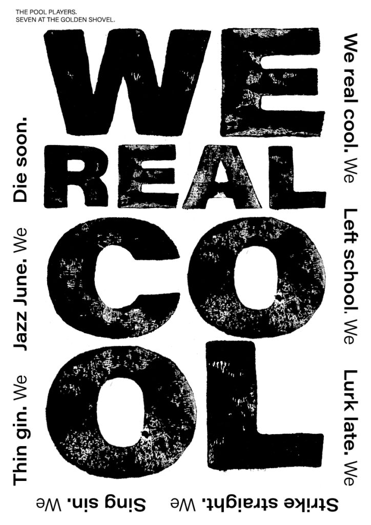
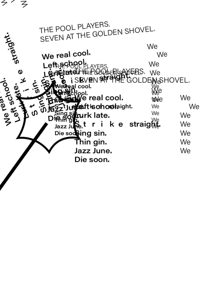
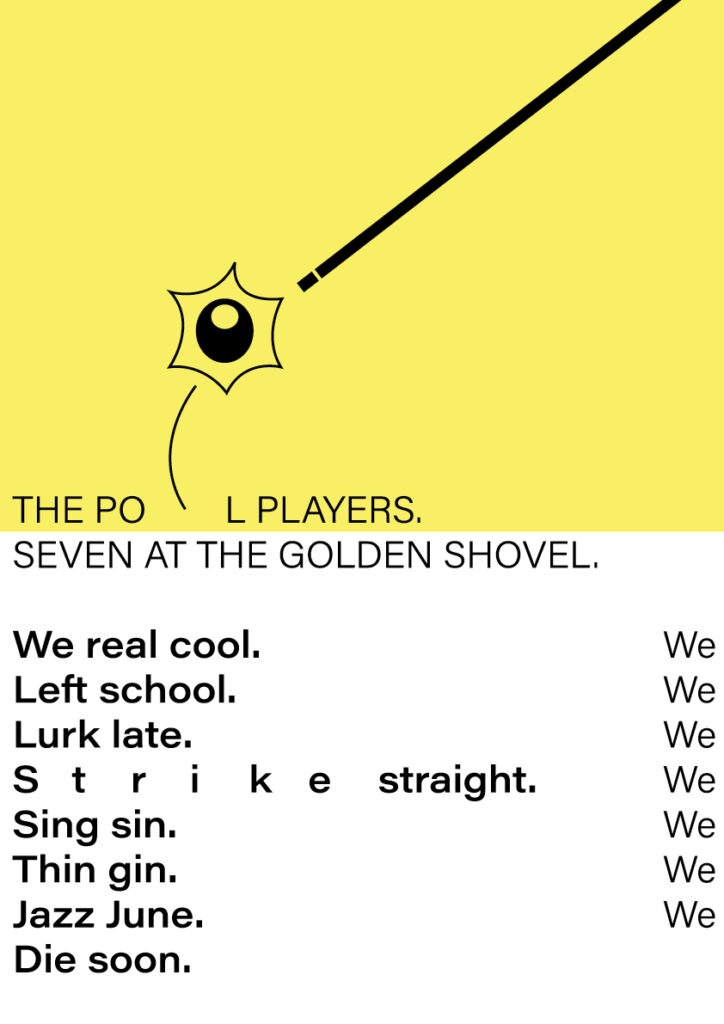
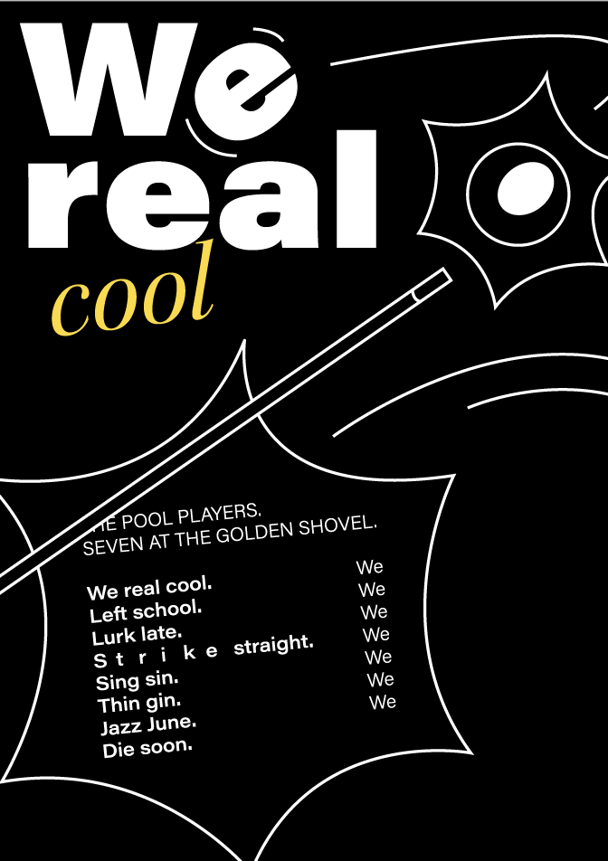
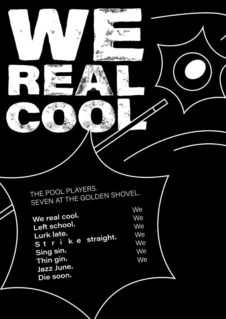
I started my workshop challenge by searching for a poem, as I do like to read, but unfortunately a lot of my favourite books are in Norwegian. Through some research I discovered the poem We Real Cool by Gwendolyn Brooks. I was intrigued by her reading of the poem (found here) as well as her work in general, which documents and comments on African Americans situation in society (Øverland, 2017). The Poem was written in 1959, right after the Civil Rights movement.
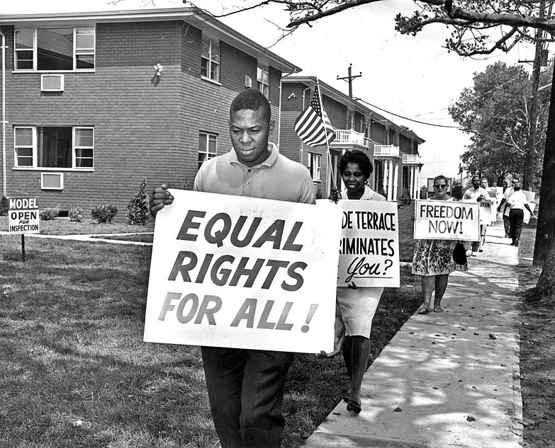
Inspired by last week’s guest lecture with Anthony Burrill, I decided to look at protestor’s posters, as the poem and author seems quite political. I think the boldness and loudness of these suits the poem well. The seven boys have dropped out of school and they seem to think quite highly of themselves. This notion makes me think that the boys are quite loud, as groups of teenagers often tend to be. Further, the boldness of poster typography suits Brooks as an author, as she fought for equality, which resonates with being proud.
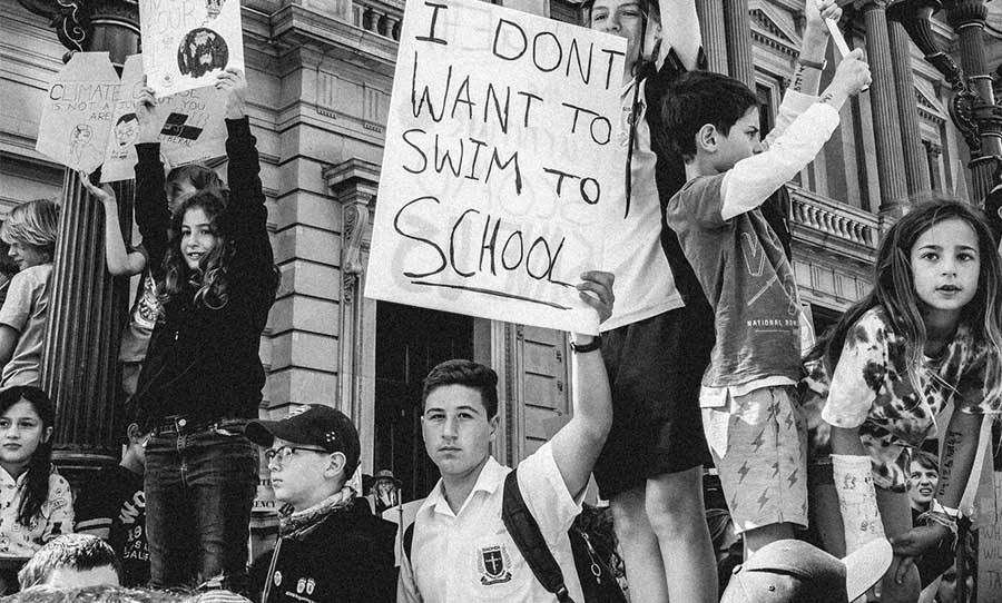
Brooks has described the boys in the poems as being anti-establishment, representing youth and rebellion (Brooks, 1963). I wanted to use this sense of anti-establishment in my design. This made me think of what young people might be protesting against today, like the school strike for climate. I didn’t end up using this in my final result, but I would have liked to explore this further if I had more time.
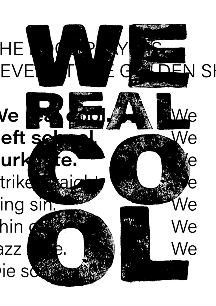
Although the boys’ situation is quite sad, I do think there is a sense of excitement in the poem as well. My interpretation of it is that you should have fun and enjoy life whilst you can, which made me think of the circle of life. The fact that Brooks reads the poem almost as if she’s singing, as well as the mentioning of jazz, made me think about fun and play, which potentially could result in interesting typography. Using this sense of fun could also be a contrasting element to the more serious aspect of the poem.
Further, I was interested in the pool-aspect. The movement of hitting the ball could be an interesting visualisation of boys being cool, constantly making sly comments and constantly having to stay up to date. The game-aspect of it also resonates with the anti-establishment aspect, as if the cues/society is pushing the balls/people around within a set system.

Process
After researching, I went on to sketch out a of the few ideas. I was interested in making something physical (inspired by the lecture) and so I decided to try and print some letters using lino.
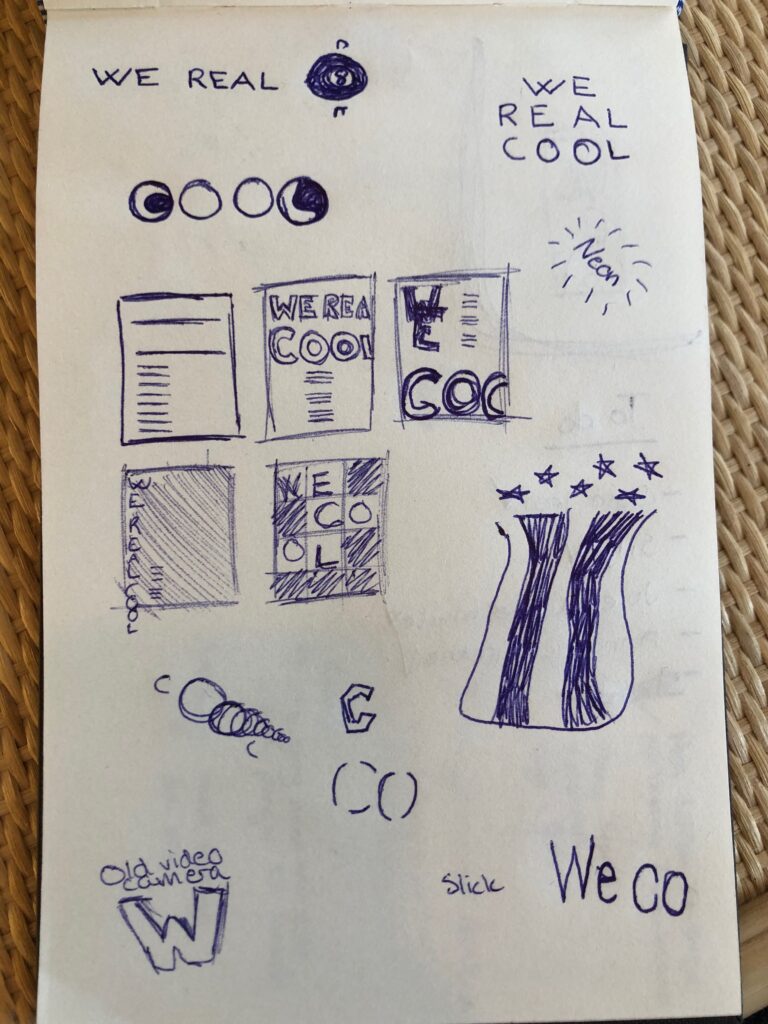
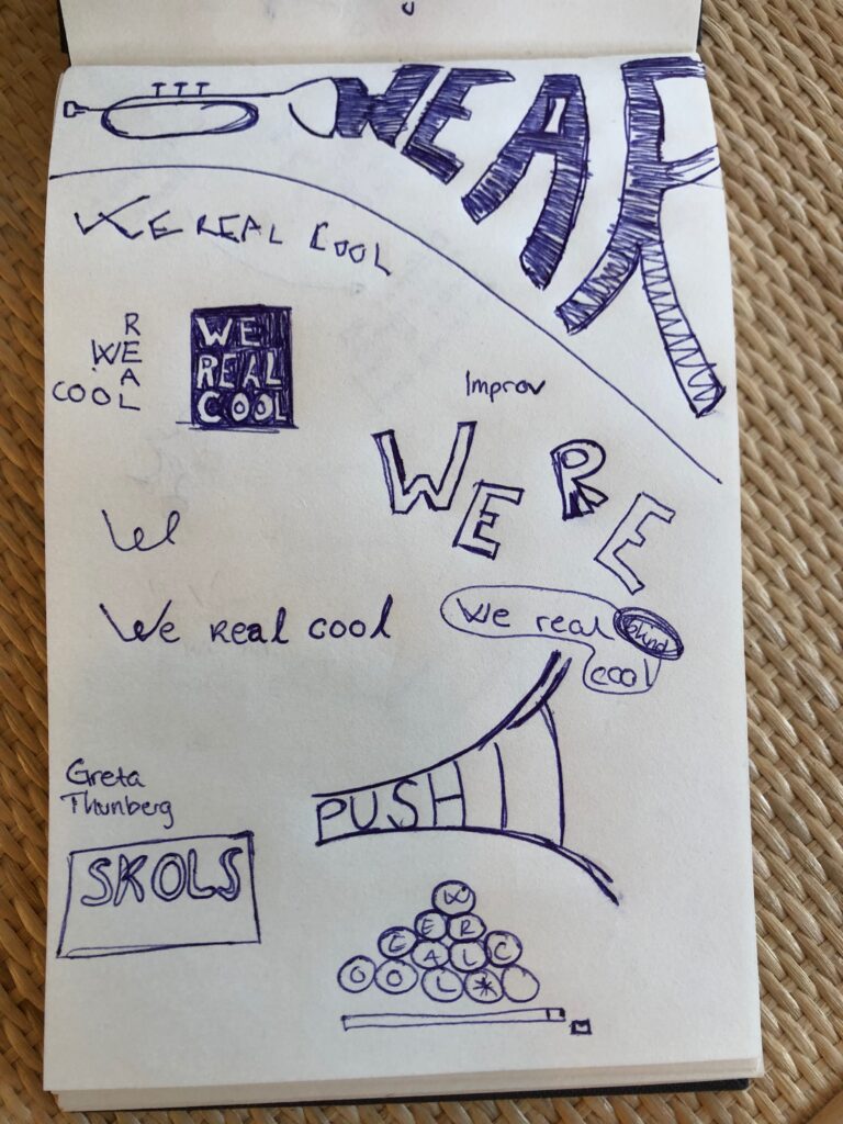
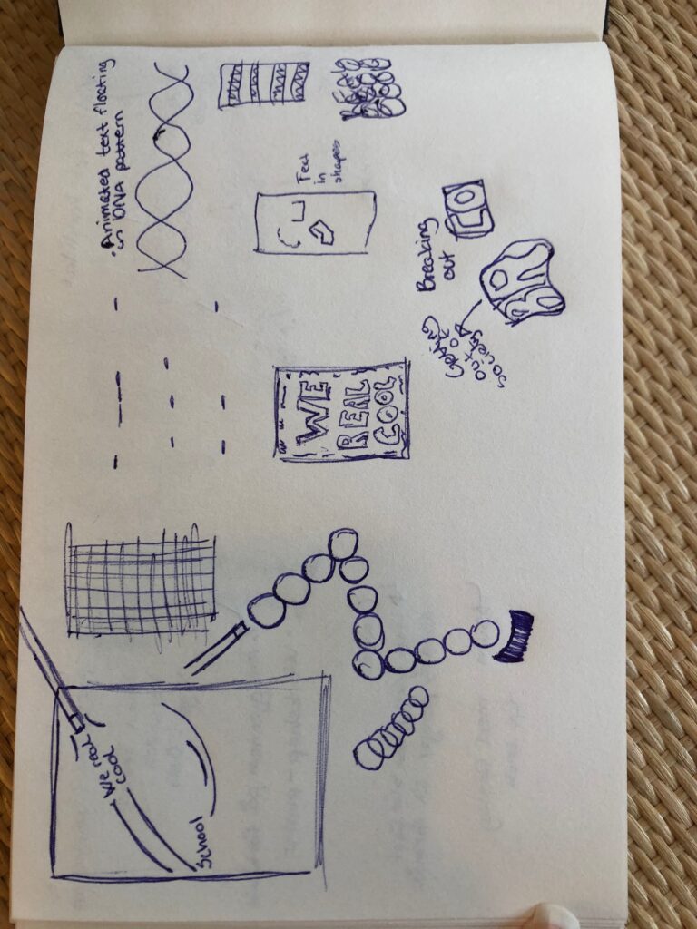
After sketching I had two concepts that I was interested in investigating further. The first was to create a heavily type based design, using hand printed letters that were inspired by the protestor’s posters. This idea was also influenced by Anthony Burrills work. The second was to create a design that played on the aspects of pool. This could potentially become too literal, but I liked the connections between the game and being anti-establishment.
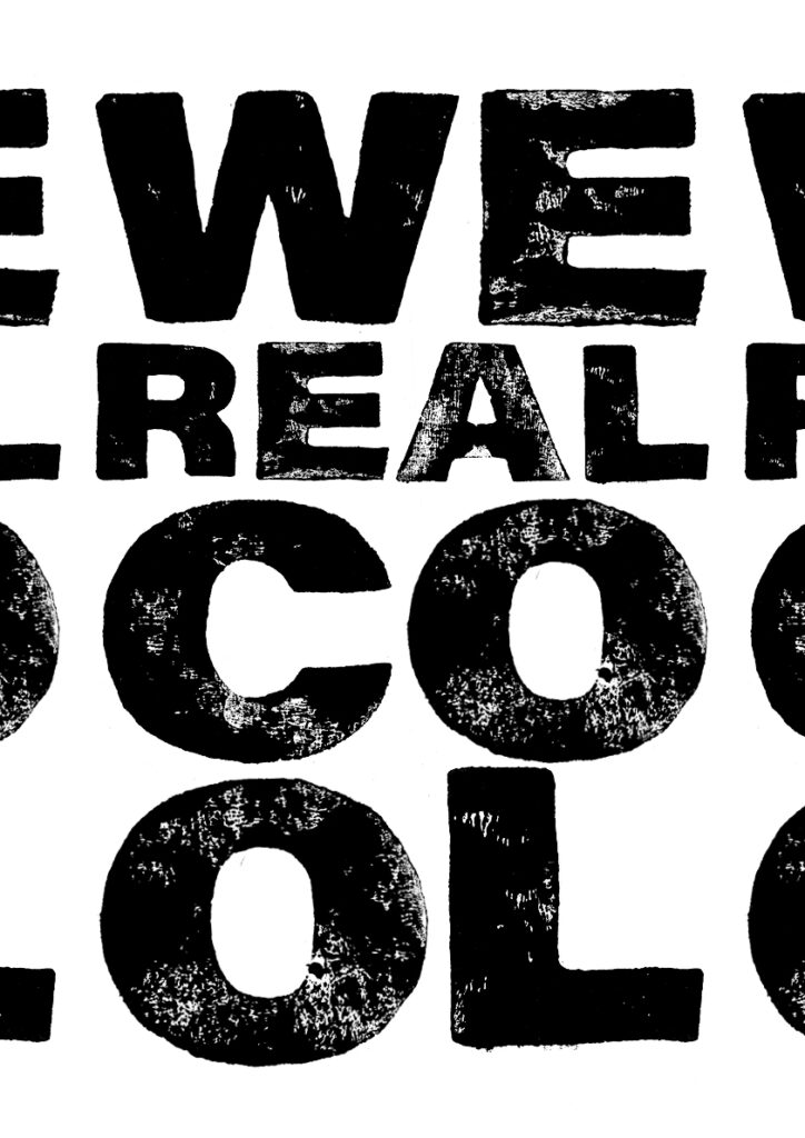
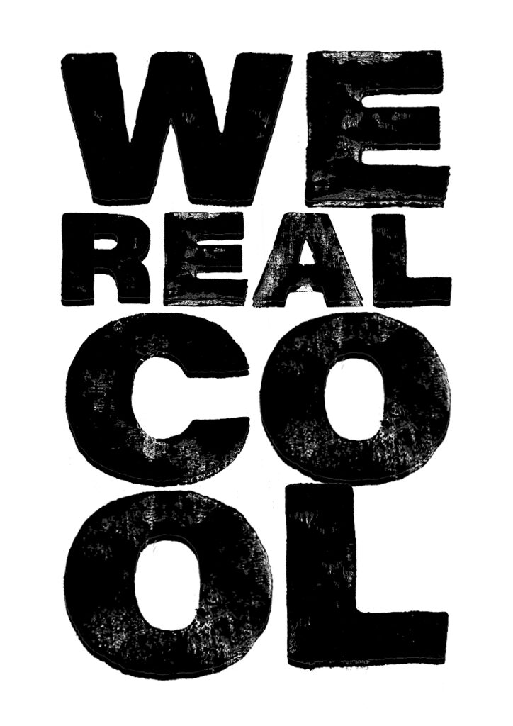
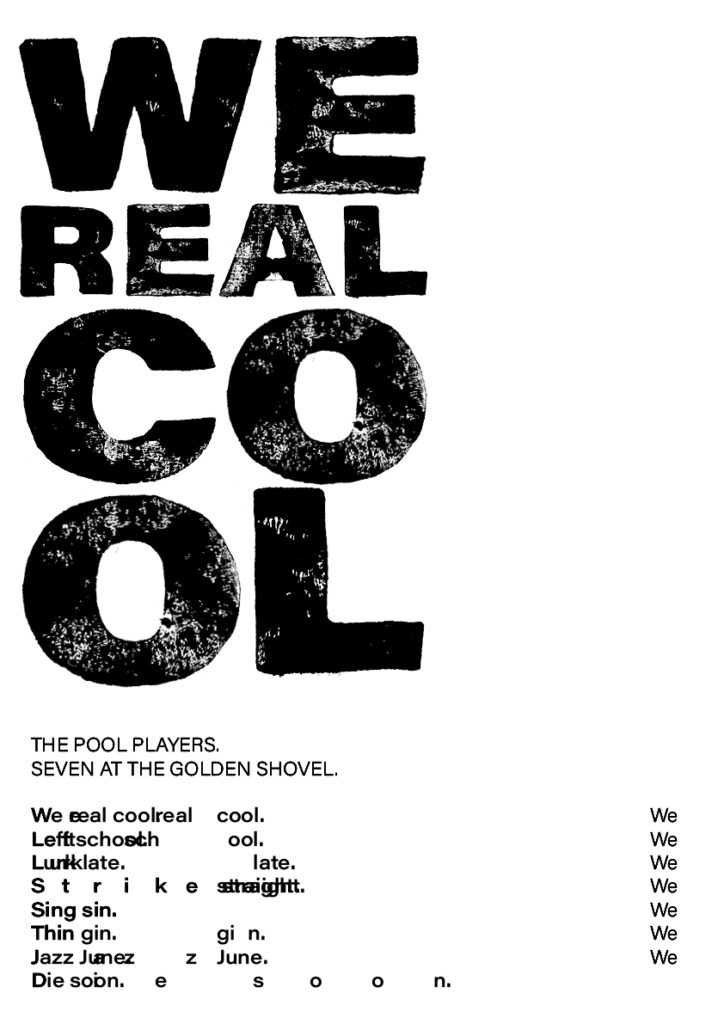
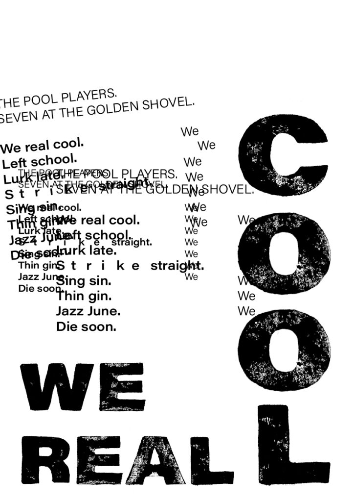
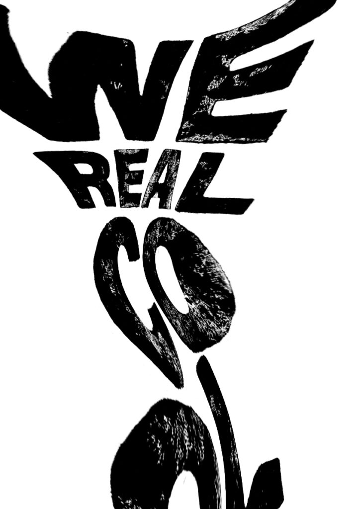
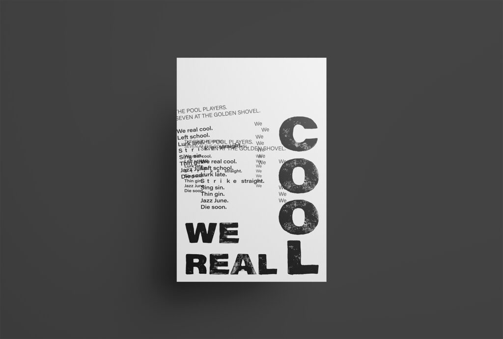
After making the above designs, I decided to take a step back. Coming back to it I felt as if I hadn’t experimented enough with various styles of typography. Unfortunately there wasn’t too much time left, but I still decided to have a quick go at a few tests. I had also gotten an advice from the ideas wall to incorporate my lino printed letters into the pool illustrations, and so I also tested that.
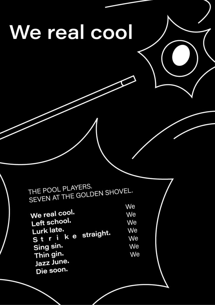
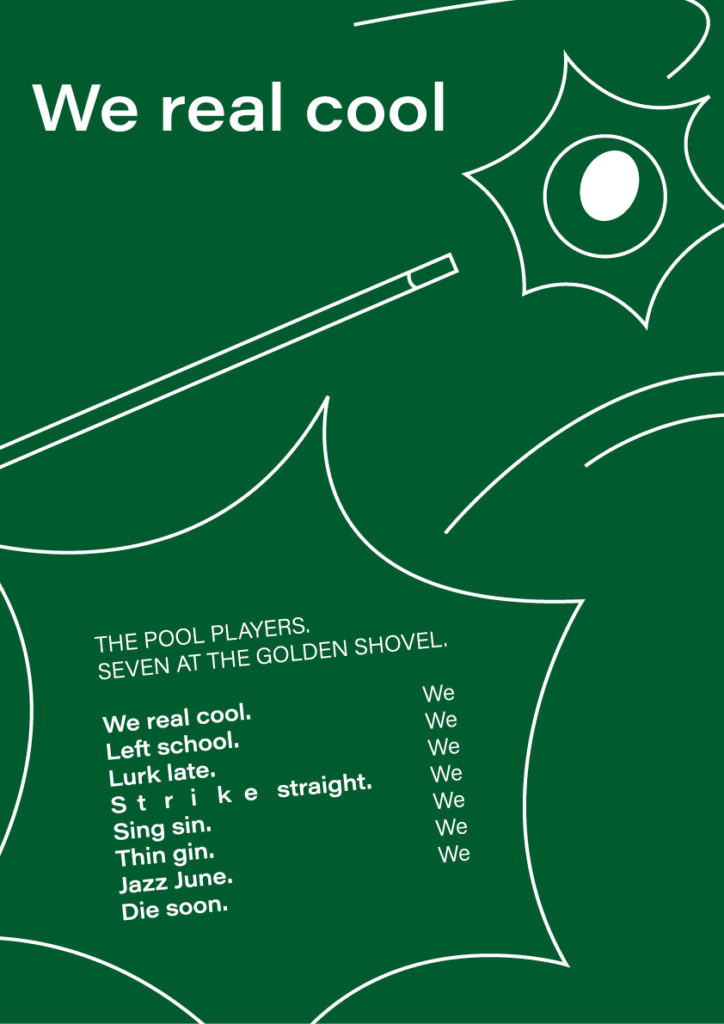
Result
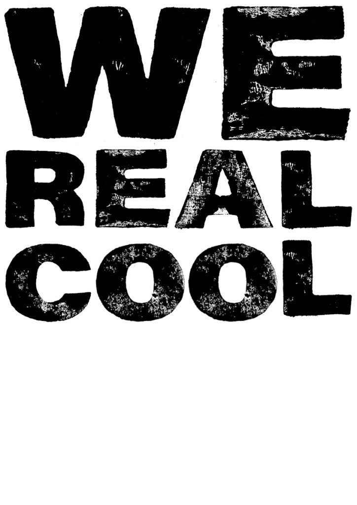
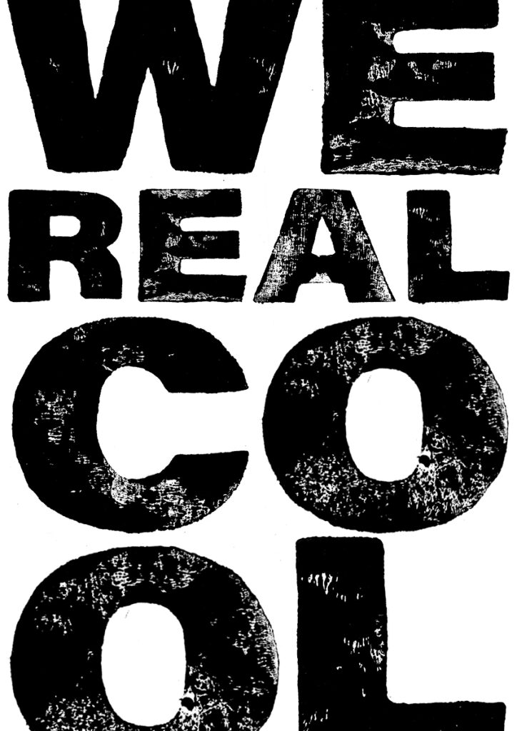
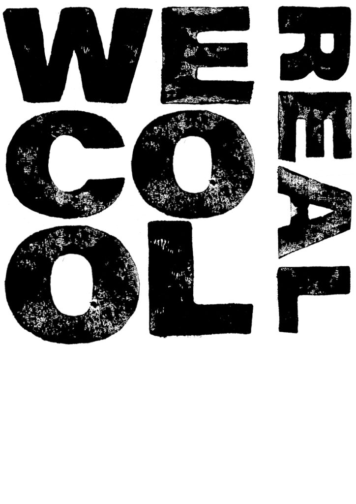
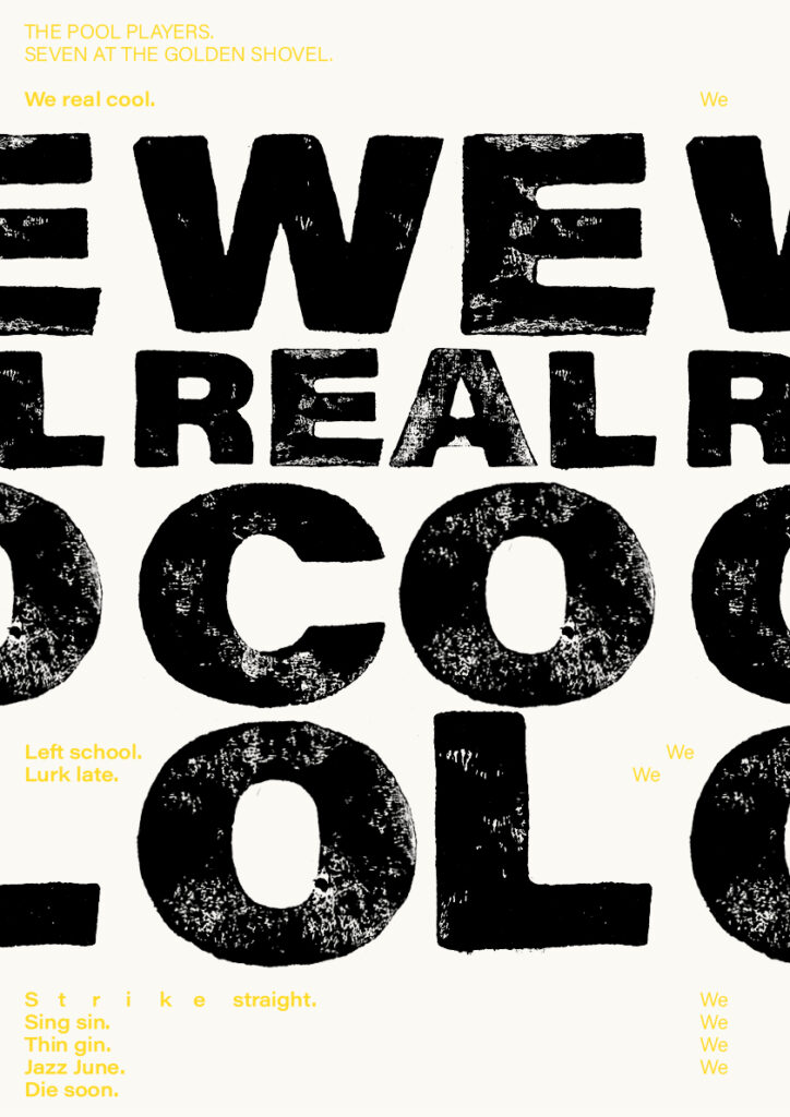
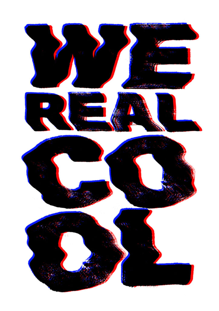
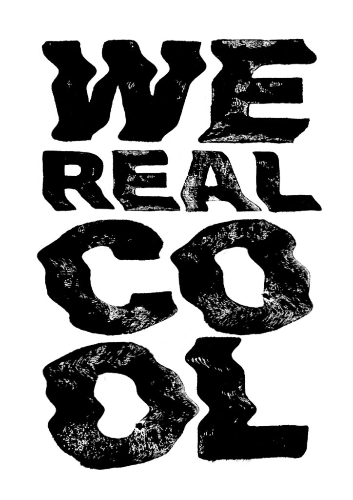
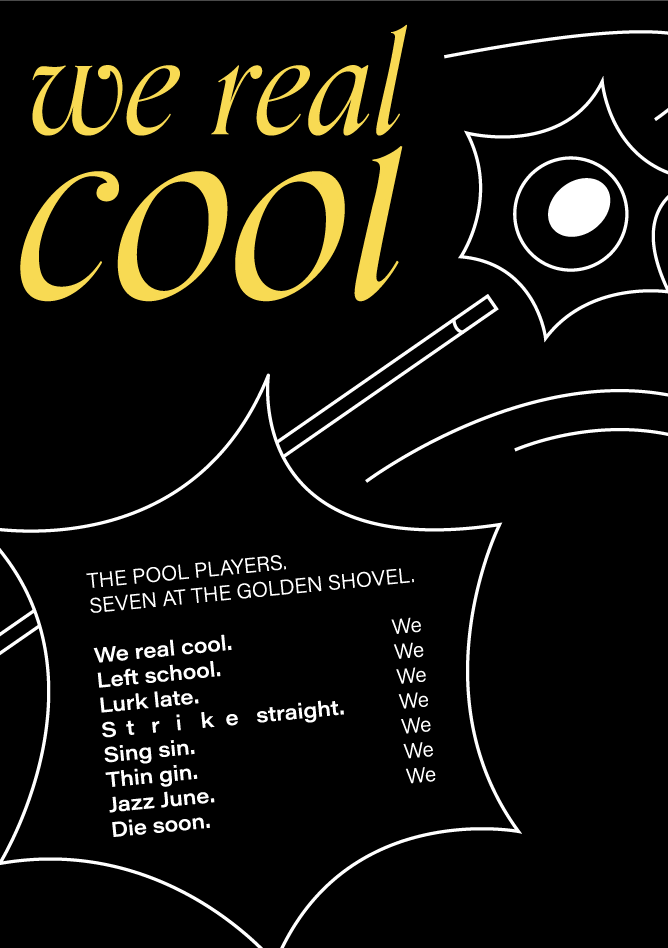
For my final poster I decided to go for a design that communicates through typography, rather than illustrations. I quite liked the messy letters from one of my experiments, as I thought they were a less literal visualisation of the movement in the game of pool. I also think the business of it goes well with the jazziness of the poem. The hand printed block characters are inspired by protestor’s posters, as a symbol of the author’s political engagement, as well as her documenting writings on the civil rights movement.
I have to admit that I think something is missing in my result for this week. Looking back, I would have liked to experiment further with a variety of type styles, rather than choosing two set directions early in the process. Looking back, I probably could have worked longer on my title/first line (as the assignment asks), before starting the whole poster, perhaps by trying to create my own letter forms. This could have resulted in a foundation which I could have based my further designs on.
In conclusion
The best part of week 10 was definitely to gain a deeper understanding of typography through the historic overview provided in the lecture. I am quite fond of the modern, but I also enjoy looking to the past for inspiration, both in therms of visual style and methods. Thus, it was fun to hand print letters for my lino type. I am very interested in testing letterpress when society opens up, as I believe that method will provide a more sophisticated look than my hand printed letters have.
Looking back at my resource reflections, I am still interested in the book Type: New Perspectives in Typography. It definitely could have been interesting to look into unifying typefaces this week, as my poem was discusses culture to a large extent. The point of going back in history and looking at our roots as a unifying aspect is still very interesting to me, and something I would have liked to explore further.
Although I loved the tactile approach of hand printing, the lino cutting process was time consuming and left less time for further typography exploration. I do like the raw and organic look of the letters, but in my final result I unfortunately think they look a bit too edgy. I wonder if I could have created a more contemporary design had I hand printed a different typeface. Either way, I would have liked to experiment further with different typefaces and methods (particularly through combining different typefaces), as well as with leading, positioning and stresses on particular words in the poem.
REFERENCES:
Brooks, G. (1963) We Real Cool. Available at: https://poets.org/poem/we-real-cool (Accessed: 26 November 2020).
Kubel, H. and Williams, S. (2015) Type: New Perspectives in Typography. London: Laurence King.
Øverland, O. (2017) ‘Gwendolyn Brooks’, Store Norske Leksikon [online]. Available at: https://snl.no/Gwendolyn_Brooks (Accessed: 26 November 2020).
Soelling, K. (2020) ‘Typography’. Canvas Falmouth Flexible [online], 20 November.
LIST OF FIGURES:
Figure 1. Lizzy BEECH. ca. 2010-2020. Alphabet lino cut print; multiple lino tiles, each letter is individually carved and then grouped together and printed using a press. Etsy [online]. Available at: https://www.etsy.com/no-en/listing/562559048/alphabet-lino-cut-print-multiple-lino
Figure 2: Ingrid REIGSTAD. 2020. Light type experiments. Private collection: Ingrid Reigstad.
Figure 3. Otl AICHER. 1962. Lufthansa logo. Shillington [online]. Available at: https://www.shillingtoneducation.com/blog/otl-aicher-tbt/
Figure 4. Huda Smitshuizen ABIFARÈS. 2011. Typographic Matchmaking in the City. Typotheque [online]. Available at: https://www.typotheque.com/books/typographic_matchmaking
Figure 5. Unknown maker. 2003. Big Fish Theatrical release poster. [3D manipulated photograph with overlayed text]. Wikipedia [online]. Available at: https://en.wikipedia.org/wiki/Big_Fish#Release [accessed 26 November 2020].
Figure 6. Carlo VIVARELLI. 1963. Neue Grafik cover. Fonts in Use [online]. Available at: https://fontsinuse.com/uses/15395/neue-grafik
Figure 7. Otl AICHER. 1972. Isny. Dezeen [online]. Available at: https://www.dezeen.com/2017/09/23/otl-aicher-isny-exhibition-graphic-identity-posters-iconography-germany/
Figure 8. Anthony BURRILL. 2020. No Safe Place. Anthony Burrill [online]. Available at: https://anthonyburrill.com/showcase/no-safe-place/
Figure 9. Unknown maker. ca. 1954-1968. No title. [black and white photograph]. Chicago Unheard [online]. Available at: https://chicagounheard.org/blog/civil-rights-movement-wasnt-just-march/ [accessed 26 November 2020].
Figure 10. Jamie WDZIEKONSKI. 2019. No title. Happy Magazine [online]. Available at: https://happymag.tv/jamie-wdziekonski-chats-protest-photography/
Figure 11. Gabri MOLIST. 2018. ASONANCIA. Behance [online]. Available at: https://www.behance.net/gallery/66407771/ASONANCIA-Comic-book
Figure 12-26: Ingrid REIGSTAD. 2020. Workshop challenge week 10 tests. Private collection: Ingrid Reigstad.
Figure 27-32: Ingrid REIGSTAD. 2020. Workshop challenge week 10 tests 2. Private collection: Ingrid Reigstad.
Figure 33: Ingrid REIGSTAD. 2020. We Real Cool. Private collection: Ingrid Reigstad.