Resource reflection: Introductory practice case studies
Notes on lectures can be found here.
Alec Dudson: Publishing Multiplatform
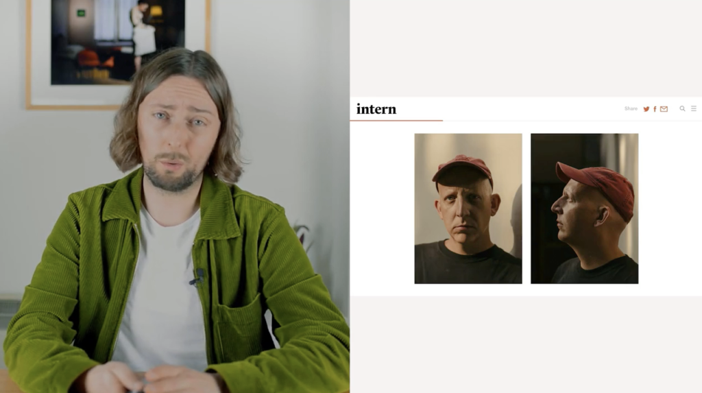
Variation and innovation were some key themes that I took with me from Dudson’s talk. As a designer I love to learn new skills and there is a temptation of developing a project that is almost more art direction led than purely design focused. This would necessarily have to be for the final outcome, but I’d like to at least consider using photography, video and animation as tools for visualising and communicating my research.
I was fascinated by how Dudson managed to develop a range of branding concepts due to the nature of Intern’s use of individual feature series. In terms of outcome it would be lovely to have developed more than one final product, as a way of experimenting as much as possible, but also as a way of developing a varied skillset.
Intern’s way of balancing between publishing platform and production studio fascinated me as well, as it made me reflect on what a design studio should and shouldn’t be. The idea that a design studio can act as a brand on it’s own, rather than a plain service, could be an interesting approach for an MA project if I was to take an entrepreneurial route.
Joseph Pochodzaj: Social Change UX
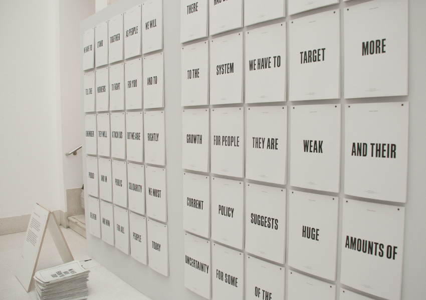
A theme I keep coming back to in my work is the environment and how we as designers can contribute to solving issues related to climate change. I’ve therefore considered researching how various design studios consider sustainability in their work, and perhaps use the findings in some sort of guide (similar to the principles of designing for all ages, mention by Pochodzaj (Joseph Pochodzaj, 2022)). However, in his lecture Pochodzaj stresses that designers should not address their critique at their own discipline, but rather at social and political phenomena (Joseph Pochodzaj, 2022). If choosing the environment as theme (I would of course have to narrow this down), perhaps I’d end up with a more interesting, and not to mention valuable, project if I was to look outside of graphic design.
Pochodzaj’s way of publishing research throughout a project was of great inspiration, as I’ve been thinking that I’ll need to be making from an early stage in this project, in order to develop and experiment as much as possible. This is something I loved doing in the Contemporary Practice module, and perhaps a good method for moving my project forward continuously.
Ben Evans James: Academic Creative Practice
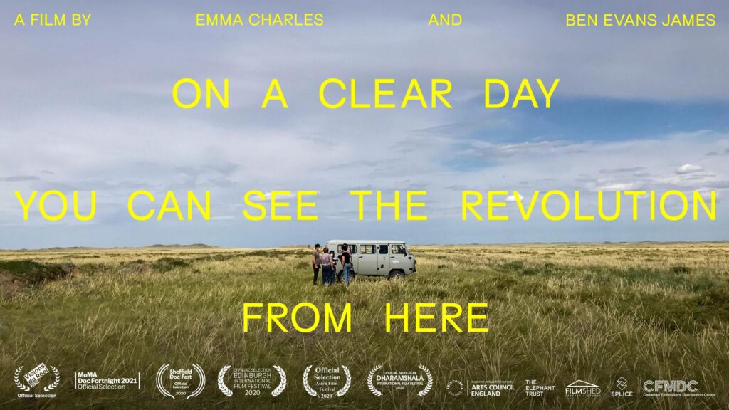
James’ lecture was a great resource for academic writing, but what I liked the most about it was his discussions on the structure of PhD’s, where you make, write, draw conclusions, and then make again (Ben Evans James, 2022). In relation to the above reflections I think this is a structure I’d like to incorporate in my MA project, even if the making only turns out to be methods for experimentation and understanding the collected resources. The fact that making and experimenting is also a form of research has become clear to me through the MA, and I’d like to cater for this when moving on to develop a project plan.
Reviewing previous projects
Coming into this module I didn’t really have a clear idea of what I wanted to base my project on. In order to get an overview of the module I set up a page in Notion where I could reflect through the project, develop aims, objectives and project plans, schedule and keep track of various information. Here I attempted to establish goals for the first four weeks.
As a start I decided to go through all the projects I had done previously in the course, in order to understand more about what I do and don’t enjoy working on, but also how I like to work. The full overview of reflections can be read here, and the main insights can be read below.
The Science Museum: The Collection
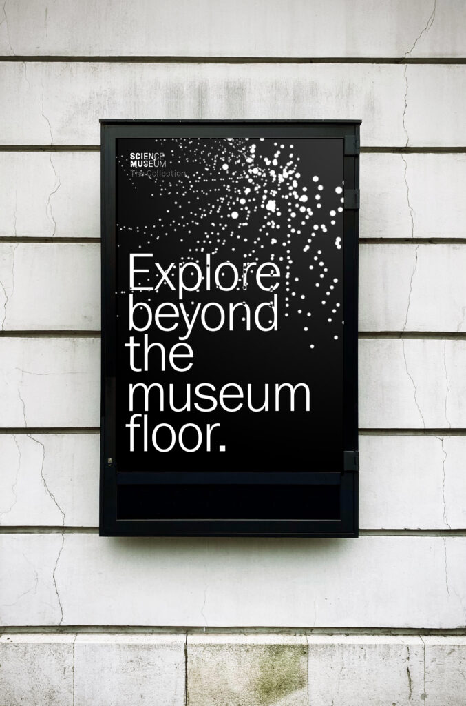
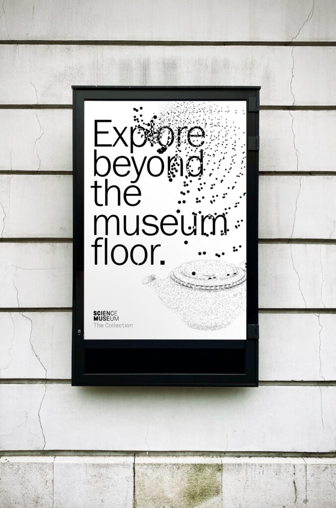
My most recent project was The Science Museum brief, where I developed an online discovery tool, which extended into a visual identity system for the museum’s online collection.
Throughout the project I struggled with identifying a clear concept and focus. I really wanted to build something usable, but at the same time I was doing this abstract project about sand grains. Part of the issue might have been that I focused a lot on the act of browsing, and the experience of the website, when my actual interests and skillsets are more revolved around developing visual systems. I struggled making the project “my own” and the final solution felt a bit too art based, at the same time as it wasn’t very experimental.
Further I think the project was a bit too broad, and that I might have benefitted from having a narrower focus.
What I enjoyed the most about this project was the animation experiments, and the attempt of using these to establish a visual identity. It was also great to develop initial ideas and concepts based on science and technology phenomena. Using concepts from archives and nature is a method I’d like to incorporate in my MA project.
Modul
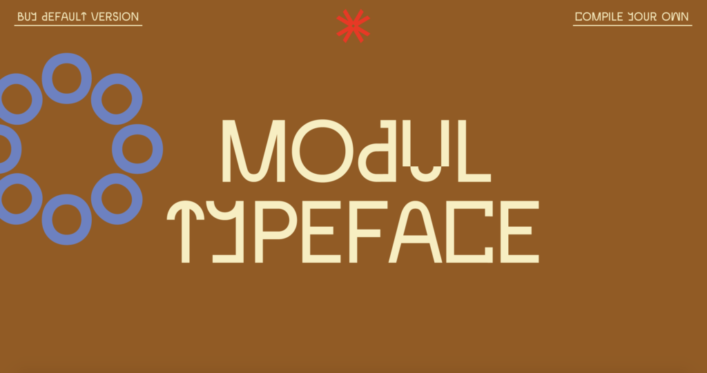
This project, where I developed a modular typeface system, is probably my favourite to date, both in terms of outcome and process. I loved spending so much time in Glyphs, letting my intuition guide me, whilst also being mindful of how the letterforms related to the second hand furniture examples that were the source of inspiration for the project. Although typography was a key factor for the enjoyment, I also think the development of a visual system played an important role – experimenting within an environment of limitation helped me develop unique outcomes.
The conceptual development stage of this project was also very enjoyable. I liked incorporating concepts from other disciplines into my own project, and the visual translation from physical objects to graphic design was interesting. I liked working out solutions to the questions what is a democratic typeface? and what is a circular typeface? – perhaps because I’m interested in the themes of sustainability and democracy, but I think it was also due to the abstract nature of the questions.
SAMLA
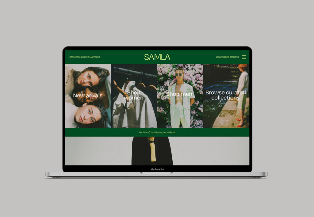
In this project I developed SAMLA – a second hand fashion brand which tackled young people’s issues with buying used clothing. I enjoyed taking more of an art direction role as I attempted to build a business concept rather than solely a website and branding system. By choosing to develop systems for photography, product development and distribution, I ended up doing more of an entrepreneurial project, which felt quite rewarding.
I would definitely have liked to look further into circular shopping, as well as more general societal structures that can help us move towards a sustainable future. This could potentially be a good theme for the MA project, as it would let me do lots of research, but also open up the possibility for designing speculative shops, governments, spaces etc., which could let me explore projects similar to Modul.
Successful methods
Whilst analysing other projects as well as the above, I realised that several of my successes were related to ways of working, rather than just themes and applications. For example, when revisiting a copy writing and branding project I did, I remembered how it had been useful to first write a piece of copy and then to design based on the tone of voice. The self initiated projects we did for creative writing had the same effect, as I really enjoyed using writing to come up with rather abstract ideas, which could then be used in the visual development process.
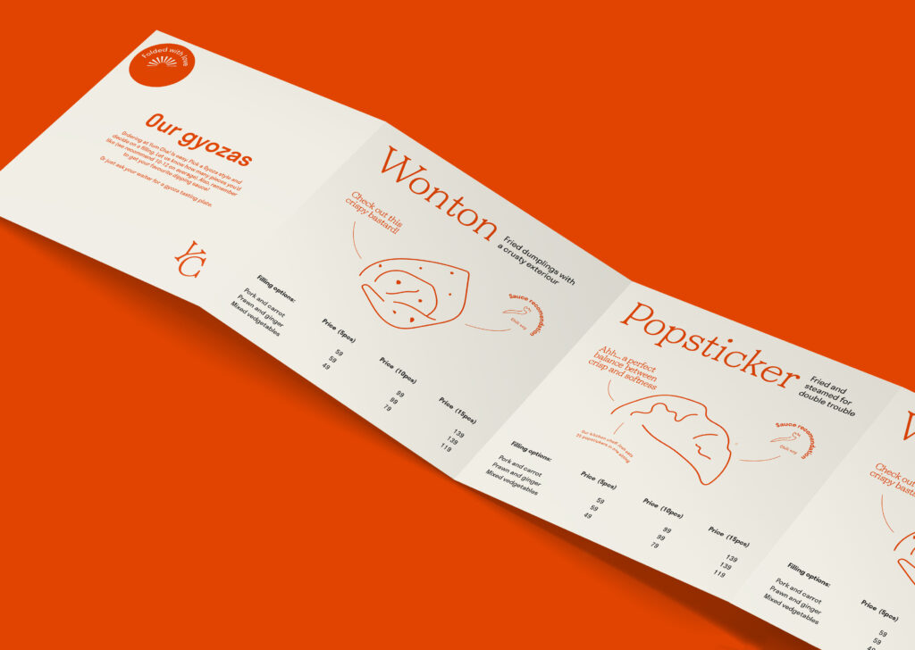
Writing regularly on this blog will thus be important throughout the project, but it could also be interesting to experiment with writing as a bigger part of my process, for example by adopting creative writing as a research method.
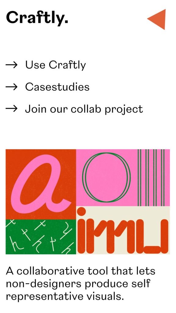
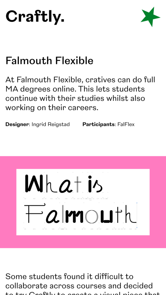
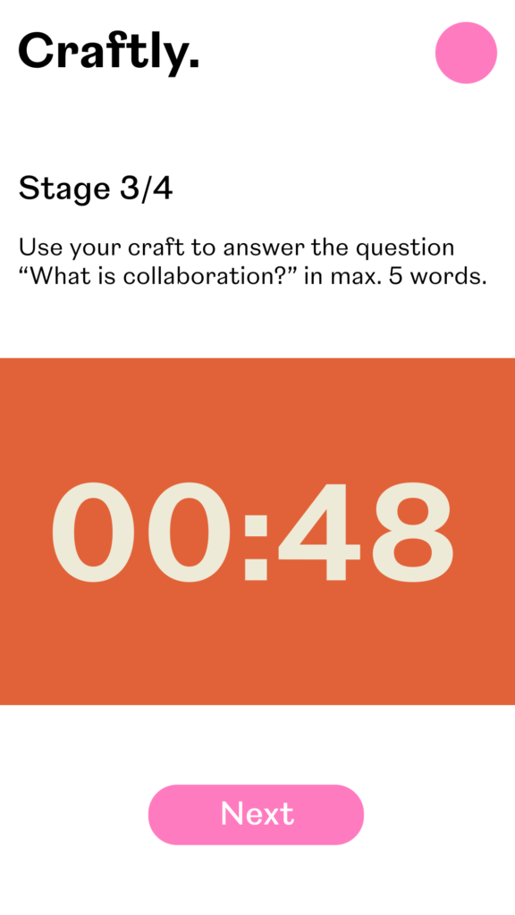
Craftly, my response to developing a collaborative tool, was also a great way of working that I’d be interested in adopting if suitable. For this project I developed a workshop structure which let non-designers participate in the design making process by using crafts. This could be a great method for including the audience in an outcome or simply for collecting ideas and opinions.
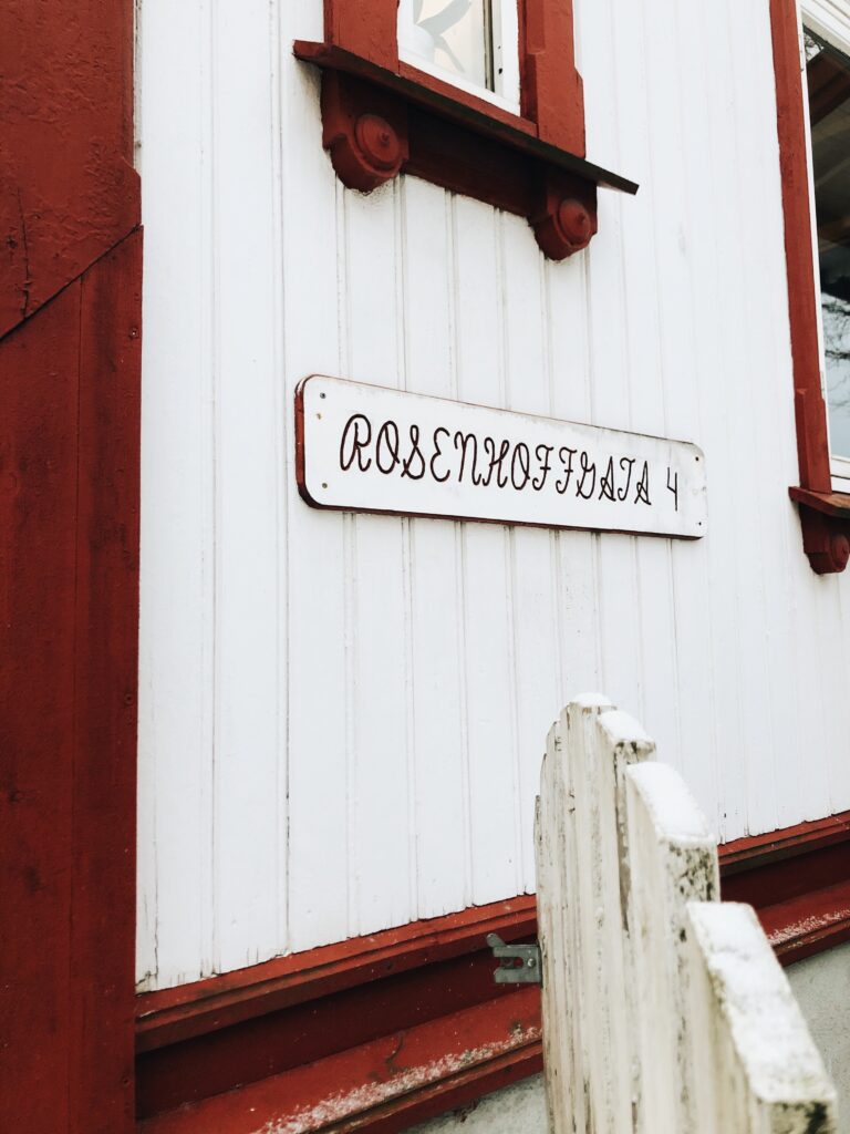
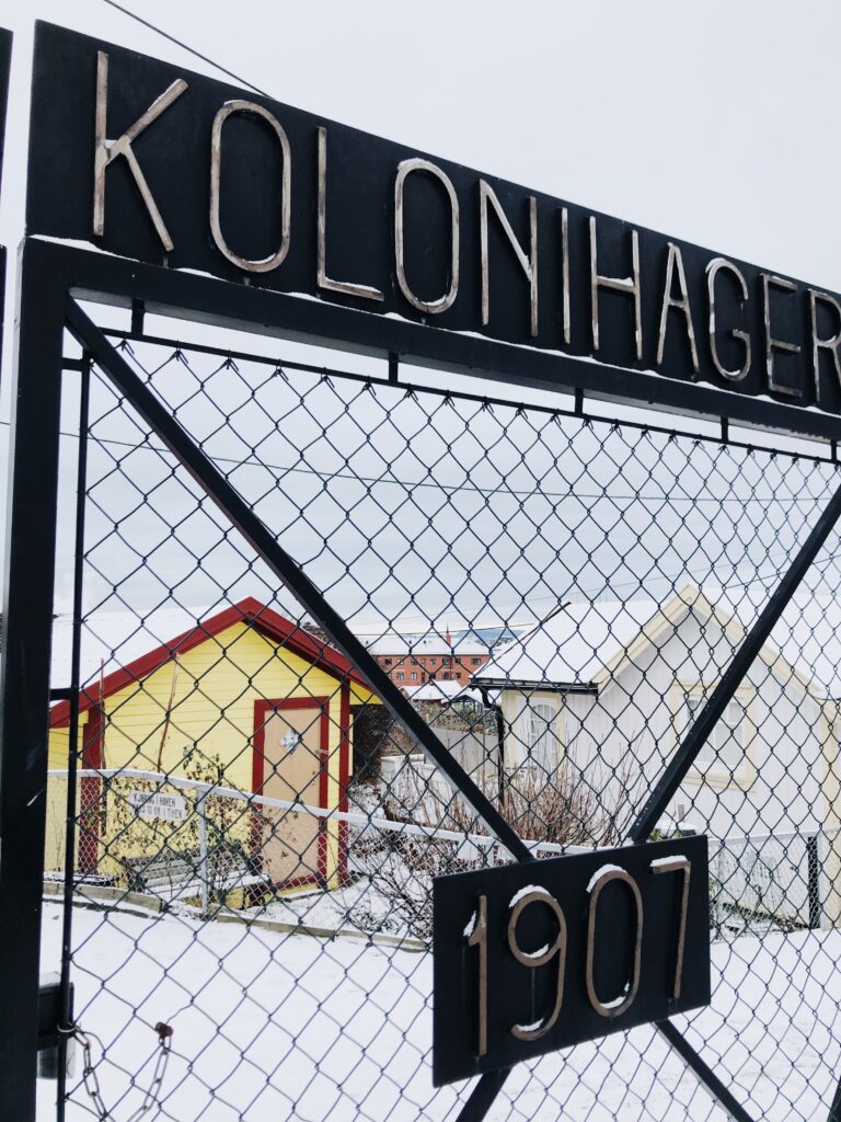
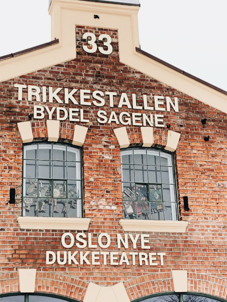
Lastly, I very much enjoyed the process of collecting vernacular typography for then to develop a custom word mark. It was great to use historic references to create a contemporary design, and I this way of working is something I’d like to incorporate in my MA project.
Reaccuring themes
Some themes I keep coming back to in my work, and that I’d like to consider for my project, are sustainability and circularity, as well as nordic nature and seasons.
I think it could be great to do a project about sustainability in society (for example by exploring speculative future societies or potential solutions to climate related issues, either in relation to individuals, businesses or governments). Yet I also really enjoyed using circularity as a conceptual reference when working on the Modul typeface. I’m not that interested in embarking on a service design project, and I’d need to be mindful of this if choosing to look at environmental issues.
Whilst I’m keen to do a project on a non-design related theme, I’m also feeling drawn towards a more experimental project where the main goal would be to develop typefaces – for example by choosing to set up a type foundry business model. The questions what is a circular typeface and what is a democratic typeface are still hugely fascinating to me, and I think it could be great to develop a similar question as a foundation for my project. Looking back at my Modul project, I think part of why I enjoyed it so much was the process of visually translating physical objects into letterforms. Therefore, I could also consider looking at translating objects, spaces or architecture into graphic design.
Ideation
Having established some areas of interest, I decided to move forwards by mapping out the most interesting project ideas that had emerged through the above reflections, as well as from quick mind mapping and watching this week’s webinar.
How can graphic design be used to visualise concepts and aspects of Nordic nature?
Nordic seasons, light, ocean – nature in general – is a part of me and what I identify with, and I think it would be lovely to use this as a conceptual reference for pieces of graphic design. In the previous module, I considered developing a typeface inspired by how the Nordic light changes throughout the seasons. I’d love to revisit this, but also to expand by looking at other Nordic nature aspects such as the ocean (a theme I loved exploring in a project where I made a book about my grandfather), Nordic heritage, plants and so on. This could potentially be a project revolved around visual exploration, rather than academia, which sounds very tempting. Almost acting as a study of representation, this idea could be a great practice on establishing visual concepts and identities.
How can historic typography be used to develop typography for tomorrow?
I’ve always wanted to emerge myself with typographic history, for example by exploring Norwegian archives. This project idea would have to be narrowed down, perhaps by giving it a focus inspired by archive finds.
How can graphic design be used to strengthen democracy in Norwegian society?
The question of what a democratic typeface is, really inspired me, and I think it could be great to expand on this. For this idea I could explore the value of graphic design in our society, but also ways of making graphic design democratic in terms of process through user generation. The question sparks curiosity in me and I like the fact that I don’t know the answer to it. This could potentially be a project of investigation where I could explore a range of visual experiments, but also analyse and reflect on Norwegian democratic values, why they are important and how they function. This could also be an interesting topic to discuss with designers, in order to gain insight.
What does graphic design look like in a completly sustainable society?
This question would have to be defined, but I like the basis of it – an exploration into a hypothetical society where every act and object is in line with sustainability. This would be a speculative project, where I could possibly design a set of sustainable design solutions. The project could be very fun and I imagine it letting me develop a range of institutions, organisations and businesses, which I could then design products and identities for. I think this could be a valuable project to me because I would have to learn more about sustainable design, materials and circular ideas, but also because it would let me design a range of identities, and thus to explore and play with design.
How can typography be used to translate the visual aspects of specific spaces and objects? And how can typography be used to not only visually translate, but empower / add something to them?
Again, a very open question focused on visual exploration and typography studies. I loved looking at visual translation in the Modul project, and I think this question could be a continuation of that. I like that it would let me explore typography in a very intuitive way, but also that it’s a great project for seeking insight from other designers, and that I could do a lot of written reflection on it, as well as visual. I could also use this as a chance to experiment with user generation workshops (inspired by Hato’s process), and various application methods (drawing on the process of Kellenberger-White). Sascha Lobe’s work for Bibliotheque Nationale Du Luxembourg is a great example of how typography and spaces can work together.
Having reflected on a range of ideas, I was left with three favourites:
- How can graphic design be used to visualise concepts and aspects of Nordic nature?
- What does graphic design look like in a completly sustainable society?
- How can typography be used to translate the visual aspects of specific spaces and objects? And how can typography be used to not only visually translate, but empower / add something to them?
Initial research
Before choosing a topic for my project I wanted to do some research into the established themes.
Spaces and typography:
Dalton Maag
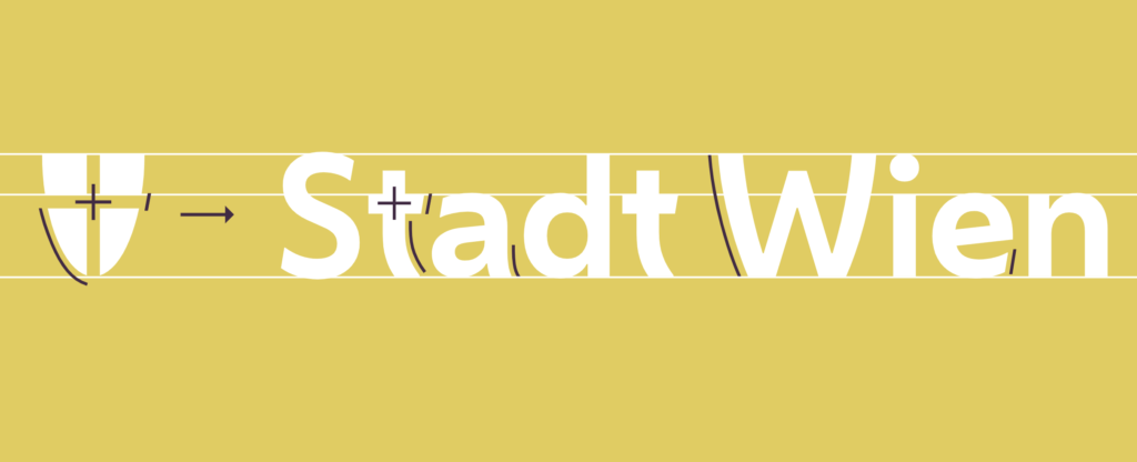
As some of my project ideas related to typography I wanted to watch last module’s guest lecture with Dalton Maag, which I hadn’t had a time to see yet. Although discussed briefly, I enjoyed hearing about their work for the city of Vienna, and the complexity of representing an entire city in one typeface (Dalton Maag, 2021). This made think about the various notions of spaces which can feed into a piece of design, like for example the time period of creation, visual traits, concept, details, wear, texture, material, scale, composition, space designer/architect’s conceptual ideas, etc.
In terms of representing a city, I also wondered how typography could potentially not only represent, but empower and add something new to the place.
Further, I really enjoyed their discussions on accessibility and functionality. A typeface is not only visual, but also technical, and thus the technical aspects of it should also reflect the typeface’s conceptual ideas. Somehow the technical possibilities of digital typography seem to add new application methods and traits, and I think they would be great to explore if choosing to do the spaces and type project. We shouldn’t only consider how a space visually translates to visual traits, but also to function, writing systems, readability, legibility and likability (audience).
MUNCH
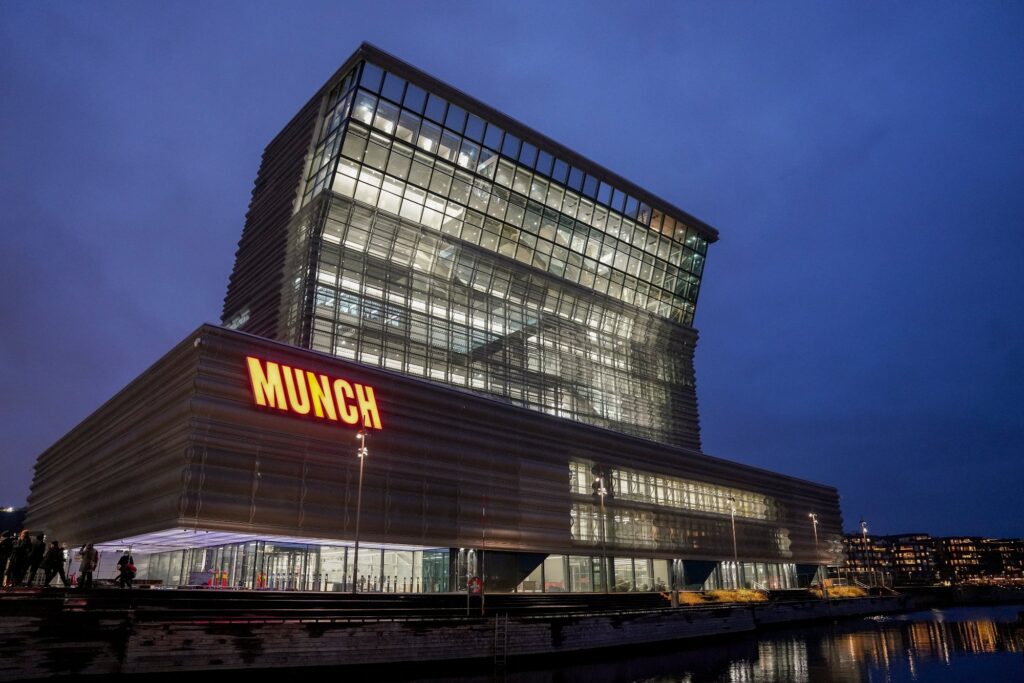
The last few years, Oslo’s Edvard Munch museum has been moved to a new building, located in Bjørvika, a city centre area filled with minimal sky scraper architecture. In 2020, the logo and museum’s outside signage was mounted, leading to controversy amongst Oslo’s citizens (Nordeide, 2020). I find this fascinating because the building, as well as the general act of moving to a new building, has received a lot of controversy itself, due to it’s plain facade (Nordeide, 2020).
The logo itself is interesting due to the way it’s been visually translated from the building, leaning 20 degrees to the left, like the building’s top (Nordeide, 2020). Yet, I think the real notion of interest here is how controversy in relation to the building has been carried on to the typography.
Lastly, this controversy becomes especially interesting in relation to the artist himself, who’s paintings were controversial in his time. This link of controversy is a great example of how typography can visually translate aspects of a space beyond just visual traits.
Snøhetta: Le Monde Group Headquarters wayfinding
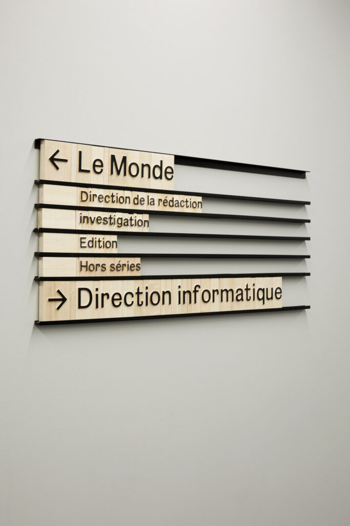
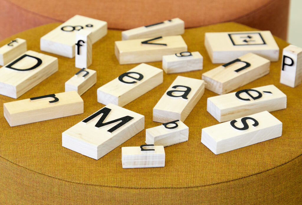
For the Le Monde Group’s headquarters (for whom they also designed the architectural building), Snøhetta developed a modular way finding system inspired by news papers’ historic printing/type techniques. On one side this relates to the architectural concept, which is also based on the same printing techniques, and on the other it relates to the habitants of the space – people working in the press today. I love how the traditional concept has been combined with contemporary typography and materials, as well as modularity and therefore longevity.
Nordic nature:
I’ve already done some research into Nordic light statistics in a previous module, which could be great to explore further. However, there are also other Nordic phenomena that could be used as reference – forests or cities could be used for mapping out shapes, like in the below project:
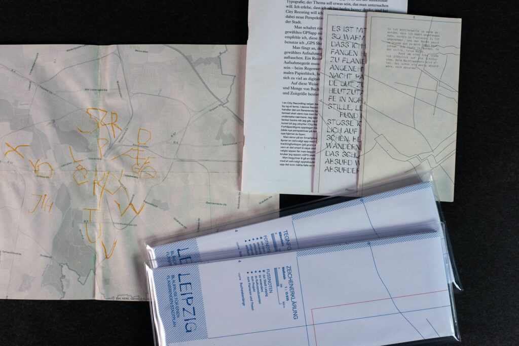
The Northern lights are also an interesting and very visual phenomena which could be translated into design by looking into storytelling, mathematical statistics, colour, texture or heritage. However, this is not a phenomena I feel very close to as I’ve never actually seen it.
As I’ve previously studies photography, I think it could be interesting to do something with light as production method, for example by developing letterforms using day to day sunlight. In fact, the weather in general could be great source to data, which could then inform design decisions.
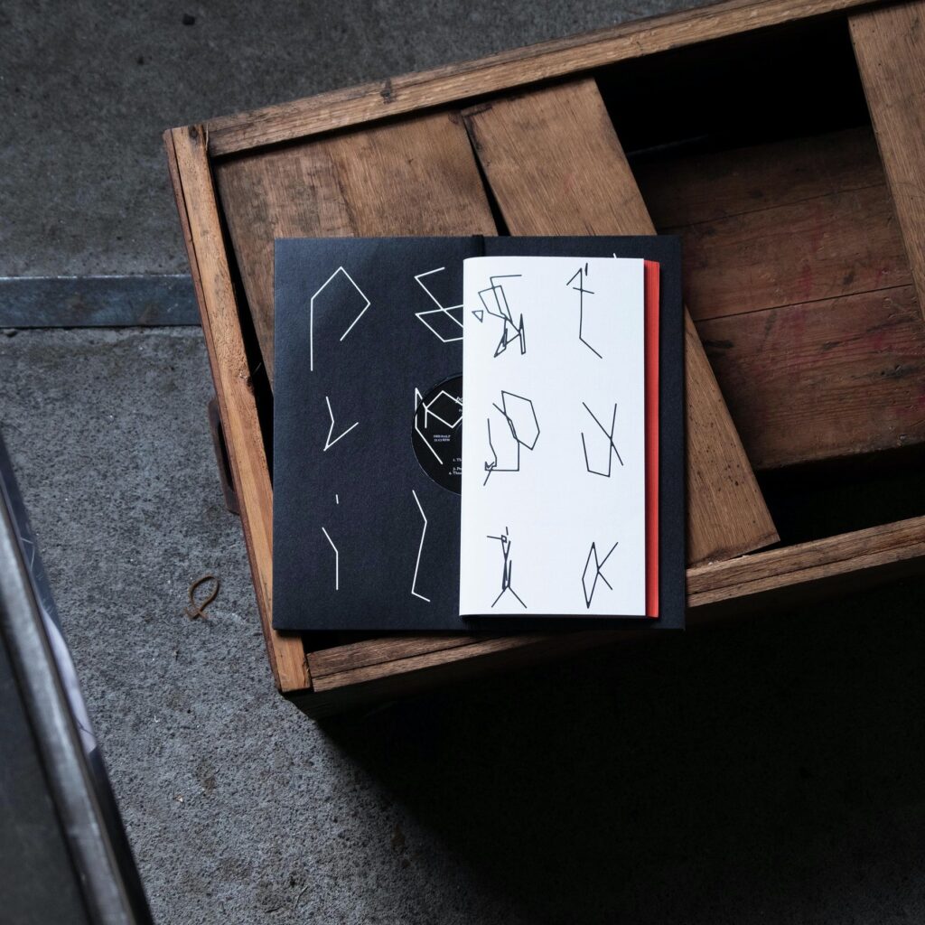
The above record cover for Postreptilia also made me wonder if I could potentially do a project based on Runes or just ancient writing systems in general, and perhaps look at how they can be used in the development of contemporary lettering.
Sustainable and speculative design:
Speculative Everything
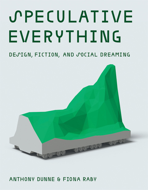
Although I haven’t read the book, Speculative Everything seems like an important reference if choosing to go ahead with the speculative sustainable society project. Before embarking on graphic design examples and what they might look like, I would have to establish a society to design from, perhaps based on sustainability literature such as FN’s climate reports and Bill Gates’ How to avoid a climate disaster.
In relation to their St. Etienne Design Biennale exhibition, Dunne & Darby writes:
“It is absolutely not about prediction, but asking what if…, speculating, imagining, and even dreaming, to create and facilitate reflection on the kind of technologically mediated world we wish to live in. Ideally, one that reflects the complex, troubled people we are, rather than the easily satisfied consumers and users we are supposed to be.” (Dunne & Raby, 2010).
Taking this approach in relation to speculative sustainable graphic design would be very interesting, but also intimidatingly complex. If choosing this project I would have to be confident with the fact that it wouldn’t just be a branding project, but rather a deep investigation into imagined sustainable solutions.
DYPP
For their MA project in product design, Frøya Thue and Frida van der Drift Breivik developed DYPP – a business that experiments with packaging made from sea weed. I wouldn’t want to make my MA a project of innovation, but I think a speculative project would at least need to explore existing innovation projects – at least if choosing to take a broad approach.
Weekly wrap up
This first week has been slightly challenging, perhaps due to my lack of experience in managing personal design projects. I’ve been feeling stuck and a little unmotivated as I haven’t known what I want to do for my MA before entering the module. Luckily I leave this week feeling a little bit more on track, having established three potential directions.
Analysing previous projects has been hugely beneficial as it allowed me to pin point what I enjoy working with and why. Going into this week I really wanted to base my project on the environment. However, looking back at my Modul project made me realise that it was more the creation of conceptual type, rather than the circularity theme, that I enjoyed. It’s become clear that visual translation and typography are big interests of mine, and although I find it scary to base such a large project on typography, I also feel rather tempted to give into the urge of emerging myself in this detail oriented discipline.
Looking back I don’t feel like I managed to find enough references for my three project ideas this week. However, the method of researching briefly into all ideas was still valuable because it opened my eyes to what the different projects could be. I quickly realised that the Northern nature project didn’t suit my interests very well, and also that the speculative project might become a bit too technical for my liking.
Moving forward it will be important to narrow down my chosen research question (I will wait for feedback before choosing one), to continue researching into a chosen theme, and of course to reflect on potential audiences, aims and goals.
REFERENCES:
Alec Dudson (2022) ‘Publishing Multiplatform’. Canvas Falmouth Flexible [online], 21 January.
Ben Evans James (2022) ‘Academic Creative Practice’. Canvas Falmouth Flexible [online], 21 January.
Dalton Maag (2021) ‘Week 12 webinar: guest lecturers from Dalton Maag’. Canvas Falmouth Flexible [online], 9 December.
Dunne & Raby (2010) ST ETIENNE DESIGN BIENNALE. Available at: http://dunneandraby.co.uk/content/projects/560/0 (Accessed: 28 January 2022).
Joseph Pochodzaj (2022) ‘Social Change UX’. Canvas Falmouth Flexible [online], 21 January.
Nordeide, T.V. (2020) Sterke reaksjoner på nytt Munch-skilt: – Noe man forbinder med mat, Avisa Oslo. Available at: https://www.ao.no/5-128-6252 (Accessed: 28 January 2022).
LIST OF FIGURES:
Figure 1: Alec DUDSON. 2022. Publishing Multiplatform [lecture still]. Available at: https://flex.falmouth.ac.uk/courses/1013/pages/phase-1-%7C-introductory-practice-case-studies?module_item_id=58675 [accessed 27 January 2022].
Figure 2. Joseph POCHODZAJ. Ca. 2010-2021. Graduate project. Joseph Pochodzaj [online]. Available at: http://studio.joepochodzaj.com/
Figure 3. Emma CHARLES and Ben Evans JAMES. 2020. On a clear day you can see the revolution from here. Ben Evans James [online]. Available at: https://benevansjames.com/On-A-Clear-Day-You-Can-See-The-Revolution-From-Here-1
Figure 4-5: Ingrid REIGSTAD. 2021. The Science Museum Delivery. Private collection: Ingrid Reigstad.
Figure 6: Ingrid REIGSTAD. 2021. Modul website. Private collection: Ingrid Reigstad.
Figure 7: Ingrid REIGSTAD. 2021. SAMLA. Private collection: Ingrid Reigstad.
Figure 8: Ingrid REIGSTAD. 2021. Yum Cha!. Private collection: Ingrid Reigstad.
Figure 9-11: Ingrid REIGSTAD. 2021. Craftly wireframes. Private collection: Ingrid Reigstad.
Figure 12-14: Ingrid REIGSTAD. 2021. Letterforms in Grunnerløkka, Oslo. Private collection: Ingrid Reigstad.
Figure 15. DALTON MAAG. 2019. City of Vienna. Dalton Maag [online]. Available at: https://www.daltonmaag.com/work/city-of-vienna
Figure 16. Fredrik HAGEN. 2020. Munchmuseet Bjørvika. Avisa Oslo [online]. Available at: https://www.ao.no/sterke-reaksjoner-pa-nytt-munch-skilt-noe-man-forbinder-med-mat/s/5-128-6252
Figure 17-18. SNØHETTA. 2020. Le Monde Group Headquarters. Snøhetta [online]. Available at: https://snohetta.com/project/536-le-monde-group-headquarters-wayfinding
Figure 19. Tiril Haug JOHNE. 2019. Leipzig Flanierende Typografie (FT Leipzig). Grafill Visuelt [online]. Available at: https://www.grafill.no/visuelt/vinnere/grafisk-design/studentarbeid/skriftsamling-plakatserie-og-kart-leipzig-flanierende-typografie-ft-leipzig
Figure 20. Rune DØLI. 2021. Postreptilia. Grafill Visuelt [online]. Available at: https://www.grafill.no/visuelt/vinnere/2021/grafisk-design/pakningsdesign-kultur/lp-og-bok-postreptilia
Figure 21. Anthony DUNNE and Fiona RABY. 2013. Speculative Everything. Dunne & Raby [online]. Available at: http://dunneandraby.co.uk/content/projects/756/0
Figure 22. Frøya THUE and Frida van der Drift BREIVIK. 2020. DYPP. Grafill Visuelt [online]. Available at: https://www.grafill.no/visuelt/vinnere/2020/grafisk-design/studentarbeid/emballasje-dypp
