
Lecture notes
Lecture reflections
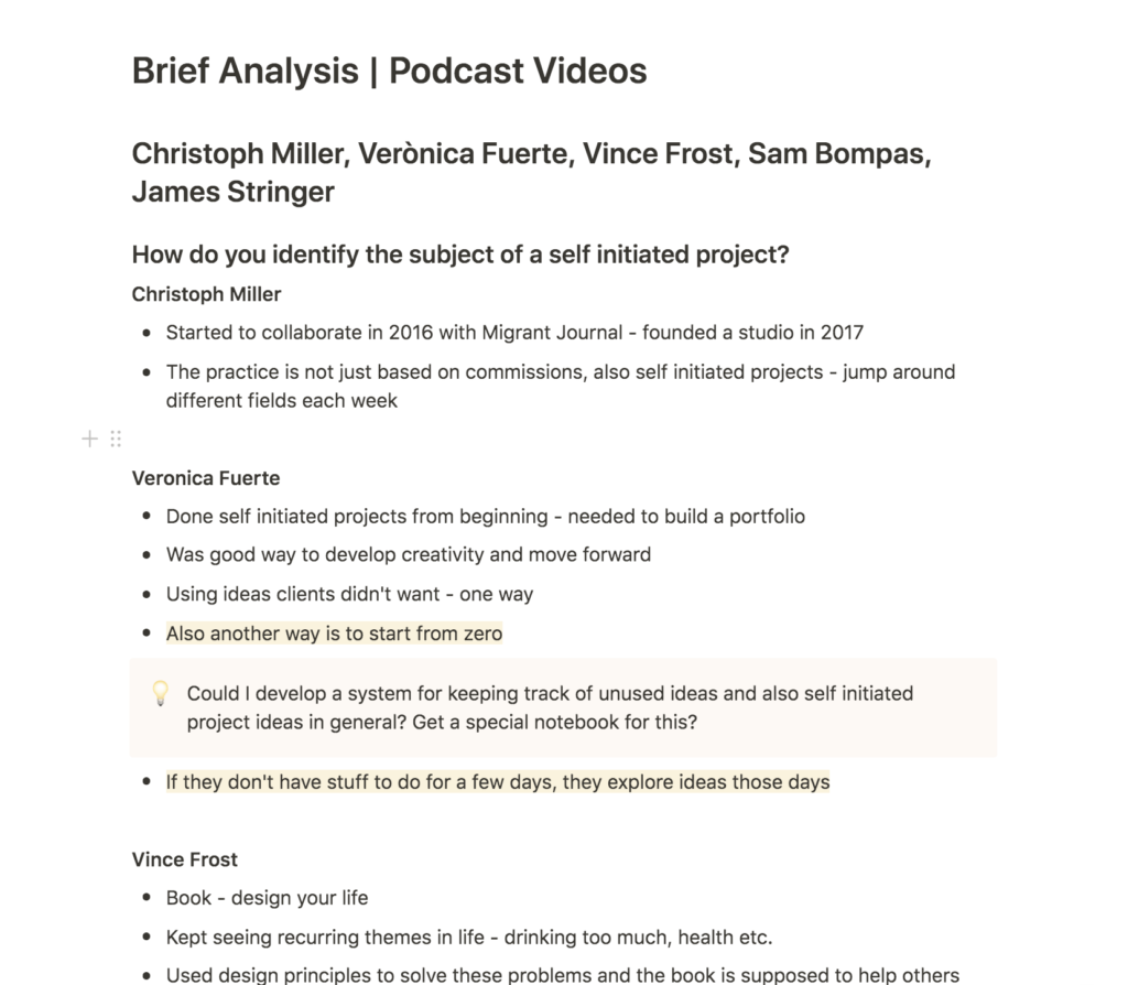
During our previous module, I realised that self initiated projects can be slightly tricky. I find it difficult to narrow down a subject when the task is so open, and it was therefore interesting to listen to this week’s lecture.
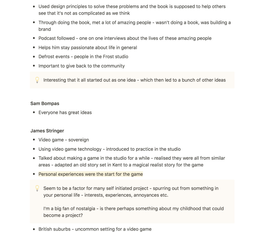
Fuerte explained how she would either explore unused concepts from client projects or start from zero when she had spare time in her studio (Christoph Miller et al., 2021). This made me wonder if I could develop a system for keeping track of unused concepts and ideas. I often find myself coming up with several concepts I’d like to explore for projects, but when I get the time to do something self initiated, I have usually forgotten about those unexplored concepts. Thus, I think a digital list or an idea sketch book would be a good investment.
Miller’s discussion on quicky projects was also interesting. The speed of this course has made me realise that I am capable of finishing projects over short time periods, and that I even tend to put more effort into these projects due to the kick one gets from having to fit a lot of tasks into a short period of time. As I move on in my career after the MA, I might try to adopt this way of working by taking a few weeks off here and there for personal projects. I imagine design sprints being handy for these type of projects.
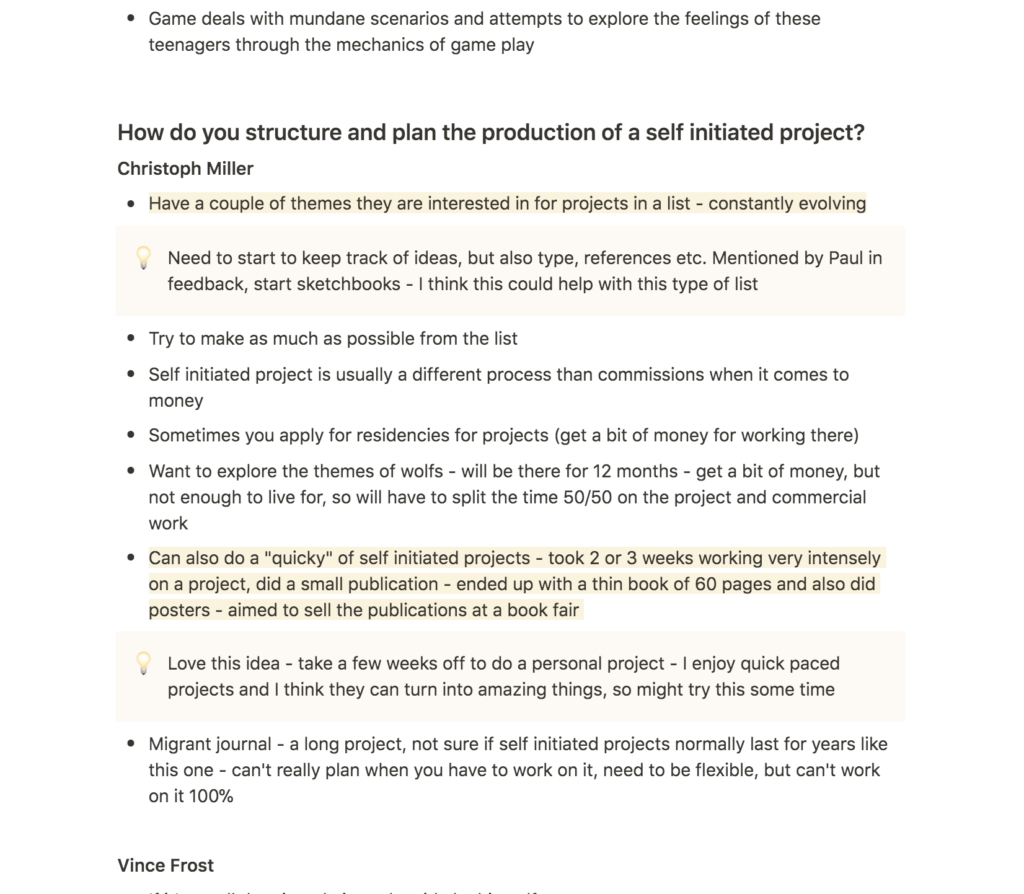
Lastly I think Bompas’ notion of treating all projects the same, regardless of them being self initiated or not, seems logic. What seems to be different, and perhaps the key challenge for personal work, is finding a balance between self initiated projects and commercial work. Do you treat self initiated projects as potential money generators in the long run, or do you simply treat them as entertainment by taking time off like Miller suggested?
Resource notes
Resource reflections
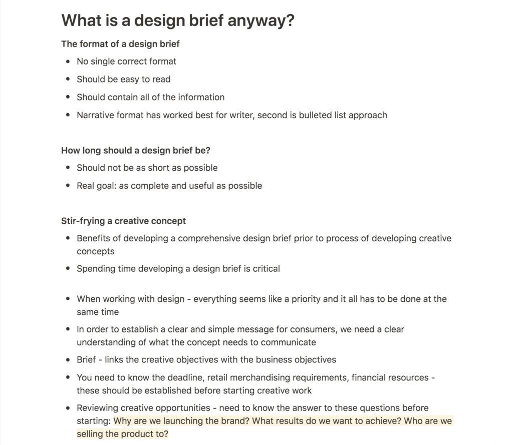
Phillips’ book provided me with great insight on writing design briefs and why they are important. His lists of questions to ask potential clients was very helpful. Particularly questions like why the client is launching a brand, what the client hopes to achieve with the project and who their target audience is (Peter Phillips, 2004).
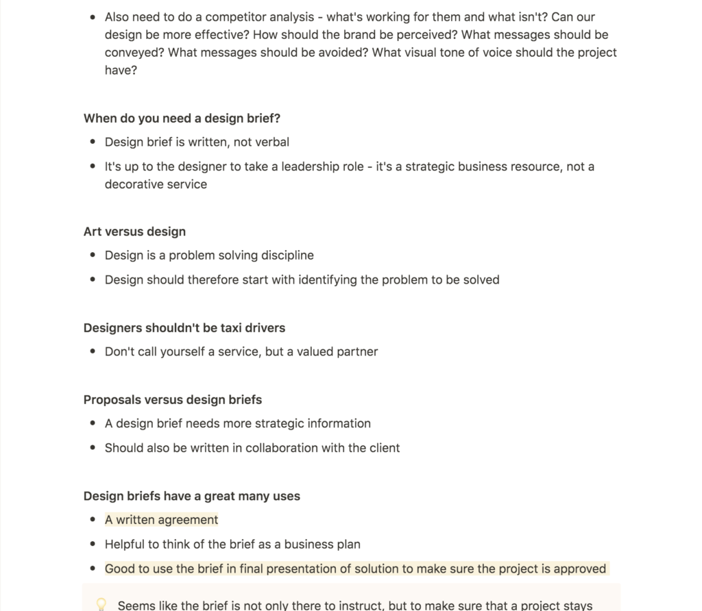
I took interests in Phillips’ discussions of the many uses of a design brief. The fact that it could act as a written agreement between client and designer is interesting, and I imagine a well written brief to be helpful if the client was to become too focused on his or her personal taste. Phillips’ suggestion of coming back to the brief when presenting the final outcome of a project was also helpful. By doing so one can work to build arguments on why this particular solution fits the brief and the client’s problems.
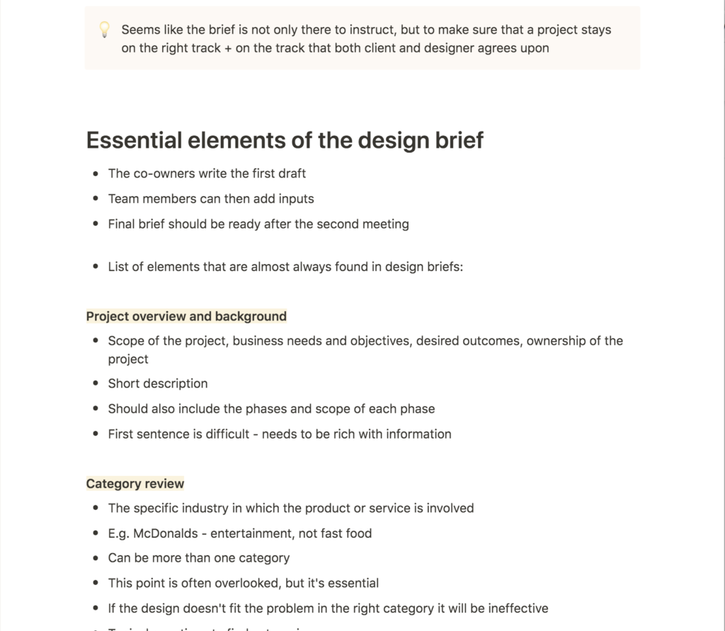
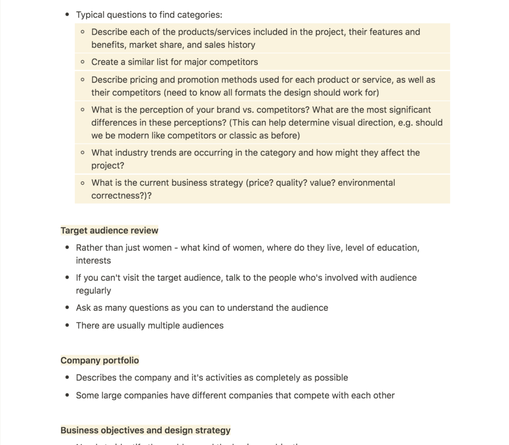
I think Phillips’ list of elements found in design briefs will become a great resource to come back to, and I would like to adopt these points as I go on to write my own design briefs for this module.
Further research
Before starting the workshop challenge I wanted to look into some examples of self initiated projects related to some of my personal interests. Since starting the course, I have wanted to learn more about typography. I have done that, but perhaps not to the extent I wanted. I therefore rewatched the guest lecture video with typographer Mads Wildgaard. I’ve also been wanting to do work related to climate change, and thus I also found two projects that tackles this problem using graphic design.
Mads Wildgaard – Bold Decisions
I loved Wildgaard’s discussions on his typeface Lars, which he’s been working on continuously since graduating (Mads Wildgaard, Ca. 2016-2020). Although his typefaces are distributed through his foundry, they all seem to have started off as self initiated projects. His description on how he sees himself as part of the typefaces (the music he’s listed to and the literature he’s been reading is part of every curve, as he puts it (Mads Wildgaard, Ca. 2016-2020)) was beautiful. I like this idea of seeing sections of your life in a typeface, and how this might be a result of the amount of time needed to make typography, which in Wildgaard’s case can be years.
Wildgaard’s process was also interesting, as his work mostly seemed to spur out from something he’d seen or collected. His quote “you see something that can evoke a feeling or that can become something” (Mads Wildgaard, Ca. 2016-2020) makes me think that his approach is very much based on instinct and personal taste. There is definitely something liberating about this approach, which I think would be nice to have in a self initiated project where you are free to work however you’d like.
Nicer Tuesdays: Adapt
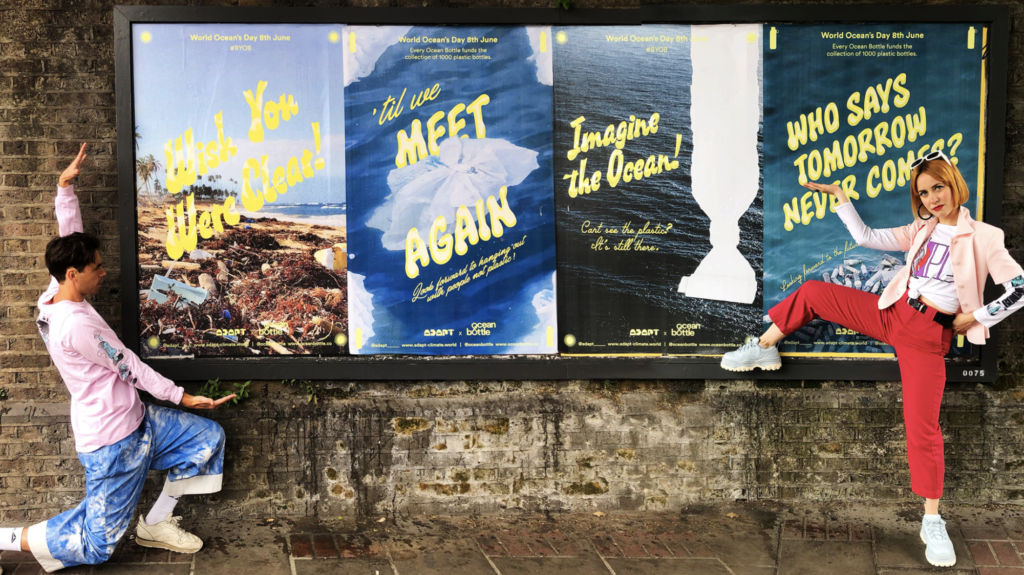
This Nicer Tuesdays episode with Adapt was a good example of how one can use graphic design to shine a light on climate change. I also found it insightful to see how their project had expanded into a full time project with various initiatives, rather than being a single campaign only. I struggle to see how some of their more protest led projects (like their exhibition AdaptX50artists) can make an actual change, but that might just be my perception of one having to come up with an answer to a problem to fix it. Protest has led to change in the past, but I personally preferred their climate change discussion guide, where Adapt riso printed a pamphlet that taught you how to respond to climate change arguments.
Goods: Index
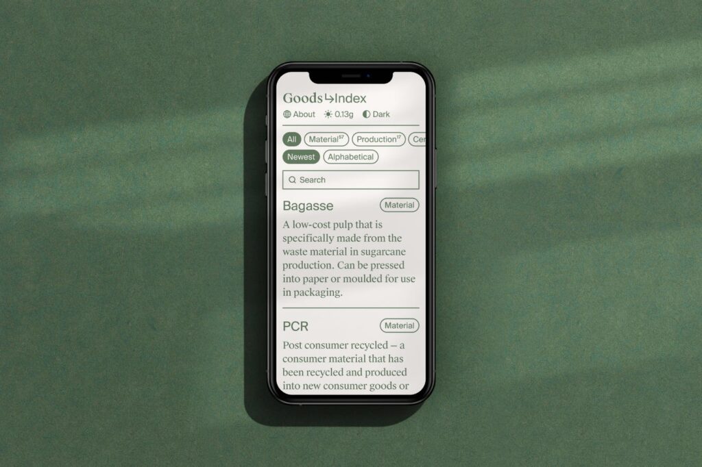
An example of work that makes up a solution to the climate change problem is Index, a packaging material guide created by design studio Goods. The website currently acts as a dictionary for materials, but Goods are also hoping to build guides and articles (Goods, 2021). The hands on approach to climate change is wonderful, because it actually helps designers make better decisions in their work. I also like the fact that they have avoided using images, in order to make the website quicker to load and therefore energy effective.
Workshop challenge
Subjects, research and outputs from GDE710
As asked for in this week’s task, I started the workshop challenge by revisiting blog posts from the GDE710 module. After reading through them, I discovered five recurring themes that I still find very interesting today:
Typography
As mentioned in my further research this week, typography is a skill I’ve been wanting to develop since embarking on this course. My goal is to feel confident in developing custom type logos, but I also hope to develop my own typeface on day, and to become an “expert” in the technical aspects of typography.
In week 2 I went to see an exhibition on historic type in Oslo, which was really interesting. It could definitely be interesting to make a modern piece of typography inspired by older letterforms as a way of merging past and present. I also think my idea of a typeface generator was a fun direction that I didn’t get to explore thoroughly.
In week 3 I continued researching typography and how other designers used furniture and architecture as influences for letterform curves. I also did some quick experiments where I attempted to build letterforms inspired by shapes found in Oslo’s main library. This approach was fun and definitely something I’d enjoy revisiting.
During week 8 we looked at side projects, and in my research I again looked at various typography projects. 36 days of type inspired me to perhaps do the challenge at some point, but I also had the idea of making a typography zine as a way of learning about typography theories. As a response to the workshop challenge I created an unfinished typeface. I downloaded Glyphs and I remember enjoying this challenge a lot. Drawing letterforms almost became a meditative action, and revisiting the project made me think about Wildgaard’s notion of working on instinct.
If I was to make a typeface during the course, I think this brief would be the perfect opportunity. The brief is short enough for it not to be too important if I was to fail, and it would also be a great way of learning wether typefaces is something I would like to explore further for the MA project.
Physical letterforms
For my week 10 workshop challenge I experimented with physical typography by attempting to print letters using lino. This made me think of something Anthony Burrill said in a previous resource – that using your hands to place letters and experiment with layout can be hugely beneficial. I have enjoyed merging physicality with digital outcomes and doing so for type work could be interesting.
Automation as method for visualising the self
In week 4 I experimented with visualising sound as a way of visualising an un-visual aspect of the body. This was a really fun project and I think I’d enjoy revisiting automation methods as a way of expressing unseen parts of one’s self. Sound is interesting, but I also like the idea of visualising movement in still outcomes like illustration or photographs.
I’ve recently gotten into running, and this made me wonder wether I could use the automatic processes that happens in the body when you exercise as a topic for a very visual project.
Visualising a community
In my research for week 6 I had a quick look at Hato’s branding project of the 2018 D&AD festival. During our previous module I spent a lot of time looking at similar approaches to design and ways of capturing a community through collaborative craft making. This workshop method is something I’d be keen to take further as part of my practice. Although it would be nice to do so for this brief, I also think it could be a great method for brief 2 which would be more client led.
Sustainable design
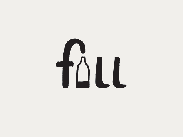
Sustainability is a topic I care about deeply on a personal level, and throughout the course I’ve been coming back to ways of making it part of my practice. In week 12 I ended up remaking the packaging structure of Coca Cola. I’m very eager to learn more about packaging design, and also ways of creating sustainable structures within companies’ packaging systems. Fill is an interesting example in this relation, that I looked at in week 2.
For a self initiated project on sustainability I could create some sort of guide, resource or campaign. I could also take a more protest like approach to the subject, but as mentioned previously I do prefer looking for solutions when discussing climate change. This subject could be very rewarding and it’s also something I’ve been thinking about doing my MA project on.
Interests, identity and experiences
So far I’ve discussed my interest for typography, sustainability, combining physical and digital methods and visualising unseen aspects of the self. I also think it’s important to keep in mind that I’d like to work with branding after graduation, and that this should be reflected in my final portfolio.
In terms of identity and experiences, I feel the need to remind myself of my love for nostalgia. During my BA this was something I kept coming back to in my photography work, and so perhaps it could be interesting to look at for a self initiated design project. Looking back at my childhood I think of fresh sea water, nordic summer evenings, boat trips and fireplace warmed up duvets. The nordic seasons are a big part of how I identify myself and my feelings, and when I experience moments of gratitude, they are often related to notions of this concept. There is so much contrast in the dark and cold nordic winter compared to the light and warm nordic summer, and although this can be hard it’s also something I appreciate deeply.
I’m not quite sure how these reflections could lead to a self initiated projects, but I think they could be interesting to explore if I was to take a more self exploratory approach to the self initiated project brief.
Ideation
Having reflected on personal interests I decided to brainstorm some potential ideas for each topic, which let me come up with more specific focus points:
The concepts I took most interest in were:
Creating a typeface
Although it’s not a very specific idea as such, I think it would be important for me to attempt building a typeface before graduating. This is something I’ve wanted to do for a long time, however I’ve been putting it off as I know it will be difficult and perhaps not as successful as I’m hoping it will be. I’d like to create a sans serif or display – something that I could keep coming back to in my work, much like Wildgaard’s Lars typeface. Thus it would have to be timeless, yet characteristic. I could also adopt Wildgaard’s approach of collecting a beautiful reference from a vintage shop or archive, and attempt to modernise it.
I also like the idea of creating a sustainable typeface – perhaps something that could save ink or digital load time. However, this might be a project better suited for the MA as I’m considering looking at sustainability in the broader sense for that project.
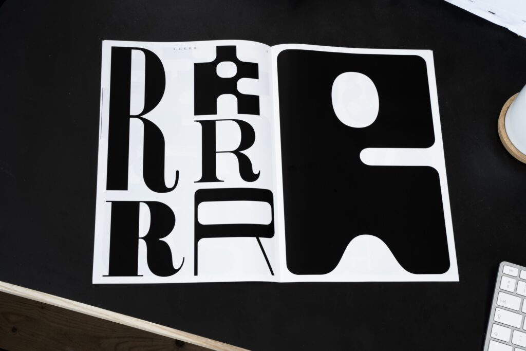
Typography experiments
Inspired by the 36 days of type challenge, as well as the RP in Review spread bellow, I’d like to experiment with singular letterforms in some way. This could either be a direct response to the 36 days of type challenge (although the challenge is not going on at the moment, so it would be a personal challenge), or I could make a visual publication, website or similar inspired by the spread below.
This could potentially be a way of learning more about various type families and terminology. However, I wouldn’t get the experience of building one cohesive typeface and the skills that follows (e.g. kerning, letter form width etc.).
Electricity running experiment
In Norway (and the rest of Europe it seems) we are currently experiencing extremely high electricity prices, which is a result of politics (we are currently distributing electricity made from renewable sources to other countries, and thus purchasing electricity from other countries made from coal, due to there being no renewable electricity left here), as well as low amounts of rain. This could be an interesting concept to pair with visualising movement, but also sustainability.
I think it could be fun to attempt to generate electricity through running (or another form of exercise) in order to demonstrate the amount of electricity needed for e.g. charging your phone. The moral would be to use electricity, but it could also be a slightly ridiculous response to saving money on electricity, and thus a satiric response to Norwegian politics.
Life in Tübingen
In Tübingen, the green party has been in charge since 2007. The Norwegian green party had a very bad result in this year’s election, and I therefore think it would be interesting to do a documentary project on life in Tübingen and what it actually is like to live in a sustainability focused city. This could result in a publication or perhaps a film? I’d probably need to use my photography skills for this project, which could be fun and something I’m yet to do in this course.
Resource on contributing to a sustainable world
Based on Bill Gate’s book How to Avoid a Climate Disaster, I think it could be rewarding to build a public resource with advice on what we can do as individuals and businesses for the environment. The information would be taken from his book, and so the design focus would be on usability and the branding identity of the resource.
How can I use graphic design to encourage green innovation?
One Gates’ main arguments for avoiding a climate disaster is encouraging green innovation (Bill Gates, 2021). I therefore got the idea of building a library of free resources available to green start ups who might not have the budget for graphic designers. The library could include links to free typefaces, advice on font pairings, presentation decs, social media templates and so on. I could also make myself available for pro bono logo orders for selected green innovation start ups. This could provide me with valuable experience, but also let me contribute in a small way to a topic I care about.
4 project ideas
At this point, I went on to create project descriptions for the four projects I liked the most:
How can I design a versatile typeface that I can keep coming back to in my own work?
Since embarking on this course I have been wanting to design a typeface as a way of learning about typography theory and practice. Much like Mads Wildgaard’s typeface, Lars, I hope to create a signature typeface that I can keep coming back to over and over again. Thus, the design would have to be timeless and modern. Since I often use expressive display faces as a key element in my work, I’d also like the typeface to have characteristic details and expression.
How can I develop my typography skill set through a 36 character challenge?
Inspired by the 36 days of type challenge, I’d like to do a project where I experiment with various ways of drawing letterforms for each character of the latin alphabet. Variety would be a key element, and I would attempt to learn about as many different typography categories as possible. Thus, the aim of the project would be to develop my skillset as a typographer, both in terms of terminology and type history. The result could be presented as a publication, website or other suitable medium.
How can I use exercise data to encourage electricity awareness?
Norway is currently experiencing high electricity rates as a result from distributing too much of our renewable energy to other countries. We are now forced to import non-renewable energy from other countries, which results in increased prices. Through this project I would demonstrate the amount of physical energy needed to power a phone or a light bulb, by comparing runners data with electrical power. The suggestion of “generating your own electricity” would be a silly and satiric solution to a financial and environmental issue.
How can I use my skills as a designer to encourage green innovation?
In How to Avoid a Climate Disaster, Bill Gates argues that most environmental issues can be solved with green innovation (Bill Gates, 2021). In order to encourage green innovation as a graphic designer, I would therefore like to build a graphics resource library that would be free of charge for green innovation start ups. This could include anything from advice on free typeface pairings to presentation decs and social media templates. I could also make myself available for pro bono logo and identity work.
Further exploration
By posting my four ideas on the ideas wall I was able to collect feedback and most people seemed to prefer the typeface project. This was also the project I felt the most drawn to personally, and so I decided to go for it. On Wednesday I had a tutorial with Stuart, who suggested to give the project a narrower concept and meaning, in order to refine it further. He also said that I don’t necessarily had to create an entire typeface, or a functioning one.
After our conversation I moved on to research and brainstorm further ideas.
Abstract: Jonathan Hoefler
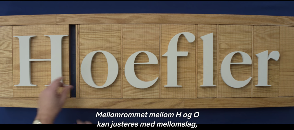
As advised by Stuart in my tutorial, I decided to rewatch the Abstract episode with Jonathan Hoefler. It was very helpful to see how Hoefler used archive references and old objects as inspiration for his typeface, Decimal, and it made me think about all the various things I could base my typeface on.
As briefly touched upon previously this week, I’m very fascinated by the Scandinavian seasons and how they affect how I’m feeling throughout the cycle of a year. Perhaps this could become a starting point for my project, and if so become a starting point for a reference search. There are so many objects and concepts related to time, light, and cycles. I could look at vintage furniture, calendars, clocks, photography exposure techniques, dated typography and so on.
The Letterform archive: ‘Calendars’
As a result of the idea above I went on to look at calendars in the online letterform archive.
Terkenkalendar Facsimile
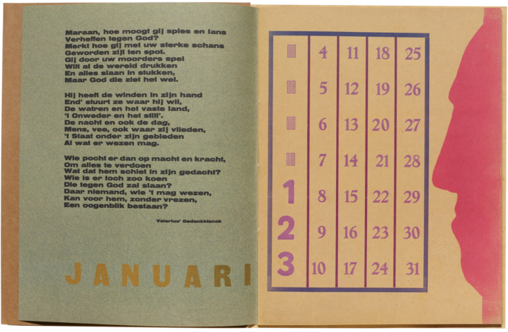
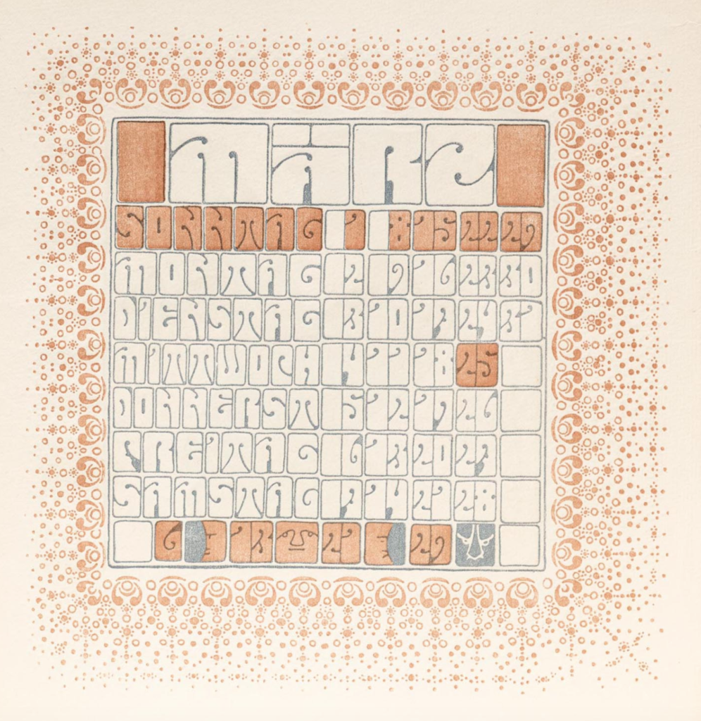
To my surprise, most of the calendars from the search were books. I think there is something interesting about how permanent this format is in relation to the “unpermanentness” of a one year calendar. I don’t know what the texts of this particular calendar are – maybe they could be songs or poems related to each month. Each month has a different use of typography and layout, which I quite like. The numerals in January are so strange – the ‘1’ and ‘2’ are not aligned, and I’m not quite sure why they have made the first three numbers bigger than the rest.
There is definitely something to this format that intrigues me, and I think it could be nice to translate this into a calendar publication centred around the nordic seasons somehow.
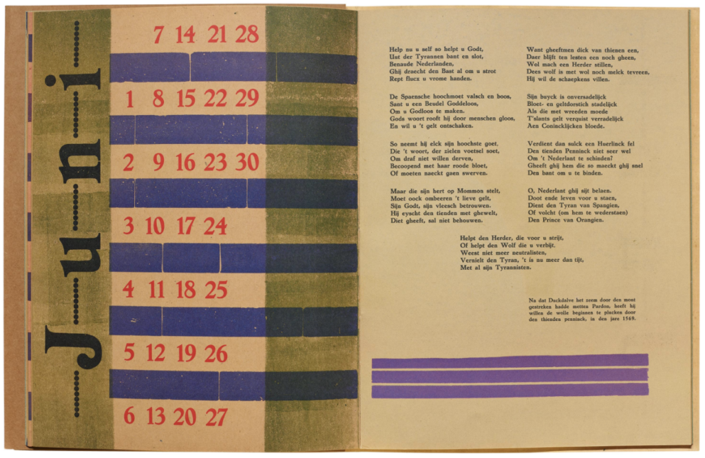
Ver Sacrum Kalender
This calendar is hardly legible, and to me it feels more illustrative than functional. The way each letter takes up space within it’s square is an interesting puzzle and could be translated into the amount of light we have in each month (if I was to look at nordic seasons).
Van Nelle’s promotional pocket calendar, 1927
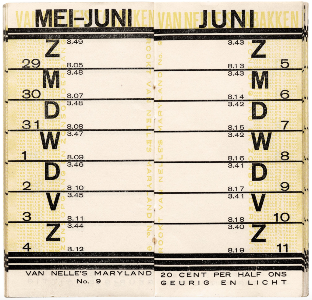
This promotional booklet calendar for Van Nelle’s tobacco is very beautiful and I love the style of the ‘2’. The systematic essence could be adopted if I was to take a more mathematic approach in my project (e.g. by using amounts of hours with light every day). The texture of the yellow writing is interesting and I wonder wether I could use letters in a similar way to mimic the amount of light we get for each month. July could use very thin characters or there could be lots of negative space, whilst January could have heavy bold characters with hardly any negative space at all.
The calendar references made me think of a new potential research question:
How can I make a typographic calendar that reflects the nordic seasons?
Nordic light statistics
In my tutorial, Stewart suggested that I could look at mathematics related to the Scandinavian seasons. I thought this seemed like an interesting direction and therefore went on to look at light statistic for different days of the year.
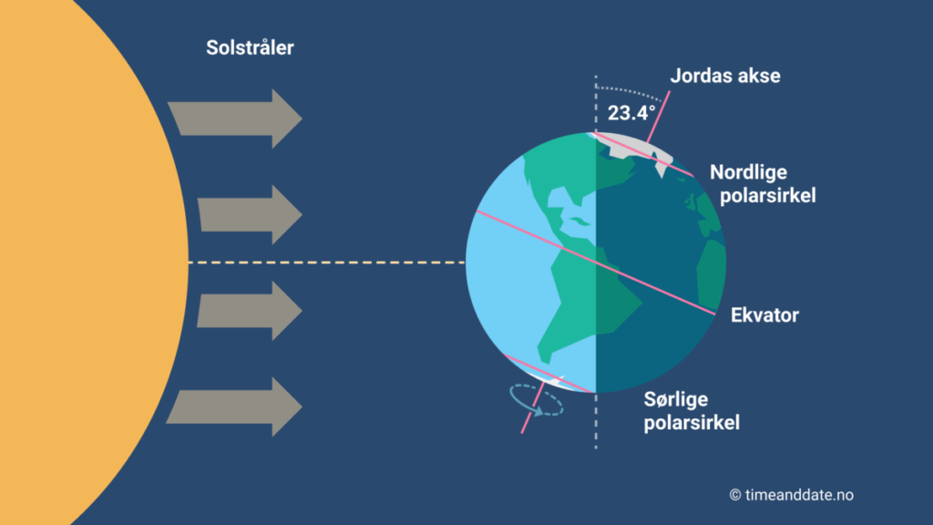
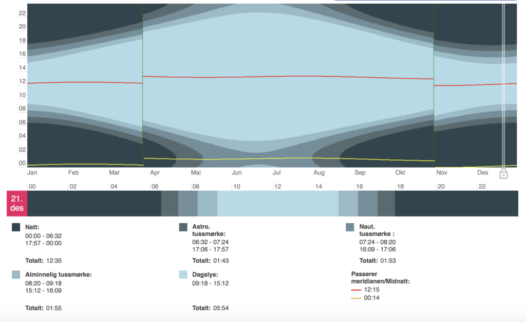
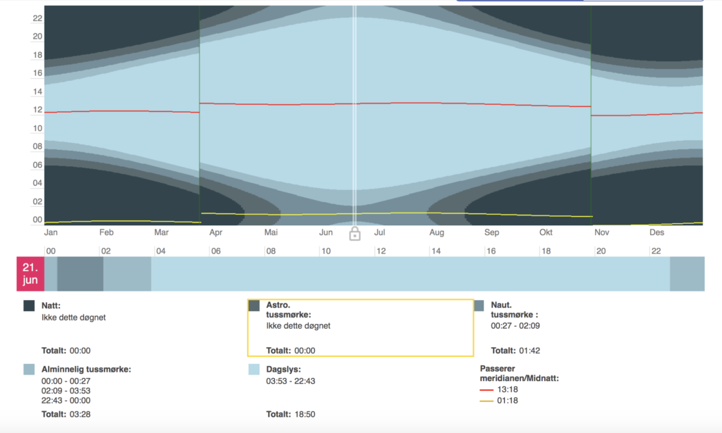
Fig. 17-18: Unknown maker. ca. 2010-2021. No title [interactive statistics]
On timeanddate.no I was able to collect graphs that show the amount of light and darkness Oslo gets each day of the year. This seemed like interesting data that could work as a foundation for a numerical typeface.
I also liked the idea of basing a typeface on the 23,4 degree angle of the earth on the lightest and darkest day of the year (in Oslo).
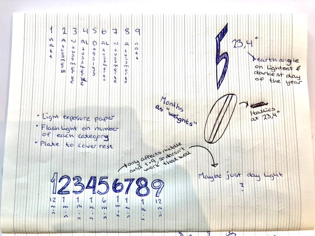
The book above also made me wonder wether I would create glyphs based on the circles of how the earth spins. This could be another interpretation of the 23,4 degree angle.
These ideas could be used solely for a nordic light numeric typeface, or it could be used to create a nordic season calendar. If I was to look at light for a publication of some sort (e.g. the calendar), it would also be interesting to look at materials affected by light, like photographic paper or ink that becomes visible when exposed to light (like the paper used in Serviceplan’s The Solar Annual Report).
The self as typography
I was happy about the way the nordic season project was going, but I still wanted to look into my initial idea of creating a typeface that reflects my own self. Through discussions with Stewart I took an interest in the question of how typography can begin to communicate a sense of the self. In order to answer this question, I would have to reflect on aspects of my own self:
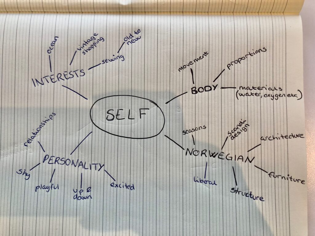
Although it’s slightly more superficial than some of the other ideas, I felt very drawn to the idea of using vintage furniture as reference for a typeface. Aesthetics are a huge part of my life and what I identify with, and furniture to me is all about aesthetics. When I’m not doing graphic design, I like to sew clothes, preferably using vintage fabrics. This notion of turning something old into something new is fascinating to me, particularly due to it’s sustainability aspect. The act of making a modern typeface based on the shapes of old furniture could be an expression for this interest, but also the societal benefit of using old objects in the process of making things. Vintage furniture can also say something about being Norwegian, as I would look at Norwegian furniture as references. Thus, this slightly superficial idea actually comes back to a lot of the points I’d use to discuss my self/identity.
Norwegian vintage furniture
At this stage I didn’t have time to visit vintage shops to study furniture. Instead, I used Digitalt Museum which had lots of digital images of old Norwegian furniture. Below are some of my favourites:
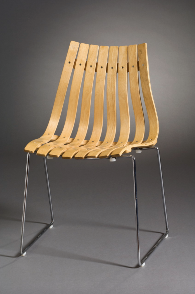
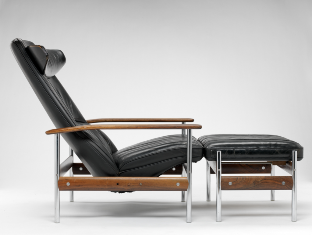
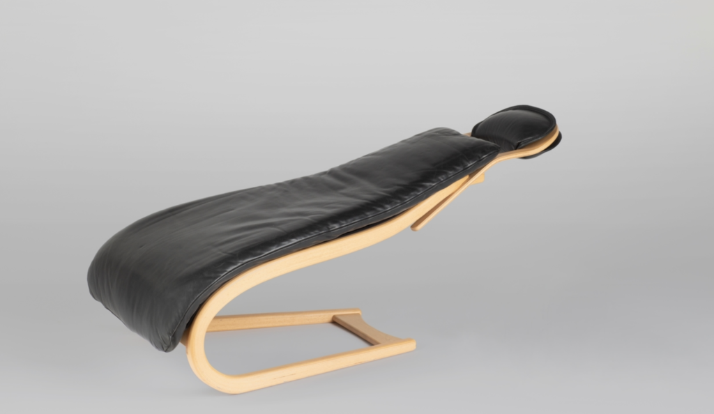
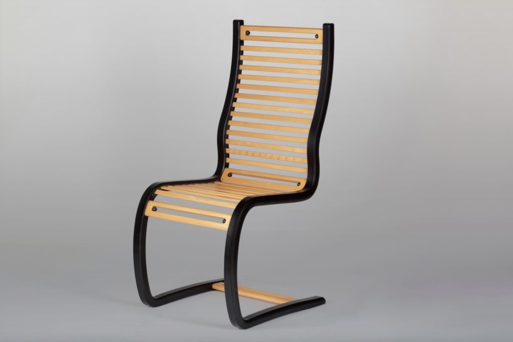
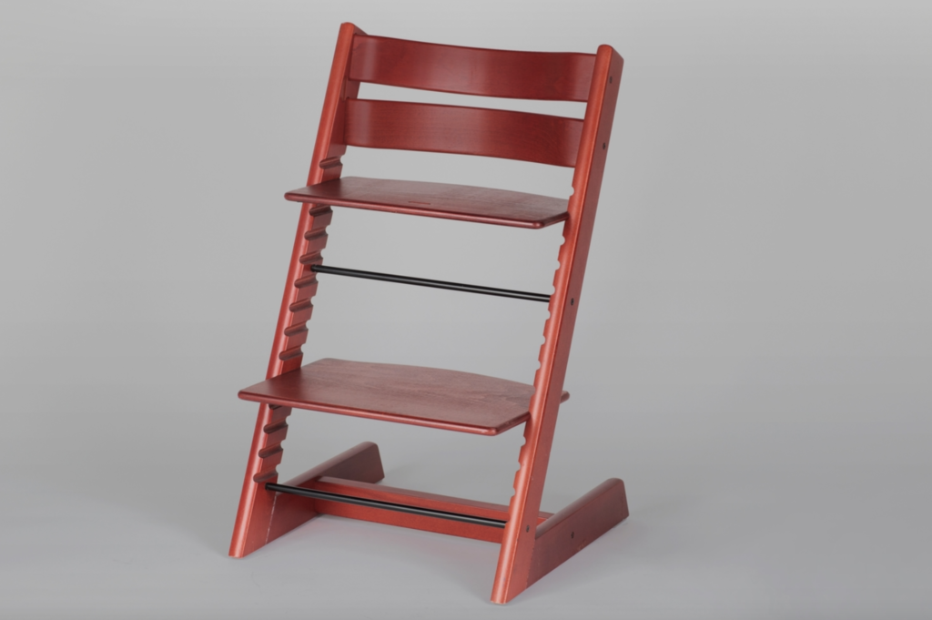
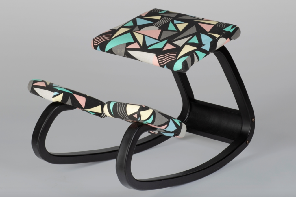
Fig. 20: Hove Møbler 1957. Scandia Junior. [Lacquered and molded, elm veneered on beech, chrome-plated steel]
Fig. 21: Dysthe 1961. 1001 AX Recliner. [Armrests and bars in varnished rio rosewood, seat in cowhide, and steel legs]
Fig. 22: Grimsrud 1983. Frontal 2. [Laminated beech, foam rubber upholstery, leather upholstery]
Fig. 23: Hope 1984. Spring. [Light beech and black lamination]
Fig. 24: Opsvik 1972. Tripp Trapp. [Laminated wood]
Fig. 25: Opsvik 1979. Balans Variable. [Beech, cotton and foam plastic]
What I like the most about these pieces of furniture is the relation between curves and hard lines. The bottom left chair (tripp trapp chair) is a statement Norwegian furniture piece used for children. I love how the very hard line of the leg acts as a contrast to the curved back.
Choosing a project
After doing the above ideation I felt torn about choosing a direction. On one side the Nordic season project felt interesting on a conceptual level, and I had a range of ideas for it. Limiting the delivery to numbers only also made it the more manageable option. However, stylistically I was more drawn to the furniture project, as this felt more in line with my work as a designer.
I decided to ask peers on the ideas wall, and I also got in touch with Mina, who helped me reflect on the ideas. This helped me realise that the furniture project ultimately resonated with me the most. Turning old objects into something new is a passion of mine, and I also find vintage design to be an important reference in my work. I can also see this typeface having a purpose, both as a comment on sustainability, and as a tool for other designers who perhaps would like to convey a sense of nostalgia, “Norwegianness” or sustainability.
After deciding on the project, I went on to explore possible research questions:
- How can I reference Norwegian vintage furniture in type design, as a comment on making something new from something old?
- How can a vintage furniture inspired typeface encourage a circular economy?
- How can I make a typeface that encourages usage of old materials when making new objects?
- How can Norwegian vintage furniture influence the making of a modern typeface?
Usage and context
Considering the amount of time we have for this project, I don’t see myself creating a final typeface, but rather a starting point of a side project that I could keep evolving moving forward.
When and if I was to finish the typeface, I can see it being used in my own work, as as a reflection of who I am as a person and as a designer. However, as the typeface would be a comment on sustainability, and the act of making something new from something old, it could also be used by other designers attempting to communicate a similar message. Usage could therefore cover projects such as furniture fairs, exhibitions with a sustainability focus, political campaigns, and branding for sustainable businesses.
It would be nice if the typeface in itself could live in an environment of sustainability. If sold online, the website could be developed sustainably (e.g. no images used), or parts of the profits could be donated to an environment organisation.
I think it’s important to state that this wouldn’t be a protest or rebellious typeface solely meant to encourage sustainability. It would first and foremost be a comment on how to build something modern using old objects as base. The typeface should reflect the elegant essence of the vintage furniture, and I therefore think it would be more suitable within the cultural field, than in a protest/rebel context.
Audience
Considering the above reflections, my target audience would be graphic designers working on projects related to the circular economy. They might want to use the typeface for visual identity projects for businesses with a circular economical structure, or perhaps an exhibition with a sustainability theme.
Below are some cares and needs I imagine my target audience to have:
- Aesthetics – the typeface needs to be visually pleasing.
- Expression – it needs to express what they themselves are trying to express with their project (this could be conceptually, but also visually). As there are so many typefaces out there today, the designers might be interested in one that fits their project conceptually.
- Professional – in most cases, the designers will be working on projects that needs to give off a professional expression. This doesn’t mean that it can’t be experimental, however, it shouldn’t be childish.
- Accessible – designers need to be able to access the typeface, either through purchase, free downloads, or subscription services such as Adobe Fonts.
- Variability – ideally the typeface would be variable, but if that’s not possible it should at least have a range of weights available. It there was a text version available, this would add value to the audience. Technical aspects such as kerning, ligatures and opentype features would also be beneficial.
- Presentation – seeing the typeface in use can help designers determine wether it’s right for their project. The visual presentation of the typeface will therefore play an important role.
Having done the above reflections I went on to write my final brief.
Final result
How can Norwegian vintage furniture design influence the creation of a modern typeface?
Aim, objective and critical context
Through the act of making something new using something old, we can begin to reunite our past and present culture, and by effect encourage a circular economy where the combination of old and new is key. In this project, I will use Norwegian vintage furniture design as a reference for a modern typeface.
Tom Foley from Monotype suggests that by continuing to make new typefaces today, we are adding to our visual culture (Tom Foley, Ca. 2016-2020). Thus as a comment on our culture’s present need for sustainable economical structures, this typeface’s aim will be to shift our focus to sustainable solutions and to present these solutions as elegant and favourable. The typeface should eventually be made available to designers, who will use it for projects that encourages sustainability and a circular economy.
In order to execute this project successfully, the following steps will have to be taken:
- Research and system development: I will collect a range of visual references from Norwegian digital archives, as well as from local vintage furniture shops. The visual references will be used to construct a system for the typeface’s characteristics – particularly the curves.
- Character development: Based on my research, I will produce physical and digital sketches of initial letterforms. Due to time management, I will focus on creating an all cap typeface. All characters might not be finished within the time frame, and so the final delivery should be seen as the beginning of a project, which I can continue working on after the deadline.
- Revision and presentation: Finally, I will revise the characters and continue to develop them as one unit, ensuring cohesiveness. In order to highlight the strengths of the typeface, the result should be presented as part of a graphics collection that shows the typeface in use.
Audience
The target audience consists of designers working on projects related to sustainability and circular economy. These projects could be anything from exhibition design to branding identity projects, but they often come from customers within the retail or cultural fields.
The target audience is concerned with conceptual suitability. If there is a typeface out there that connects with their project on both a visual and a conceptual level, it would provide satisfaction to them as makers.
Further needs and wants contain:
- Aesthetics: The audience wants their typefaces to be visually pleasing and in line with their project’s overall look. They also want it to work well with other existing typefaces.
- Expression: The audience needs the typeface to express the same messages as their project (visually, but also conceptually). Since they work within the retail and cultural fields, their choice of typefaces is affected by these fields’ trends and customs.
- Accessible: The audience needs to access the typeface with ease, either through purchase, free download, or subscription services. The presentation of the typeface can help make it more accessible (73% are more likely to buy a font if they see examples of it being used in products or logos (Mary Catherine Pflug, 2020)).
- Variability: It’s beneficial for the target audience if the typeface varies in weights and styles. Technical aspects such as kerning, ligatures and opentype features are favoured (Mary Catherine Pflug, 2020).
- Price: Designers and their clients might not be able to justify purchasing typefaces at a high cost. However, only 6% of designers don’t buy typefaces (Mary Catherine Pflug, 2020).
Anticipated final outcome
The final outcome should be the beginnings of a typeface, inspired by Norwegian vintage furniture design. Rather than creating a finalised typeface, the outcome will be a personal project that I can keep working on. Eventually, the typeface should become a key element for graphic designers working on projects related to sustainability and the circular economy.
In conclusion
Although I’m finding self-initiated projects slightly difficult in terms of where to start, it’s been rewarding to reflect on my interests this week. Mads Wildgaard’s guest lecture inspired me a lot, and I’m very keen to build my own typeface. I like the idea of having a meditative project that I can keep evolving in time to come.
Looking back at my work from GDE710 made me re-discovered ideas that I had forgotten about. In my analysis of those ideas, I also realized that there are certain themes and interests I keep coming back to in my work. Typography experiments and sustainability are perhaps the ones I’ve looked at the most up until now. In the future I will try to look back at my work from time to time, as a source of reflection and unused ideas.
In this week’s webinar, Harriet mentioned that some of us had jumped to conclusion on a final outcome too quickly. Looking back at my work this week, that might be applicable to my project. Rather than deciding straight away that I wanted to make a typeface, I probably should have let the idea of making a typeface come out of a personal interest or issue, rather than the other way around. After talking to Stewart however, I was at least able to develop a deeper concept and meaning for my project. The Abstract episode with Hoefler was a great starting point for this as it made me realize how typeface concepts emerge.
Looking into the mathematics of Nordic seasons was a lot of fun and if I had more time, I would have experimented more before neglecting the concept. At this point of research however, I’m happy to have chosen the furniture concept. The sustainability aspect of the brief resonates with my care for the environment, and the visual aspects of making a typeface from Norwegian design appeals to me on an aesthetic level.
Since I chose a final outcome so quickly, I think it will be important to keep an open mind as we go on to research next week. Perhaps the research question could be changed to How can I use typography to encourage a circular economy? If so, other possibilities could emerge in terms of references and concepts.
REFERENCES:
Bill Gates (2021) How to Avoid a Climate Disaster. London: Penguin Books.
Christoph Miller et al. (2021) ‘Brief Analysis’. Canvas Falmouth Flexible [online], 17 September.
Goods (2021) ‘Goods lanserer Index – et åpent rammeverk for bærekraftig emballasjedesign’, KreativtForum, 23 June. Available at: https://www.kreativtforum.no/arbeider/goods-lanserer-index-et-apent-rammeverk-for-baerekraftig-emballasjedesign (Accessed: 20 September 2021).
Mads Wildgaard (2016) ‘01 Mads Wildgaard Bold Decisions Amsterdam’. Canvas Falmouth Flexible [online].
Mary Catherine Pflug (2020) ‘Results of the 2019 Font Purchasing Habits Survey’, Medium. Available at: https://medium.com/font-stuff/results-of-the-2019-font-purchasing-habits-survey-39339f591a6c (Accessed: 23 September 2021).
Peter Phillips (2004) Creating the perfect design brief: how to manage design for strategic advantage. New York: Allworth Press.
Tom Foley (2016) ‘Tom Foley Monotype’. Canvas Falmouth Flexible [online].
LIST OF FIGURES:
Figure 1: Mads WILDGAARD. Ca. 2016-2020. Mads Wildgaard – Bold Decisions [lecture presentation still]. Available at : https://fast.wistia.net/embed/channel/442tfhl7jj?wchannelid=442tfhl7jj&wmediaid=j7rby4jlka [accessed 23 September 2021].
Figure 2. ADAPT. Ca. 2015-2021. Ocean Bottle (wod). Adapt [online]. Available at: https://www.adapt-climate.world/2-0-work
Figure 3. GOODS. 2021. Index. Kreativt Forum [online]. Available at: https://www.kreativtforum.no/arbeider/goods-lanserer-index-et-apent-rammeverk-for-baerekraftig-emballasjedesign
Figure 4: Ingrid REIGSTAD. 2020. Typeface Maker 2. Private collection: Ingrid Reigstad
Figure 5: Ingrid REIGSTAD. 2020. Type experiment 5. Private collection: Ingrid Reigstad
Figure 6: Ingrid REIGSTAD. 2020. Type experiments 2nd attempt. Private collection: Ingrid Reigstad.
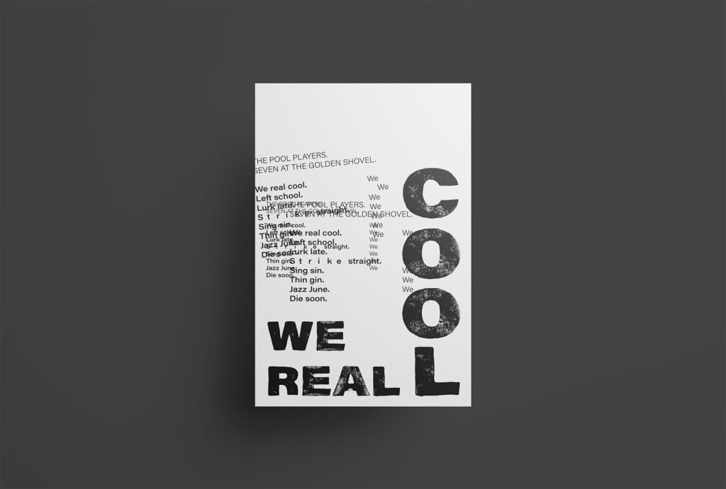
Figure 7: Ingrid REIGSTAD. 2020. We Real Cool. Private collection: Ingrid Reigstad.
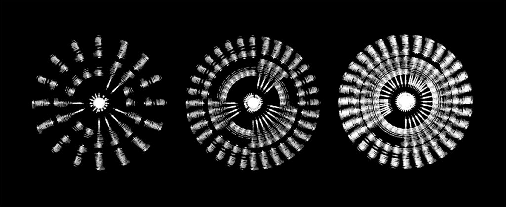
Figure 8: Ingrid REIGSTAD. 2020. Sound wave experiment 4. Private collection: Ingrid Reigstad
Figure 9: FILL REFILL CO. 2020. Promotional animation for Fill. Fill Refill Co. [online, instagram]. Available at : https://www.instagram.com/p/CELx6T4nh70/
Figure 10. REGULAR PRACTICE. 2020. RP in Review #2. Regular Practice [online]. Available at: http://regularpractice.co.uk/
Figure 11: Brian OAKES. 2019. Abstract: Jonathan Hoefler: Typeface Design [film still]. Available at : https://www.netflix.com/title/80057883 [accessed 23 September 2021].
Figure 12-13. H. N. WERKMAN. Ca. 1940-1949. Terkenkalendar Facsimile. The Letterform Archive [online]. Available at: https://oa.letterformarchive.org/item?workID=lfa_netherlands_0006&targPic=lfa_netherlands_0006_021.jpg
Figure 14. Alfred ROLLER. Ca. 1900-1910. Ver Sacrum Kalender. The Letterform Archive [online]. Available at: https://oa.letterformarchive.org/item?workID=lfa_austria_0001&targPic=lfa_austria_0001_018.jpg
Figure 15. Jacob JONGERT. 1927. Van Nelle’s promotional pocket calendar, 1927. The Letterform Archive [online]. Available at: https://oa.letterformarchive.org/item?workID=lfa_jongert_0157&targPic=lfa_jongert_0157_004.jpg
Figure 16. Unknown maker. ca. 2010-2021. No title. [digital illustration]. Timeanddate.no [online]. Available at: https://www.timeanddate.no/astronomi/vintersolverv [accessed 23 September 2021].
Figure 17-18. Unknown maker. ca. 2010-2021. No title. [interactive statistics]. Timeanddate.no [online]. Available at: https://www.timeanddate.no/astronomi/sol/norge/oslo?month=12&year=2021 [accessed 23 September 2021].
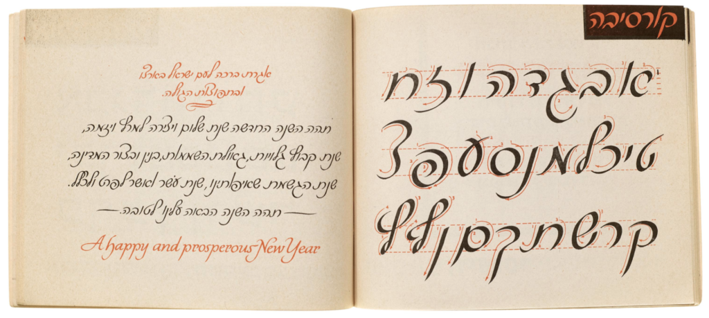
Figure 19. L.F. TOBY. 1973. The Art of Hebrew Lettering. The Letterform Archive [online]. Available at: https://oa.letterformarchive.org/item?workID=lfa_israel_0001&targPic=lfa_israel_0001_006.jpg
Figure 20. HOVE MØBLER. 1957. Scandia Junior. Digitalt museum [online]. Available at: https://digitaltmuseum.no/011062435643/scandia-junior-stablestol
Figure 21. Sven Ivar DYSTHE. 1961. 1001 AX Recliner. Digitalt Museum [online]. Available at: https://digitaltmuseum.no/011061475793/1001-ax-recliner-lenestol
Figure 22. Tone GRIMSRUD. 1983. Frontal 2. Digitalt Museum [online]. Available at: https://digitaltmuseum.no/021068556580/frontal-2-hvilestol
Figure 23. Terje HOPE. 1984. Spring. Digitalt Museum [online]. Available at: https://digitaltmuseum.no/021068480950/spring-spisestuestol
Figure 24. Peter OPSVIK. 1972. Tripp Trapp. Digitalt Museum [online]. Available at: https://digitaltmuseum.no/021068556588/tripp-trapp-barnestol
Figure 25. Peter OPSVIK. 1979. Balans Variable. Digitalt Museum [online]. Available at: https://digitaltmuseum.no/021068556578/balans-variable-stol