Lecture reflection
Seeing the case studies of week 1’s lecture gave me some new perspectives on what it means to be part of a graphic design studio as well as how varied different studios’s practice and processes are. In Tony Brook and Adrian Shaughnessy’s book, Studio Culture, Shaughnessy (2009) mentions three key aspects of which a design studio is made up of: The physical space, the people who occupy that space and the work they produce. These points might be a good foundation for an analysis of design studios and so, further, I will reflect upon the case studies in light of Shaughnessy’s (2009) three points.
SPACE
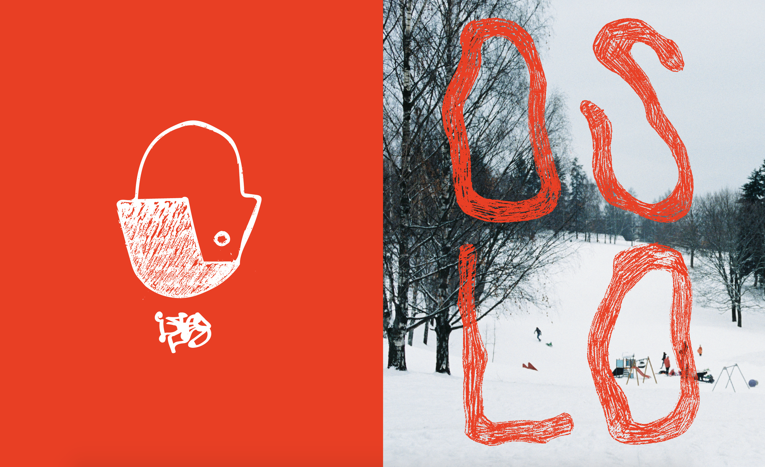
All of the design studios presented in the lecture were based in London. Having lived in London for a brief period of time, I can imagine, as several of the studios mentioned, that one is bound to get a lot of impressions from the busy city. Therefor, I am not surprised to hear that Sam Winston uses his studio space as a silent place where he can explore ideas and concepts by himself.
It might be interesting to draw lines between the way in which a design studio is set up and the work that springs out from the space. Looking at Sam Winston’s work, I can’t help but notice that there is a systematic simplicity to it. However, the work also seems to reflect a sense of noise and loudness. This is interesting as Sam mentions in his interview that he takes in many impressions from the loud city, but works in silence with his ideas, considerate of what he brings into his work space.
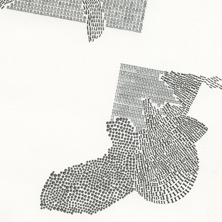
Looking at Regular Practice’s (who share a studio with their creative friends) work, a sense of play comes to my mind. Although they also seem to have a systematic and clean approach to their work, it seems more colourful and fluid to me, than Sam’s work.
Assuming that Sam’s and Regular Practice’s work is a mere result of the different studio spaces from where they are produced, might not be entirely correct. However, I think it’s interesting to reflect upon a possible correlation between the space in which a piece of work is created and the end result.
PEOPLE
Looking at design process, I think it’s essential to reflect upon collaboration and how you go about working with others and who with. Listening to how the different design studios collaborate, I noticed how much their preferences in working with others varies. Whilst collaboration seemed to be the core of Regular Practice’s process, Intro Design seemed to be working by themselves most of the time.
WORK
When asked to reflect upon what design is, Regular Practice’s answer particularly resonated with me. At the end of the day, all design studios will do the work in the way they think is right – what separate different design practices is the stylistic and conceptual choices. They also mentioned that a designer should be a bit geeky and have an interest in diving into new topics and techniques they haven’t tried before. The notion of variation and unexplored territory is what got me interested in design and I hope to make exploration and play an even bigger part of my practice as I move forward with my studies.
As we embark on our MA’s I think it will be interesting to see how our design studio (I suppose we can refer to our course as a studio) will grow from our spaces, people and areas of work. How will we work together and how will our studio evolve – and to what? As we participate from around the world, I look forward to seeing how different cultures and technologies will affect our practice and processes over the next two years.
Resources reflection
The resources from week 1 all seemed to be about studio culture and what it means to be a designer. I was especially intrigued by the case studies presented in the lecture, but also in the book Communication Design: insights from the creative industries (Yates and Price 2015). Reading about different design practices and approaches made me realise that there are so many ways of being a designer today.
I have often gone to It’s Nice That for design inspiration and so it was interesting to read the interview with the founder, Will Hudson. The website started as a university project and was initially meant to be a collection of resources (Yates and Price 2015). I think It’s Nice That is a great journal for me to look at for inspiration for the journal you are currently reading. Much like Hudson points out, a collection of resources should be carefully edited and both the writing and references should have a unified tone of voice (Yates and Price 2015).
Hudson goes on to explain how he focuses on maintaining quality in his work and the importance of working with interesting brands and people, rather than catering everything you do to a certain audience (Yates and Price 2015). As a designer I am intrigued by the idea of following my own interests, rather than creating design simply for the sake of hitting an audience. If one is to only follow an audience’s interests without thinking about one’s own interests as a designer, how is one supposed to create something experimental and innovative? Of course, the audience is still an important aspect of design, but I think there is a balance that needs to be found between the audience’s interests and the designer’s. Perhaps the solution is to be restrictive about what types of clients and projects you take on? On the other hand, some might argue that an important part of a designer’s skillset is the ability to alter his or her interests to a client or audience.
In addition to the listed books in week 1, I also had a look at the visual resources: www.designeverywhere.tumblr.com and www.visuelle.co.uk. I collected some references in my digital sketchbook and had a closer look at each reference in order to find out what drew me to them.
SWISS ART AWARDS – Siri Backmann

I think the typography used in this visual identity has a uniqueness to it. It feels classical, yet modern with it’s pointy and slightly unconventional details. Due to it’s uniqueness and amount of space given on posters and brochures, I think it’s a nice way of creating a visual base, which will maintain brand awareness, even if the colours and graphic shapes changes.
SUSUMU YOKOTA – CLOUD HIDDEN – Non-Format & ANTI

The realistic aspect of the photograph is an interesting contrast to the graphic flat background. I like the delicate and natural texture of the moss cloud. The surreal approach of creating a cloud out of a different material than a cloud normally consists of, is also very interesting and creative to me. Whilst the medium of photography and graphic design creates variety and contrast, the simplicity in the use of colours and shapes creates harmony and unity.
MINYONS DE TERRASSA – Xavi Miranda

This reference proves the importance of placement in typography and how it can enhance one’s narrative. One doesn’t necessarily have to build figures out of letters, but experimenting with type as shapes, lines, waves etc. can be an interesting and important part of a composition.
DOMO – Wedge Studio & Philippe Dionne Bussières

By adding a slight twist to the M in the logo, whilst keeping the formality and geometric sense of the remaining letters, creates a playful, yet sophisticated look. The combination of geometry and fluidity is also used in the illustrations, which creates unity and cohesiveness. The playful approach breaks with the traditional corporate aesthetic that one might normally see in relator agencies’ brand identities, enabling DOMO to stand out and appeal to a younger demographic.
Workshop challenge
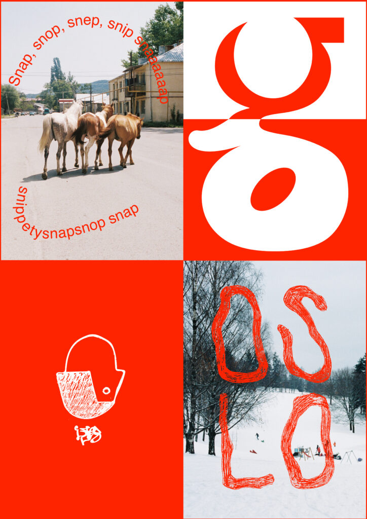
I started my work on the quadriptych by reflecting on the questions the work was supposed to answer.
- Who are you?
My name is Ingrid Reigstad and I work as a digital marketer in Oslo. I have previously studied Fashion Photography at Falmouth University, but after moving back to Norway, my practice has shifted towards graphic design. I still photograph, but as a hobby, usually on vacation and in my spare time. I like animals, everything cozy and learning new things.
- What is it that you do?
I love to experiment and play as much as I can with my work. However, up until recently, I didn’t experiment much with typography. A pivotal project would therefor be a personal branding project for a fictional indie band, where I decided to experiment with expressive typefaces. This has inspired me to learn more about typography and I am now eager to start experimenting with making my own letters.
- Where are you?
I am based in Oslo, Norway. During my photography degree I lived in Falmouth and London, and after moving back home I’ve realised how much of my identity lies in being Norwegian. Oslo is an urban city packed with things to do, but there is also a lot of nature here and a river running through the town. Living in the south of Norway means that I get to experience big changes in seasons and I always feel inspired by the changes in weather and my surroundings. Scandinavia is known for it’s design, and I think my work is somewhat influenced by the clean aesthetic our area is known for. However, I am also drawn to more expressive design, which might differentiate from traditional Scandinavian design.
- Why Design?
I have always been interested in aesthetics and creativity. As a person I get easily caught up in new interests and this is why design is such a good medium for me. There is always a new topic to explore and a new technique to try. The adaptive medium fulfils my need for variation and constant exploration.
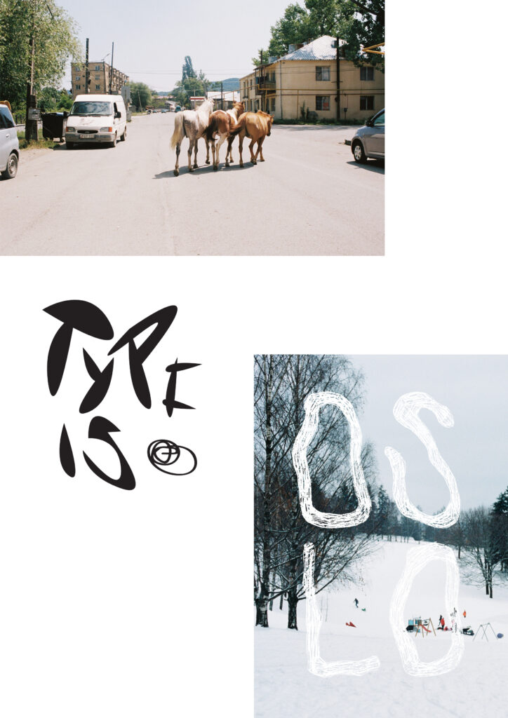
After reflecting upon the questions, I created a moodboard on Pinterest with visual references. I also sketched out ideas in my sketchbook. I wanted my quadriptych to have some sort of handmade element in it, something organic that stemmed from the physical self. I therefor played around with some drawings and cutouts, which I later imported to illustrator.
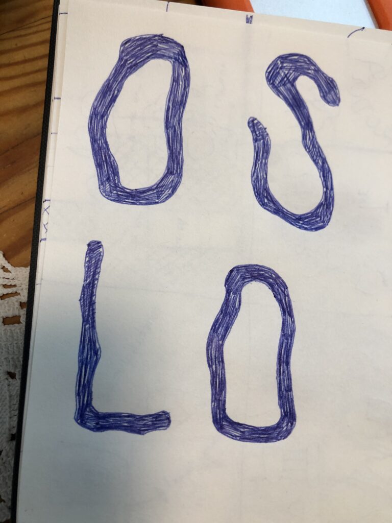
Sketch on type for OSLO. I wanted the type to feel energetic, like the city. I also wanted to reference the river which runs through our town. 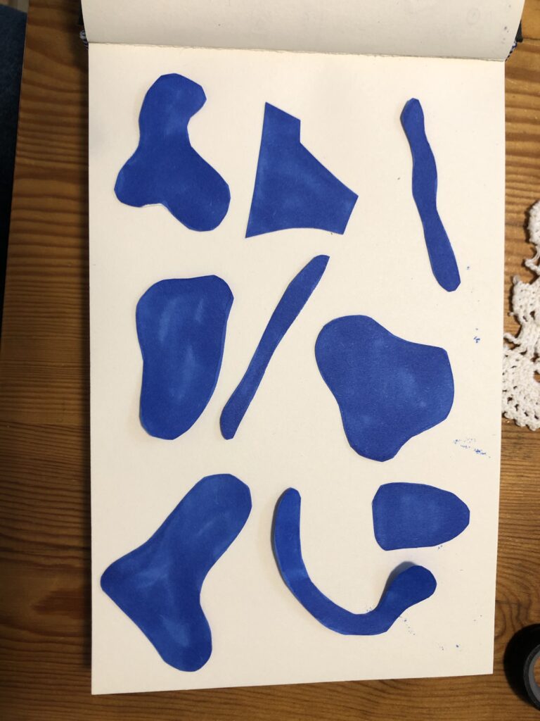
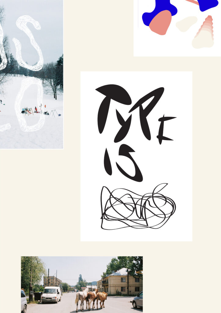
Cutout shapes – meant to represent the variety of graphic design as a medium. 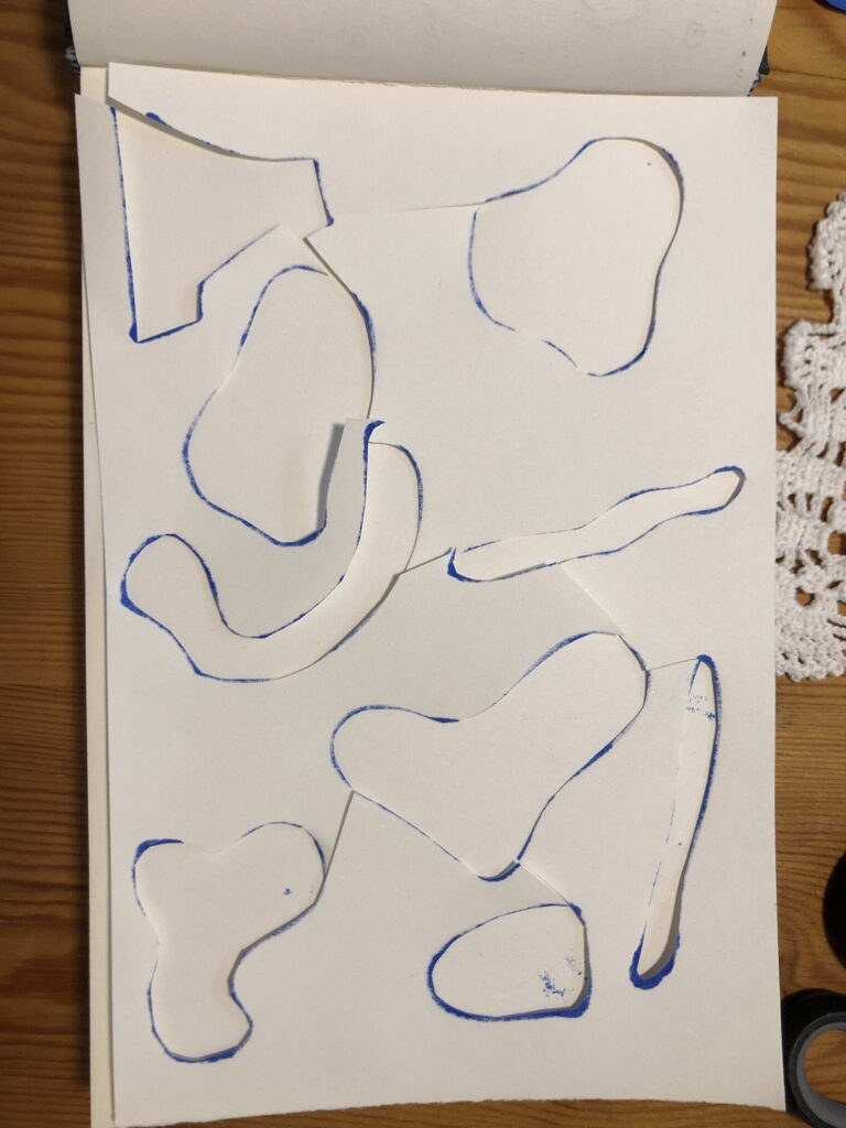
I think the left over paper from the cut outs was interesting. I tried using this, but it didn’t work for this assignment. Might revisit this later. 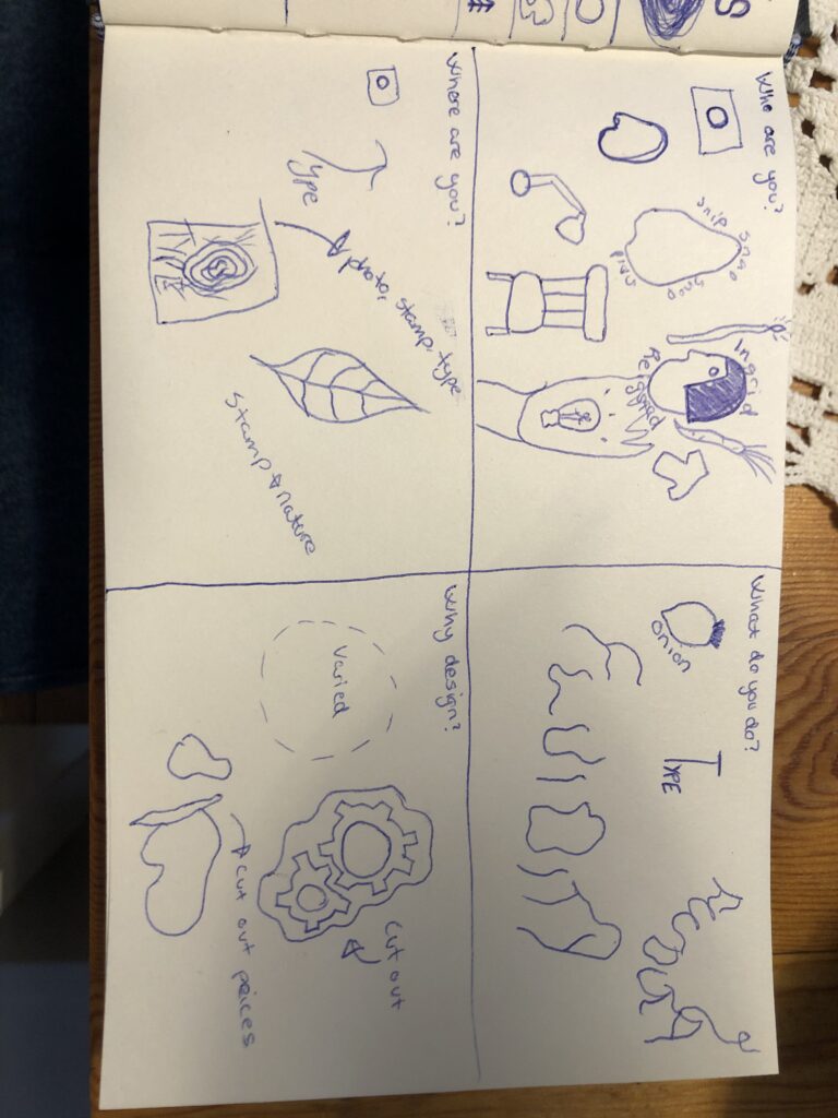
Brainstorm on objects and drawings for each question. 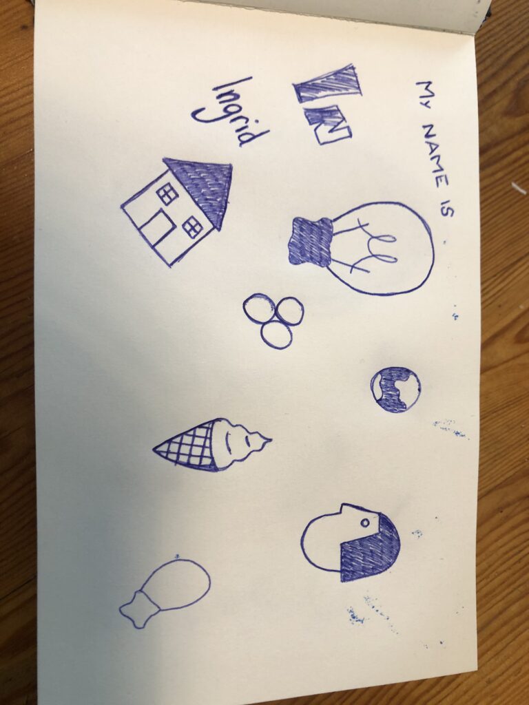
Drawings which I later imported to illustrator. 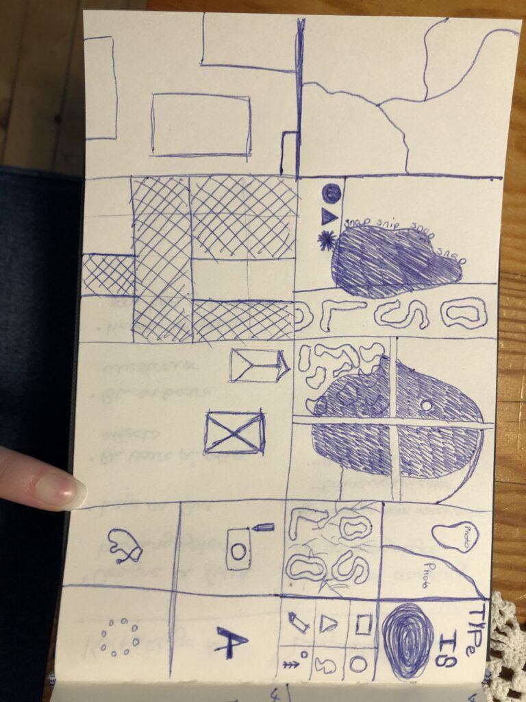
Sketches on how I wanted to use the grid and ideas for the different sections.
After sketching out some ideas, I started working in illustrator to see what worked on screen. My first attempts were quite busy. I wanted to keep a fun and expressive aesthetic, but I also wanted the work to feel balanced and sleek. I therefor decided to focus on one colour in my graphics, which led to a more cohesive look.
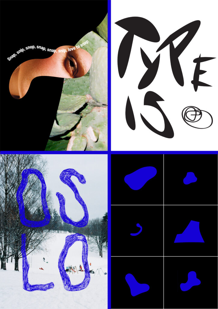
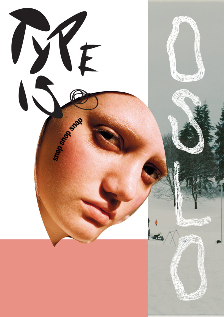
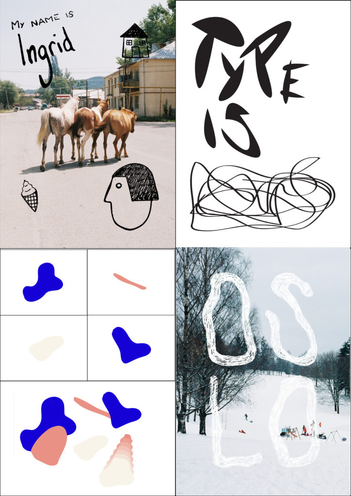
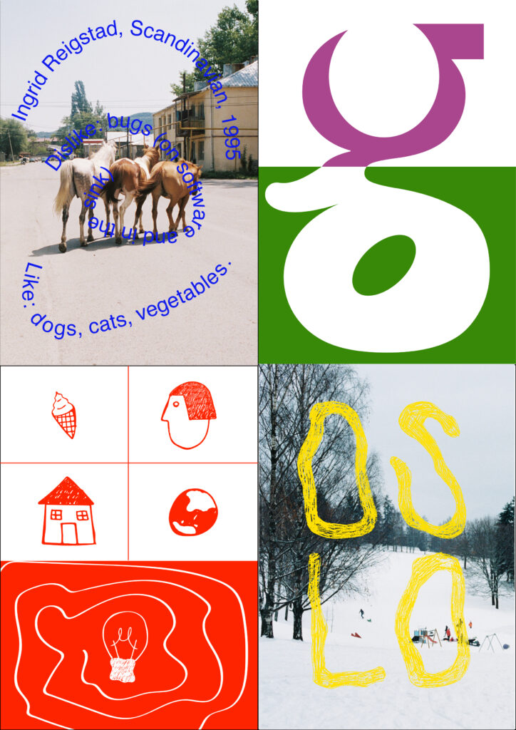
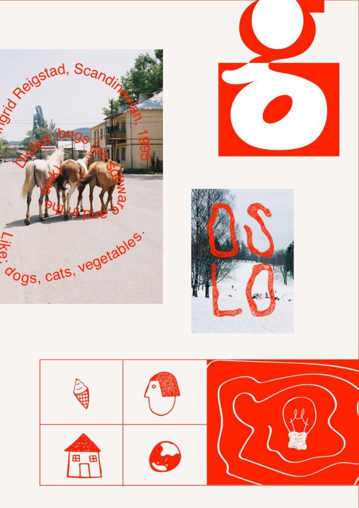
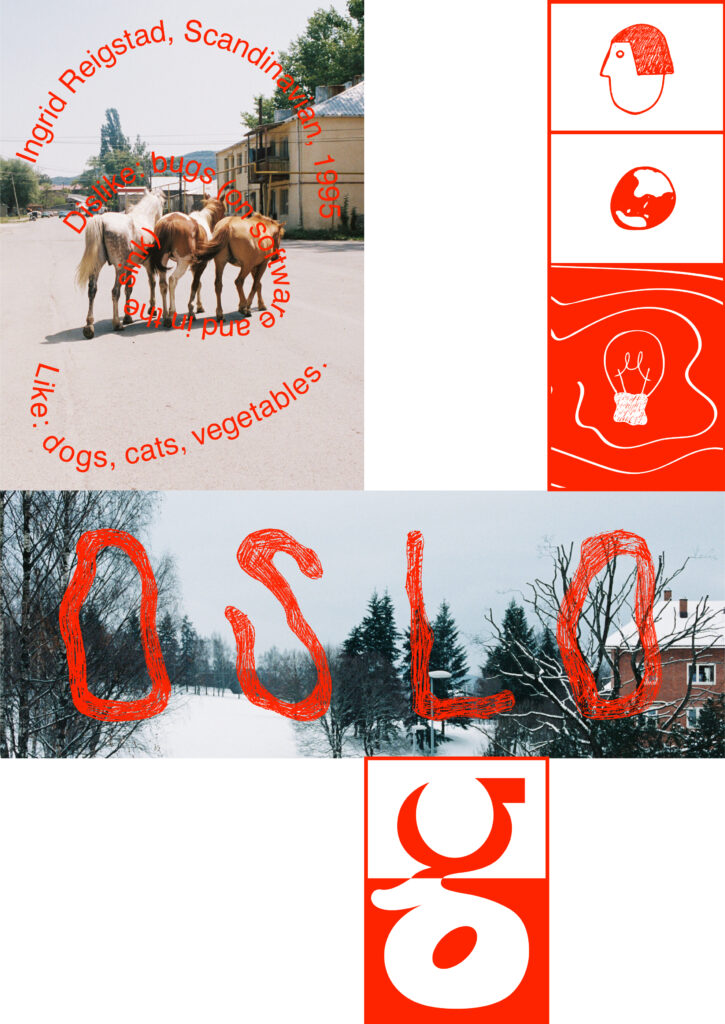
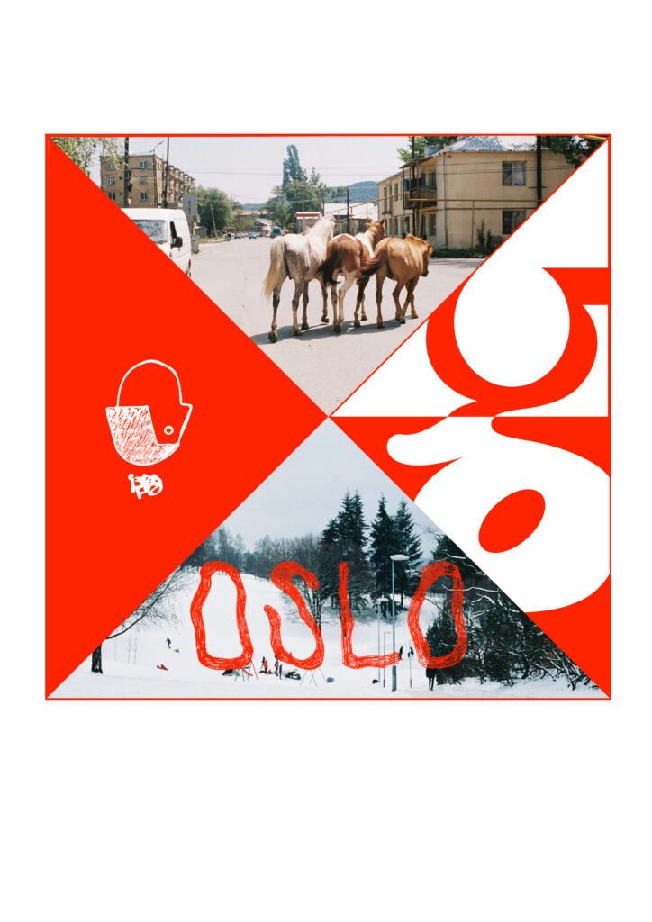
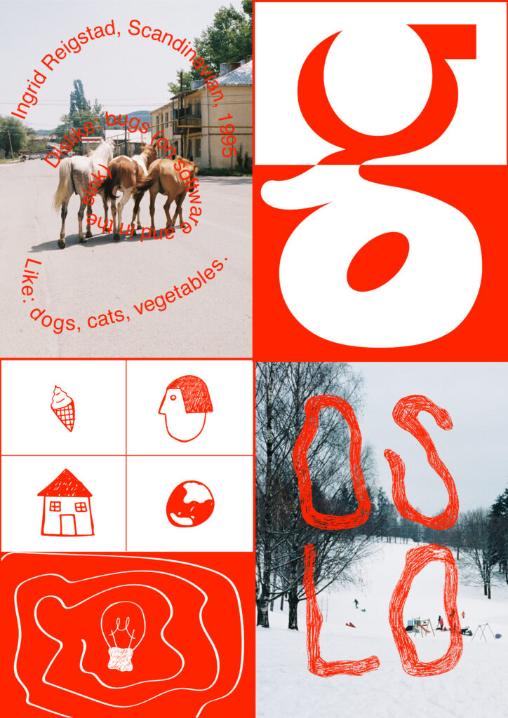
After submitting the last image of the gallery above to the ideas wall, I received feedback suggesting to make the copy on image 1 less literal. Paul also suggested to make the quadriptych simpler somehow. I agreed with both suggestions and decided to drop the grid of drawings in image 3. I only really felt as if the face added to my concept and so I chose to focus on that one drawing. In order to get across the message of variety and flexibility in design, I added a “thought-bubble” above the head, illustrating my constant change of interests.
In image 1 I decided to play on the word “snap” as in snapping a photo. I started my creative journey in photography, but now my photography work mainly consists of taking snapshots in my spare time. I’m a fan of quirky sounds and words and so I tried to translate this into the copy, in order to make it more abstract.
Looking back at my first attempts in relation to the final result, I’m reminded of the importance of editing, pointed out by Will Hudson (Yates and Price 2015), mentioned previously in this blog post. In the beginning of the proses I had a lot of ideas, that didn’t necessarily work well together. I think an important part of making the quadriptych was to strip it back and toss ideas that, although being good ideas on their own, didn’t add to the cohesiveness of the image.
Summary of the week
This week has forced me to look at myself and figure out how my personality correlates with and influences my design practice. Learning about different designers’ practices, journeys and ways of working has shown me the importance of being yourself, also in your design practice.
There seems to have been a sense of nervousness amongst several of us this week (which is only natural when starting something new), but seeing the variety of approaches to this week’s workshop challenge, as well as the variety in approaches to design in general in the lecture’s case studies, proves that there is no right or wrong in design. I leave this week feeling more confident in my way of working, yet intrigued to learn new ways and skillsets over the next two years.
REFERENCES:
BROOK, Tony and Adrian SHAUGHNESSY. 2009. Studio Culture. London: Unit Editions.
YATES, Derek and Jessie PRICE. 2015. Communication Design: insights from the creative industries. New York: Fairchild Books.
LIST OF FIGURES:
Figure 1. Sam WINSTON. 2020. A E I O U. Instagram [online]. Available at: https://www.instagram.com/p/CDUCaEBhvFM/
Figure 2. REGULAR PRACTICE. 2019. Identity for the Royal College of Arts graduate exhibition. Instagram [online]. Available at: https://www.instagram.com/p/BzYes2uhvRj/
Figure 3. Siri BACHMANN. 2013-2014. SWISS ART AWARDS. Siri Bachmann [online]. Available at: http://www.siribachmann.com/new-page
Figure 4. NON-FORMAT. 2019. Susumu Yokota – Cloud Hidden. Behance [online]. Available at: https://www.behance.net/gallery/86302691/Susumu-Yokota-Cloud-Hidden
Figure 5. Xavi MIRANDA. 2020. 6M. Behance [online]. Available at: https://www.behance.net/gallery/58761401/6M?tracking_source=best_of_behance
Figure 6. WEDGE STUDIO and Philippe Dionne BUSSIÈRES. 2019. Domo Neighbourhood Apartments. Behance [online]. Available at: https://www.behance.net/gallery/89244217/Domo-Neighbourhood-Apartments-Brand-Identity
Figure 7: Ingrid REIGSTAD. 2020. Workshop challenge week 1 experiments. Private collection: Ingrid Reigstad.
Figure 8: Ingrid REIGSTAD. 2020. Workshop challenge week 1. Private collection: Ingrid Reigstad.